How to Shoot Food
Food photography is the most practised genre in the history of the medium. More food pictures are taken daily than photographs of all other subjects combined — a claim that may or may not be statistically rigorous, but feels entirely true the moment you open Instagram.
We photograph our restaurant plates before eating them, our home cooking before it gets cold, and occasionally our shopping before putting it away. The habit is universal. The results, for the most part, are disappointing — not because the food wasn't good, but because the photograph has utterly failed to communicate that. The soup looked magnificent in the bowl. In the picture, it looks like mud.
This is fixable. Food photography is genuinely learnable, and it doesn't require a professional studio, a thousand pounds of lighting equipment, or a food stylist on retainer. It requires understanding a handful of principles — about light, angle, composition, and what you're actually trying to say with a picture — and applying them consistently. That's it. The food does the rest.
What follows covers those principles in enough depth to be useful, without treating you like someone who has never seen a camera before. You've been looking at photographs your entire life. You know what a good one looks like. The gap between knowing and doing is smaller than you think.
Before You Shoot
Every food photograph has a hero — the specific element you are actually photographing. Not "the dish", not "the table", not "the whole spread": the hero. It might be a single tart. It might be a stack of pancakes. It might be one perfect scoop of ice cream in a bowl surrounded by other scoops. Identify it before you pick up your camera, because every decision that follows — angle, light, props, composition — is in service of making that specific thing look its best.
Before the hero arrives in frame, use a stand-in. If you're preparing a plate that takes fifteen minutes to plate beautifully, don't set up your light and composition around the finished dish — by the time you've dialled things in, the sauce has skinned over and the greens have wilted.
Use a similar plate, a book, a mug, anything that occupies roughly the same space. Get your angle, your light, your props all arranged and confirmed on the stand-in. Then swap in the real thing, make your minor adjustments, and shoot quickly.
Food deteriorates fast once it's under lights or away from heat. Steam dissipates within seconds. Ice cream doesn't need to be told this. Anything with a crisp top goes soft; anything saucy gets a skin; anything green goes dull. The professional approach is to prepare backup ingredients — a second portion of the hero element, kept perfect until needed. The home cook's approach is to shoot decisively. Either way, dithering is the enemy. Decide what you're going to do before the food is ready, do it, and eat the evidence.
Before you think about angle or props, ask yourself: what story is this photograph telling? This sounds precious, but it's a genuinely useful question. A picture of a roast chicken on a Sunday afternoon tells a different story from a picture of the same chicken on a white marble surface against a pale background.
The first is domestic warmth; the second is a recipe photograph. Neither is wrong, but choosing before you set up means everything in the frame works toward the same end, rather than contradicting itself.
Finding the Hero Angle
The angle you shoot from is one of the most important decisions in food photography, and there's a useful two-factor framework for arriving at it quickly. The two factors are: how tall is the dish, and how many visible layers does it have?
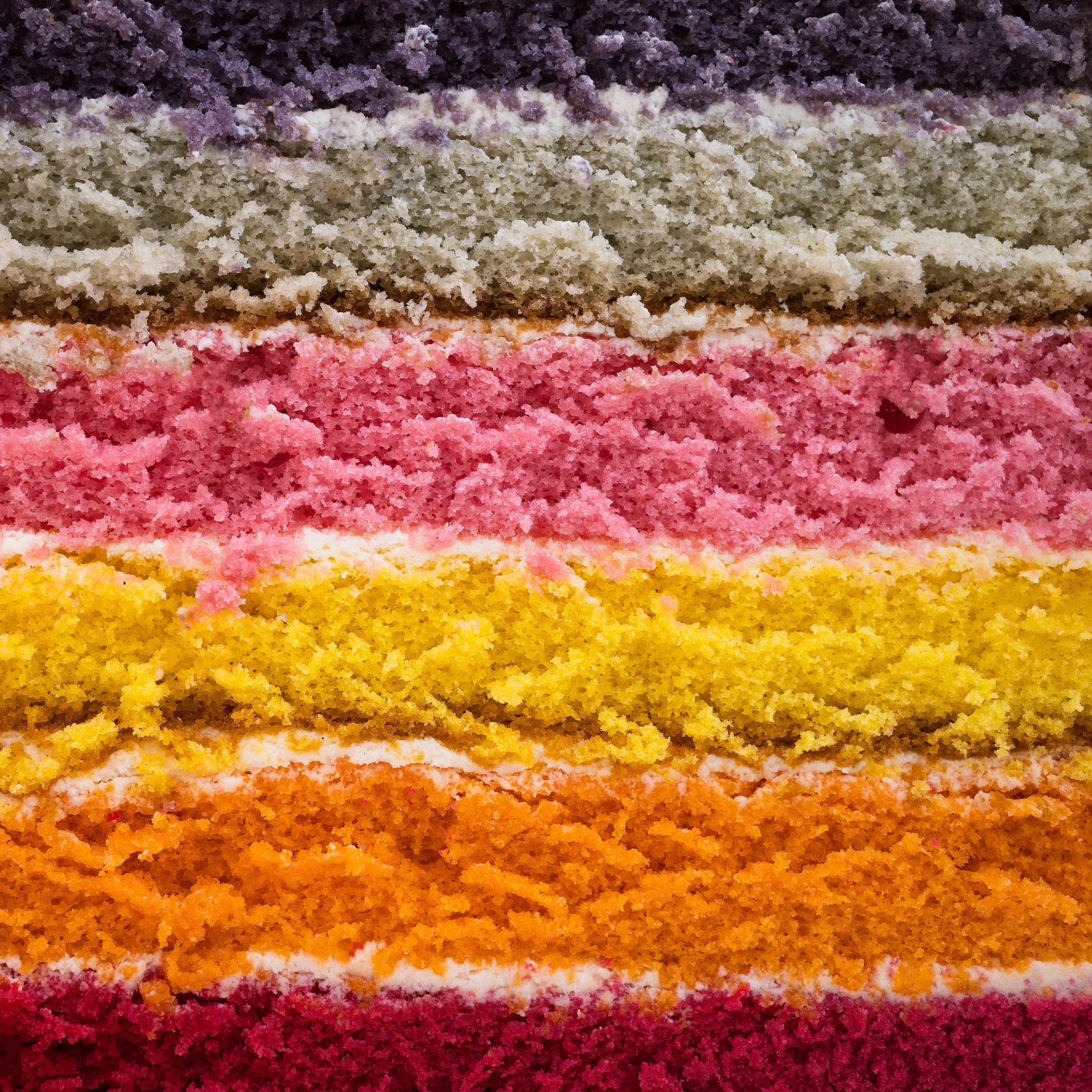
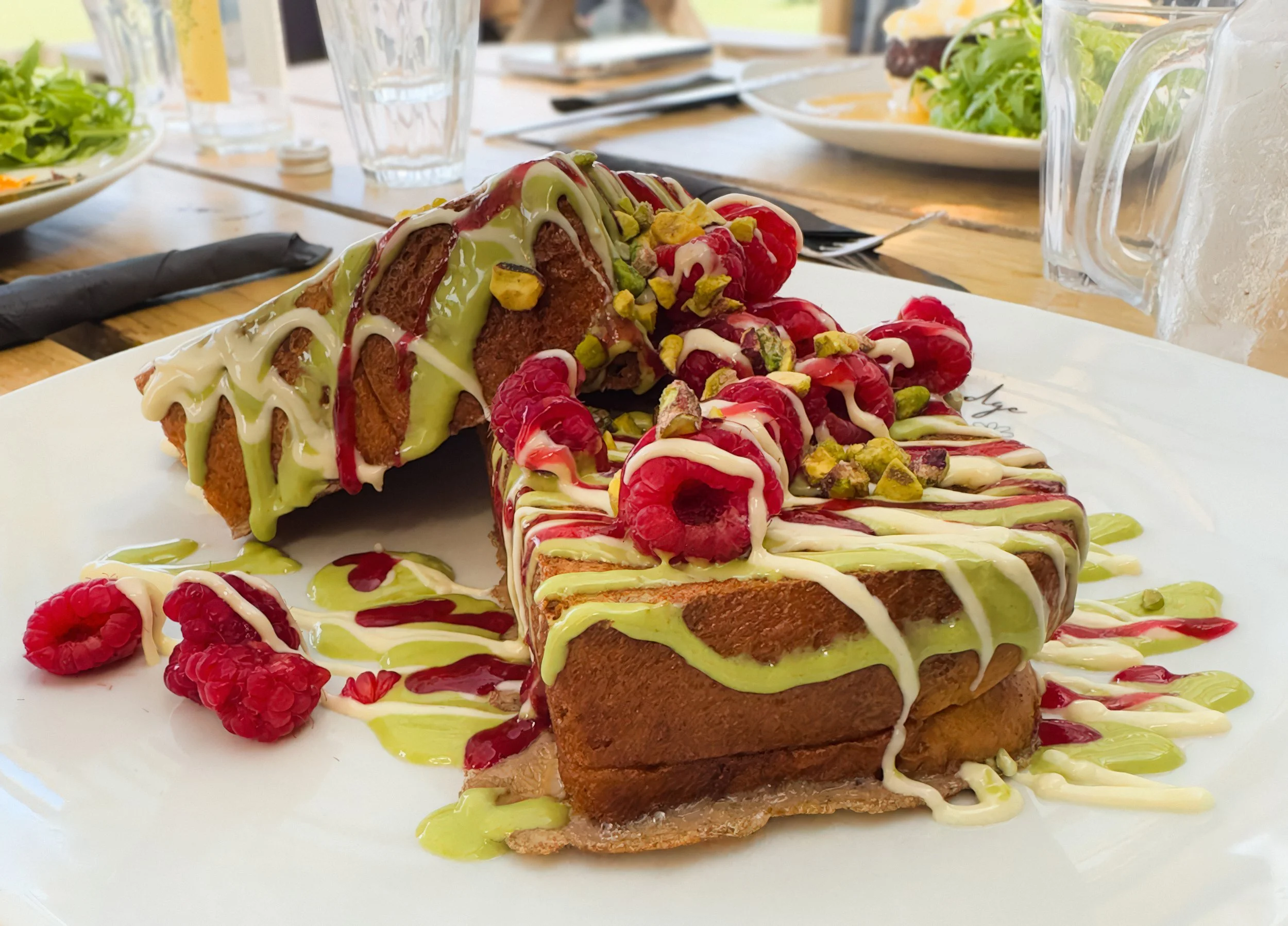
Tall subjects — burgers, layer cakes, ice cream sundaes, stacked pancakes — have their best story in their height. Their visual appeal is vertical. Shooting them from directly above flattens and hides the thing that makes them interesting.
For tall, layered subjects, work between 45 degrees and eye level. You want to see the layers, the stack, the height. The exact position within that range depends on the specific dish and what looks best; which is the perfect segue into the most useful advice in this section: take multiple shots. Shoot it at 45 degrees, then at 60, then at eye level. Compare them on the screen. The right angle will be obvious.
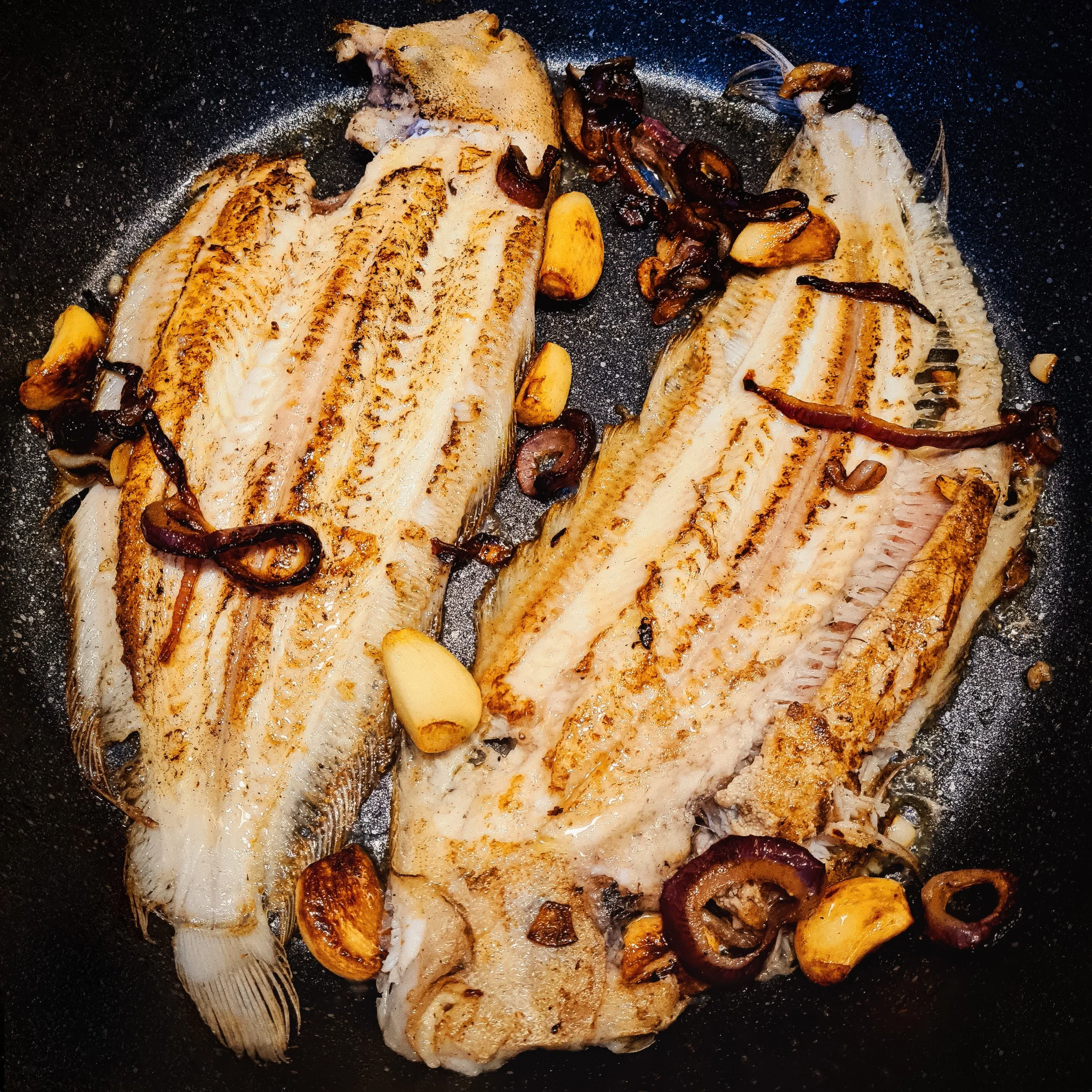
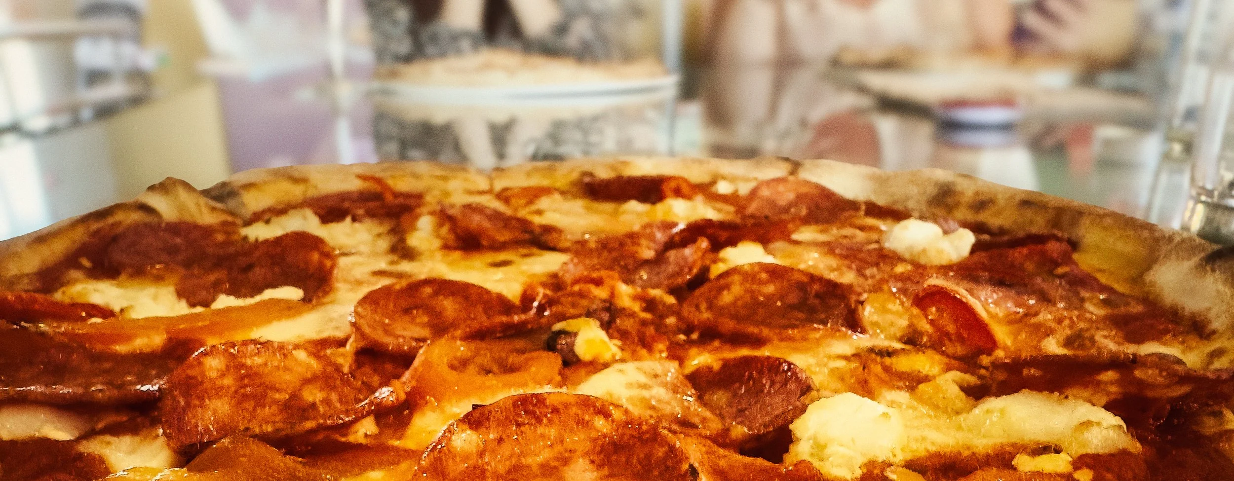
Flat subjects — tarts, cookies, pizzas, flatbreads, most soups in wide bowls — have their best story in their surface. Their beauty is in texture, colour, and arrangement on the plane of the plate. For these, overhead (directly above) to about 75 degrees (slightly off vertical) is your range. A pizza shot from eye level looks like a pizza from someone else's table. The same pizza from directly above is a pattern, a texture, a composition.
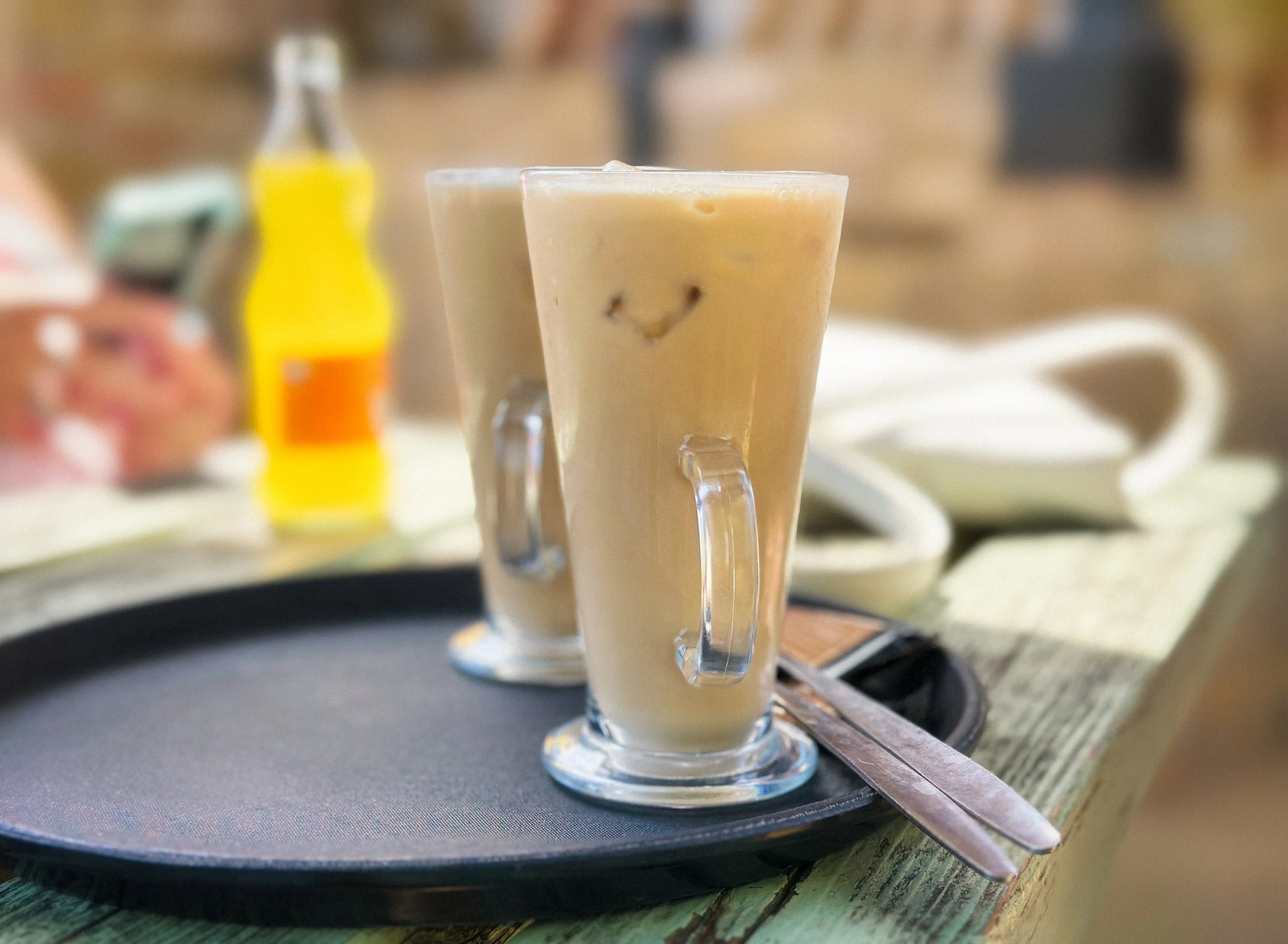
Soups and liquids occupy a useful sub-category, because the vessel matters as much as the contents. A tall mug of ramen, with its noodles mounded above the broth, gets treated as a tall subject — shoot from the side to show the depth and the layering. A wide, shallow bowl of tomato soup gets treated as a flat subject — overhead or near-overhead, where the colour and the swirl of cream become the picture.
The overhead shot deserves a specific word. It works brilliantly for complex arrangements, multiple dishes, full table settings, and any time the arrangement itself is the point. It flattens everything annoyingly when there is one tall hero element that has been stripped of its best feature by being shot from above. Before committing to overhead, ask whether the dish has anything vertical worth keeping.
Light : The Only Thing That Matters
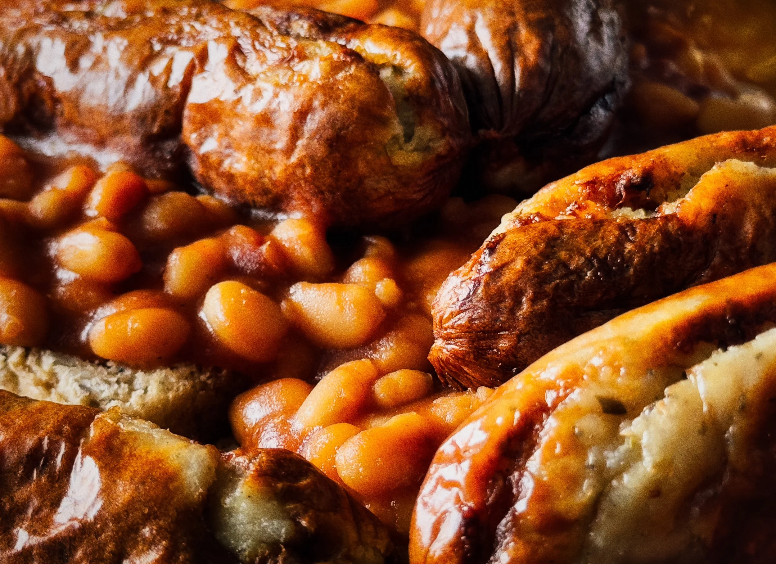
This heading is slightly tongue-in-cheek. There are other things that matter. But light is the thing that makes or breaks a food photograph more decisively than any other factor, including the food, which feels like it should rank higher. It doesn't. Sublime food under terrible light produces a terrible photograph. Beans on toast under beautiful light can produce something genuinely lovely.
Natural window light is your baseline, your starting point, and for most food photography shot at home, your best available option. Position your food near a window — ideally within a metre or so — and position it so the light comes from the side, not from behind you.
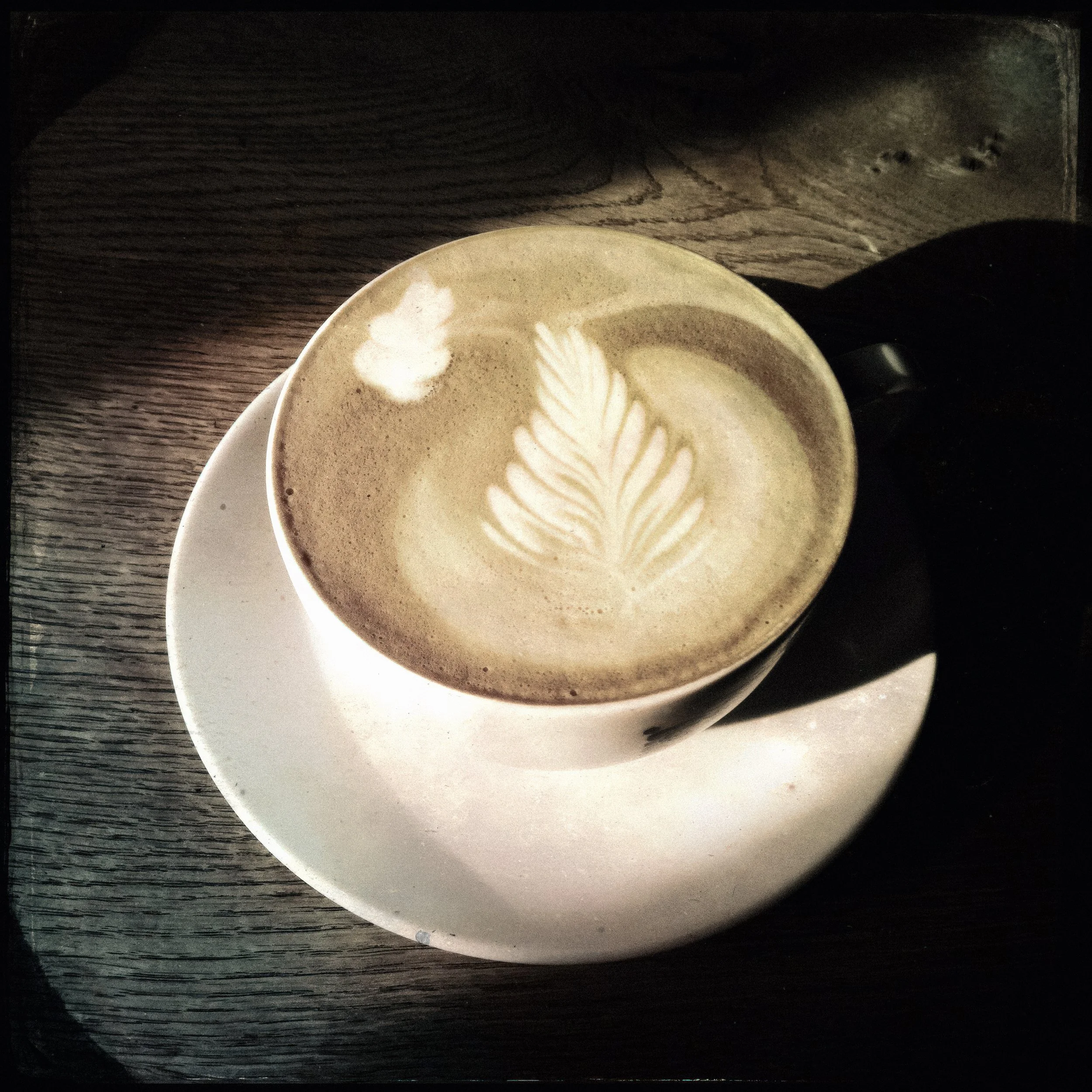
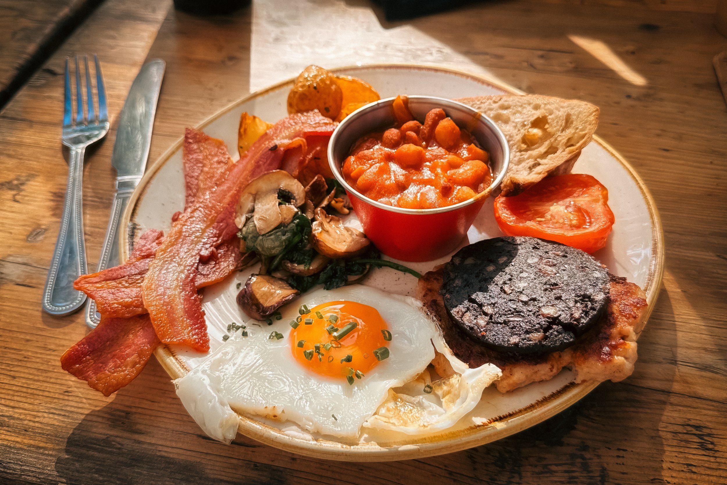
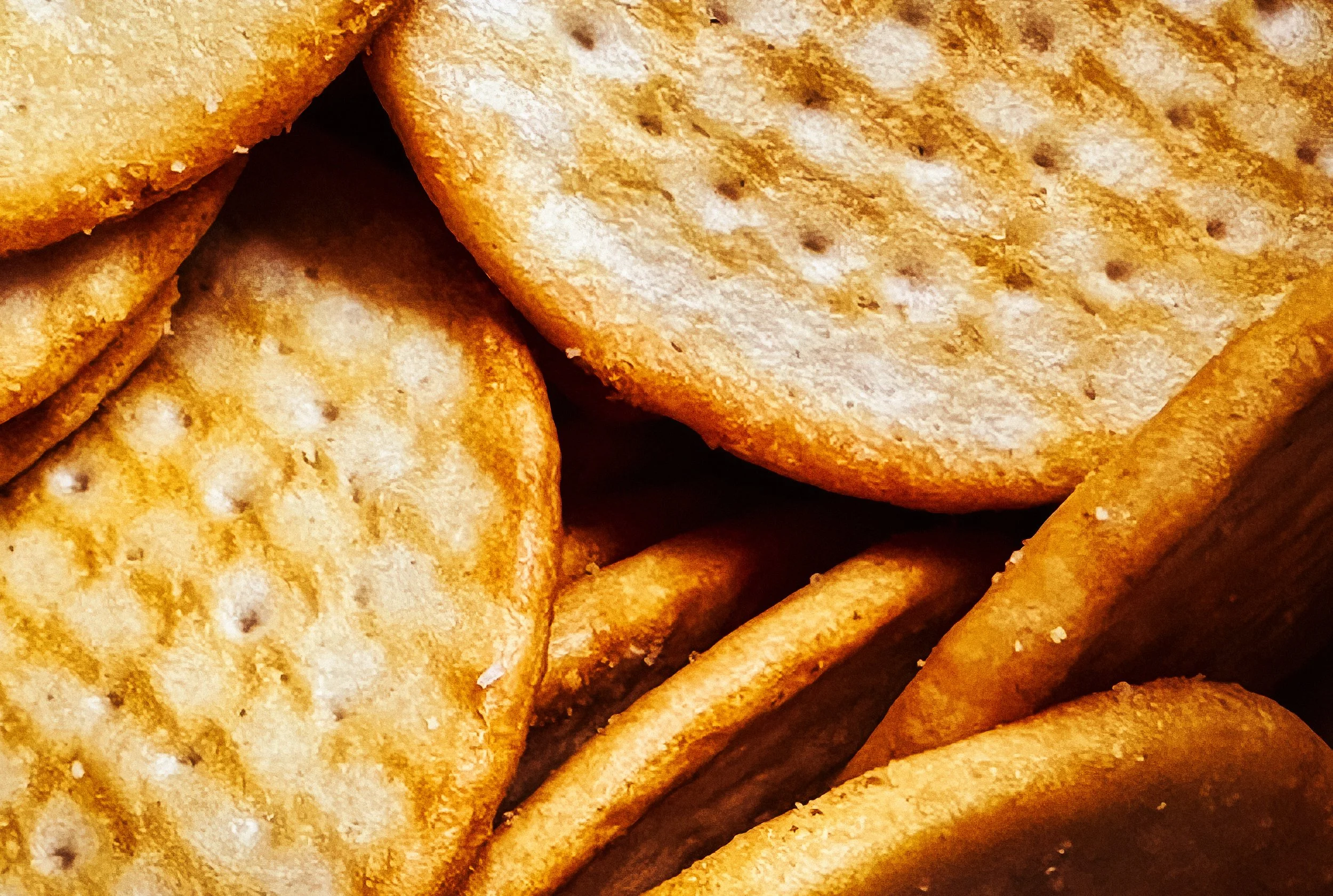
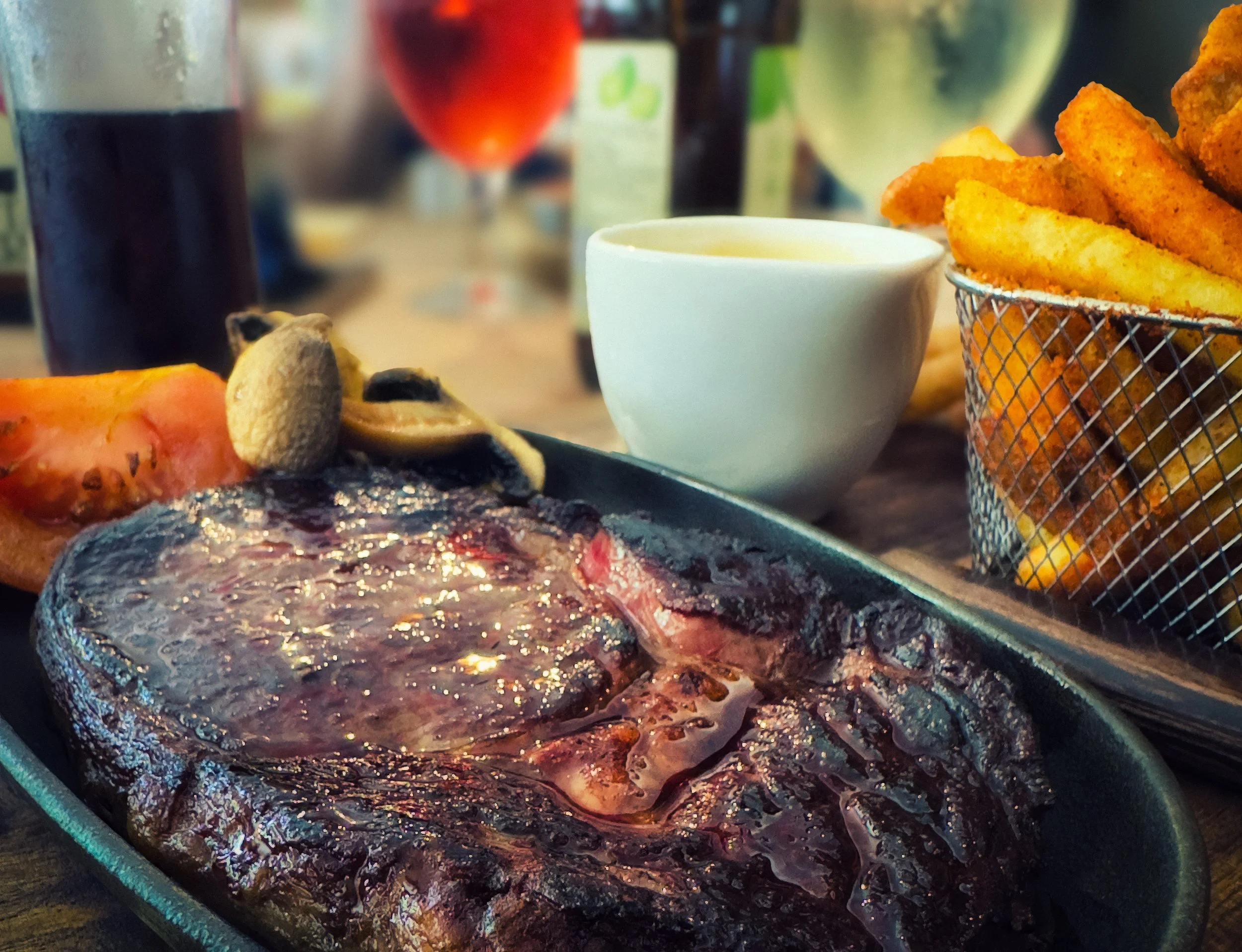
Side lighting (the window to the left or right of the food, rather than behind the camera) does the thing that matters most in food photography: it reveals texture. The seeds on a bun, the crust on a loaf, the gloss on a sauce. These are all sculpted by raking light from the side. Flat front lighting, which is what you get when the camera is between the food and the window, flattens them out.
The quality of the light — hard versus soft — is the other variable. Overcast light through a large north-facing window gives you soft, directionless light with gentle shadows. This is often described as flattering and is genuinely useful for smooth, poured, or plated food.
A net curtain or a piece of white diffusion material taped across a bright window softens the light considerably and costs almost nothing. Direct sunlight through an unobstructed window can be beautiful or brutal: the shadows are hard and can cut across a plate in ways that ruin a composition, and the bright spots bleach out colour and texture. It's not impossible to work with, but it requires more care.
Turn off the built-in flash. This is not a suggestion. The built-in flash kills food photography. It produces flat, bright, colour-destroying light from exactly the worst possible angle. Nothing on a plate was ever improved by it.
Time of day matters. The light through a north-facing window is reasonably consistent throughout the day. East-facing windows give you warm morning light that can be gorgeous, and nothing in the afternoon. West-facing windows are the reverse. South-facing windows get direct sunlight for much of the day, which is brilliant for some things and awful for others. Know your kitchen. Know when the light is good.
When natural light genuinely isn't available — evening, basement flat, professional kitchen with no windows — a softbox positioned to the side is the closest artificial equivalent. A simple LED panel with a diffusion layer, positioned at roughly the same angle you'd position a window, gets you surprisingly close. The key is keeping it to the side, keeping the camera shadow out of frame, and avoiding light from multiple directions that creates confusing double-shadow chaos on the plate.
Composition for Food Photography
The rule of thirds is where most people start, and it's a perfectly good starting point. Divide the frame into a three-by-three grid (most phone cameras will overlay this for you) and place the hero element at one of the four intersections rather than dead centre. This is not a rule so much as a reliable default that avoids the static, ID-card quality of centred-everything compositions.
The golden ratio and dynamic symmetry exist, are interesting, and are worth reading about separately. In practice, for food photography, the rule of thirds does the job.
Negative space — the empty area around the subject — is underused by most beginners, who fill every inch of the frame in the belief that more content equals more interesting. It doesn't. Negative space gives the hero somewhere to breathe, creates visual hierarchy, and often makes a photograph feel calmer and more confident. A single croissant in the lower-left third of the frame, with a plain surface taking up the rest, is a better photograph than a croissant surrounded by jam pots and stray crumbs and a spare plate.
Every element in the frame creates a line. A spoon handle, the edge of a wooden board, a folded napkin — these lead the eye. Consciously or not, the viewer follows them. If they lead toward the hero, this is useful. If they lead out of the frame, this is less useful. Arrange props so that their implied lines point inward or around the subject, rather than directing attention out of the picture.
When you have multiple elements in the hero position — three cookies, five strawberries, seven canapes — an odd number creates more dynamic, natural-looking arrangements than even numbers. Even numbers tend to pair up symmetrically. Odd numbers resist it. Two cookies look like a pair. Three look like a composition.
The food should always be the most interesting thing in the frame. Props support this; they don't compete with it. If your eye keeps being drawn to the beautiful vintage tile you found for the background rather than to the food in the foreground, the tile has won and the food has lost. This is not what you wanted.
Props & Styling
A prop has one job: to provide context. It tells the viewer where this food exists, what occasion it belongs to, and something about the person or place it came from. A worn linen napkin and a simple fork next to a bowl of pasta says something specific. A slate board, scattered rock salt, and a sprig of rosemary next to the same pasta says something quite different. Neither is wrong; both are deliberate.
Surfaces do enormous work in food photography. Worn wood, stone, slate, concrete, aged enamelware — these textures complement food without competing with it. They have their own visual interest but don't overwhelm. Shiny surfaces — lacquered tables, polished metal, mirrors — create reflections that rarely look intentional and almost always distract. Avoid them unless you specifically know what you're doing with a reflection.
Plate choice matters more than most people acknowledge. A plate with a raised rim casts a shadow on the food inside it and creates a compositional ring that traps the eye. Flat plates and boards let the food breathe into the frame. Avoid plates whose colour fights the food — bright red plates with tomato dishes, for instance, create a mess of competing reds. The plate should hold the food, not battle it.
The scattered herb, the artfully placed fork, the folded corner of a napkin: these props add context and texture, but they accumulate quickly. The tendency is to add more; the discipline is to remove.
The professional food stylist's maxim is to start minimal and add only what's missing, rather than start maximally and subtract. This is harder than it sounds. If you're setting up at home, try deliberately starting with the food and the plate only, then adding one prop at a time and asking whether each one improves things. Stop the moment the answer becomes uncertain.
There are broadly two stylistic approaches in contemporary food photography. The first is messy chic: the apparently casual, lived-in arrangement where things look as though someone just cooked and sat down — a smear of sauce, a crumb, a dribble at the edge. This requires more arrangement than it looks. The messiness is curated. The second is clean minimal: the precise placement, the white surface, the single element. Both work. The mistake is trying to do both at once, which produces neither warmth nor precision, just confusion.
The hero garnish — the basil leaf placed on the pasta, the icing sugar dusted over the tart — should be both believable and functional. A sprig of something you'd never actually eat perched implausibly on a steak is a prop, not a garnish, and it reads that way. The unnecessary garnish is easy to spot: if you wouldn't eat it, and its only function is visual decoration, consider whether it's actually helping.
Colour & Mood
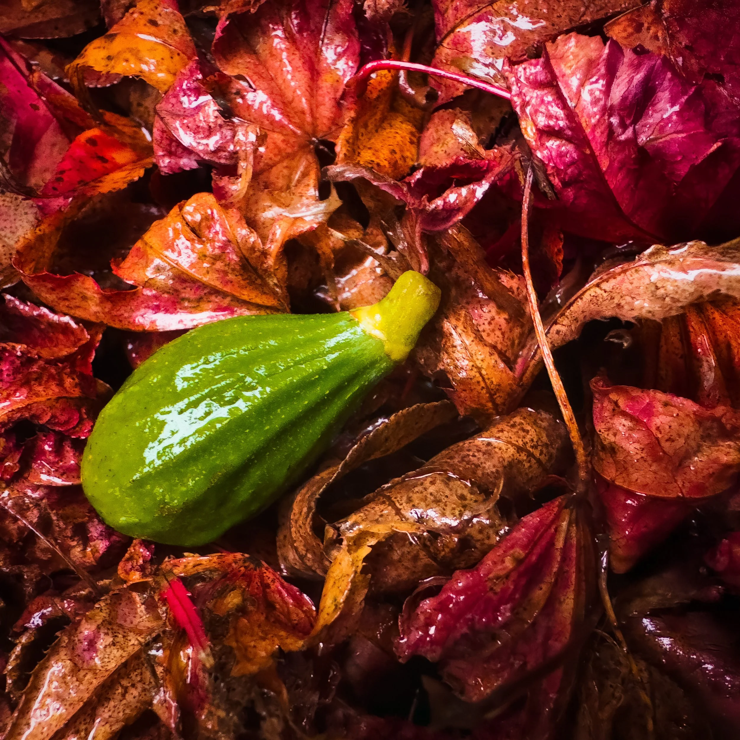
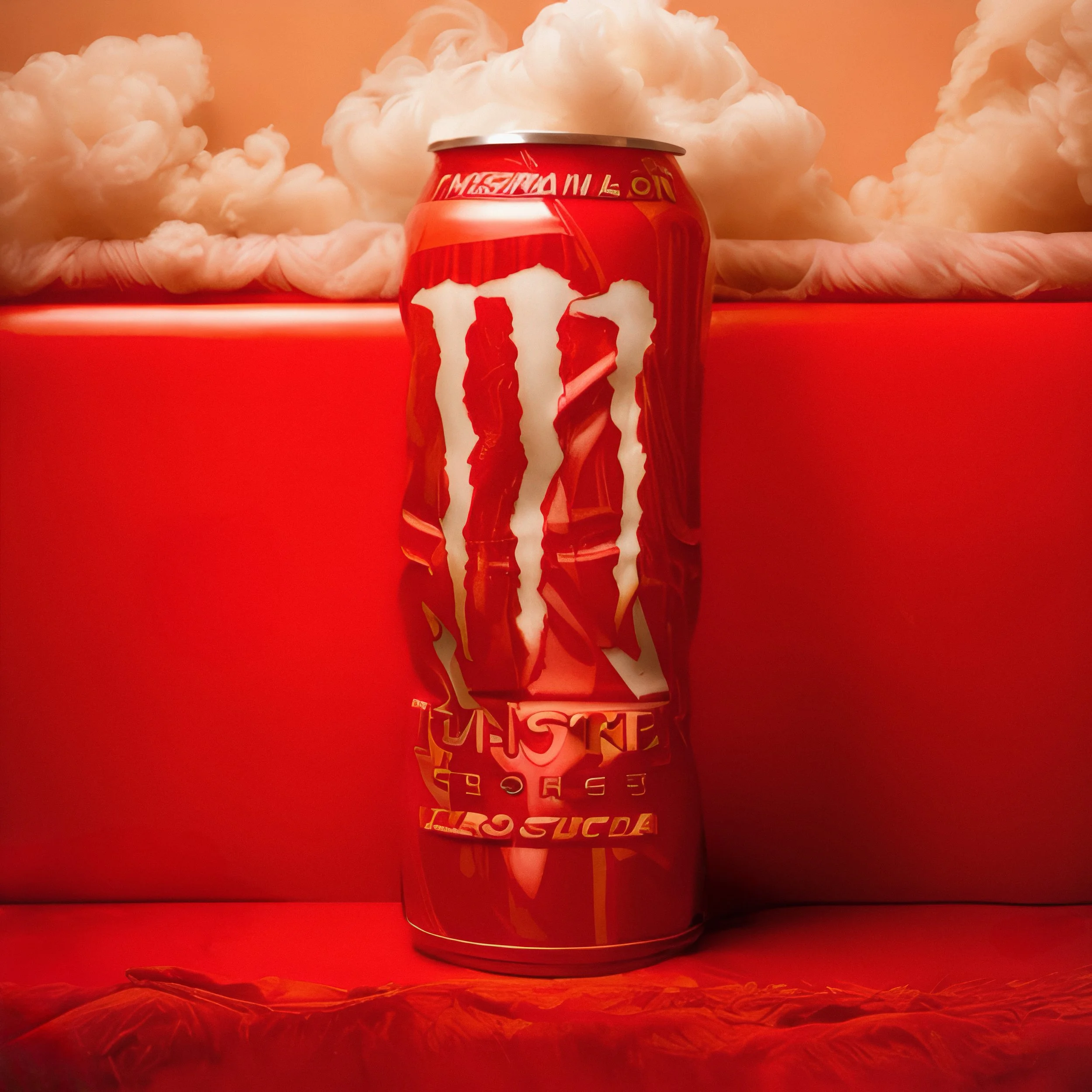
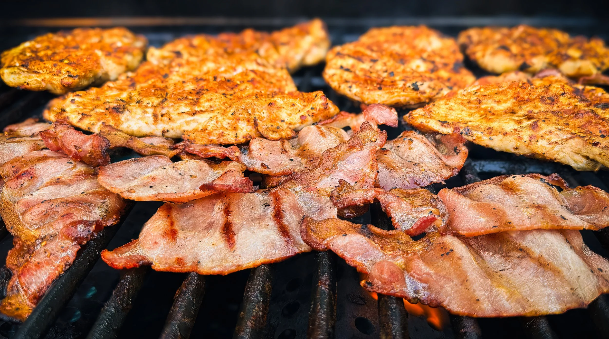
Warm colours — reds, oranges, deep yellows — are associated with appetite and warmth in ways that are not simply cultural. Photographs of food in these registers feel inviting. This is partly why so many fast-food logos use orange and red, though that's a slightly grim rabbit hole. The practical implication is that warm-toned surfaces, warm light, and warm backgrounds tend to make food look more appetising.
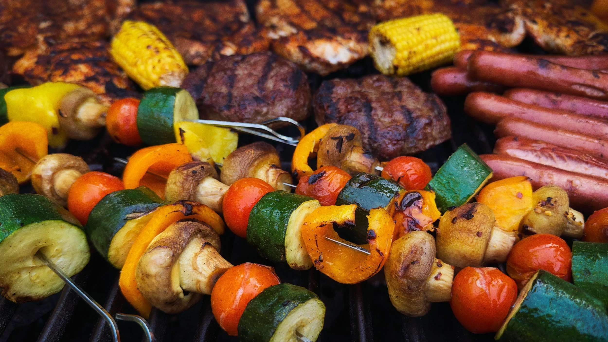
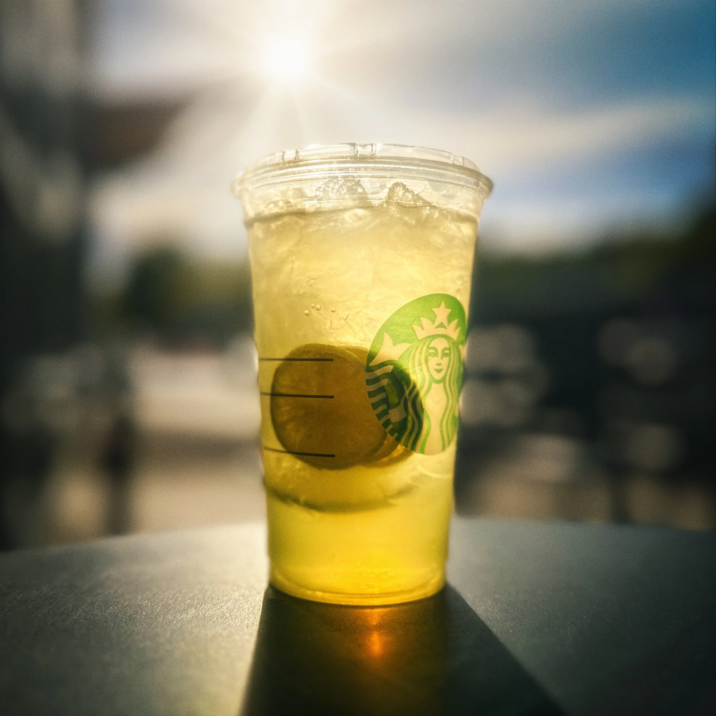
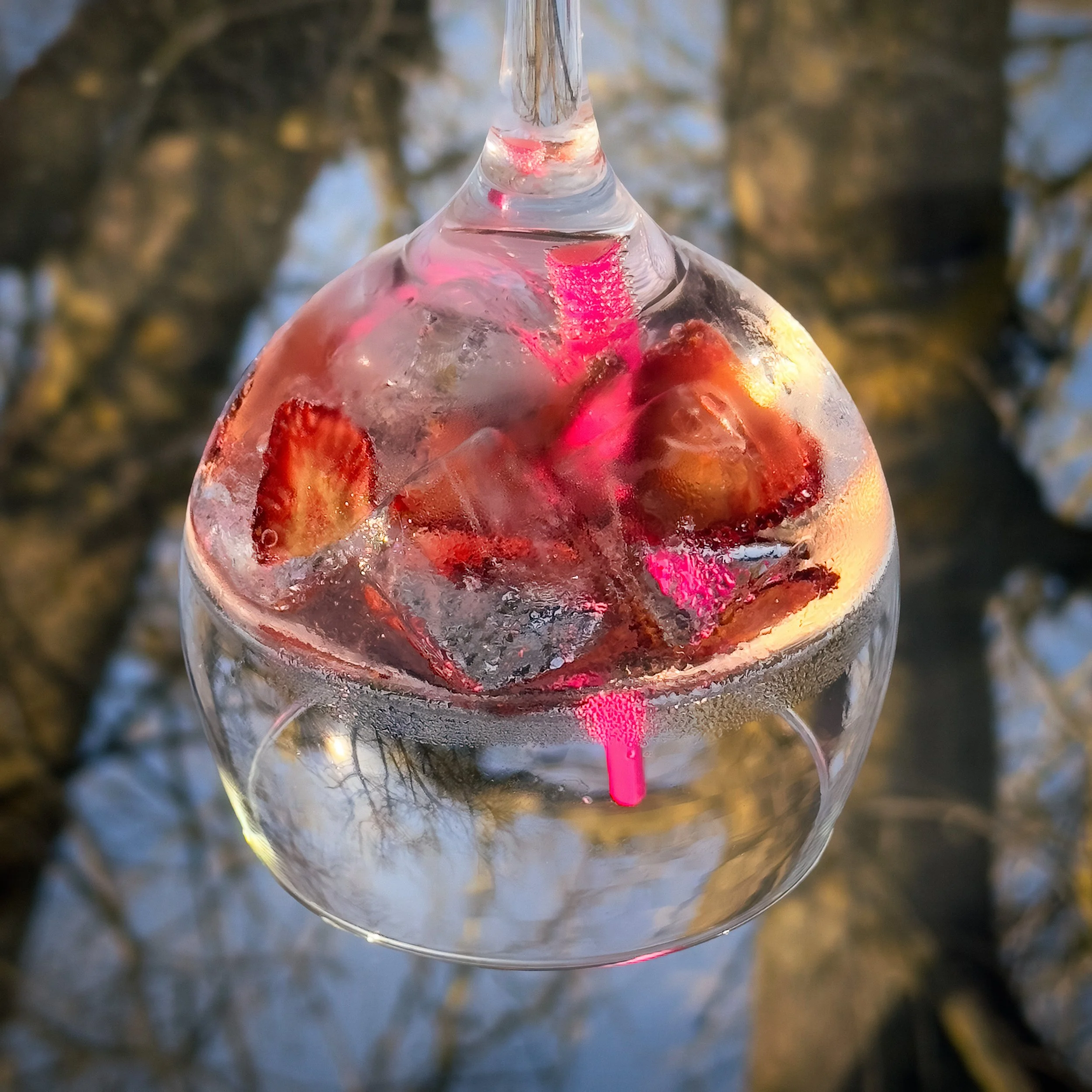
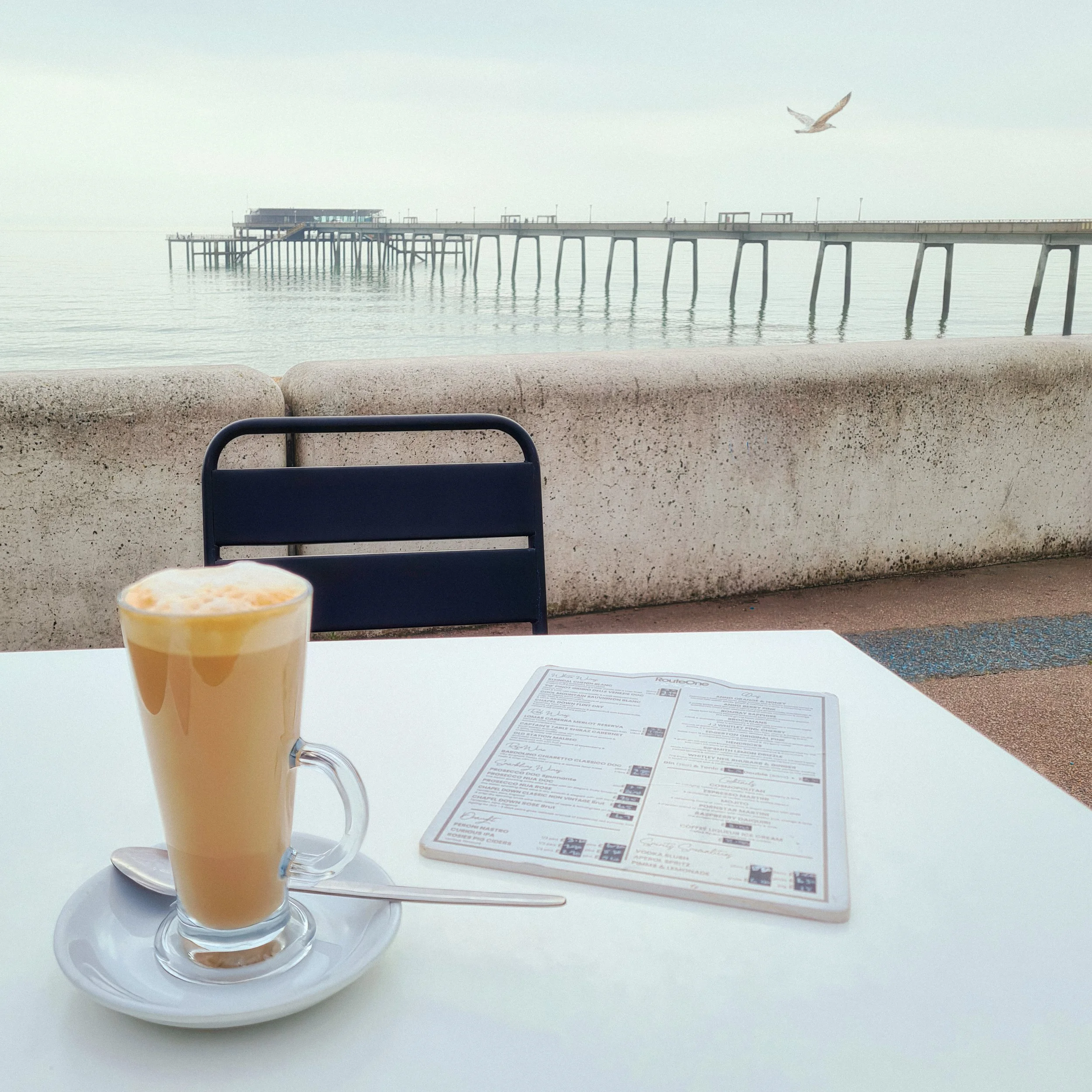
Cool colours — blues, greens, clean whites — suggest freshness, lightness, health, and occasionally clinical precision. They work beautifully for salads, fresh fruit, cold drinks, and summer food. They're less reliable for hearty, cooked food, where a blue-grey cast on a stew makes it look like something from a crime scene. Use cool tones with awareness of what they're saying.
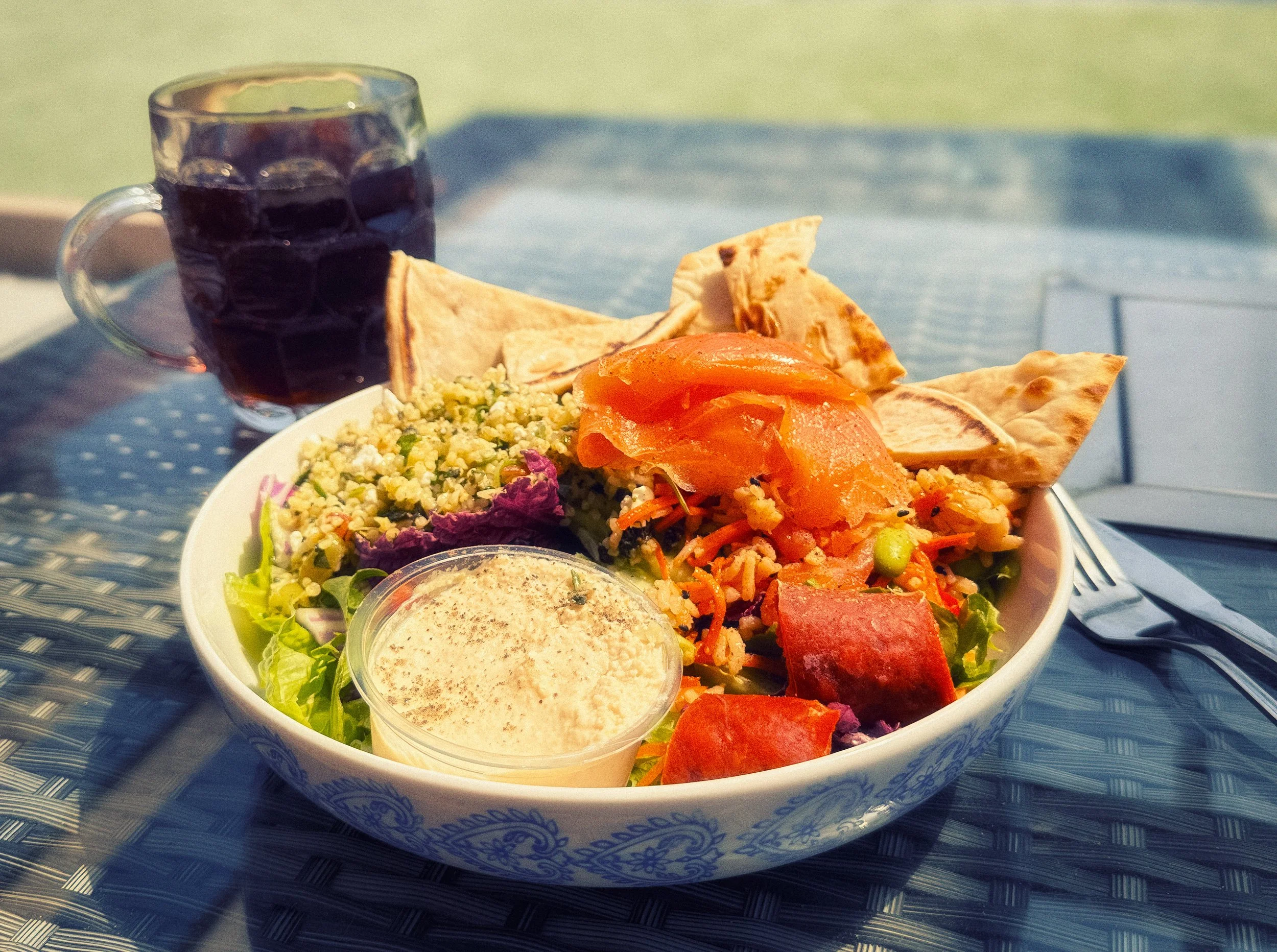
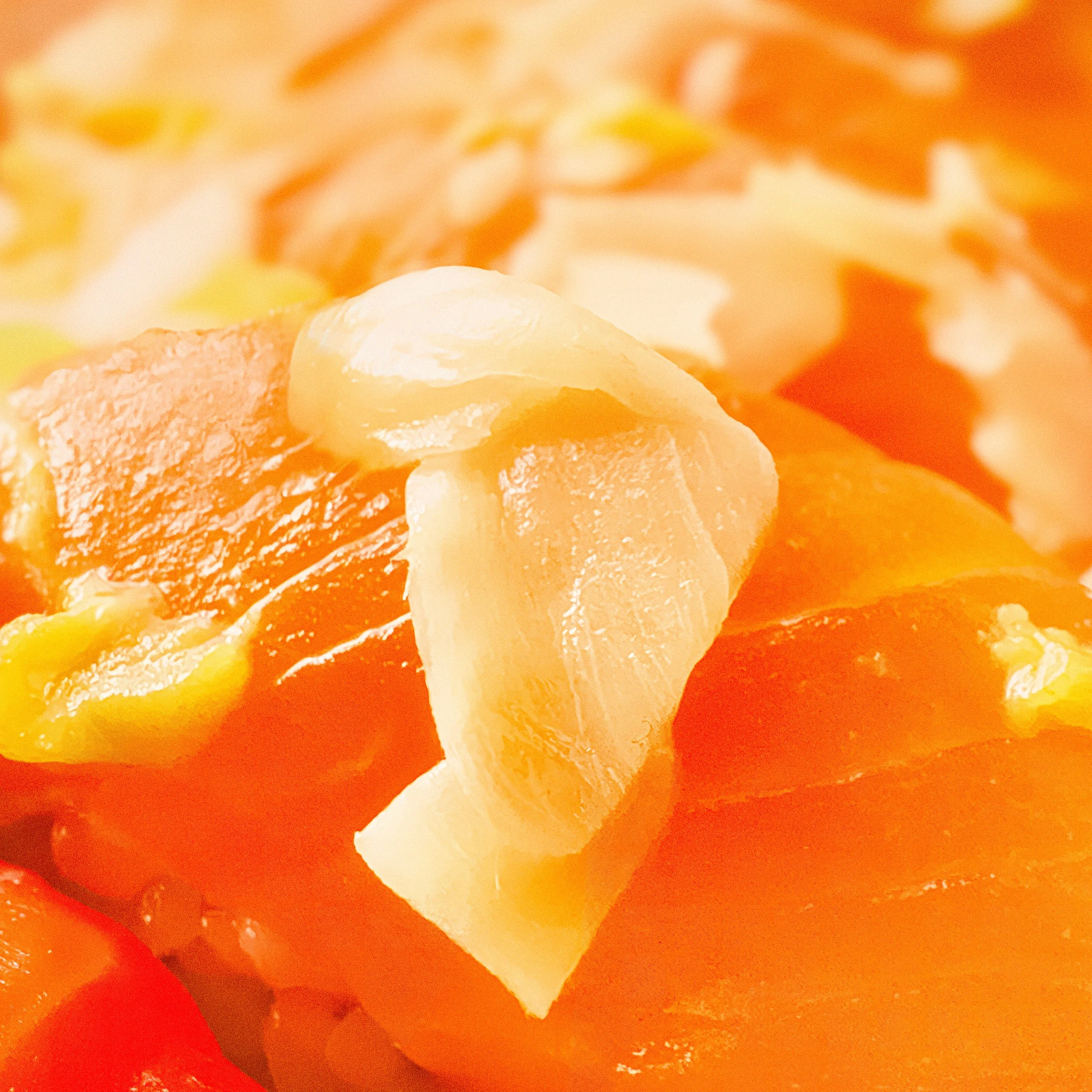
Before you choose your surface and your props, look at the food's dominant colour. A bowl of lentil soup is amber-brown. A plate of smoked salmon is coral-pink. A summer salad is multiple greens. Build outward from the food's colour, choosing backgrounds and props that work with it.
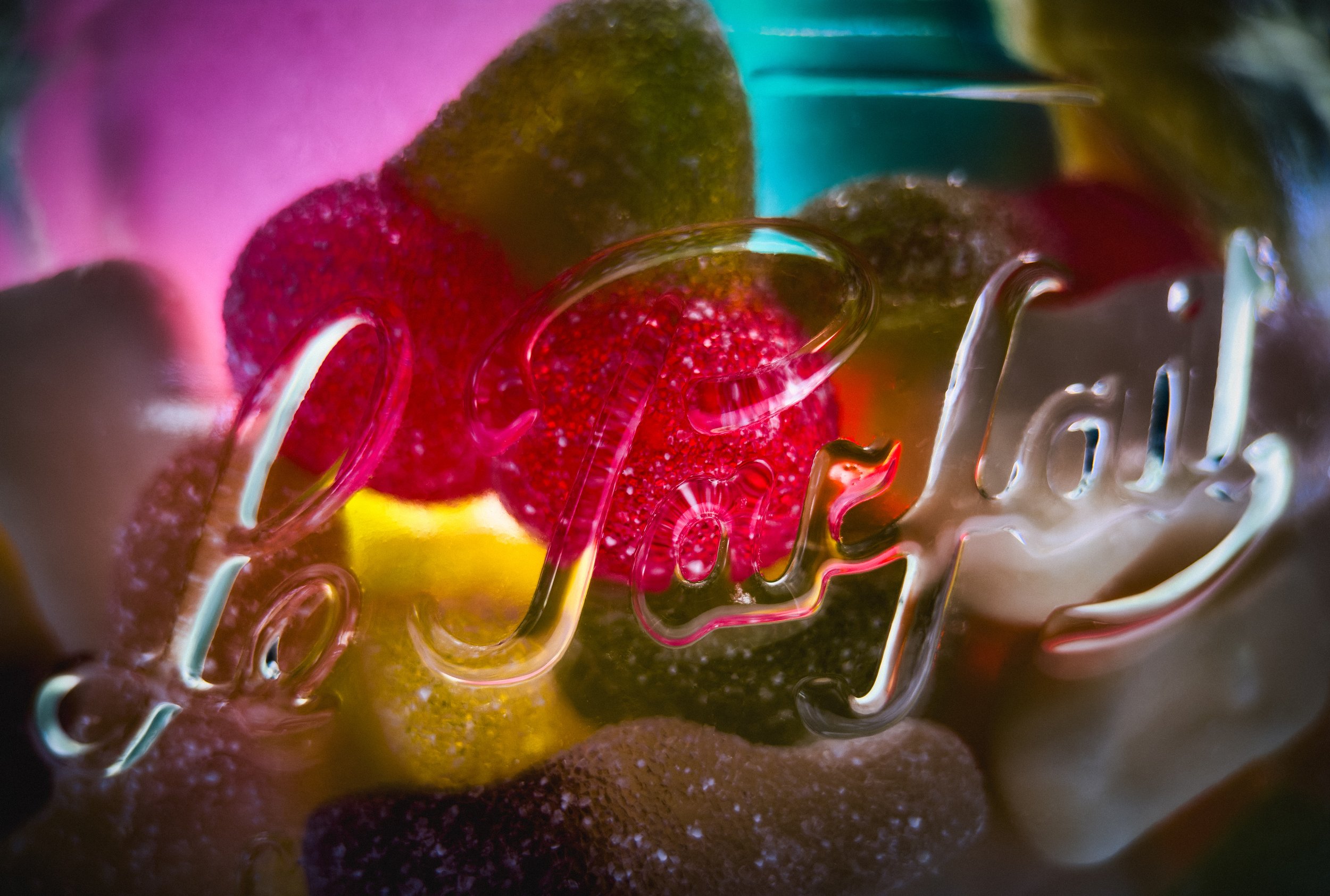
Complementary colours — opposite each other on the colour wheel — create energy and contrast. Analogous colours — adjacent on the wheel — create harmony and warmth. Monochromatic approaches — everything in one tonal range — can be striking and sophisticated when done well.
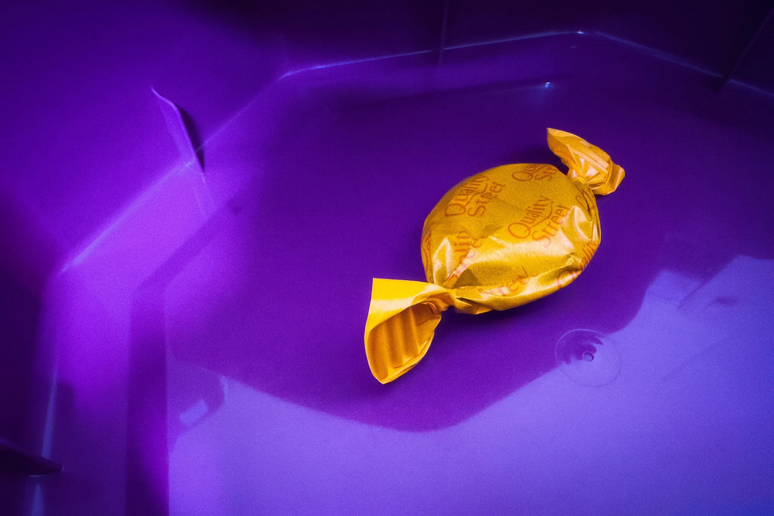
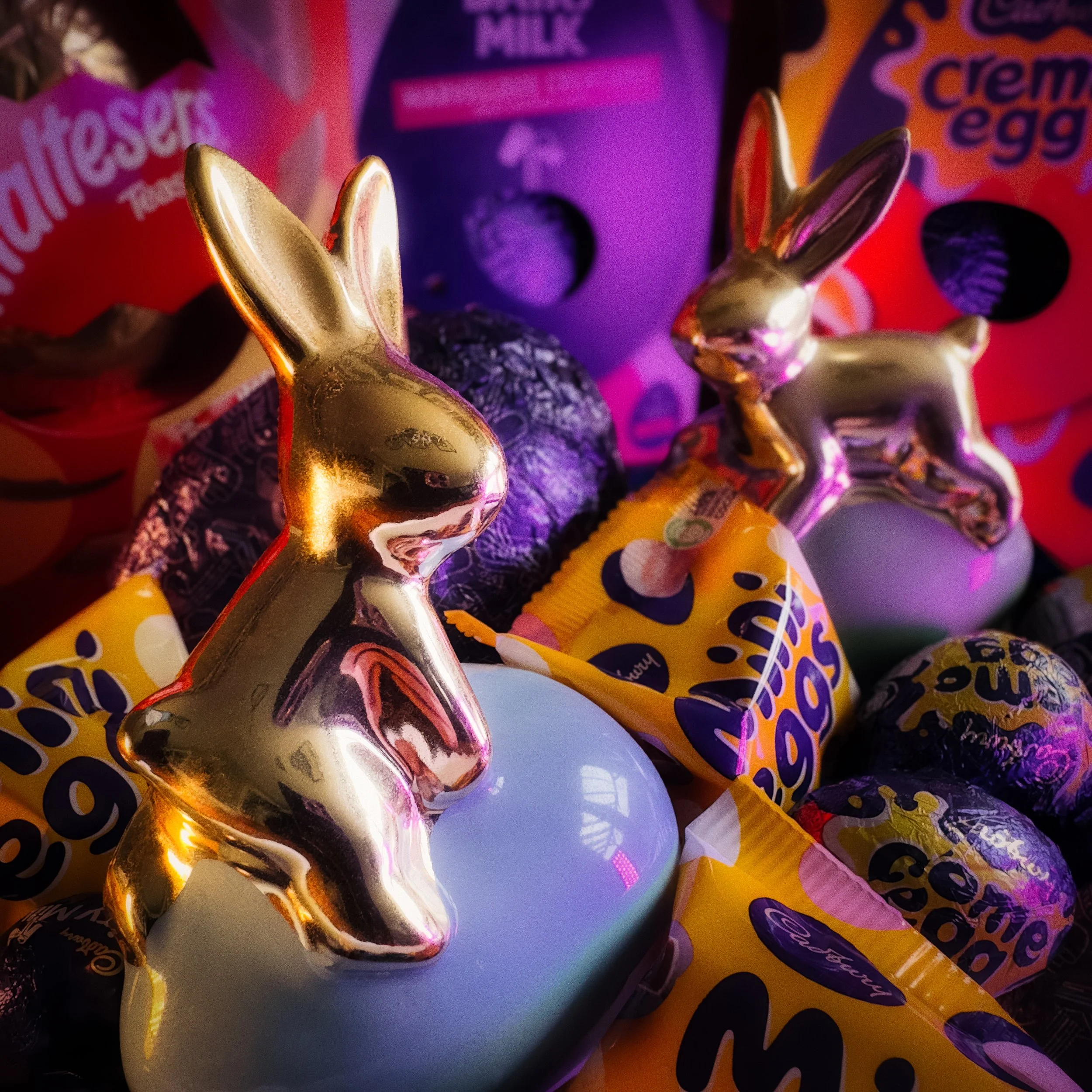
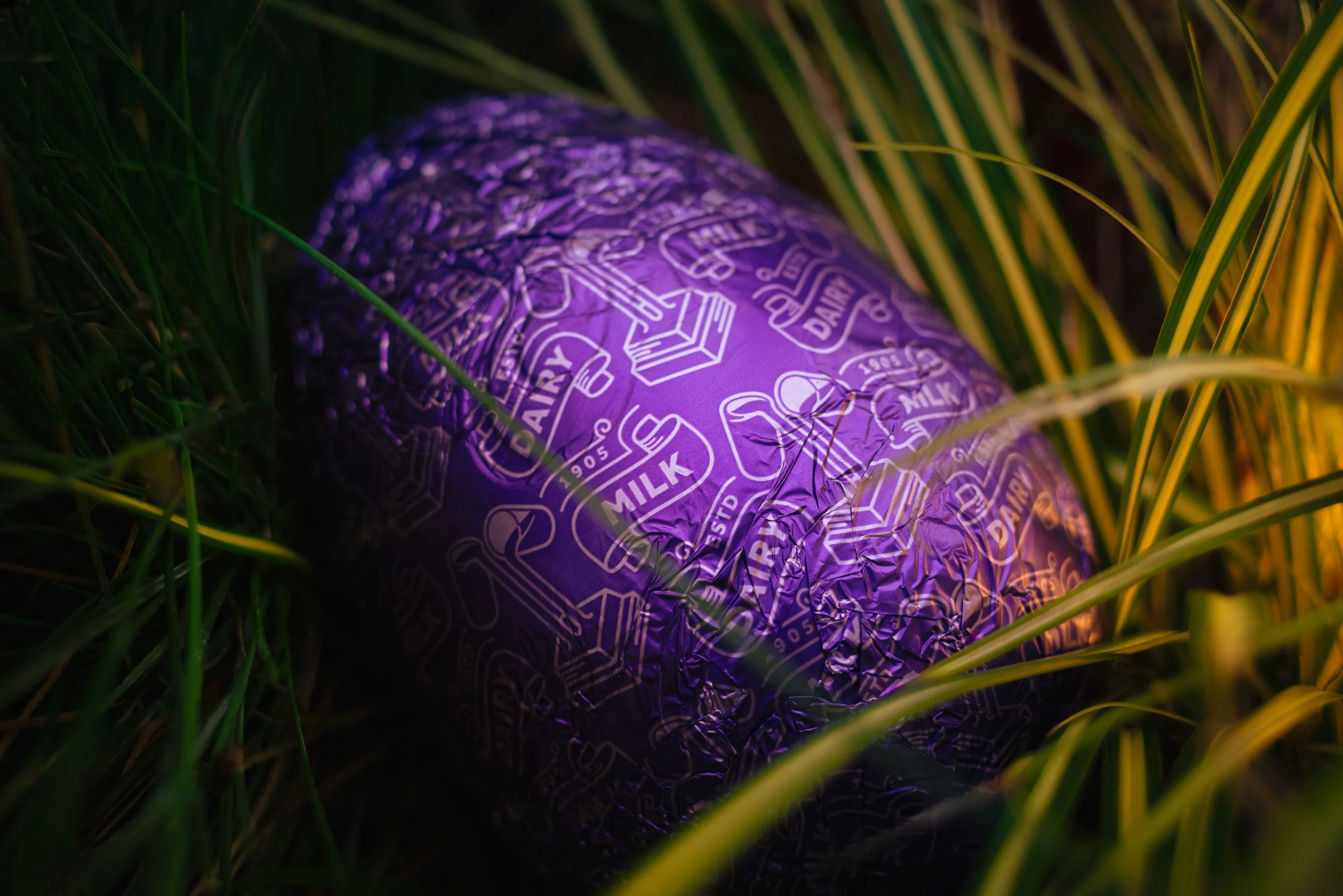
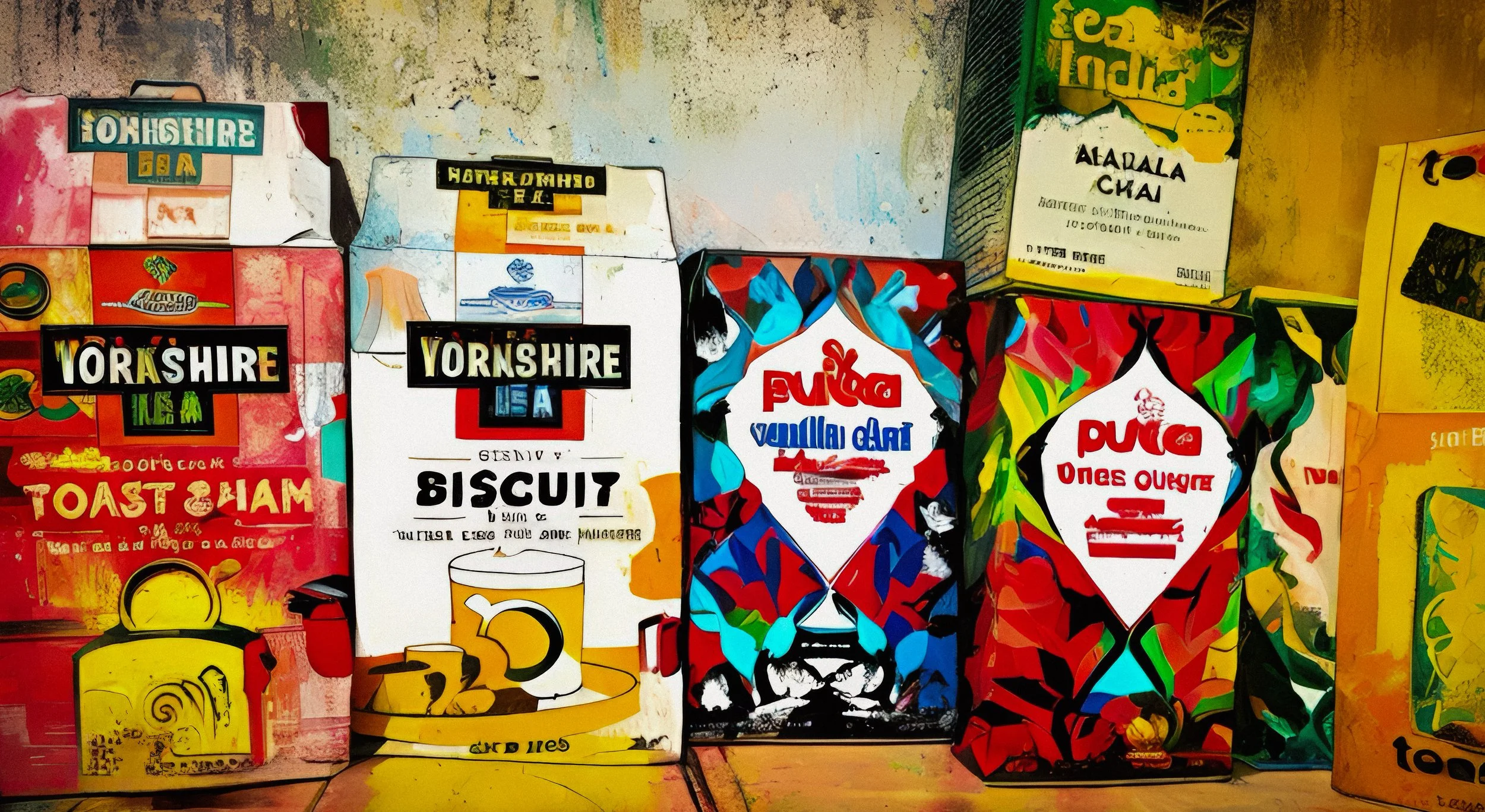
The pop-art approach to food photography — bright, high-contrast, primary colours, bold graphic backgrounds — is a legitimate aesthetic with its own logic. It suits fast food, snacks, candy, and food with inherent graphic qualities. It doesn't suit a carefully composed Sunday roast.
Smartphone-Specific Technique
Most food photography is shot on a smartphone, and the smartphone is genuinely capable of excellent results. The gap between phone and camera has narrowed to the point where it's largely irrelevant for photographs that will be viewed on screens. That said, there are smartphone-specific techniques worth knowing.
Turn on the grid overlay in your camera settings and use it. The rule-of-thirds grid is there; use it for composition, use it to ensure your shot is level, use it to stop you tilting the plate and not noticing.
Tap to focus and tap to expose, and do both on the food. Not on the beautiful background. Not on the window. On the food. The camera's automatic metering will pick the brightest thing in the frame if you let it, which is usually the window or the white plate, which means the food is slightly underexposed. Tap the food; the camera adjusts around it.
Avoid Portrait Mode for textured food. Portrait Mode uses edge detection to separate subject from background and then blurs the background artificially. Edge detection struggles with steam, wisps of herbs, drizzled sauce, and any other soft or complex edge — and in food photography, there are many. The result is a partially blurred herb sprig or a halo of wrongness around a sauce bottle. Portrait Mode is wonderful for, among other things, portraits. For close-up food photography, use the standard camera and move the phone to control your depth of field naturally.
If your phone has a 2x telephoto lens, use it for close-up work. The telephoto compresses perspective in a way that flatters food — objects at different depths feel closer together, backgrounds feel more blurred, and you avoid the barrel distortion of the ultra-wide lens that makes plates look like they're bowing outward. You don't have to be physically close to use the telephoto; step back and zoom in.
If your camera app supports RAW format, use it. RAW files contain more image information than JPEGs, which gives you much more flexibility in post-processing — particularly for white balance correction and shadow recovery.
Finally: hold the phone so your hand doesn't cast a shadow across the plate. This sounds obvious and is frequently ignored. Rotate, reposition, check.
Post-Processing
Post-processing food photography has two goals. The first is to make the food look as it actually tasted — which is to say, as good as the real thing, rather than either better or worse. The second is to remove distractions. That's it.
Start with exposure. Most food photography benefits from a slight lift in the midtones — not blown out, not overexposed, but present and warm. Then contrast: food generally wants a gentle S-curve, enough to add depth and separate the elements visually, not so much that shadows go black and highlights go white. Then white balance: food straight from a phone camera often has a colour cast — too warm under tungsten light, too blue under fluorescent. Correct it. You're looking for the whites to be white and the food colours to look real.
The HSL panel (Hue, Saturation, Luminance) in Lightroom, Snapseed, or any comparable app allows you to adjust specific colour ranges independently. This is where you pull up the tomato red without affecting everything else. It's where you make the herb green more vivid, or pull back the orange cast on the pastry. Use it with restraint. The goal is the food as it was, not the food as some hyper-saturated ideal.
Crop decisively. If the background isn't earning its place, remove it. If there's a distracting element in the corner, crop it out. The composition you set up in the shot is your starting point; post-processing gives you a second chance to refine it.
Over-processing food photography is immediately identifiable and always counterproductive. The colours become unreal, the shadows block up, the highlights blow out, the food looks inedible. The viewer may not know precisely what's wrong, but they know something is. Restraint in post-processing is not timidity; it's the thing that makes the photograph believable.
Resources
Andrew Scrivani from the iPhone Photography School starts off our video compilation with some great composition advice for your food photography: “With the right techniques, you can turn a piece of food into a beautiful and compelling image. All you need to know are a few composition tricks! Are you ready for an incredible food photography adventure? Join @andrewscrivani7004 in stunning Sicily as he teaches you the best tips and techniques for capturing mouthwatering photos using your iPhone!
Here’s a This is a lovely video from Canadian lifestyle photographer Sadia Badiei of Pick Up Limes that gives clear tips on setting up your food photography: preparation is the key to great results in this genre!great video
Here’s a clear and concise video from Tuvy Lemberg at V-Flat World, which demonstrates the angles that are used in professional food photography: “In this video Tuvy shows the 3 main angles in product & food photography. Master these angles and master your work. It's important to know when to use which angle. You need to know the best way to tell your story and the right angle can make or break the photograph.”
Now, let's return to Andrew Scrivani, who has created a series of superb videos on food photography basics that are definitely worth watching. This one gives very clear and practical advice about the props you can use to make your shots work well: “Have you ever looked at your food photography and wondered why it just isn't working? Great food photography isn’t just about the food; it’s also about what else you include in the frame. That’s why props are so important in food photography!”
Give it a Try!
Three exercises. Do all three.
The Window Shot
Cook or prepare one dish at home — anything you like, including beans on toast. Set it up within one metre of the largest window in the room. Take three shots: directly overhead, at 45 degrees, and at eye level. No props except the plate it came on. Natural light only. Compare all three on the screen. Write down which angle flatters the dish and why. The answer will be obvious, but making yourself articulate it is what turns instinct into technique.
The Prop Edit
Set up a food shot with every prop you think it needs. Use the tablecloth, the napkin, the cutlery, the condiment bottle, the sprig of something, the candle. Take a shot. Then remove props one at a time — each time asking whether what remains still tells the story — until you have reached the minimum that still makes sense. Take a shot at the end. Count how many you removed. The number will probably surprise you. The final shot will probably be better than the first.
The Chip Shop Challenge
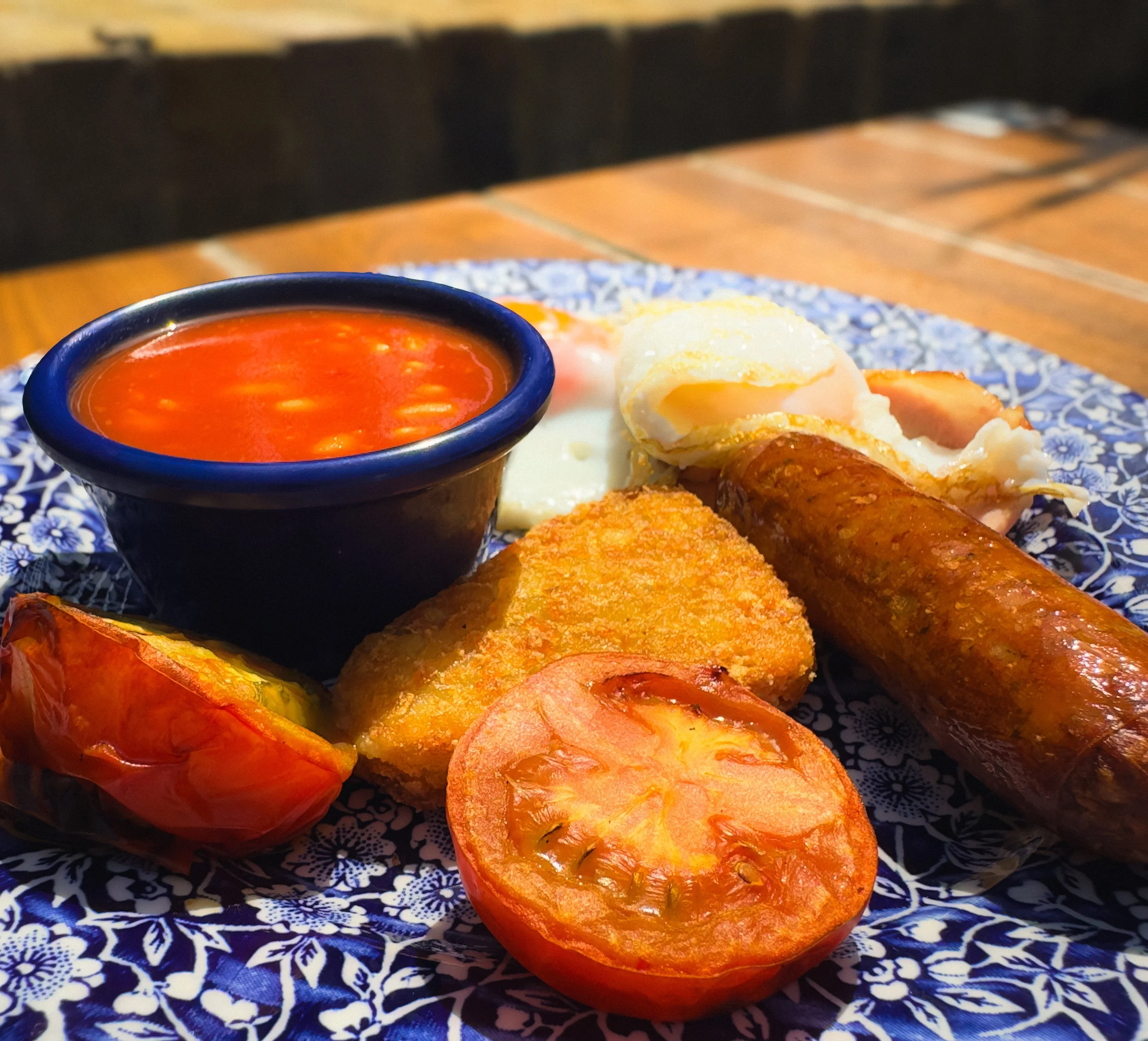
Photograph something genuinely ordinary and unglamorous. Chips in a polystyrene tray. A bacon sandwich in its grease. Beans on toast — there, it was going to come up eventually, and there is absolutely nothing wrong with beans on toast, which is what everyone secretly knows. The rules: you may not use any props you don't already have to hand, you may not move to a more picturesque location, and you may not pretend the food is something it isn't. Use light, angle, and composition only, and make it look as good as you possibly can.
This is the exercise that teaches you the most. Anyone can photograph a beautiful cake in good light and call it food photography. Making a polystyrene tray of chips look like a considered image is the real thing.