Light & Shadow
The word "photography" comes from two Greek roots: phos, light, and graphé, writing or drawing. You are, quite literally, writing with light. Every other compositional principle in this series — the thirds, the lines, the horizon — is ultimately a description of how you arrange things within the light. None of it means much if you haven't first thought about what the light is actually doing.
Most people beginning photography think about light in terms of whether there is enough of it. Understandable: a photograph needs light to exist. But the question that separates a technically adequate photograph from an interesting one is rarely how much light, and almost always what kind, from where, and what shape are the shadows it creates.
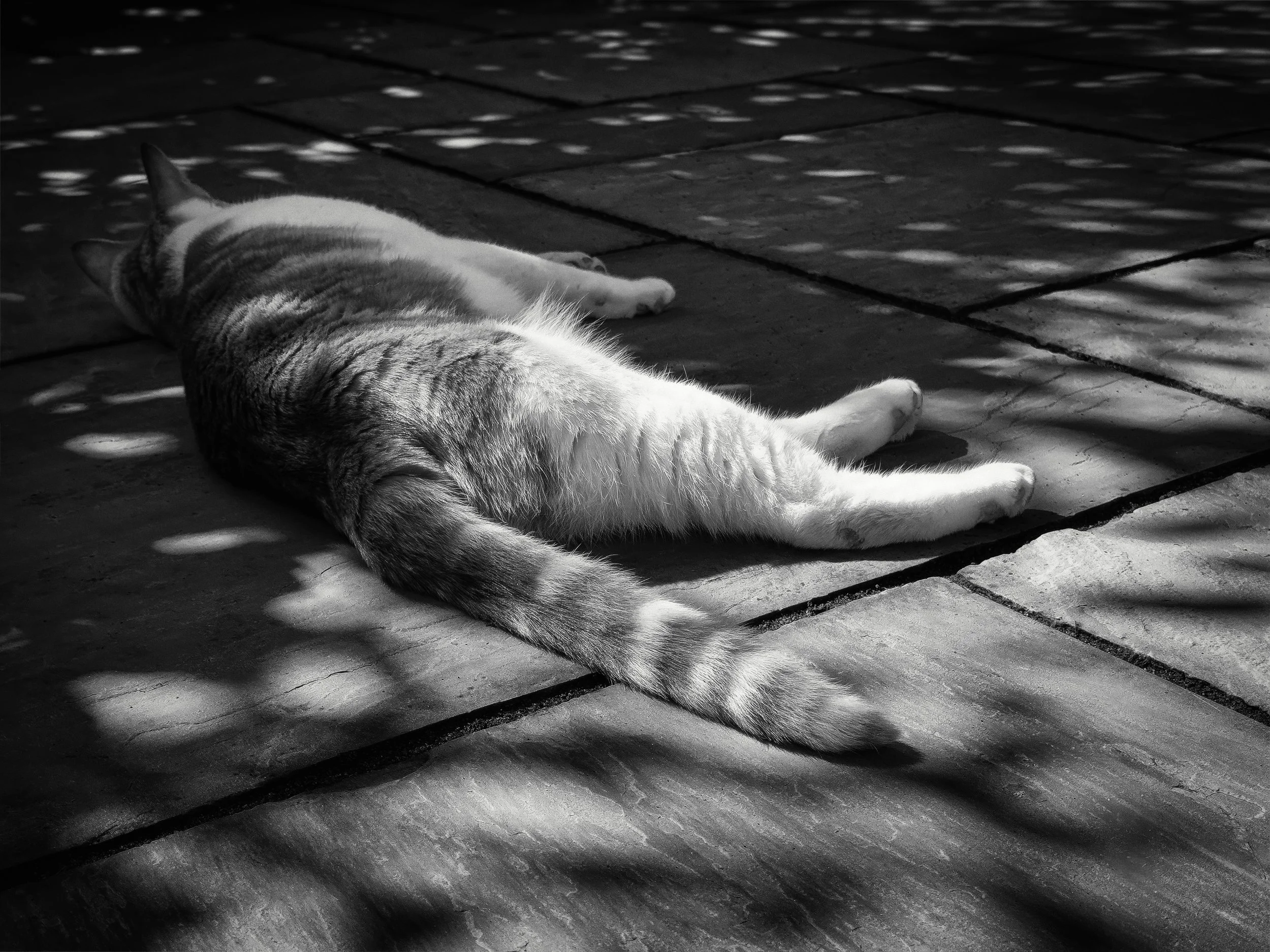
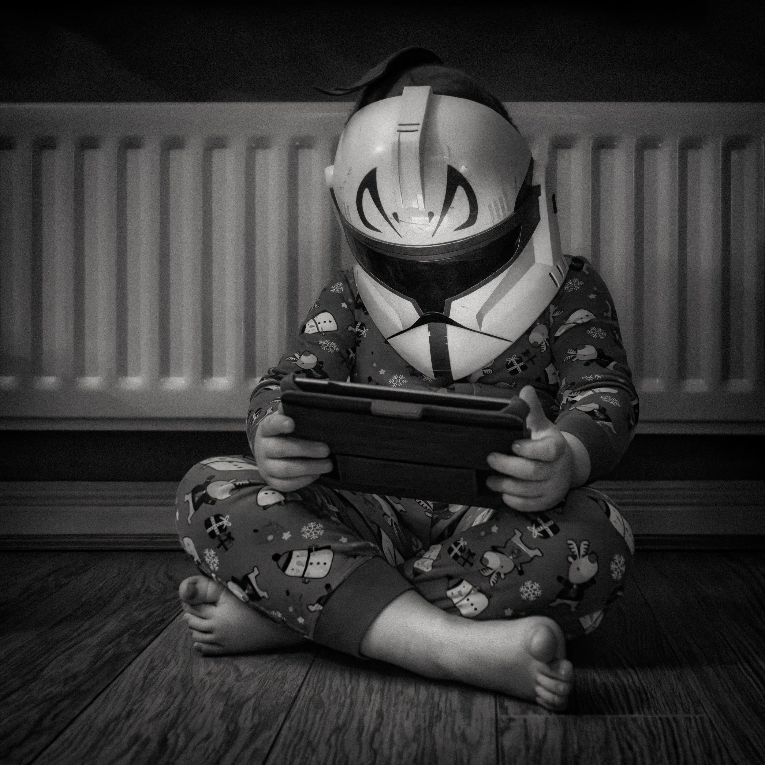
Shadow is not the absence of light. It is the direct consequence of light — its signature, its proof of direction. In skilled hands, shadows are as active a compositional element as any subject in the frame. A photographer who has learned to read shadows has learned to read the whole scene.
The shift this article is trying to provoke is a simple one to describe and rather more demanding to internalise: stop thinking of a scene as a subject that is lit up plus the areas around it that aren't, and start thinking of light and shadow as a unified system that you are working with.
The subject sits inside that system. How you position yourself relative to it, how you expose for it, which parts you allow to fall to black — these are choices, not accidents. Making them consciously is one of the most significant steps you can take as a photographer.
How We See Light & Shadow
Before reaching for a camera, it is worth understanding what your visual system is actually doing when it looks at a scene — because the camera does not do the same thing, and knowing the difference helps enormously.
Here is the first important fact: the human eye is not a brightness detector. It is a contrast detector. What the visual system is exquisitely sensitive to is the difference in luminance between adjacent areas, not the absolute level of either. This is why you can read in relatively low light once your eyes have adapted, and why a pale object against a pale background is nearly invisible even in good light, while the same pale object against a dark shadow is immediately and vividly present. Contrast is the mechanism of visibility. Shadow, by creating contrast, is what makes things legible.
The second important thing shadow does is tell you about form. A flat-lit object appears two-dimensional — it is a shape, not a volume. Add directional light, and you get shadow: on one side of a sphere, along the crevice of a texture, under the lip of a raised edge. That shadow tells your visual system that the object is three-dimensional. It communicates the curve of a surface, the roughness of a material, the depth of a hollow. Without shadow, you lose a critical perceptual dimension. This is why flat lighting is fine for documentation (you want to record the thing, not dramatise it) and why it tends to be catastrophic for anything where form and texture are the point.
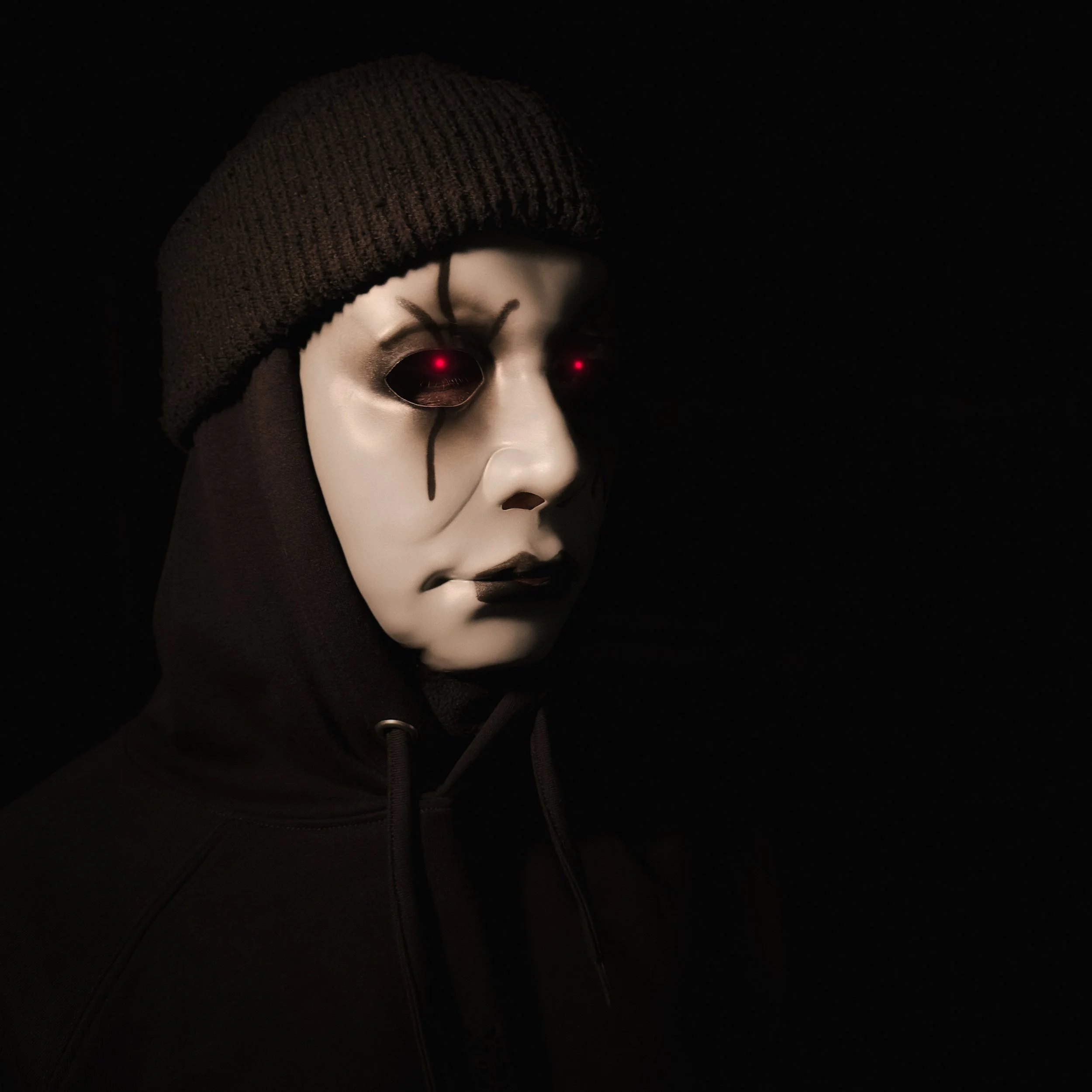
The third dimension is psychological, and it runs deep. Human beings have strong, consistent, and cross-cultural associations between light and safety, visibility, knowledge, and virtue, on the one hand; shadow and danger, mystery, the unknown, and moral ambiguity, on the other.
These are not merely cultural conventions. They have evolutionary roots: darkness in the natural world genuinely obscures threats, while light allows you to see what is coming. Photography exploits these associations whether you intend it to or not. A brightly lit face is readable, accessible, trustworthy. A face half in shadow is ambiguous, intriguing, potentially threatening. A room with warm even light is welcoming. A room with one stark source and deep surrounding darkness is a room where something is about to happen.
This is not a formula ("put subject in shadow = drama"). It is a set of perceptual tendencies that you can work with or against. The point is to be aware that they are operating.
Hard Light & Soft Light
Before anything else in photography, you need the fundamental distinction.
Hard light comes from a source that is small relative to the subject — the midday sun (which, despite being enormous, is so distant that it subtends less than a degree of arc), a bare flash, a single exposed bulb, a torch. Hard light creates sharp-edged shadows with abrupt transitions. It is high-contrast, unforgiving, and texturally revealing. Every pore, every wrinkle, every grain of stone is exposed. It is excellent for drama and for surfaces where texture is the point. It is not kind to human skin.
Soft light comes from a source that is large relative to the subject — an overcast sky (which turns the entire cloud layer into one enormous diffuse source), a window with a sheer curtain, a studio softbox, a wall or ceiling bouncing light from a primary source. Soft light creates gradual transitions between light and shadow, smooth tonal gradations, and gentle contrast. It is flattering to skin. It reveals colour more faithfully than hard light. It can be beautifully subtle, and it can also be visually dull if overdone.
Neither is superior. They serve different purposes. A portrait photographer working with a subject's appearance generally wants soft light. A photographer trying to reveal the texture of rough stone or weathered wood generally wants hard, raking, directional light. Understanding which you need — and then either finding it or creating it — is most of what lighting is about in practice.
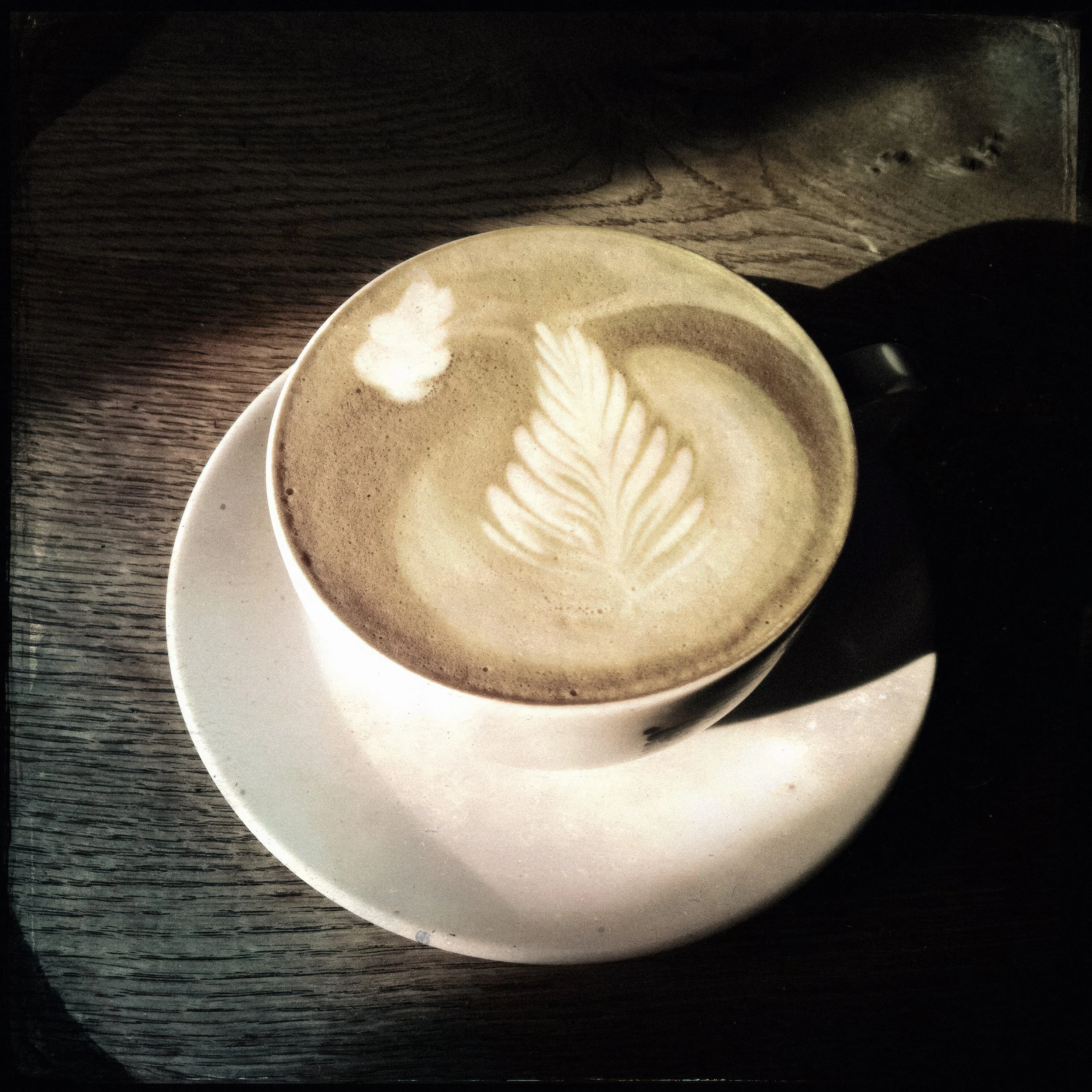
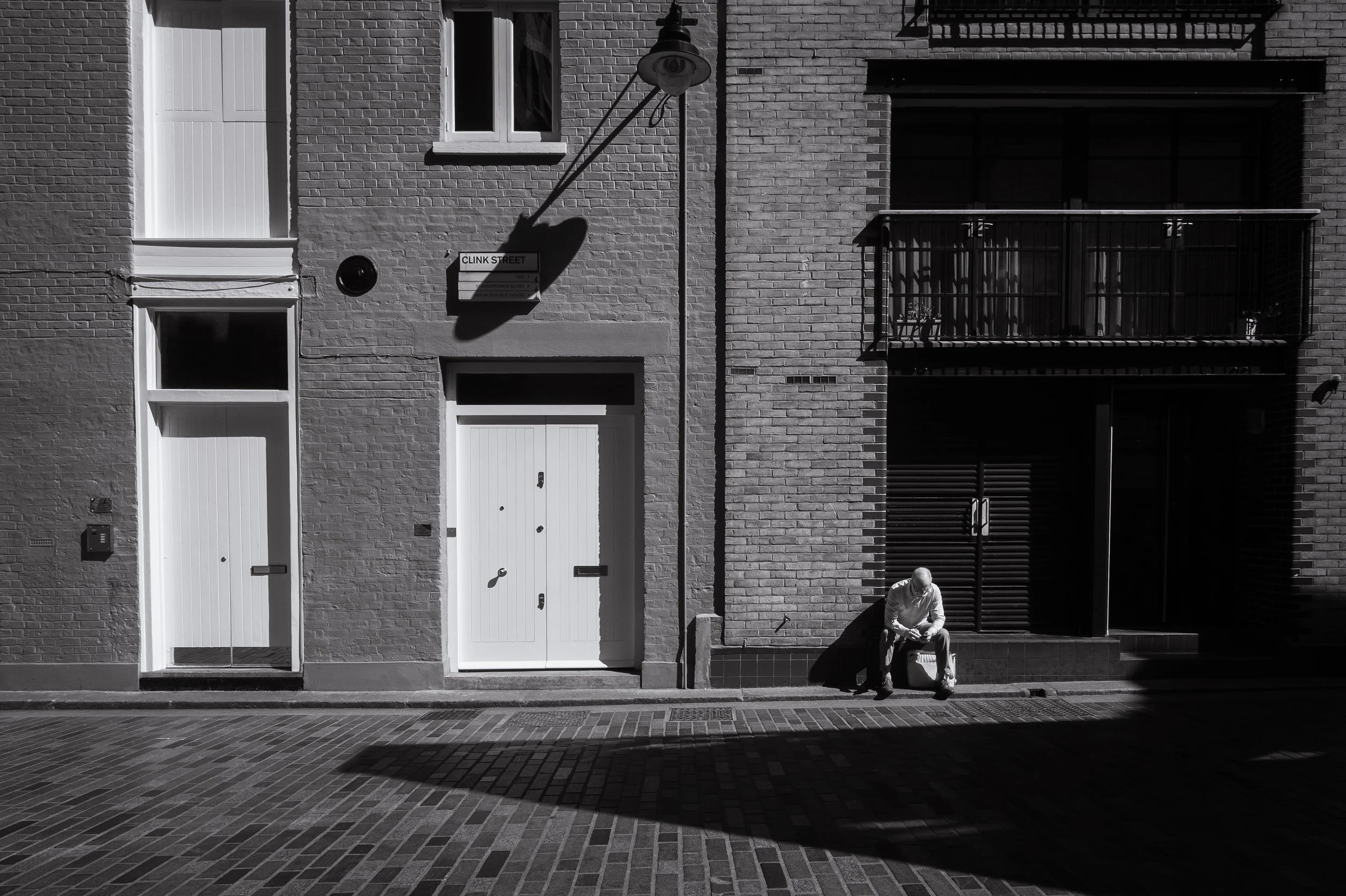
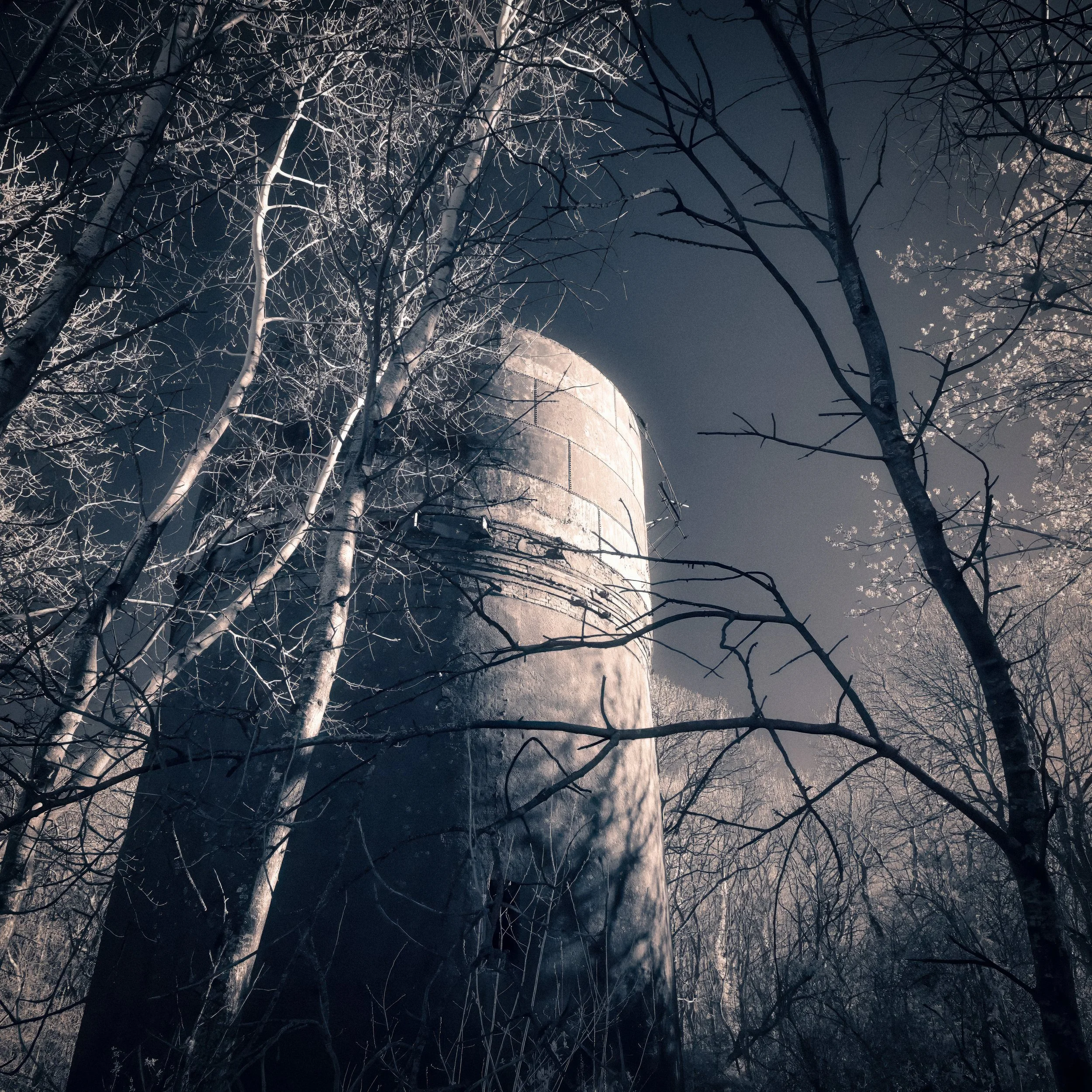
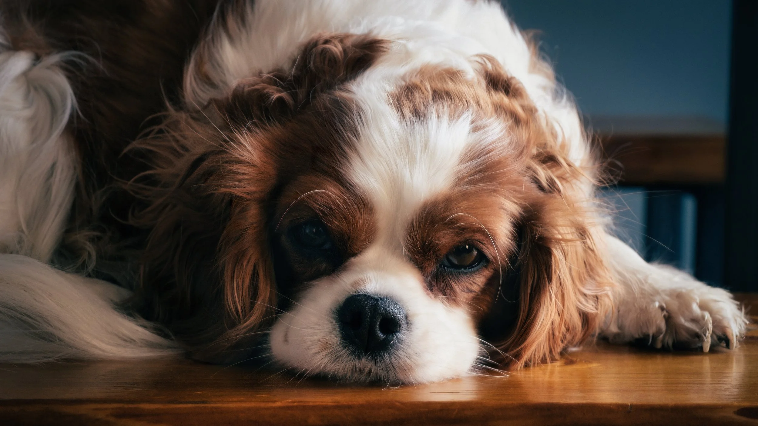
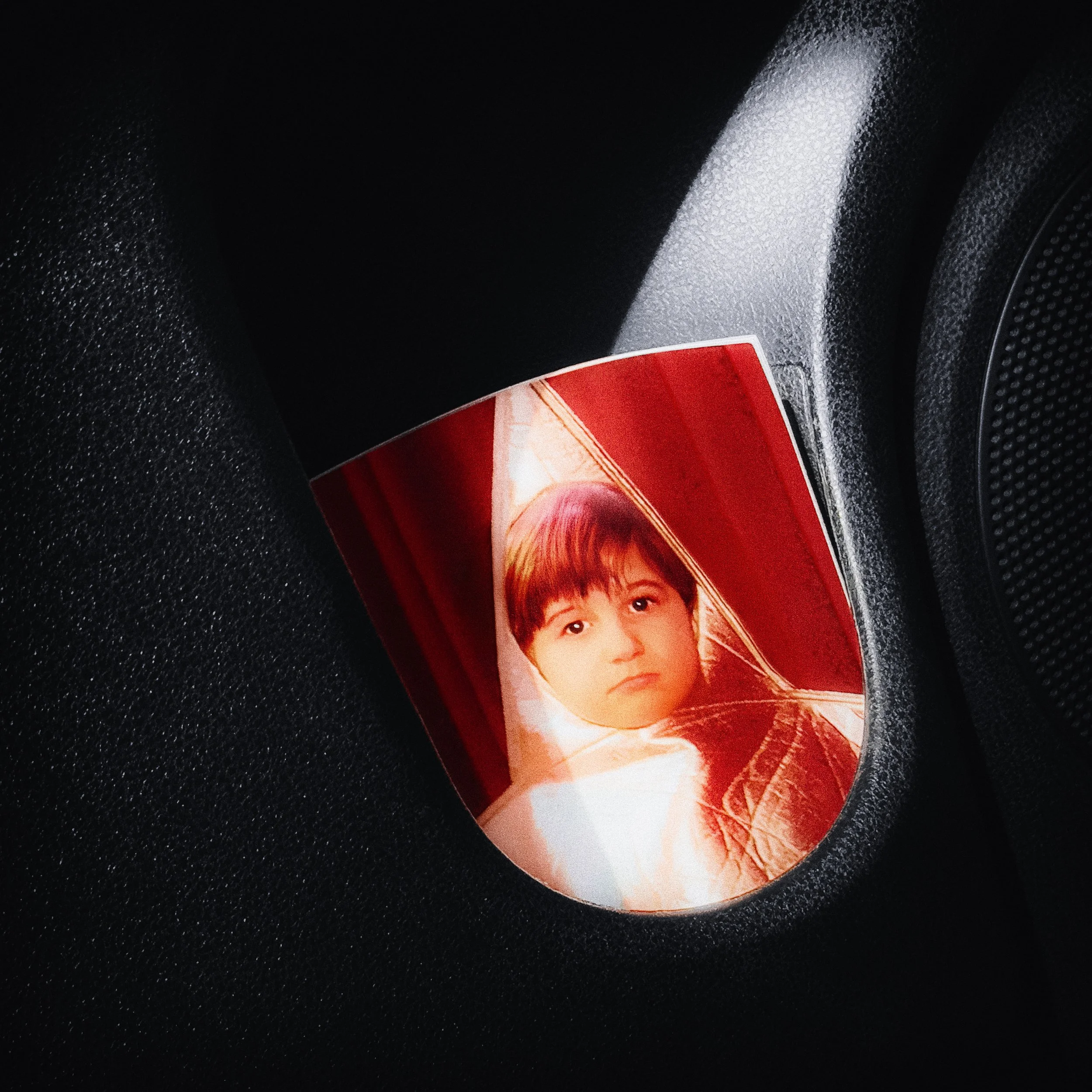
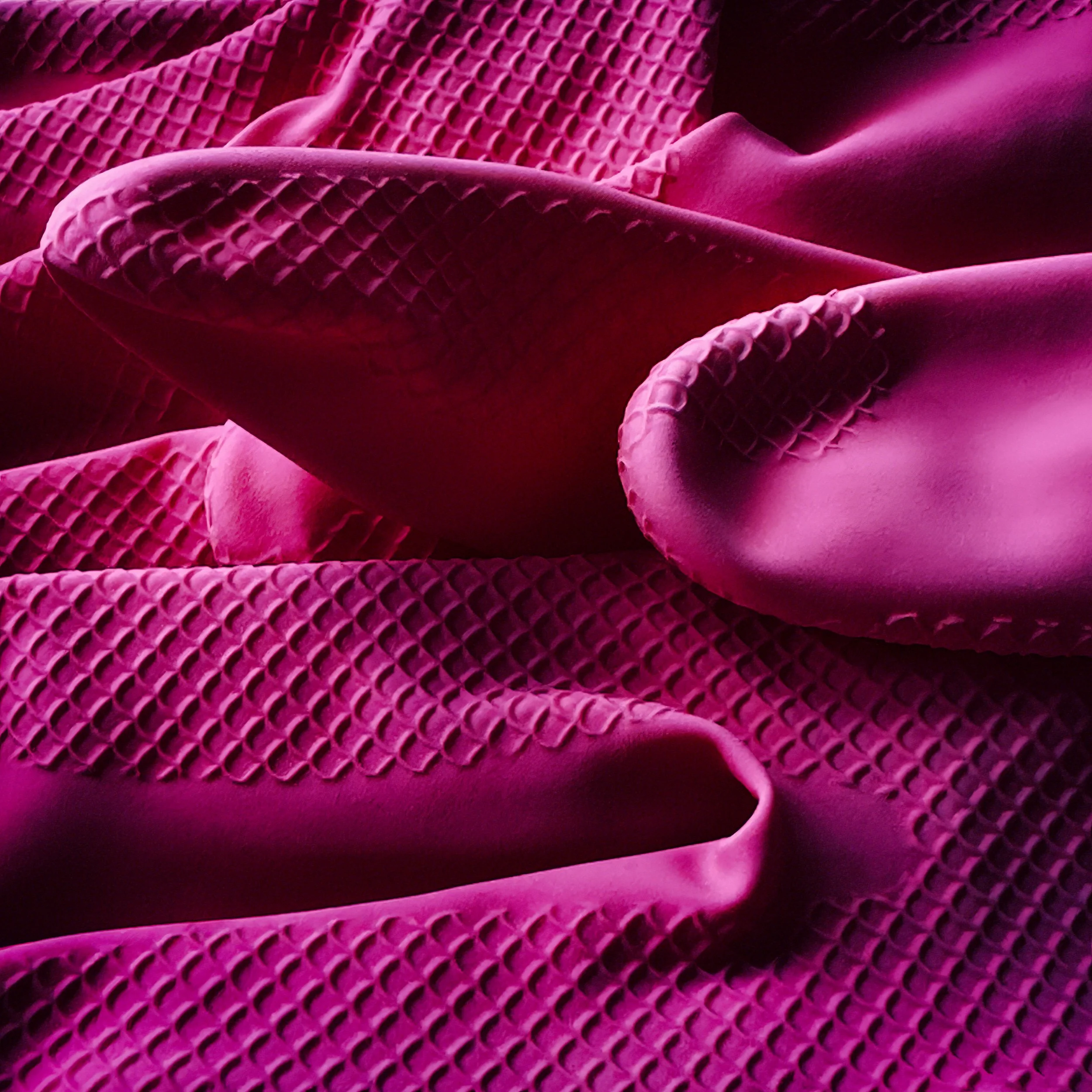
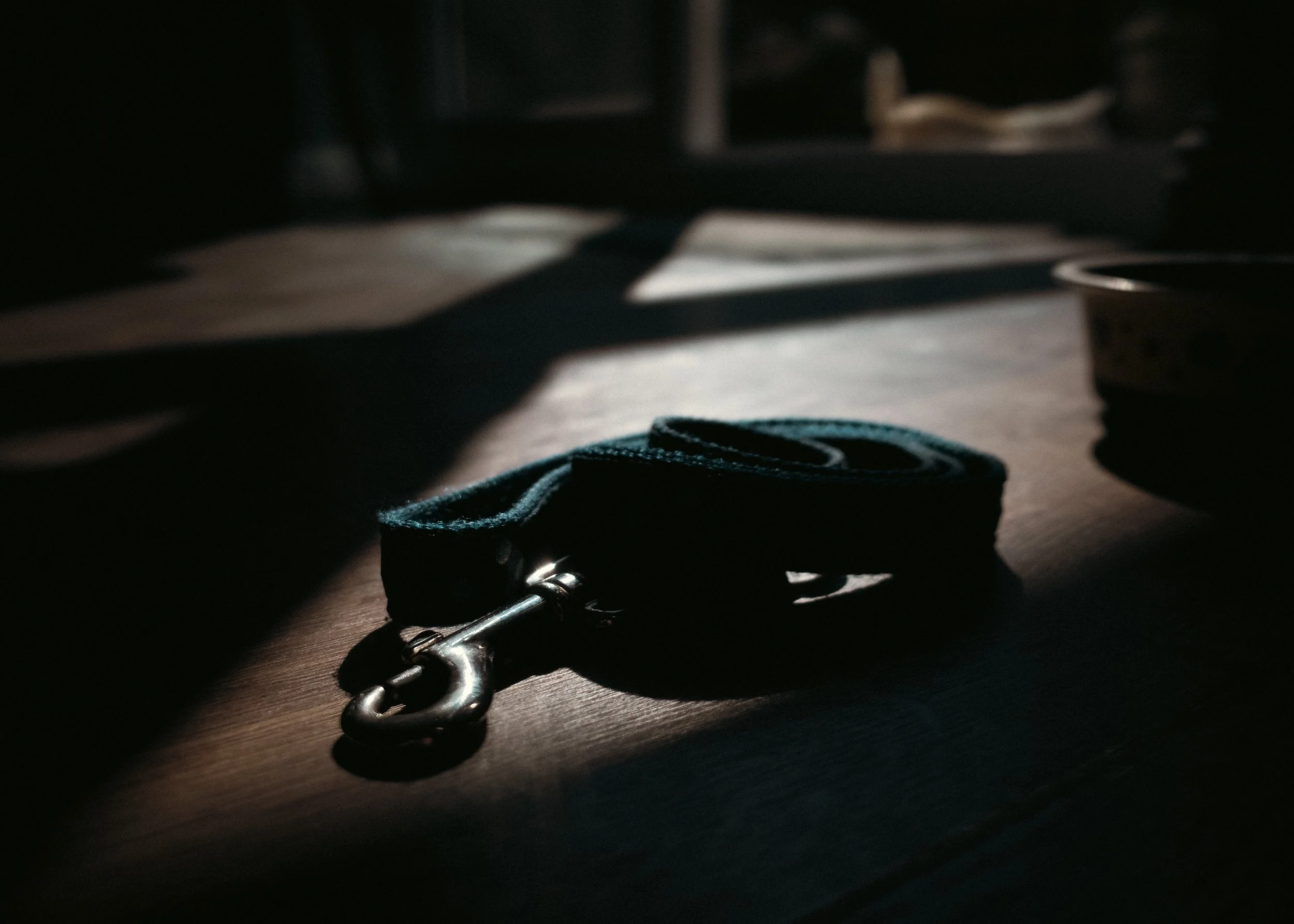
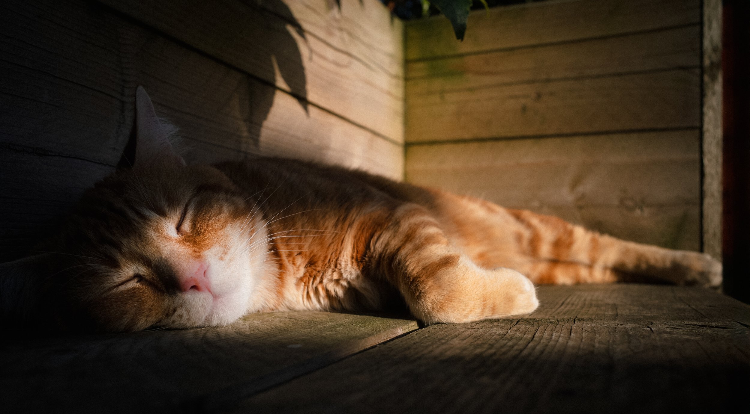
Three Centuries of Painted Light
Photographers did not invent the grammar of light and shadow. They inherited it, more or less wholesale, from five centuries of painting. Understanding where that inheritance comes from is not merely art-historical housekeeping: it explains why certain lighting arrangements feel right, why shadow in certain proportions feels dramatic or intimate or threatening, and why the human visual system has been trained — through centuries of images — to respond to directional light as a signal of significance.
Medieval and Symbolic Light
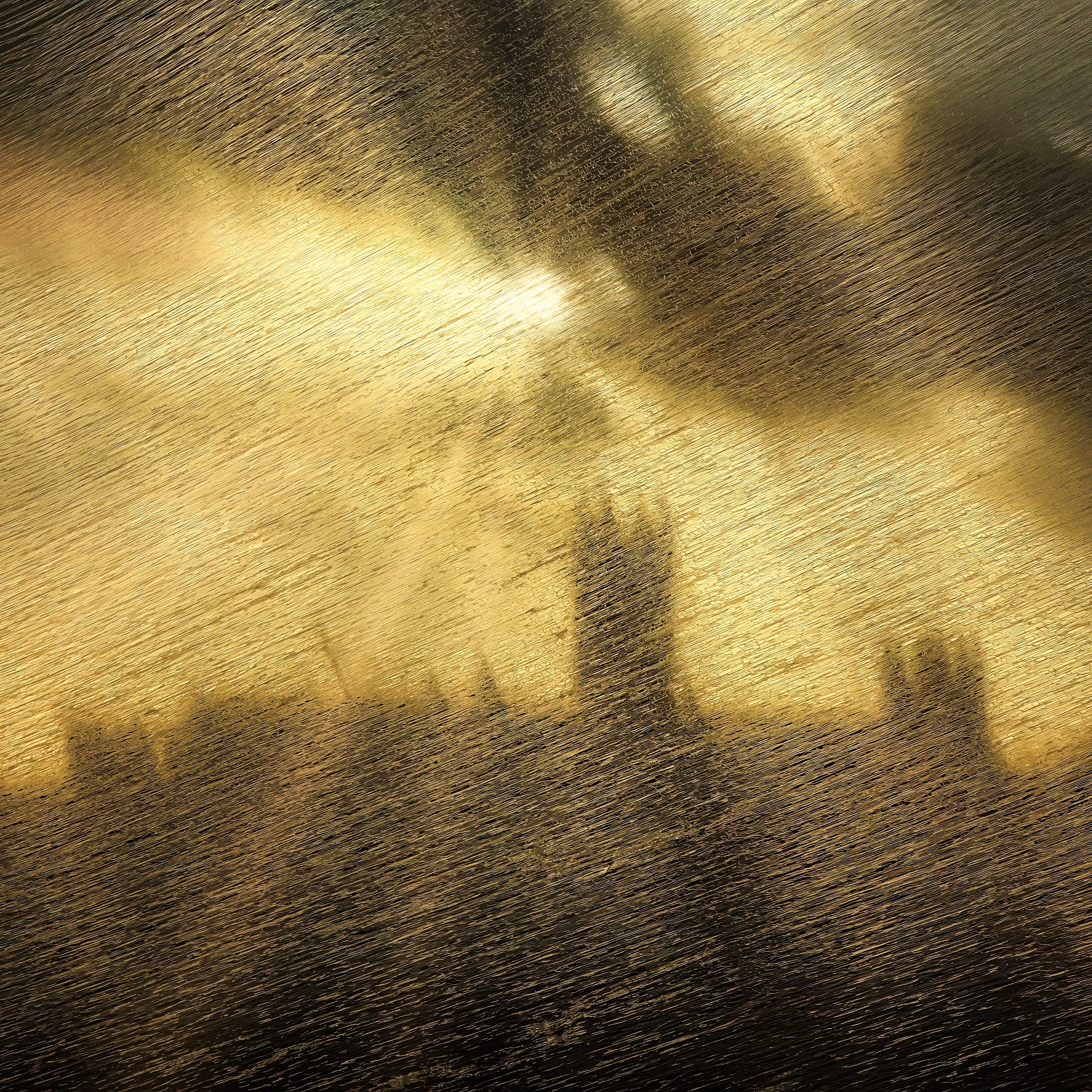
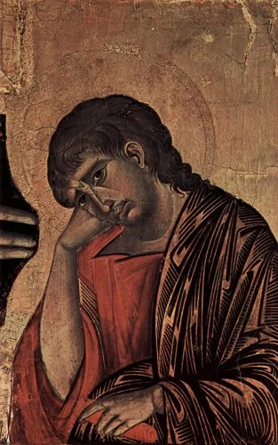
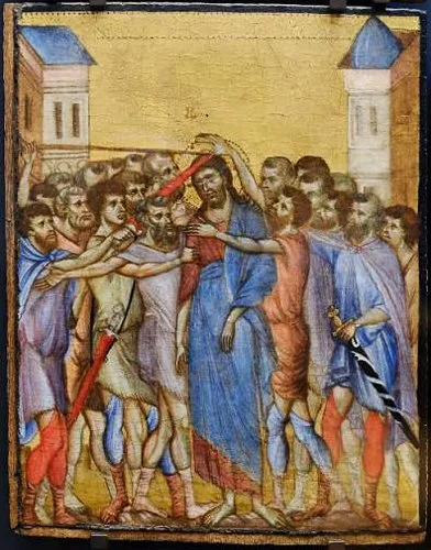
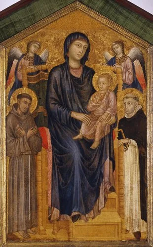
Medieval European painting was not concerned with the representation of actual light falling on actual surfaces. It was concerned with hierarchy, symbolism, and spiritual significance. Gold leaf behind saints was not sunlight; it was divine radiance. Figures were flat, outlined, arranged for legibility and symbolic relationship rather than spatial coherence. The light in these images has no direction because it has no physical source — it emanates from the sacred itself.
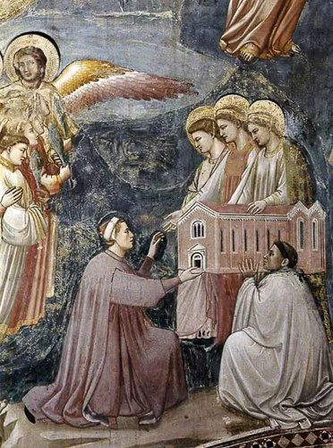
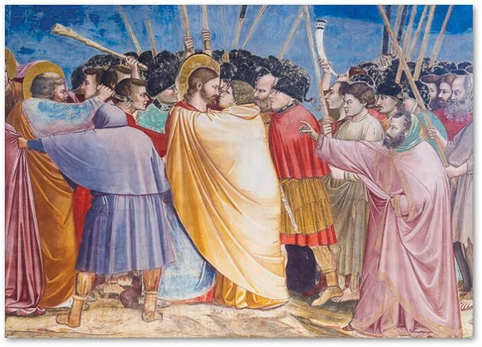
By the late thirteenth century, painters like Cimabue and then, more decisively, Giotto were beginning to suggest three-dimensional form through shading. Giotto's figures in the Arena Chapel frescoes (c. 1304–1306) have weight; they cast shadows; their robes fold in response to implied light. This was a genuinely radical shift — from symbolic to representational — but systematic direction of light remained rare, and the light in these works has no consistent source angle.
Leonardo and the Smoky Boundary
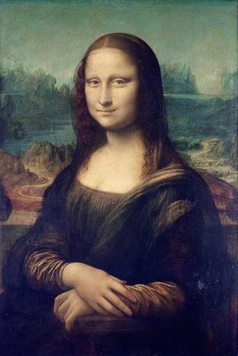
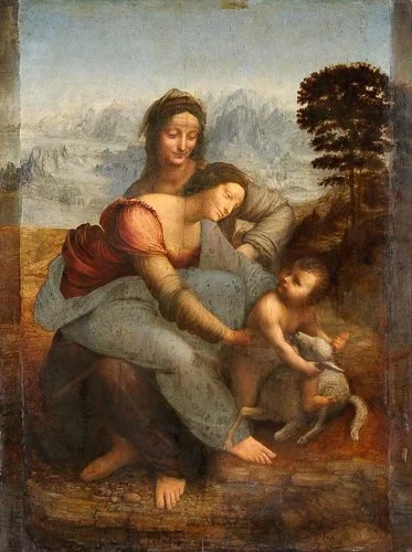
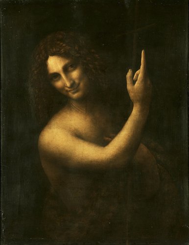
Leonardo da Vinci's contribution to the grammar of painted light was not chiaroscuro in its dramatic sense but something more subtle and, arguably, more influential: sfumato. The word comes from the Italian for smoke. Sfumato is the technique of blurring the transition between light and shadow, of allowing the boundary to dissolve rather than defining it sharply. The effect is the slightly out-of-focus, atmospheric quality you see in the Mona Lisa (1503–1519) — a face that appears to exist in real space, under real light, but which you cannot quite resolve at its edges.
Leonardo wrote extensively about light in his notebooks. He described what we would now call diffuse versus directional light, identified how surfaces of different curvature respond differently to the same light source, and was essentially working out — through observation and description — much of what photographers later called the relationship between source size, distance, and shadow quality. His light is never violent; it gently models form, with infinite gradation.
Caravaggio and Tenebrism
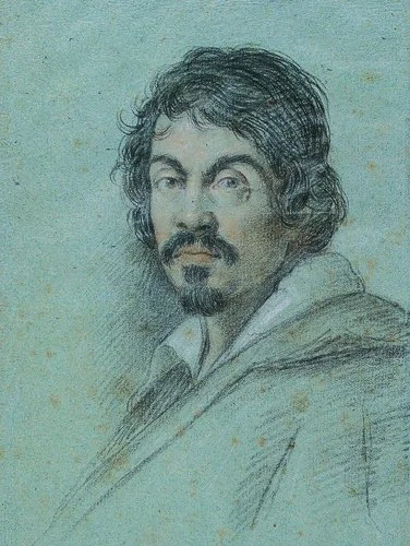
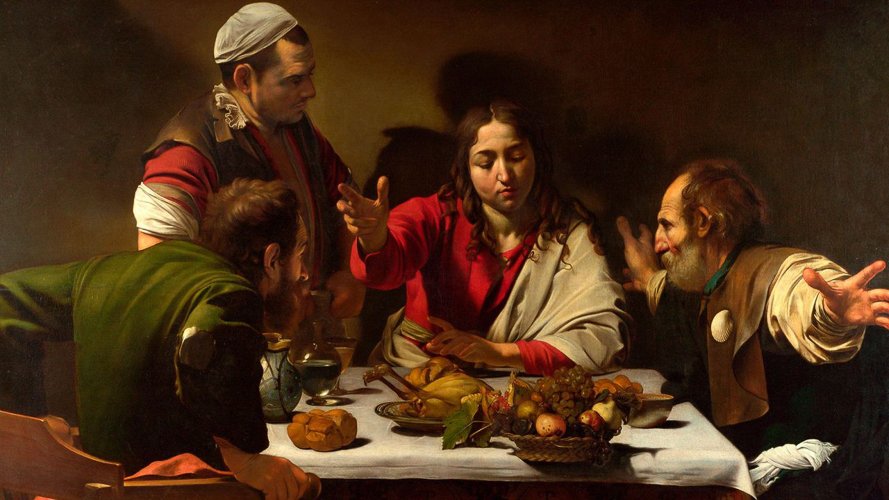
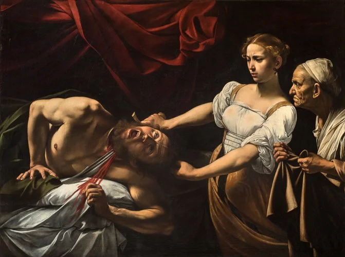
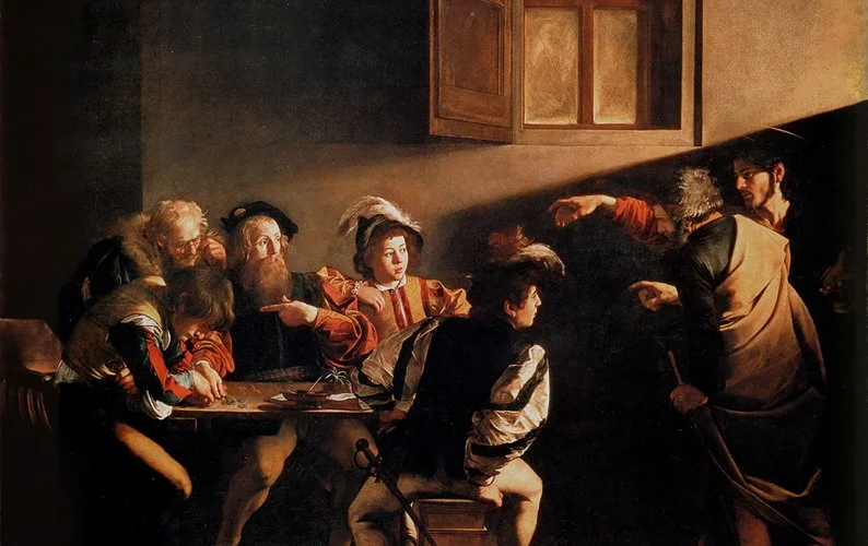
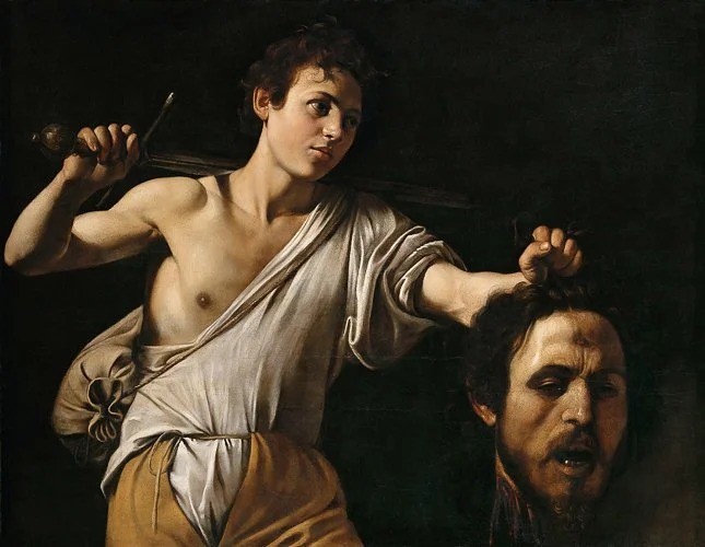
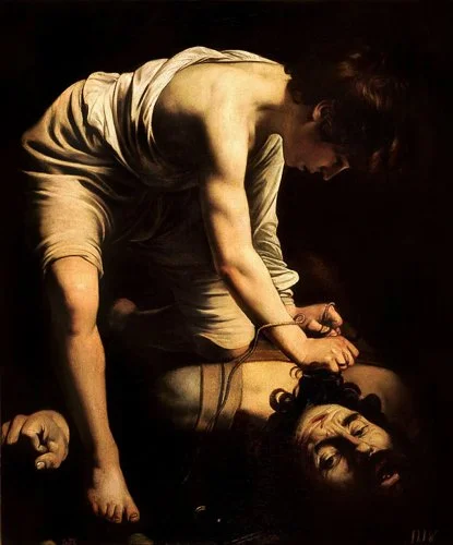
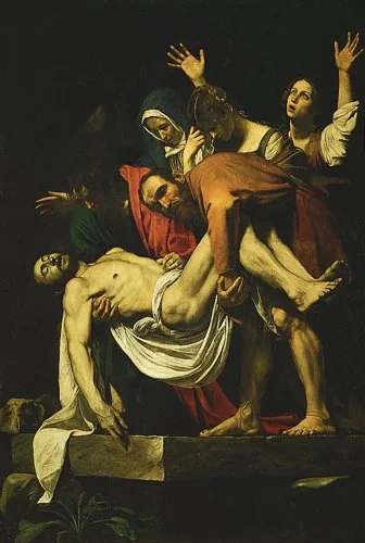
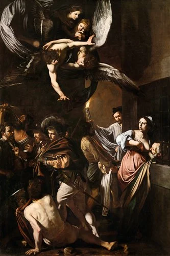
Michelangelo Merisi da Caravaggio (1571–1610) did something genuinely shocking to European painting, and its shock has never entirely subsided. Where Leonardo sought gradation, Caravaggio sought confrontation. His figures emerge from near-total darkness, lit with a directional light source of almost violent specificity. The surrounding shadow is not gradual or atmospheric — it is black. Not almost black, not deep shadow with detail, but uninflected black. The light lands where Caravaggio decided it would land, and nowhere else.
The technique has a specific name: tenebrism, from the Italian tenebre, meaning darkness. It is the extreme version of chiaroscuro — vast areas of the composition swallowed in shadow, with the light surgical in its selectivity. The Supper at Emmaus (1601) places its figures in a concentrated pool of light against near-blackness. Judith Beheading Holofernes (1598–99) lights its subject with the specificity of a crime-scene photograph.
What is particularly relevant to photography is how Caravaggio achieved this. He was working from life, with live models, using an actual directional light source — almost certainly a high window in a darkened studio. His shadows are sharp-edged and convincingly cast because they are real shadows from a real source. He was not inventing a visual grammar; he was observing one. The photographer using a single lamp in a darkened room is doing exactly what Caravaggio was doing, four centuries earlier, in a Roman studio.
Rembrandt and Psychological Light
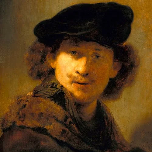
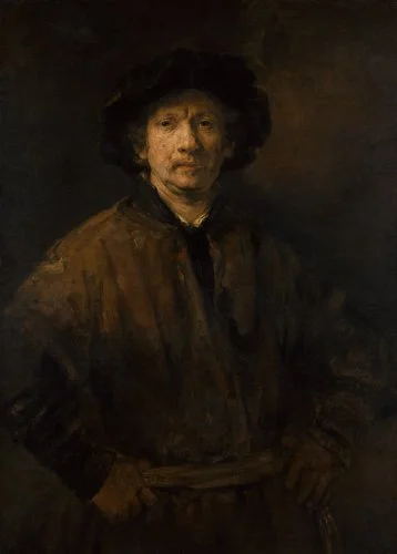
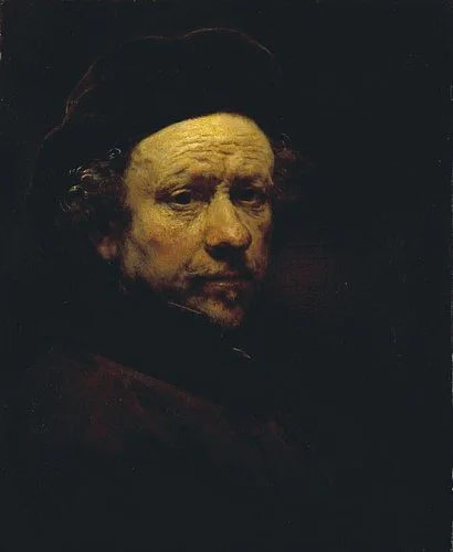
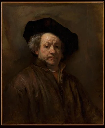
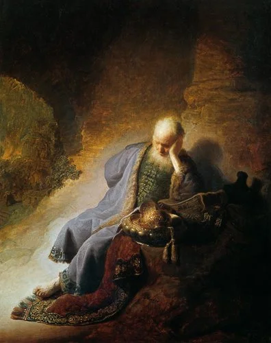
Rembrandt van Rijn (1606–1669) took Caravaggio's discovery — that light and shadow could be the primary emotional instrument of an image, not merely a rendering technique — and turned it inward. Where Caravaggio's light is external and theatrical, Rembrandt's is intimate and psychological. His light seems to emerge from somewhere within the subject as much as from any external source. It is the light of interiority.
The specific lighting arrangement known as "Rembrandt lighting" — named for him and still in standard use in portrait photography and cinematography today — places the light at roughly 45 degrees to the face and slightly above eye level. The result is a small triangular highlight on the shadow side of the face, below the eye. This triangle is the diagnostic feature: if it's there and it's roughly equilateral in shape, you have Rembrandt lighting. If it isn't, you don't.
What makes Rembrandt's series of self-portraits (spanning roughly 1628 to 1669, the year of his death — over forty accepted paintings, plus etchings and drawings) uniquely instructive is that you can watch the light shift across them. As the angle and intensity change, so does the mood: the early self-portraits have something swaggering and self-assertive about them; the late ones, with their deeper shadow and softer modelling, are among the most psychologically penetrating images in the history of portraiture. The light is the emotional content. This is not a metaphor. The same face, under different light, is a different emotional statement.

Photography's Inheritance
When Fox Talbot and Daguerre created photography in the 1830s and 1840s, they were not working in a visual vacuum. They were working within a painterly tradition that had spent three centuries developing a precise and sophisticated grammar of pictorial light. Early Pictorialist photographers — the late nineteenth- and early twentieth-century movement that sought to establish photography as a fine art — made this inheritance explicit: they soft-printed their images to resemble charcoal drawings or engravings, and they composed and lit their subjects according to painterly conventions.
The later Modernist rejection of Pictorialism — the "straight photography" advocated by Alfred Stieglitz, Edward Weston, and the f/64 group in the 1930s — was partly a rejection of this dependence on painterly light in favour of photography's own tonal capabilities. Weston wanted photographs that looked like photographs, not like paintings. But even his most uncompromisingly photographic images — the close studies of peppers, shells, and nudes — are fundamentally studies of how directional light reveals form. The inheritance is still there, just worn differently.
The Direction of Light
If you could change only one thing about your photography tomorrow, and were limited to a single variable, the answer is almost certainly this: start paying attention to the direction of your light source. Exposure you can adjust; focal length you can choose; the direction of light determines the fundamental character of the image.
Front Lighting
Front lighting means the light source is behind you, illuminating the subject from the same general direction as the camera. The face looking at the lens sees the light; the shadows fall behind the subject, away from the camera.
The result is flat and even. Colours are rendered accurately. Shadows are minimised or hidden. This is good for: documentation where you want to record the thing without dramatising it; accurate colour reproduction; situations where shadow creates a problem (harsh shadows under eyes in a family snapshot, for example, might be worse than the flatness of front lighting).
It is bad for: conveying texture, volume, depth, or any sense of the three-dimensional character of the subject. A landscape photographed in flat front light looks like a postcard even if the landscape is astonishing. A face photographed in flat front light loses its sculptural quality. The technical term for the extreme version of this — a very bright light directly on-axis with the lens — is "flat lighting", and that is precisely what it produces.
The deer-in-headlights look has a physical explanation: it is perfectly even, perfectly directionless front light from a direct flash.
Side Lighting
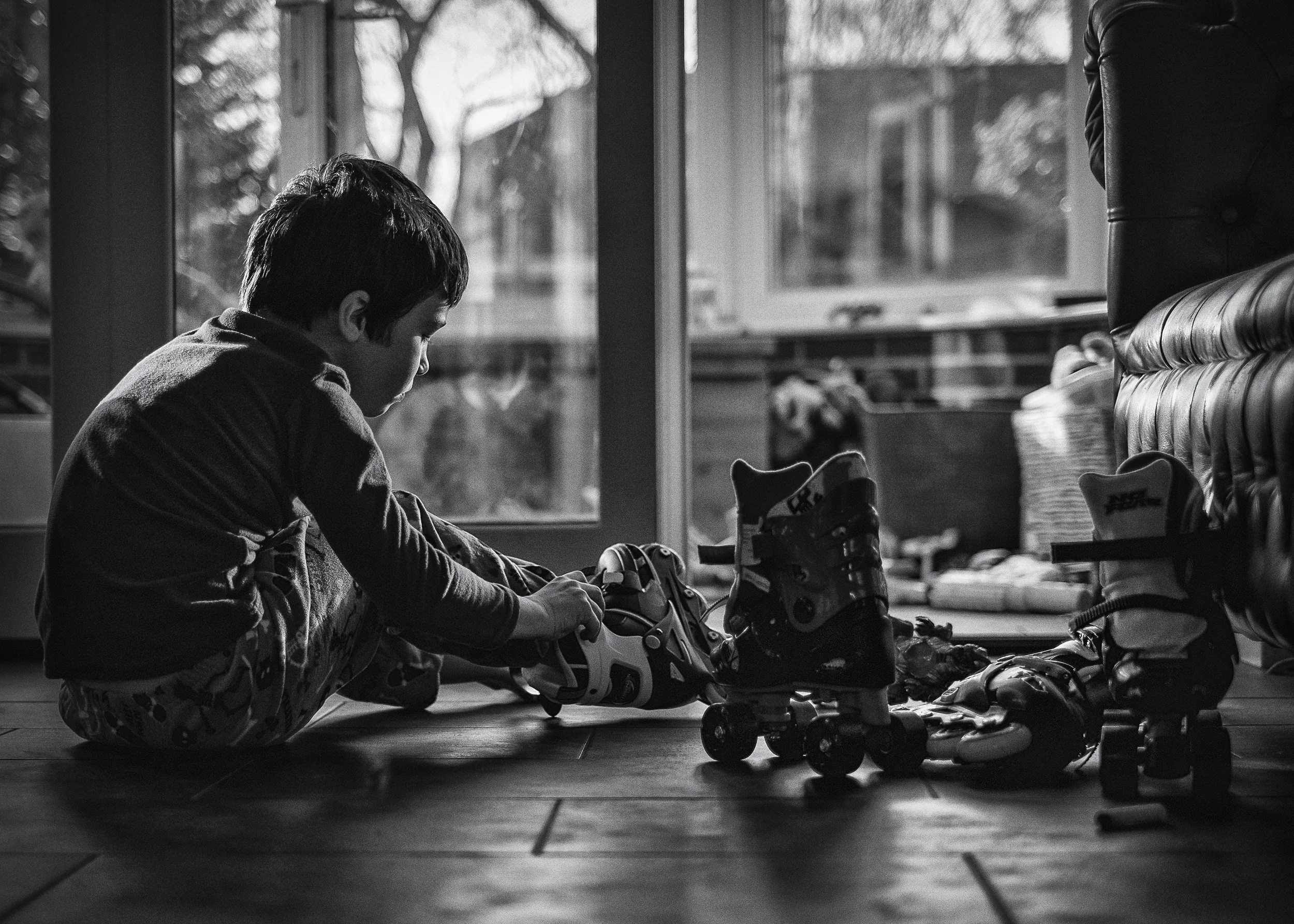
At 90 degrees to the camera-subject axis, the light source no longer illuminates the face the camera sees. It is illuminating the side of the subject. Shadows now fall across the surface that the camera sees — and those shadows reveal everything. Every contour, every raised edge, every textural variation in the surface catches or blocks the light, creating a corresponding shadow.
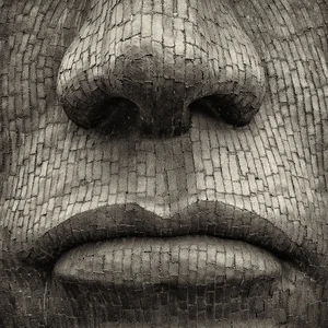
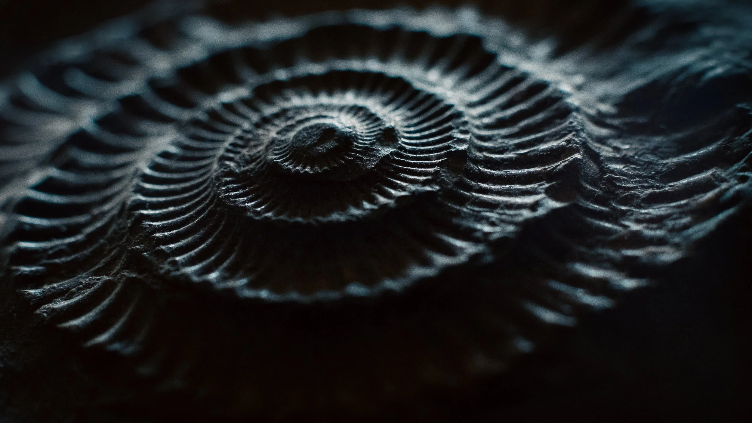
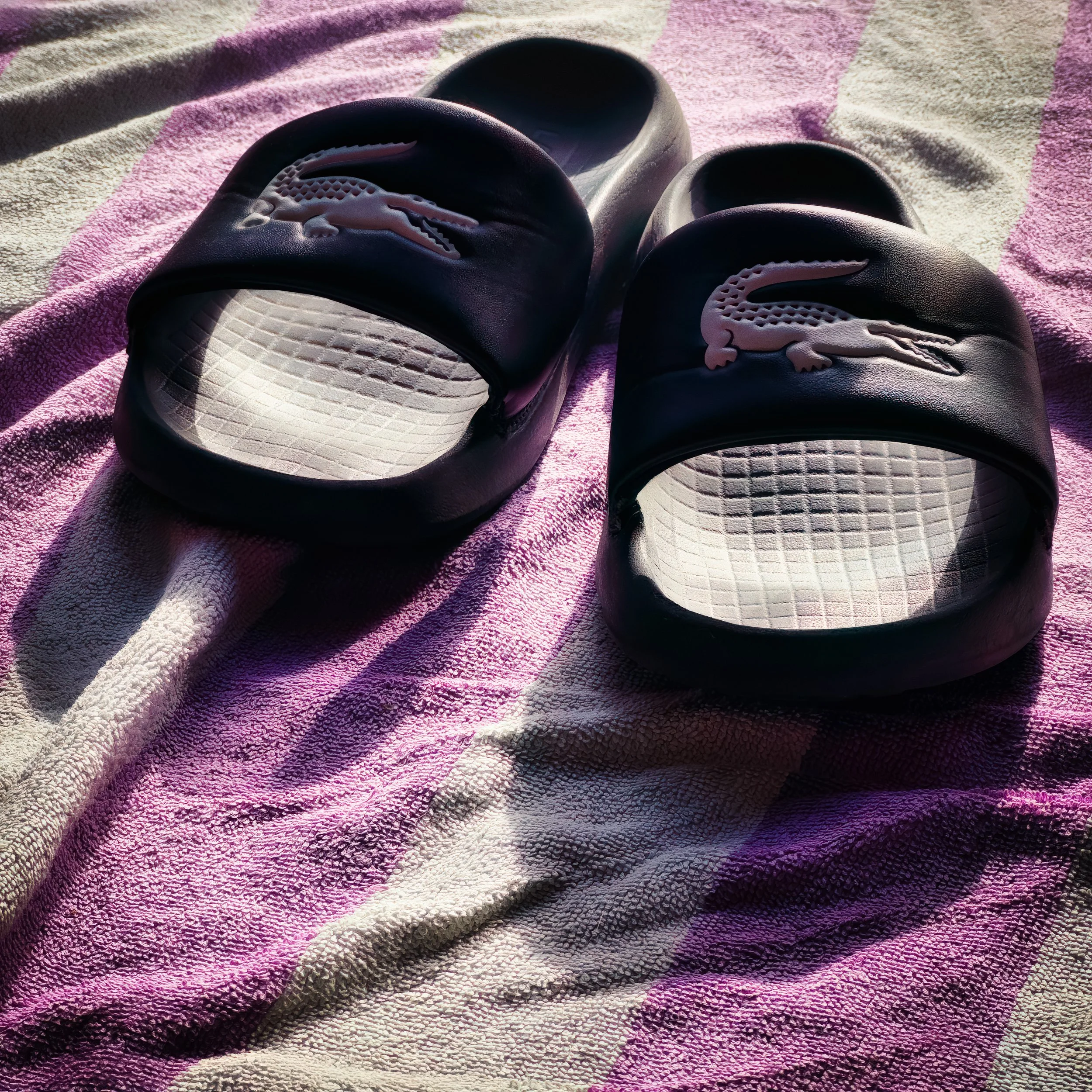
This is the light of revelation, in both the photographic and the slightly more dramatic sense. A landscape photographed in raking sidelight at golden hour shows the texture of the land in a way that flat noon light never will. Close-up photographs of stone, fabric, skin, or any materially interesting surface benefit enormously from hard side lighting — the technique specifically called "raking light" (where the light source is nearly tangential to the surface) is standard practice in archaeological and conservation photography precisely because it reveals surface detail invisible under any other lighting condition. The tiny tool marks on a medieval manuscript, the weave of a textile, the inscription half-worn from a gravestone — all visible in raking light, invisible in flat light.
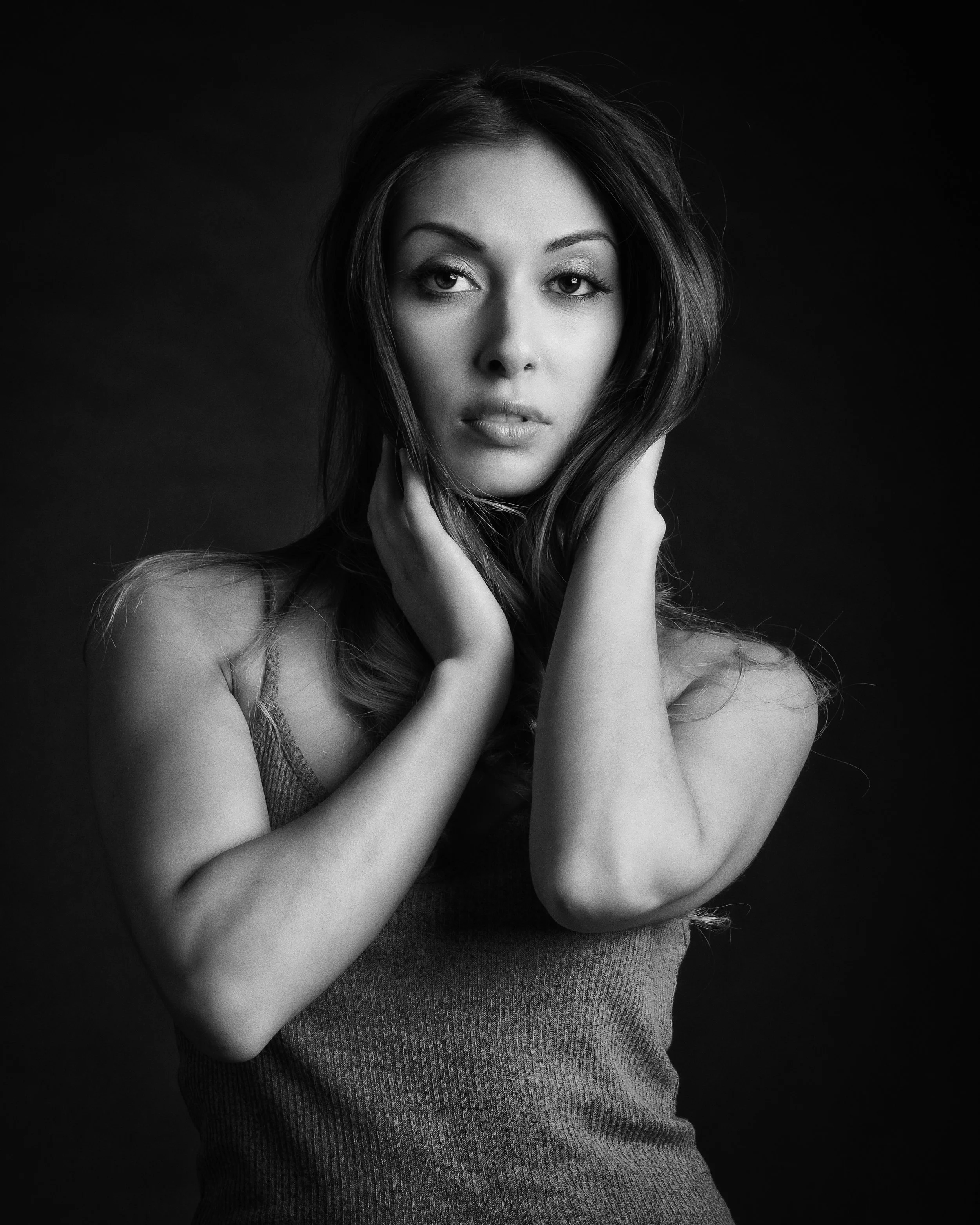
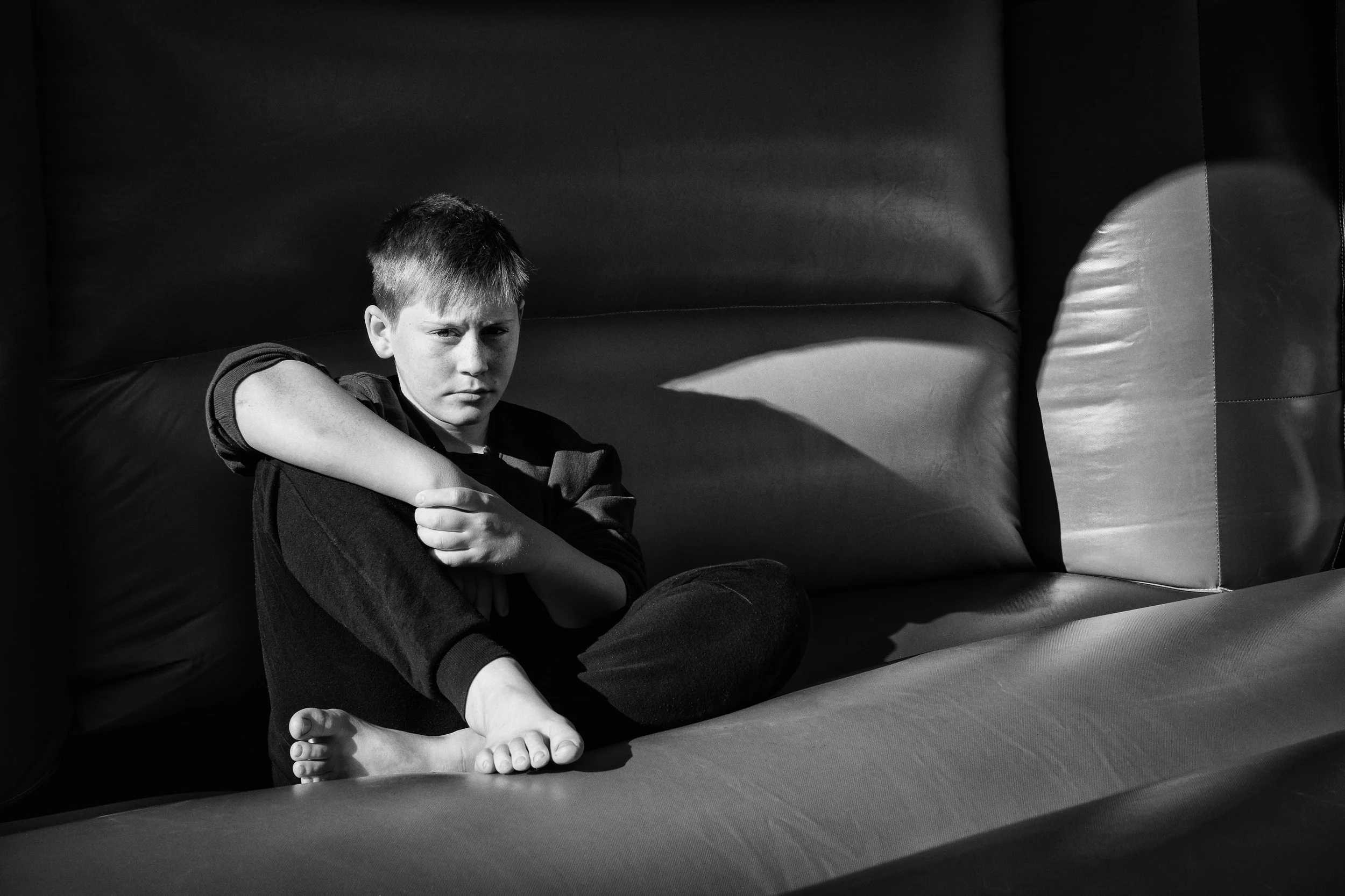
For portraits, 90-degree side lighting is dramatic to the point of severity. One side of the face is fully lit; the other is in deep shadow. The subject is split — literally divided by light — and the effect is suited to character studies and theatrical portraits but can feel harsh for more intimate work. Moving the light to 45 degrees — halfway between front and side — gives you a more balanced treatment that retains the sense of volume and directionality without the full drama of the split.
Back Lighting
When the light source is behind the subject, between the subject and the camera, you are in back lighting territory — and you have two distinct creative options.
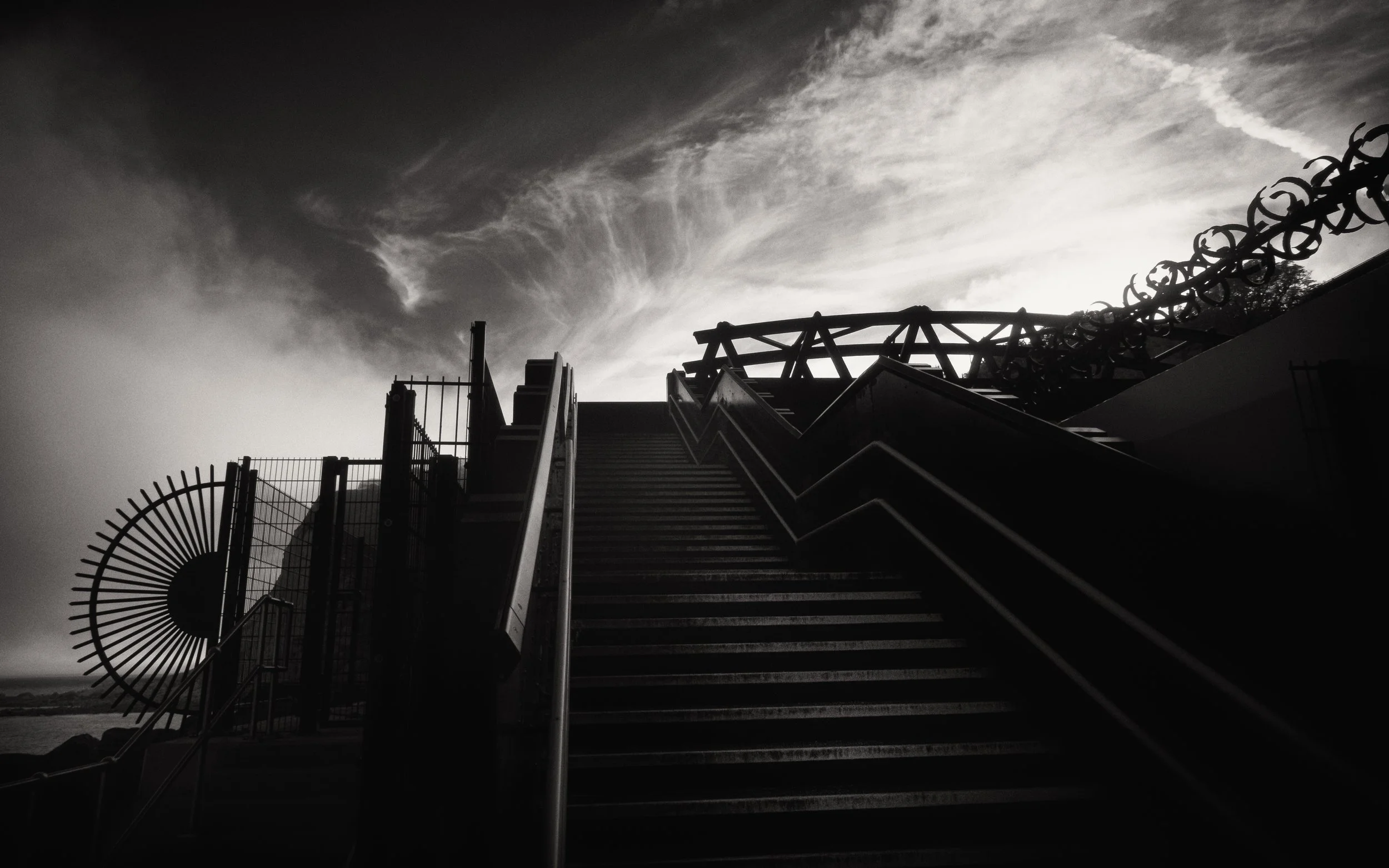
The first is the silhouette. The subject becomes a dark shape against a bright background. All detail within the subject is lost; only the outline remains. This is a powerful compositional tool when the outline is distinctive — a person walking against a sunset, a tree against a bright sky. There is a full treatment of silhouettes in the corresponding article in this series; the cross-reference here is to note that silhouettes are, fundamentally, a consequence of backlighting.
The second option is rim lighting: exposing for the shadow side of the subject, so that detail is retained there, while the edge of the subject nearest the light source is outlined in a bright highlight. The rim of light separates the subject from the background and gives it a three-dimensional, almost glowing quality.
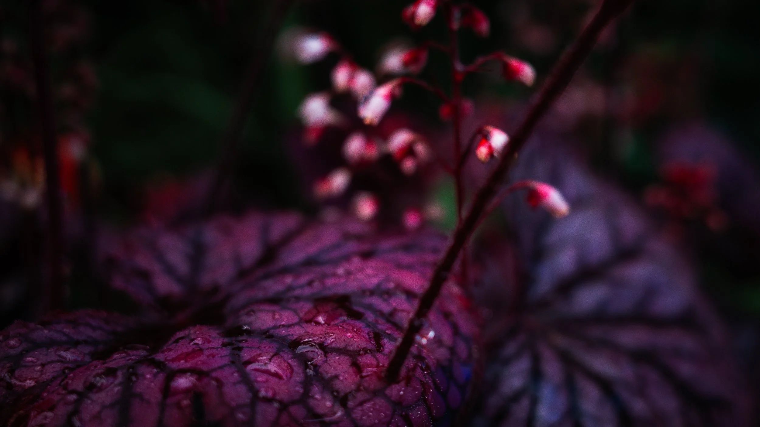
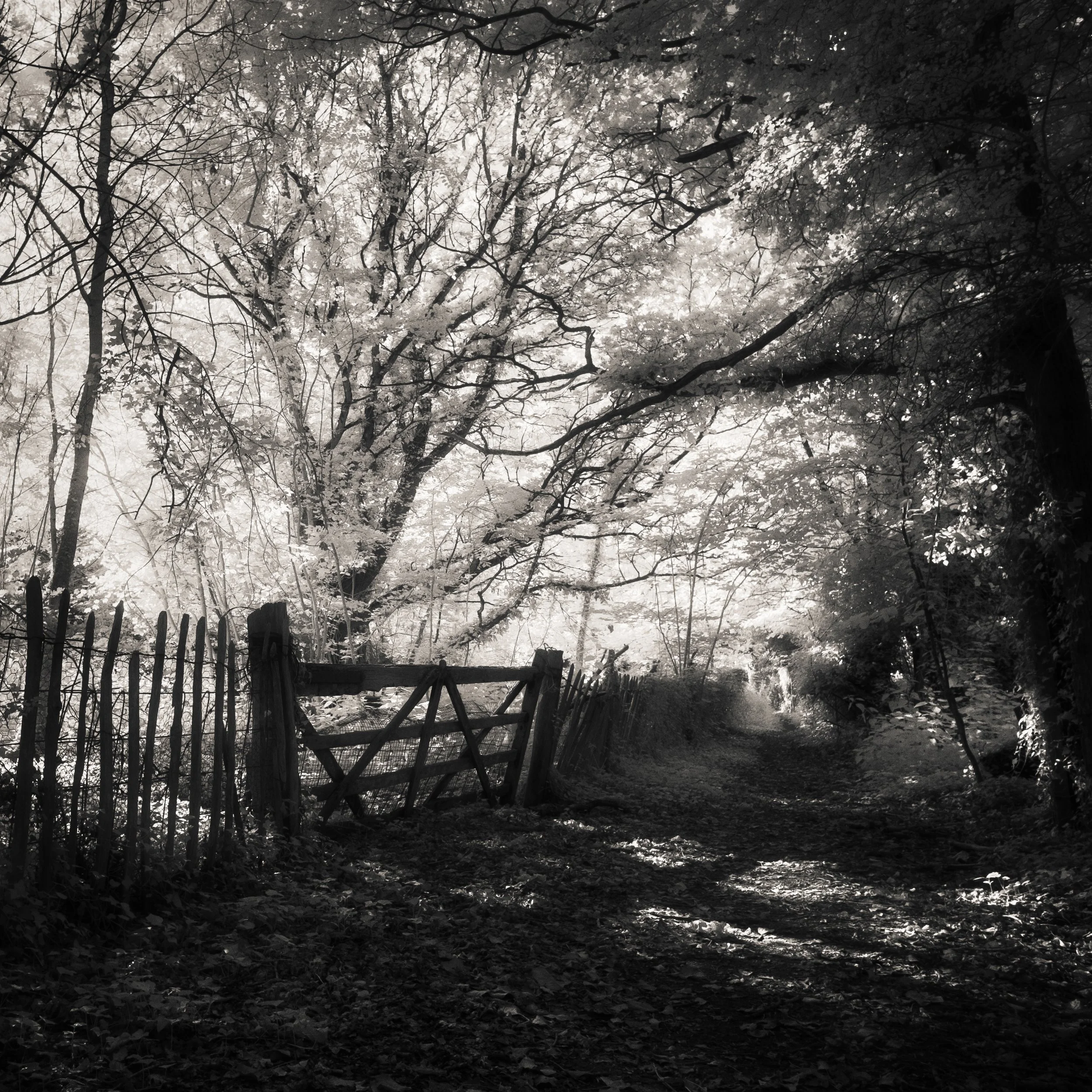
The third possibility — which requires a translucent subject — is transmitted light. Point a light source through a leaf, a petal, a sheet of tracing paper, a glass of wine, or a piece of fine fabric, and the material does not block the light but allows it through, revealing the internal structure: the veins of the leaf, the colour variation in the petal, the texture of the weave. This is a peculiarly beautiful quality of light that has no equivalent in shadow or front-lit photography, and it is available with almost any back light source.
Top Lighting
Directly overhead. This is midday summer sun, roughly: the light falls straight down from above.
For faces, this is generally the most unflattering possible light. Deep shadows under the brows, hollow eyes, a dark groove under the nose, a shadow under the chin. The structure of the face is exaggerated in the least flattering direction. Portrait photographers do not choose midday sun for this reason, and have not, historically, had kind things to say about it.
It has its uses. Flat-lay photography — the product shot or recipe image viewed from directly above — benefits from top lighting because the camera-subject axis is also top-down, so the light is effectively front lighting from the camera's perspective. Architectural photography of horizontal surfaces works similarly. But for any subject with significant vertical structure, overhead light tends to create more problems than it solves.
Rembrandt Lighting in Practice
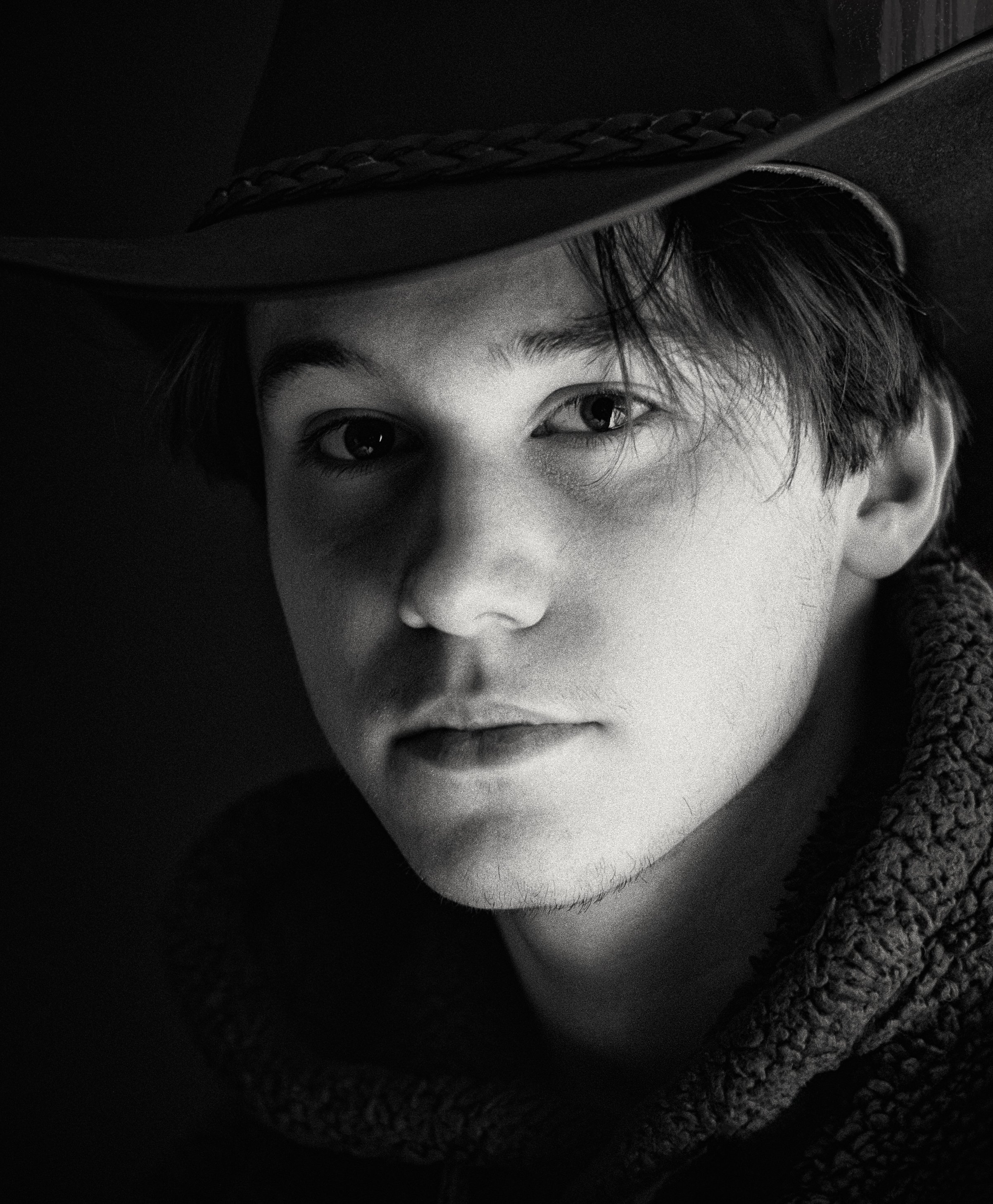
The specific arrangement: light source at approximately 45 degrees to the face, slightly above eye level. The subject faces somewhat toward the camera, but not directly. The light strikes the forehead, the bridge of the nose, one cheek, and one side of the chin. The other side of the face is in shadow. The critical detail is the small triangular catch of light on the shadow side of the face, formed where the nose's shadow falls just short of the cheek and the cheekbone catches a small amount of light.
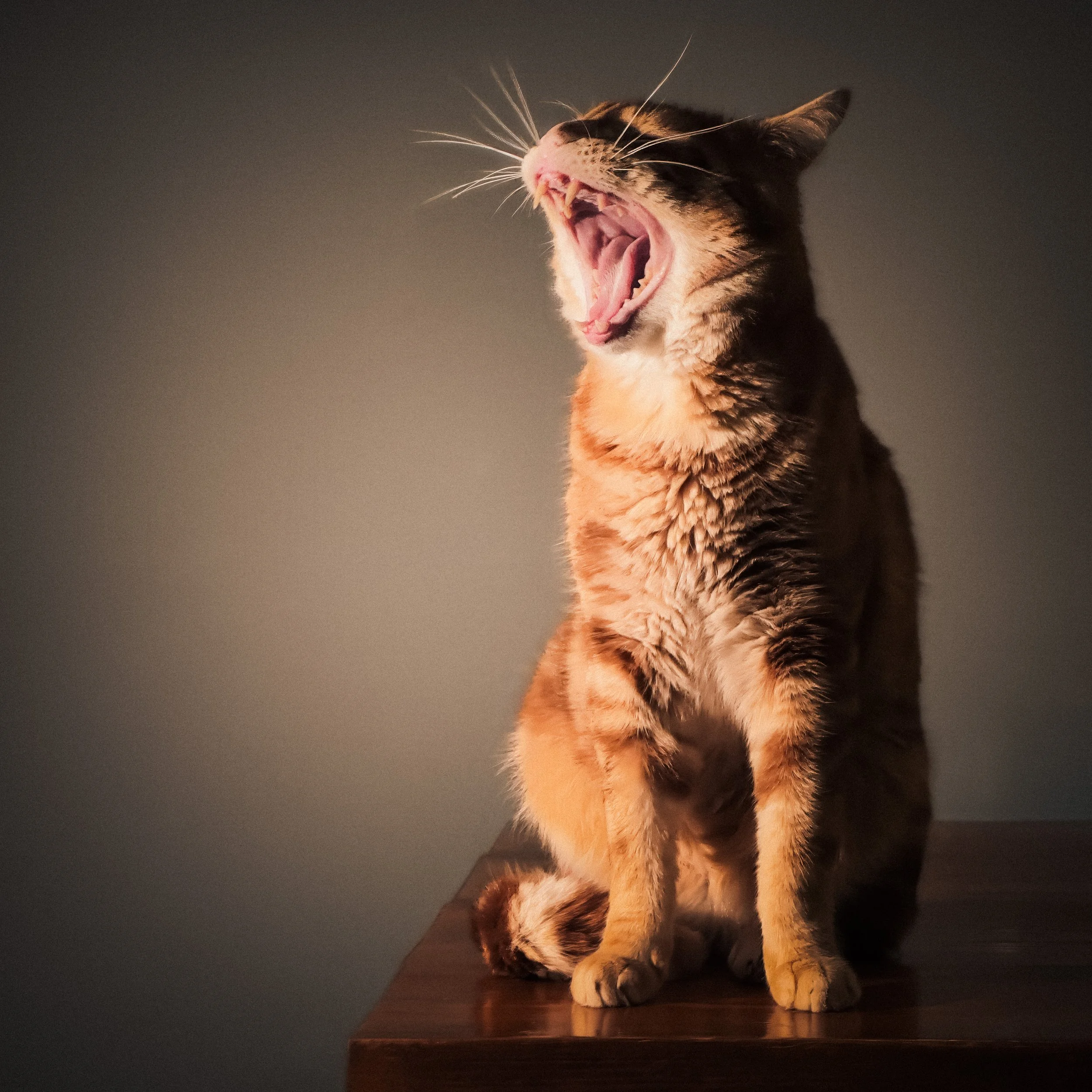
With studio equipment, you set this up deliberately. Without studio equipment, a single window at roughly 45 degrees to the subject achieves a very similar result on a clear day — the window acts as a medium-hard source. On an overcast day, the same window gives you soft Rembrandt lighting, which is arguably lovelier: all the directionality and shadow structure, but with a gentle gradation rather than a sharp edge.
The practical steps: place the subject perhaps a metre from the window; turn them at 45 degrees to it; have them face slightly toward the camera; make sure the window is slightly above their eye level (they can sit while the window is at standing height, or you can stand slightly above them). Look for the triangle. If it's there, you have it.
Directional Light Without the Studio
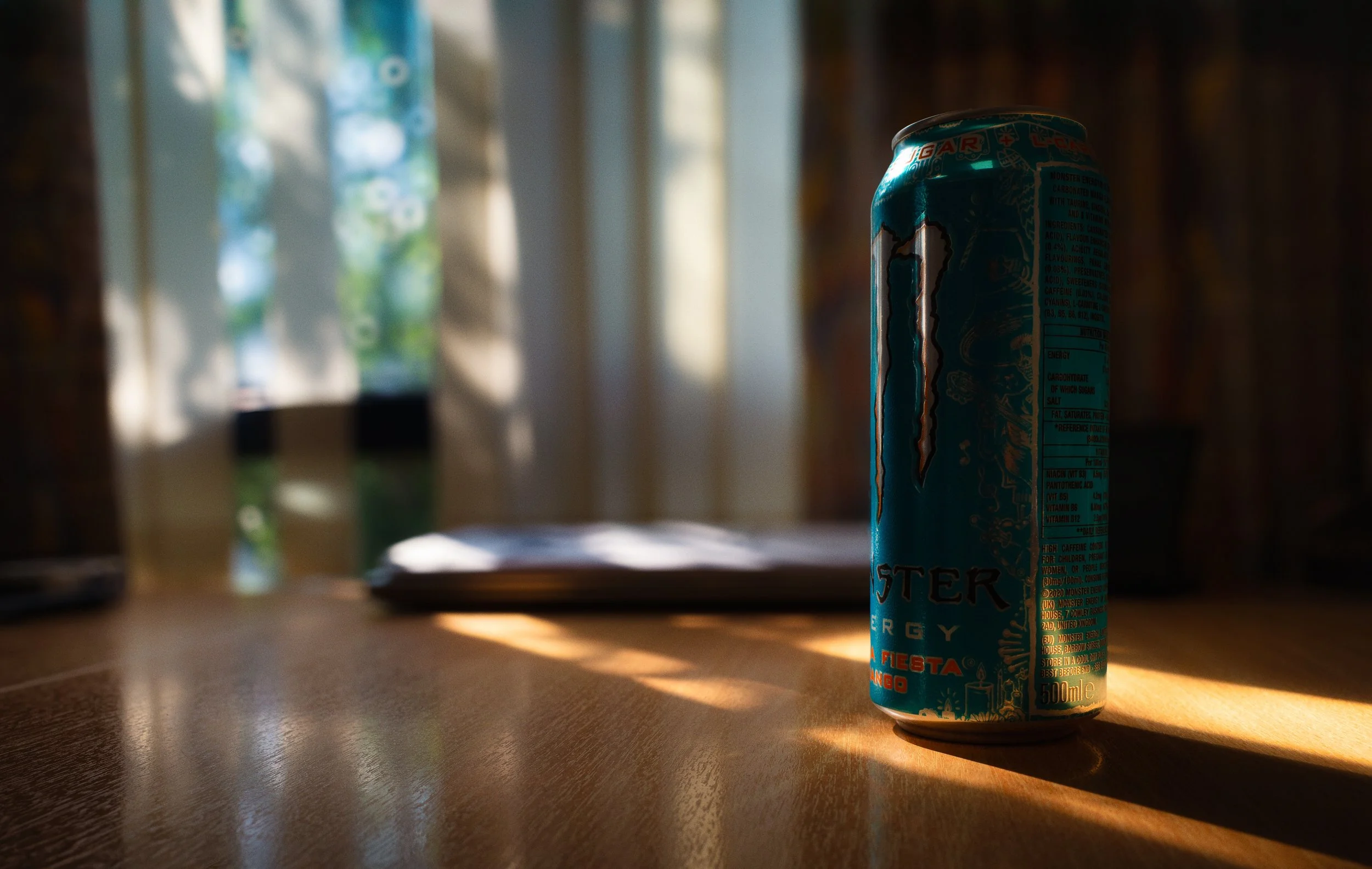
A single window is the most readily available directional light source in almost any interior. It behaves very differently depending on the weather, the time of day, and whether you hang a sheer curtain or piece of diffusion paper across it.
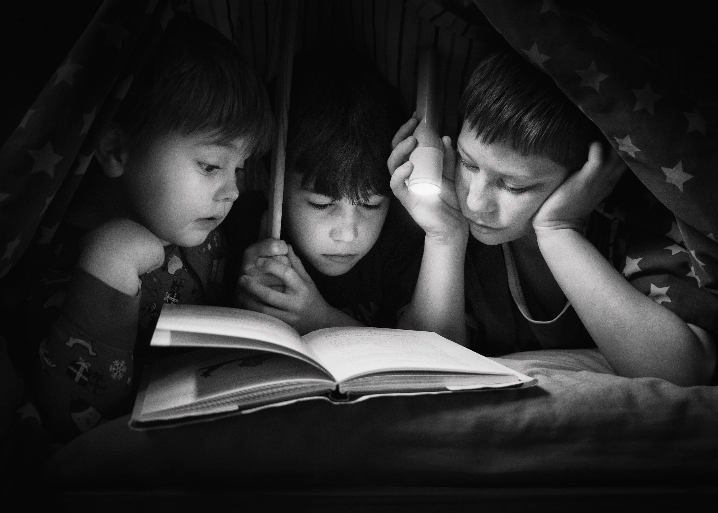
A torch or a desk lamp with the shade removed is an entirely controllable hard light source for tabletop subjects — and for the exercise at the end of this article, it is all you need.
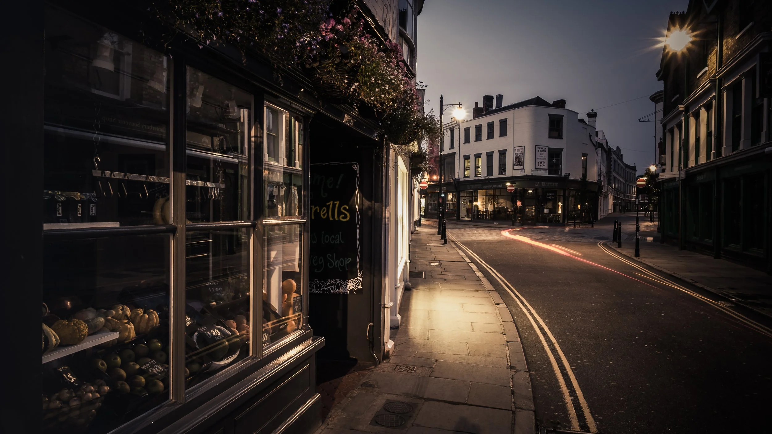
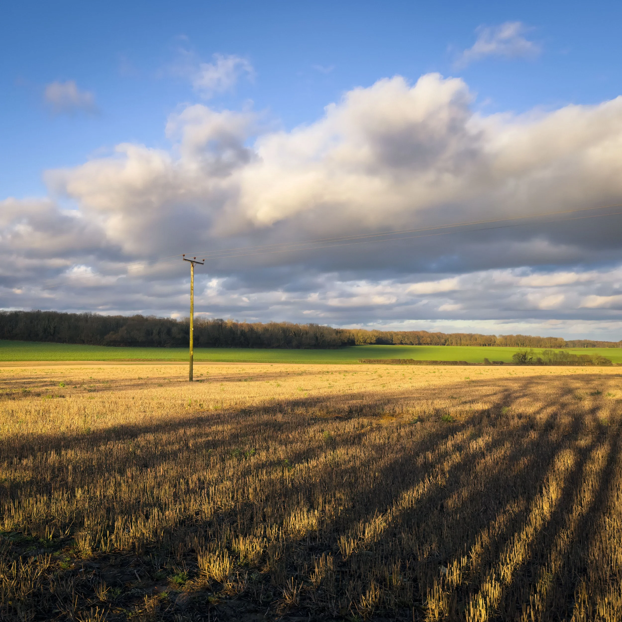
At golden hour, the sun itself is your side light: low, warm, and raking across the landscape. This specific quality of light gets its own full treatment in the Golden Hour article in the LRN collection, so the details are there. The relevant point here is that golden hour is simultaneously directional (low sun = extreme side light) and partially diffused (the light passes through more atmosphere, reducing some of the midday harshness). It is an unusually forgiving natural light source that does two things at once.
Hard Light vs. Soft Light
The hard/soft distinction introduced above has considerably more practical nuance than a simple either/or.
When hard light is the right answer:
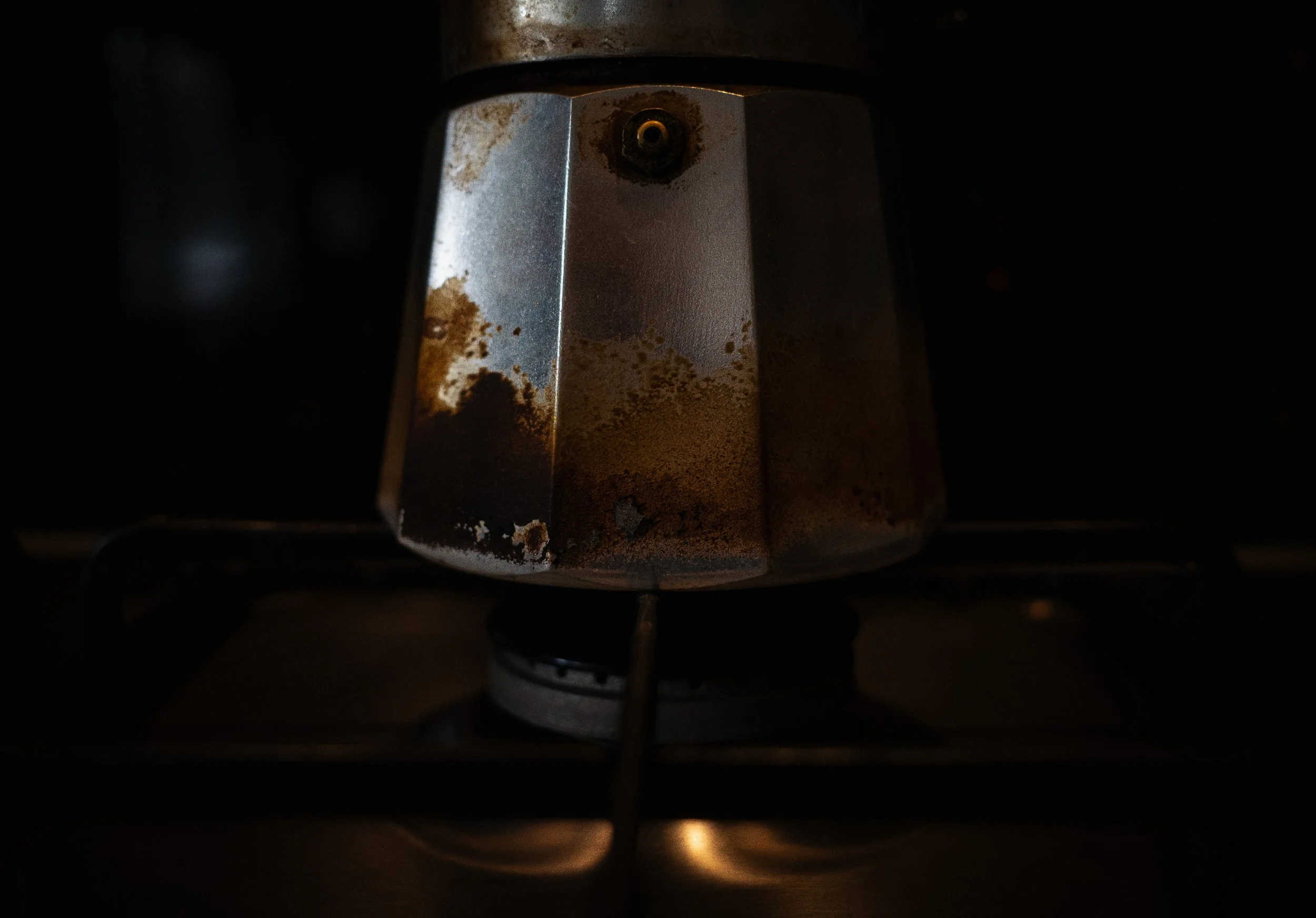
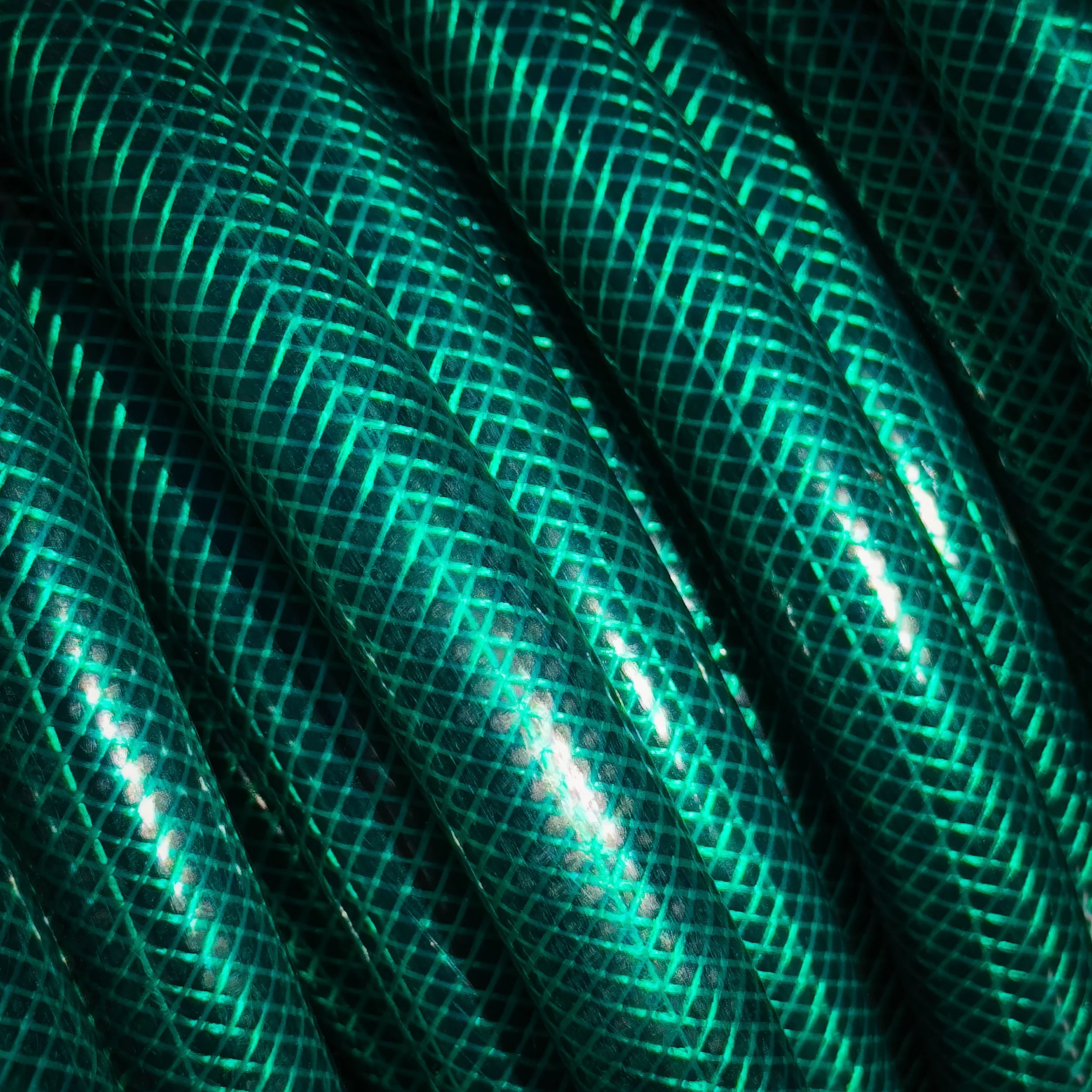
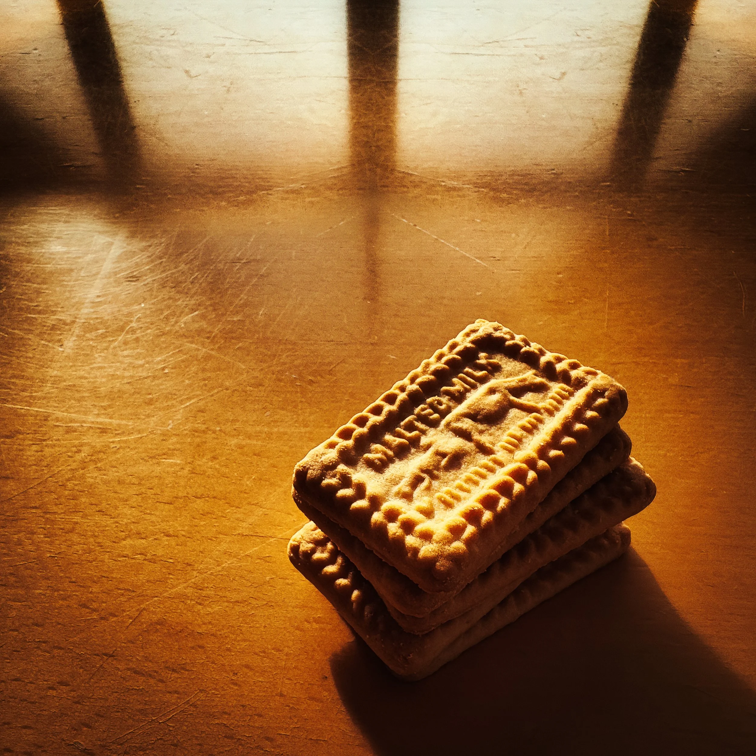
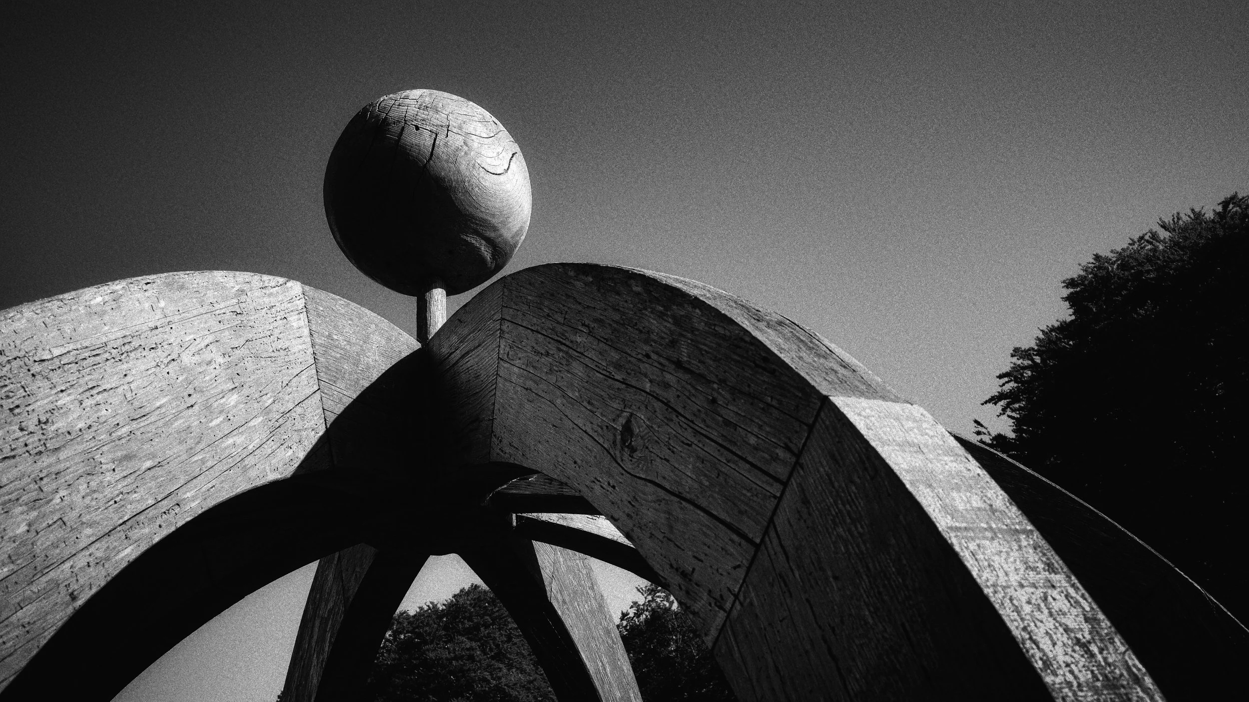
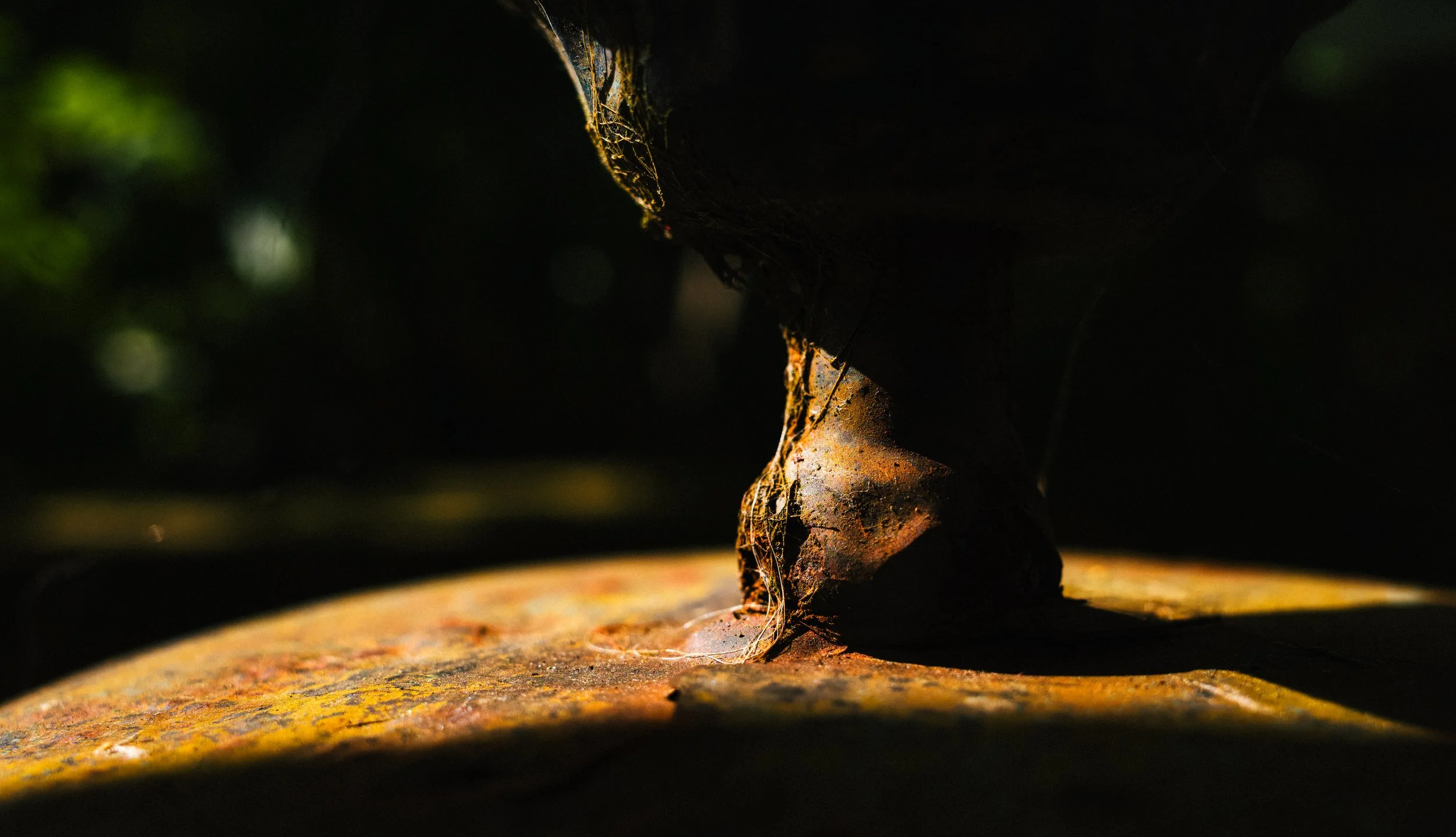
Texture is the story. Any surface where the material quality is what you are photographing — stone, wood grain, weathered skin, woven fabric, corroded metal — benefits from hard directional light, because hard light creates the sharp-edged shadows in the micro-topography of the surface that make it visually legible. An overcast-day photograph of a dry-stone wall is a competent photograph. The same wall in hard raking light at low sun is a study in geology and time.
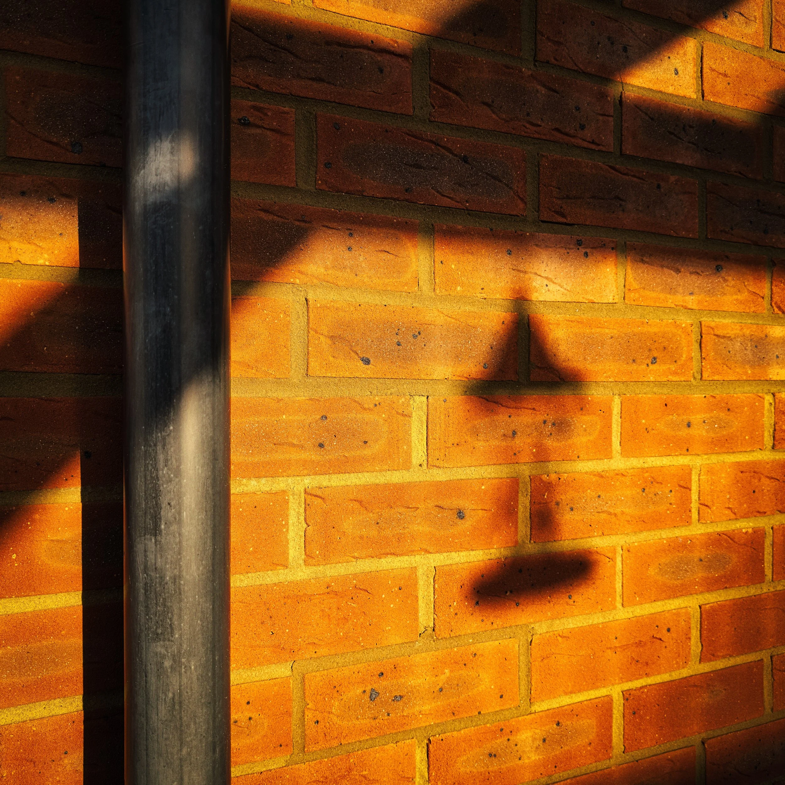
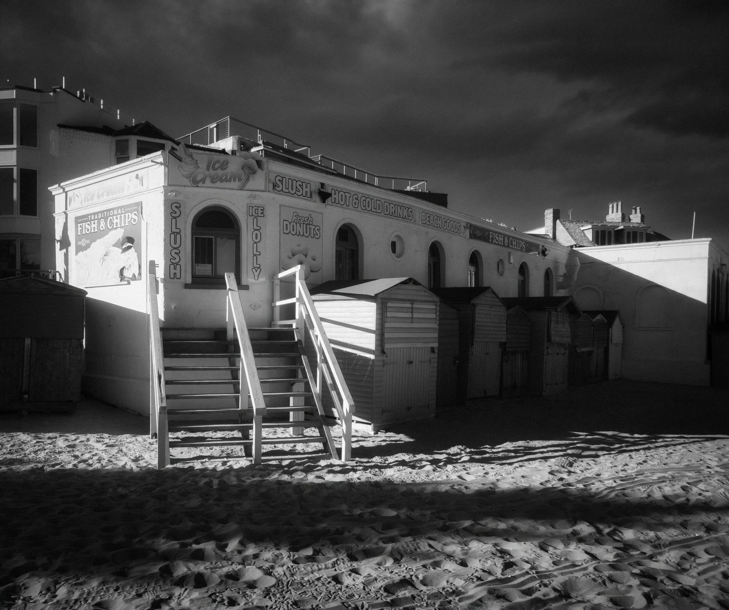
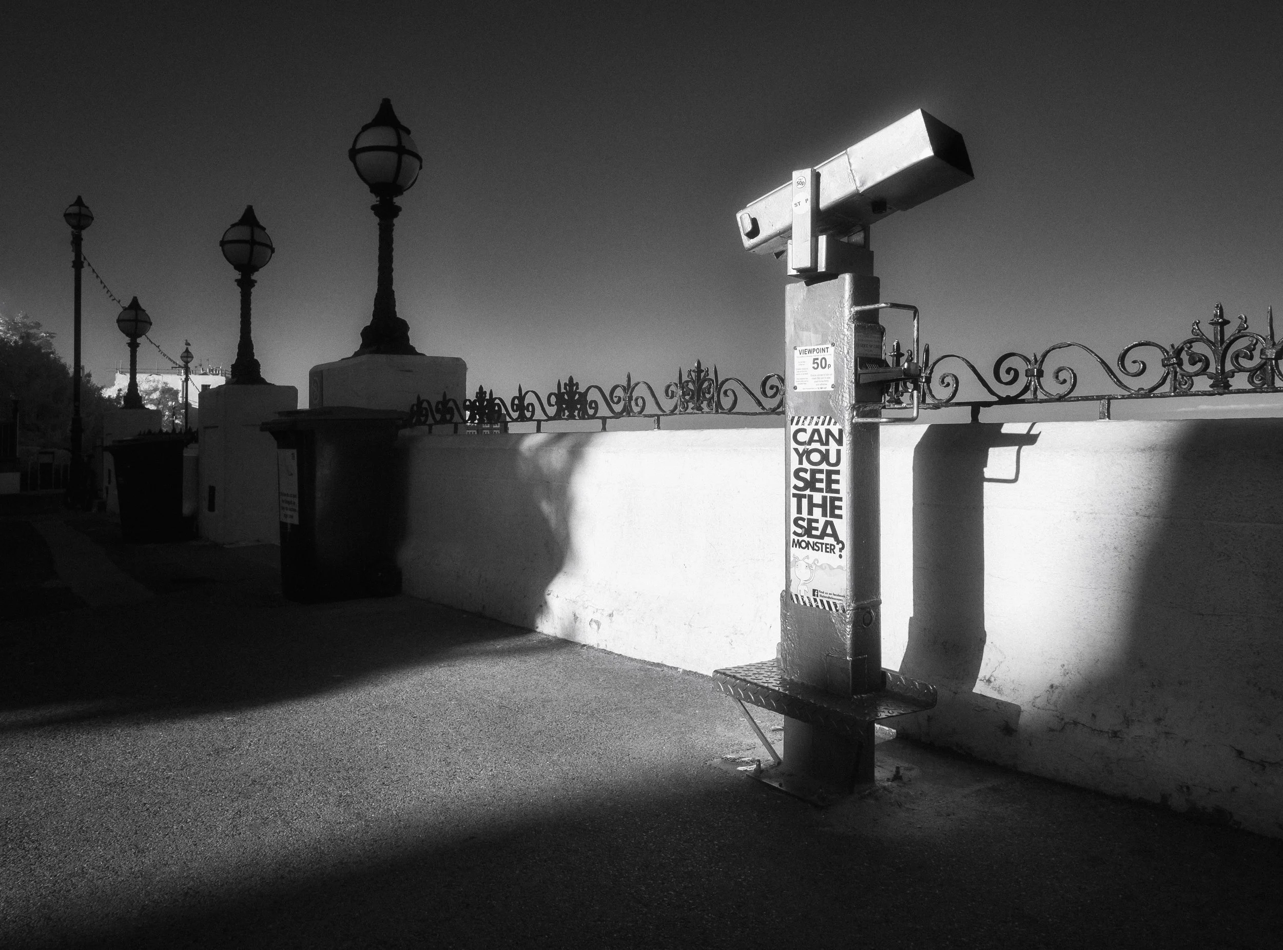
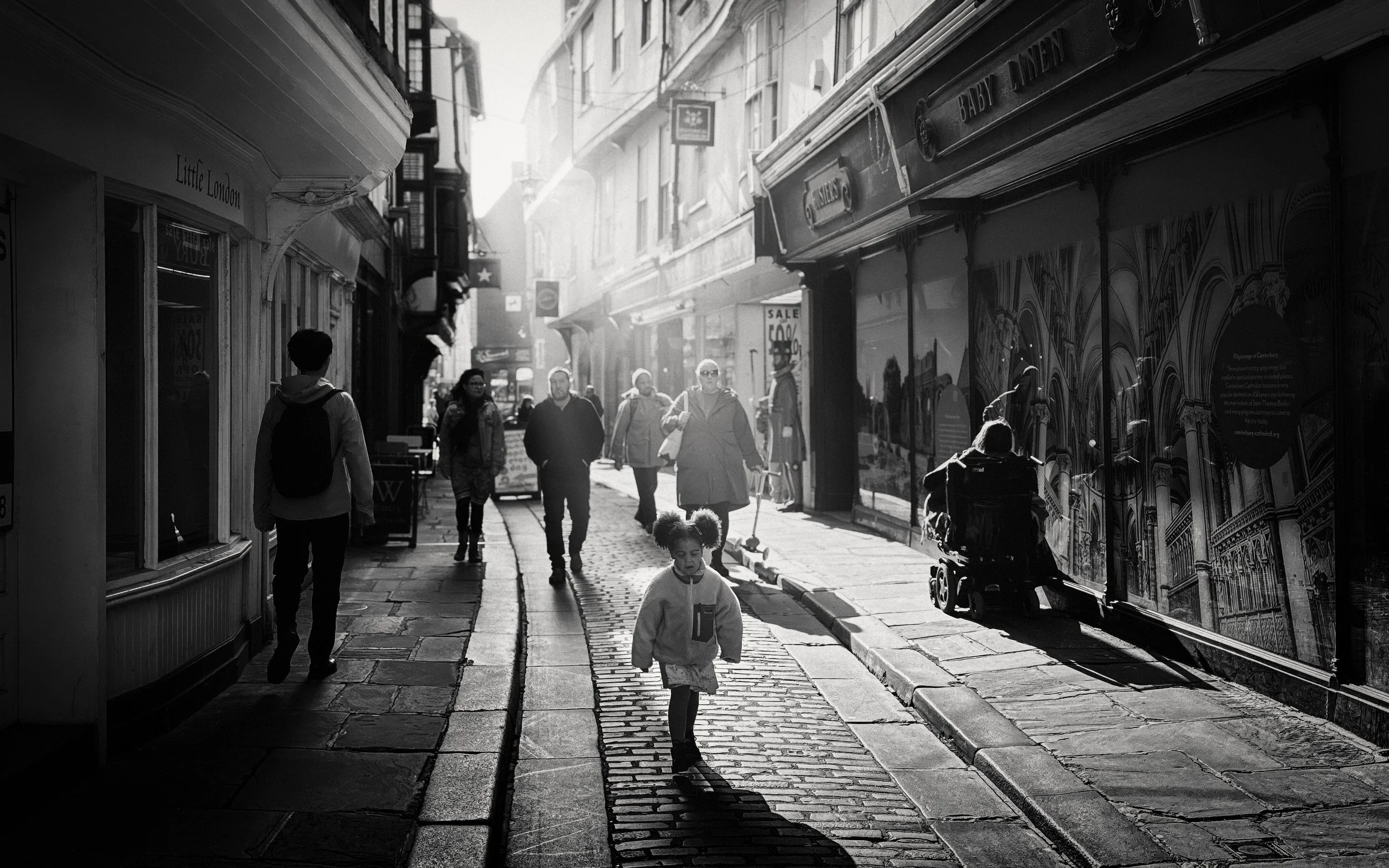
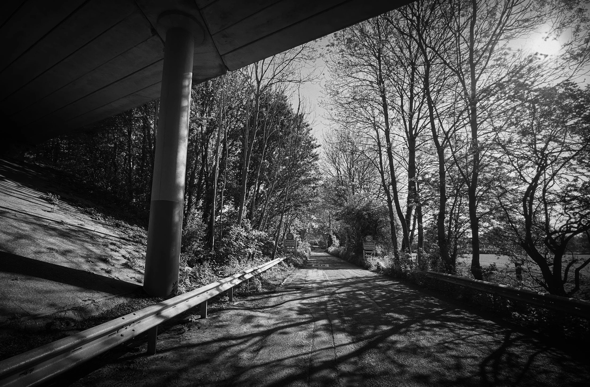
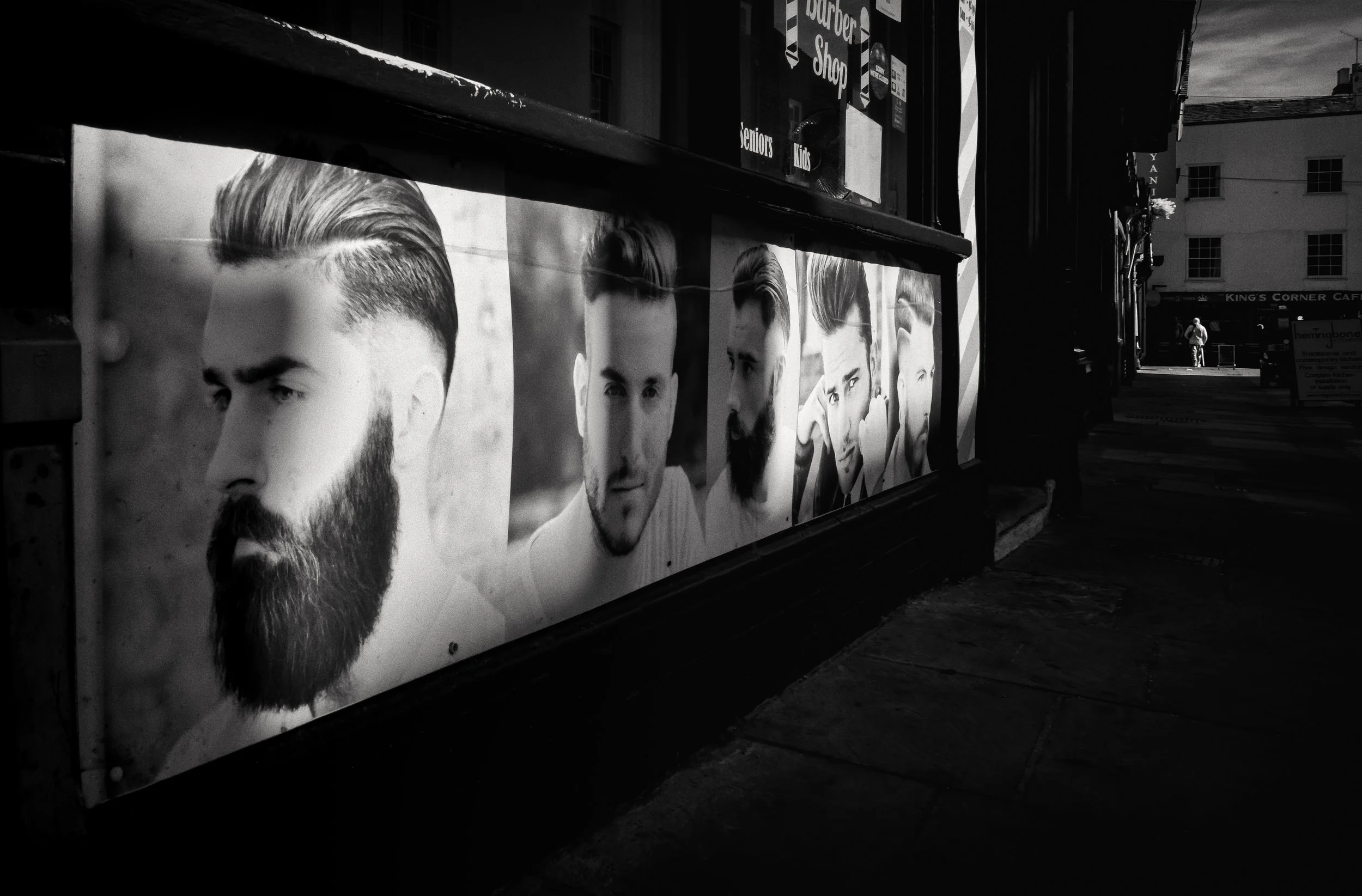
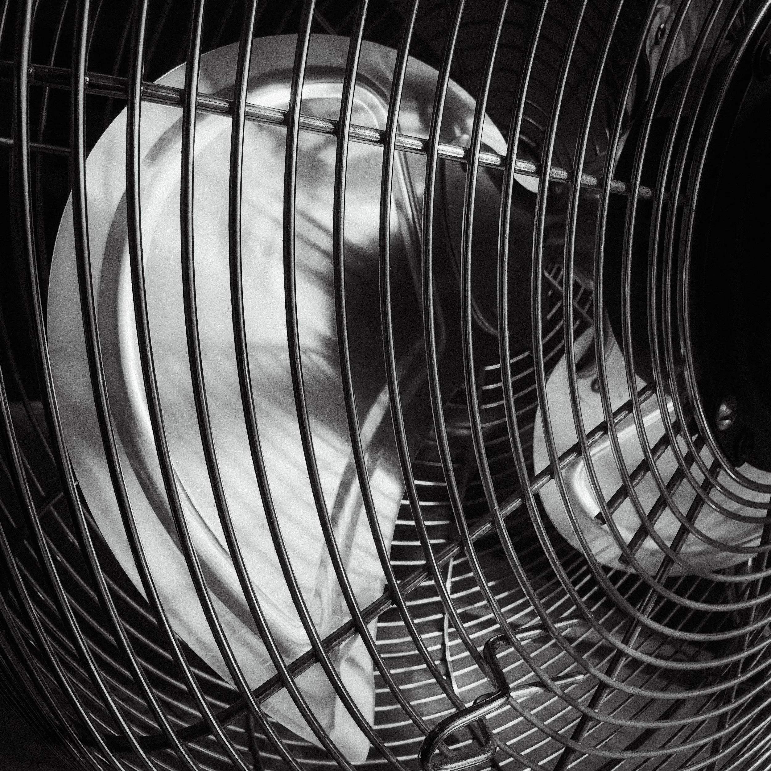
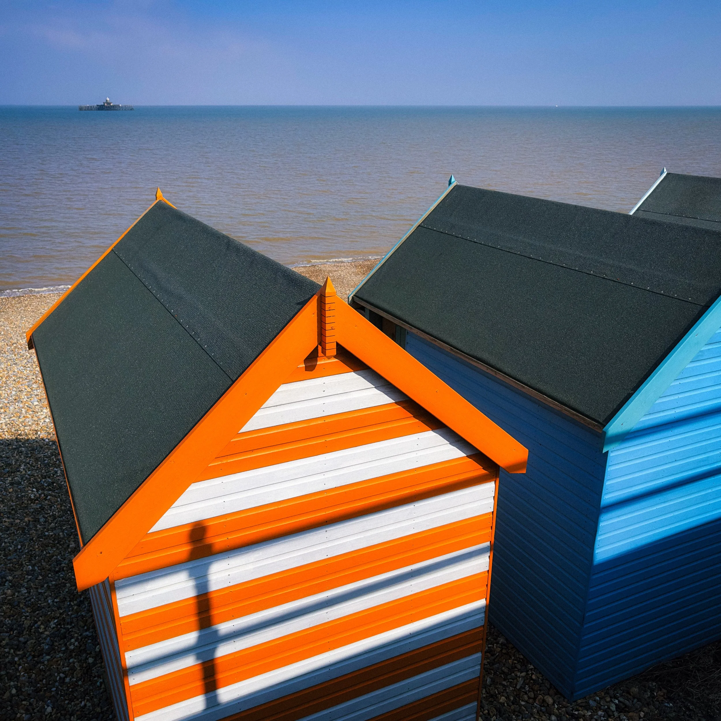
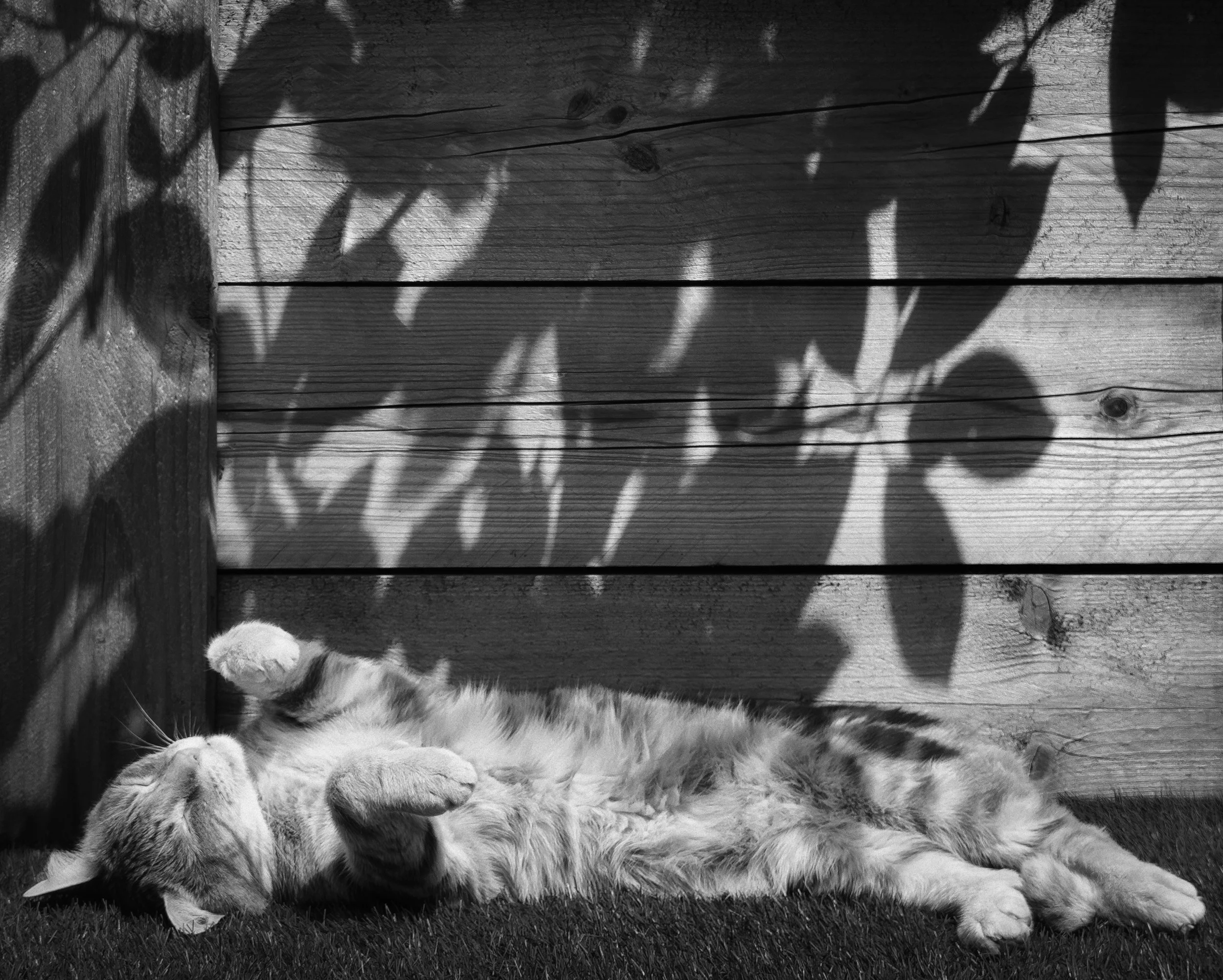
Pattern is the story. The shadow itself is geometric and interesting — the grid of a window frame on a wall, the repeated diagonals of railings on a pavement, the interlocking shapes cast by a pergola at noon. Hard light creates crisp, graphic shadow-patterns. Soft light smears them.
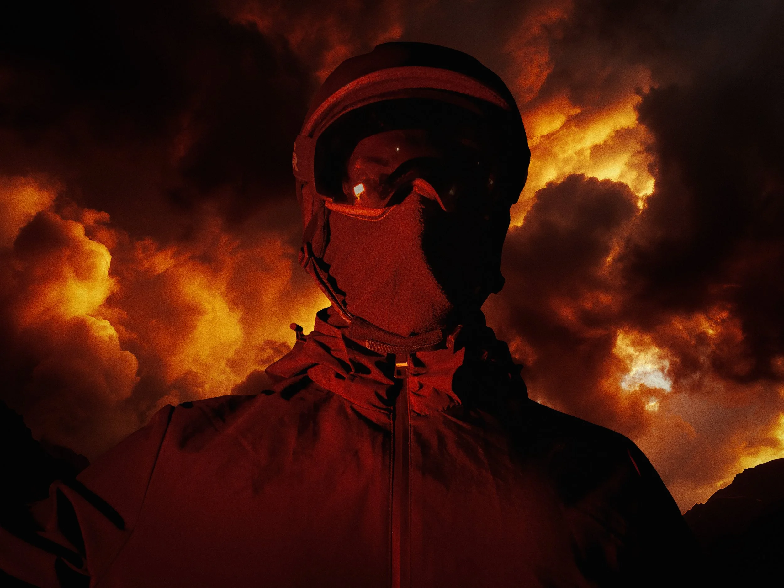
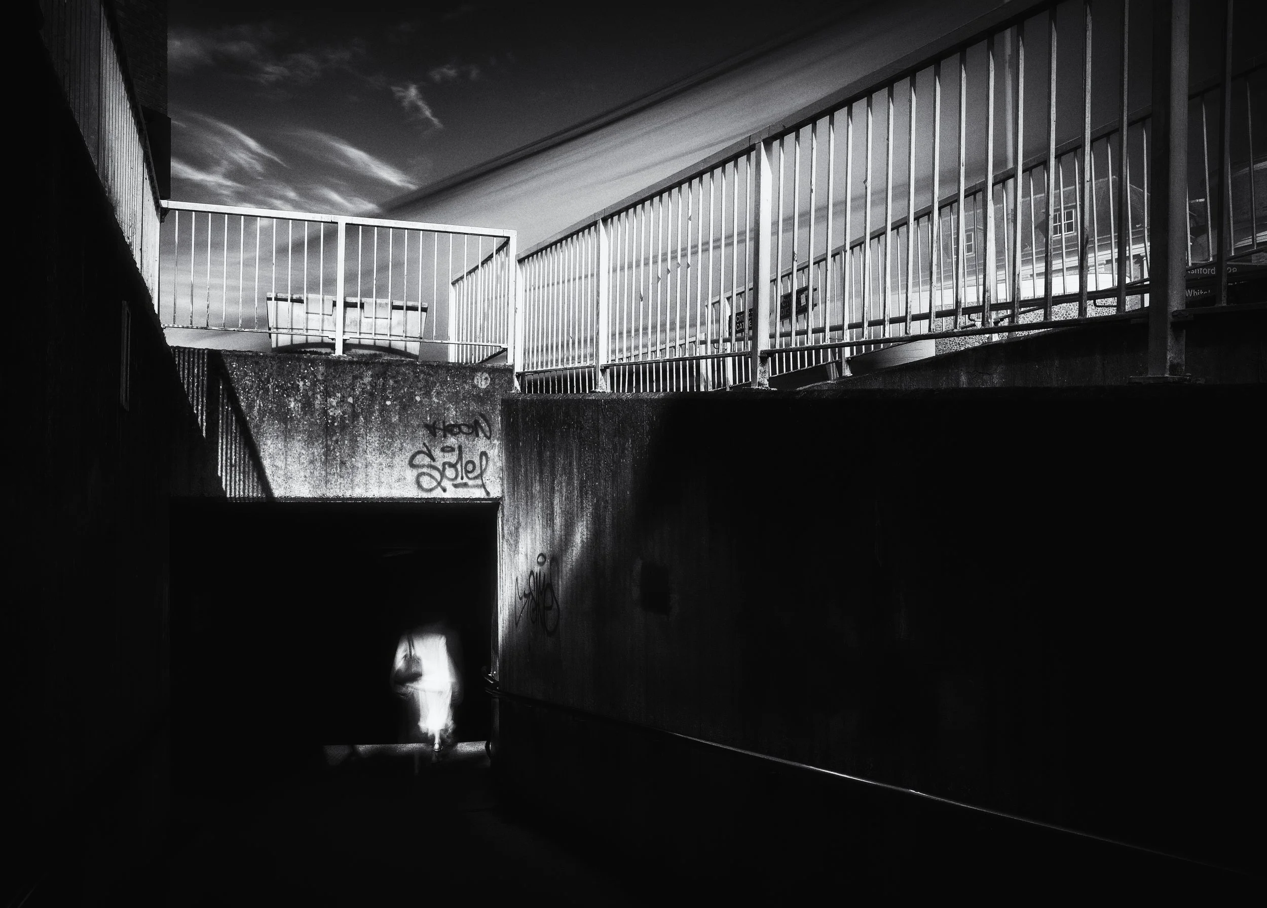
Drama is the point. The vocabulary of hard light — high contrast, deep shadow, bright highlight — is the vocabulary of tension, danger, and moral ambiguity. Noir cinema, horror films, thriller photography, portraiture that is trying to reveal rather than flatter: all use hard light.
When soft light is the right answer:
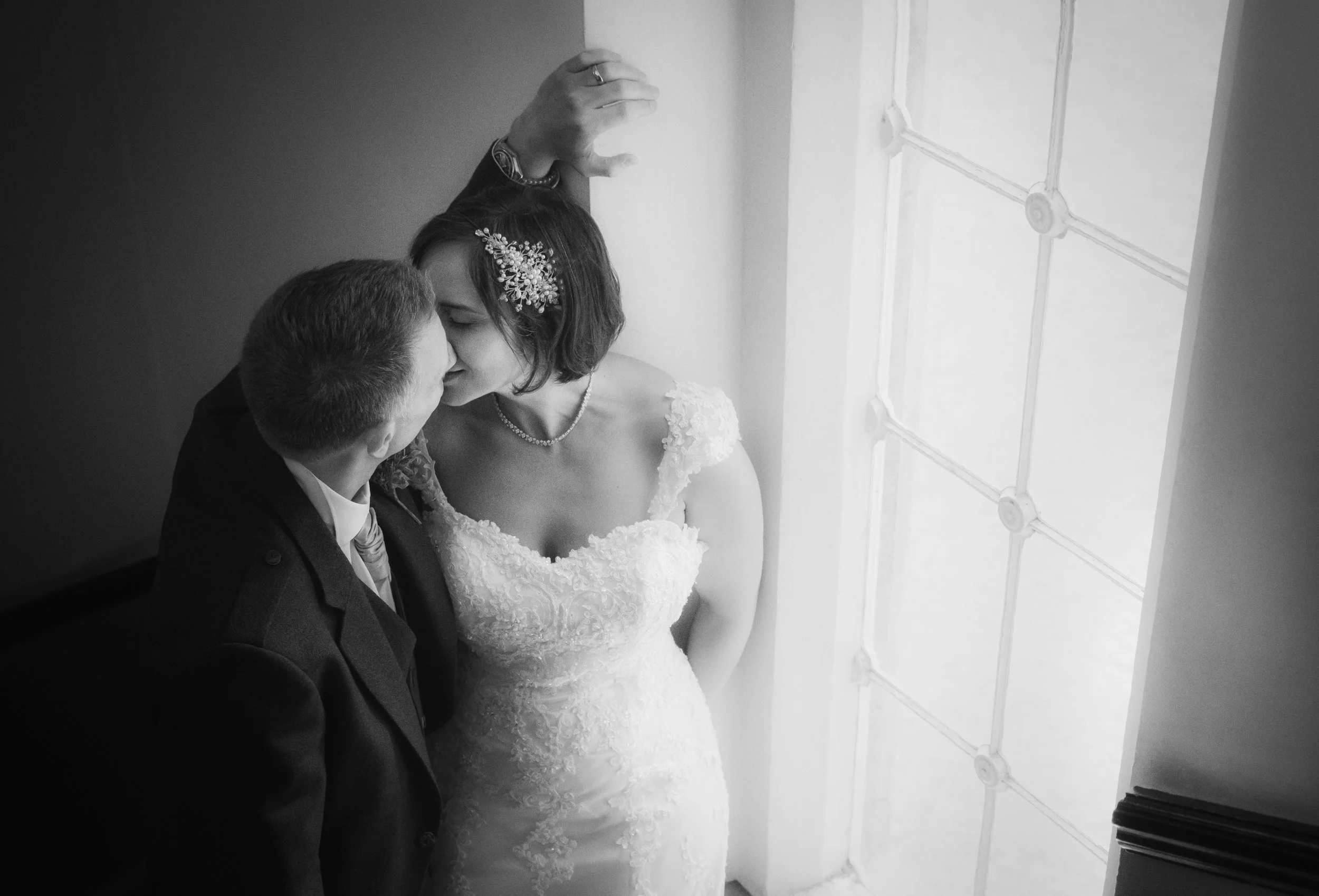
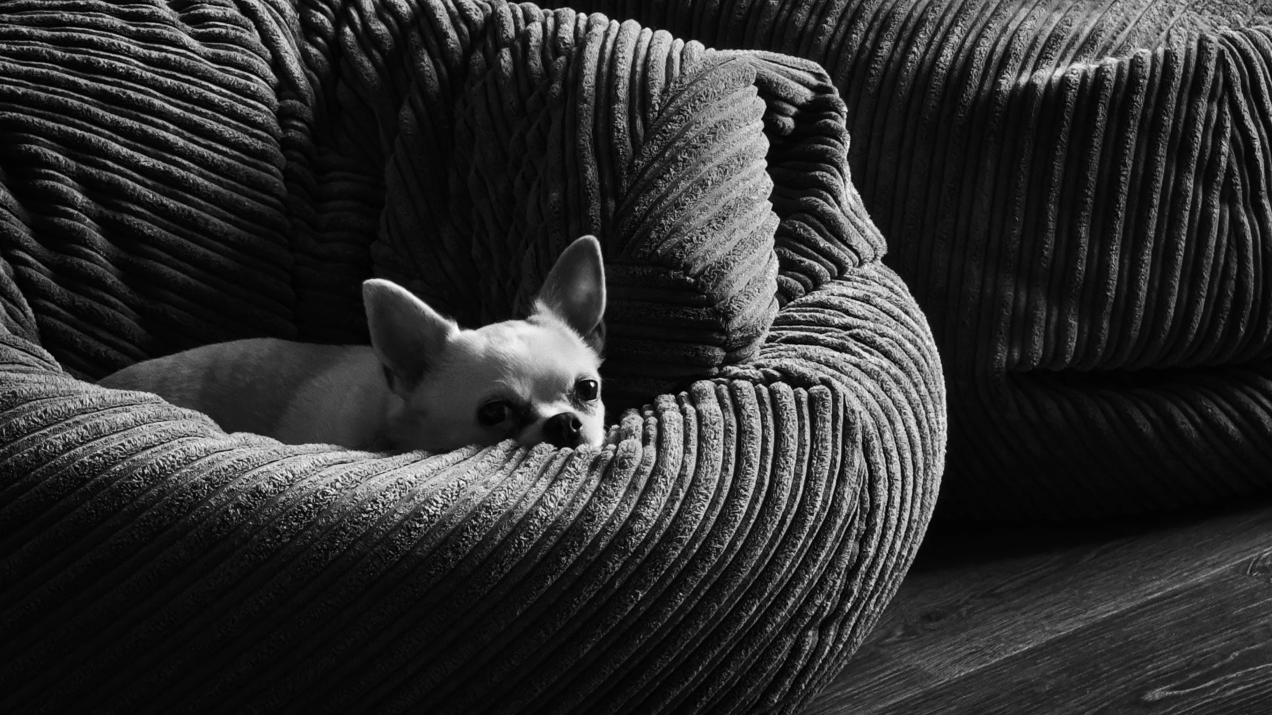
Portraits where you want the subject to look good. Soft light is skin's best friend: it smooths, it flatters, it reveals colour rather than texture, and it creates the gradual tonal transitions that make a face look luminous rather than carved.
Overcast landscape photography. This gets insufficient attention. An overcast sky is a magnificent light source for landscapes where colour and subtlety are the story — the greens of a forest, the blues of a coastal scene, the tonal range of a misty valley. The flat light suppresses shadow-texture (which, in a landscape, may not be the primary interest) and allows colour and atmosphere to dominate. Turner painted overcast landscapes. Atget photographed Paris primarily in diffuse light. It is not second-best.
Anything where the colour matters more than the form. Hard light introduces strong highlights that blow out colour information and deep shadows that block it up. Soft light preserves tonal gradation and with it, colour detail.
Diffusing hard light yourself:
This is more accessible than most beginners realise. A sheet of baking paper taped over a window on a bright day converts hard window light into soft, diffuse window light. A sheer curtain does the same thing more elegantly. A white card or piece of white polystyrene placed on the shadow side of the subject to bounce light back in reduces contrast without adding a second light source. None of this requires equipment. All of it matters.
Shadows as Subjects
There is a habit of thinking about shadow as what happens to the areas around your subject. Shadow is what the light does not reach. Shadow is the background.
This is worth deliberately dismantling, because it is limiting in ways that are invisible until you dismantle it.
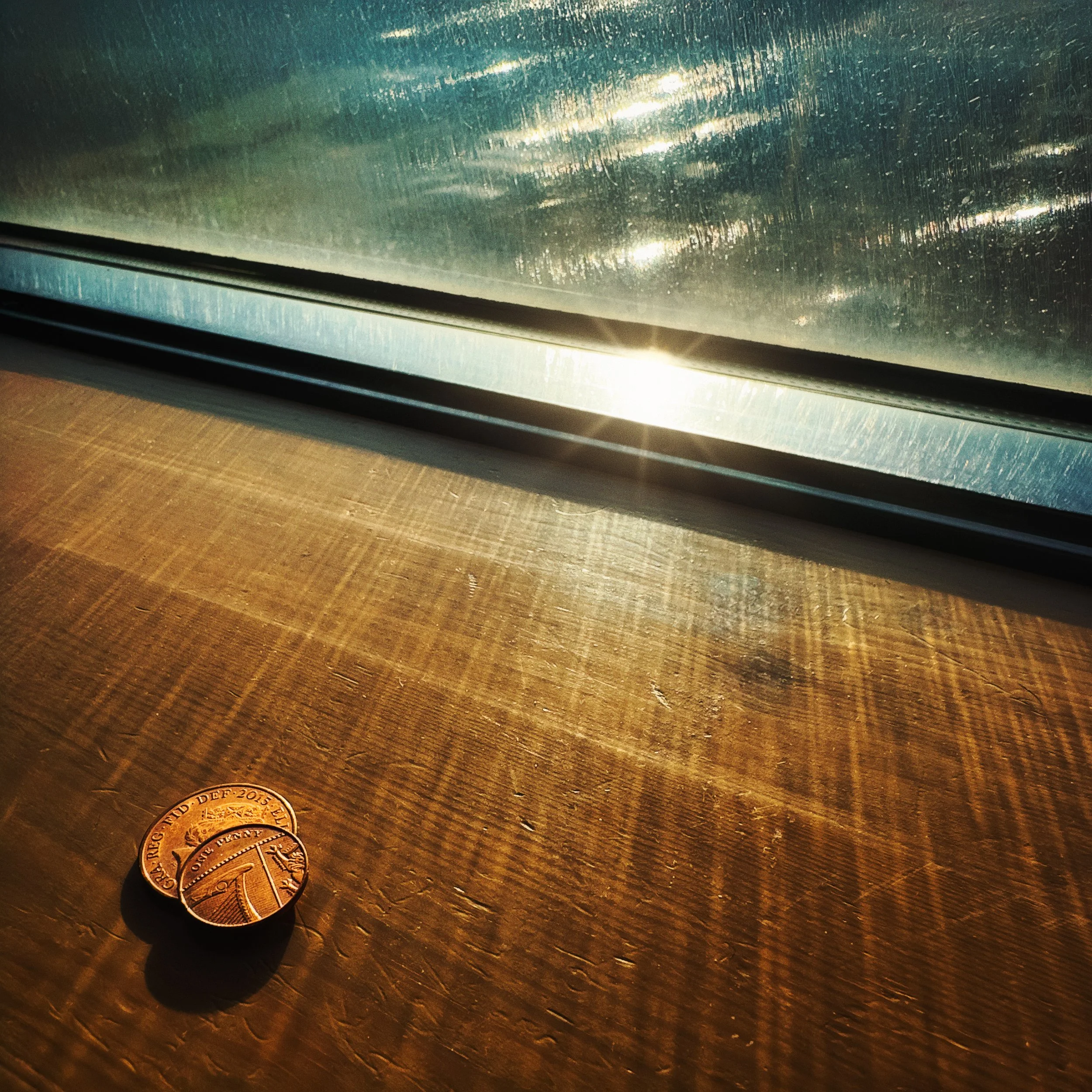
Consider the shadow cast by a window frame on a blank wall. The window frame is a functional object; the wall is a surface. Neither is particularly interesting as a subject. But the shadow the frame casts on the wall at a certain hour in late afternoon — a grid of light and dark, distorted slightly by the angle of the sun, perhaps broken by the undulations of old plaster — can be a striking graphic composition. The shadow has a shape. That shape has edges, proportions, and internal geometry. In many circumstances, the shadow is simply more compositionally interesting than the object casting it.
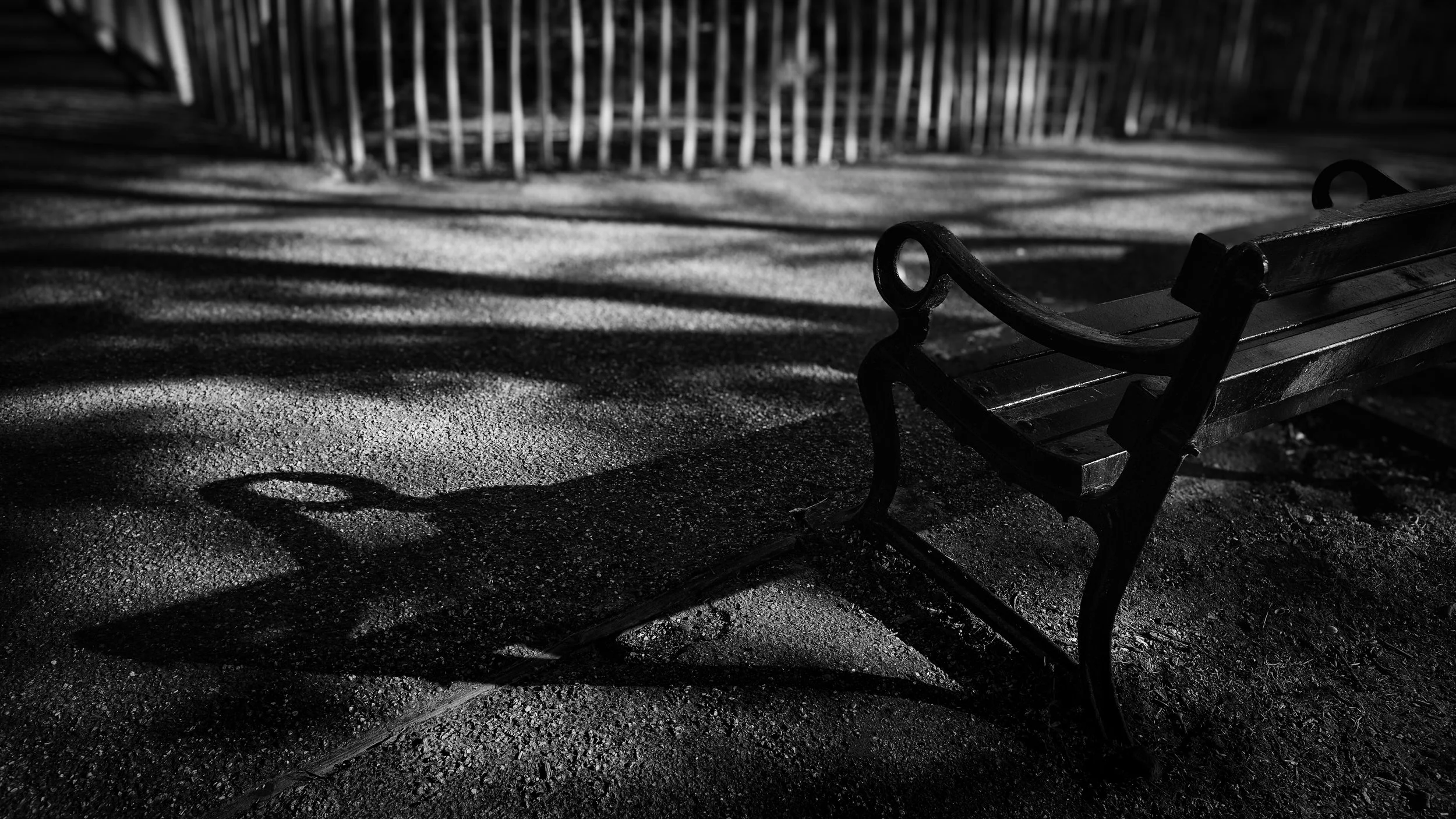
Once you have noticed this — and photographing it is the most effective way to notice it — it becomes impossible to unsee. Railings cast shadows on pavements that turn the ordinary into graphic pattern. A person walking in afternoon sun casts a shadow that is longer and more dramatically shaped than the person themselves. A tree at low sun spreads a shadow across a field that maps the entire structure of its branches onto the ground. The lamp, the bicycle wheel, the chair — in certain light, their shadows are the subjects.
The Emotional Register of Shadows
Shadow carries emotional weight that varies considerably with its character. This is not esoteric; it is a practical observation.
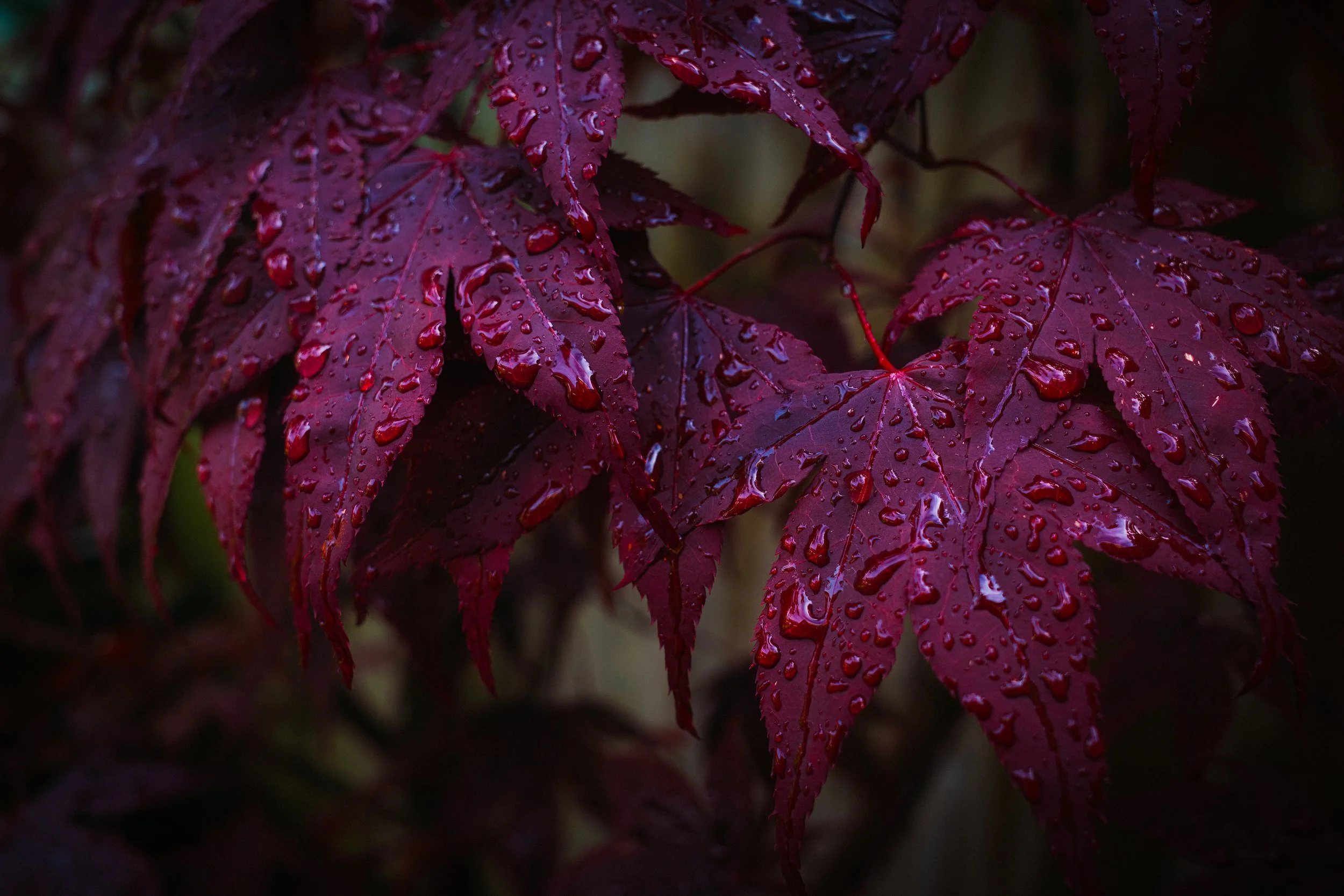
Long shadows, cast at golden hour, have a specific emotional quality: expansive, elegiac, retrospective. They suggest time passing, late afternoon, the day winding down. They make spaces feel larger. They have a quality of gentle melancholy.
Short, hard shadows at noon are harsh and expose everything. There is nowhere to hide in noon light. The shadows are small and dense. The light is merciless.
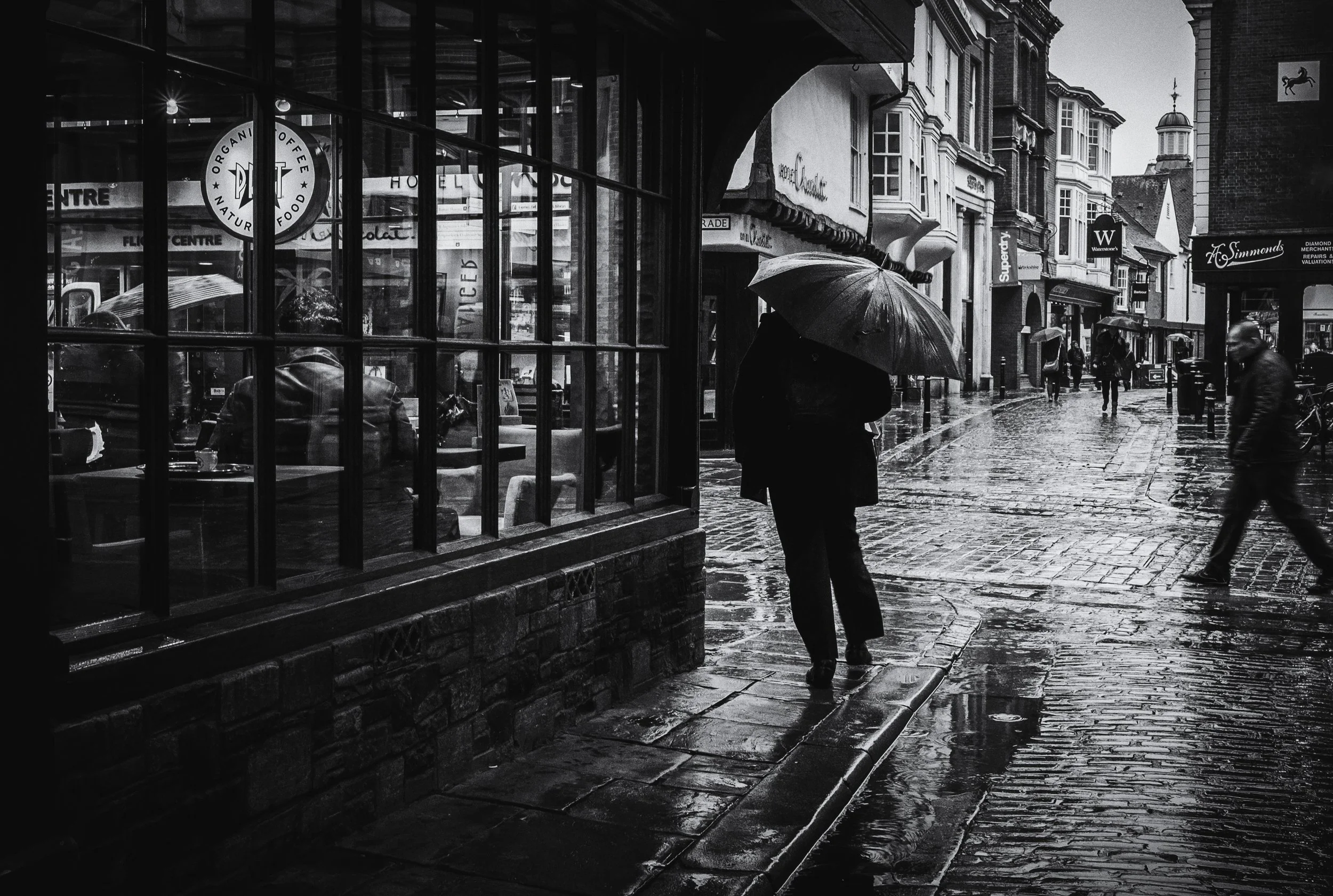
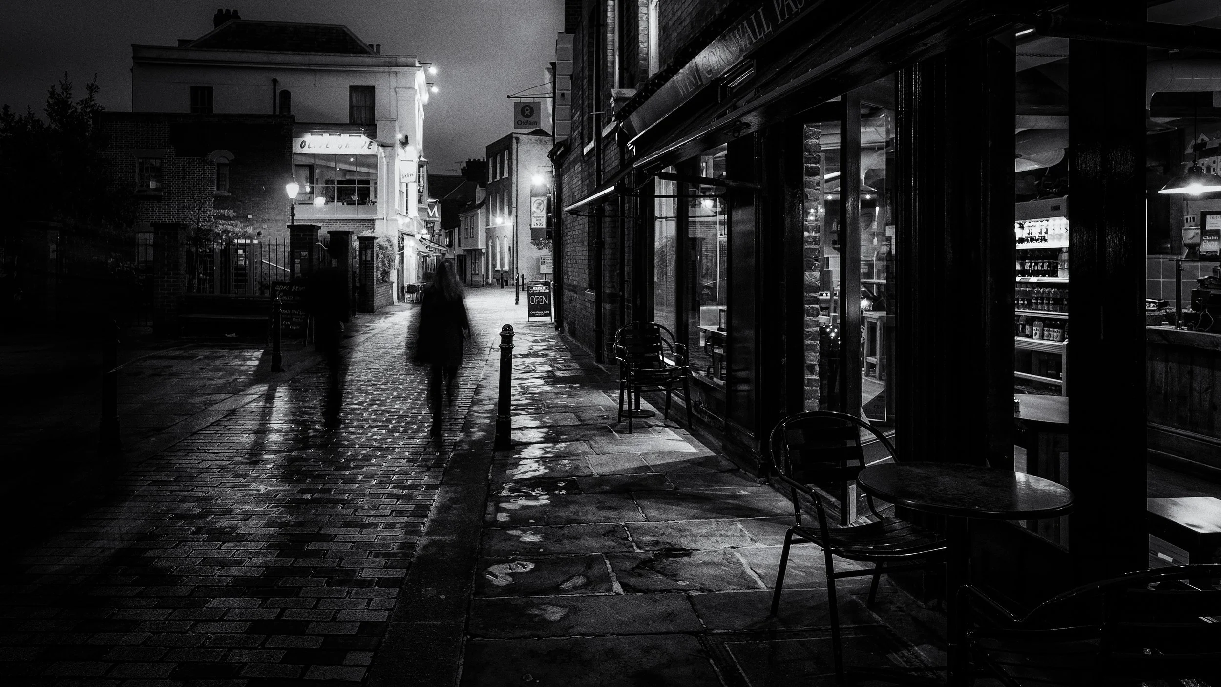
The shadow of a person walking alone at night on a lit pavement has an entirely different quality from the same shadow at 4pm on a summer afternoon, even if the length is similar. Context modulates the associations — but the associations are real and consistent, and they are worth attending to.
A shadow that is larger than the object casting it (long low-sun shadows, or the shadow of a small figure cast enormous on a wall by a nearby lamp) implies threat, scale discrepancy, and a kind of uncanny quality. Horror cinema uses this deliberately. So can you.
Silhouettes
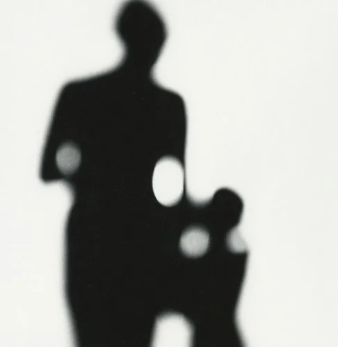
The silhouette is the limiting case: shadow so complete that the subject is reduced to pure outline. It is addressed fully in the Silhouettes article in this series. The relevant point here is that a silhouette is not a failure of exposure — it is a deliberate choice to trade all internal detail for the graphic power of outline. It requires that the outline be interesting enough to carry the image, which is its own discipline.
Photographers and the Mastery of Light
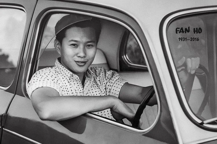
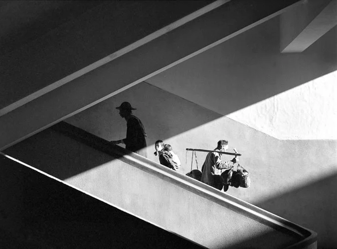
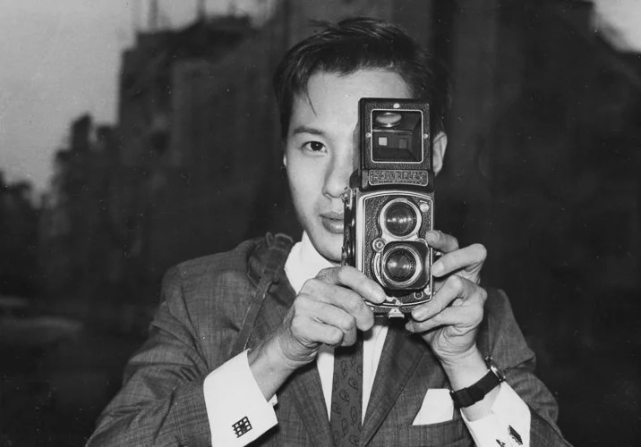
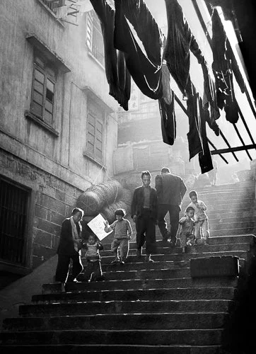
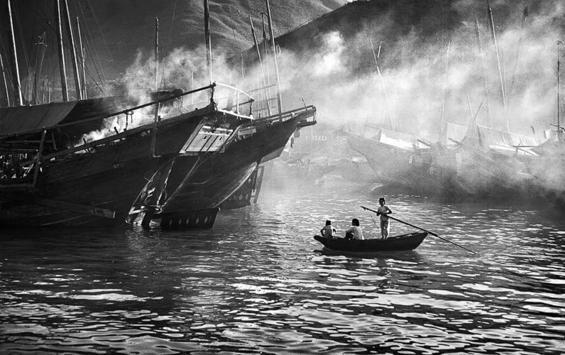
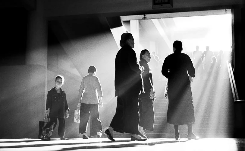
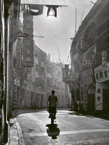
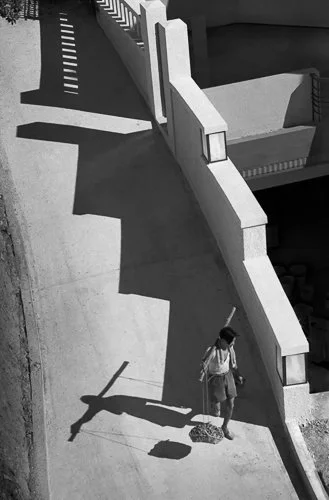
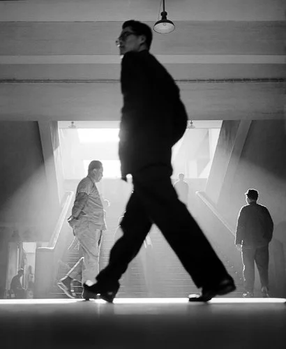
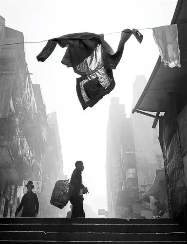
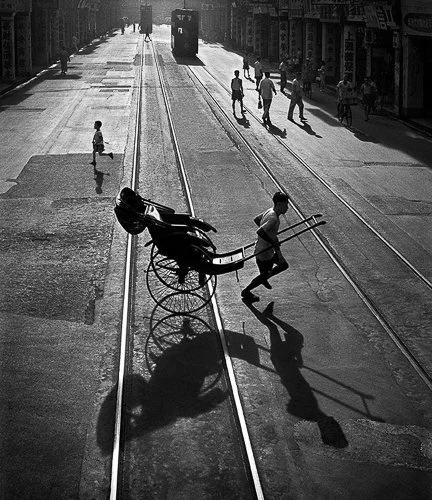
Fan Ho (1931–2016) was born in Shanghai, moved to Hong Kong in 1949, and made his most important work through the 1950s and early 1960s, in the streets, alleys, markets, and stairwells of a city in the process of defining itself.
His primary tool was a Rolleiflex twin-lens reflex camera — a medium-format instrument that you hold at waist level and look down into, which changes your relationship to the scene. You are not putting a camera to your eye and pointing it; you are looking down into a frame and composing. This matters because it meant Fan Ho was often shooting from a low angle, looking up at architectural structures, letting light fall into the frame from above.
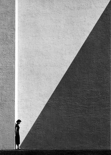
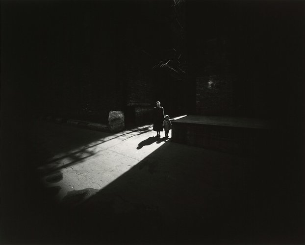
Approaching Shadow (1954) is his canonical image. A woman walks in strong directional light; ahead of her, an enormous diagonal shadow slices the pavement at a steep angle. She is, literally, approaching the shadow — but the image works because the shadow has become as much the subject as she is. The composition is almost entirely geometrical: the diagonal of the shadow against the pavement lines, the figure's position in relation to that geometry. The shadow is not a backdrop; it is an active compositional force that the figure is moving toward and will soon enter.
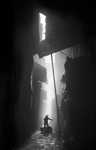
But Approaching Shadow can make Fan Ho seem like a one-trick image maker, which he was not. The Glorious (1959) shows a figure in a dark alleyway, lit from above through what appears to be an opening in the roof or a gap between buildings, with the light falling in a column that is itself the subject — a physical beam of light in a dark space, the figure providing scale. Homecoming (1955) uses a completely different quality of light: soft, diffuse, early-morning. The shadow work here is subtle and volumetric rather than graphic and geometric.
His philosophical position on shadow was explicit: he spoke of "the absence of light" as having its own beauty, and of shadow as a positive presence rather than a negative space. This is precisely the perceptual reorientation this article has been arguing for.
Fan Ho was also, it is worth noting, not the strict candid photographer he is sometimes described as. He pre-visualised compositions, directed subjects into the light, and returned to locations at specific times of day to catch the light he needed. He was, in this sense, working like Caravaggio — setting up the conditions for the image he had already seen in his mind, rather than reacting to what happened to be there. The print of Approaching Shadow sold at auction for nearly $50,000 — a figure that communicates, in the most direct possible market terms, what the photography world makes of this work.
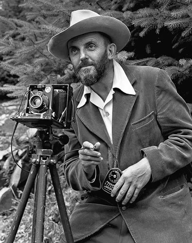
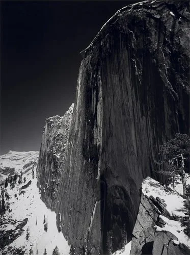
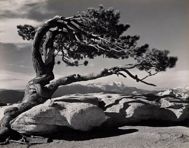
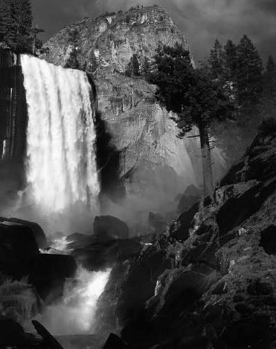
Ansel Adams (1902–1984) is the most discussed American photographer and, in some circles, the most discussed photographer full stop, which has had the paradoxical effect of making him seem like a cliché. He is not. His technical contribution — the Zone System, developed with Fred Archer in the late 1930s and early 1940s — is one of the most precise and practical frameworks for thinking about light and tone in photography.
The Zone System is not simply "he was good at tonal range". It is a formal method for pre-visualising the tonal range of a final print before the shutter is pressed, and then systematically adjusting both exposure and development (in film photography) to achieve that pre-visualised result. The system divides the tonal range from pure black (Zone 0) to pure white (Zone X) into eleven zones of luminance, each one stop apart. The idea is not that you record what the light meter says — it is that you decide which zone each significant area of the scene should occupy in the final print, and then expose and develop accordingly.
The photographic relevance of this to the light and shadow question is direct: Adams was not thinking about light as something that happened to be present and that he was trying to faithfully reproduce. He was thinking about the tonal structure of the image — where the darkest shadow would fall, where the brightest highlight would land, and what the relationship between them would say. The shadow in an Adams print is placed deliberately. The highlight is where he decided it would be.
Digital photographers do exactly this when adjusting highlights, shadows, whites, and blacks in Lightroom or any other editing software. The language is different; the conceptual operation is identical.
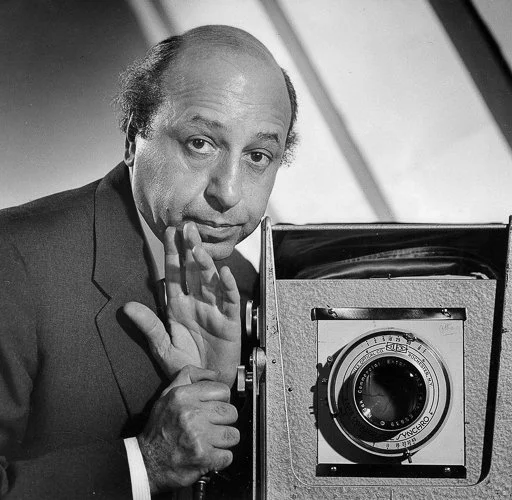
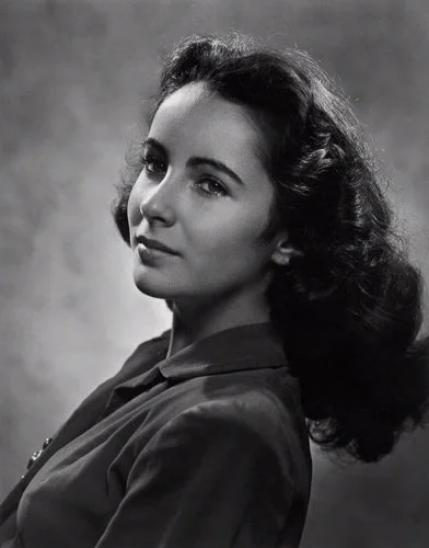
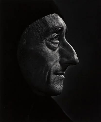
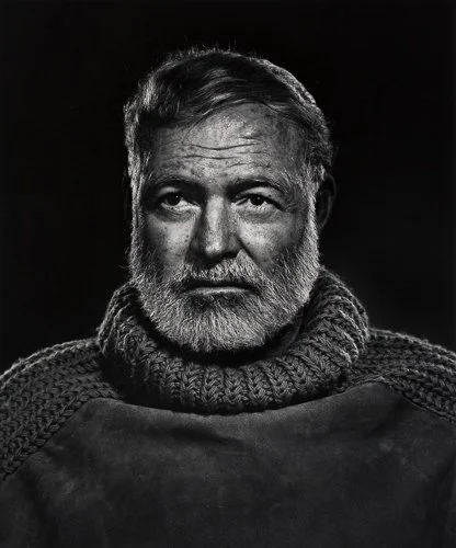
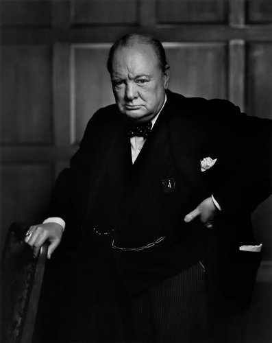
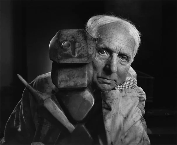
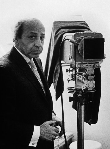
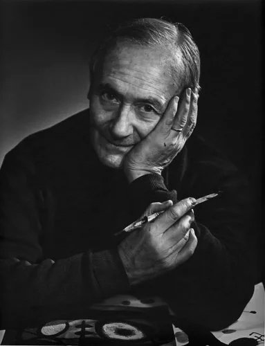
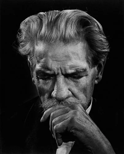
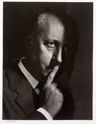
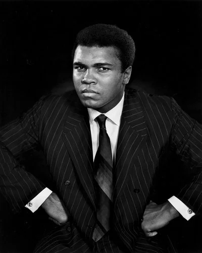
Yousuf Karsh (1908–2002) was born in Armenia, survived the Armenian genocide, was sent to live with an uncle in Canada, and became the most celebrated portrait photographer of the twentieth century. His subjects included Churchill, Hemingway, Einstein, Picasso, Humphrey Bogart, Audrey Hepburn, and Grace Kelly — a list that reads like a roll-call of the mid-twentieth century's definition of significance.
His portrait of Winston Churchill (1941) is almost certainly one of the most reproduced photographs in history. The story of its making is famous: Churchill came to Karsh's Ottawa studio in December 1941, fresh from addressing the Canadian parliament, cigar in hand and disinclined to be delayed. He had agreed to one minute. Karsh set up his lights — a large key light to Churchill's left, a fill light to retain some shadow detail without flattening the contrast, deep shadow on the right side. Then, immediately before the exposure, he stepped forward and removed the cigar from Churchill's mouth without asking.
Churchill's expression — outrage, defiance, barely contained fury — is what made the photograph. But the lighting is what makes the portrait: the light reveals the structure of the face as a map of character. The deep-set eyes in shadow under heavy brows, the jowls, the set of the jaw. Karsh believed, and the image supports the belief, that light could reveal the interior of a person — that with the right light, the face becomes a document of the life behind it.
Karsh's studio notes on lighting are detailed and consistent: he used the same basic three-point approach with modifications for each subject, always seeking what he called the "essential truth" of the face rather than flattery. The quality of shadow in his portraits is always deliberate and always psychological — it is not decorative darkness but information about character.

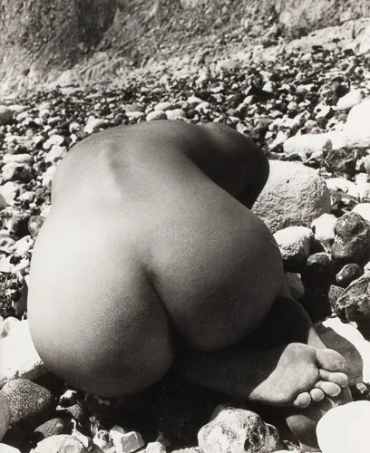
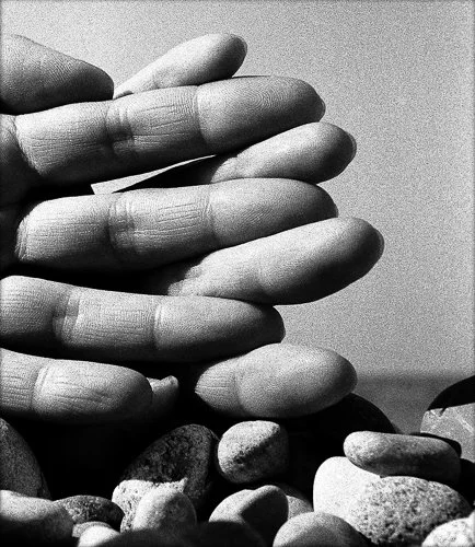
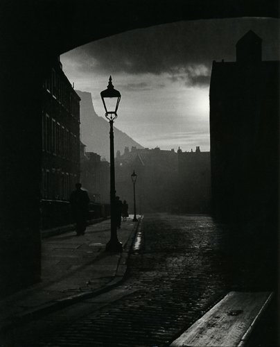
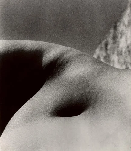
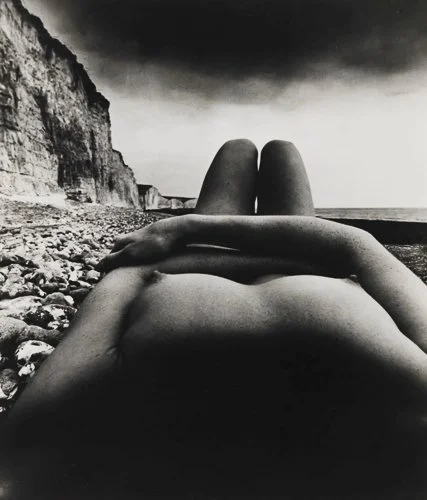
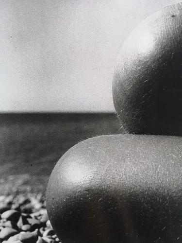
Bill Brandt (1904–1983) is less universally known than Adams or Karsh but belongs in this company. Born in Hamburg, working primarily in Britain, his career spans documentary social photography (the remarkable class-contrast work of the 1930s), wartime London in the Blitz (the Underground shelter photographs), and, in his later career, something else entirely.
His late nudes, made from the 1940s onwards using an extreme wide-angle lens (a fixed wide-angle in an old wooden police camera, with a very small aperture and peculiar optical properties), are among the most formally radical photographs in the medium. The wide-angle lens and the low-light conditions — sometimes barely candlelit — distort the human body into abstract landscape forms. A knee becomes a cliff face. A shoulder becomes a dune. The light, partial and dramatic, renders skin as if it were stone. Shadow fills the frame in great swathes, and the body emerges from it as form rather than as person.
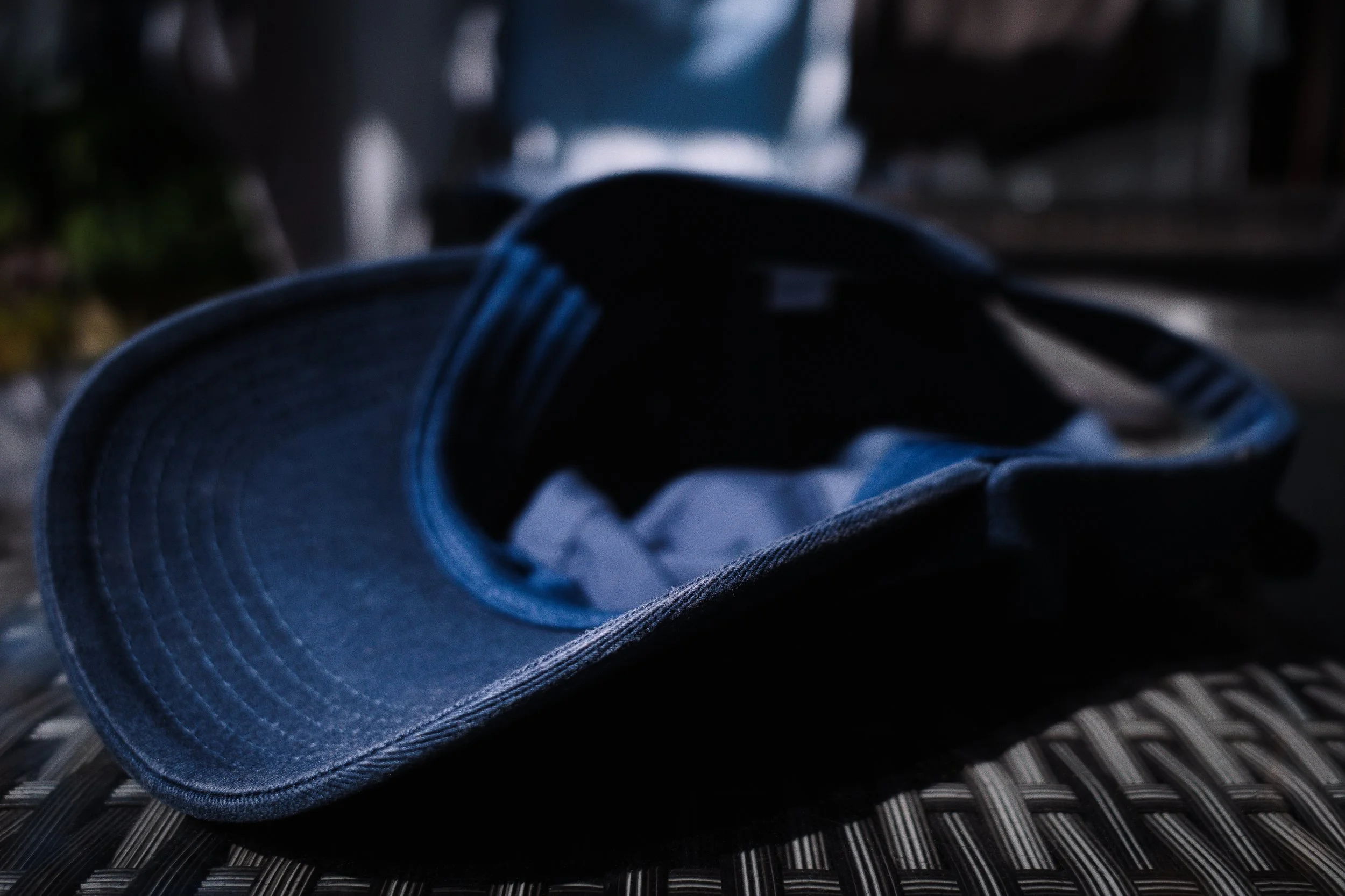
What Brandt demonstrates — and it is relevant here — is that shadow can reduce a subject to its essential form by removing everything but the structure that the light falls on. In very low light with hard directional light, you do not get texture (too much shadow) or colour (too little light for colour to register as such). You get shape, edge, and the geometry of light versus dark. Sometimes that is exactly what the image needs.
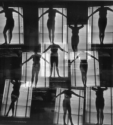
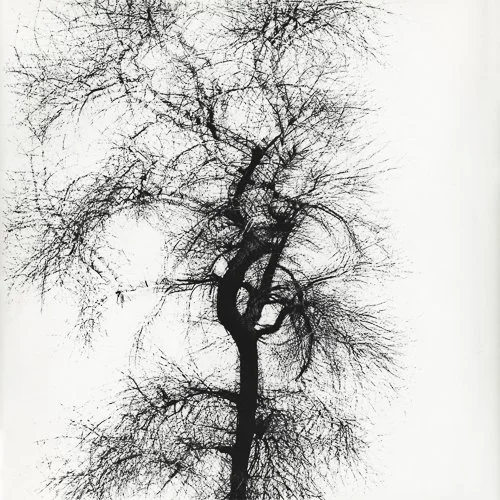
Harry Callahan (1912–1999) is the photographer's photographer — enormously influential, not universally known outside the field. His light experiments are formally interesting in the specific context of this article because they involve accumulation rather than direction.
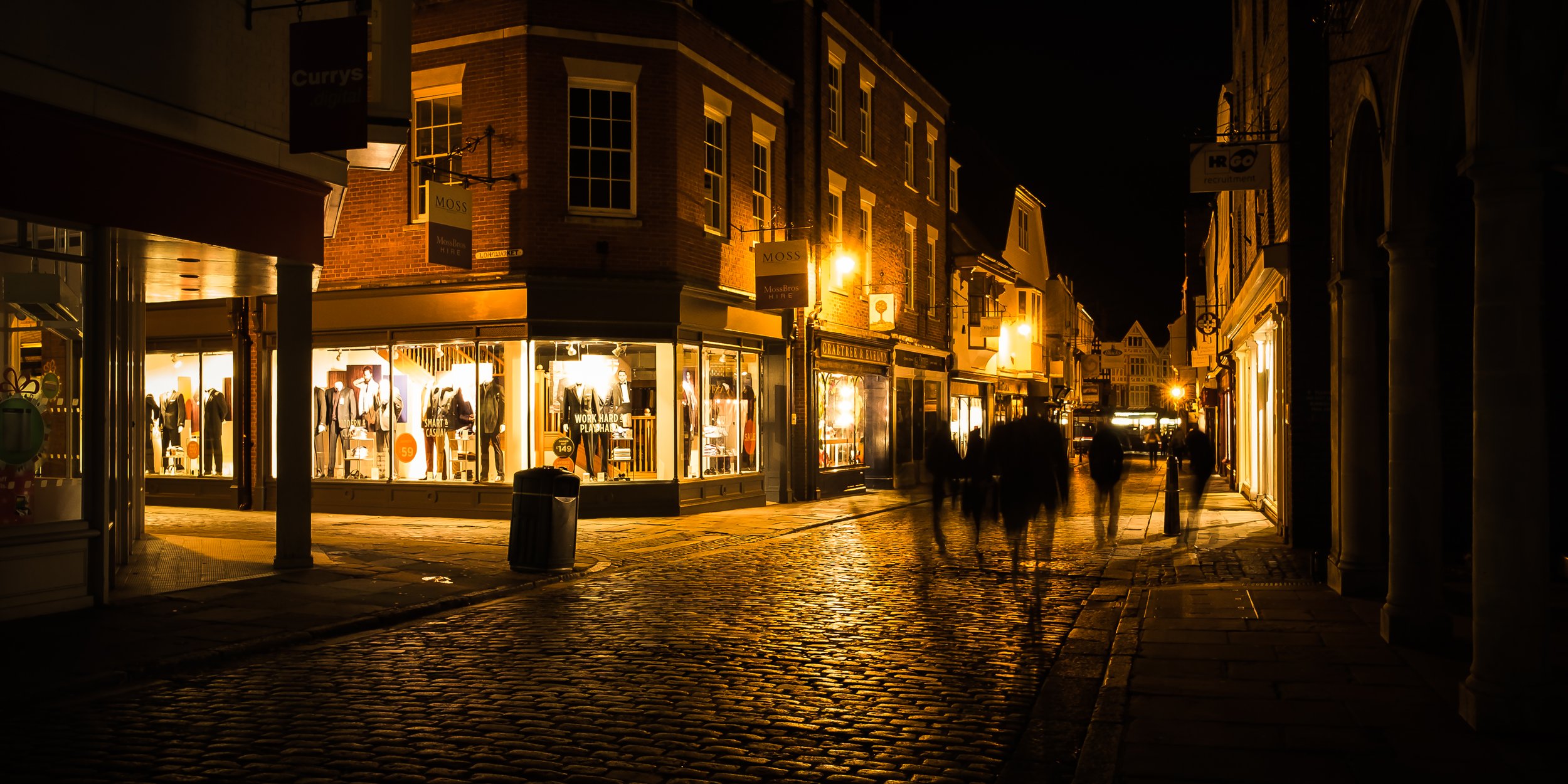
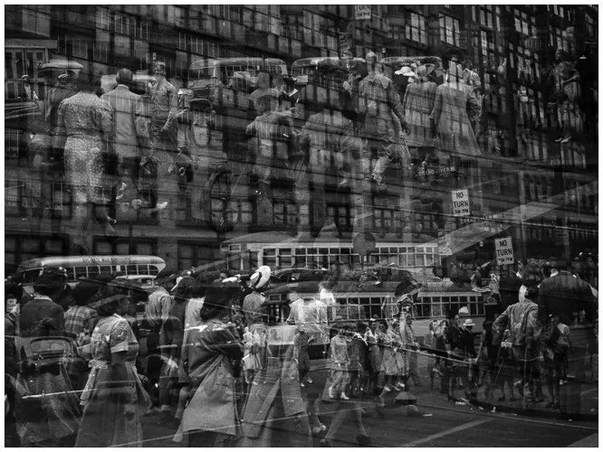
His long exposures and multiple exposures — particularly his photographs of Eleanor (his wife, his primary subject for decades) — use time to build up light in ways that the single-moment photograph cannot. A long exposure in low light accumulates shadow; what is moving becomes ghosted or disappears; what is stationary against a bright background appears with particular clarity. Shadow is not an instant but a duration.
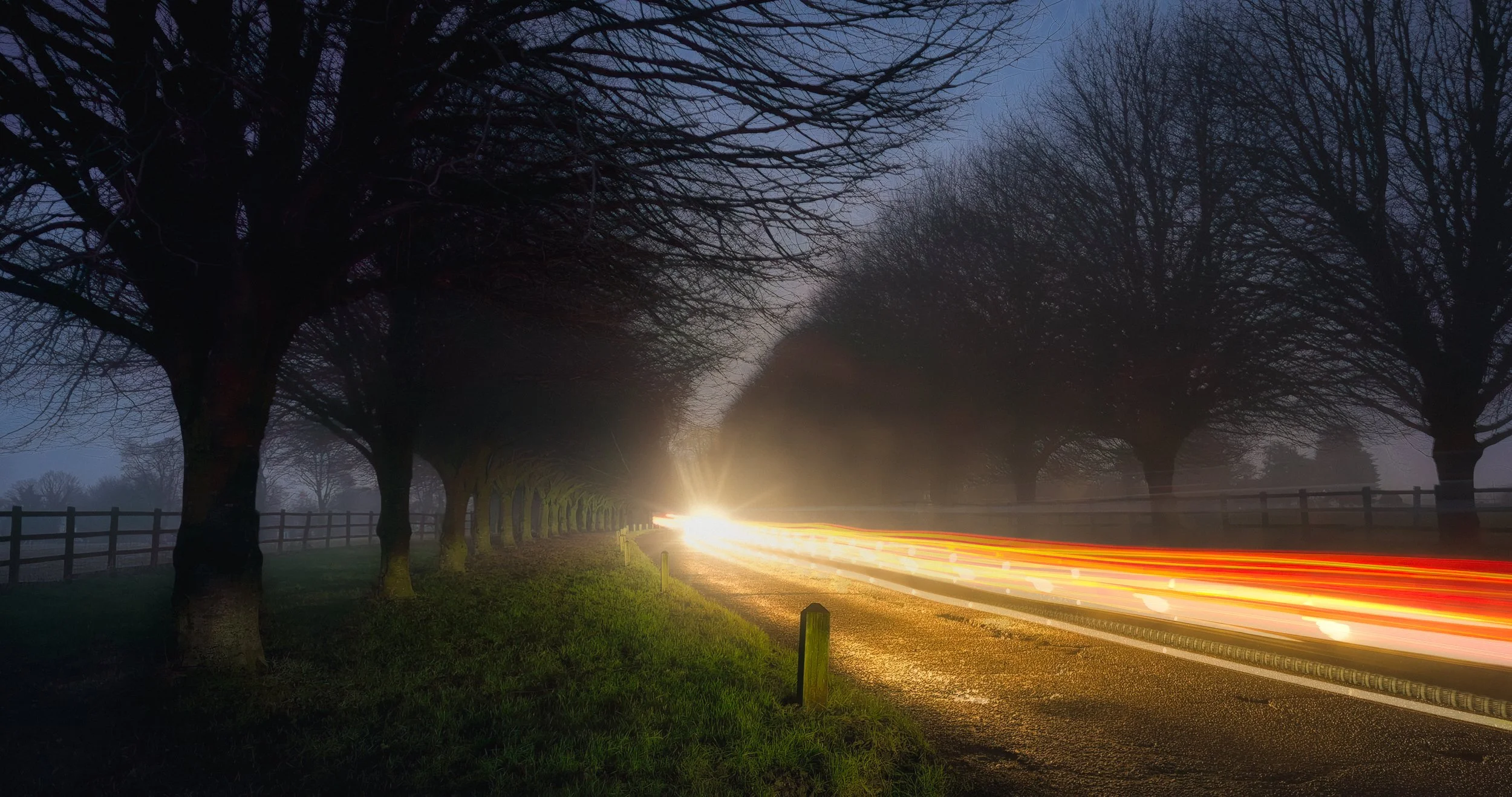
This is a different relationship with shadow from anything discussed so far: not a single moment of light and dark, but time made visible as tonal distribution. It is an advanced approach, but the principle it rests on — that shadow is a product of the light you have, and that you can choose how much or how little to accumulate — is available to any photographer willing to put the camera on a tripod and think about time.
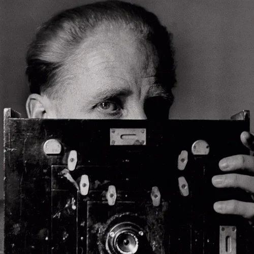
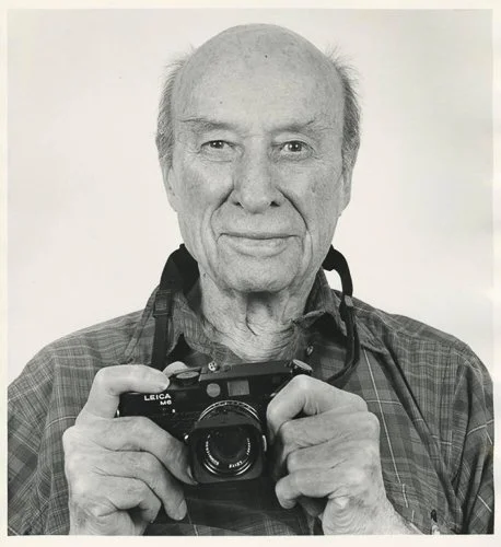
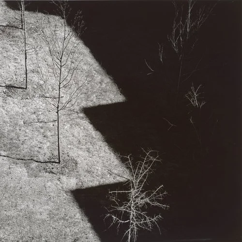
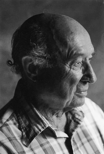
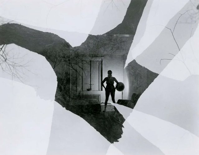
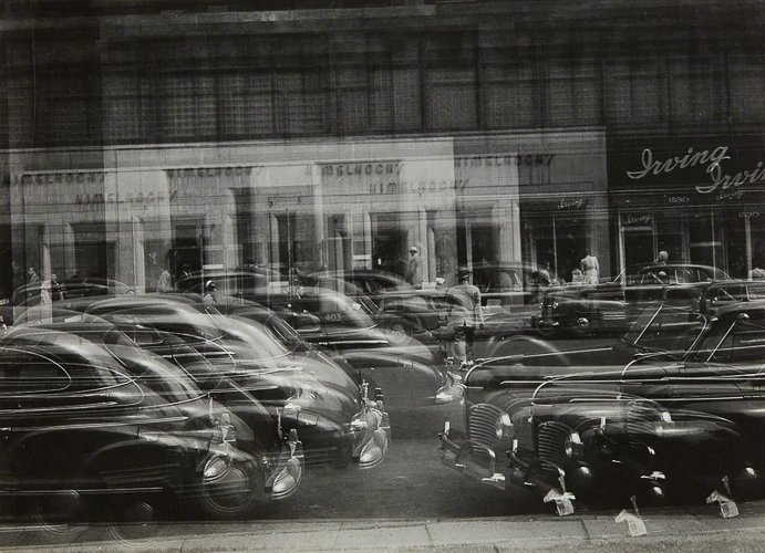
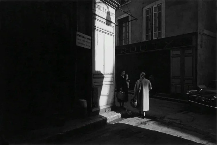
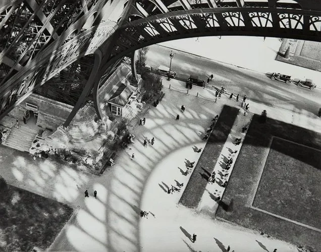
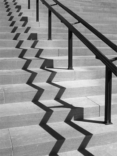
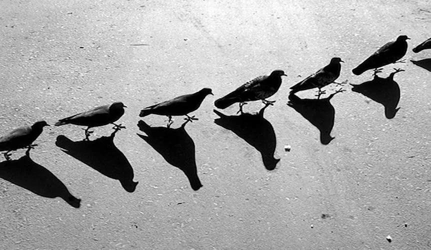
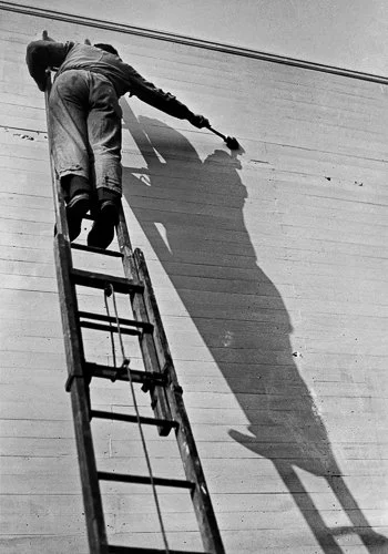
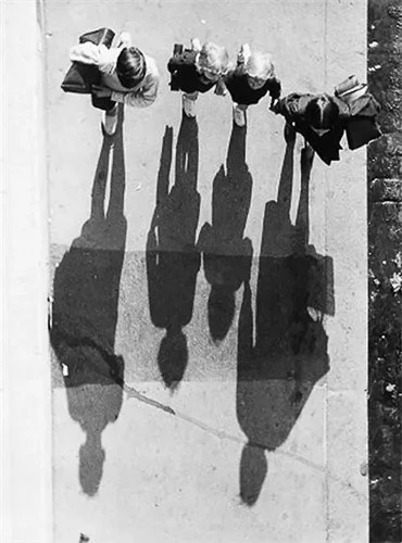
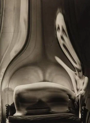
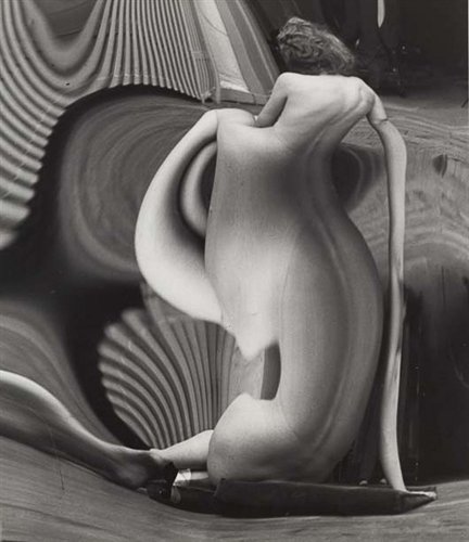
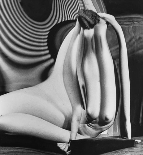
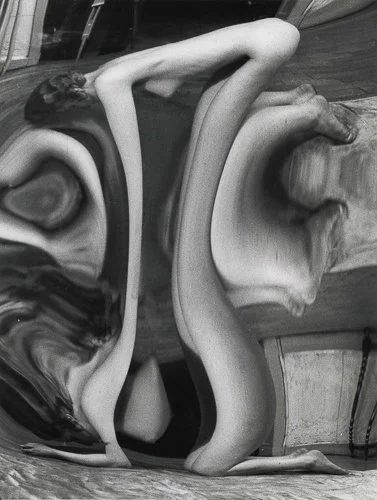
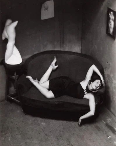
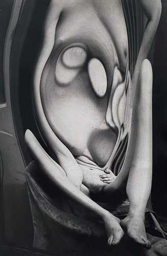
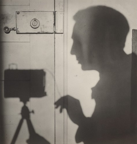
André Kertész (1894–1985) is impossible not to mention in any serious discussion of shadow in photography. His Shadow of the Eiffel Tower (1929) and Satiric Dancer (1926) are masterclasses in the use of shadow as compositional architecture. But it is perhaps his less famous work that is more instructive: throughout his career, from Budapest to Paris to New York, Kertész consistently used the shadow of the window or the railing or the lamp post not as incidental backdrop but as the structural spine of the image.
His contribution to this specific conversation is the demonstration that the shadow of an object can be the primary graphic element of a composition, with the object itself serving merely as the explanation for what the shadow is doing. The railing is there to justify the bars of shadow. The window exists to explain the grid. This is the inversion that opens up shadow photography as a full creative mode.
Resources
A clear, practically focused overview of the hard/soft distinction with photographic examples. Useful alongside the conceptual framework here; the examples are simple and the comparisons direct.
Tucker is a reliable explainer of the relationship between the tonal range your eye sees and what a camera can capture. The dynamic range question — why the shadow that looks like shadow to your eye records as black, and the highlight that looks bright blows to white — is practical and important. Worth watching when you start to feel frustrated that your camera isn't capturing what you thought you were seeing.
The clickbait title slightly undersells what is actually a well-structured, practical video built around a genuinely useful idea: that light doesn't just illuminate a composition — it creates one. Shadows act as ready-made frames, shapes, and negative space before any subject arrives; the photographer's job is to recognise the composition that light has already made, then wait for life to move through it. Sfakianos teaches this as a three-step progression from simple (find a clean shadow pattern and frame it) through to complex (connecting two subjects across separate pockets of light), which maps well onto the exercises in this article. The specific exposure guidance for high-contrast scenes is a practical bonus.
A live-stream presentation from Alex at The Photographic Eye, built around a close study of celebrity portrait photographer Vincent Peters as a case study in what shadow actually does. The central argument — that photographers talk endlessly about light while the shadow is doing most of the emotional work — is one worth sitting with. Peters shoots with Fresnel lenses of the kind used on old Hollywood sets, producing the sharply defined shadow edges that give his portraits their quality; Alex unpacks exactly why that matters. Best watched after you've spent some time shooting with available light and have started to notice that your shadows feel soft and directionless. A good prompt to start looking at them more deliberately.
Give it a Try!
The Direction Walk — Choose a single subject: a piece of fruit, a friend's face, a textured object, or a section of wall with visible surface texture. Photograph it four times, changing only the direction of the light source. Front-lit (light behind the camera), left-side-lit, right-side-lit, back-lit. If you are working outdoors, the sun will move if you wait long enough; indoors, walk a lamp around the subject, or move the subject around a fixed window. Compare all four images. The aim is not to decide which is "best" — it is to understand, viscerally and directly, what direction does to a subject. No amount of description substitutes for this exercise. Do it with something mundane, like an orange. An orange lit from the front is a picture of an orange. An orange in hard side light is a study in surface texture and volume. Knowing this in your body, not just your head, changes how you look at every scene you photograph afterwards.
The Shadow Subject — Make three photographs in which the shadow is the primary subject of the image — not incidental, not background, but the thing the image is actually about. A window frame's shadow on a wall. The shadow of railings on a pavement at a low-sun angle. A person's shadow stretched long across a field at the end of the day. The object casting the shadow should ideally be absent from the frame, or present only as an incidental element. The aim is to train the eye to see shadows as compositional objects in their own right — shapes with edges, proportions, and graphic character — rather than as consequences of subjects. This is the perceptual shift the article is trying to produce, and making the photographs is how the shift actually happens.
The Torch Test — In a darkened room, with a small tabletop object (a cup, an orange, a piece of crumpled paper, a hand), use a single torch or small lamp as your only light source. Move it through at least six positions: directly in front, 45 degrees left, 90 degrees left (side), 135 degrees left (Rembrandt), directly behind, and directly above. Photograph from each position without changing the camera or the subject. The aim is to understand, in the most stripped-back way possible, how the direction of light affects form, texture, mood, and the subject's readability. A controlled experiment with a torch in a dark room is not glamorous. It is, however, one of the most efficient ways to learn lighting that exists — and the principles you will have understood after twenty minutes of torch work apply to every photograph you make for the rest of your life, in every condition and with any camera.