The Histogram
Your camera's LCD screen is a liar. It is a small, backlit panel whose brightness you may have adjusted months ago and never thought about since, viewed in ambient light that varies from bright sunshine to a dimly lit room. Your brain compensates automatically for all of this, and your brain is also a liar, because it desperately wants the image to look good. The result is that you will frequently convince yourself a photograph is well exposed when the shadow detail is already gone, or convince yourself the highlights are fine when they have been clipping since stop one.
The histogram tells you none of that. The histogram is indifferent to what you want. It shows you, objectively and without editorialising, the precise tonal distribution of the image: every pixel, counted and plotted, from the darkest value to the brightest. It cannot be affected by your screen's brightness setting. It does not care whether the photograph is of your child, a landscape you drove three hours to reach, or a test shot of a grey card. It simply shows you what is there.
This is genuinely one of the most useful things a digital camera can do, and a remarkable number of photographers ignore it.
There is, however, an important caveat to establish before we go any further: the histogram tells you nothing about whether the image looks good. A histogram can be technically flawless — tones spread across the full range, no clipping at either edge — and the photograph can still be dull, poorly composed, and emotionally empty. A masterpiece can have a histogram that would make a laboratory technician recoil. The histogram is a diagnostic tool, not a judge of quality. Once you understand that, you can use it properly.
What a Histogram Actually Is
A digital image is made of pixels. Each pixel has a brightness value. In an 8-bit image — which is what a standard JPEG gives you — that value runs from 0 (pure black, no brightness at all) to 255 (pure white, maximum brightness). Every pixel in your image sits somewhere on that scale.
A histogram is simply a frequency distribution: a count of how many pixels in your image fall at each brightness value, plotted as a graph. The horizontal axis runs from 0 on the left to 255 on the right. The vertical axis shows the number of pixels at each value — taller bars mean more pixels at that brightness. That is genuinely all there is to it.
If you have shot in RAW rather than JPEG, the underlying bit depth is greater: 12-bit RAW gives 4,096 distinct tonal values per channel; 14-bit RAW gives 16,384. Your camera's display histogram — and the histogram shown by most editing applications — typically maps these into 256 display columns regardless of the underlying depth.
This is one reason the histogram displayed in-camera (which is always generated from a JPEG interpretation of the RAW data) can differ slightly at the edges from the histogram you see when you open the same file in Lightroom or Capture One. The JPEG rendering applies tone curves, saturation adjustments, and in-camera sharpening that the editing application has not yet applied.
If you are shooting RAW and making decisions about highlight recovery, be aware that the in-camera histogram is an approximation: the actual RAW data typically contains slightly more information at the bright end than the camera's histogram suggests.
One important thing the histogram does not show you is where in the image particular tones are. The histogram describes the tonal distribution of the whole image, not its spatial structure. Two completely different-looking photographs can produce almost identical histograms. A portrait of a person with pale skin against a dark background and a landscape with a bright sky over a dark foreground might have similar-looking histograms while being nothing alike as images. The histogram tells you what tones are present; it tells you nothing about where they are.
A Brief History
The histogram did not arrive with digital photography. It arrived much earlier — it was just analogue.
Ansel Adams and the Zone System
In 1939 and 1940, Ansel Adams and Fred Archer developed the Zone System at the Art Center School in Los Angeles. Adams, working in large-format film photography, needed a systematic way to connect the tones he saw in a scene to the tones he wanted in the final print. His solution was to divide the entire tonal range into eleven zones — Zone 0 being pure black, Zone X being pure white — and to develop a set of techniques for controlling where particular scene values would fall within those zones, both in exposure and in darkroom development.
The Zone System is the direct conceptual predecessor of the histogram. It maps the tonal range of a scene onto the tonal range of an output medium, systematically and quantitatively. The difference is that Adams did this through careful visualisation, a calibrated light meter, and variable film development; the histogram does it automatically, in real time, without Adams's decades of practice. For a full explanation of the Zone System and its relationship to 18% grey — the perceptual anchor that holds the whole thing together — see the Understanding 18% Grey article.
The Digital Histogram
The first digital cameras with histogram display arrived in the late 1990s and early 2000s. Early consumer digital cameras were limited in how much post-capture feedback they offered, but as sensor quality improved and RAW workflows became practical, the histogram became an essential tool. By the mid-2000s, histogram display had become standard on DSLR cameras, both in post-capture playback and, eventually, in live view.
It is worth pausing to appreciate what this actually means. Film photographers working before this era had no way of obtaining instant, objective, quantitative feedback about the tonal distribution of an image. They could use a spot meter and extrapolate — which is essentially what Adams was doing manually — but they could not simply look at a graph and see whether they had captured shadow detail. The histogram, in this respect, is one of the most practically useful inventions in photographic history.
ETTR : A Specific Innovation
A related and important innovation came in 2003, when photographer and writer Michael Reichmann, after a conversation with Thomas Knoll (the original developer of Adobe Photoshop and the Camera Raw plug-in), published an article on his website describing the technique of exposing to the right. We will examine ETTR in detail below; its history is worth noting here because it demonstrates how the availability of the histogram enabled an entirely new approach to RAW capture that had no analogue equivalent.
Optimizing Exposure, Reichmann’s original 2003 article is the text that introduced expose-to-the-right to the wider photography community. It predates Lightroom (Camera Raw was new at the time and Lightroom did not yet exist), and some of the specific software references are dated — but the underlying argument about where tonal information lives in a digital RAW file remains entirely valid and is explained here from first principles. Reading it alongside a modern ETTR tutorial gives a useful sense of how much and how little has changed in RAW workflow thinking over twenty years.
Reading the Luminance Histogram
The luminance histogram is what your camera shows you by default — a single histogram that treats the image as if it were monochrome, representing the overall brightness distribution regardless of colour. This is the histogram to learn first.
The key to reading it is to stop looking for a "correct" shape. There is no universally correct histogram shape. What you are looking for is:
Whether the histogram reflects your creative intention for the image
Whether there is clipping at either edge that you did not intend
With those two questions in mind, here are the shapes you will encounter.
The Well-Distributed Histogram
The histogram spreads across the full tonal range from left to right, without significant spikes against either edge. This is what photography tutorials typically show as "the ideal histogram," and it can be useful to understand why — it means the image uses the full tonal scale, from near-black to near-white, with tones distributed across the range.
However, a well-distributed histogram does not mean the exposure is correct for the subject. It means the image contains a full range of tones. If you are photographing a snow scene, a well-distributed histogram might indicate the snow is being rendered as mid-grey, which is not correct. If you are making a low-key moody portrait, a well-distributed histogram might mean you have lifted the shadows too much for the mood you wanted. Use the well-distributed histogram as a starting reference, not as a target.
The Left-Skewed (Dark) Histogram
The bulk of the data is bunched toward the left side of the histogram, with relatively little at the right. The image is predominantly dark.
This could mean one of two things, and the histogram alone cannot tell you which:
It is a correctly exposed low-key image. A dramatic portrait with deep shadows, a night scene, an intimate interior study — these images should be left-skewed. The darkness is the intention.
It is an underexposed image that should have more tonal information. The camera was set too dark and the subject has lost shadow detail, midtones have been pushed into the shadow range, and the overall image is flatter and noisier than it should be.
How to tell which: look at the left edge of the histogram. Is there a spike pressed against the far left wall? If so, shadow clipping has occurred and detail is lost. Is the image intentionally dark? If the shadows are compressed but not fully lost, and the image looks the way you intended, you are fine.
The Right-Skewed (Bright) Histogram
The bulk of the data is bunched toward the right. The image is predominantly bright.
Again, two possible interpretations:
A correctly exposed high-key image. Fashion photography on white backgrounds, product photography, bright outdoor portraiture in open shade — these often and deliberately produce right-skewed histograms. The intention is brightness.
An overexposed image where highlights have been lost. The camera has rendered a midtone scene too brightly, and the bright areas have run off the right edge.
Look at the right edge for clipping (more on this below). If there is no clipping, and the image looks bright for the right reasons, the histogram is correct.
Clipping and the Edge Spike
This is the histogram feature that matters most when you are trying to protect tonal data. When a significant number of pixels are at exactly 0 (pure black) or exactly 255 (pure white), those values have been clipped: they have hit the wall of the tonal scale and there is nothing beyond them. Any detail that should have been there is gone.
In the histogram, this appears as a spike or bar pressed hard against the left or right edge. The taller the spike, the more pixels are clipped.
A very small spike at either end may be entirely acceptable. A specular highlight — the pure white reflection of a light source off a shiny surface — is expected to clip. A small area of true black in a shadow with no detail to preserve is fine. But a large spike, or a histogram whose data runs off the edge entirely, indicates meaningful lost information.
On the highlight (right) side: clipped highlights are, in most situations, more problematic than clipped shadows. RAW files can typically recover one to two stops of overexposed highlight information, but there is an absolute ceiling: once all three colour channels are clipped to white simultaneously, there is genuinely nothing there to recover. (See the RGB histograms section below — a channel can be clipped even when the luminance histogram looks clear.)
On the shadow (left) side: clipped shadows lose detail, but lifting dark shadows in a RAW file is often possible without visible artefact — though it will reveal noise, because shadow areas contain less signal relative to noise than bright areas. Whether this is acceptable depends on the image.
Your camera almost certainly has a highlight clipping warning (sometimes called "blinkies" or "the blinking highlights") — a playback mode where clipped highlight areas flash on and off on the LCD. This is a quick visual complement to the histogram. It does not replace the histogram, but it tells you where in the image the clipping is, which the histogram cannot.
The Narrow, Centrally Bunched Histogram
All the tonal data is packed into a small central range, with empty space at both the left and right ends. The image has no deep blacks and no bright whites — it is low in contrast, occupying only a portion of the available tonal scale.
This is the histogram you typically get from a scene photographed in flat, even light: an overcast day, a studio with soft boxes and no deep shadow, a subject photographed in full shade. It is not wrong, but the image will usually benefit from expanding the tonal range in editing.
In most editing applications, dragging the black point handle to the right until it meets the start of the tonal data, and the white point handle to the left until it meets the end of the data, will immediately improve the contrast of the image. The auto-levels or auto-tone functions in most editors do exactly this.
The Bimodal Histogram
Two separate peaks, one toward the left and one toward the right, with a valley between them. This is the histogram of a high-contrast scene.
The classic examples: a landscape with a bright sky and a darker foreground. A person or object lit by a lamp against a dark background. A sunset with a silhouetted foreground. The left peak represents the shadow mass; the right peak represents the highlight mass; the valley in between is the zone where relatively few pixels fall — neither shadow nor highlight.
This histogram tells you something important: the scene has more dynamic range than the camera may be able to capture comfortably in a single exposure. The valley between the peaks is where the tones are transitioning, and what you do about it depends on the image. You can expose for the highlights and accept lost shadow detail; expose for the shadows and accept blown highlights; use a graduated neutral density filter to reduce the contrast of the scene before you shoot; shoot multiple exposures and blend them; or accept the trade-off consciously. The histogram identifies the problem. The photographic judgement determines the solution.
Combing (Gaps in the Histogram)
After heavy editing — particularly multiple rounds of JPEG editing — the histogram can develop a "combed" or spiky appearance: gaps at regular intervals across the histogram, like teeth on a comb.
This is tonal posterisation. When an 8-bit JPEG is edited and re-saved repeatedly, the tonal data is redistributed with each pass, and some values end up with no pixels while neighbouring values accumulate them. The result is visible as a loss of smooth tonal gradation — a step-like quality in what should be smooth gradients, particularly noticeable in skies or skin.
This is one of the most practical arguments for shooting RAW and doing all significant editing before any export to JPEG. RAW files, edited once in a high-bit-depth application, will not show combing. A JPEG that has been edited, saved, reopened, edited again, and re-saved will. The more rounds of processing, the worse the combing becomes.
RGB Histograms : Reading Colour Channels
The luminance histogram shows a single graph representing overall brightness. The RGB histogram shows three separate histograms — one each for the red, green, and blue colour channels — overlaid or displayed in separate panels. This is a more complete picture, and in some situations it is the only one that catches a problem.
The reason this matters: a colour channel can be clipped even when the luminance histogram appears clean.
Consider a vivid red sunset. The red channel contains the very bright red tones of the sky. Even if the overall luminance of those sky pixels is moderate — mixed with blue and green values that bring the average down — the red channel alone may be spiking off the right edge. The luminance histogram would show no clipping. The RGB histogram would show the red channel is maxed out. That red detail is gone.
The same issue arises with:
Bright orange and yellow tones in autumn foliage
Deep, saturated blue skies
Vivid artificial lighting, particularly sodium-vapour or LED sources
Skin tones under strongly directional or warm light
Any scene where you have pushed vibrance or saturation in editing — boosting colour can push individual channels into clipping even when the overall exposure is unchanged
How to access RGB histograms: on most cameras, histogram display can be switched from luminance to RGB in the playback menu. The exact method varies — refer to your camera manual, and look for display options in the playback or image-viewing settings. In Lightroom Mobile, the histogram at the top of the editing panel shows individual RGB channel information (indicated by coloured shadows within the histogram — you can often see where channels separate at high brightness). In Snapseed, the histogram is luminance-only; there is no RGB view.
You do not need to check the RGB histogram for every image. Use it when you are photographing scenes with intense, spectrally narrow colours — saturated skies, vivid flowers, artificial light sources, anything where a single colour channel is likely to be pushed hard.
Expose to the Right (ETTR)
ETTR is one of the most practically important techniques that the histogram makes possible. It is also sometimes misunderstood or reflexively dismissed, so it is worth explaining carefully.
Why the Right Side of the Histogram Contains More Data
Digital sensors capture light in a roughly linear relationship: double the photons, double the signal. The bit depth encoding of a RAW file, however, is also linear — equal numbers of tonal values are allocated to each stop of brightness.
The consequence is this: the brightest stop in a 12-bit RAW file captures the most light and, because the sensor is operating at high signal, contains the most tonal information — approximately half of the 4,096 available values. The next stop down uses half of what is left (roughly 1,024). The stop after that, half again (roughly 512). By the time you reach the darkest stop, you have perhaps 64 tonal levels to work with instead of 2,048.
This matters enormously for image quality. Shadow areas have very few tonal levels and relatively high noise (because there is less signal to distinguish from the sensor's background noise). Highlight areas have many tonal levels and very clean data.
What ETTR Means in Practice
The technique, as described by Michael Reichmann in 2003 after a conversation with Thomas Knoll, is simple in principle: expose the image as brightly as possible — pushing the histogram as far to the right as you can — without clipping the highlights. Then, in editing, pull the exposure back down to the desired brightness.
The result is an image that started with maximum signal in the shadow areas. When you pull it back in editing, the shadows — which had been briefly rendered as midtones — are now well-encoded with plenty of tonal levels and low noise. Compare this to an image that was exposed darker, where the shadows were always in the low-signal, low-data-density part of the tonal scale: pulling those shadows up will reveal the noise and the coarseness of the tonal steps.
In practice, an ETTR RAW file pulled back in editing will typically have cleaner shadow detail and less noise than a "correctly exposed" JPEG or an underexposed RAW file with its shadows lifted.
The Practical Limits of ETTR
ETTR requires careful, ongoing monitoring of the highlights. If the histogram clips the right edge, the technique has failed: you have lost the highlight data you were trying to preserve, and you will not recover it in editing.
This is why ETTR belongs in the histogram article and not the exposure article: it is a technique built entirely around reading the histogram as you shoot. You cannot do ETTR reliably by watching the LCD image, because the LCD will show you a bright, overexposed-looking image and your instinct will be to pull back the exposure before you need to. Trust the histogram.
There is an additional complication: in-camera histograms are generated from the JPEG interpretation of the RAW data, not from the RAW data itself. The JPEG rendering may apply a tone curve that makes highlights appear to be clipping when the underlying RAW data has not yet done so. This is a known limitation. Some dedicated RAW review tools (RawDigger, FastRawViewer) show the actual RAW histogram; in the absence of these, leave a small margin of safety between the rightmost data and the edge of the histogram.
ETTR on a Smartphone
ETTR is a RAW technique. JPEG shooting on a smartphone — even one with an excellent camera — applies tone mapping, HDR blending, and computational processing internally, before you ever see the image. Deliberately overexposing a smartphone JPEG will often result in clipped highlights and blown processing artefacts, not recoverable RAW data.
If you want to try ETTR on an iPhone, you need an app that captures genuine RAW files: Halide, Lightroom Mobile in RAW mode, and ProCamera all support Apple ProRAW or DNG capture. In any of these apps, exposing to the right and then pulling back in Lightroom Mobile is a legitimate workflow and the results are similar to what you would get from a dedicated camera. Without RAW capture, ETTR is not applicable.
The Live Histogram
So far, we have discussed the histogram as a tool for reviewing images you have already taken. The live histogram is different: it shows you the tonal distribution of the scene in real time, before you shoot, updating as you adjust the exposure settings. It is, in principle, the difference between diagnosing a problem after the fact and preventing it in the first place.
Most mirrorless cameras, many DSLRs in live view mode, and some smartphone apps display a live histogram. On a mirrorless camera with an electronic viewfinder, you can see the histogram while you are looking through the viewfinder. On cameras with optical viewfinders (most DSLRs), live histogram is only available in live view on the rear screen. The Halide camera app on iPhone shows a real-time histogram, as does ProCamera.
How to Use the Live Histogram
The live histogram updates as you turn the exposure compensation dial or adjust shutter speed, aperture, or ISO. You can watch the histogram shift in real time, and stop adjusting when it sits where you want it. In controlled shooting situations — landscapes on a tripod, studio work, product photography — this is extremely powerful. You can dial in the exact exposure before taking a single frame.
For ETTR specifically, the live histogram allows you to advance the exposure until the histogram data is as far right as it can go without clipping, then take the shot. This is more precise than ETTR-by-review, where you adjust and reshoot, though both methods work.
When Not to Use the Live Histogram
The live histogram has a cost: it makes you slow. Looking at a graph while composing a shot is a cognitively demanding task; it splits your attention between the technical and the visual. In any fast-moving situation — street photography, candid portraiture, events, wildlife — spending time watching the live histogram means missing the moment.
In these contexts, trust your experience, shoot, and check the histogram in playback. The live histogram is a precision instrument for precision work. Street photography requires a different relationship with your camera.
Using the Histogram in Editing
The histogram in editing software is not merely a diagnostic; it is an active control. Understanding this unlocks a large portion of what editing applications can do.
Setting Black and White Points
The single most fundamental tonal adjustment available in editing is setting the black and white points: establishing where the darkest tone in the image sits (the black point) and where the brightest tone sits (the white point).
In Lightroom and Lightroom Mobile, the Blacks and Whites sliders in the Basic panel control these points. The histogram itself can also be dragged: click and drag the leftmost region of the histogram to move the black point; drag the rightmost region to move the white point. Dragging the right end of the histogram data to meet the right edge of the histogram display maps the brightest tone in the image to pure white. Dragging the left end to the left edge of the display maps the darkest tone to pure black.
This single adjustment — black and white point setting — is responsible for more improvement in more photographs than almost any other edit. An image that looks flat and low-contrast because it was shot in diffuse light will frequently snap to life when its black and white points are set. The histogram makes this precise: you can see exactly where the data starts and ends, and set the points accordingly.
In Photoshop, the equivalent is the Levels adjustment. Three sliders under the histogram: black point (left), midtone gamma (centre), white point (right). Dragging the black and white handles inward to meet the data is the same operation as in Lightroom, functionally. The gamma slider in the centre changes the brightness of the midtones without affecting the endpoints.
Reading the Histogram as You Edit
One of the practical habits that separates competent editors from beginners is watching the histogram as they work, rather than solely watching the image. This matters because:
When you increase contrast or push the whites slider, the histogram data moves toward the right edge. If it touches the edge, you have introduced clipping that was not there before.
When you recover highlights, the data at the right pulls back toward the centre. If the histogram data does not move, the highlights were already fully clipped and there is nothing to recover.
When you lift shadows, the data at the left shifts right. If the left edge spike disappears, you have lifted the shadows above the clipping point. If the left edge spike grows, you have introduced a problem.
Colour adjustments affect individual channels. Warming the white balance (moving toward orange) boosts the red channel and slightly suppresses the blue; the RGB histogram will show the channels diverging.
Reading the histogram as you edit is not about following rules. It is about maintaining awareness of what the data is doing as you work on the image, so that you do not inadvertently introduce new problems while solving others.
The Histogram in Snapseed
Snapseed (Google's free editing app, available on iOS and Android) includes a histogram that is accessible while using the Tune Image tool. Tap the small graph icon in the lower-left area of the screen to show or hide it. The histogram updates in real time as you adjust the sliders.
This is a luminance histogram only — there is no RGB channel view in Snapseed. It is nonetheless a useful feedback tool, particularly for the brightness, contrast, and shadows/highlights adjustments. If you are using Snapseed as your primary editing app, get into the habit of opening the histogram every time you start adjusting an image.
The Histogram in Lightroom Mobile
In Lightroom Mobile (the iOS and Android version of Lightroom), the histogram is displayed at the top of the editing panel when you open an image in the edit view. It shows colour channel information — you can see red, green, and blue channel data within the histogram, appearing as separate-coloured shapes that overlap in the central tones and diverge in the extreme values.
You can drag directly on the histogram to adjust tones: dragging in the shadow region (left side) adjusts the Shadows slider; dragging in the highlight region (right side) adjusts the Highlights slider. This is one of the most intuitive implementations of the histogram as a direct editing tool anywhere in photography software. The visual feedback is immediate: drag right on the shadows area and the shadow data shifts toward the right; you can see in the histogram itself whether you are approaching the midtones without introducing shadow clipping.
If you are shooting RAW on an iPhone (with Halide or Lightroom Mobile's own camera), Lightroom Mobile is the most complete editing and histogram workflow available on a smartphone.
Histogram Shapes & Creative Intent
Having worked through all the histogram shapes and their technical implications, it is worth stepping back to make the most important point in this article: the histogram describes the image. It does not prescribe what the image should be.
Some of the greatest photographs ever made have "wrong" histograms. Some have histograms that are technically perfect for images that say nothing. The histogram is a tool. It has no aesthetic judgement.
High-Key Work
Fashion and beauty photography, product photography on white backgrounds, lifestyle imagery with bright, airy tones, clean environmental portraiture — all of these genres deliberately and appropriately produce right-skewed histograms. The image is intended to be bright. The histogram confirms that it is. There will frequently be a spike on the right edge representing the white background; in a product shot on a pure white sweep, this is intentional and correct.
Reading the histogram of a successful high-key image and concluding it is "overexposed" is a category error. The exposure is not wrong; the genre is different from the norm.
Low-Key Work
Dramatic portraiture, film noir-influenced street photography, intimate interior studies with pools of lamplight, still life with dark backgrounds — these images are shadow-heavy by intention. The histogram sits toward the left. Deep shadows and limited highlight information are part of the vocabulary. If you are shooting low-key work and the histogram looks left-skewed and dark, that is exactly right.
The question to ask is not "is the histogram centred?" but "does the histogram reflect what I intended?"
Landscape Dynamic Range
A landscape with a bright sky and a shadowed foreground will almost always produce a bimodal histogram. This is not a failure of technique; it is the nature of outdoor photography with a wide dynamic range.
What the histogram tells you is useful: it shows you the scale of the dynamic range challenge, whether either end is clipping, and how much of the tonal range is occupied by the two masses of pixels. From there, the photographic decision might be:
Accept the trade-off and expose for the subject that matters more
Use a graduated neutral density filter to reduce the sky's brightness before exposure
Bracket exposures and blend them in post-processing
Expose to the right and accept slightly blown sky in exchange for better shadow quality in the foreground
None of these is universally correct. All of them are legitimate. The histogram identifies the challenge; photography solves it.
A Note on Don McCullin
Don McCullin — the British conflict photographer whose images of Vietnam, Biafra, and Northern Ireland are among the most powerful ever made — shot largely on Kodak Tri-X 400 film, regularly pushed to 1600 ASA or higher. They were taken in extreme, mixed, and uncontrollable lighting conditions, under circumstances where rechecking exposure was sometimes impossible and always secondary to survival.
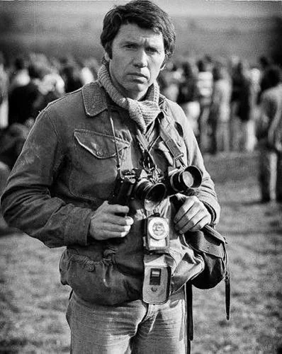
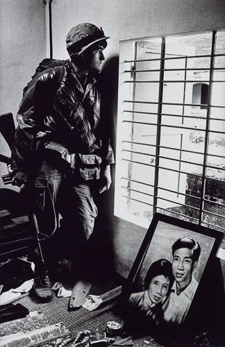
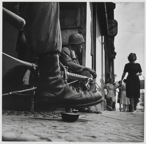
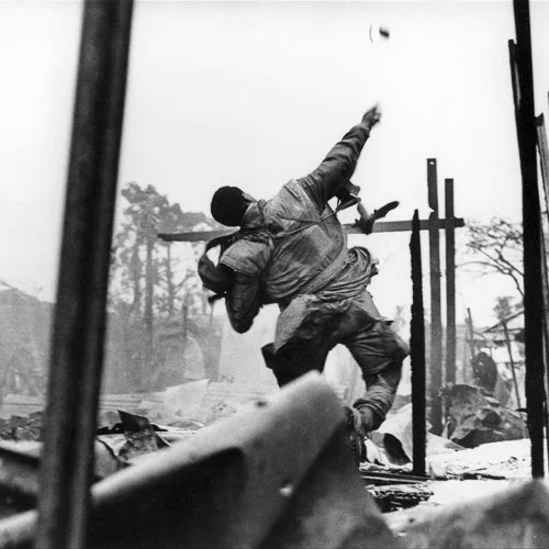
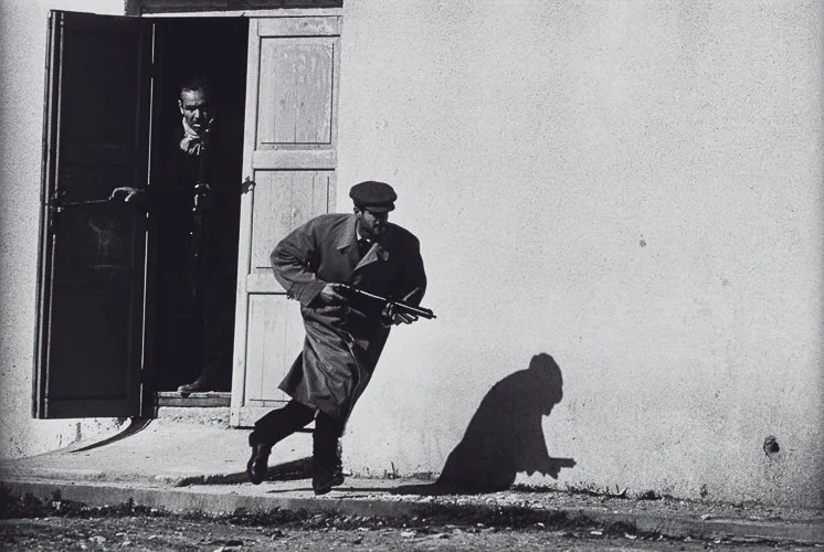
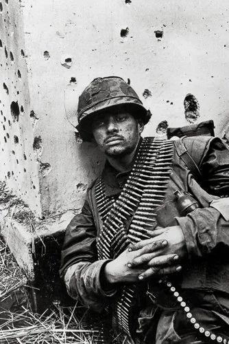
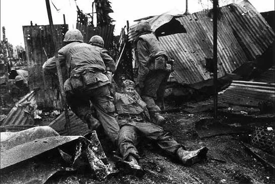
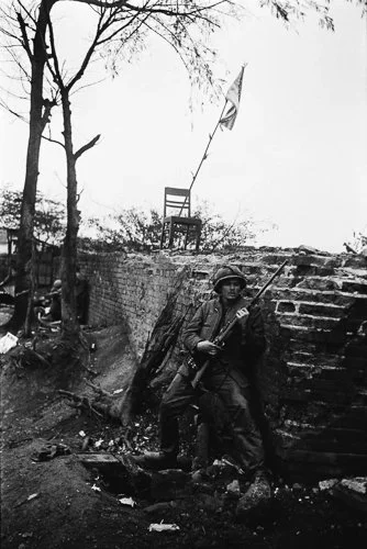
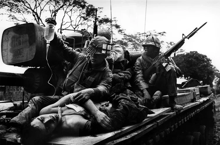
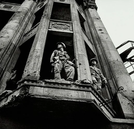
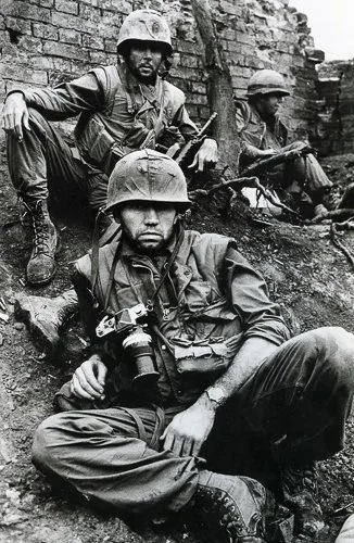
The negatives that resulted were, by laboratory standards, badly exposed. The resulting prints have crushed shadows and blown highlights. They also have a quality of witness — of being inside the event rather than photographing it from a safe aesthetic distance — that is inseparable from their technical roughness. The histogram, had it existed for his purposes, would have been irrelevant.
This is not an argument against histograms. It is an argument for keeping them in their proper place. The histogram is a tool for understanding and controlling what tonal information your image contains. Whether that matters depends on what you are trying to say with the image. Sometimes it matters enormously. Sometimes it does not matter at all.
Resources
Paul Farris, an Australian photography teacher based in Brisbane, makes consistently clear and practical tutorial videos. This one covers the histogram from first principles — what it is, how to read it in-camera on Nikon, Canon, and Fujifilm bodies — and includes a section on ETTR and editing in Lightroom. It is one of the best plain-language introductions to the subject available. Photo Genius has published over 26 million views worth of photography tutorial content, which is a reasonable indicator that the explanations work for a broad audience.
Henry Turner is a UK-based landscape photographer working extensively in the Lake District, Scotland, and Wales. This article and its accompanying video show histogram use in the field — specifically dealing with a waterfall scene that has both very bright highlights and deep shadows, the exact kind of high-contrast bimodal situation described above. Turner uses the histogram to set exposure at the scene (14mm, f/11, ISO 250, ¼ second) and notes precisely how he used the histogram to ensure neither the highlights nor the shadow detail was lost. This is histogram use as it actually happens in landscape photography, rather than as a studio concept.
Dan Fox takes a slightly more conceptual approach than most histogram tutorials, which is precisely what makes it worth watching alongside the others. He starts with generic histogram theory before moving into camera-specific use, which sounds dry but actually makes the camera application click in a way that jumping straight to "left is dark, right is bright" doesn't quite achieve. The section specifically covering how histograms can mislead you — situations where the display looks acceptable but the image is not — is an honest and useful addition that most beginner tutorials quietly skip over.
Finally, the awesome Tony Northrup explains how to use camera and post-processing histograms to prevent underexposure and overexposure. Learn how to identify blown-out highlights, manage contrast, and apply the technique of shooting to the right for cleaner image data.
Give it a Try!
Exercise 1 : The Shape Collector
Over the course of one day, photograph ten different scenes — varied subjects, varied lighting, varied times of day. Before you do anything else with the images — before you delete them, edit them, or judge them — look at the histogram of each one in playback mode.
For each image, note:
Is the histogram left-skewed, right-skewed, centred, narrow, or bimodal?
Is there any clipping at the left edge, the right edge, or both?
Was the clipping intentional, if it is there? Does the bright area that is clipping represent detail you needed, or a specular highlight you do not?
Does the histogram shape match what you intended when you took the shot?
Do not delete or edit anything yet. The purpose is to build the habit of reading the histogram rather than trusting the LCD, and to begin developing a vocabulary for what different shapes mean in real photographs of real subjects. Ten images is enough; thirty is better if you have the time.
Exercise 2 : The Black and White Point
Take five photographs you have already made — not rejects, but images you think are reasonable or good. Open each one in Lightroom Mobile or a comparable editor that shows a histogram.
Before you do anything else, look at the histogram. Does the tonal data reach the left edge? Does it reach the right edge? In most images, you will find that the data starts a little way from one or both edges — there is empty space on the left, or the right, or both.
Now drag the black point (left edge of the histogram, or the Blacks slider at its minimum) to meet the start of the tonal data. Then drag the white point (right edge, or the Whites slider at its maximum) to meet the top of the tonal data.
Observe what this does to each image. In a flat, low-contrast image, this will produce a dramatic improvement — full contrast will snap into place immediately. In an image that was already well exposed, the change may be subtle. In a deliberately low-key or high-key image, you may not want to do this at all.
The aim is to understand black and white point adjustment as the most fundamental tonal correction available in editing, and to discover that a significant number of images benefit from this single operation without any other adjustment.
Exercise 3 : The ETTR Experiment
This exercise requires RAW capture on a smartphone. On iPhone: use Halide, Lightroom Mobile (switch the camera to RAW or ProRAW mode), or ProCamera. If you have a mirrorless camera or DSLR, use that.
Find a scene with some shadow detail and some highlights — a window in a room, a landscape, any scene with both bright and dark areas. Shoot it three times without moving the camera:
At the metered exposure — whatever the camera suggests
At +1 stop (deliberately brighter, deliberately to the right on the histogram)
At -1 stop (deliberately darker)
Now open all three files in Lightroom Mobile. Take the +1 stop (bright) version and pull the Exposure slider down by 1 stop to approximately match the metered version. You now have two "correctly exposed" versions: the original metered shot, and the pulled-down ETTR version.
Compare the shadow areas of these two images closely — zoom in if necessary. Look for noise: grain, speckle, colour variation in areas that should be smooth. Which version has cleaner shadows?
In most cases, the ETTR version will have noticeably cleaner shadows. This is the practical demonstration of why exposing to the right matters. It is not a dramatic effect in good light at low ISO — but in challenging light, at higher ISO values, or in any situation where you will be lifting shadows significantly in editing, it can be the difference between a usable image and one with distracting noise.