Exposure & Dynamic Range
Every decision a photographer makes — where to stand, which direction to point the camera, what time of day to show up, whether to wait for a cloud to pass — is ultimately a decision about light. But the most fundamental decision of all is simpler, and more consequential than it first appears: how much light do you let in, and for how long?
This is what exposure means.
It is not just a technical setting. Exposure is a creative tool — possibly the most powerful one available to you. The same scene, exposed differently, tells a completely different story. A sun-bleached courtyard in the full brightness of a Spanish afternoon, and the same courtyard pulled down into shadow — these are not the same photograph. They are not even the same experience. Exposure is where you make that decision.
The second concept this article addresses — dynamic range — is where things get genuinely interesting, and genuinely frustrating, for photographers at every level.
Dynamic range is all about the gap between what the scene in front of you contains and what your camera can actually record. It is why your phone photographs of the Christmas tree look wonderful to you in the moment, and flat, blown-out, and slightly depressing on the screen. It is why experienced photographers make different decisions about where to point their camera at different times of day. Understanding this gap, and learning to work within it or around it, is one of the things that most reliably separates photographers who are frustrated by their results from photographers who understand why their results look the way they do.
Along the way, we will introduce the histogram — the exposure tool that tells you the objective truth about your image when the camera's own screen is lying to you. The histogram is treated in full depth in The Histogram article in this series; here you will get enough to make it immediately useful.
This article also touches on metering — how the camera decides what "correct" exposure is — but does not attempt to fully explain why metering works the way it does. That foundation is in Understanding 18% Grey, also in this series, and it is worth reading in conjunction with this one.
And if you want to pursue the artistic dimension of light further — what shadow does compositionally, what the quality of directional light contributes to a subject — the Light & Shadows article in this series covers that territory in depth.
What Exposure Actually Is
A photograph is made when light strikes a light-sensitive surface — film or sensor — for a controlled period of time. In the fraction of a second the shutter is open (or, in modern smartphones, the fraction of a second the sensor is actively reading), photons arrive at the surface and are converted into an electrical signal. The more photons, the stronger the signal, the brighter the resulting image. That much is simple. The consequences ramify considerably.
Too little light, and the image is underexposed: the overall image is dark, with shadow areas that contain no recoverable detail — pure black, with nothing underneath. You lose what was there.
Too much light, and the image is overexposed: the bright areas become pure white, clipped, again with nothing recoverable. You lose what was there.
The goal of what is conventionally called "correct" exposure is to record sufficient light to capture detail throughout the tonal range the photographer wants to preserve.
And here is the point worth making clearly, at the start, because it is the point that is most commonly misunderstood by beginners: "correct" exposure is not a single value. There is no Platonic ideal of right exposure lurking somewhere in your histogram, awaiting discovery. There is only intentional exposure.
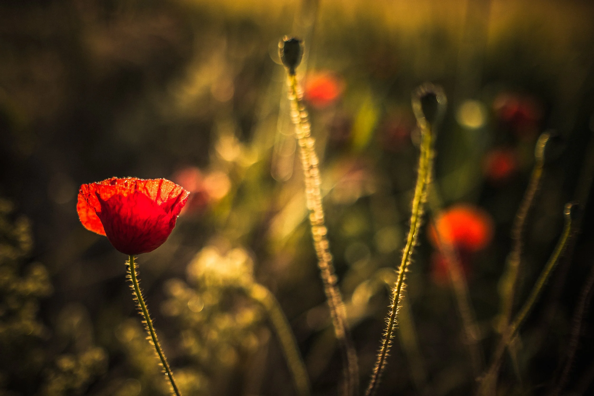
A deliberately dark, moody image — a portrait where the subject emerges from shadow, or a foggy landscape where detail is swallowed by darkness — is not "underexposed" if that darkness was the creative intention. A deliberately bright, airy image, where light fills the frame and shadows are minimal, is not "overexposed" if that brightness was what you were after. The camera will sometimes try to tell you otherwise, by blinking at you or waving an icon. You are allowed to ignore it.
This distinction matters more than it might seem. The camera's job is to calculate a technically acceptable exposure; your job is to decide whether that calculation is serving the image you intended to make. Learning to make that distinction — to override the camera when it is wrong, and to trust it when it is right — is a significant part of learning photography.
The Exposure Triangle
Three controls determine how much light reaches the sensor and how. In traditional cameras, these are physical settings you adjust directly. In smartphones, the same variables are at play, though the interface varies and some controls are partially fixed. Each control has a primary photographic effect (how much light enters) and a critical side effect (something else that changes as you adjust it). The side effects are not problems to be managed. They are creative tools.
Aperture
The aperture is the opening through which light enters the lens. In traditional cameras, it is controlled by an iris diaphragm — a ring of overlapping metal blades that expand and contract to change the size of the opening. The mechanism traces its lineage directly to the human iris, which does exactly the same thing, and to the aperture stops used by some of the earliest photographers, who literally used strips of metal with holes of different sizes, swapped in and out of a slot in the lens barrel. These were called Waterhouse stops, after John Waterhouse, the British military engineer who invented them in 1858. They are the origin of every aperture control that has existed since.
Aperture is measured in f-numbers, also called f-stops: f/1.4, f/1.8, f/2, f/2.8, f/4, f/5.6, f/8, f/11, f/16, and so on. The numbering is counterintuitive until you understand what it represents. A bigger f-number means a smaller opening — f/16 is a much smaller hole than f/2.
The reason: the f-number is not the diameter of the hole. It is a ratio — specifically, the focal length of the lens divided by the physical diameter of the aperture. An f/8 aperture on a 50mm lens has a physical opening of 50 ÷ 8 = 6.25mm. An f/2 aperture on the same lens has an opening of 50 ÷ 2 = 25mm — four times as wide in diameter, and (because area scales with the square of the diameter) sixteen times the area, admitting sixteen times as much light.
Each step along the standard f-stop series doubles or halves the light: f/2.8 admits exactly half the light of f/2, and exactly twice the light of f/4. This doubling relationship — one stop — is fundamental to how exposure is discussed and calculated throughout photography.
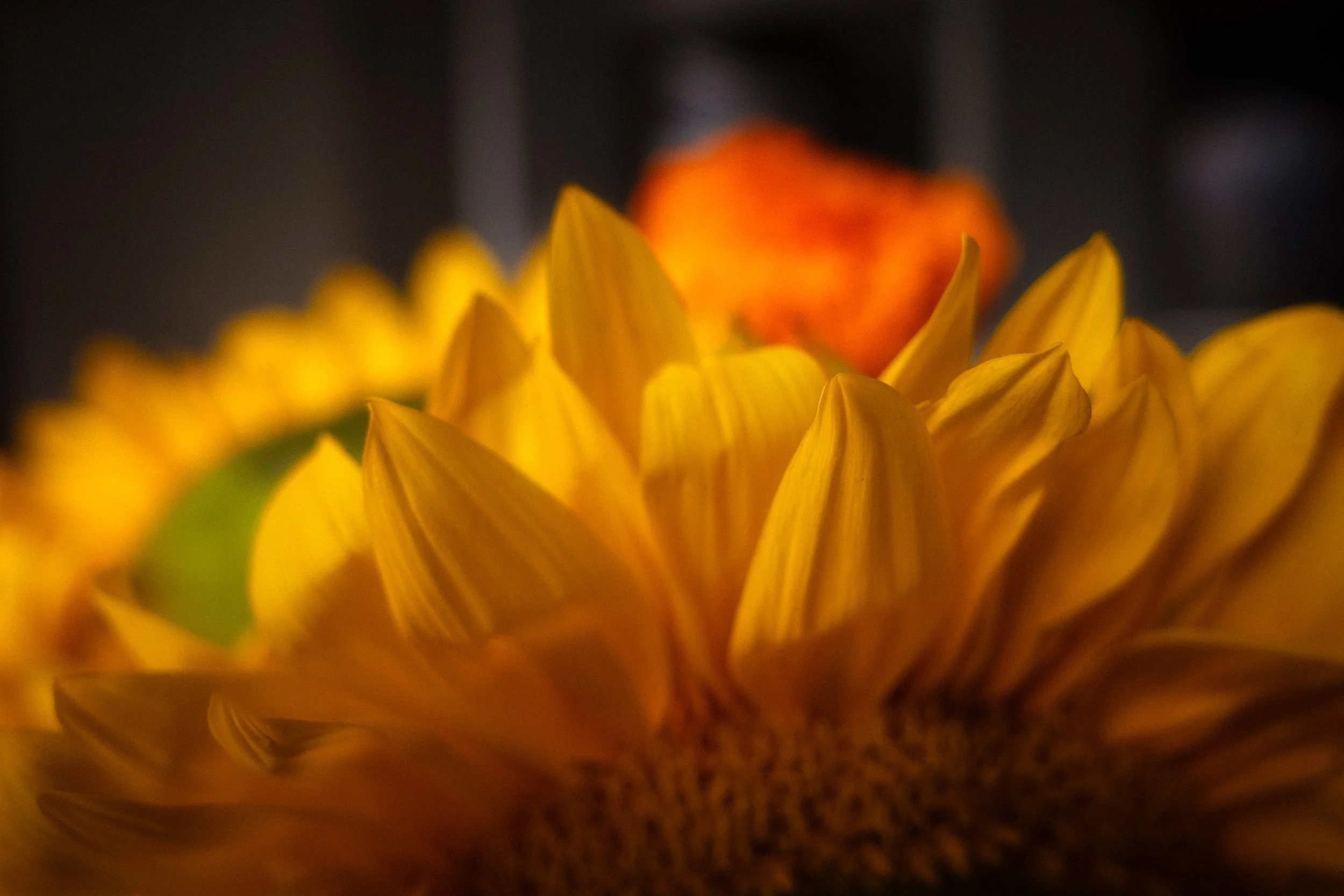
The critical side effect of aperture is depth of field: the zone in the image where subjects appear acceptably sharp. A wide aperture (small f-number: f/1.4, f/1.8, f/2.8) produces a narrow depth of field — the sharp zone is shallow, the background blurs smoothly into what is called bokeh (from the Japanese, meaning blur or haze). A narrow aperture (large f-number: f/8, f/11, f/16) produces a wide depth of field — foreground and background can both be sharp within the same frame. The former is the standard idiom of portrait photography; the latter of landscape photography. Neither is correct. Both are choices.
Smartphones and aperture: Most smartphones have a fixed aperture on their main cameras — the opening cannot change. Flagship models typically use wide apertures in the f/1.5 to f/1.8 range to maximise light gathering on the small sensor. The iPhone 15 Pro main camera (26mm equivalent, 48MP) has an aperture of f/1.78.
Because the aperture is fixed, the shallow-depth-of-field effect of a wide aperture — the portrait background blur — cannot be produced optically. Instead, it is simulated computationally in Portrait mode: the camera uses depth-mapping data from multiple sensors to calculate what is subject and what is background, then applies a synthetic blur. The results are often convincing.
They are not, however, the same optical phenomenon, and the computational approach tends to struggle with hair, transparent objects, and anything that does not cleanly separate from its background. When it works, it works well; when it fails, it looks distinctly strange.
Shutter Speed
The shutter speed is the duration for which the sensor is exposed to light — more precisely, the duration of the exposure.
In a camera with a mechanical shutter, this is how long the shutter curtain stays open.
In a camera with an electronic shutter, it is how long the sensor actively reads incoming photons.
In a smartphone, it is almost always an electronic shutter. Some cameras use a combination of both.
Shutter speed is expressed as a fraction of a second at short durations — 1/1000s, 1/500s, 1/250s, 1/125s, 1/60s, 1/30s, 1/15s — and as whole seconds at longer durations: 1s, 2s, 10s, 30s. On camera displays, fractions are usually shown without the denominator, as 1000, 500, 250, and so on, which can be confusing until you recognise the convention.
The critical side effect of shutter speed is motion, or more accurately, it controls how movement appears in the image.
Fast shutter speeds (1/500s or faster) freeze motion. A bird in full flight, a breaking wave, a footballer mid-kick — at 1/1000s, these are sharp, detailed, arrested.
Slow shutter speeds (1/30s or longer) allow motion to record as blur.
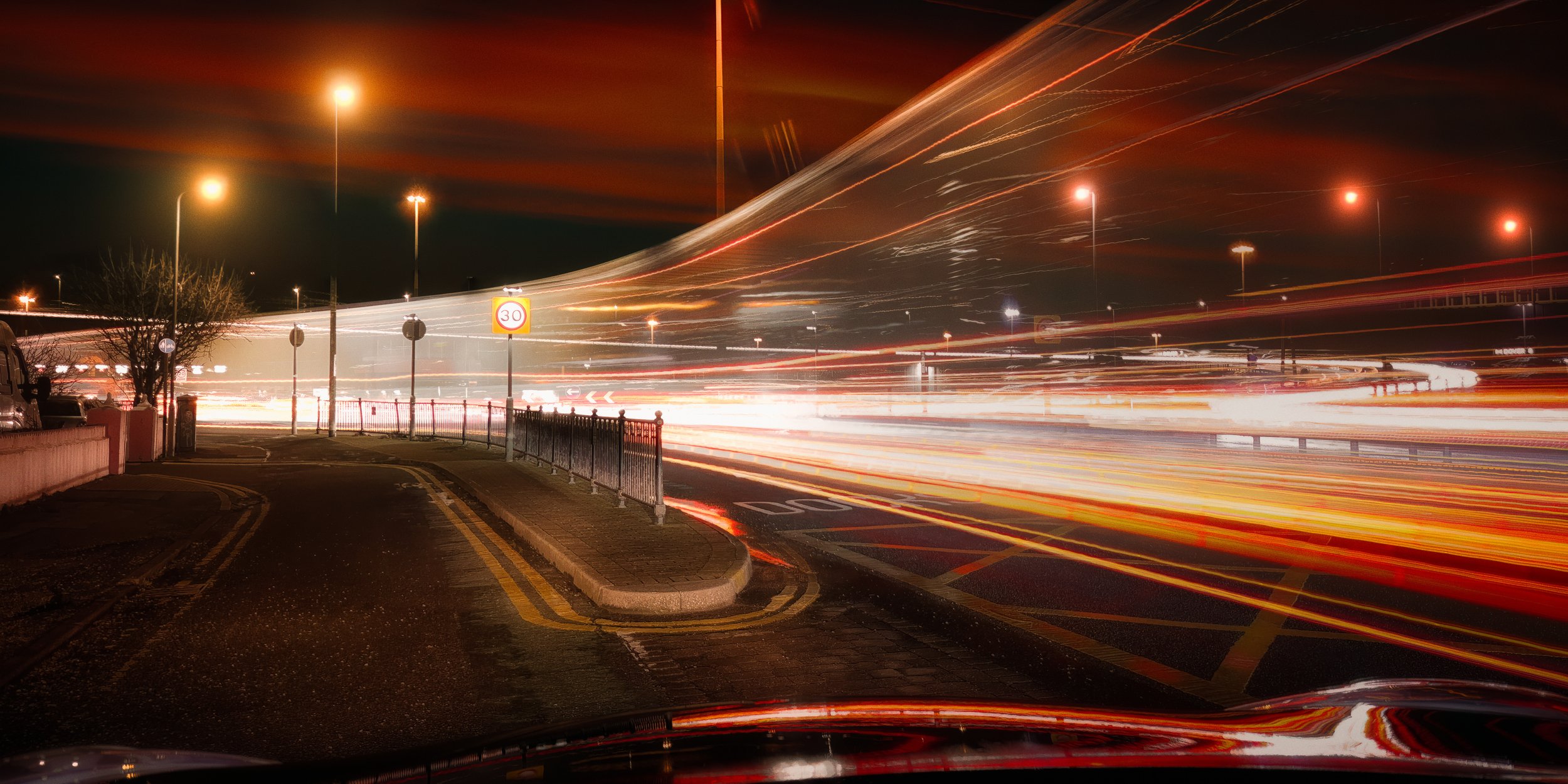
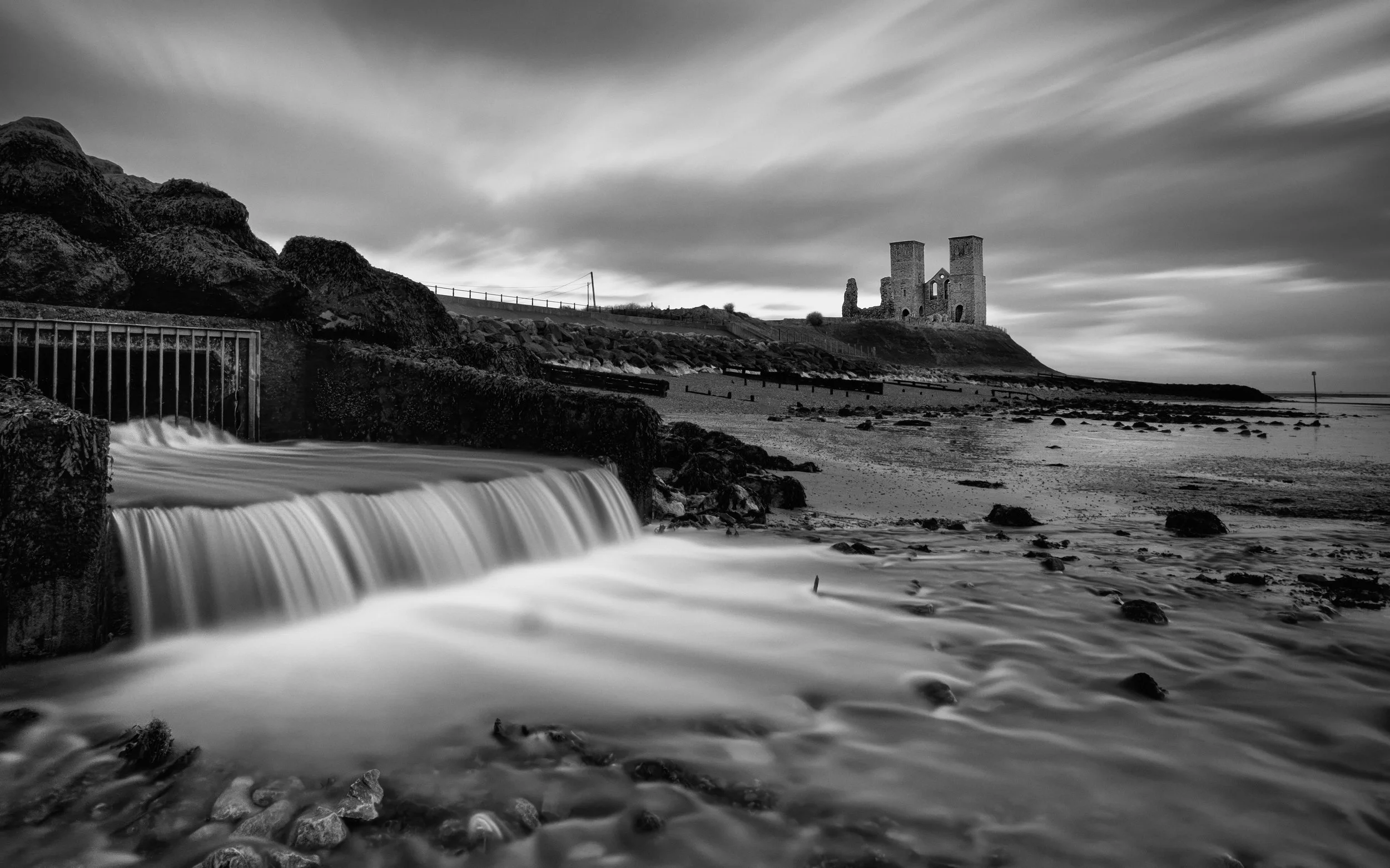
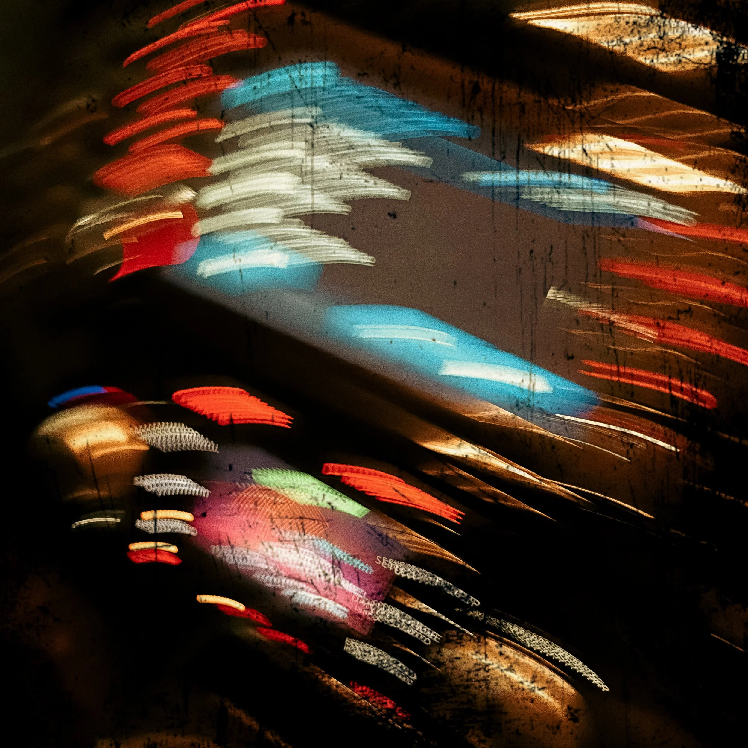
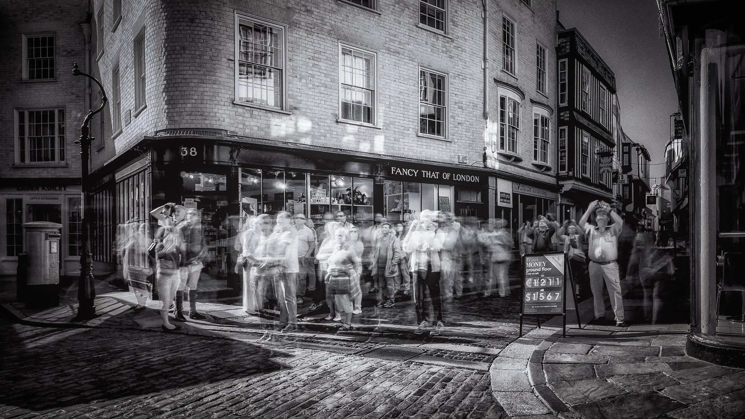
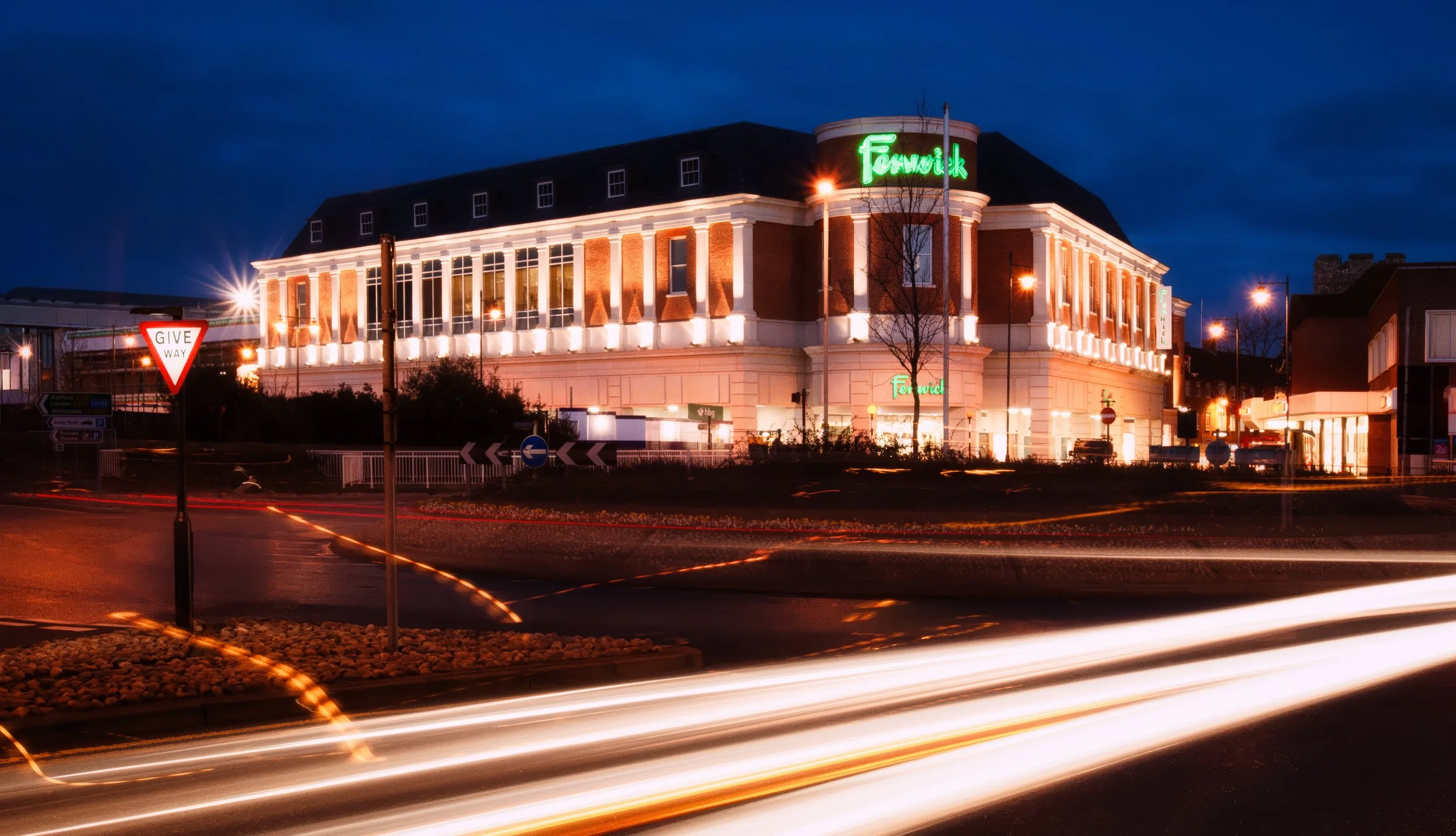
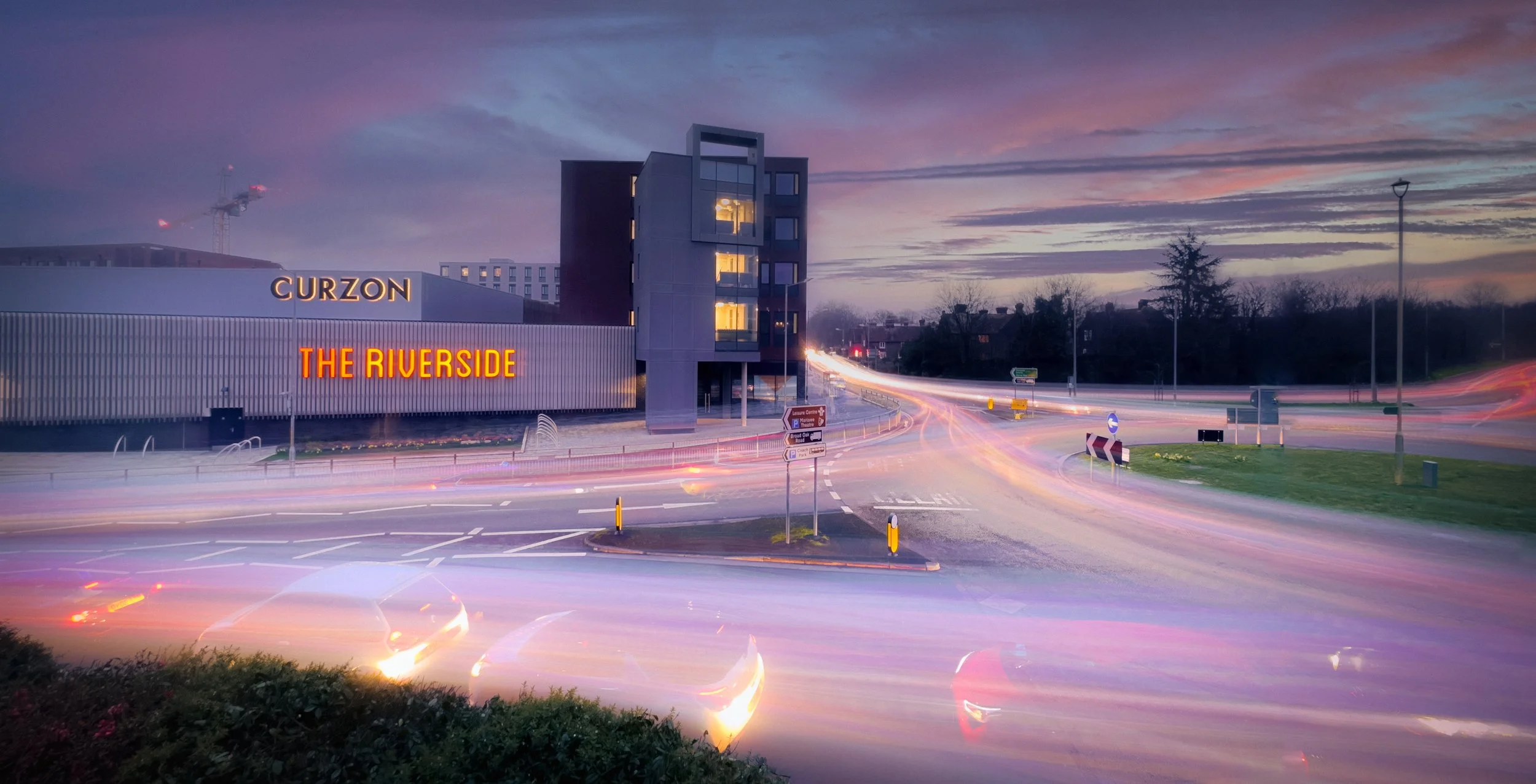
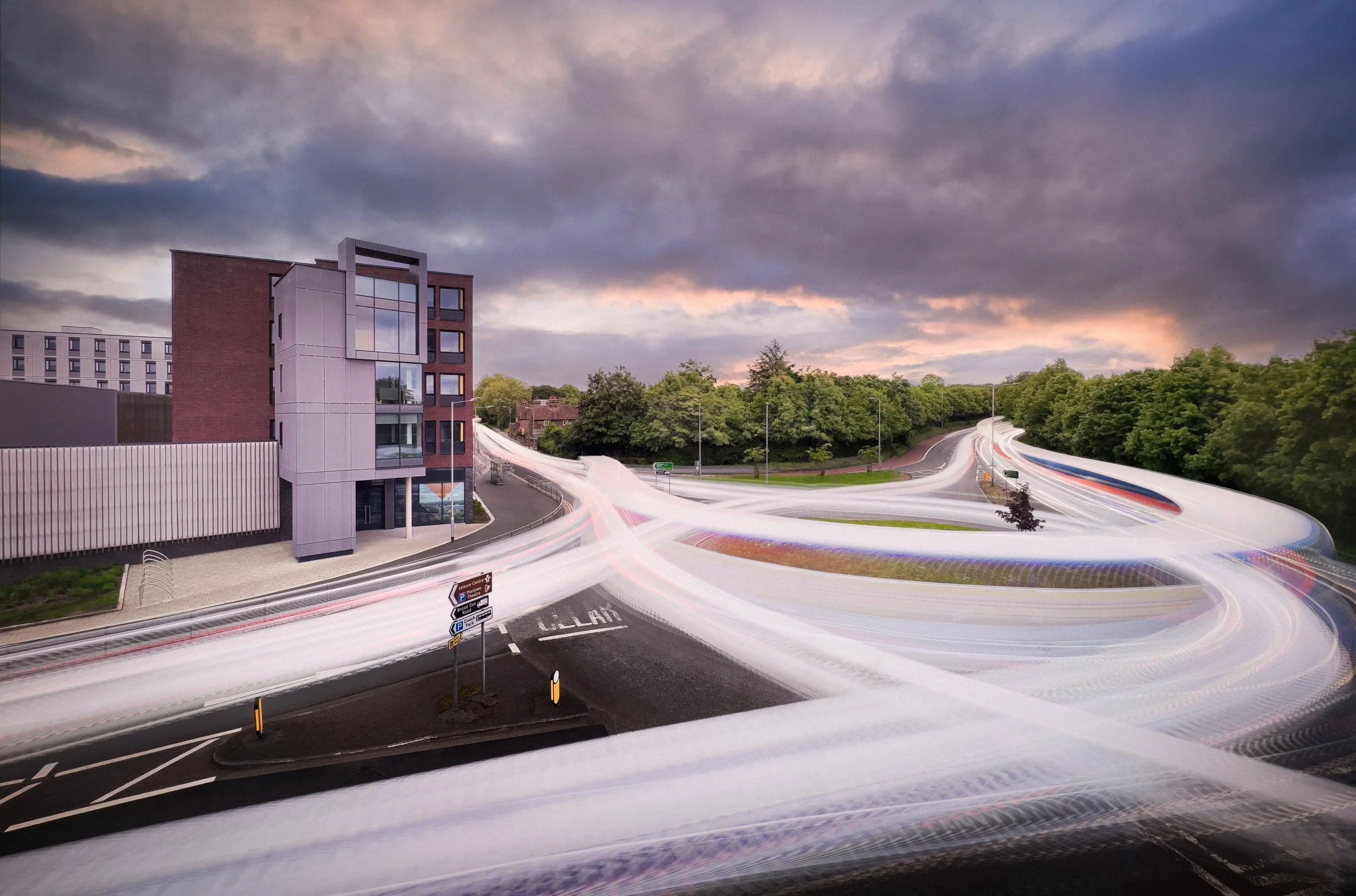
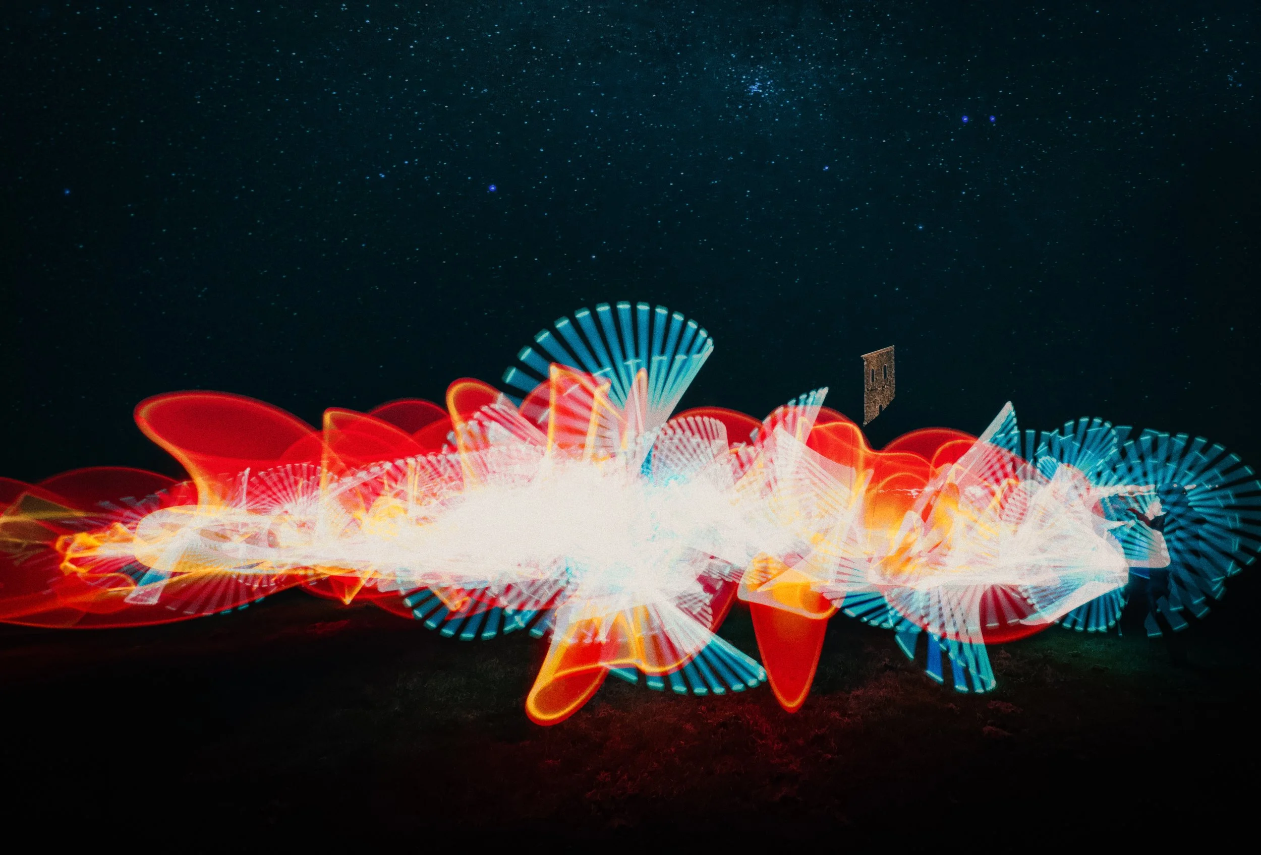
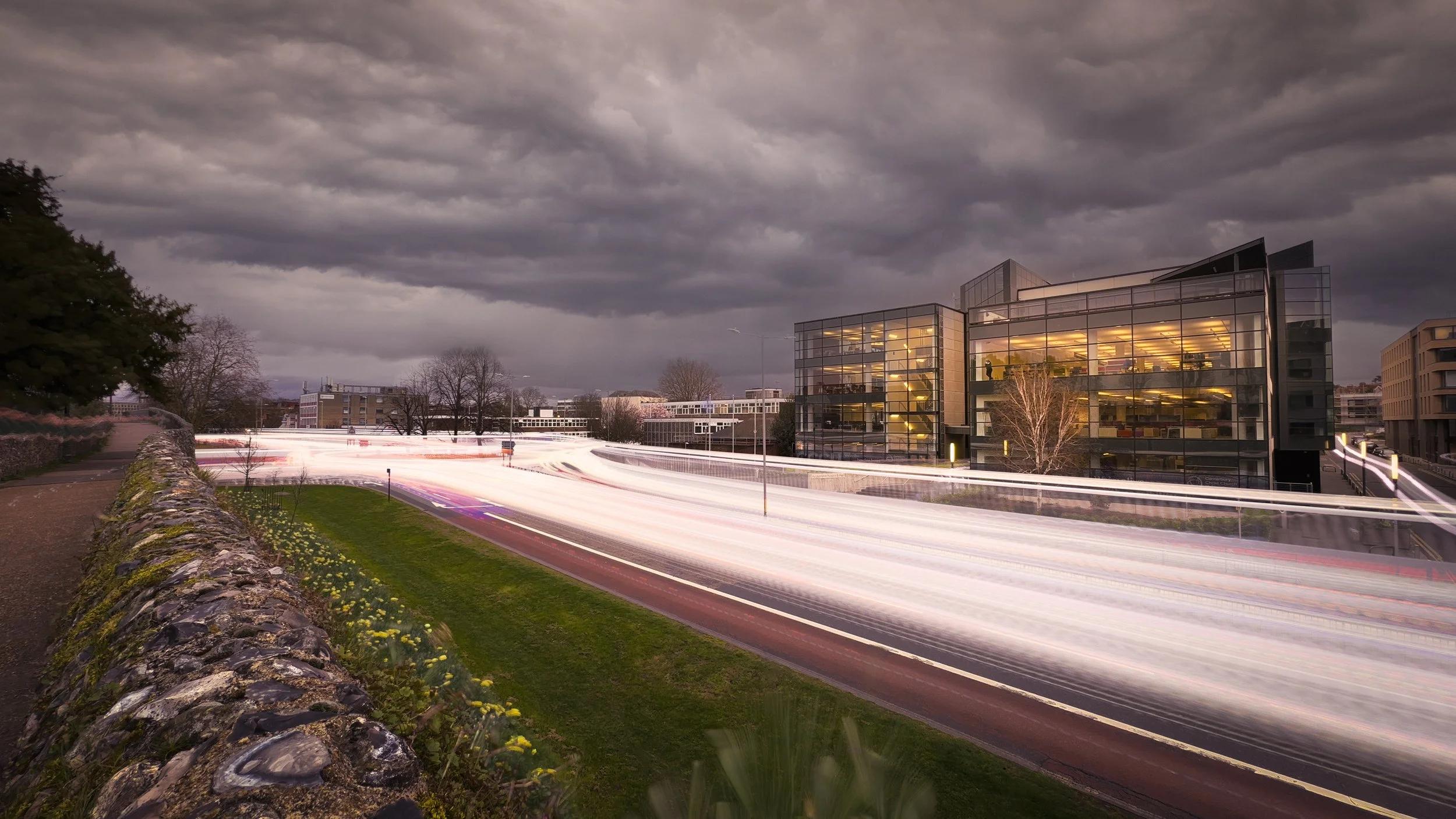
The silky-smooth waterfall that appears in almost every photography textbook is produced by a shutter speed of several seconds; the light trails of cars on a motorway at night are typically 10–30 seconds; star trails, the arcing paths of stars across the sky over hours of rotation, require exposures of many minutes. These are not failed attempts at sharpness. They are what long exposures look like.
The less aesthetically welcome form of motion blur is camera shake: the tiny, unintentional movement introduced by handholding the camera at slow shutter speeds. The traditional rule of thumb is that the minimum safe shutter speed for handheld shooting, without image stabilisation, is approximately 1/[focal length] seconds — so for a 50mm equivalent lens, at least 1/50s; for a 200mm equivalent, at least 1/200s.
The longer the focal length, the more any angular movement is amplified, and the more blur results. Modern cameras and smartphones substantially extend this range through optical image stabilisation (OIS), which uses gyroscopic sensors to detect movement and physically compensate in the lens or sensor. The iPhone 16 Pro uses sensor-shift OIS, physically moving the sensor itself to counteract camera shake, and can produce sharp handheld images at shutter speeds of 1/4s or slower in ideal conditions.
One further consideration: cameras with electronic shutters can also produce rolling shutter distortion — a skew or wobble in fast-moving subjects, caused by the sensor reading different rows of pixels at slightly different times. This is not an issue in most photography, but if you have ever photographed a spinning propeller, or a swinging baseball bat, and produced what looks like a banana, this is why.
The history of photography is, among other things, the history of the pursuit of shorter and shorter exposure times. Louis Daguerre's daguerreotype process, which became publicly known in 1839, required exposure times of several minutes in direct sunlight — and considerably longer in shade. Early portraiture, the bread and butter of early commercial photography, required subjects to remain motionless for so long that head-clamps and posing stands were used to prevent inadvertent movement.
The entire arc of photographic technology — from wet collodion plates to fast gelatin dry plates to panchromatic film to modern back-illuminated CMOS sensors — can be read as the pursuit of sensitivity sufficient to freeze the moving world.
ISO
ISO is the sensitivity of the imaging system to light — in digital cameras, the amplification applied to the sensor's electrical signal; in film photography, the sensitivity of the light-sensitive emulsion. The acronym comes from the International Organization for Standardization; the organisation's own guidance is that ISO is pronounced "eye-soh" and derives from the Greek isos, meaning equal — reflecting the ISO's mission of international standardisation, not a direct abbreviation of the organisation's name.
Film sensitivity was historically rated on the ASA (American Standards Association) scale, which had a direct numerical equivalent to modern ISO. ISO 100 is the same sensitivity as ASA 100. When photographers speak of "ISO 400 film" and "ISO 400 on the sensor," they are describing equivalent sensitivity, though the underlying mechanism differs.
Lower ISO values (ISO 64, 100, 200) mean lower sensitivity: the sensor requires more light, but produces cleaner, smoother images with less noise. Higher ISO values (ISO 800, 1600, 3200, 6400, and beyond) mean greater sensitivity: the sensor can work in lower light, but the image shows more digital noise — the random variation in pixel values that appears as a speckled, grainy texture across the image. Noise is most visible in areas of smooth, even tone, such as skies, skin, and dark shadows.
In film photography, the equivalent of digital noise was grain — the individual silver halide crystals in the emulsion, which become visibly coarse at high sensitivity ratings. And here is the thing about grain: it is not simply a flaw. Visible grain is deeply embedded in the aesthetic identity of mid-twentieth century documentary and street photography.
The coarse, alive grain of Kodak Tri-X (rated ISO 400, but often pushed to 800 or 1600 in development) is inseparable from the visual language of photographers like Henri Cartier-Bresson, Robert Frank, and Don McCullin. William Klein's Moscow (1964), with its deliberately pushed, contrasty, high-grain film work, uses grain as an expressive tool — it contributes to the rawness and immediacy of the images rather than undermining them.
Modern AI-powered noise reduction in smartphone cameras can remove digital noise so effectively that it produces an almost clinical smoothness. Whether this is an improvement depends entirely on whether you want that smoothness, or whether you valued what the noise was doing.
The noise-ISO relationship is not simply linear. ISO 3200 is not twice as noisy as ISO 1600 in any simple, predictable sense; the relationship depends on sensor size, pixel size, sensor architecture, and the quality of the analogue-to-digital conversion. The fundamental variable is sensor size: larger sensors have larger individual pixels, which gather more photons, which means a stronger signal relative to the noise floor.
This is why a full-frame or APS-C mirrorless camera can shoot at ISO 6400 and produce usable images, while a smartphone sensor — which is physically tiny by comparison — shows significant noise at ISO 1600. The high-ISO performance of current flagship smartphones (the iPhone 16 Pro, the Samsung Galaxy S25 Ultra) is genuinely remarkable by the standards of even five years ago, reflecting improvements in sensor design, lens aperture, and computational processing.
But physics is physics: a full-frame mirrorless camera, even an inexpensive one, will produce cleaner high-ISO images than any smartphone currently available.
The Interdependence
The three controls are not independent. Together, they determine the total exposure — the total amount of light reaching the sensor. If you change one, you change the exposure, and to maintain the same total exposure you must compensate with one or both of the others. This interdependence is commonly illustrated as a triangle, with the three controls at the vertices; changing any vertex requires adjustment elsewhere to keep the total in balance.
A practical illustration: you want to photograph a waterfall with a slow shutter speed — 1/4s — to produce that smooth, silky blur in the falling water. But the day is bright. At f/8 and ISO 100, the "correct" exposure in that light might be 1/500s. To get from 1/500s to 1/4s is seven stops — the shutter is open 128 times as long, admitting 128 times as much light.
To compensate, you need to close the aperture by seven stops (which would take you to around f/64, which very few lenses can achieve, and which would introduce significant diffraction softening), or lower the ISO (which, at ISO 100, has no further room), or both — and even then, in bright daylight, you will run out of room and need a neutral density (ND) filter to physically reduce the amount of light entering the lens.
ND filters are rated in stops: a 3-stop ND reduces light by a factor of eight; a 10-stop ND, which is common for daytime long-exposure work, reduces it by a factor of 1024. The arithmetic is straightforward; the creative possibilities are considerable.


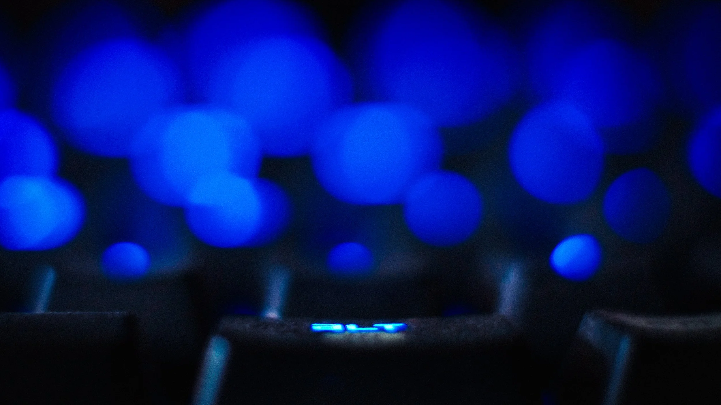


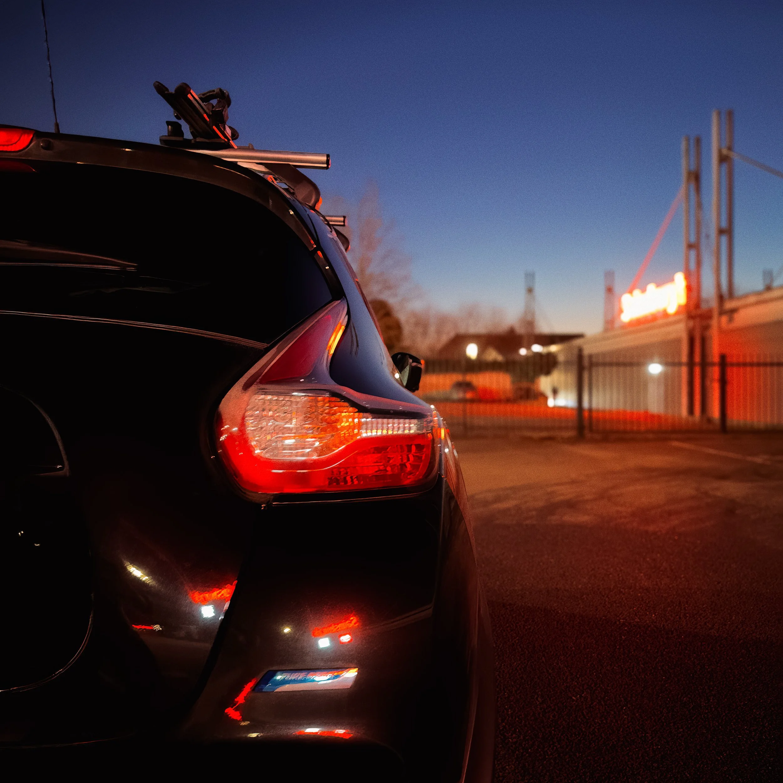
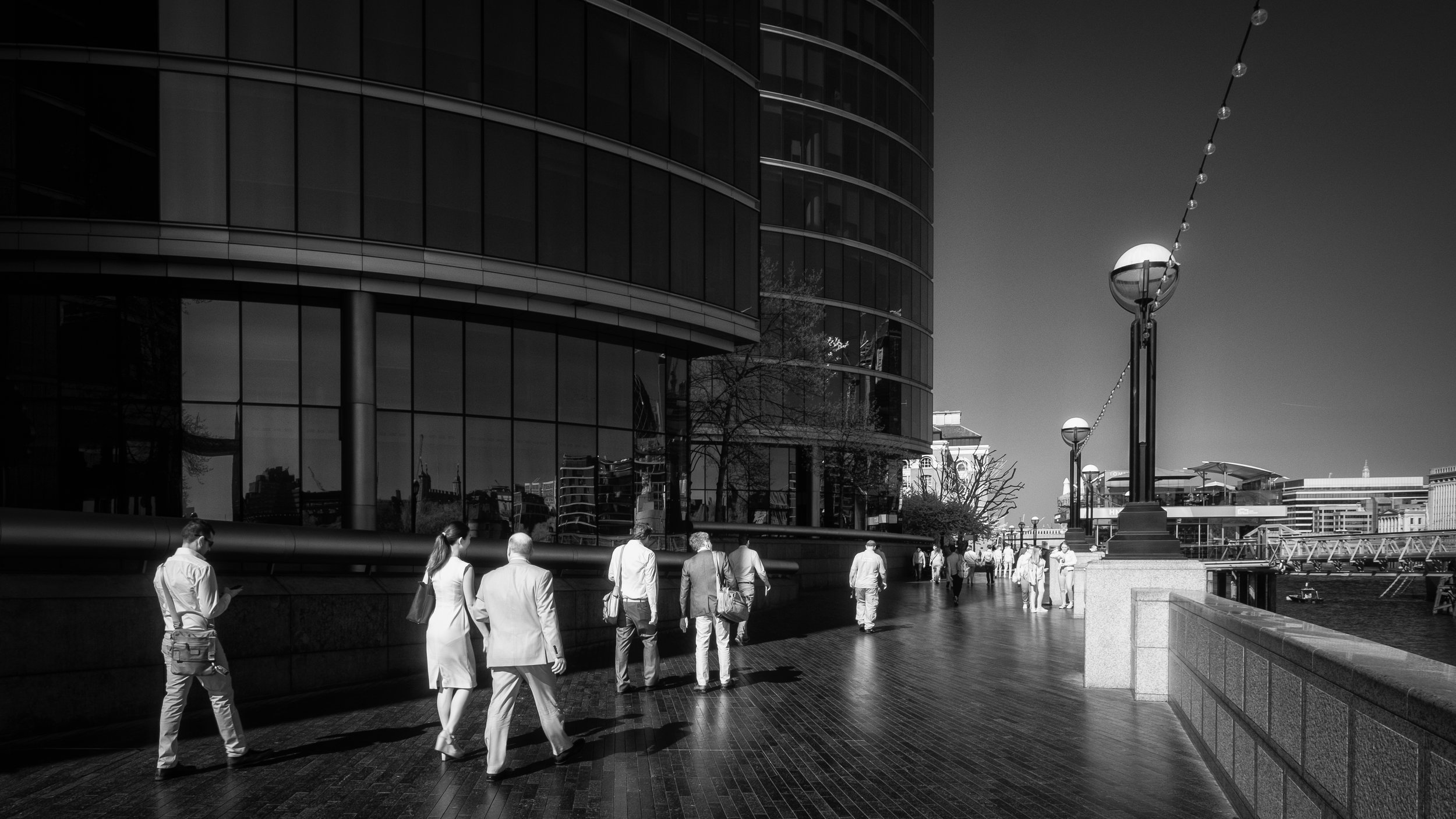

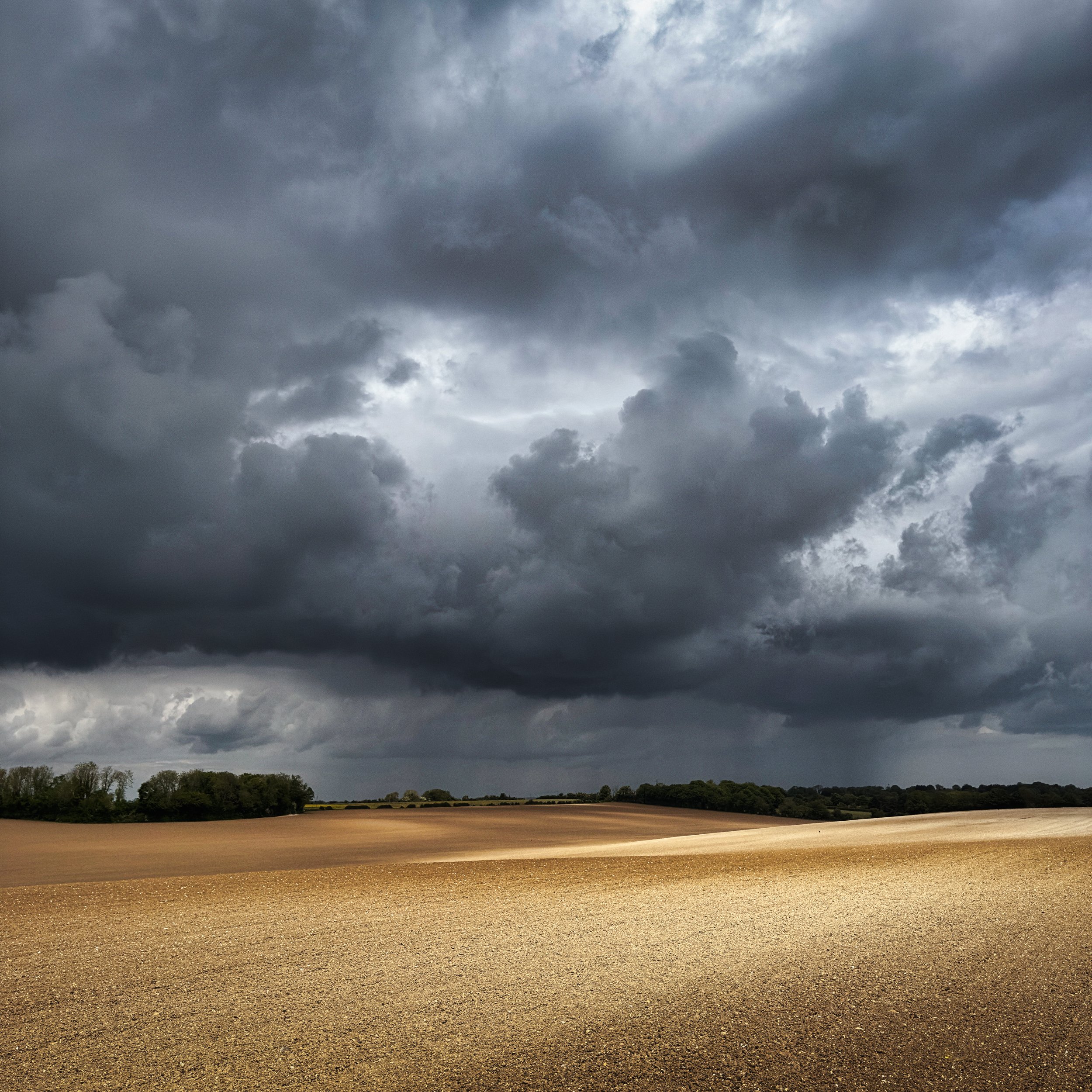
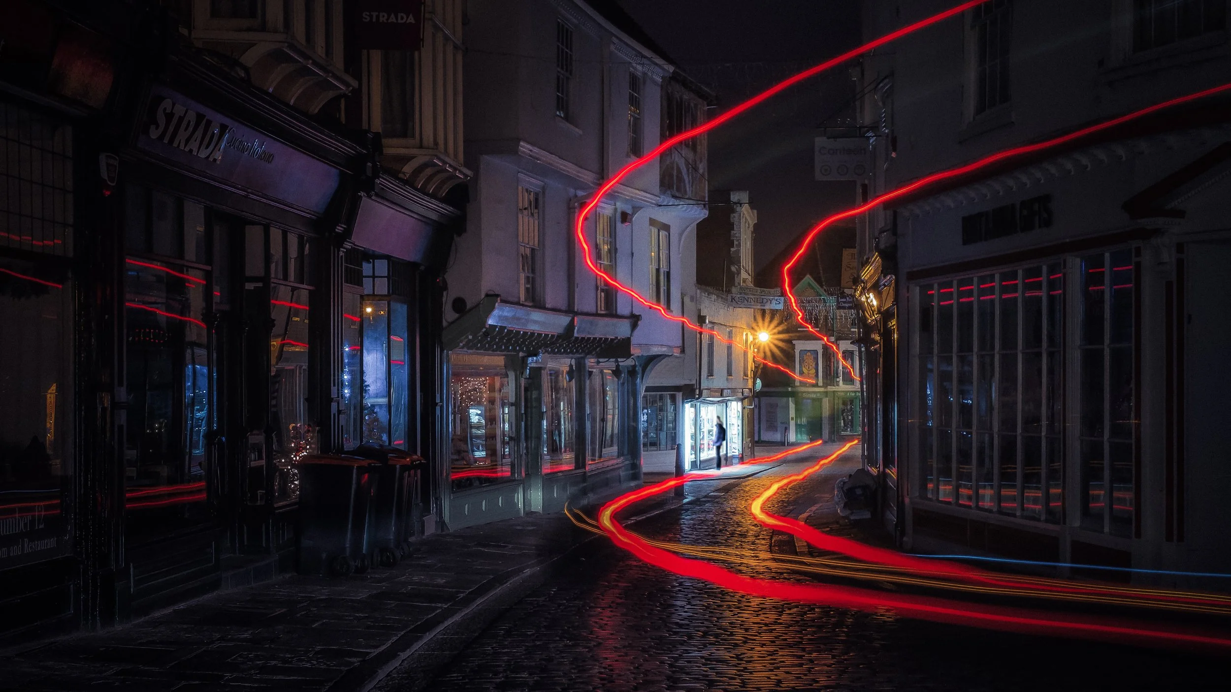

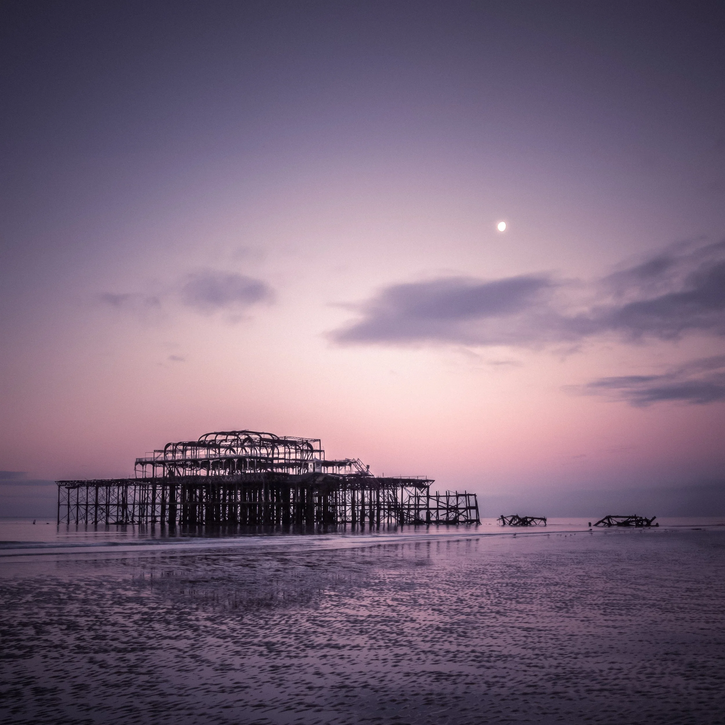

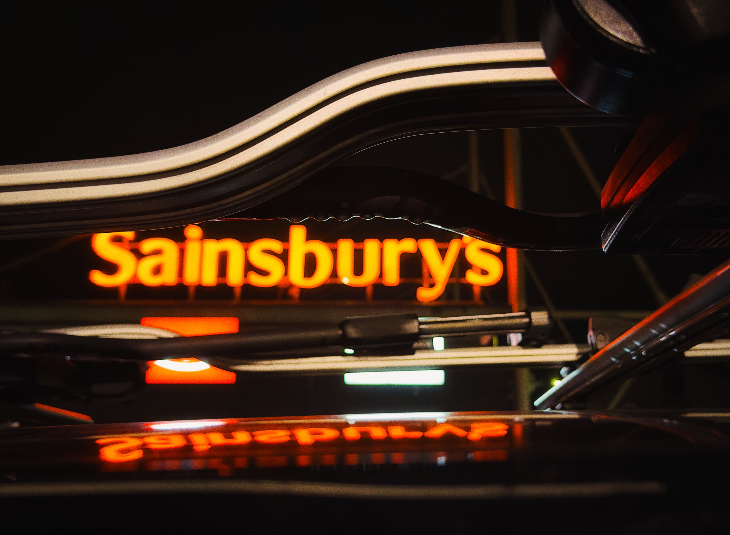














How the Camera Decides : Metering
Modern cameras and smartphones use reflected-light metering: they measure the light bouncing back from the scene. The camera's metering system analyses the reflected light and calculates an exposure it judges to be appropriate.
An incident light meter does the opposite — it measures the light falling onto the subject. These are separate devices, used by cinematographers and studio photographers, and are held within the scene pointing back at the camera.
But how does the camera know what the appropriate exposure is? What standard does is measure it against? This is where the foundations of metering lie — in a concept called 18% grey, the perceptual midpoint of the tonal scale that metering systems have been calibrated to since at least the 1940s.
A full explanation of what 18% grey is, why it is 18% rather than 50%, and what that means for metering in challenging conditions, is in the Understanding 18% Grey article in this series. The short version: the camera assumes the average real-world scene reflects approximately 18% of the light falling on it.
When the scene is predominantly bright — a snow field, a white-walled room, a subject against a bright sky — this assumption causes the camera to underexpose, pulling the scene down towards middle grey. When the scene is predominantly dark — a black car on wet tarmac, a subject in a dark interior — the same assumption causes overexposure. Knowing this, you can predict and correct for it.
Modern cameras offer several metering modes:
Evaluative or matrix metering divides the scene into a grid of zones, takes readings from each, and uses pattern-recognition algorithms (comparing the result against a database of known lighting situations) to arrive at an exposure judgement. This is the most intelligent of the standard modes and the appropriate default for most situations. Modern evaluative metering, particularly in Sony and Nikon cameras, is genuinely impressive.
Centre-weighted metering gives the most weight to the central portion of the frame and progressively less weight towards the edges. This was the dominant metering mode before evaluative metering became widespread, and it remains useful for portraits where the subject is centred and you want to prioritise their tonal values over the background.
Spot metering takes its reading from a very small area — typically 1–5% of the frame, often linked to the active focus point. It is the most precise mode and the most demanding: used incorrectly, it will expose your chosen spot perfectly and throw everything else off badly. Used correctly — when you know exactly which tone in the scene you want to expose for — it is extremely powerful. A face in dappled light, a specific shadow you want to preserve, the bright edge of a cloud — spot metering lets you tell the camera precisely what to prioritise.
Smartphone metering is primarily evaluative, but increasingly augmented by AI scene recognition that goes beyond simple zone comparison. On an iPhone, tapping the screen sets both the focus point and the exposure metering point simultaneously. The vertical slider with a sun icon that appears is exposure compensation — you are manually shifting the camera's calculated exposure up or down from that reference point.
Press and hold on an iPhone screen, and you engage AE/AF lock (indicated by "AE/AF LOCK" appearing in yellow), which freezes both focus and exposure, allowing you to recompose without the camera re-metering when the composition changes. This is one of the most practically useful iPhone camera controls, and one of the least-known.
Exposure Compensation
Exposure compensation is, for most photographers working in automatic or semi-automatic modes, the single most practically important control after understanding the basics of aperture, shutter speed, and ISO.
The principle is simple: exposure compensation (abbreviated EV, from Exposure Value) shifts the camera's calculated exposure by a set number of stops in either direction. +1 EV doubles the exposure — one stop brighter. +2 EV quadruples it — two stops brighter. -1 EV halves the exposure. -2 EV quarters it. Most cameras allow adjustment in 1/3 stop increments (±0.3, ±0.7, ±1, ±1.3, and so on up to ±3 EV).
The practical application: use it whenever you know the camera's metering is going to arrive at the wrong conclusion. This includes:
Predominantly bright scenes: a snowy landscape, a white sandy beach, a subject wearing white against a pale background. The camera will underexpose to bring the average luminance down to its grey reference point. Apply positive exposure compensation (+0.7 to +2 EV, depending on how bright) to counteract this.
Predominantly dark scenes: a black subject, a dark interior, a nighttime scene with small areas of light. The camera will overexpose. Apply negative compensation.
Backlit subjects: a person standing against a bright window or bright sky. The camera meters the bright background and underexposes the subject. Positive compensation will bring the subject up, at the cost of blowing the background — a creative trade-off to make deliberately.
Any situation where you want the image to be brighter or darker than the camera's neutral judgement suggests.
Exposure compensation does not permanently change your camera's calibration. It shifts the current exposure up or down relative to the metered value, and should be reset when the lighting situation changes. It is, however, frequently forgotten — checking the exposure compensation value is one of the first things to do when an image looks unexpectedly dark or bright.
Dynamic Range : Mind the Gap
Stand in a room with a window. Look at the scene. You can, in a glance, see the details of the furniture across the room and the trees in the garden outside the window simultaneously. Your visual system adapts continuously to handle the enormous difference in brightness between the dim interior and the bright exterior. The effective dynamic range of human vision — the range of luminances we can perceive detail across in a static scene, without adaptation — is roughly 10 to 14 stops. With pupillary adaptation over time, it extends considerably further; the full range of luminances humans can see across different conditions exceeds 20 stops.
Now photograph that same room. The scene outside the window blows out to white, or the interior plunges into darkness, or both. Your camera, in a single exposure, is operating within a fixed dynamic range, and the scene in front of it exceeds that range.
Modern full-frame digital sensors have a dynamic range of approximately 12 to 15 stops under optimal conditions. Recent APS-C sensors are close behind. Smartphone sensors, being physically much smaller, typically achieve 10 to 13 stops, though the gap has narrowed considerably in recent years through improvements in sensor design and computational processing. The Sony IMX sensors used in several flagship smartphones have made genuine progress here.
In high-contrast scenes — bright sky with deep shadow foreground, interior with a bright window, a face partly in direct sunlight and partly in shade — the camera cannot simultaneously retain detail in the brightest highlights and the deepest shadows. The photographer must choose.
Blown Highlights
Blown highlights are image areas so bright that they have reached the maximum recordable value — in 8-bit digital imaging, this is 255 (on a scale of 0–255, where 0 is pure black and 255 is pure white). Once an area is blown, the detail is gone: it is pure, undifferentiated white, with no tonal variation. In a JPEG, this is permanent. In a RAW file, there is sometimes a small amount of recoverable headroom beyond the JPEG white point, because RAW captures the linear sensor data before processing applies the exposure curve — but there are limits, and genuinely clipped highlights in RAW cannot be recovered either. Editing applications will show "highlight clipping warnings" (blinkies, or red overlay in Lightroom) to indicate blown areas.
Blown highlights are generally considered the more visually disruptive failure mode, because the eye is drawn to bright areas of a photograph, and a large white void where there should be detail is distracting in a way that dark shadows often are not.
Crushed Shadows
Crushed shadows are the opposite: areas so dark they record as value 0 — pure black, with no recoverable detail. Shadow clipping is generally considered more forgiving than highlight clipping for two reasons: the eye is less drawn to shadow areas than highlight areas, and in RAW files, shadow recovery is substantially easier than highlight recovery. A shadow area that appears black in the camera's JPEG preview may contain several stops of recoverable detail in the RAW file; the same is not true of blown highlights, where the headroom is much smaller.
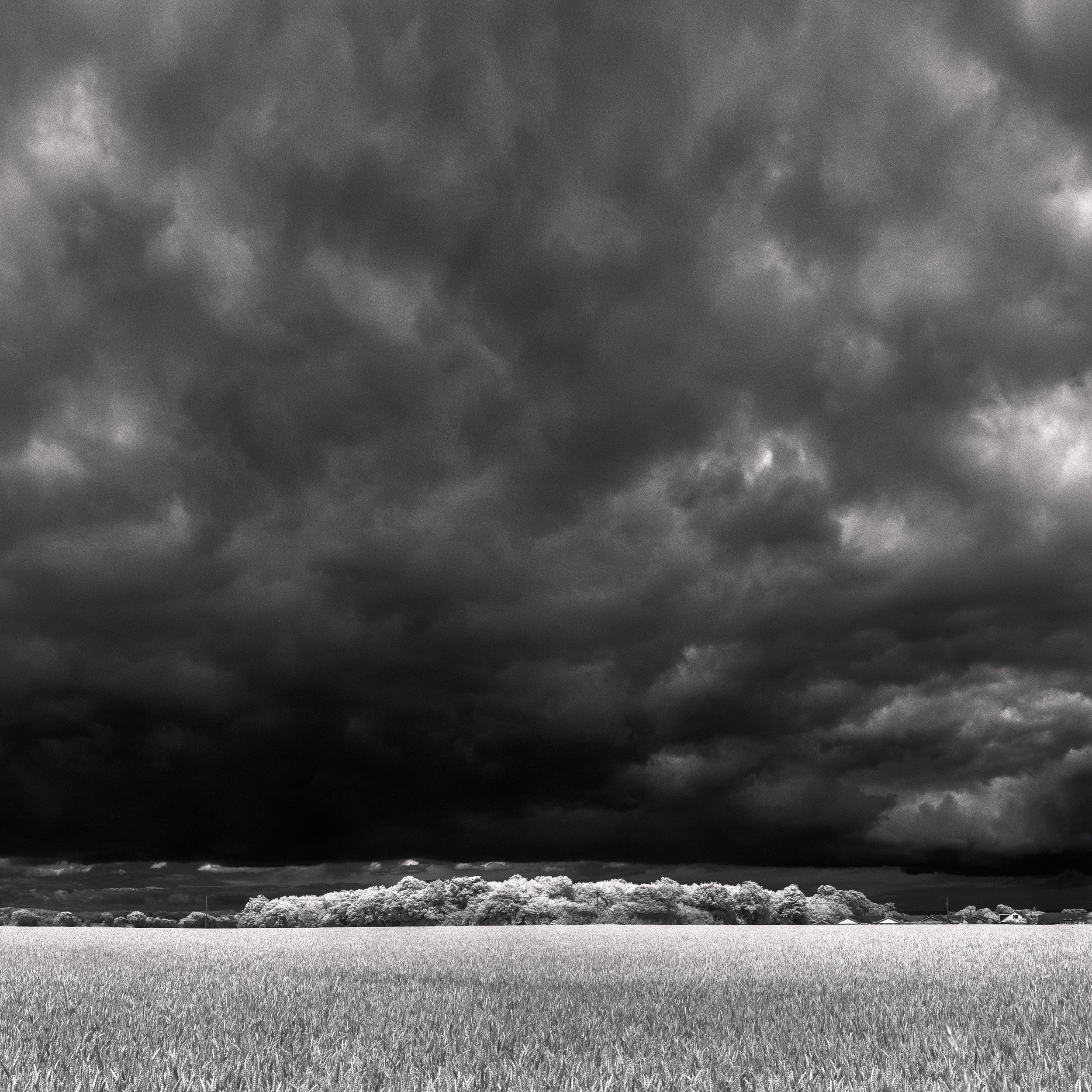
The practical implication is directional: when in doubt, expose for the highlights. In high-contrast lighting, prioritise preserving highlight detail, and accept that shadow areas may lose detail or be lifted in post-processing. This is the basis of a technique called Expose to the Right (ETTR) — intentionally placing the exposure as close to the right edge of the histogram as possible without clipping highlights, to maximise the signal-to-noise ratio captured in the RAW file. The Histogram article in this series covers ETTR in detail; for now, the principle is simply: protect your highlights.
HDR Photography
High Dynamic Range (HDR) photography addresses the fundamental limitation of single-frame dynamic range by capturing multiple exposures of the same scene and merging them.
In its original form — practised by photographers like Charles Wyckoff in the 1960s and formalised as a digital technique by Greg Ward in the early 1990s before becoming widely accessible through Photoshop and dedicated HDR software in the 2000s — HDR involved manually bracketing three to five exposures (typically at -2 EV, 0 EV, +2 EV) and combining them with tone-mapping algorithms into a single image with extended tonal range.
The early results were, to put it diplomatically, a period-specific aesthetic: haloed, over-processed, hyperrealistic. The HDR look of the mid-2000s is now as firmly dated as a particular haircut. Modern HDR processing is considerably more subtle, and in smartphone cameras, it is largely invisible — the camera does it automatically without you needing to think about it.
On a modern iPhone or flagship Android device, HDR operates by capturing a short burst of frames at different exposures, often including an underexposed frame to protect highlights and an overexposed frame to lift shadows, then computationally merging them in real time. The result is an image with broader tonal range than any single frame could achieve.
All this happens by default when the camera's algorithm judges it necessary; on the iPhone, you can disable it manually in Settings > Camera > Smart HDR (or, in more recent models, via the photographic controls in the camera app) if you want to work with a single exposure — useful when you are making a deliberate creative choice to let highlights blow or shadows crush, or when the motion in the scene makes multi-frame merging produce artefacts.
When HDR is appropriate: high-contrast scenes where you want to retain detail in both highlights and shadows — landscapes, interiors with windows, backlit subjects.
When it is less appropriate: intentionally high-contrast creative work (low-key portraits, silhouettes, moody landscapes where the blown sky is the point), fast-moving subjects where frame-merging introduces ghosting, and any situation where the creative intention requires the tonal range limitation rather than working around it.
The Histogram : A Brief Introduction
The camera's LCD screen is not a reliable tool for judging exposure. Its brightness varies with the ambient light around you (perfectly visible on an overcast day, all but invisible in direct sunlight), it is calibrated for a pleasing appearance rather than accuracy, and it is simply too small to reveal subtle tonal problems in the image. An image that looks beautifully exposed on the camera screen may contain significant blown highlights or clipped shadows that only become apparent when you open it on a computer.
The histogram is the reliable tool. It is a graph of pixel brightness across the image: the horizontal axis runs from pure black at the far left (value 0) to pure white at the far right (value 255); the vertical axis at any point shows how many pixels have that brightness. The histogram does not tell you what looks good; it tells you objectively what is in the image, tonally.
What to look for:
A spike or large mass of pixels pressed hard against the right edge indicates blown highlights — pixels that have reached value 255 and clipped. If this is accidental, you are losing detail.
A spike or large mass pressed against the left edge indicates crushed shadows — pixels at value 0, clipped to black.
The overall shape tells you about the tonal character of the image: a histogram biased towards the left is dark overall; biased towards the right, it is bright. A histogram with gaps at either extreme suggests the full tonal range is not being used.
None of these patterns are inherently wrong. A low-key portrait will have a histogram heavily weighted to the left; a high-key product photograph will be weighted to the right. What the histogram tells you is not what the image should look like, but what it actually does look like, in terms you can trust.
The Histogram article in this series covers how to read, interpret, and use the histogram in detail — including the ETTR technique, the RGB histogram versus the luminance histogram, and what different histogram shapes tell you about different lighting conditions. It is worth reading alongside this one.
Intentional Over- and Under-Exposure
Once you understand the mechanics of exposure, the interesting question becomes: what are you trying to say?
High-Key Photography
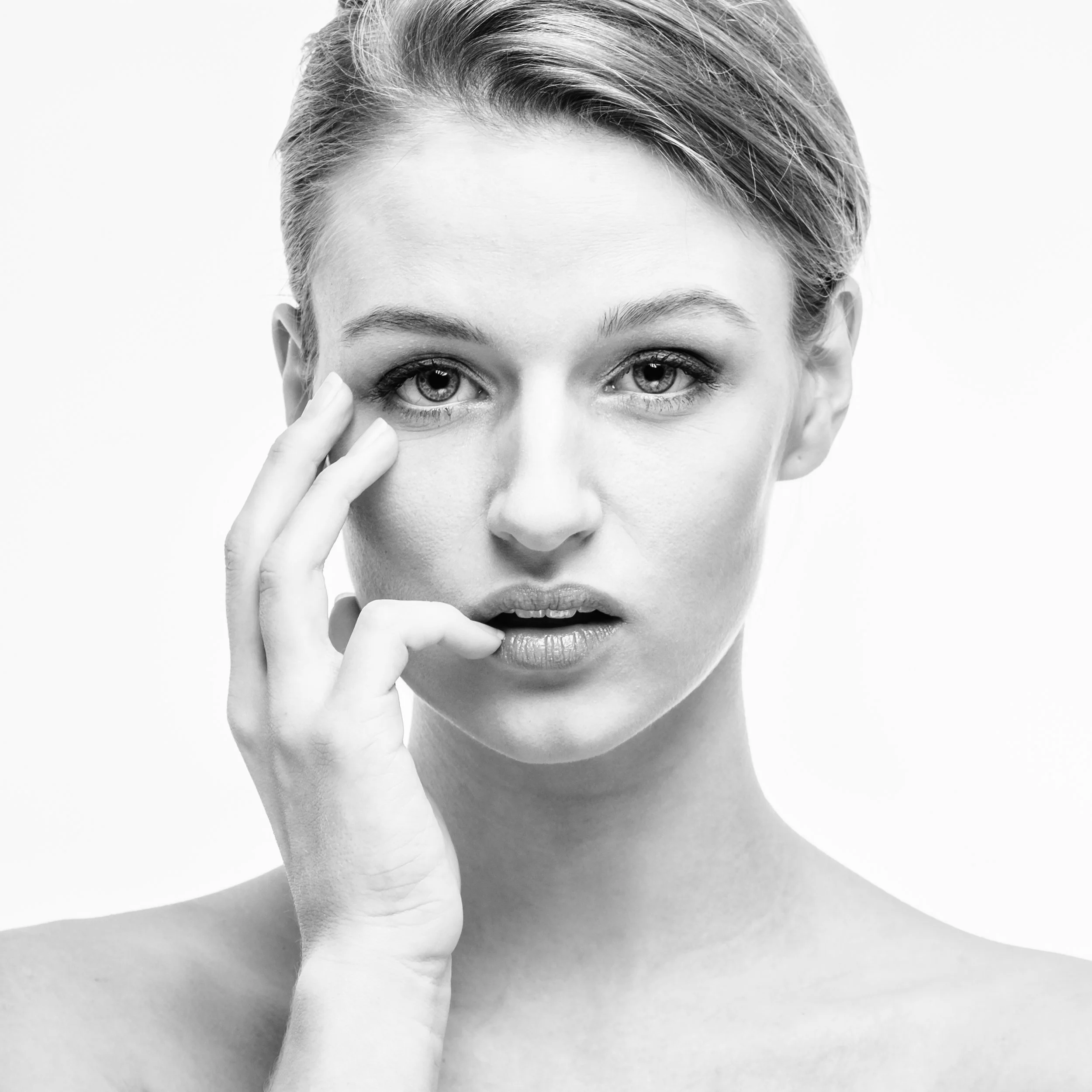
High-key photography is characterised by bright tones, minimal shadow, and an overall impression of lightness and space. Backgrounds are typically white or very light; the subject is lit to reduce or eliminate shadows; exposure is pushed into the upper part of the tonal range without clipping. The emotional register is optimistic, airy, innocent — which is why high-key is the dominant idiom of fashion photography, beauty advertising, and newborn portraiture. The visual weight of shadow is absent; everything feels clean and open.
The technical challenge of high-key work is maintaining the bright aesthetic without blowing highlights. This requires attention to lighting (soft, even, wrapping light rather than directional contrast light) and careful exposure monitoring, precisely because the histogram will show the image weighted to the right edge, and the temptation is to interpret this as overexposure and pull the exposure back.
Low-Key Photography
Low-key photography is the counterpoint: predominantly dark, with areas of controlled light emerging from shadow. The emotional register is weighted towards drama, mystery, intimacy, and weight. This is the photographic heir to the chiaroscuro tradition — the use of strong contrast between light and dark that is most readily associated with Caravaggio's paintings, but which runs through the history of visual art as a means of directing attention and creating psychological tension.
In photographic terms, low-key work typically involves tight, directional light on a dark background, with the exposure set to preserve the lit areas and allow the surrounding shadows to fall to black. The Light & Shadows article in this series explores this territory in depth, including the compositional use of shadow as a positive element rather than simply the absence of light.
Silhouettes
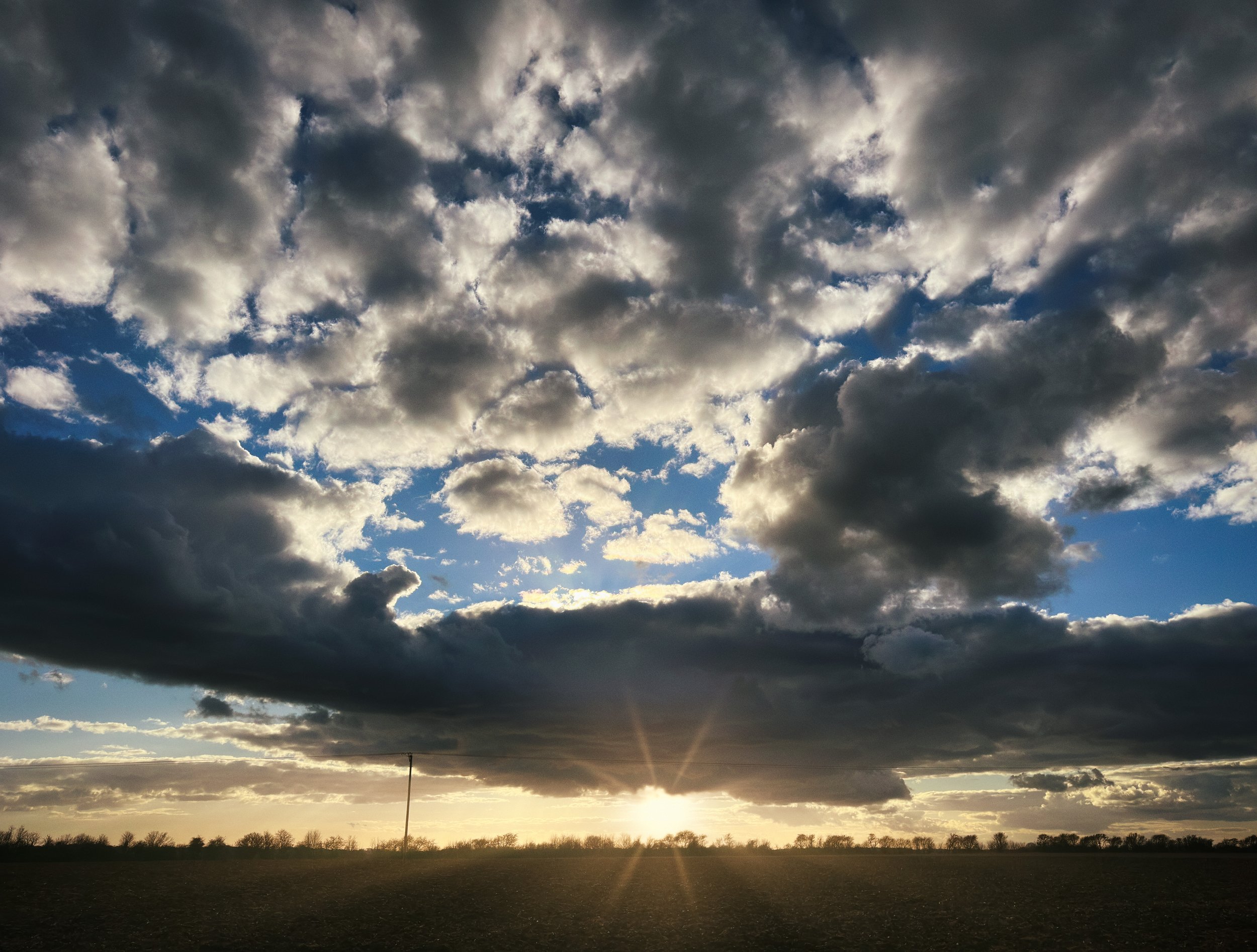
The silhouette is the extreme case of intentional underexposure of the subject relative to the background: the subject is exposed as a dark, featureless shape against a bright background, the form reading as a graphic element. A person against a sunset sky, a tree against a pale winter sky, a figure in a doorway with bright light behind them. Expose for the bright background, and the foreground subject goes dark. This is not an accident; it is a technique with a long tradition in both painting and photography.
Photographers and Exposure
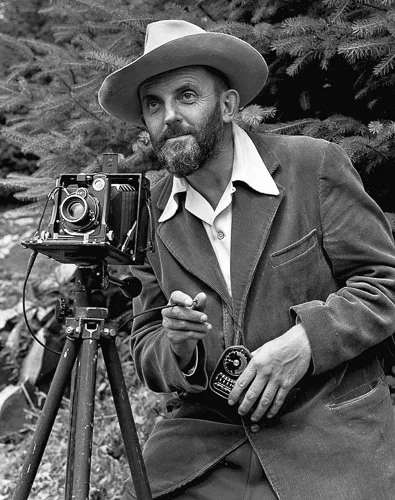
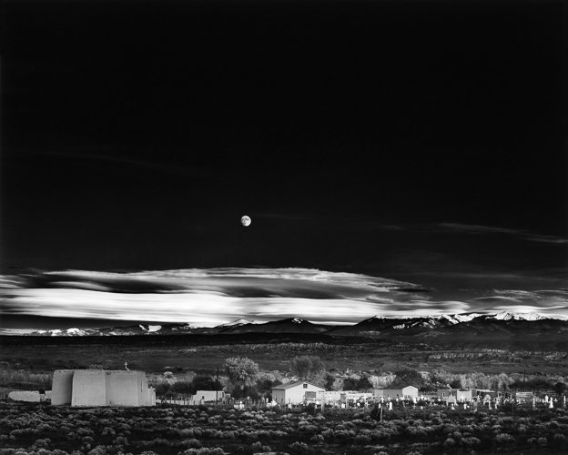
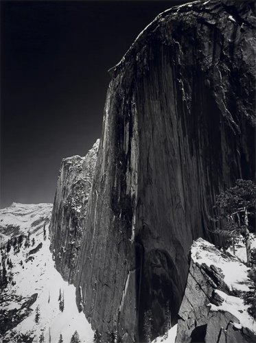
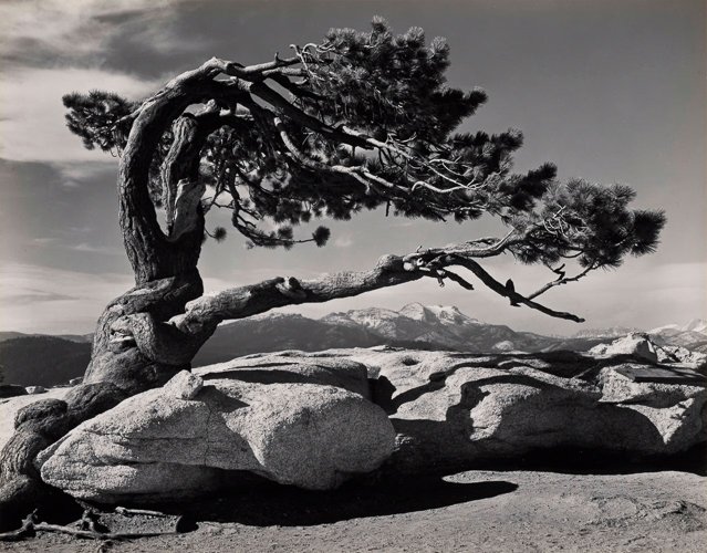
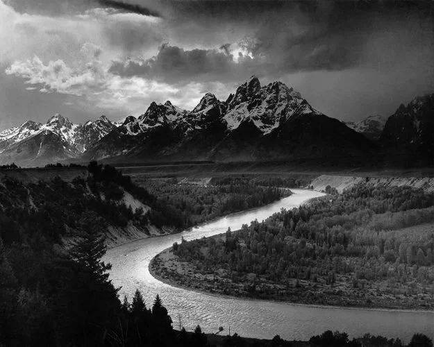
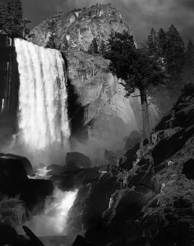
Ansel Adams developed the Zone System — a methodology for pre-visualising the full tonal range of a scene and translating that pre-visualisation into precise exposure and darkroom printing decisions — not as a technical exercise, but as a means of making exactly the print he had imagined before pressing the shutter.
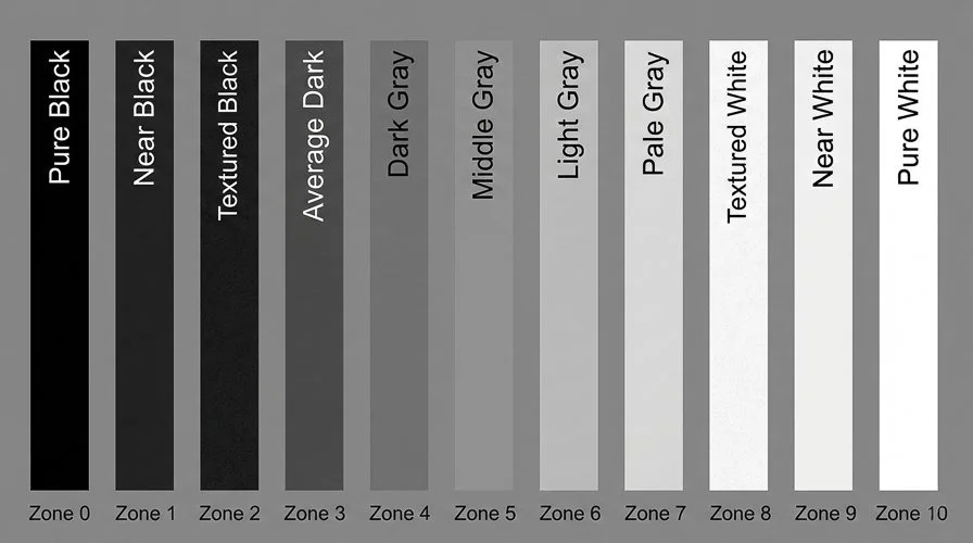
The Zone System divides the tonal scale into eleven zones, from Zone 0 (pure black) to Zone X (pure white), with Zone V representing middle grey. The relationship between the Zone System, 18% grey, and metering is covered in the Understanding 18% Grey article. The point to carry here: Adams did not expose to make technically correct images. He exposed to make specific prints.
His Moonrise, Hernandez, New Mexico (1941) was exposed in seconds by rapid mental calculation of the moon's luminance as a Zone VII value — there was no time for a measured reading. The exposure was a creative decision made under pressure, based on a deep internalisation of the relationship between luminance values and print tones. The image has sold as prints for over a million dollars. The exposure was right.
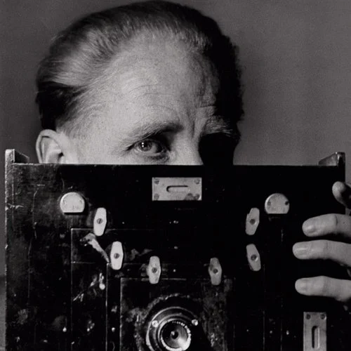
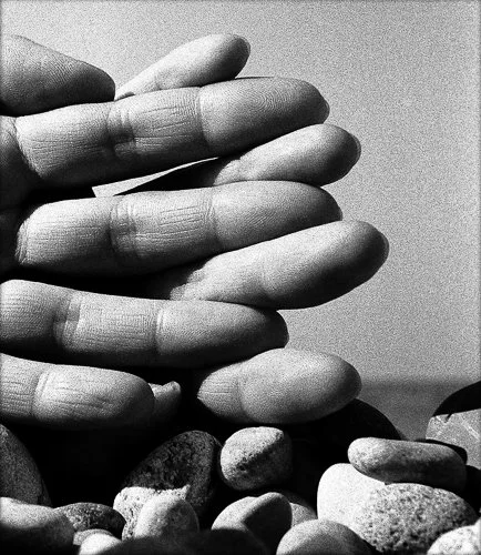
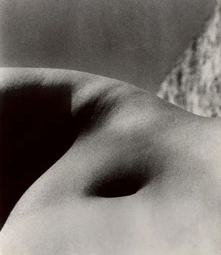
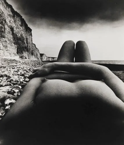
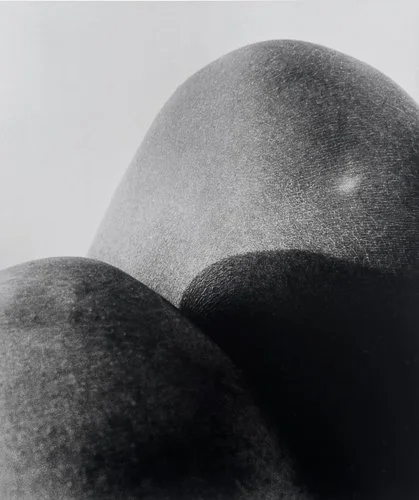
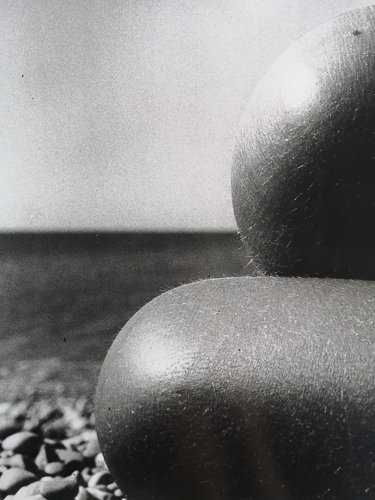
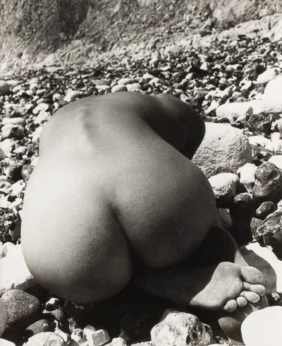
Bill Brandt was a British photographer whose career spans the 1930s through the 1970s, and whose work spans documentary social photography, portraiture, landscape, and — most distinctively — his late nude studies.
The nude series, produced primarily in the 1940s through 1960s using an early-model Kodak wide-angle camera with an extremely wide-angle lens and tiny aperture, achieves its distinctive quality through the combination of extreme depth of field, close viewpoint, and hard, contrasty printing that reduces the human body to near-abstract tonal forms — curves of light and dark, the curve of a shoulder reading like a landscape, a hand filling a frame like a promontory.
The exposure decision and the darkroom printing decision were inseparable in Brandt's practice; the image was not made at the moment of shooting but through the complete process of exposure, development, and printing.
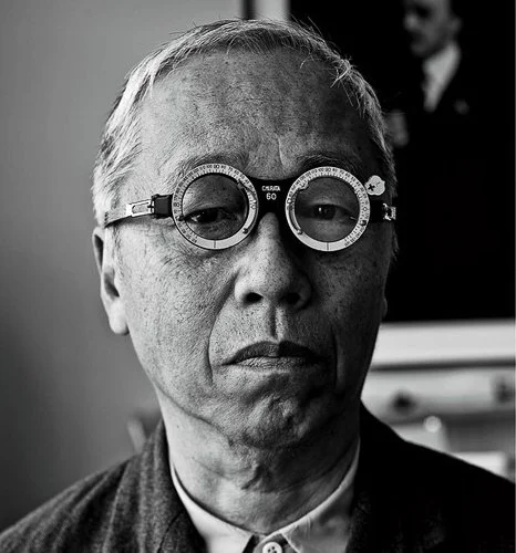
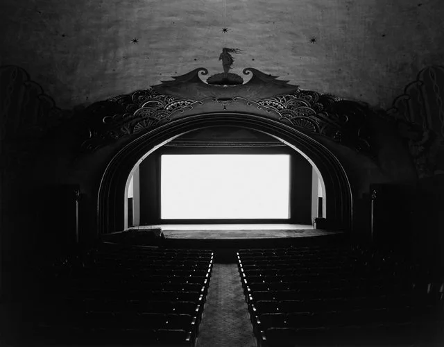
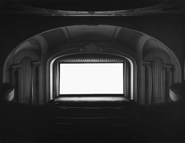
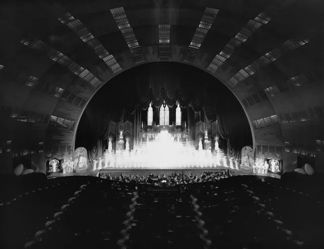
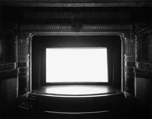
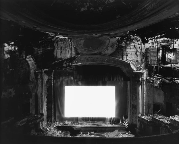
Hiroshi Sugimoto — discussed in the Horizons & Verticals article in this series — approached exposure as a conceptual tool. His Theatres series, begun in the late 1970s, involves setting up a large-format camera in a cinema and making a single exposure for the entire duration of a film screening, sometimes three hours or more. The moving image on the screen — which is, of course, a rapid succession of still frames, each occupying only a fraction of a second — is integrated over the entire exposure, averaging to a pure, luminous rectangle of white light.
The seats, the theatre's architecture, and the decorative elements of the ceiling are all recorded with complete sharpness and detail. The exposure is the concept: the entire content of a film, compressed into a single moment of light.
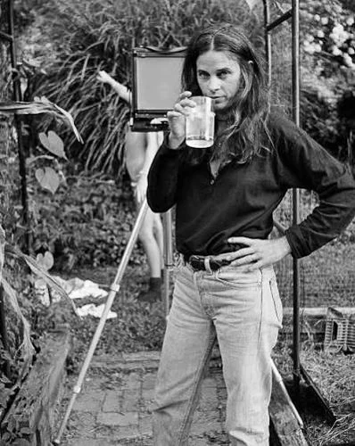
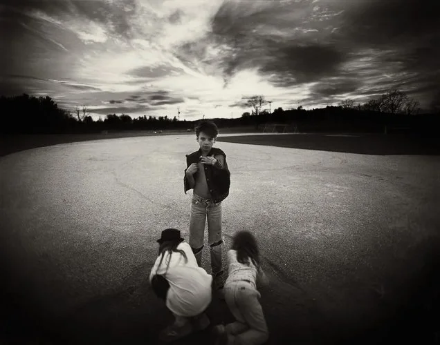
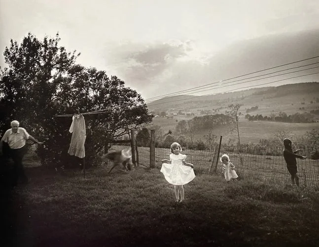
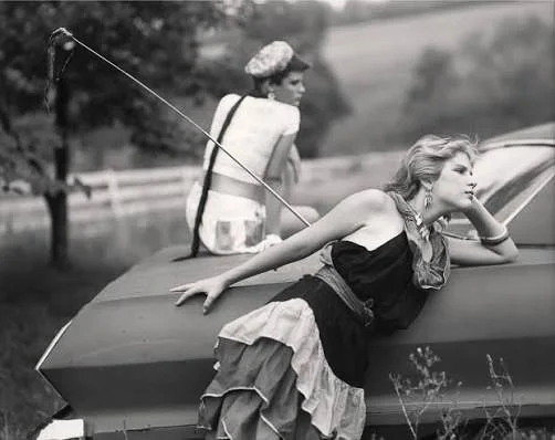
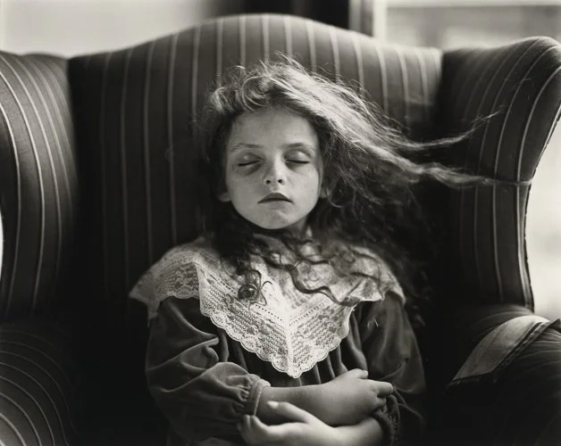
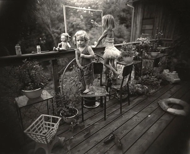
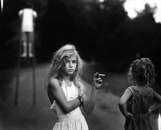
Sally Mann, working with large-format cameras in the Virginia landscape and Shenandoah Valley, particularly in her series Immediate Family (1992), embraces the variable and imperfect light conditions of outdoor summer shooting with a directness that makes technically "correct" exposure beside the point.
Blown skies, crushed shadows in dense tree shade, halation from strong backlighting — these are not errors Mann failed to correct. They are part of the visual register of the work: evidence of the materiality of photography, the limits of the film, the specific quality of that particular summer light on that particular afternoon. The imperfection is the authenticity.
Practical Exposure on a Smartphone
The principles above apply directly to smartphone photography; the interface differs slightly.
Setting the metering and focus point: Tap anywhere on the iPhone screen to set both the focus point and the exposure metering point. A yellow square appears. The camera will focus and expose for that point.
The exposure slider: Immediately after tapping, a sun icon appears to the right of the focus square with a vertical slider. Drag up to increase exposure; drag down to decrease it. This is real-time exposure compensation relative to the metered value for that tap point. Use it constantly. The camera's default judgement is often slightly conservative.
AE/AF lock: Press and hold the focus square until it says "AE/AF LOCK" in yellow at the top of the screen. This freezes both the focus distance and the exposure value, allowing you to recompose the shot without the camera re-evaluating either. Essential when you want to meter from a specific tone in the scene and then move the camera to a different framing.
HDR mode: Covered above. In most recent iPhones, Smart HDR operates automatically. For deliberate control — particularly when making low-key images or silhouettes — disable Smart HDR in Settings > Camera > Smart HDR.
RAW shooting: JPEG files are processed and compressed in-camera, with limited latitude for editing. RAW files (specifically, Apple's ProRAW format on the iPhone 12 Pro onwards, or DNG files from third-party applications) preserve the full sensor data, providing significantly more latitude for adjusting exposure, recovering highlights, and lifting shadows in post-processing. For serious work — situations where the lighting is difficult, the dynamic range is high, or you want maximum control in editing — shoot RAW. Recommended applications: Halide Mark II (arguably the best iPhone RAW camera app, with in-app histogram and exposure tools), Lightroom Mobile (full RAW pipeline with integrated editing), and ProCamera (extensive manual controls). On Android, most flagship camera applications support RAW (DNG) shooting either natively or through Pro mode.
In-camera histogram: Some iPhone camera apps (Halide, for instance) display a live histogram. The native iOS camera app does not. When shooting JPEG with the native camera app, check the image histogram after capture in the Photos app (tap the image, swipe up to see the histogram and other metadata). In Lightroom Mobile, the histogram is visible in the edit screen. Using the histogram as a regular part of your shooting workflow — not just for checking afterwards, but for making decisions about exposure before you finalise the shot — is a habit worth developing early.
The "expose for the highlights" principle in practice: In high-contrast scenes, tap the brightest important area of the scene to set the metering point, then use the exposure slider to pull down slightly if the highlights are still blowing. Let the shadows fall where they fall. In RAW files, you can recover shadow detail in editing; you cannot recover blown highlights.
Resources
Emil Pakarklis runs one of the more useful iPhone photography channels precisely because he avoids the gear fetishism that afflicts much of the photography internet. His treatment of exposure and dynamic range is practical and directly applicable, without the detour into camera comparison that characterises many equivalent tutorials. Specifically useful for the exposure slider, AE/AF lock, and HDR sections — the controls this article has described, demonstrated in real use on an actual iPhone. Worth watching for the hands-on confirmation of the principles covered here.
The Northrups produce some of the most technically rigorous photography tutorials available, and their treatment of the exposure triangle is thorough without being dry. This is the resource to reach for if you want the concepts covered above reinforced with additional visual demonstration, additional examples, and more depth on full-camera controls. Less specifically iPhone-focused than Pakarklis, but the fundamentals are universal.
Pieta's overview approach — focused on clarity over comprehensiveness — makes this useful as a quick orientation if the more extended treatment above feels dense. Recommended specifically as the starting point before the more detailed resources, or as a check that the core concepts have landed. Keep the expectations calibrated: this is an introduction, not a deep dive.
Filmmaker IQ specialises in going properly under the bonnet of photographic and cinematic concepts, and this is one of their best. It starts where the article leaves off — with the psychophysics of human vision and why our eyes handle a far greater brightness range than any sensor — before working through gamma correction, logarithmic encoding, and what "dynamic range" actually means at a data level. The first eight minutes in particular, covering Stevens' Power Law and how our brains perceive brightness non-linearly, will reframe how you think about exposure decisions. The later sections drift toward cinematography, but the foundations are entirely relevant to still photography. Worth the commitment.
Give it a Try!
The Exposure Run
Find a static subject with some textural interest — a rough stone wall, a piece of fruit on a windowsill, a face. Set your phone to meter at the subject and photograph it at five different exposures: -2 stops, -1 stop, the camera's metered value (0), +1 stop, and +2 stops, using the exposure slider or manual controls. Review the five images together.
The aim is not to find the "correct" exposure. The aim is to see what the scene contains at different exposures — the detail that lives in the shadows at -2 stops, the tonal softness that appears at +2. Identify which exposure best serves your intent with this subject, and why. The camera's preference (0) may not be yours.
The High-Contrast Challenge
Find a scene with extreme contrast: a window in a dark room, a person standing with their back to a bright sky, a shadow falling across a sunlit surface. Make three photographs of the scene. First, expose for the highlights — tap the brightest area, pull the exposure down if needed, and let the shadow areas go dark. Second, expose for the shadows — tap the darkest area you want to see detail in, and let the highlights blow. Third, if your phone offers it, make an HDR version.
Compare all three. The aim is to see the limits of the sensor's dynamic range directly — to understand, in a specific scene you have chosen, where the camera runs out of room. Then make a fourth image: a deliberate creative choice about which trade-off serves the image. Neither the correctly exposed JPEG nor the HDR version is automatically the right answer.
The Intentional Exposure
Before you shoot this exercise, write down what you are trying to achieve — physically write it, even in a note on your phone. Then make two photographs of the same subject. The first: a high-key version, bright and light-filled, using positive exposure compensation (+1 to +2 EV) and, if available, even, open light. The second: a low-key version, dark and shadow-dominated, using negative compensation (-1 to -2 EV) and directional or constrained light.
The aim is not technical demonstration. The aim is to internalise that exposure is a creative decision with emotional consequence — that you can make the same subject feel completely different by deciding, in advance, what you want it to feel like. The notes you wrote before shooting will tell you whether the result achieved the intention. If it did not, adjust and try again. This is what learning photography actually involves.