
Horizons & Verticals
Everything you photograph exists on a grid you cannot see. Two axes — horizontal and vertical — organise the visual world so thoroughly that you only notice them when something goes wrong. A tilted horizon stops you dead. A building that leans backwards pulls your eye away from everything else.
These aren't minor annoyances — they're perceptual disturbances, and the human visual system treats them that way: diverting cognitive resources to investigate the anomaly, and distracting the viewer from the normal interpretation of the scene.
That's the argument for taking horizons and verticals seriously. Not because there's a rule that says lines should be straight, but because the moment they aren't, they dominate the entire frame. The composition you worked carefully to construct — the light, the subject, the mood — becomes invisible. All anyone can see is the wonky horizon. Getting these fundamentals right doesn't make a photograph — but getting them wrong destroys one.
This article is about those two axes: what they mean visually and psychologically, how to control them in camera, and what happens when you decide, deliberately, to do something else with them entirely.
How We Read Lines
Before you can work with lines, it helps to understand what they do to you — or rather, what they have always done to human beings looking at the world.
Horizontal lines speak of rest. The horizon is the most fundamental horizontal there is: the line where looking ends and resting begins. Every landscape photograph that achieves a sense of calm, spaciousness, or eternity is drawing on this. Think of what a wide, flat seascape does to a room. The horizontal is the baseline of stillness.
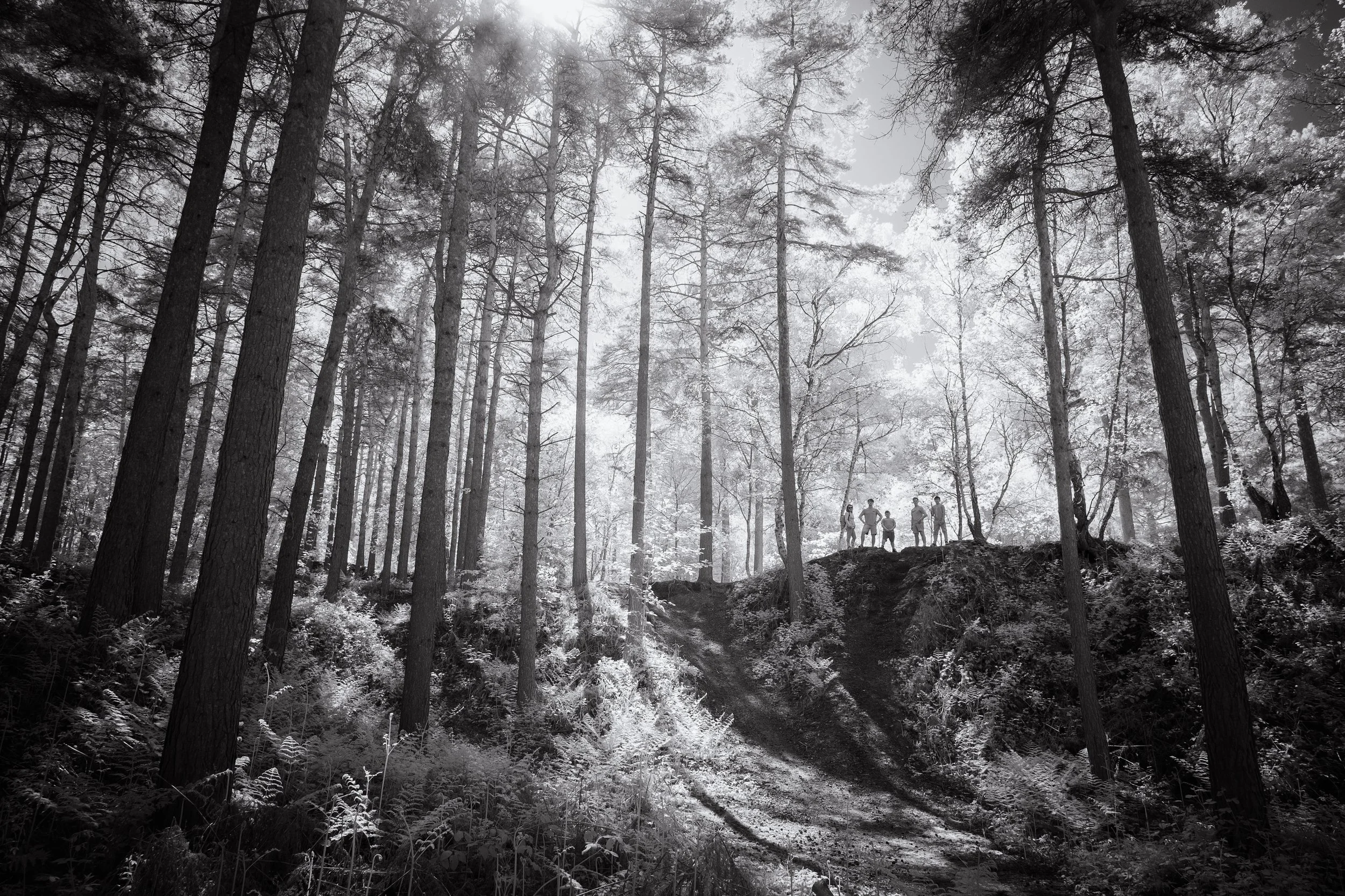
Vertical lines do the opposite. They speak of aspiration, authority, and energy. A standing tree, a column, a person upright against a sky — these all read as vital, active, alive. The vertical implies effort against gravity. Cities are almost entirely made of verticals; so are forests. There's a reason we say something "stands tall".
What lies beneath these responses is partly cultural, and partly much older than culture. Our bodies are vertical — the axis of balance runs from the crown of the skull to the ground. The horizon is the calibrating line against which that axis is measured. We read horizontal and vertical not just visually but proprioceptively: they tell us where we are in space.
Diagonal lines disrupt both axes simultaneously, which is why they feel energetic and unstable. A diagonal carries implied direction and implied force — it is going somewhere. The next article in this series, Leading Lines, explores that in depth.
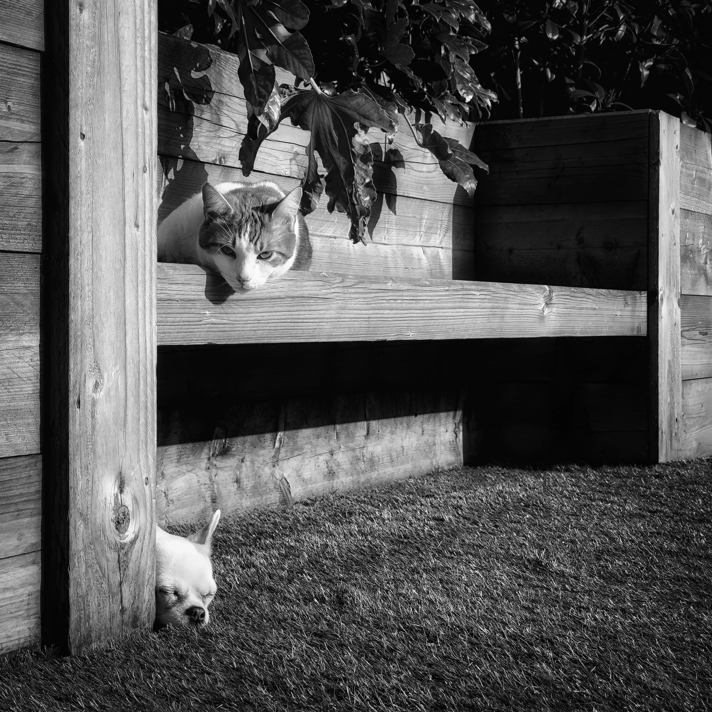
One more thing worth knowing before we begin: lines don't have to be drawn to function as lines — they can be implied. The edge of a shadow, a row of trees, a fence receding into distance, the direction of a gaze — all of these register as lines and carry the same directional energy. Your eye follows structure, and structure takes many forms.


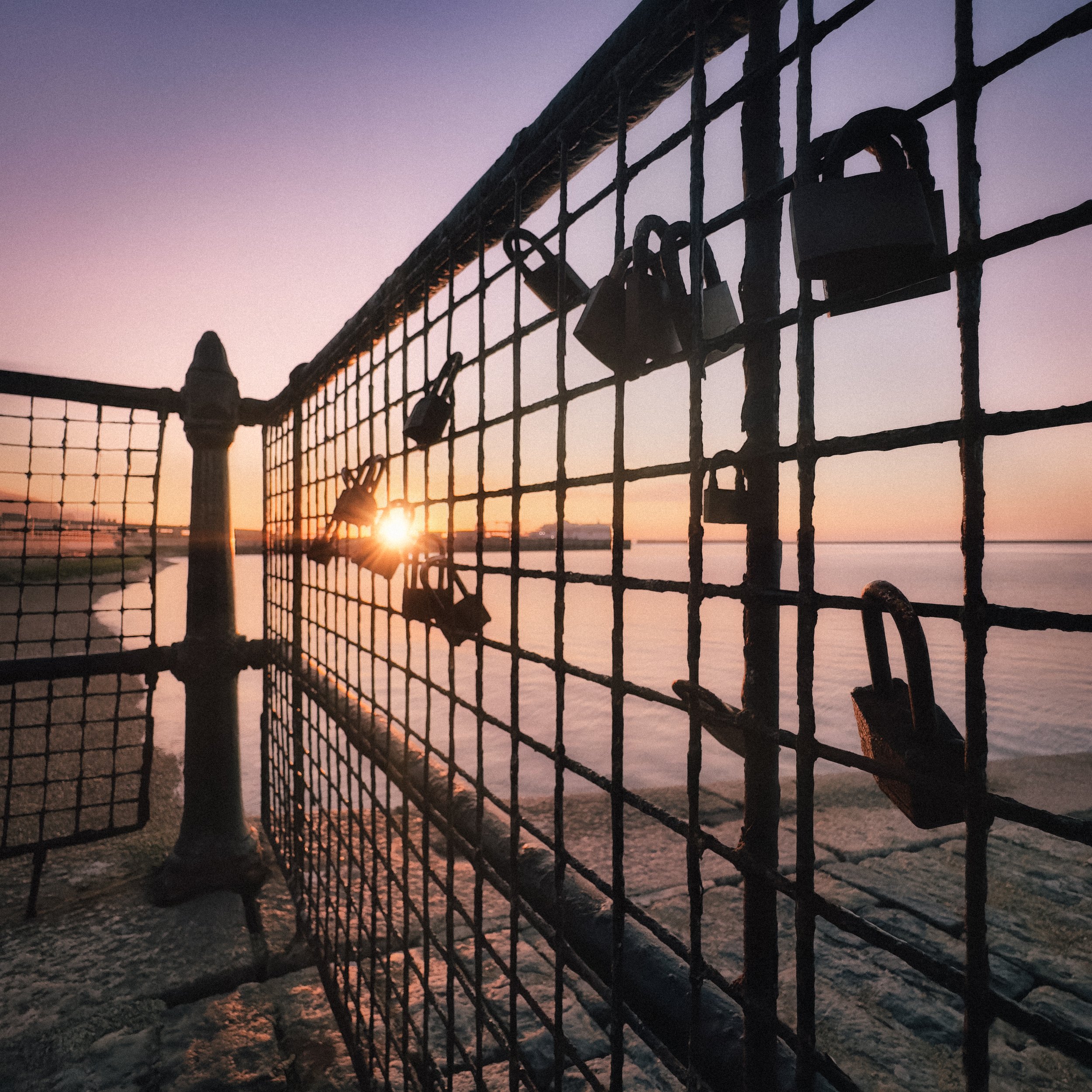


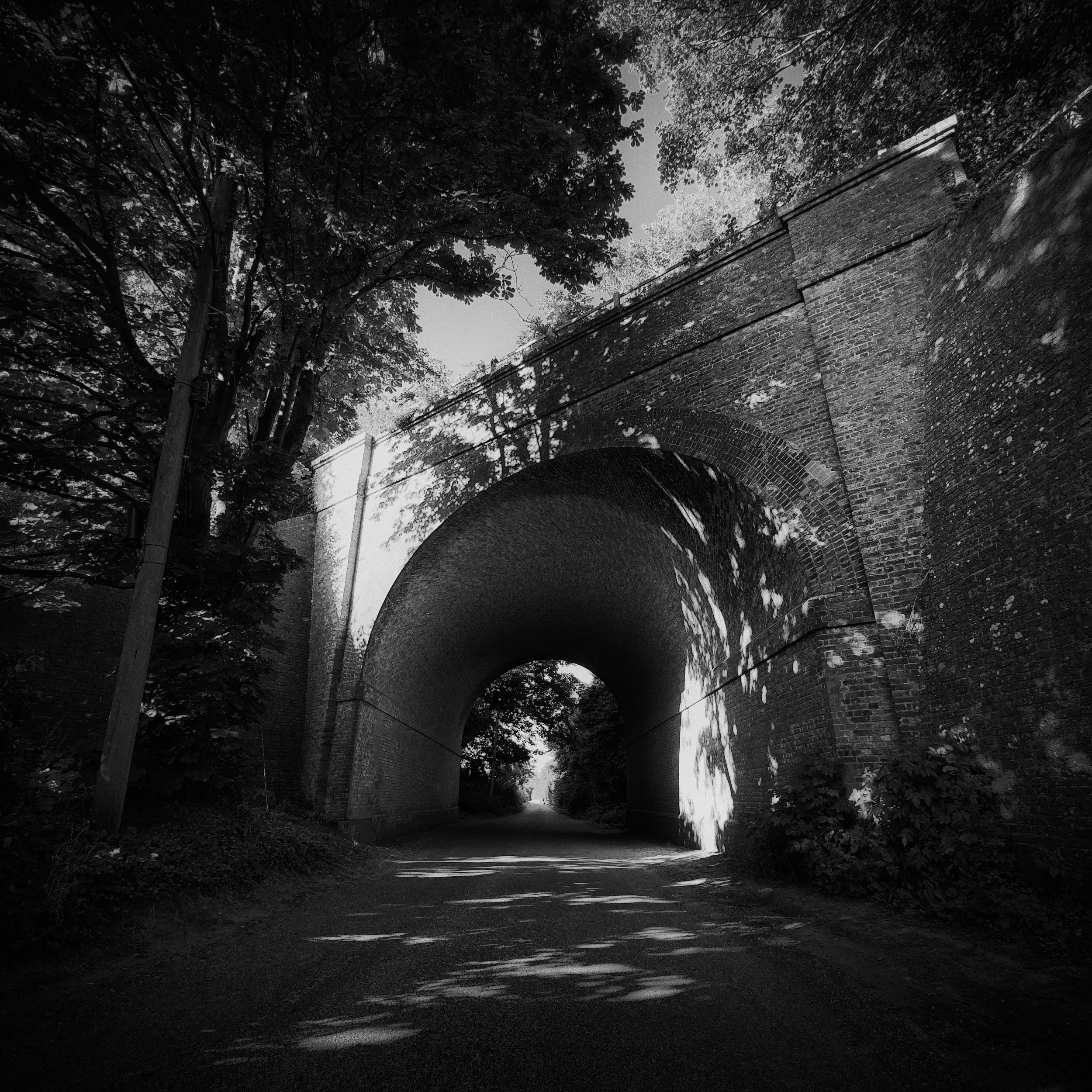


The Horizon
The horizon is the most fundamental compositional element in landscape photography. Not because of any rule, but because it is the literal meeting point of earth and sky — the primary division of the visual world. Where you place it is one of the most consequential decisions you'll make in the frame.
Placement: High, Centre, Low
Every position of the horizon line implies a different emphasis and a different mood.
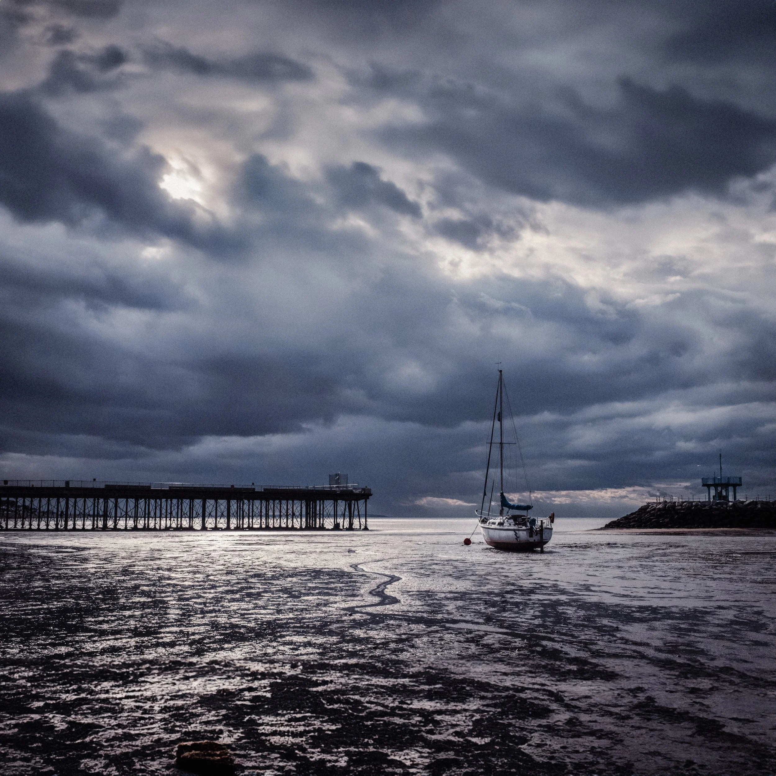
A low horizon — pushed to the lower third of the frame or below — gives the sky dominance. This is the natural choice when the sky is doing something worth watching: dramatic clouds, sharp light at the edge of a storm, the wash of a sunset. It creates a sense of openness and scale. It also works for minimalist compositions, where a wide expanse of undifferentiated sky becomes negative space.
A high horizon — in the upper third — shifts emphasis to the foreground and middle distance. This is the right call when the land is the story: a field of texture, an interesting shoreline, a landscape with complex foreground elements. It brings the viewer in close and gives the earth room to breathe.
A centred horizon is usually avoided in compositional guides, but it earns its place in specific circumstances: a mirror-flat reflection, or any composition where the symmetry between the two halves is the subject. The Seascapes of Hiroshi Sugimoto — discussed in more detail below — place the horizon at the precise centre of every image, deliberately, as a philosophical statement. When the equality of sky and water is exactly the point, a centred horizon isn't a failure of composition; it's the composition.
The rule of thirds (covered in its own article) offers a useful starting point for horizon placement: align with either horizontal grid line, and you have a solid default. But treat it as a default, not a ceiling. The horizon belongs wherever the photograph requires it to be.
Level: Why a Tilted Horizon Hijacks Everything
A level horizon is almost always essential — not for aesthetic reasons but because of how the visual system works. The image-processing systems in our eyes and brain evolved with the primary function of helping a medium-sized, slow-moving plains ape survive in a hostile environment. When the world looks the way the brain expects, all’s well, but at soon as something in the scene appears ‘off’, it could be a threat, and that demands your visual attention until the matter is settled.
The horizon is the primary reference your eye uses to calibrate everything else in an image. When it tilts, even slightly, your brain devotes significant processing resource to trying to correct for it, and the composition you intended simply can't be seen clearly. A tilted sea looks like the water is about to run off the frame. A tilted field becomes a mystery rather than a landscape.
The tools to avoid this are already in your pocket:
iPhone: Settings > Camera > Grid turns on a 3×3 overlay that serves double duty — composition guide and horizon-level reference. Settings > Camera > Level adds a crosshair indicator that turns yellow when you're precisely level.
Android cameras typically have a grid option in camera settings; exact path varies by manufacturer.
Mirrorless and DSLR cameras offer a virtual horizon display in the electronic viewfinder or LCD, usually accessed through display settings; some viewfinders show it as a two-axis spirit level. Check your manual.
The grid is the more useful of the two iPhone tools for general composition. The level indicator is particularly valuable when you're shooting something that doesn't have obvious horizontal references — a wide open seascape, say, where there's no building or treeline to align against.
The Deliberate Tilt: The Dutch Angle
There is one context in which a tilted frame is entirely intentional and legitimately powerful: the Dutch angle.
The name is a linguistic accident. The technique originates in German Expressionist cinema of the 1910s and 1920s — the Deutsch angle, not the Dutch one. When those films finally reached international audiences after the First World War, the German word Deutsch was misread as Dutch, and the name stuck. The Cabinet of Dr. Caligari (1920) is the canonical early example: a film in which the entire set was physically built at angles to create an atmosphere of psychological instability. Later filmmakers achieved the same effect more economically by simply tilting the camera.
The Dutch angle works because it turns both of the primary visual axes — horizontal and vertical — into diagonals simultaneously. The frame no longer has a stable base. Things feel wrong, disorienting, unmoored. In cinema, it signals menace, madness, or moral ambiguity; you see it throughout Citizen Kane, The Third Man, and most Hitchcock thrillers.
In photography, it functions the same way — but requires commitment. A tilt of two or three degrees reads as a mistake, not a decision. A tilt of fifteen degrees or more reads as an intention. If you're going to use the Dutch angle, commit to it: go far enough that the viewer understands you meant to do this.
The rule of thumb is simple: go big or go home. A half-hearted tilt looks like you dropped the camera.
Hiroshi Sugimoto and the Seascapes
The most philosophically rigorous engagement with the horizon line in the history of photography is almost certainly Hiroshi Sugimoto's Seascapes series, begun in 1980. The first image in the series was made at the Caribbean Sea in Jamaica — a photograph Sugimoto later described as a beginner's work, noting the difficulty of finding truly clear air and an unobstructed horizon in the tropics. But the conceptual engine was running from that first exposure, and it never stopped.
The premise of the Seascapes is deceptively simple: an 8×10 large-format camera, a body of water, the horizon at the exact centre of the frame, and nothing else. No land, no sky features of note, no human presence. Just water below, air above, and the line between them. Every image in the series — there are hundreds now, shot from the Caribbean to the Arctic Ocean, from the Ligurian Sea to the Sea of Japan — is composed on the same principle. Water and sky in equal measure, bisected by the horizon.
The reason this is not merely formalist minimalism but something stranger and more vertiginous lies in what Sugimoto understood the horizon to be. He has spoken of the sea as the one element of the visual world that has remained unchanged throughout human history — that the seascape you would see from a cliff today is indistinguishable from the seascape a person standing on the same cliff would have seen ten thousand years ago. His images are, in that sense, photographs of the same thing every human being who has ever stood on a coast has looked at. They collapse time.
Sugimoto has described his camera as a time machine. In the Seascapes, he used long exposures — sometimes hours — to smooth the sea's surface, to remove the particular from the timeless. The resulting images sit at the edge of abstraction: two tonal fields divided by a near-invisible line, printed with meticulous care in gelatin silver, the horizon bisecting the image with mathematical precision. They are the simplest photographs imaginable. They are also philosophically vertiginous in exactly the proportion that they succeed — the more clearly you understand what you are looking at, the stranger it becomes.
When the series was shown at the Parrish Art Museum in 2025, the accompanying text described it as depicting "a horizon that has remained unchanged throughout human history." That is the project, and it is larger than photography.


Michael Kenna has worked in a register that shares Sugimoto's minimalism and his patience. Kenna's landscapes — shot in long exposures, almost always in monochrome, often at dawn or in darkness — reduce scenes to their essential tonal structures. His horizon lines, when they appear, often bisect the frame with similar clarity and philosophical quietness: not as a statement about time in Sugimoto's sense, but as an instinct for stillness. Where Sugimoto's rigour is conceptual, Kenna's is atmospheric.
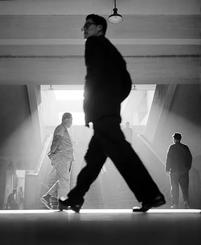
Fan Ho worked with the horizon differently: as one compositional element among many in complex urban scenes. His photographs of Hong Kong in the 1950s and 1960s use the horizontal lines of streets, waterways, and architectural edges to organise frames of extraordinary spatial complexity. The horizon isn't always visible, but the horizontal logic always is — Fan Ho divides his frame with horizontal masses of shadow and light in the same way a seascape photographer uses the waterline. Often described as the Cartier-Bresson of the East, his work shows how horizontal structure operates in dense urban environments just as powerfully as it does in landscape.
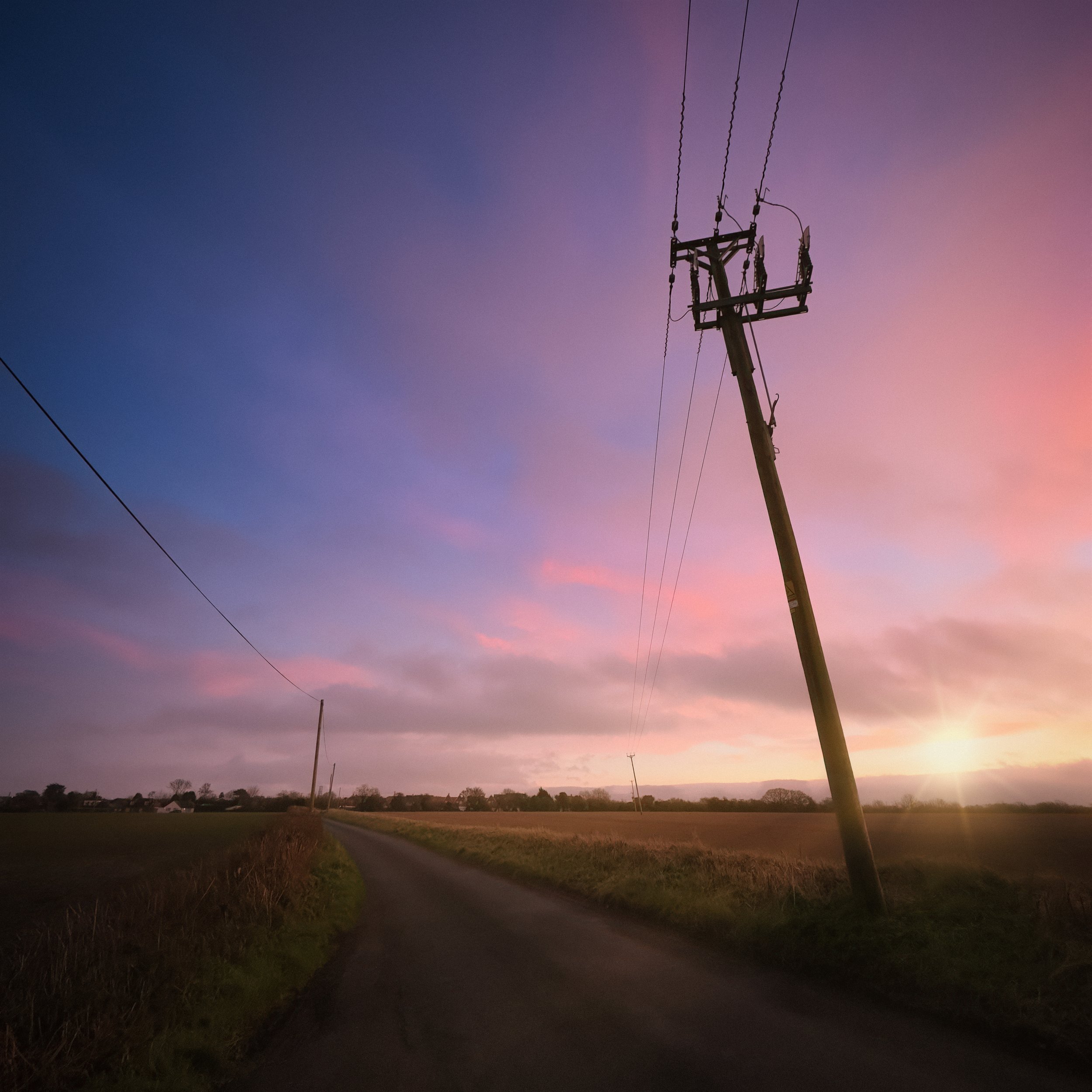
Vertical Lines : Height, Drama, and Convergence
Vertical lines — trees, buildings, columns, door frames, standing figures — carry the primary visual weight of most architectural and urban photography. They are also the lines most likely to cause technical problems. And they are the lines that, when you decide to break the rules deliberately, offer some of the most expressive options available.
The Power of Verticals
The psychological resonance of verticals runs deep. Height implies aspiration: the cathedral, the skyscraper, the old-growth tree — all derive some of their expressive force from the simple fact of rising. Scale is almost always dramatic in vertical subjects; a building that fills the frame from bottom to top creates a sense of the monumental that the same building, photographed from a distance with the horizon in frame, never quite achieves. The vertical is also closely associated with authority and permanence — the column, the obelisk, the standing stone.
In natural settings, the vertical of a tree canopy or a cliff face brings the same quality of height and enclosure. In urban settings, converging towers and facades create some of the most dramatic compositional geometry available to the photographer.
Converging Verticals
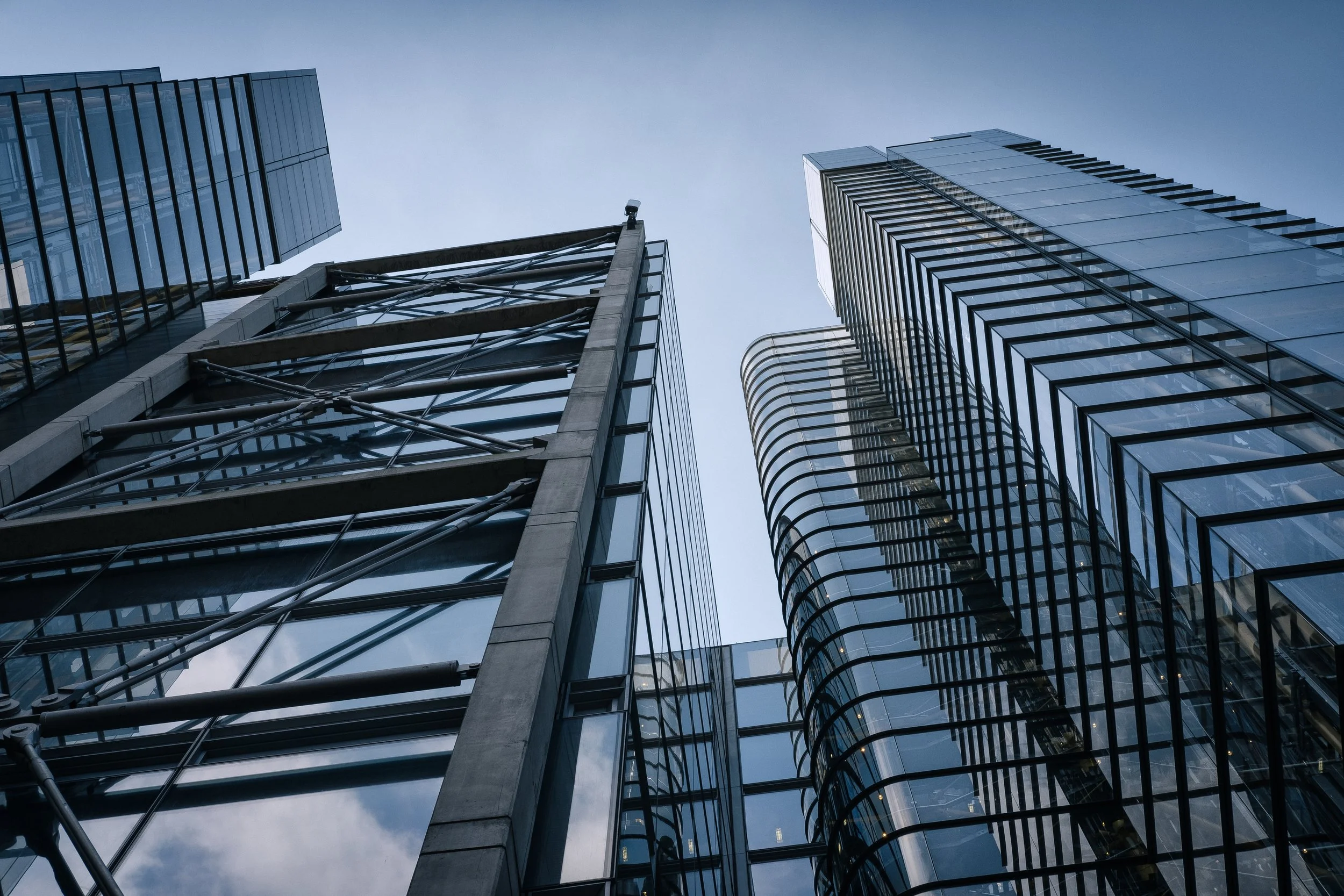
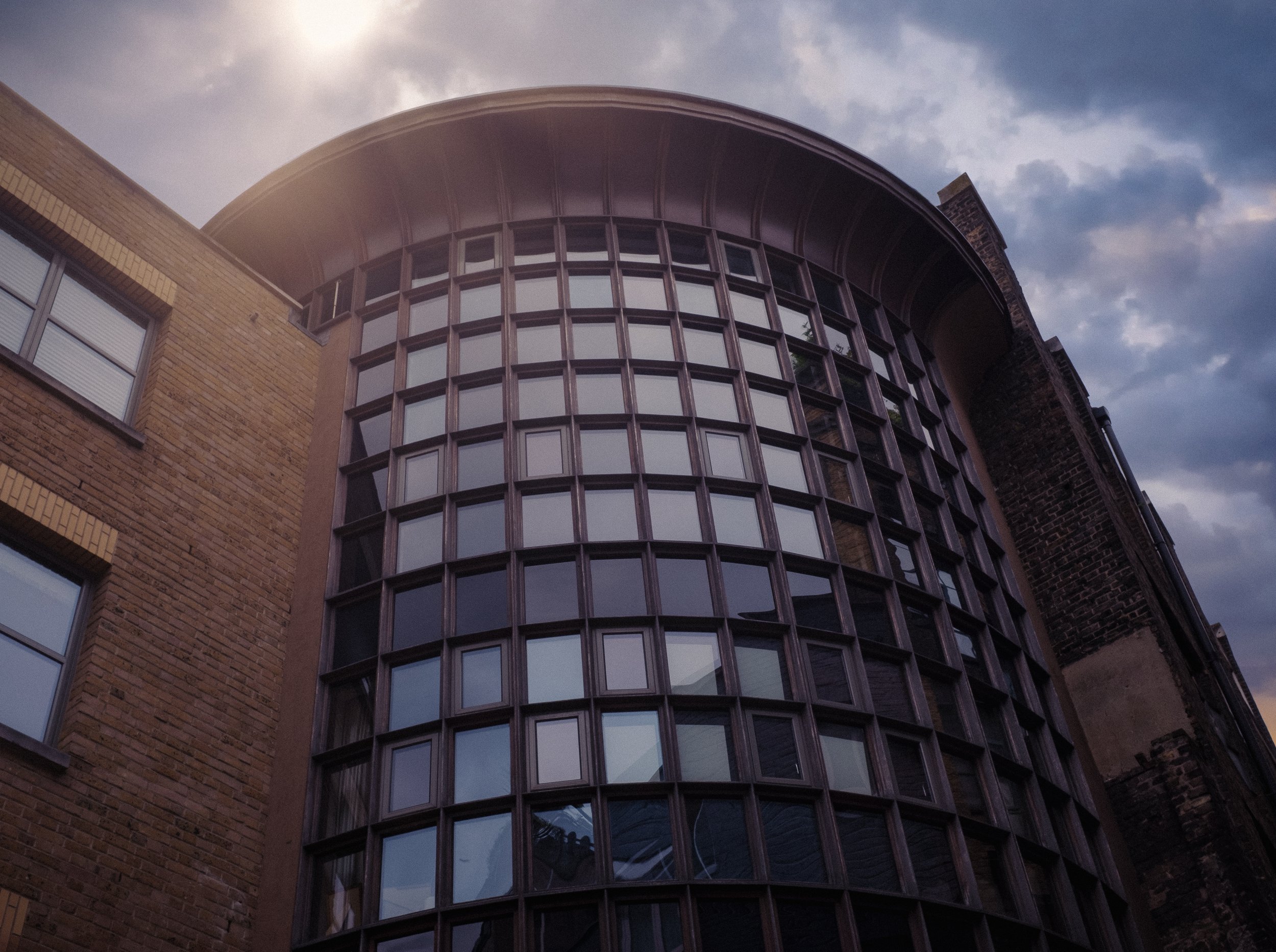
Here is the technical problem: vertical lines converge when your camera isn't perfectly parallel to them.
If you stand at the base of a tall building and tilt your camera upwards to capture the full height, the building's sides appear to narrow towards the top. This is converging verticals — also known as the keystone effect. It happens because the top of the frame is physically further from the building than the bottom of the frame, so the building appears wider at the base and narrower at the top.
This isn't a flaw in the camera or the lens. It's an accurate depiction of perspective — it's what the building actually looks like from that position. Whether it's a problem depends entirely on what you want the image to do.
When convergence is distracting: In most architectural documentation, in real estate photography, and in many editorial contexts, convergence reads as technical carelessness rather than creative intent. The building appears to be falling backwards. This is particularly noticeable with wide-angle lenses, which exaggerate the effect.
When convergence is expressive: Tilting the camera upwards at a tall building or a stand of trees — and allowing the lines to converge — creates a heroic perspective. The subject is made to appear larger, more powerful, more overwhelming. Looking up at a row of skyscrapers from street level, the converging lines create a kind of visual gravity that pulls you upwards. This is a deliberate compositional choice, and a strong one.
Looking downwards: Convergence also occurs when you tilt the camera downwards, but here the effect is reversed: the subject widens at the bottom and narrows at the top. This makes subjects feel smaller, more contained, viewed from above. The perspective of authority or distance.
The Architectural Photography Problem
For architectural photographers, convergence is the central technical challenge — the thing around which almost every other technical decision is organised.
The specialist solution is a shift lens (also called a tilt-shift or perspective control lens). This allows the lens to slide laterally or vertically relative to the sensor, keeping the film plane parallel to the subject without tilting the camera. The result is a building photograph with perfectly corrected verticals taken in camera, with no cropping required. Shift lenses are expensive, specialised, and optically superb. They are standard equipment for any serious architectural photographer.
Most photographers working without a shift lens correct verticals in post-processing:
Lightroom / Lightroom Mobile: the Transform panel offers Auto, Level, and Vertical correction buttons, plus a Guided mode where you manually draw lines on what should be vertical in the image and let Lightroom align to them. Guided is the most precise option for complex corrections.
Snapseed: the Perspective tool allows you to push or pull the corners of the image to correct for converging lines; it's less precise than Lightroom's Guided mode but entirely usable on a smartphone.
Photoshop: Perspective Crop, Warp, and the Transform tools all allow manual correction.
Every correction involves trade-offs. Correcting convergence always means cropping: when you straighten a converging building, the corners of the image don't fit a rectangular frame anymore, and something has to go. It also introduces some edge distortion, particularly with stronger corrections. And here is a counter-intuitive truth that experienced architectural photographers know: perfect convergence correction can actually look wrong. A trace of convergence is often more natural-looking than a building whose sides are absolutely parallel. The correction is frequently best taken most of the way, rather than all the way.
The Bechers and the Decision Not to Correct
The most rigorous response to the problem of perspective in architectural photography was made not by eliminating it in post-processing, but by eliminating the conditions that cause it.
Bernd and Hilla Becher spent decades photographing industrial structures — water towers, blast furnaces, cooling towers, mine headframes — in Germany and across Europe and North America. Their method was systematic to the point of near-obsession: every subject photographed from the same moderate distance, the same height (typically eye level or slightly elevated, never from below), under the same flat overcast light, in the same tonal register. No dramatic angles, no expressive lighting, no compositional flourishes. The camera, in their method, is a neutral recording instrument, and perspective is a variable to be controlled, not exploited.
The point of this rigour was not the individual image but the series. When you gather thirty water towers into a single presentation, shot with identical parameters, you begin to see the differences between them — differences of function, era, region, industrial logic. Convergence, dramatic lighting, and compositional eccentricity would have injected the photographer's presence into images that were designed to be about the structures themselves.
The Bechers were awarded the Golden Lion for sculpture at the Venice Biennale in 1990 — a remarkable honour for photographers, and one that reflected the sculptural, typological nature of their project. Their influence spread through the Kunstakademie Düsseldorf, where they taught from 1976 to 1996. Their students — Andreas Gursky, Thomas Struth, Candida Höfer, Thomas Ruff — became the Düsseldorf School, one of the most influential movements in late twentieth-century art photography.
Andreas Gursky, in particular, took the Bechers' appetite for systematic, frontal image-making and scaled it to enormous prints of global industrial and commercial landscapes — Rhine II, 99 Cent, Paris, Montparnasse — that are simultaneously cool and overwhelming.


Berenice Abbott and Changing New York
The problem of photographing extreme verticality in an urban context is older than the Bechers. Berenice Abbott faced it in 1930s Manhattan, where the skyline was changing faster than it ever had before or has since.
Abbott began the Changing New York project in 1935, commissioned by the Federal Art Project — a New Deal programme that employed artists during the Depression. From 1935 to 1938, she photographed the city systematically, producing 305 prints that documented Manhattan's extraordinary vertical transformation: new skyscrapers rising alongside nineteenth-century commercial buildings, the old city still visible at the foot of the towers replacing it.
The vertical challenge Abbott faced was not merely technical. The buildings were so tall and the streets so narrow that a straight, level view of the full structure was often physically impossible from the surrounding streetscape. Her photographs frequently embrace the resulting convergence — not as carelessness but as documentation of a specific visual reality. To look at these images is to understand what it felt like to stand at the base of a rising skyscraper in 1936. The convergence is the experience.
Changing New York was published as a book in April 1939, in advance of the New York World's Fair, with captions by the art critic Elizabeth McCausland. It remains one of the most important documentary photography projects of the twentieth century, and a masterclass in using perspective as information rather than merely as a problem to correct.
Holding Your Camera : The Practical Control of Lines
All of the above theory is only useful if you know what to do when you're standing in front of a subject. Here is the practical summary.
The Parallel Principle
The single most useful habit in controlling vertical lines is keeping your camera sensor parallel to what you're shooting. When the sensor plane is parallel to a wall, doorframe, or tree trunk, the verticals will be straight. When you tilt the camera up or down, they converge.
In practice, this means:
For buildings or architectural subjects, try to find a position where you can see the subject without tilting the camera upwards. Move back if necessary. A narrower field of view (zooming in or using a longer lens) will often help — the further you are from the subject, the smaller the angle of tilt required to include the top of the building, and the less convergence you'll see.
Check against doorframes, window edges, and walls in the viewfinder or on screen — these give you a quick visual calibration for vertical accuracy.
For shooting in portrait orientation (camera held vertically), remember that the camera orientation itself changes the visual logic of the frame. Shooting portrait of a landscape, or landscape orientation of a tall building, both have compositional implications worth thinking through before you press the shutter.
Grid and Level Tools
Smartphones offer convenient settings for displaying useful grid and levelling tools. The instructions below are for the iPhone, but the procedure for Android phones is very similar:
Grid: Settings > Camera > Grid. Enables a 3×3 overlay in the camera app. The two horizontal lines serve as horizon guides; the vertical lines help you check whether vertical subjects are parallel to the frame edge.
Level: Settings > Camera > Level. Displays a crosshair level indicator that turns yellow when the camera is precisely level on both axes. Particularly useful for tripod work and for landscapes without obvious vertical references.
Mirrorless and DSLR cameras offer equivalent tools — look in your display settings or viewfinder settings for a virtual horizon, electronic level, or grid overlay. Most modern cameras support all three.
The Tripod Advantage
A tripod is not essential for controlling lines, but it makes precision significantly easier. When your camera is on a tripod, you can make small, deliberate adjustments to framing and tilt without fighting camera movement. For architecture in particular, a tripod transforms what is otherwise a game of inches into something methodical.
Correcting Lines in Editing
The goal in camera is to get your lines as straight as possible before you open an editing app. The better the original, the less correction work is needed, and the less cropping and edge distortion the correction introduces.
That said, some correction in post is almost always part of the workflow — even for careful photographers.
When to Correct
A tilted horizon in a landscape almost always needs correction unless the tilt is large enough to read as a deliberate Dutch angle.
Converging verticals in architectural images should usually be at least partially corrected, unless the convergence is the compositional choice.
Street and documentary photographs often benefit from leaving convergence uncorrected — it preserves the sense of being on location, at eye level, in the moment.
Lightroom / Lightroom Mobile
The Transform panel is the primary tool. The most useful options:
Level applies a straightening correction to the horizon without affecting verticals.
Vertical attempts automatic vertical correction.
Auto combines both, often with reasonable results.
Guided Upright is the most precise mode: you draw two or more lines on elements in the image that you know should be vertical (or horizontal), and Lightroom aligns the image to match. This is the right tool when automatic correction misses.
Every Transform correction crops the image automatically. If you're working with an image that doesn't have much headroom, factor this in.
Snapseed
The Perspective tool in Snapseed allows you to push the corners of the image to correct for converging lines. It works well on a smartphone and is the most capable mobile-only correction option available without a desktop. The Straighten tool (in Rotate > Straighten) handles horizon levelling.
The Remaining Trace
As noted above: a small remaining trace of convergence is frequently more natural-looking than perfect correction. Architectural photographers who correct verticals professionally often leave a degree or two of convergence deliberately — it preserves the sense that the image was made by a person standing somewhere, not generated by software. The goal is correctness, not mechanical perfection.
Resources
A clear, practically-demonstrated explanation of why converging verticals happen and how to minimise them at the point of capture — moving back, raising your position, adjusting focal length. Mike Browne is one of the most reliable photography educators on YouTube. Watch this before you accept that correction in post is inevitable.
Matthew Anderson's channel is built around architectural and interior photography at a professional level. His videos on composition, vertical correction, and the practical workflows around Lightroom Transform are methodical and specific. Particularly worth looking at if you're planning to photograph buildings seriously or want to understand how the professionals approach the convergence problem.
Here’s a fascinating long-form interview with Sugimoto in which he discusses the Seascapes, his understanding of the camera as a time machine, and the philosophical underpinning of a project that has now been running for more than forty years. More interesting than any written summary of his work, including this one. Listen to it on a walk, or on a train, or sitting somewhere with a view of the sky.
Give it a Try!
Three exercises. Do all three.
The Level Challenge — Choose a subject with a clear, strong horizontal line — a shoreline, a lake horizon, a long wall, a roofline. Make ten photographs of it, giving each one your full attention to levelling. Use the grid overlay, the level indicator, or both. Then look at the results. The aim is not to produce beautiful images but to develop the muscle memory of levelling before you shoot, rather than correcting afterwards. Pay particular attention to the difference between images you thought were level and the ones that actually are. Most photographers are surprised by how reliably they tilt the camera in one direction. Knowing your own systematic bias is the most useful thing this exercise can teach you.
The Deliberate Tilt — Find a subject that implies tension, instability, or unease — a narrow alley, an abandoned building, a figure dwarfed by their environment, a storm sky. Make the same photograph twice: once level, once with a committed Dutch angle of at least fifteen degrees. Not ten. Not five. Fifteen or more. The aim is to understand what the Dutch angle actually does to a subject — which is not always dramatic, but is always a change in emotional register. Compare the two versions. The exercise will also show you clearly whether your subject benefits from the technique or whether it simply looks uncomfortable. Not every subject earns a tilt.
The Convergence Explorer — Find a tall vertical subject — a building, a tree, a lamppost — and make three photographs of it: one with the camera level (parallel to the subject), one tilting upward steeply, and one looking down from a higher position or tilting slightly downward. Your aim is to observe what each perspective does to the apparent scale and authority of the subject. The upward tilt should make it feel imposing and monumental; the downward angle should diminish it. This is not about getting technically correct verticals — it's about understanding convergence as a compositional choice. Once you know what it does, you can decide, each time, whether to embrace it or correct it.