Leading Lines
There is a moment, usually quite early in learning to look at photographs properly, when you suddenly see the lines. Once it happens, you cannot undo it. The road that vanishes to a point on the horizon. The railing of a staircase curving away from the camera. The river winding through a valley, the shadow of a wall cutting diagonally across a pavement, the gaze of a figure in a portrait directed off towards the left edge of the frame.
You start to see them everywhere — in photographs you have always admired, in scenes you walk through every day without thinking, in the composition of things you have been looking at your whole life without quite knowing what you were looking at.
Leading lines are one of the most powerful compositional tools available to a photographer, not because they are complicated or subtle but because they exploit something the human visual system does automatically and involuntarily: it follows lines. Not passively, either — it follows them with a kind of urgent, predictive attention, wanting to know where they lead. A well-placed leading line in a photograph is not a trick. It is a direct appeal to the neurology of vision.
Why the Eye Follows Lines
There is a tempting shorthand for this, which is to mention the Gestalt Law of Continuity and move on. The Gestalt psychologists of the early twentieth century noticed that when we see a series of aligned elements — or a line — we automatically project its direction and imagine where it continues. Our perceptual system fills in the gaps, extrapolates the path, and anticipates the destination. This is real and important, but it does not fully explain why lines feel quite so urgent to follow in photographs. For that you need to go a little deeper.
The key insight is that visual perception is not primarily a passive recording system — it is a prediction engine. The brain is not waiting to be told what is in front of it; it is constantly generating predictions about the world and checking incoming visual data against those predictions. A line activates this predictive machinery directly. When you see a line pointing in a direction, the brain's question is immediate: where does it go? Following the line is not a leisurely aesthetic choice; it is the visual system doing its job.
This has an evolutionary logic behind it. Lines in the natural world are rarely decorative. A path is a line; so is a river, the edge of a clearing, the boundary between forest and open ground, the horizon between land and sky, the trajectory of a thrown object.
These are all informationally significant — they indicate routes, boundaries, transitions, and the predicted paths of moving things. The visual system evolved to attend to them, rapidly and automatically, because they matter. When you compose a photograph with a strong leading line and watch a viewer's eye snap to it, you are not exploiting an obscure quirk of perception; you are activating one of the visual system's most ancient and fundamental modes of attention.
It is also worth distinguishing between lines and edges, because they work differently and the distinction matters compositionally. An edge is a boundary: the frame of a window, the corner of a building, the sharp margin between light and shadow across a wall. Edges contain. They define shapes and separate zones.
A leading line, by contrast, is a directional element — it has implied motion and an implied destination. It directs. Both are essential compositional tools, but a leading line should not be confused with a strong edge just because the edge is prominent. The question to ask is: does this element point somewhere, or does it enclose something?
Eye-tracking research on how people look at photographs has confirmed the practical consequence of all this. Studies consistently show that viewers follow lines through images — a diagonal running from the lower-left corner toward the upper right, for example, traces a path along which the viewer's gaze travels before arriving at the subject. The line does not just draw attention; it choreographs the order and direction of the viewer's journey through the frame. That is the fundamental mechanism, and it is worth keeping clearly in mind: a leading line is not primarily a visual decoration. It is a programme of instructions about how to look.


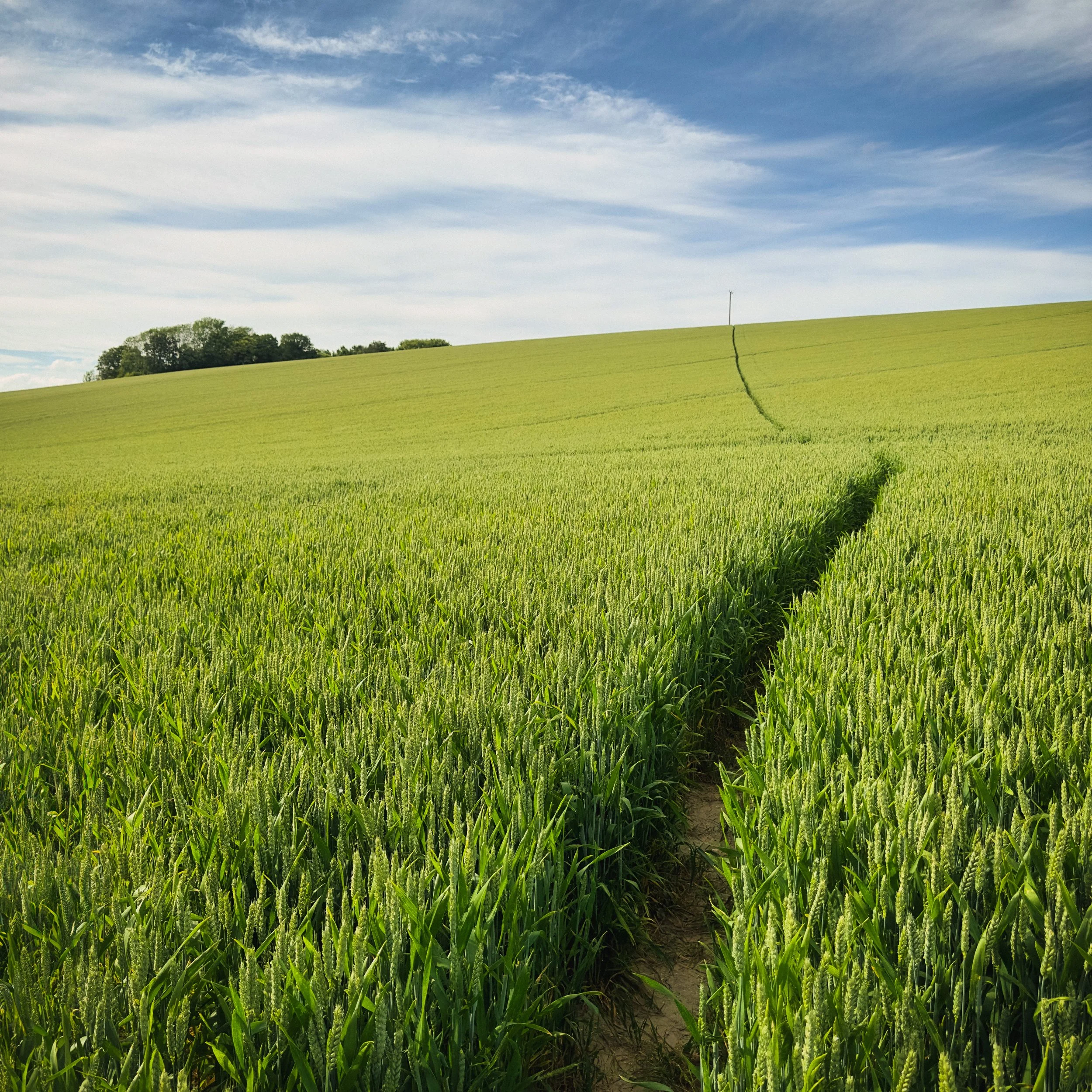
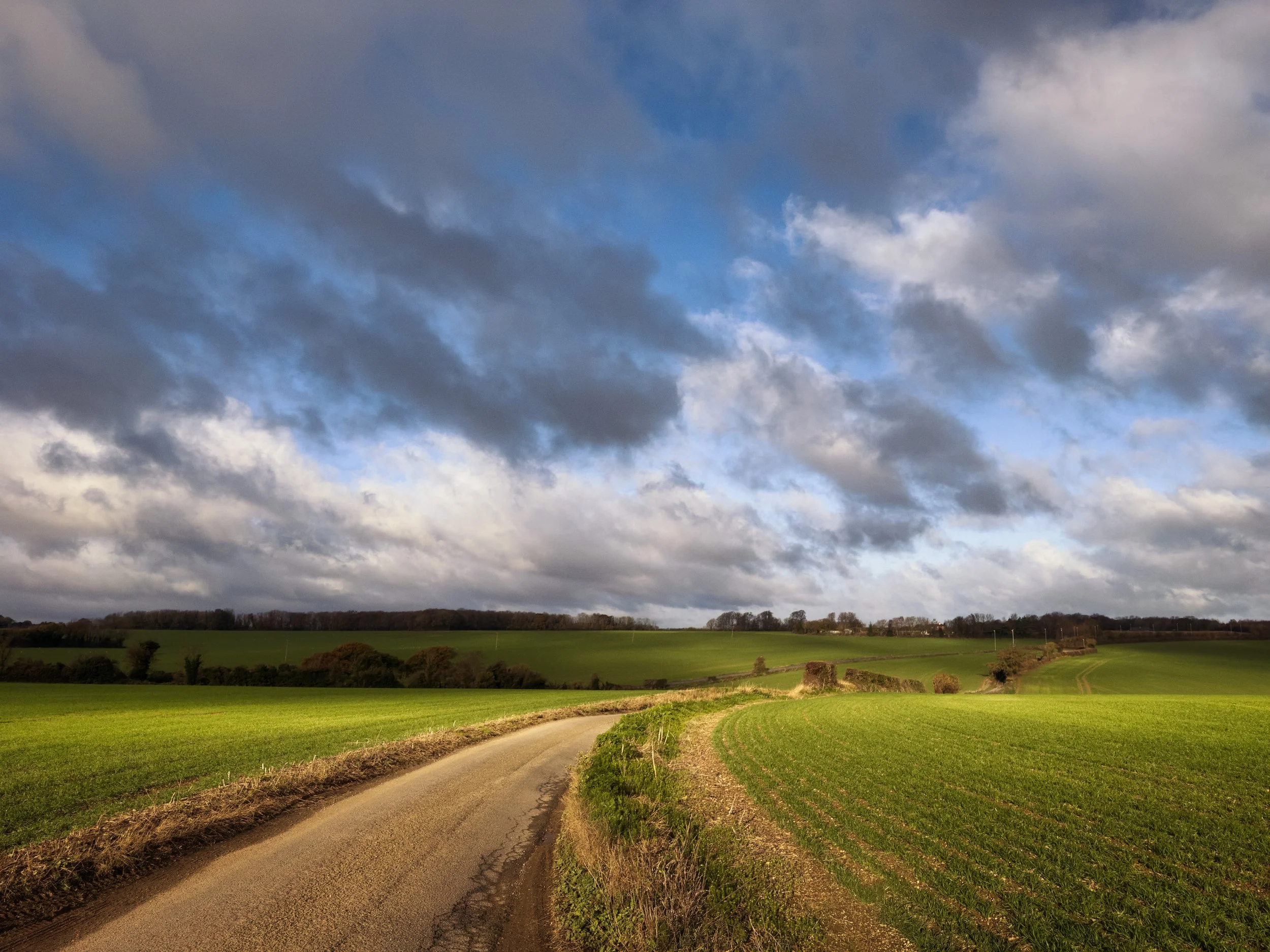
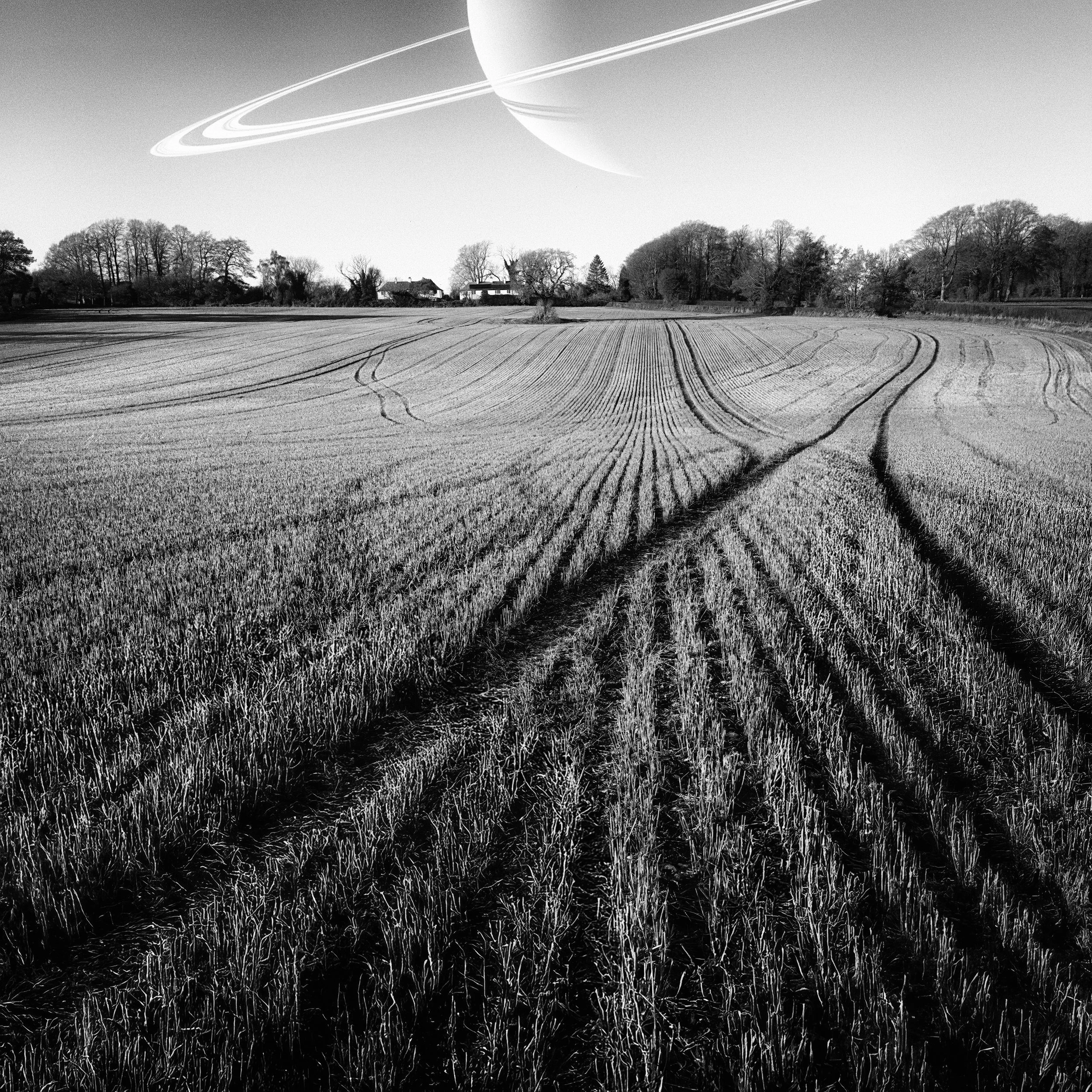
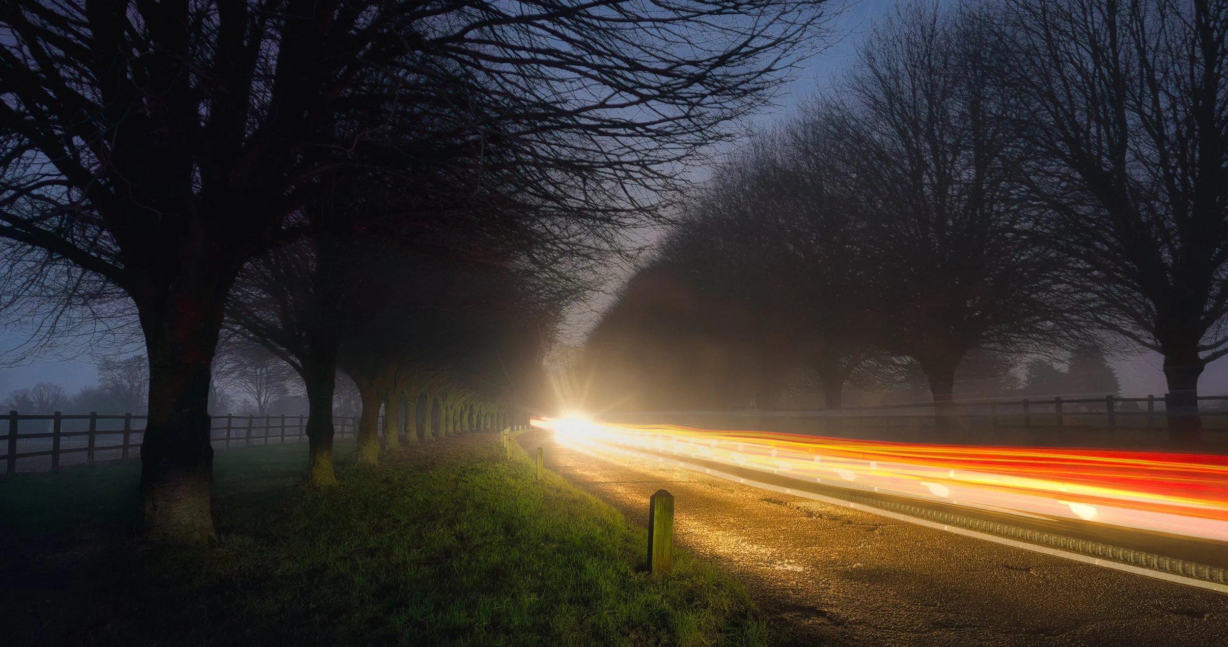
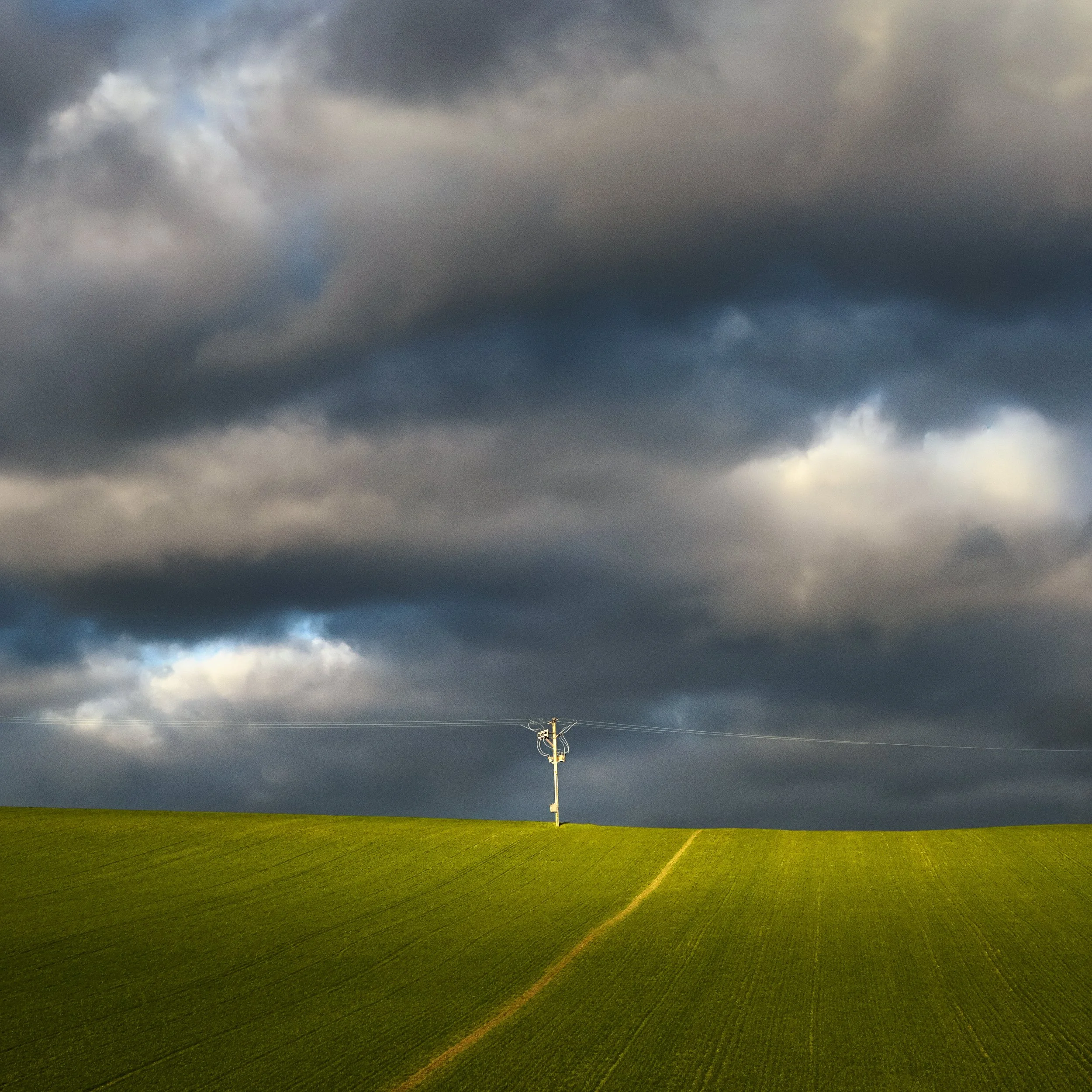
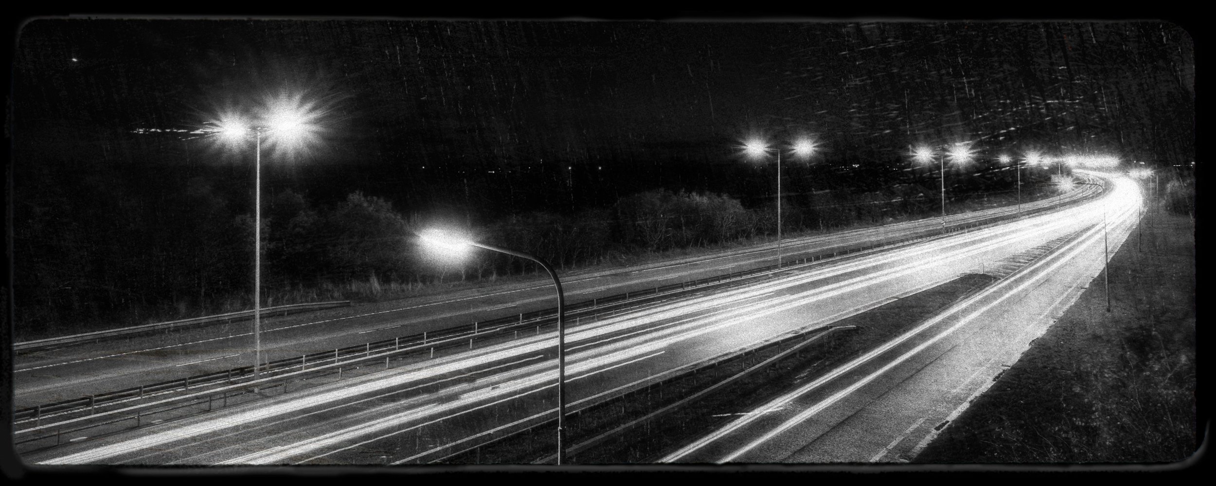
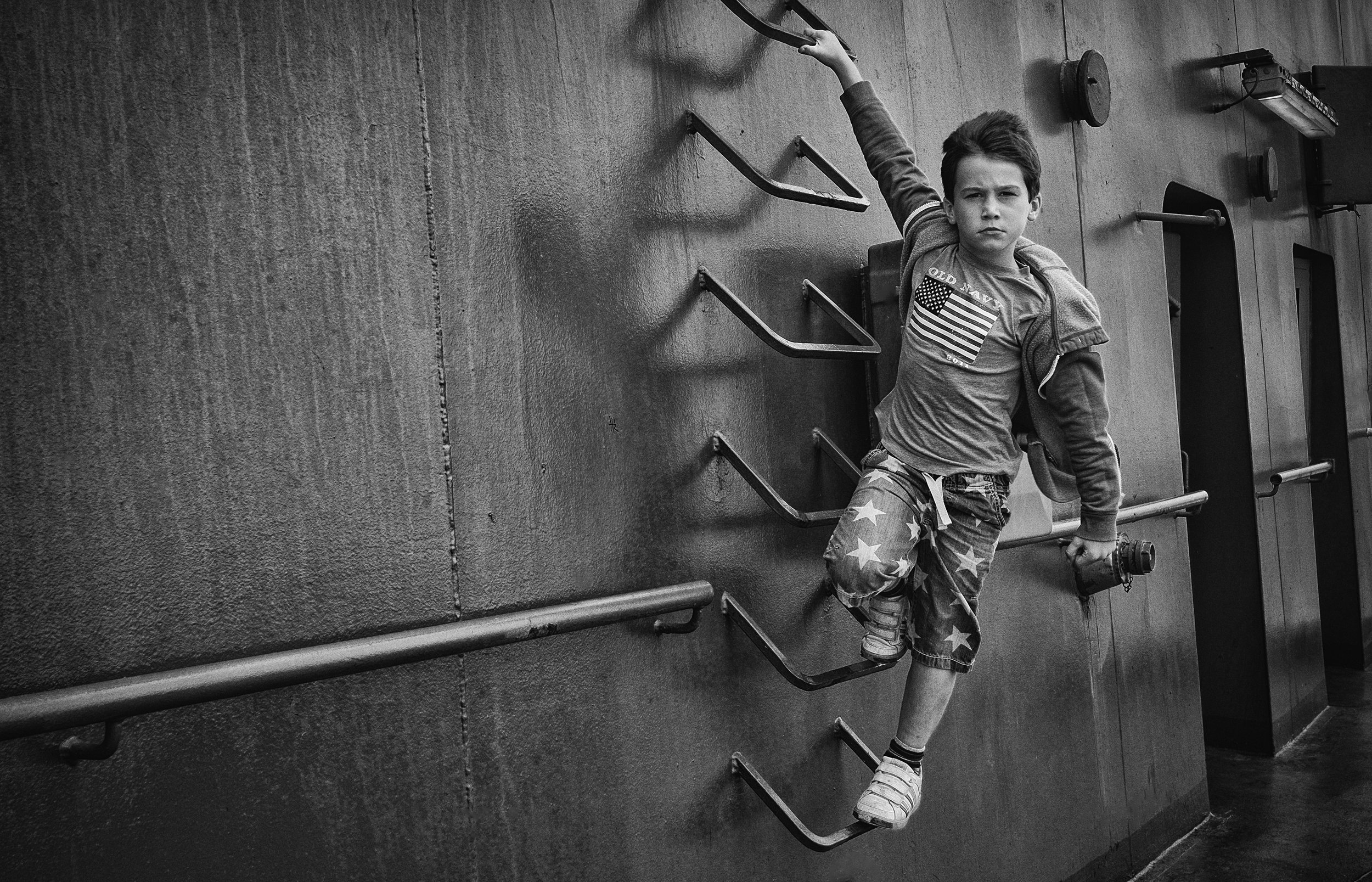
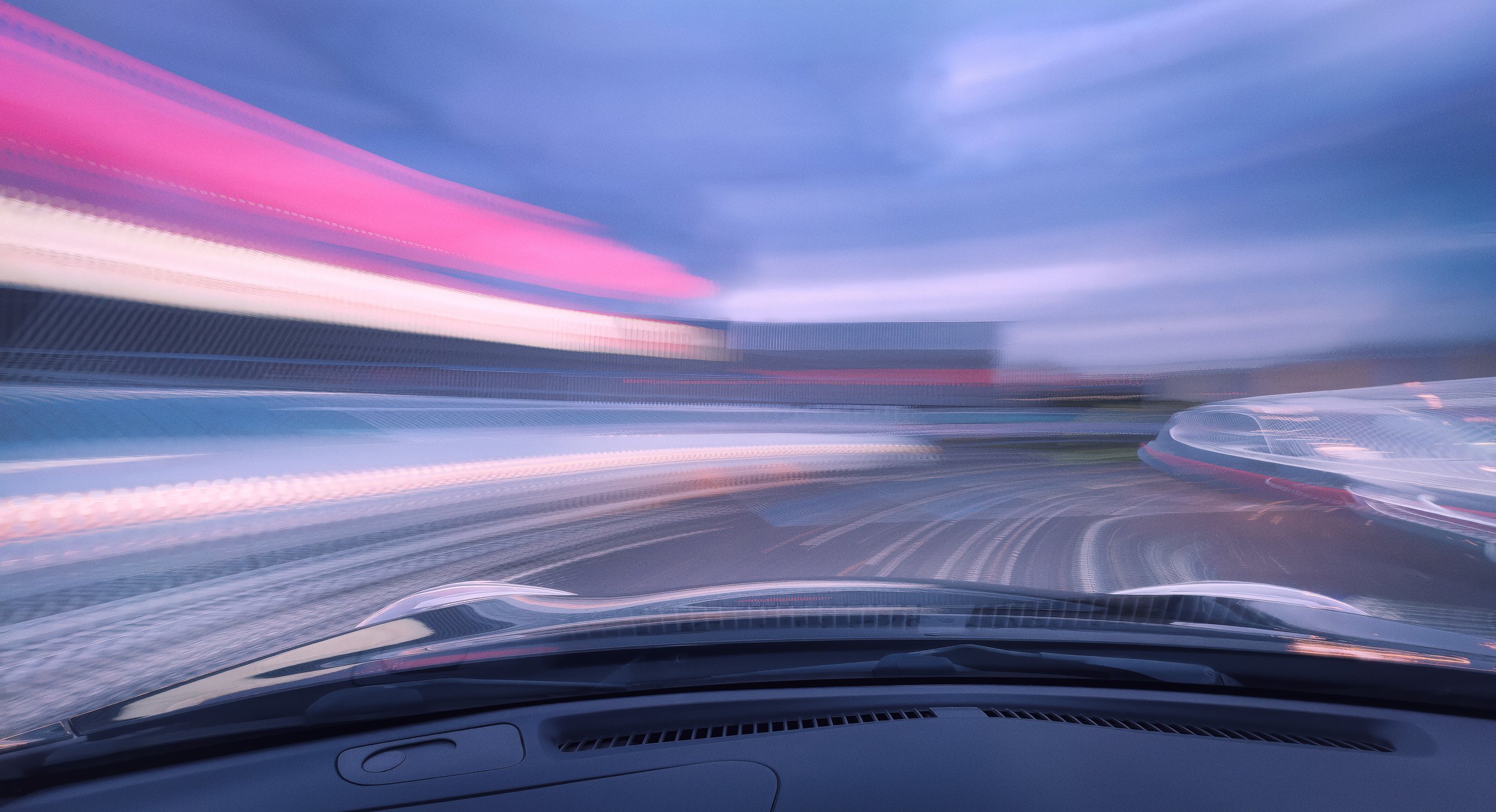
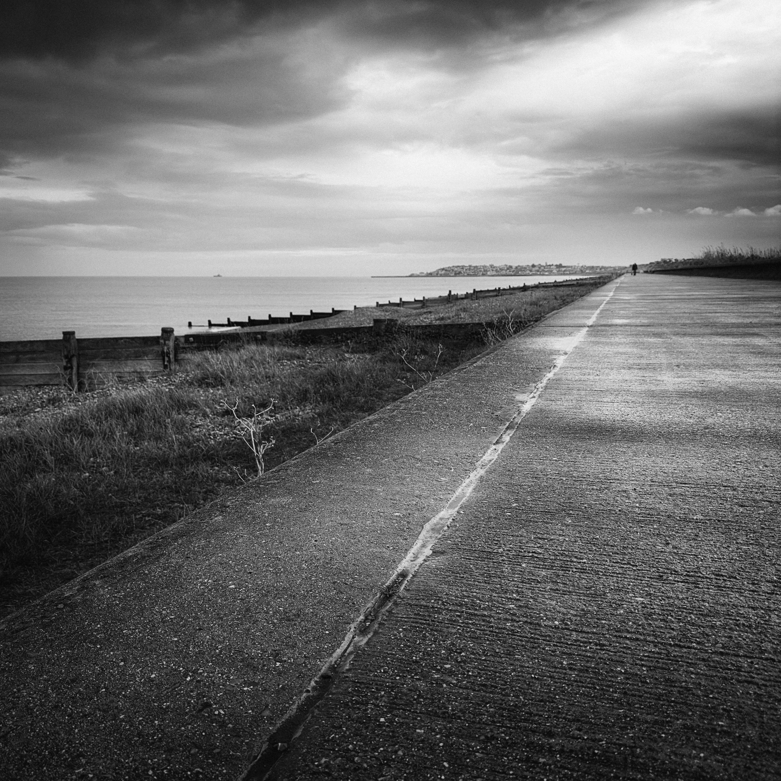

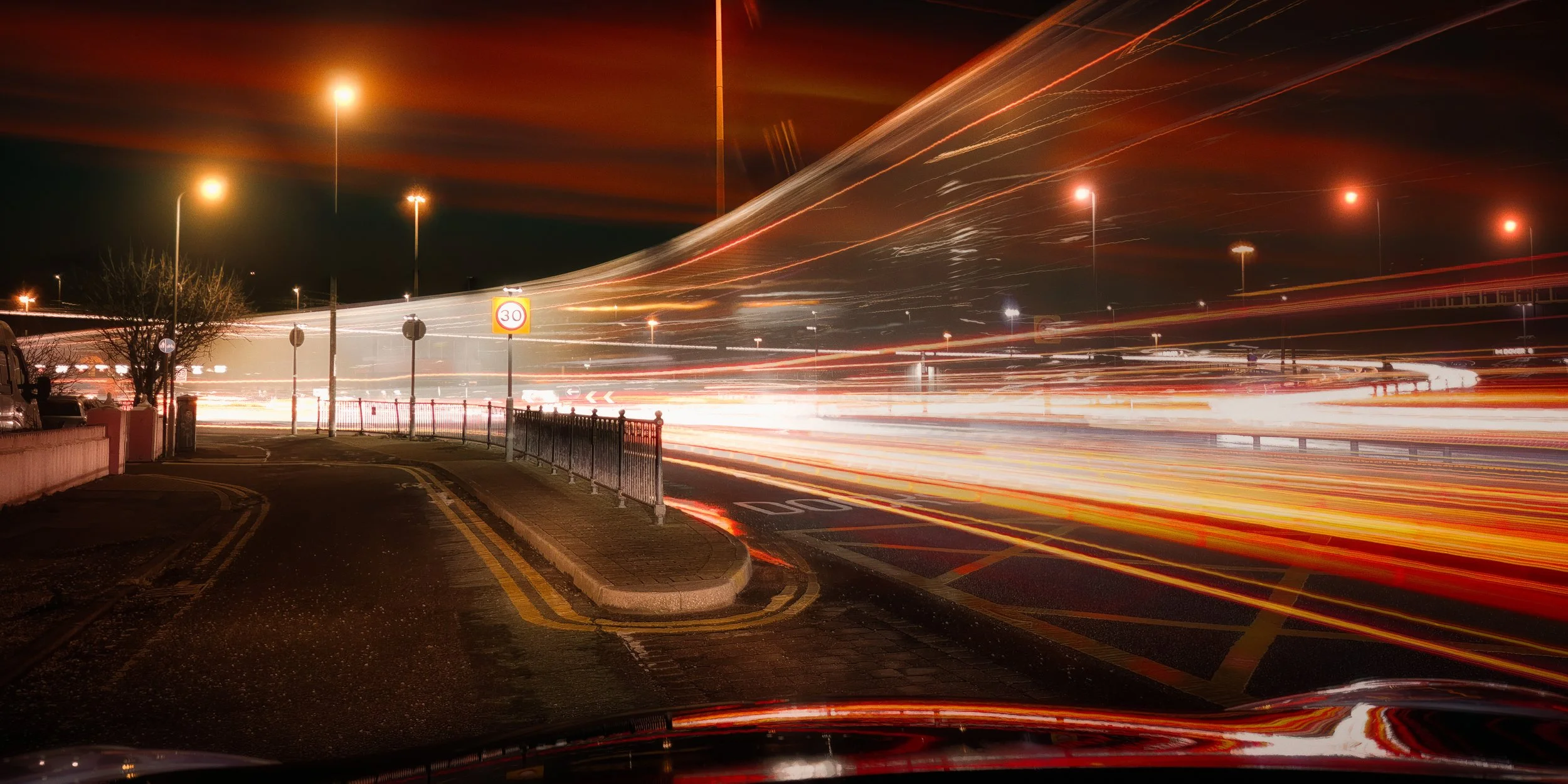
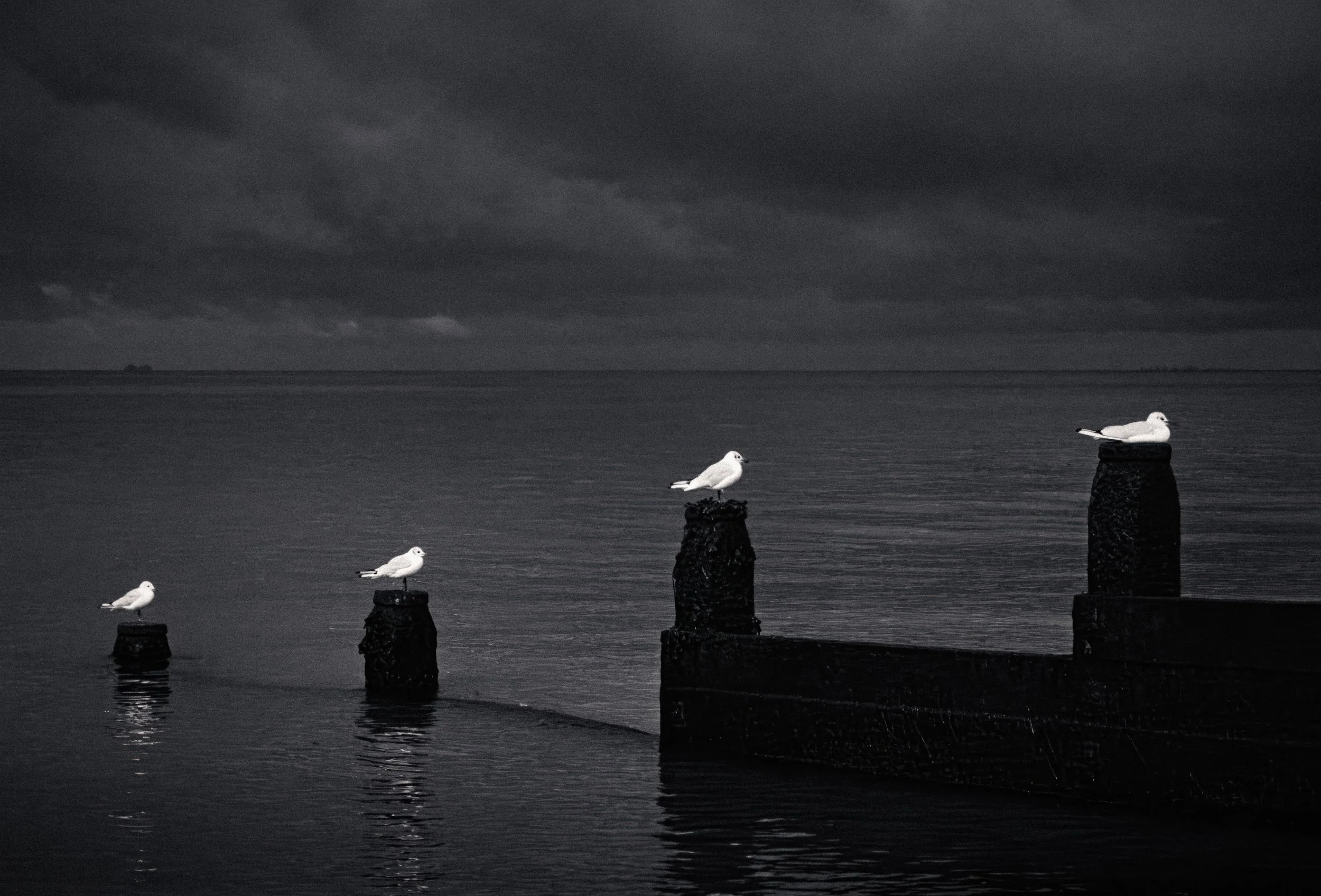
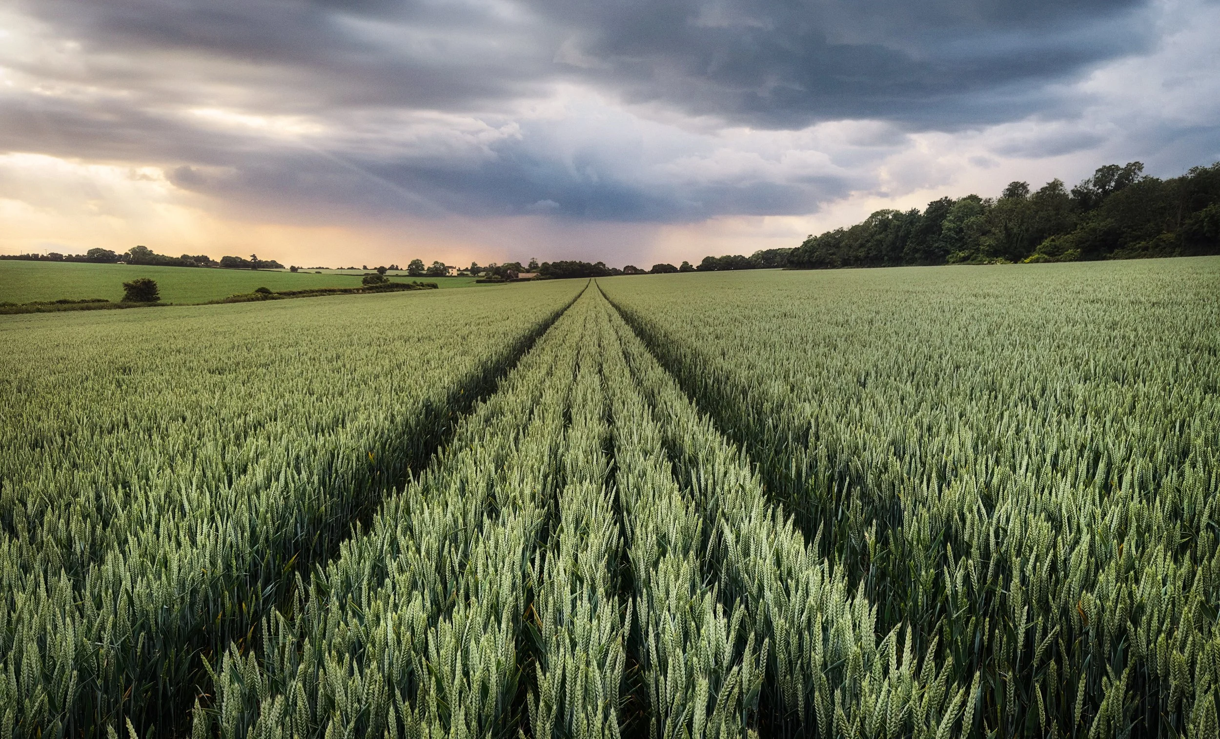
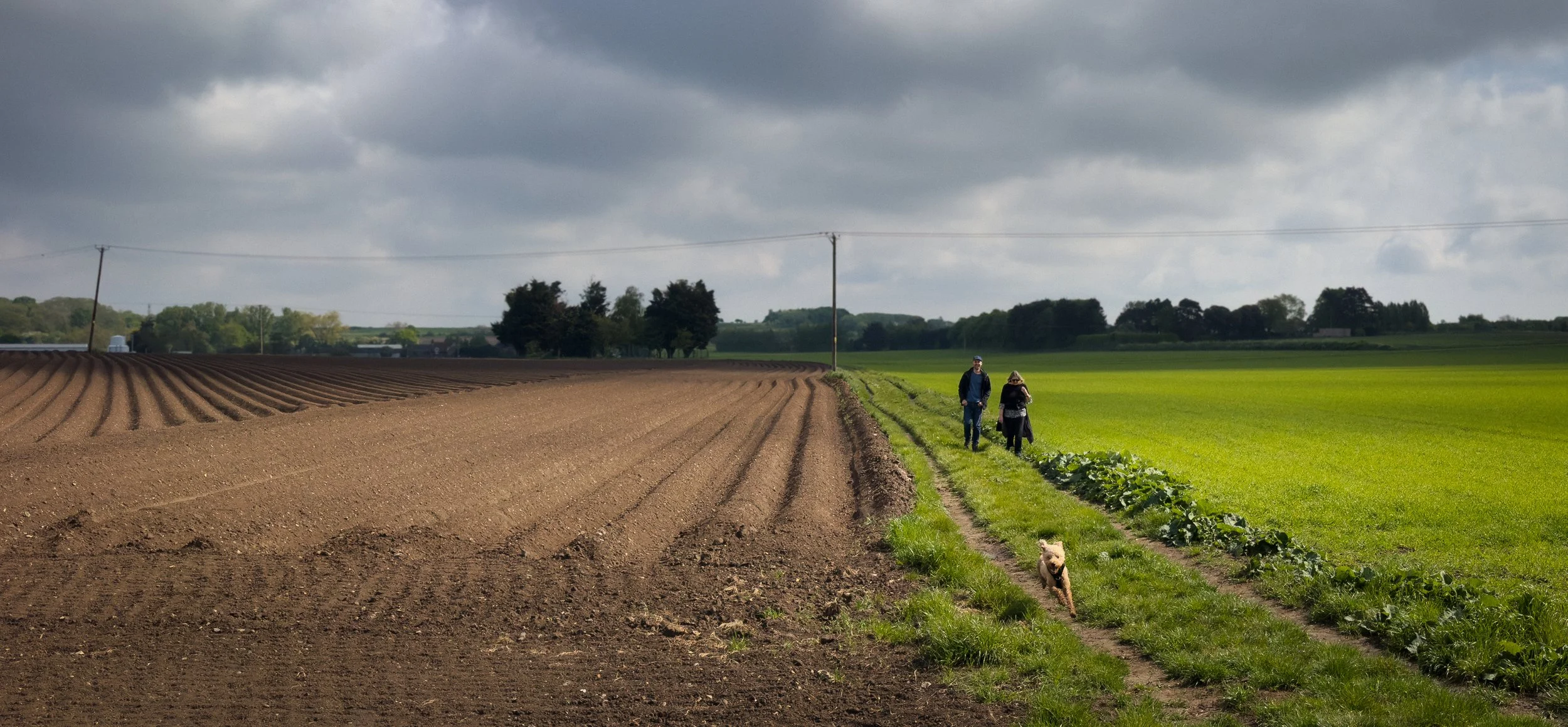
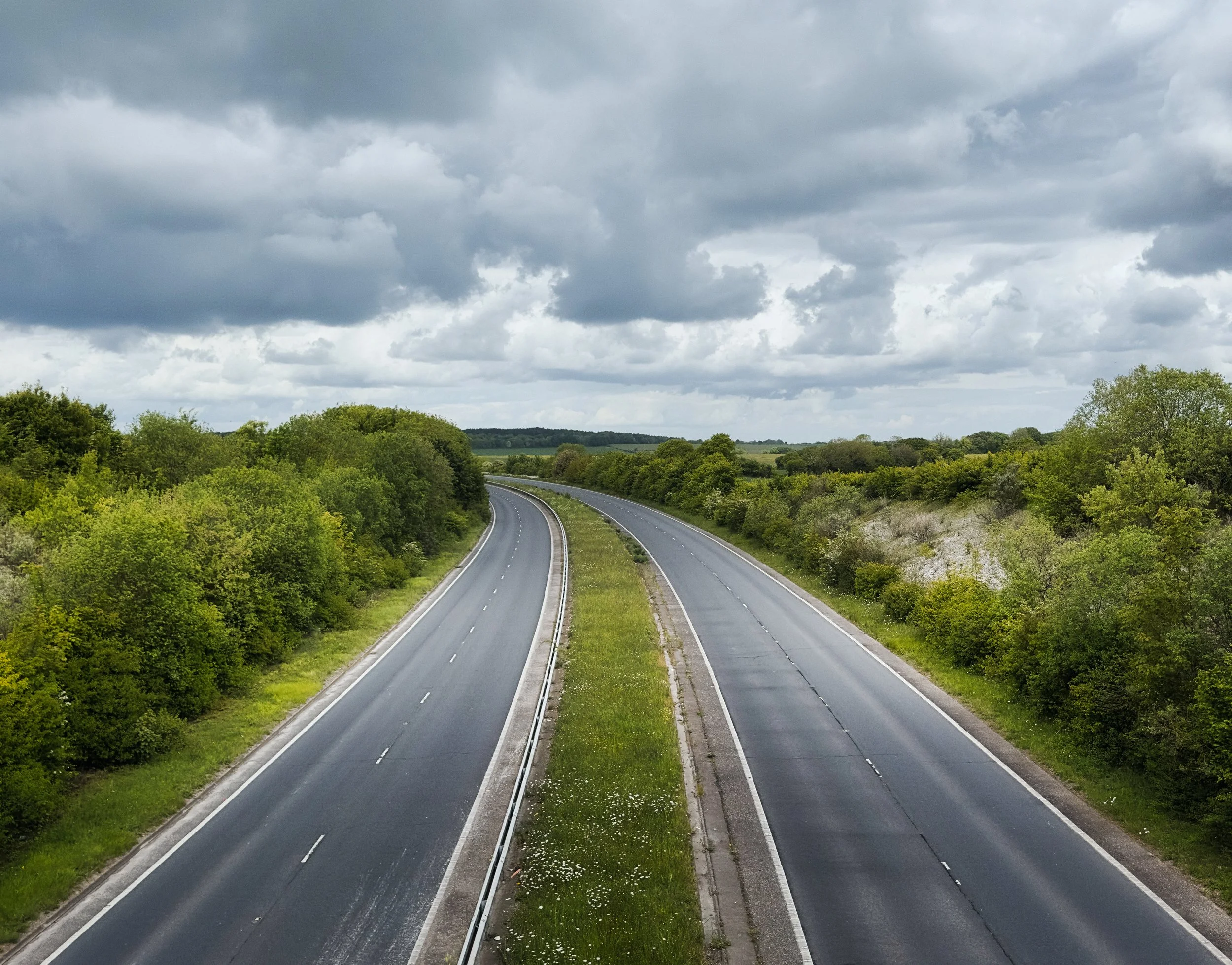
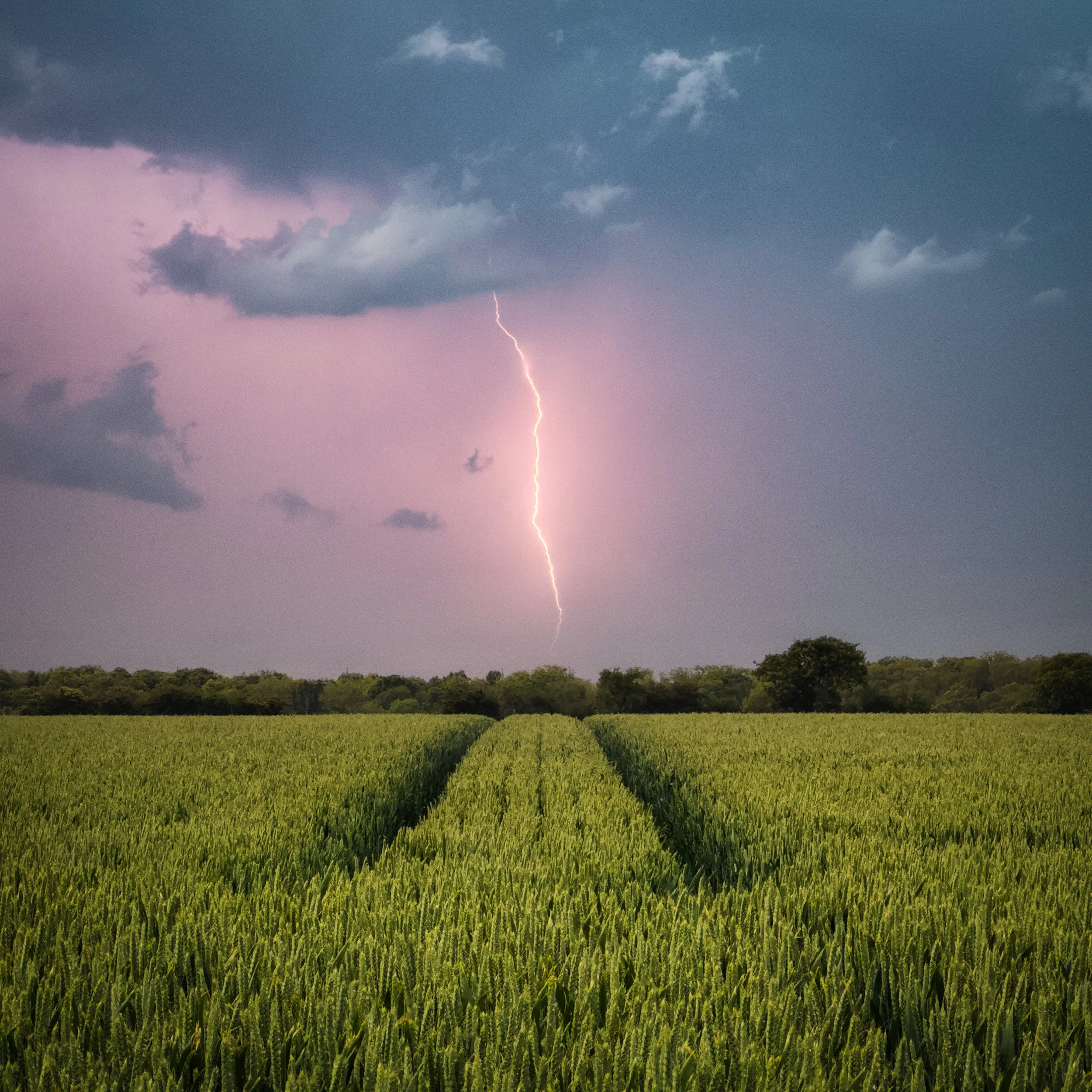
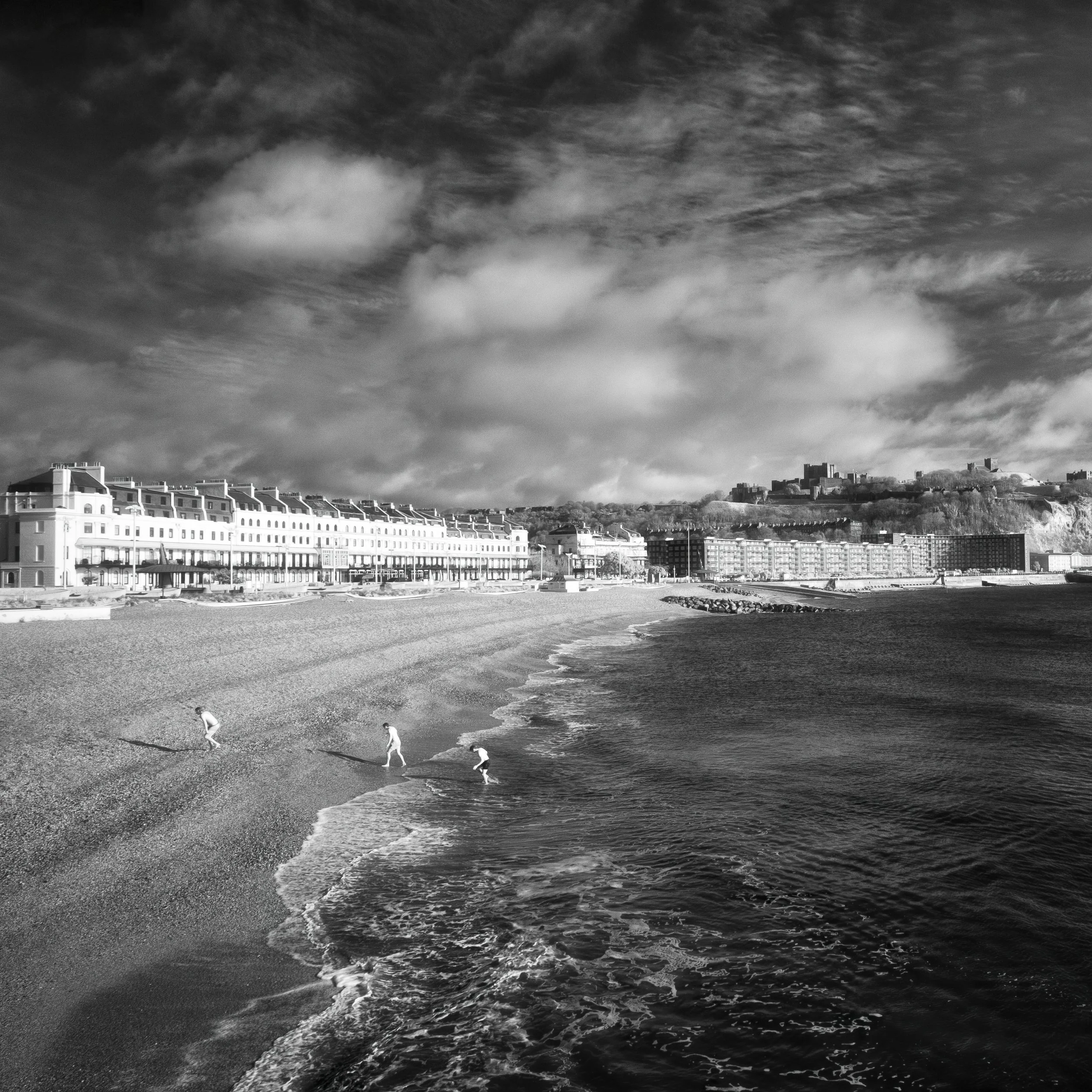


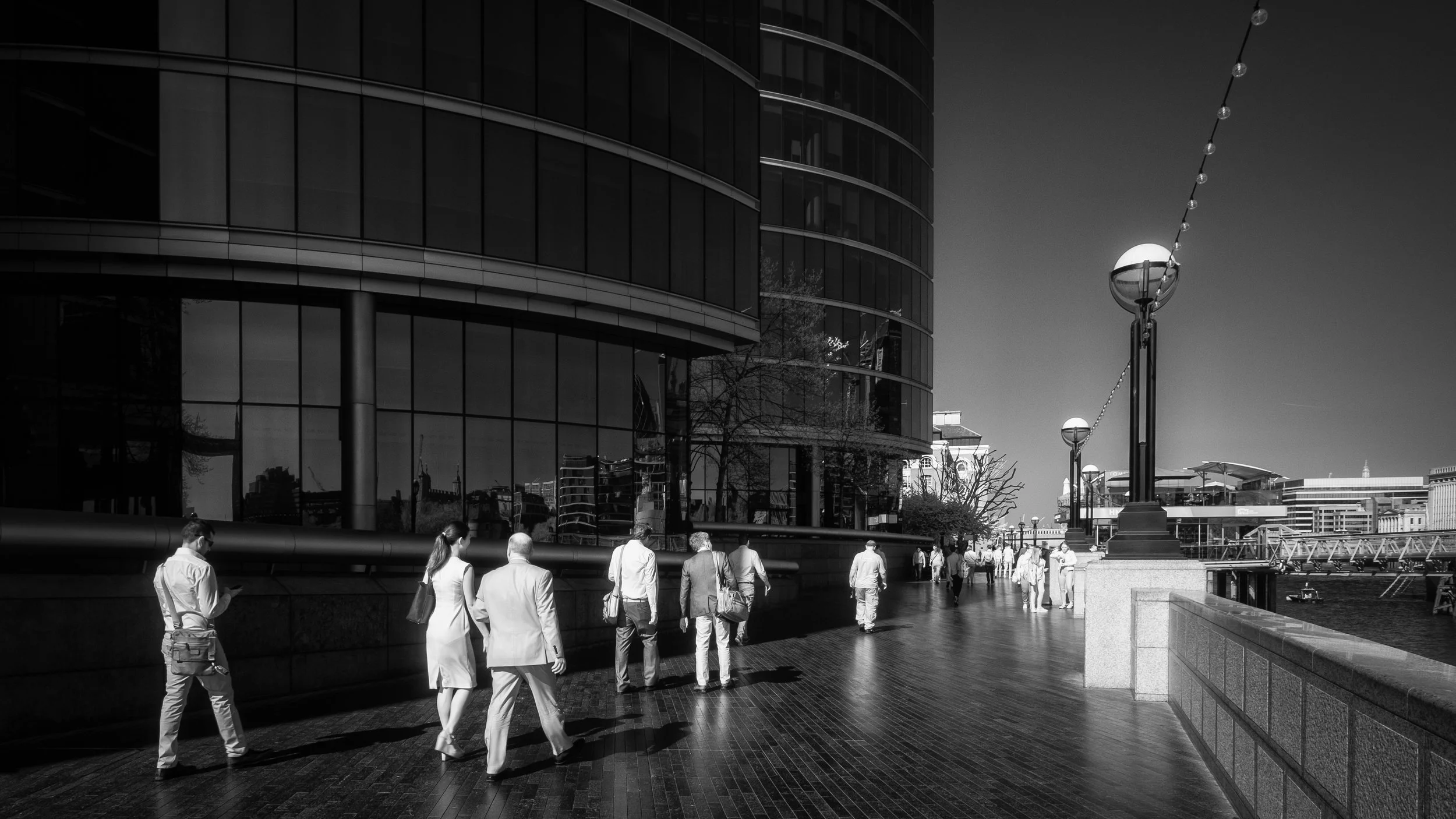
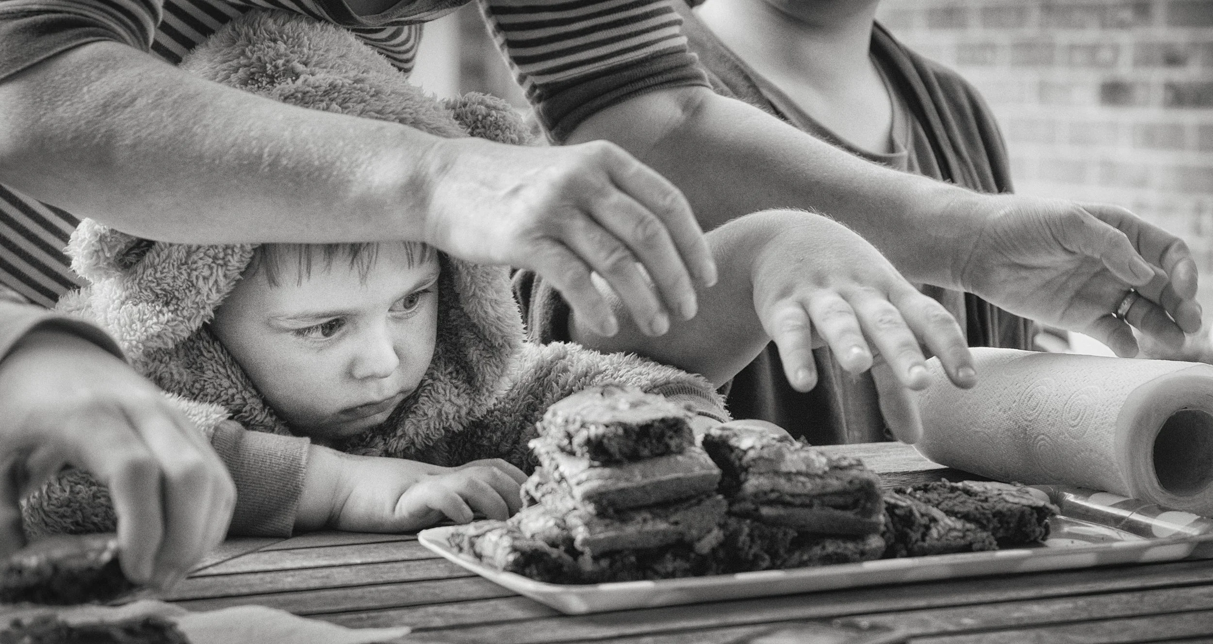
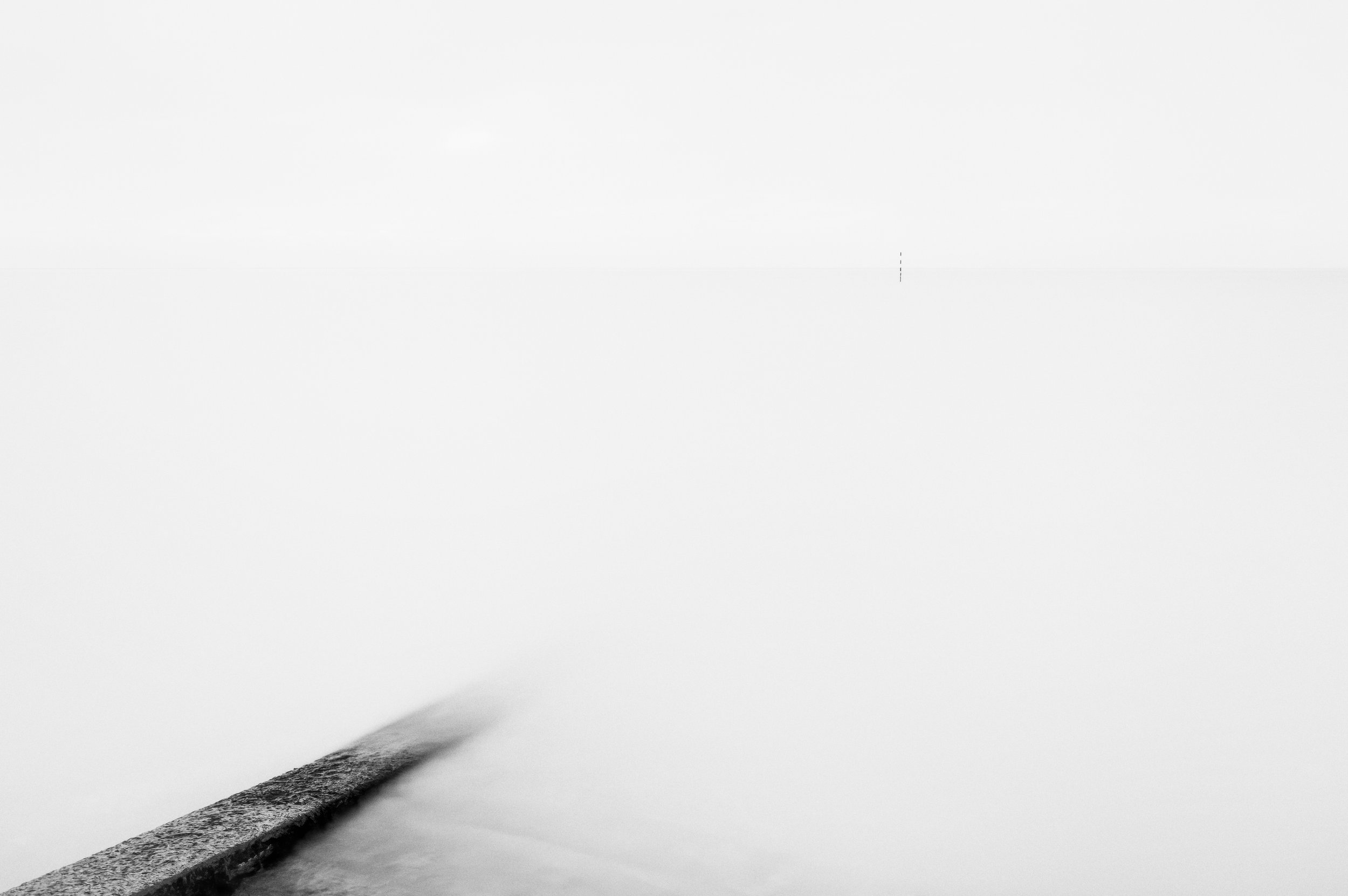
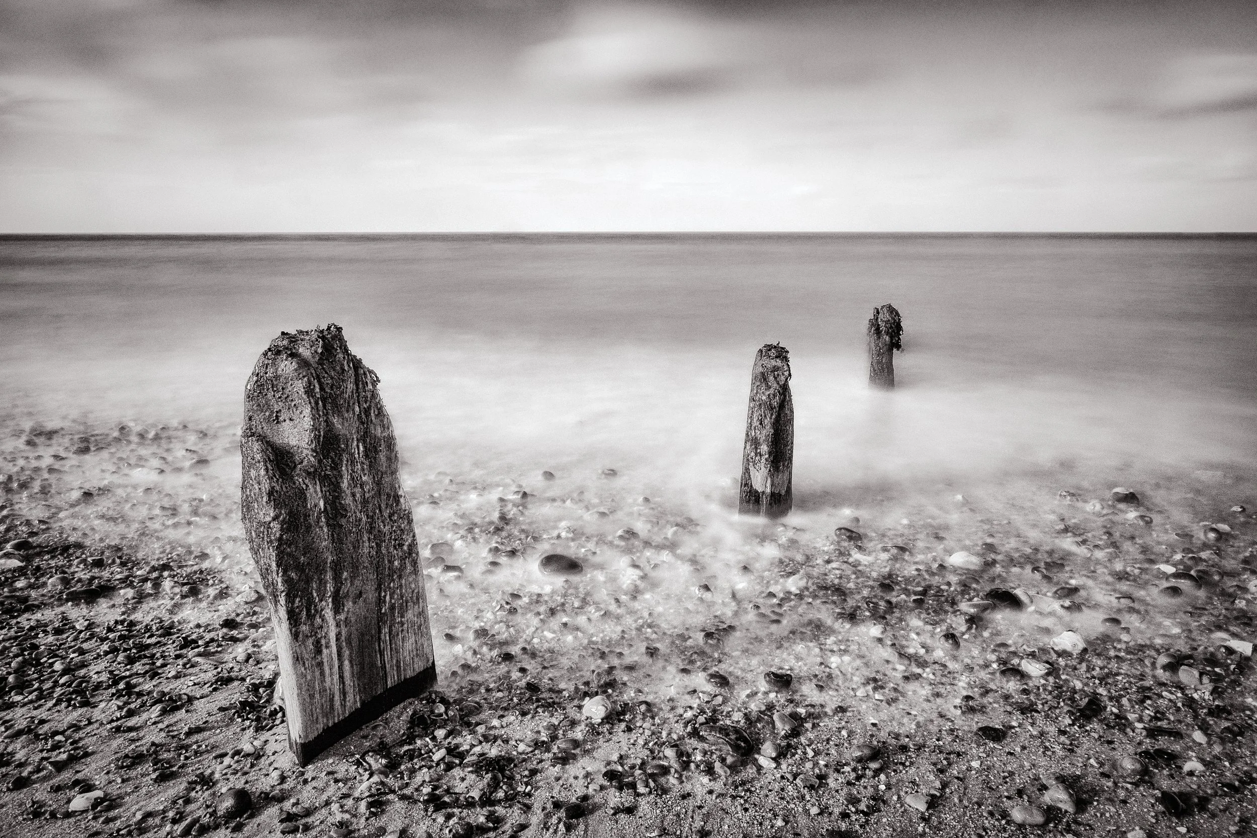

Types of Lines & Their Effects
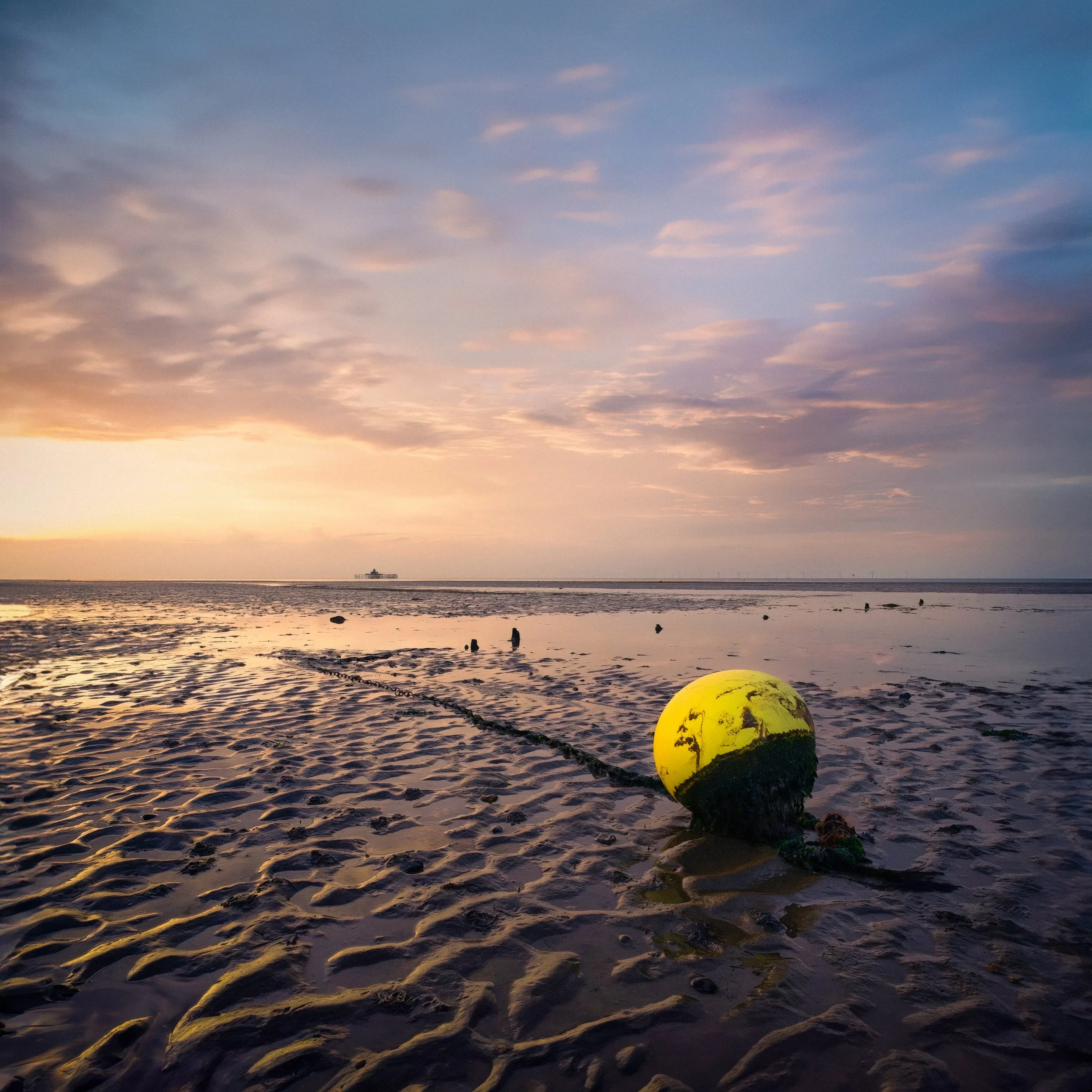
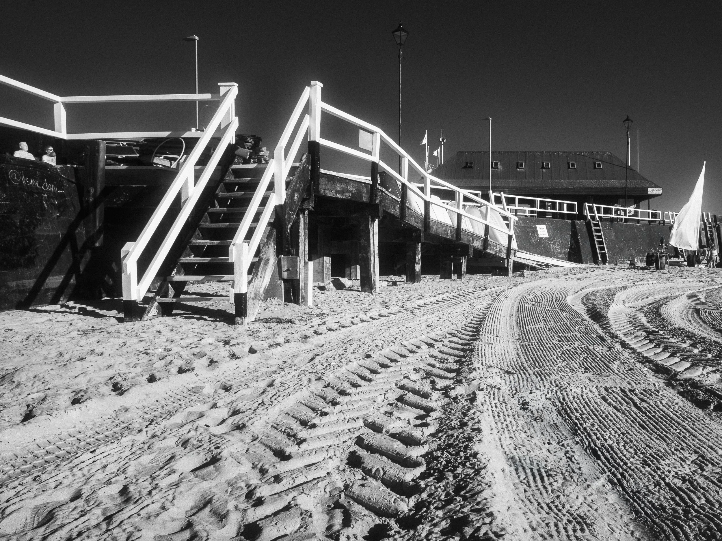
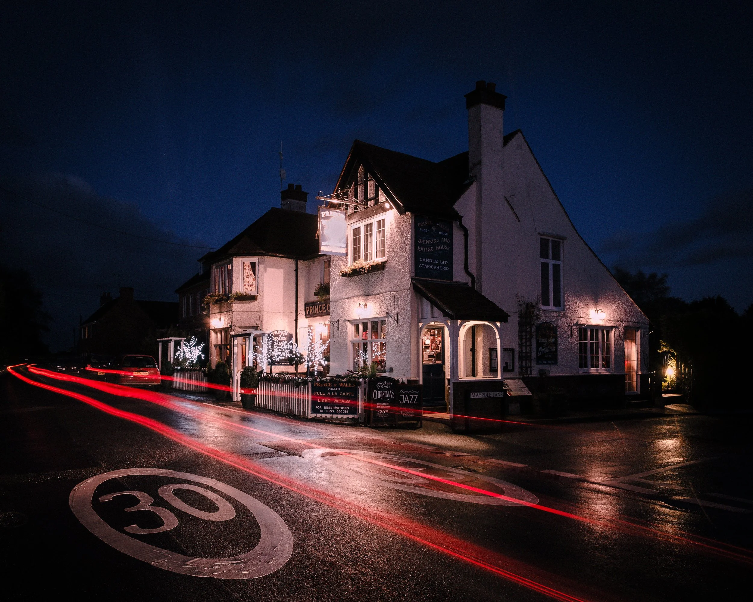
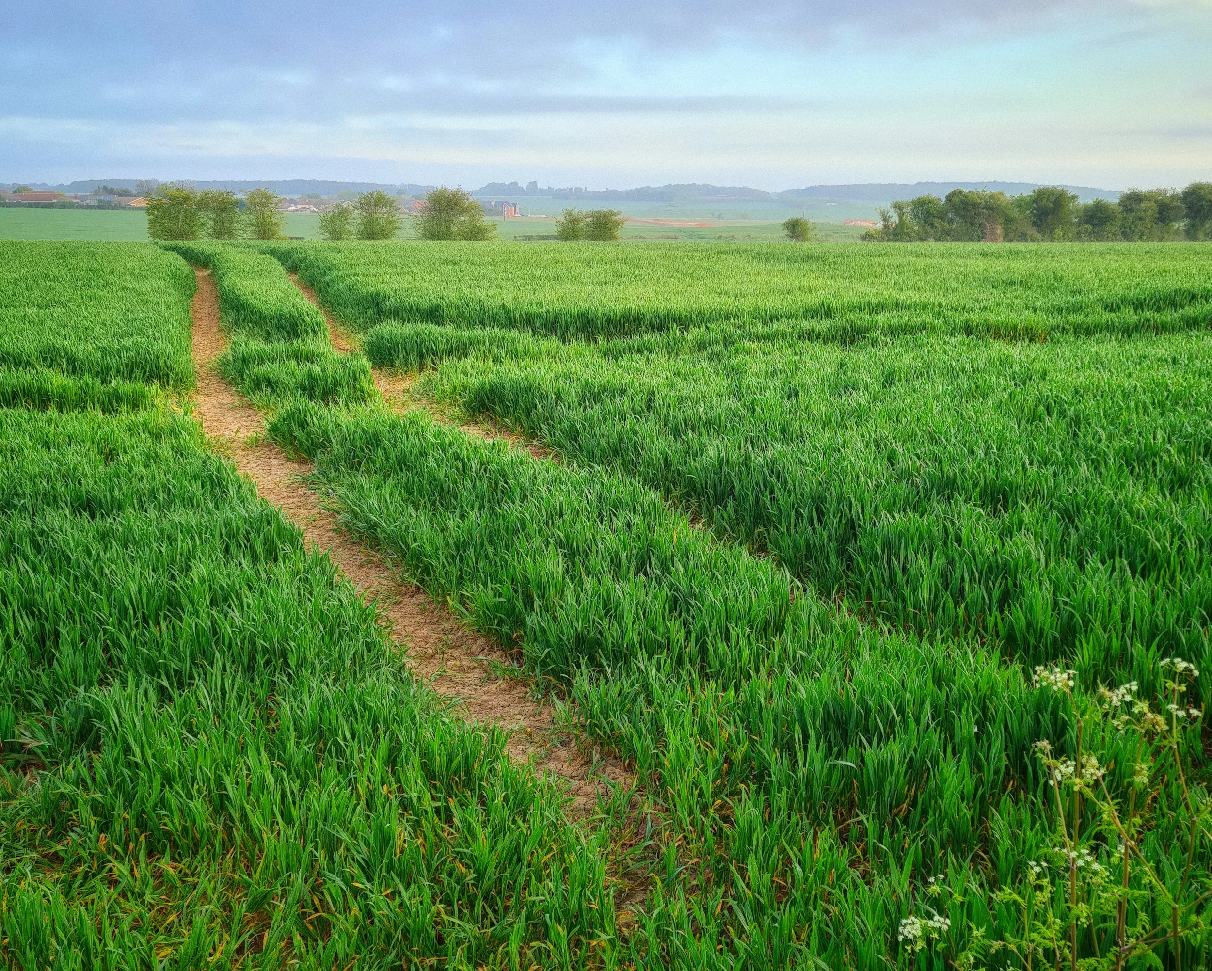
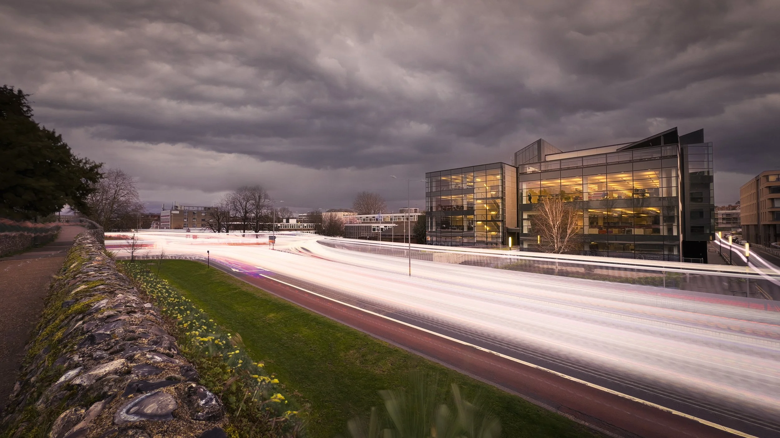
Not all lines lead equally. The direction of a line, its curvature, and whether it is physically present in the scene or merely implied by the arrangement of elements all determine how it functions compositionally. These distinctions are worth understanding before you go looking for lines to use.
Straight Lines
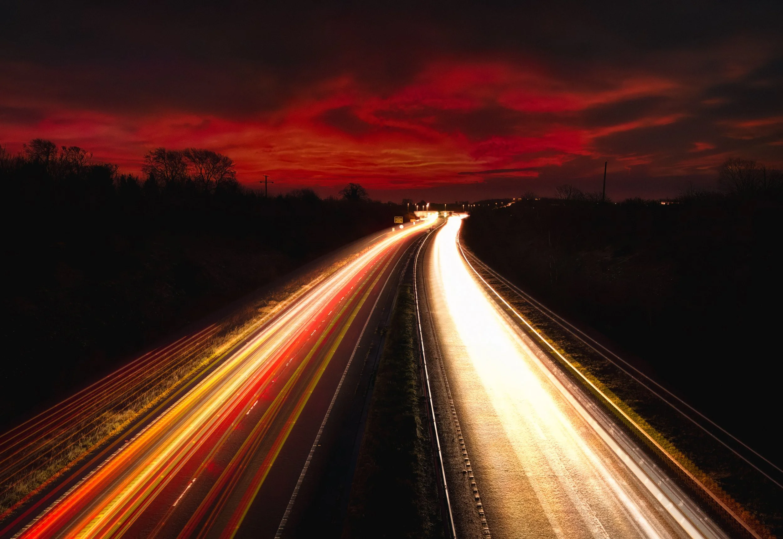
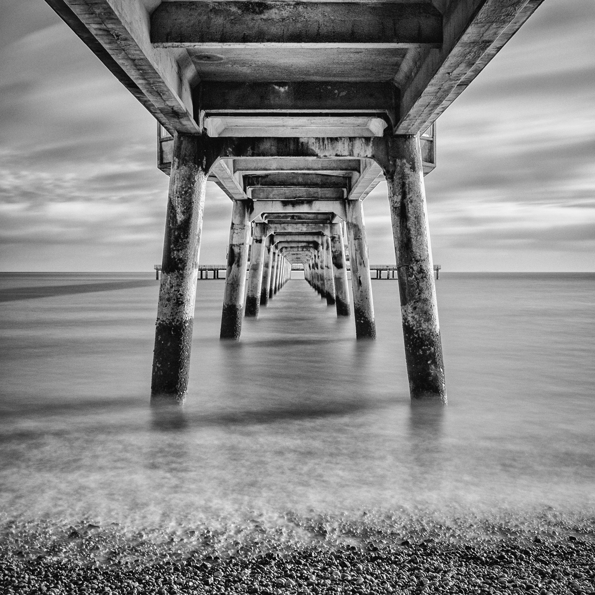
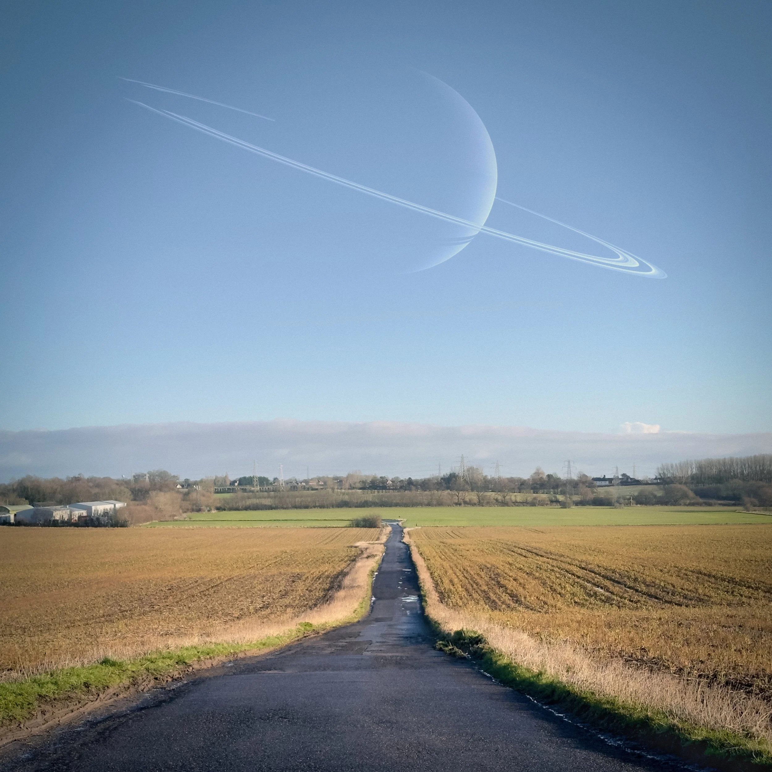
The most direct, the most authoritative, and — used badly — the most tyrannical. A straight leading line has a single, unambiguous direction: from here to there. Roads, railway tracks, piers, jetties, long straight corridors, the line of a fence running toward a distant gate: these are the classic straight-line subjects of landscape and architectural photography, and they work reliably well because their directional force is maximum. The eye cannot help itself; it sprints along the line toward the destination.
The risk is exactly this sprint quality. A very strong straight line can propel the viewer through a composition so quickly that the journey is lost — the intermediate content of the frame, the texture and detail along the way, gets skipped over rather than dwelt upon. Whether this matters depends on whether the journey is the point or the destination is. A photograph of a pier leading out to a lighthouse benefits from the viewer's gaze arriving promptly at the lighthouse; a photograph of a forest path in which the path is as much the subject as any destination it might reach deserves a line that moves the eye at a more considered pace.
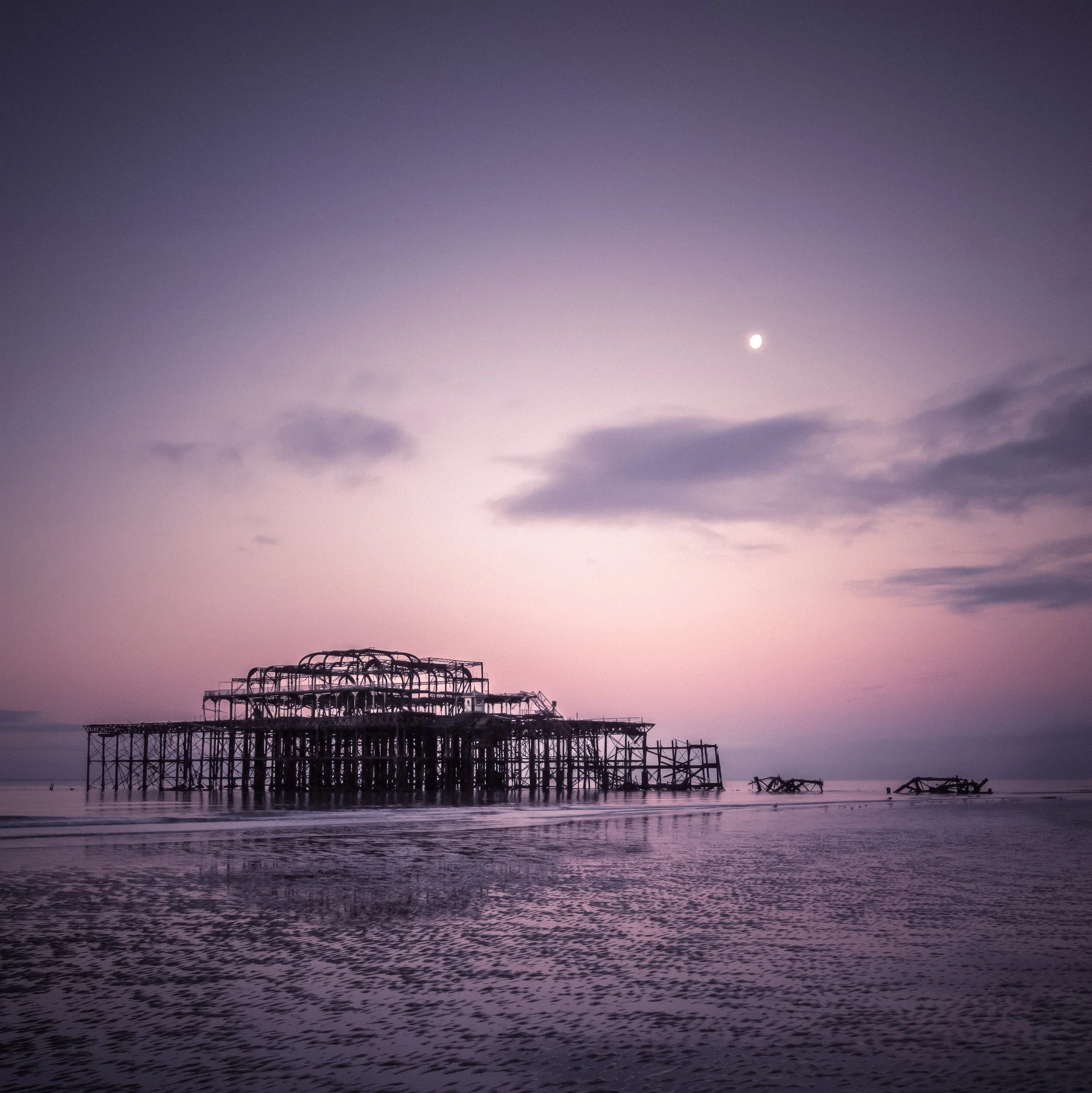
The other thing to watch with strong straight lines is their terminal point. A straight leading line that ends at a significant subject delivers the viewer somewhere worth going; a straight line that terminates in nothing, or that runs off the edge of the frame, delivers the viewer nowhere, and that is compositionally unsatisfying in a way that feels instinctively wrong.
Diagonal Lines
If straight lines are authoritative, diagonals are energetic. A diagonal cuts across the frame on both the horizontal and vertical axes simultaneously, and this is not a small thing: the horizontal and vertical axes are the primary directions of stillness and stability in a composition (as covered in the Horizons and Verticals article), and a line that cuts across both of them simultaneously creates an implicit dynamic tension. The scene feels as though something is happening, or is about to.
The practical distinction worth making is between a diagonal that leads into the frame from a foreground corner toward the subject, and a diagonal that crosses the frame, dividing it. The first is a classic leading-line use: a path or road entering from the bottom-left corner and running toward the upper-right third of the frame, where the subject sits, is one of the most reliable compositional structures in outdoor photography. The second is a compositional division — a diagonal shadow, a slanted wall — which creates energy and visual interest but is not directing the viewer toward anything in particular.
Diagonals also respond dramatically to camera angle. A road that, shot straight on at head height, creates only gentle converging parallels can be transformed into a powerful diagonal by moving your position ten metres to the side. The angle of approach is a variable that beginners tend to fix too early; experienced photographers move around a subject, checking what the lines look like from different positions before deciding where to stand.
Curved Lines and S-Curves
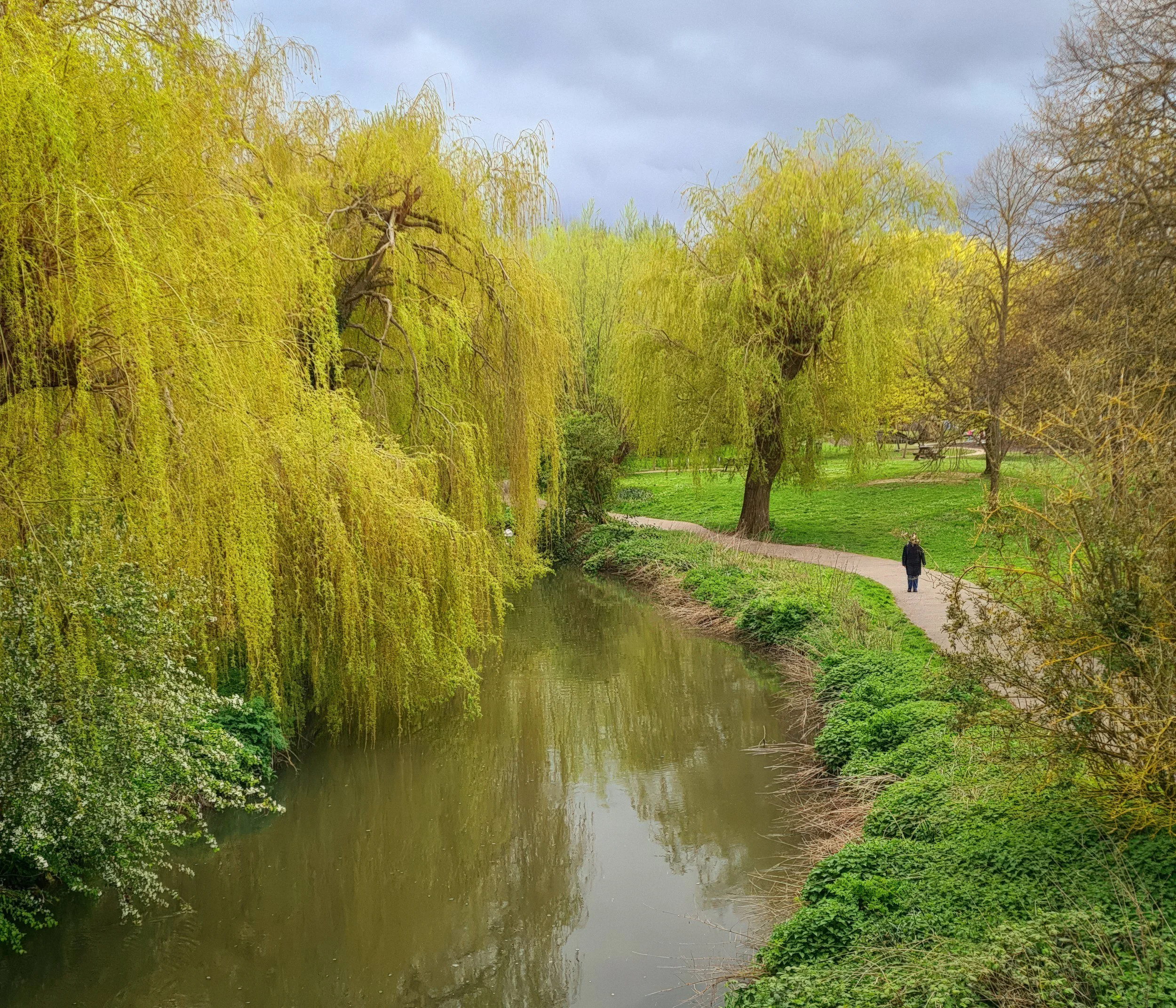
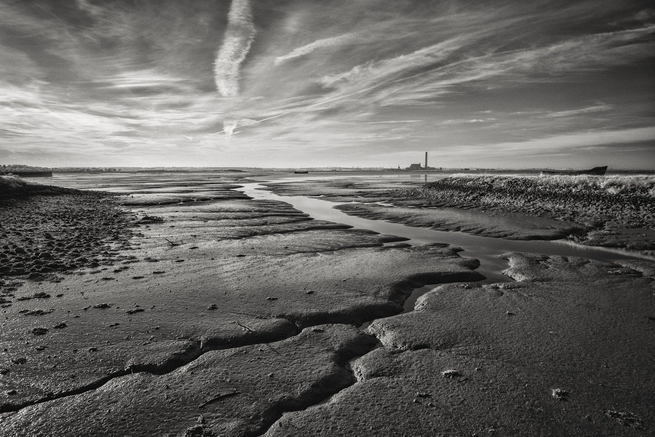
Where straight lines direct and diagonals energise, curves invite. A curved path or river asks the eye to follow at a slower pace; it meanders rather than points. The visual journey along a curved leading line is more contemplative, and this is often exactly the right emotional register for landscape photography.
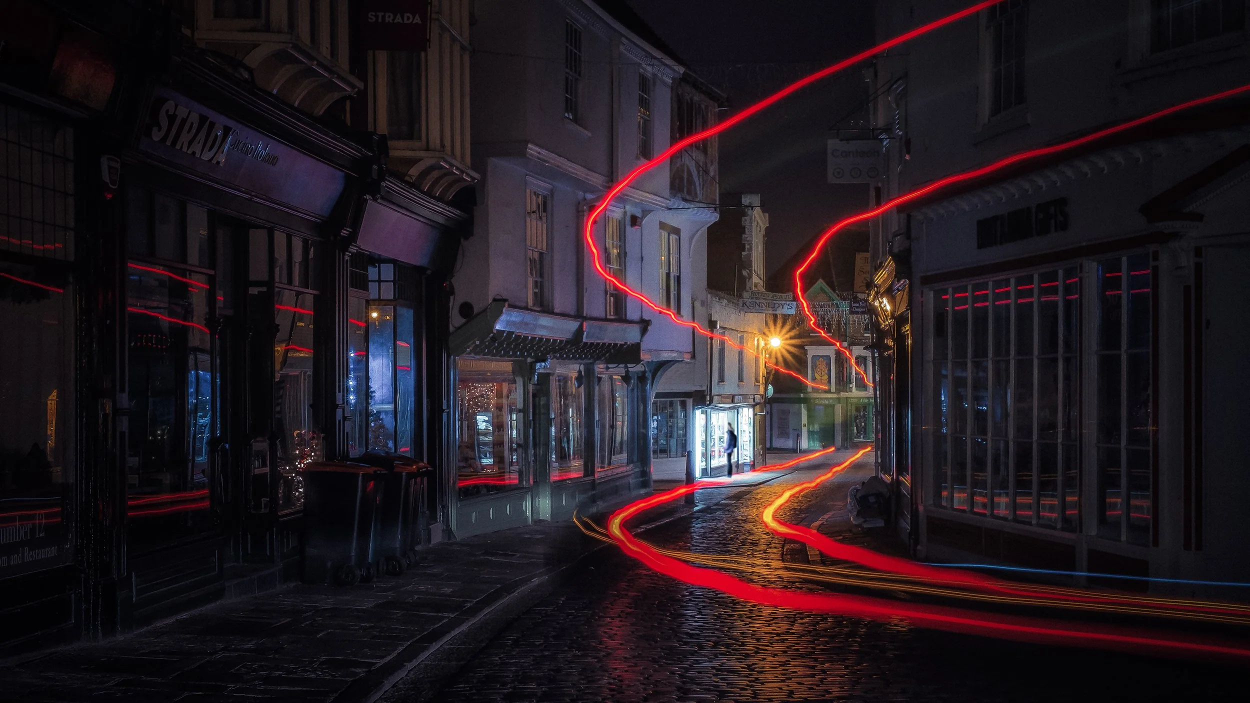
The S-curve deserves particular attention, because it is considered one of the most aesthetically satisfying compositional structures in Western visual art. An S-curve presents the eye with two successive curves in opposite directions — the line swings one way and then the other — and the effect is both deeply pleasing and spatially compelling.
A river that bends away from the camera and then bends back, a road that curves left and then right as it climbs a hillside, a coastline that describes two arcs from foreground to background: these are S-curve compositions, and they appear again and again in landscape photography for the very good reason that they work reliably well.
The theory behind the S-curve's appeal is not new. In his 1753 treatise The Analysis of Beauty, the English painter and satirist William Hogarth called the serpentine line — his term for the S-curve — the "line of beauty" and argued that it was the fundamental form of aesthetic pleasure in art. His account was more intuitive than systematic, but the empirical aesthetics research of the last few decades has largely borne him out: people reliably prefer curved forms to angular ones, and the specific S-curve structure rates particularly highly. Hogarth was onto something real, even if he could not fully explain why.
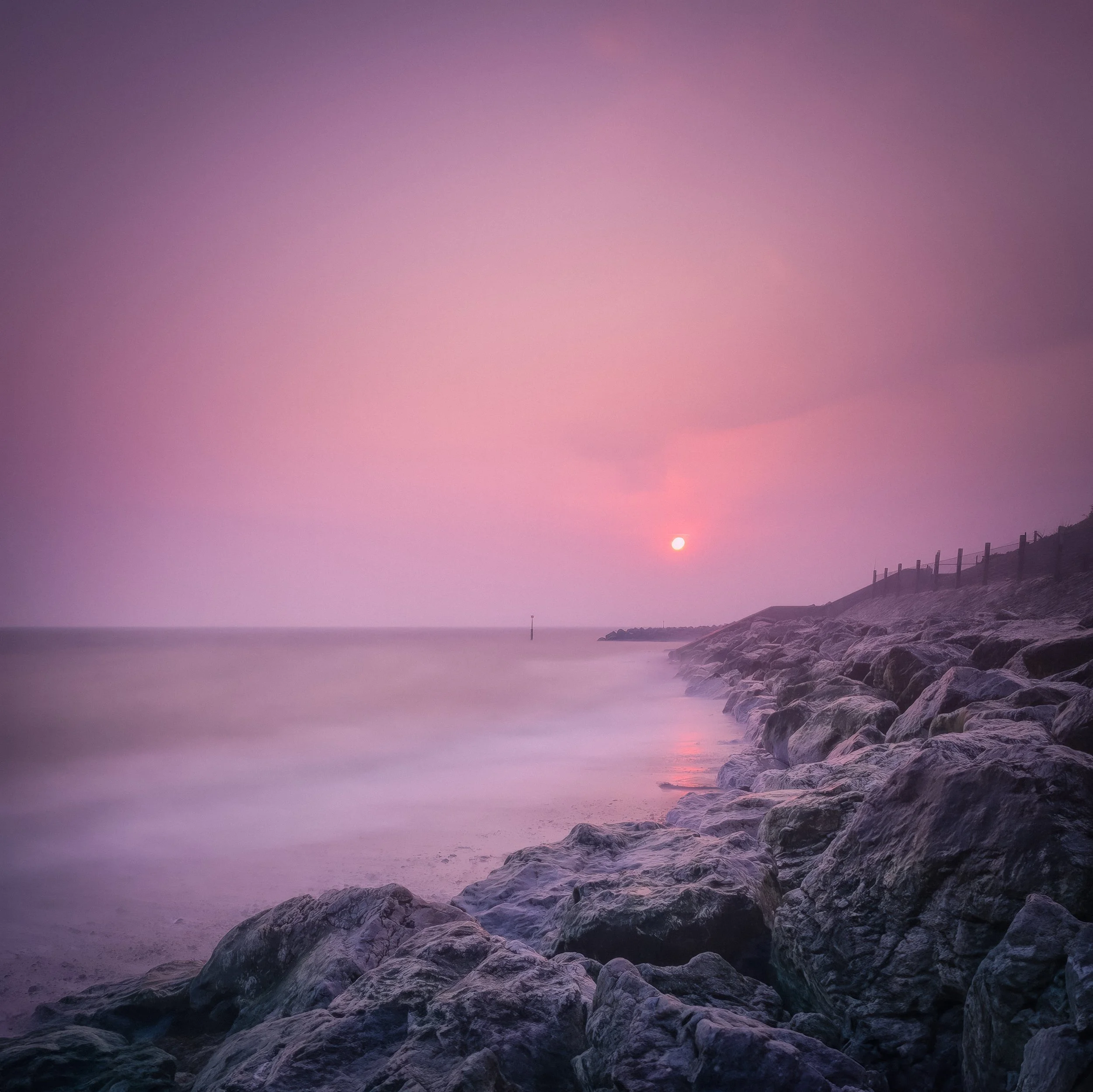
In landscape photography, the S-curve has one further advantage: because the line changes direction, the eye cannot sprint along it. It moves more slowly, registering both curves before arriving at the subject or the horizon. This slowing effect, counterintuitive though it sounds, tends to make the composition feel richer.
Converging Lines and the Vanishing Point
When two or more parallel lines recede from the camera into the distance, they appear to converge toward a single point — the vanishing point of one-point perspective. This is the basic geometry of how three-dimensional space is represented on a two-dimensional surface, and photography inherits it automatically. The result is one of the strongest depth-creating devices available: a pair of railway tracks converging to a point on the horizon does not just describe a pair of rails and a horizon; it constructs a sense of deep space and recession that goes far beyond what any single element could achieve alone.
Converging lines function as leading lines in a precise sense: they carry the eye from the wide, close foreground toward the narrow, distant vanishing point. The more pronounced the convergence — which is to say, the wider the angle between the lines at the foreground — the more dramatic the sense of depth. Getting low (close to the ground) or using a wide-angle focal length exaggerates convergence; standing upright or using a longer focal length flattens it.
One important observation: the vanishing point does not need to be inside the frame. Some of the most effective convergence compositions have the vanishing point just outside the frame's edge, so the lines are clearly converging but have not yet arrived. This creates a sense of implied destination — the viewer knows where the lines are going even though the image does not show it — which can feel more suggestive and dynamic than having the convergence resolve neatly on-screen.
The relationship between converging lines and the specific architectural distortions of vertical convergence is discussed more fully in the Horizons and Verticals article, which deals with the challenge of buildings appearing to lean backward. The principle here is the same geometry put to different ends: convergence as depth rather than convergence as distortion.
Implied Lines
The most intellectually interesting type, and the one that tends to produce the most sophisticated photographs once you learn to see it. An implied line is a leading line that has no physical existence in the scene — it exists only in the viewer's perceptual interpretation of the image.
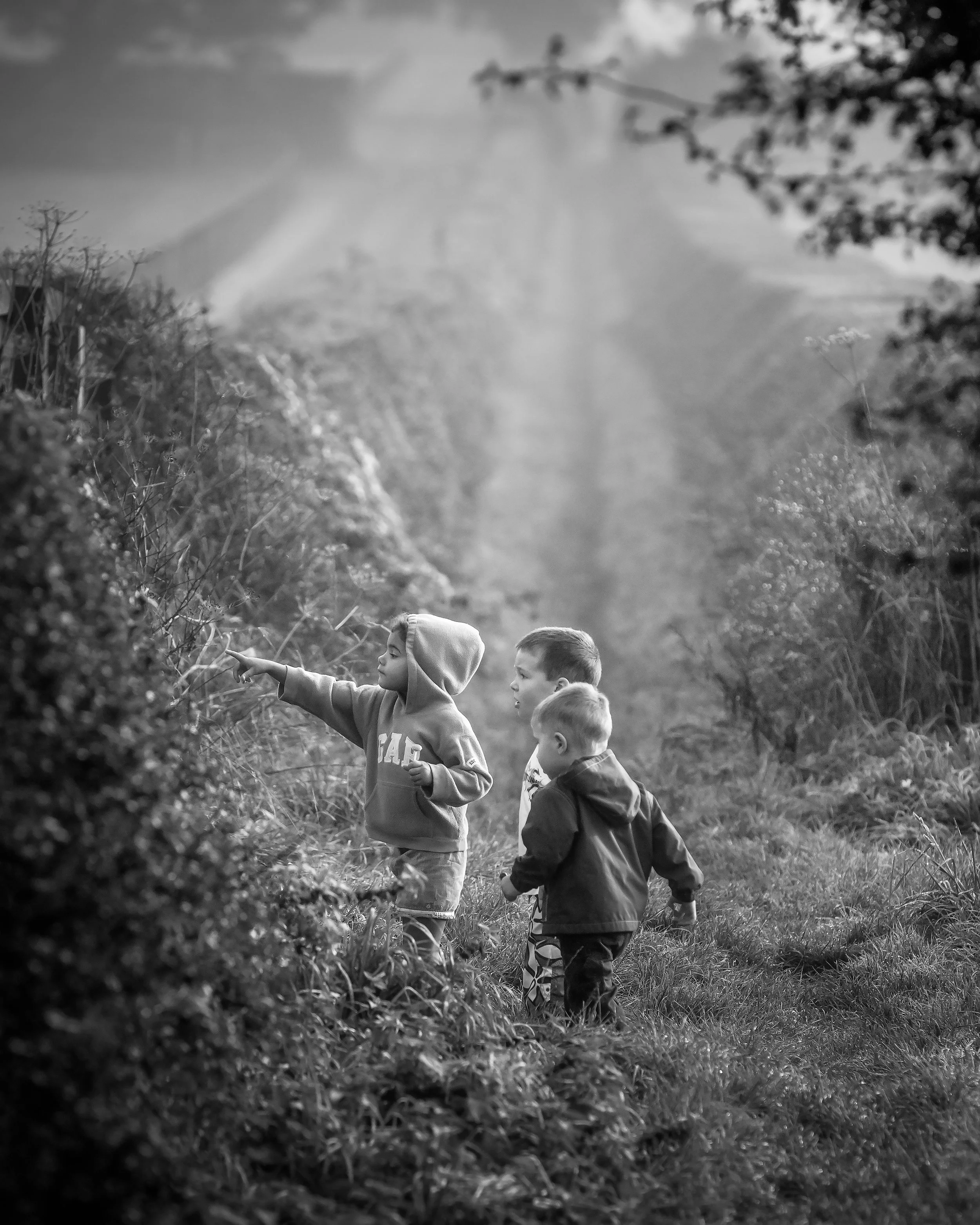
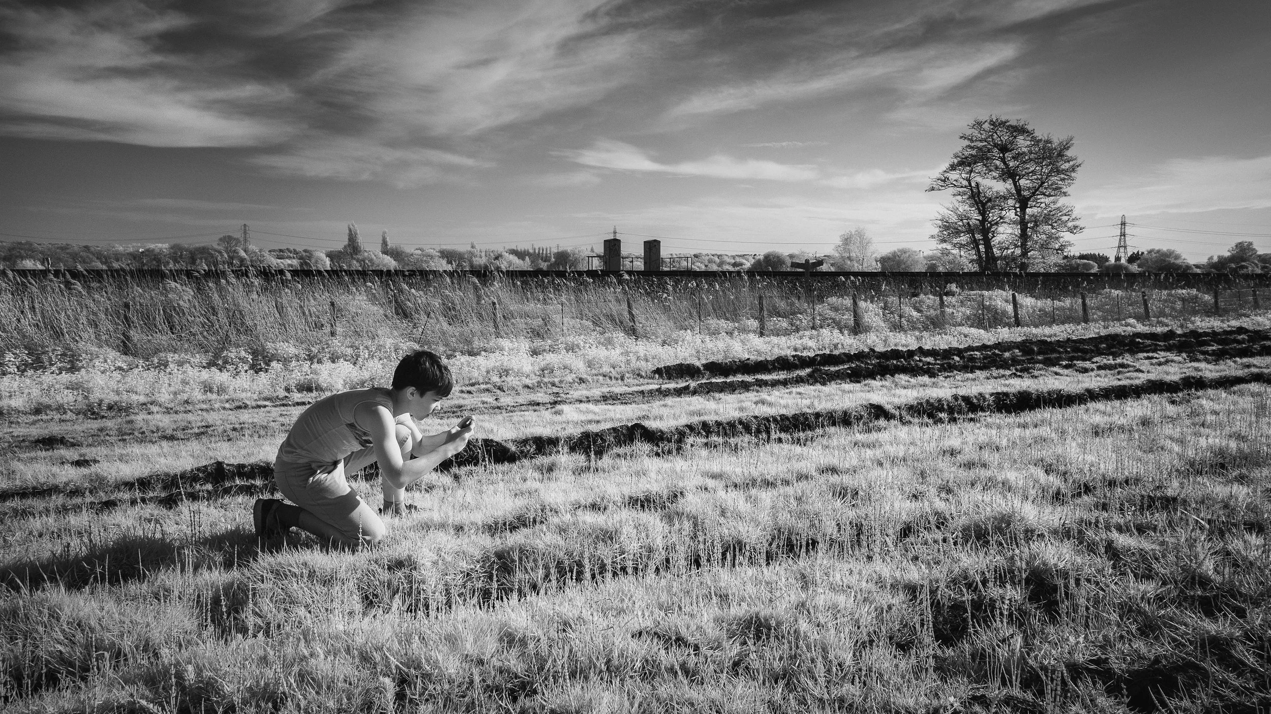
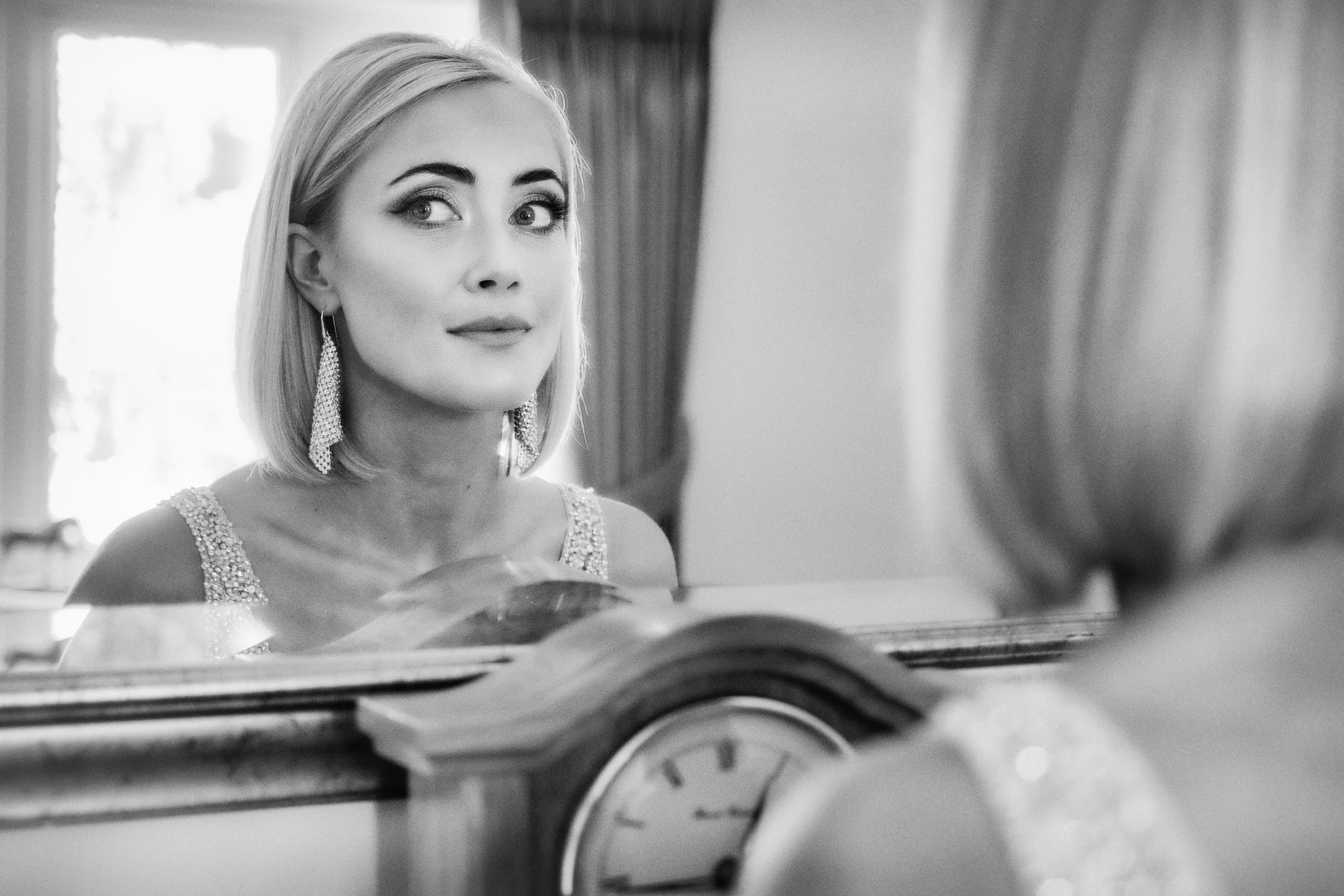
The most common form is the gaze line. When a person in a photograph is looking toward the left, a powerful implied line extends from their eyes in the direction of their gaze — even if whatever they are looking at is off-frame and invisible. The viewer's eye follows the gaze just as reliably as it follows a road or a river, because the same predictive machinery is active: what are they looking at? A pointing finger works the same way. So does the barrel of a camera in someone's hands, the direction of a figure in motion, the implied arc of an object just thrown.
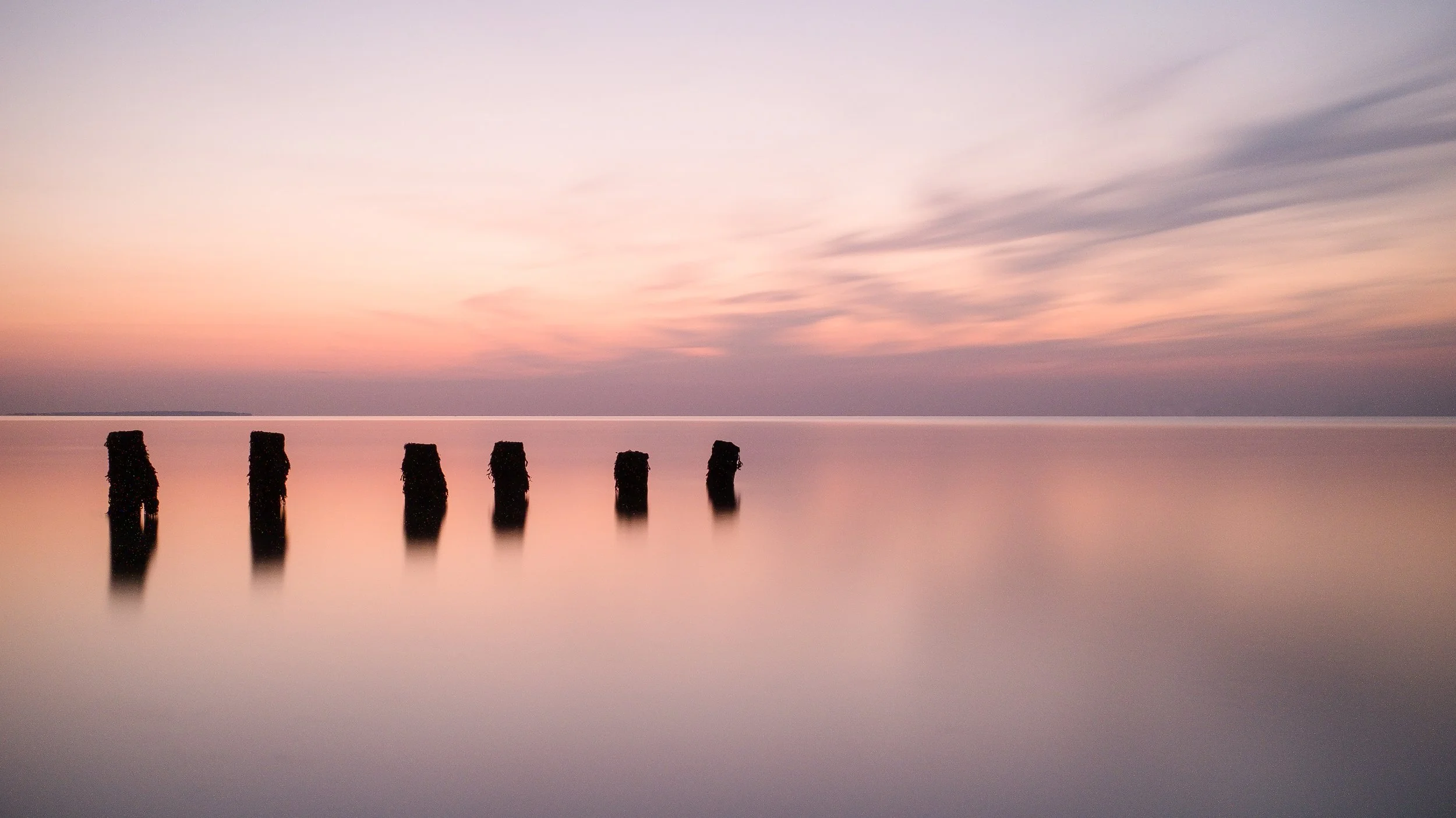
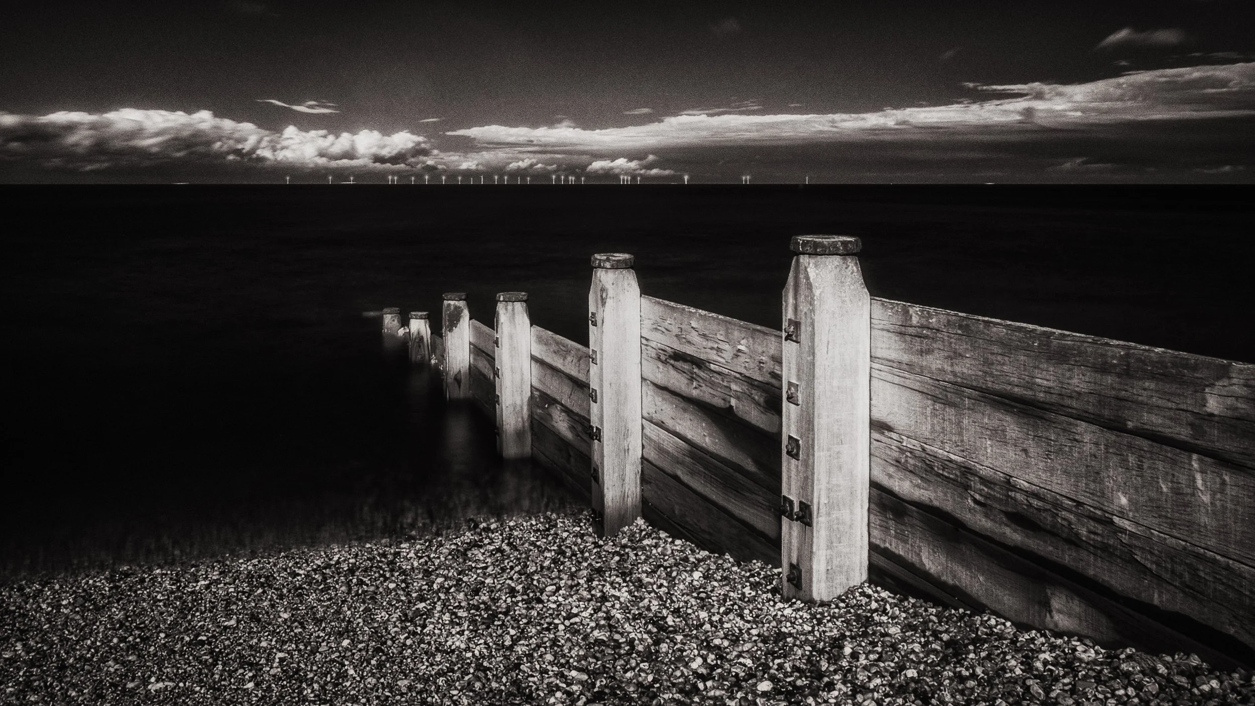
Beyond individual gestures, implied lines emerge from sequences and groupings. A row of stepping stones across a stream is an implied line — there is no single physical line connecting them, but the eye reads the sequence as directional. A queue of people, a line of fence posts, a series of bollards: each of these reads as a line even though the space between each element is physically empty. The Gestalt Law of Continuity is working here, and so is something simpler: the human visual system is very good at finding patterns in sequences, and a sequence of similar objects read as implying a line is one of the most reliable patterns it can find.
Implied lines require slightly more work from the viewer than physical lines — there is an interpretive step involved — but this is not a disadvantage. The extra interpretive work can be engaging rather than exhausting, and implied lines often feel more alive and less mechanical than explicit structural lines. A photograph built around a gaze line has a quality of psychological tension that a photograph built around a railway track does not.
Lines That Do Not Lead Anywhere
This is worth naming explicitly, because it is the most common way that lines go wrong in a composition. A line that terminates in nothing — or, worse, that actively leads the viewer's eye out of the frame — is a compositional problem. Not necessarily fatal: sometimes a leading line's destination is genuinely, intentionally off-frame, and the sense of implied destination beyond the frame's edge is exactly the effect the photographer wanted. But this should be a deliberate choice, not an accident.
The distinction is between a line that escapes the frame and a line that directs attention outward. The first is a failure of composition; the second is a compositional decision. If you find yourself with a line running off the edge of the frame, the question to ask is: is this creating a sense of the world extending beyond the image, which enriches the photograph? Or is it simply dragging the viewer's eye out of the frame and failing to deliver them anywhere? The honest answer is usually apparent when you look at the image for a moment.
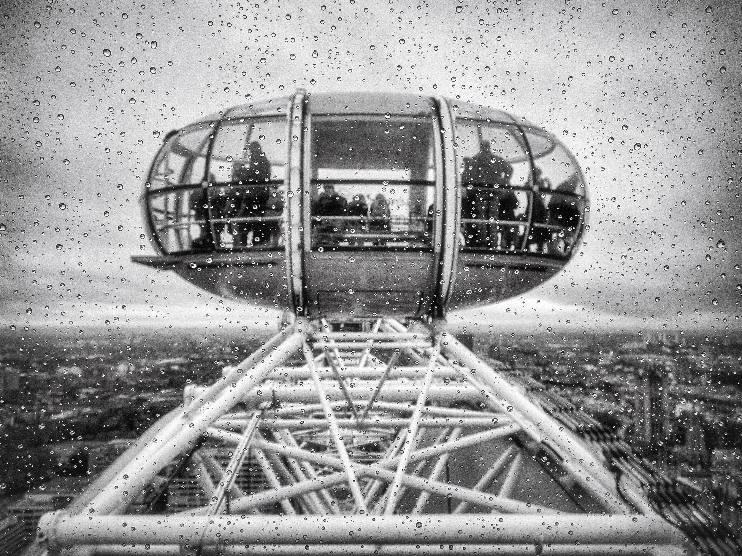
Similarly, multiple competing lines that point in different directions can cancel each other out, leaving the viewer without a clear path through the frame. This can be managed by suppressing some lines (by angle of approach, framing, or focal length) or by choosing a position from which the lines converge or align rather than conflict. But it requires conscious attention, because the eye will try to follow every strong line in a frame, and if they point in different directions, the result is visual confusion rather than visual direction.
Finding & Using Leading Lines
Theory is one thing. Going out with a camera and actually finding and deploying leading lines is another, and the gap between knowing the principle and being able to apply it spontaneously is where most of the actual learning happens.
Training the Eye
The claim that "leading lines are everywhere" is true but not immediately useful to a beginner, because it is not obvious where to look. A practical starting exercise: stand somewhere completely familiar — a corridor, a garden path, a road you walk every day — and systematically identify every leading line in the scene. Count them. For each one, ask: does this line lead to something worth looking at, or does it lead to nothing? Does it enter the frame from an edge or a corner, or does it start in the middle? Is it straight, curved, converging, or implied?
This is a version of what experienced photographers do automatically, but they do it quickly and unconsciously, having internalised the process over many thousands of frames. The deliberate, slow version of the exercise makes the process visible, and once you have done it consciously a few times, it starts to become faster and more automatic.
A useful companion habit is to look for lines before raising the camera. Stand in a location and look at it with your eyes, not through a viewfinder, asking the question: where are the lines, and where do they go? Then, when you do raise the camera, you are choosing your position relative to lines you have already identified rather than discovering them retrospectively on a screen.
Camera Height and Angle
Few variables change the character of leading lines as dramatically as camera height. Crouching low on a road makes the kerb lines and road markings converge dramatically — from ground level, even a modest road with slight convergence becomes a powerful leading-line composition because the angle of view exaggerates the perspective. Standing upright, the same road may barely register as a leading-line subject. Getting the camera to ground level is not always possible or comfortable, but it is worth knowing that this is one of the most reliable ways to transform a flat, uninteresting foreground into a dynamic compositional element.
The angle of approach matters equally. A path photographed head-on, from directly in front, produces a straight bilateral symmetry with the path running toward the centre of the frame — sometimes effective, often static. The same path photographed from the side, so that it runs as a diagonal from the bottom corner toward the upper-right third, has considerably more energy. Moving your feet — literally walking around the scene to check how the lines look from different positions — is not optional; it is the primary compositional tool.
The Entry Point
Leading lines work best when they enter the frame from the edges, and specifically from the corners. This is because a line that begins at a corner and runs across the frame to the subject maximises the distance the eye travels — which means maximising the time the viewer spends in the frame before arriving at the subject. A line that begins partway along an edge has less purchase on the composition; a line that begins in the middle of the frame has very little. The corner is the maximum-leverage entry point.
The bottom-left corner is particularly favoured, partly because Western viewers are habituated to entering images from the left (consistent with the left-to-right direction of reading) and partly because a line from the bottom-left to the upper-right produces a compositional diagonal that naturally leads the eye through the frame to a subject placed in the upper-right zone — which, if you are applying the rule of thirds, is exactly where a subject often wants to sit.
None of this is a rule so much as a useful observation about leverage. Leading lines from other entry points can work perfectly well, and sometimes entering from an unexpected direction creates exactly the right sense of disorientation or surprise. But if you want to maximise the directional force of a leading line, start it at a corner.
Combining Leading Lines with Other Compositional Tools
Leading lines and the rule of thirds are natural partners. The leading line conducts the viewer through the frame; the rule of thirds determines where the subject sits at the end of the journey. If the line enters from the bottom-left corner and leads to a subject placed at the upper-right third intersection, the viewer's journey through the frame follows the most natural compositional path available. This combination accounts for a huge proportion of the landscape photographs that feel instinctively right, even to viewers who have never heard of either technique.
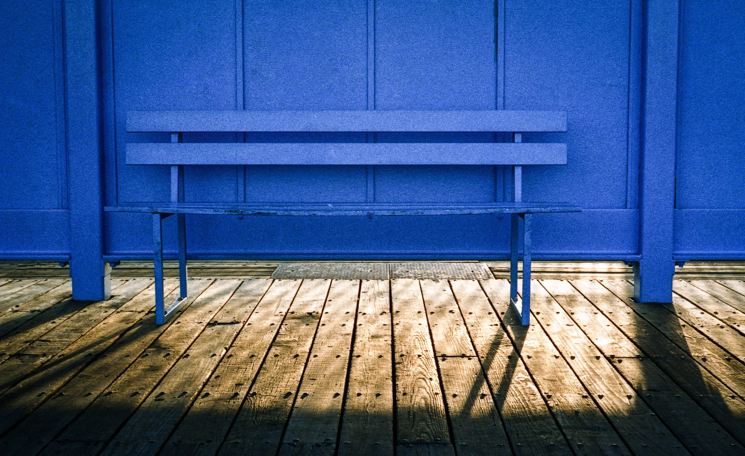
Light can also function as a leading line, or can reinforce one. A shaft of light falling at a diagonal across a scene is a directional element — the eye follows it in the same way it follows a physical line. The combined effect of a physical leading line (a path, a wall) and a beam of light falling along roughly the same direction is more than the sum of the parts: the composition has both structural and luminous direction, and the effect can be quite powerful. Early morning and late afternoon light, falling at low angles, creates long shadows that function as additional lines — sometimes reinforcing the primary leading line, sometimes crossing it, and the relationship between them is worth noticing.
Photographers & Leading Lines
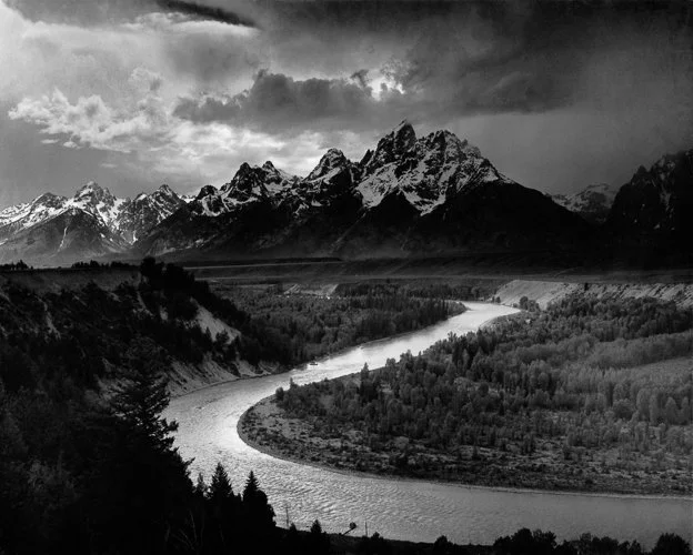
Ansel Adams — The Tetons and the Snake River (1942)
This photograph — taken from an elevated overlook in what is now Grand Teton National Park in Wyoming, commissioned as part of an Interior Department mural project — is one of the most analysed compositional structures in photographic history, and legitimately so. The Snake River creates a true S-curve leading line through the entire frame, and the first thing to notice about Adams's compositional decision is where the river enters: the lower-right corner of the frame.
The river swings left across the lower portion of the image, turns, and then curves right toward the Teton range at the top of the frame. The S-curve maximises the distance the viewer travels from foreground to subject — the eye cannot take a shortcut; it must follow the river's full arc before it arrives at the mountains.
What is easy to miss is that Adams was making compositional decisions, not just recording a view. He positioned himself, chose his moment and his vantage point, and decided how much of the river to include in the lower portion of the frame. The river is doing compositional work that the mountains alone could not do — it creates the journey that makes the destination meaningful. Without the river as a leading line, the Tetons are a handsome mountain range photographed competently. With it, the photograph constructs an entire spatial narrative, from the valley floor at the viewer's feet to the peaks in the distance.
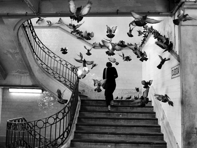
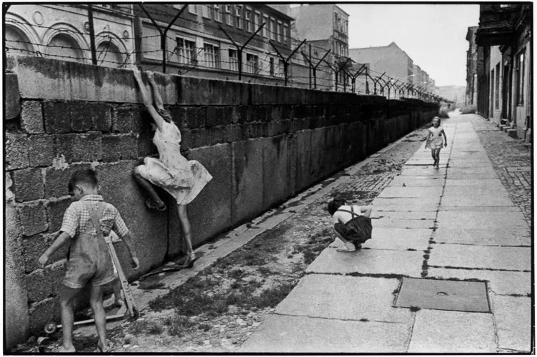
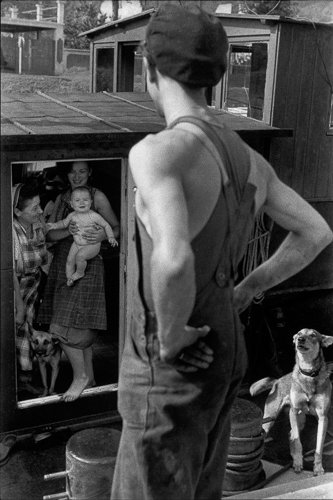
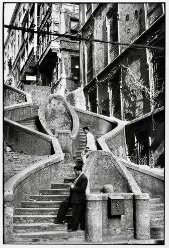
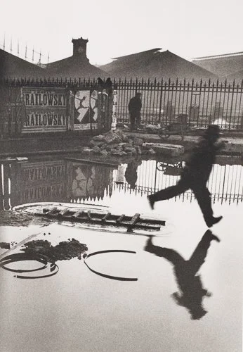
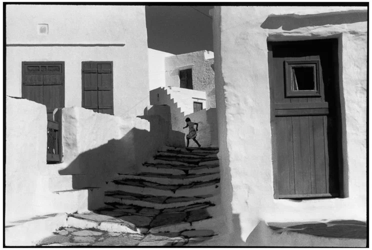
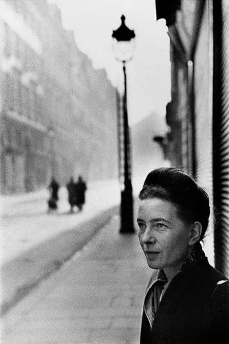
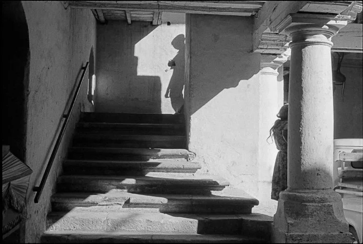
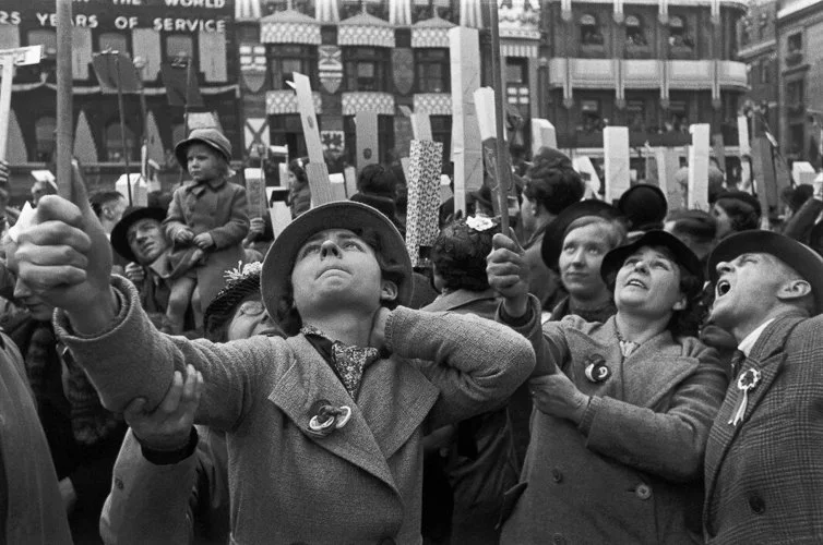
Cartier-Bresson's concept of the "decisive moment" is often discussed in terms of timing — the fraction of a second when everything aligns. But what it actually describes is compositional alignment: the moment when the lines, shapes, and directions within the frame achieve a momentary geometric harmony. His work is full of leading lines, but they are rarely the structural, architectural kind. Cartier-Bresson was primarily a street photographer, and his leading lines are almost always implied: the direction of a figure's movement, the implied trajectory of someone about to jump, the gaze of one figure toward another.
The characteristic Cartier-Bresson composition brings multiple implied lines into simultaneous alignment — which is exactly what makes the "decisive moment" so hard to capture and so briefly available. The direction of a figure's gaze, the arc implied by a moving leg, the angle of a shadow: these are all implied lines, and they point in slightly different directions.
At the decisive moment, they align. A fraction of a second earlier or later, they do not. This is compositional geometry executed at speed, intuitively, with no time for deliberate analysis — which is why he insisted that conscious composition, at the moment of pressing the shutter, was impossible. The analysis comes before and after; the moment is pure reflex.
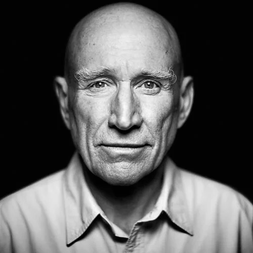
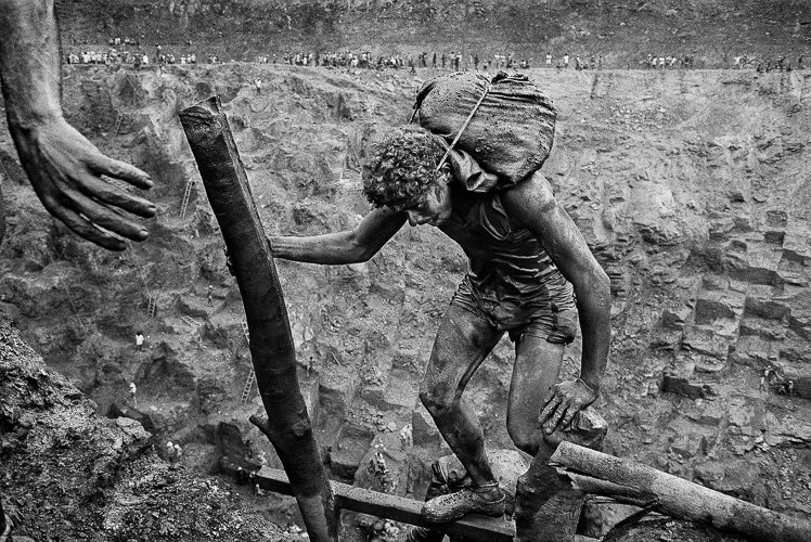
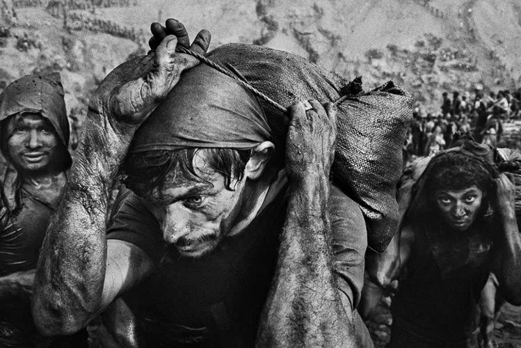
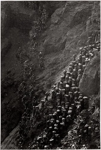
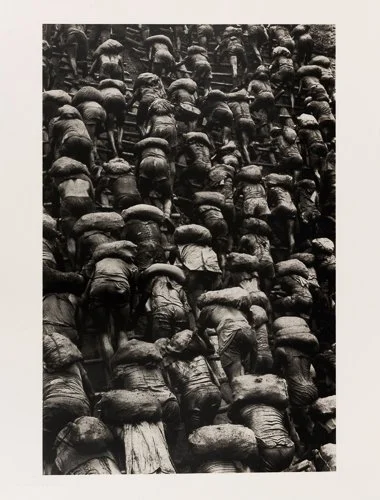
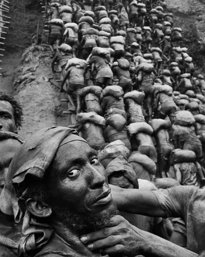
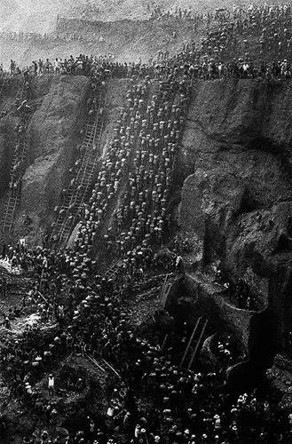
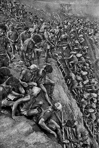
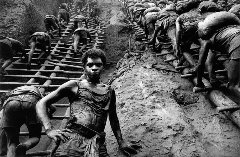
Sebastião Salgado — Serra Pelada (1986)
Salgado's photographs of the Serra Pelada gold mine in the state of Pará in Brazil are among the most extraordinary documentary images of the twentieth century, and their compositional power rests almost entirely on the use of human figures as leading lines. The mine is a vast open pit, and Salgado photographed it from elevated positions, looking down over the ant-like streams of workers ascending and descending the pit face — each carrying a sack of earth, each connected to the next by a rope or a ladder or simply the physical proximity of thousands of bodies moving in the same direction.
The chains of workers create multiple parallel and converging implied lines through the frame. They go up and down, left and right, at different depths and different diagonals, creating a visual complexity that should be overwhelming and is instead, somehow, comprehensible — because the eye can follow the lines of movement, pick out individual streams of direction, and understand the spatial structure of the mine from the patterns of human motion.
Leading lines here are not an aesthetic choice; they are the compositional mechanism that makes the scale and the system legible. Without the lines created by those streams of workers, the image would be an undifferentiated mass of people. With them, you understand exactly what is happening and how large the operation is.
It is also worth noting that Salgado's intention is documentary rather than aesthetic. The lines of workers communicate exploitation and scale — the photograph is an argument as much as an image. The compositional structure serves the documentary purpose: it shows you the system, not just the spectacle.
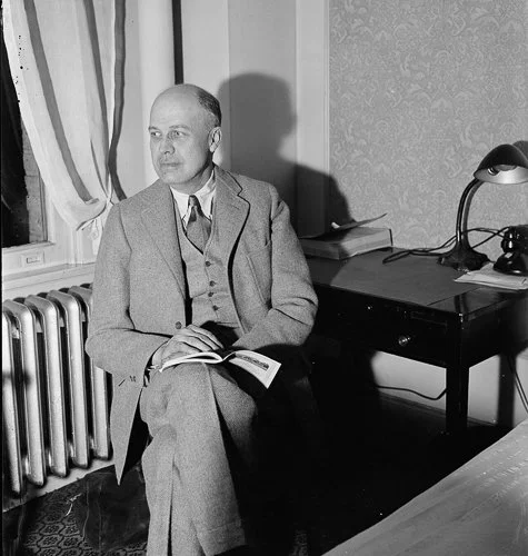
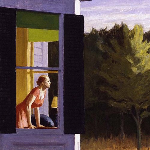
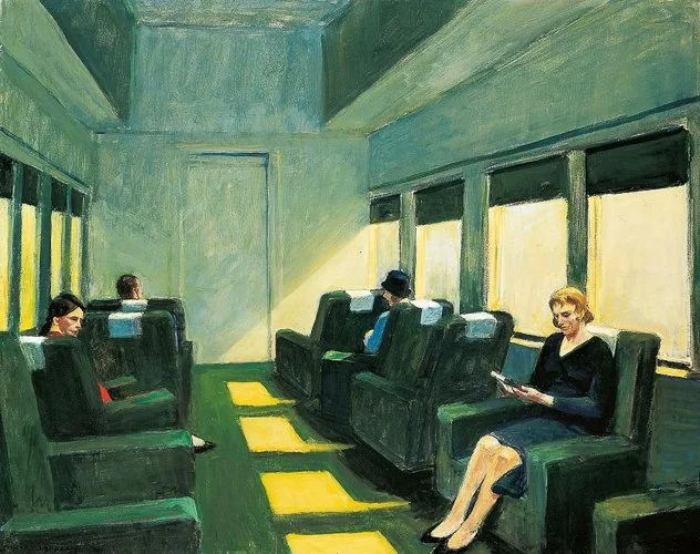
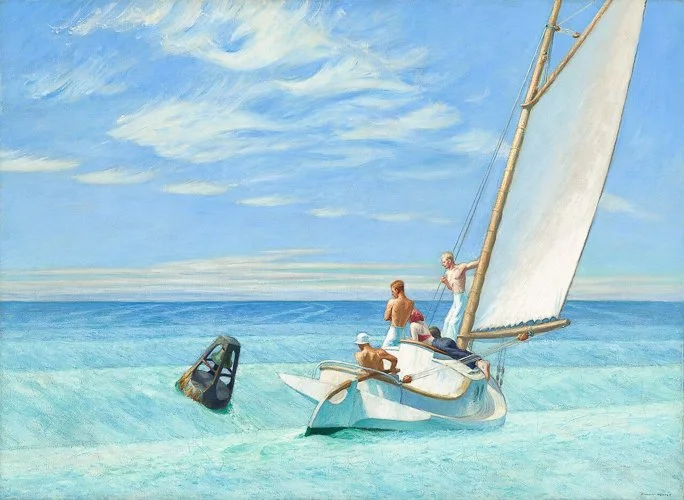
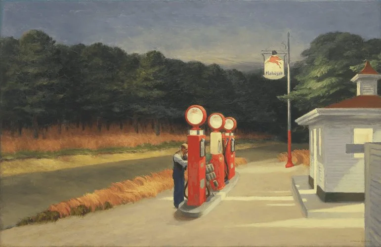
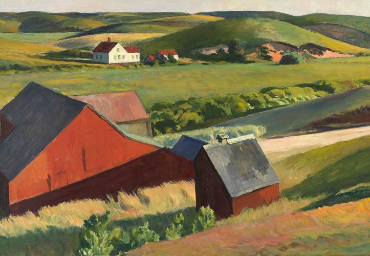
Hopper was a painter, not a photographer, but his influence on American photography — particularly interior, architectural, and urban photography of the second half of the twentieth century — is direct enough to justify including him here. His paintings make systematic use of diagonal recession and linear perspective: rooms in which floorboards recede from the foreground, windows that create strong directional light falling at angles, architectural lines that create depth and psychological distance simultaneously.
What Hopper understood, and what photographers working in his visual register have absorbed, is that straight lines and converging geometry do not just create depth — they create mood.
The long diagonal recession of a diner counter, the converging parallels of a window frame leading to an empty street outside: these are not just spatial descriptions. They are emotional ones. The geometry of linear recession in a Hopper painting creates solitude, isolation, a sense of the world extending beyond the frame. Photographers who reach for strong architectural leading lines in urban settings are often, consciously or not, working within this tradition.
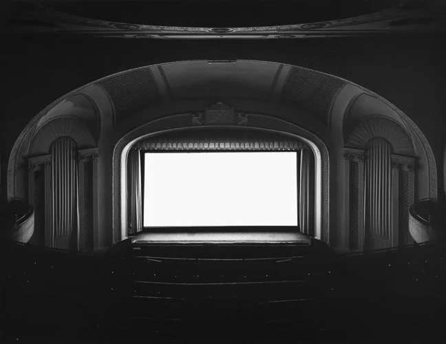
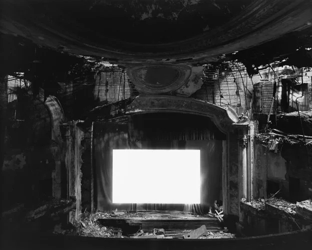
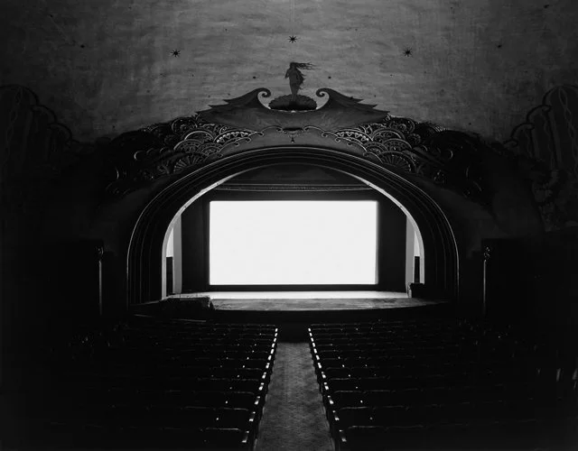
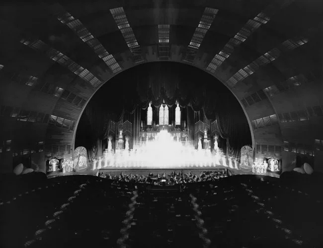
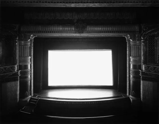
Hiroshi Sugimoto — Theaters series (1975 onwards)
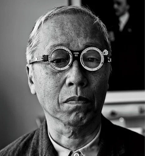
Sugimoto's theatre photographs are, technically, extreme long exposures of cinema screens — long enough for the entire film to play out over the course of the exposure, resulting in a screen of pure white light. But compositionally, what makes them extraordinary is the surrounding architecture. The theatre's seats, walls, and balconies frame the screen as a perfectly centred vanishing-point composition, with the architectural recession converging precisely on the glowing screen at the centre of the frame.
This is convergence used with absolute deliberateness. The leading lines of the theatre's architecture — every row of seats, every wall panel, every line of the ceiling — converge on the screen. The viewer's eye is given no alternative destination; the entire spatial structure of the image points to a single, luminous point.
The fact that this point is a screen projecting light — a window, of sorts, onto another world — gives the compositions their peculiar quality of depth: you feel as though the vanishing point recedes beyond the frame, into the film itself. It is one of the most rigorous uses of convergence as compositional structure in photographic history.
Resources
Browne's channel is consistently practical and clear, and this video is an excellent starting demonstration of how leading lines work in landscape photography. The windmill example he uses is simple but genuinely instructive: it shows the difference between a composition with a leading line and the same scene without one, in a way that makes the principle immediately visible. If you want to see the theory of this article applied to an actual image in real time, this is a good place to start.
A more analytical treatment, covering the full taxonomy of line types — vertical, horizontal, diagonal, organic, and implied — with reference to photographs by Hiroshi Sugimoto, Arnold Newman, Charles Sheeler, and Richard Avedon. Forbes is thorough and art-historically literate in a way that rewards attentive watching. The assignment at the end of the video (make five images, one for each line type) is genuinely useful as a practical exercise.
Joshua Cripps is a landscape photographer with a gift for clear explanation, and this short video — despite being a decade old — remains one of the most widely recommended introductions to leading lines on YouTube. His particular focus is on where lines should point: not just vaguely "into the frame" but toward a specific visual payoff — a mountain, a pool of light, a face. He also makes an excellent point about camera position, showing how a few steps in any direction can transform a line from effective to useless. A good watch before you head out with a specific subject in mind.
Most leading lines tutorials default to roads and railway tracks; this one works almost exclusively with natural lines — rivers, ridgelines, shorelines, rows of trees — making it particularly useful if your photography leans toward landscape or nature. The channel has a thoughtful, unhurried style, and the examples are well-chosen. Worth watching as a counterpoint to the more urban examples that dominate the genre, and as a reminder that lines exist everywhere in the natural world, not just wherever a civil engineer has been at work.
Give it a Try!
The Line Inventory
Find a single location — indoors or outdoors — and, without moving your feet, photograph every leading line you can find from that spot. Look for straight lines, diagonals, curves, converging pairs, and implied sequences. Count them. For each one, consider: where does this line lead? Does it point toward something worth looking at, or toward nothing? Does it enter the composition from an edge or a corner, or does it begin in the middle of the frame?
The aim is not to make great photographs — it is to discover how many directional lines exist in any given location once you start actively looking for them. Most people are surprised by how many they find, and by how many of those lines have been pointing at interesting things without their ever having noticed.
The Same Path, Three Ways
Find a path, road, or corridor with some length to it, and photograph it three times from the same position but at three different heights: standing at full height, crouching, and as low as you can physically manage — phone placed on the ground if necessary, or camera held at ankle level. Do not change anything else: same position, same direction, same framing as closely as you can manage.
Compare the three images. The aim is to understand, empirically and in your own photographs, how dramatically camera height changes the prominence, energy, and visual weight of leading lines. What is a modest compositional element at standing height often becomes a dominant compositional structure from ground level. This is one of the most controllable variables in composition, and it repays direct experience.
The Implied Line
Make a photograph in which the primary leading line is implied rather than physical. The most obvious approach is to use a person's gaze: place your subject so that they are looking toward something off-frame, and consider how the implied line of their gaze affects the composition. Where does the eye go? Does the implied destination feel like a presence, or an absence? You can also try a row of objects (stones, bollards, chairs), a sequence of stepping stones, or a pointing gesture — any arrangement in which the "line" exists only in the viewer's perceptual interpretation of the image.
The aim is to understand that leading lines do not require physical marks. They require directed attention — and directed attention can be created by arrangement, sequence, and gesture as readily as by any road or railway track.