The Rule of Thirds
The Rule of Thirds is probably the most widely taught compositional guideline in photography. It is also, depending on who you ask, either an indispensable foundation for beginners or a piece of misdirected nonsense that has been holding photographers back for decades. The truth, as is usually the case, is somewhere in between — and considerably more interesting than either extreme suggests.
Let's start with what it actually is. You divide the frame into a 3×3 grid using two horizontal and two vertical lines. You then place your key subject — a face, a horizon, a focal point — along one of those lines, or at one of the four intersections where the lines cross. These intersections are sometimes called power points or crash points. The theory is that this off-centre placement creates visual tension, energy, and interest that a dead-centre composition cannot.
That is the rule. Or rather, that is the guideline. It is worth establishing from the outset that the word "rule" is doing a lot of mischief here. No photograph has ever been improved by rigidly obeying a grid, and no photograph has ever been ruined by ignoring one. What the Rule of Thirds offers is a starting point — a concrete, learnable technique for getting your eye out of the habit of putting everything in the middle of the frame, which is where most of us naturally point a camera when we first pick one up.
Understanding why it works, however, is considerably more valuable than simply applying it. The grid is a tool. The underlying principle — that asymmetry, tension, and negative space are fundamental to how we experience images — is what you actually want to internalise.
Why Off-Centre Works So Well
There is something worth unpacking here, because the Rule of Thirds is often taught as though it were simply a convention — a thing photographers have agreed to do, like shaking hands or driving on the left. It is not. The preference for off-centre placement reflects something genuine about how human vision works, and understanding that will do more for your photography than any grid overlay.
The eye is not a camera. When you look at a photograph, you do not take it in all at once, the way a sensor captures light. You scan it. Eye-tracking research consistently shows that in cultures with left-to-right reading patterns, viewers enter an image from the left edge and scan across — not unlike reading a page. A subject placed dead-centre stops that scan immediately. There is nowhere to go. The image resolves in an instant, and the viewer moves on. A subject placed to one side gives the eye something to travel towards — and something to travel from, leaving behind a region of space that the brain continues to process.
Figure and ground. When you place a subject off-centre, you automatically create asymmetric negative space — more space on one side than the other. This asymmetry does several things simultaneously. It increases what visual psychologists call figure-ground contrast: the subject stands out more clearly from its surroundings because the surrounding space is not equal on both sides. It also gives the image "breathing room" — a phrase that sounds vague but describes something real. A portrait with the subject pressed against the centre of the frame feels slightly airless, slightly crowded, even if there is technically plenty of space around them.
The psychology of space. There is a directional element to negative space that is easy to miss until someone points it out, after which you will see it everywhere. A subject with space in front of them — in the direction they are facing or moving — feels alive and purposeful. They are going somewhere. The space is active, waiting to be entered. A subject with more space behind them than in front feels cornered, static, or on the verge of exiting the frame. This is not a conscious response from the viewer; it happens below the level of deliberate thought. A bird in flight placed at the left third of the frame, with empty sky to the right, feels like flight. The same bird placed at the right third, with nothing but space behind it and the frame edge in front, feels like it is about to crash.
Tension and resolution. Here is perhaps the most important idea: compositional tension is not a flaw. A perfectly balanced, perfectly symmetrical image resolves too quickly. The eye sees it, registers it, and is satisfied — and satisfied viewers move on. Asymmetric compositions keep the eye moving, keep it searching for balance that is slightly, deliberately withheld. This is why a well-composed off-centre image tends to hold viewers longer than a centred one, even when the centred image is technically perfect.
None of this means centred compositions are wrong. They are right in specific circumstances, and those circumstances are worth understanding properly.
When the centre works
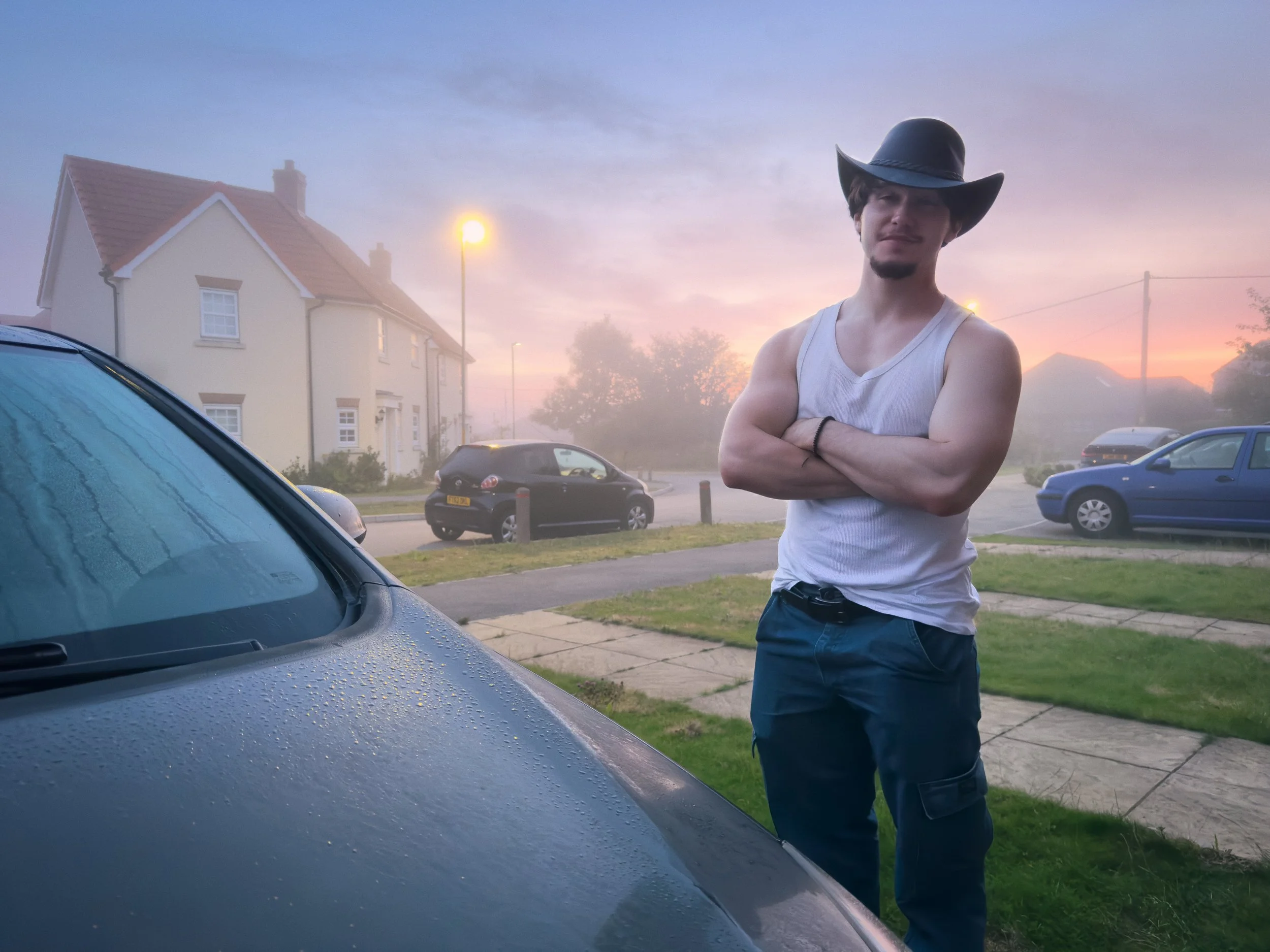
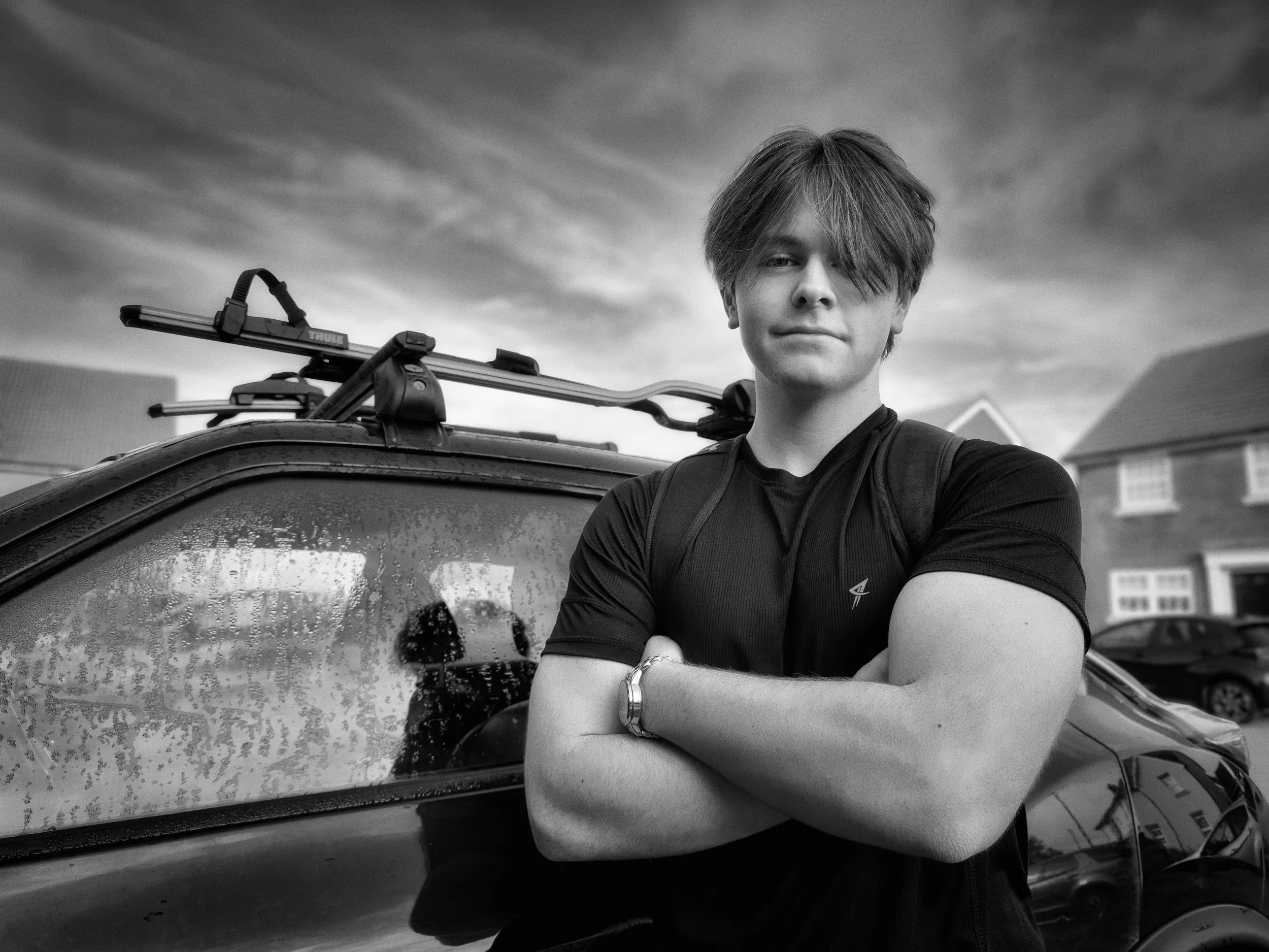
Symmetry, confrontation, and minimalist abstraction are the three cases where centring often produces the strongest result. A reflection — a lake perfectly mirroring a mountain range — needs the horizon at the centre to activate the symmetry; placing it on the lower third destroys the effect entirely.
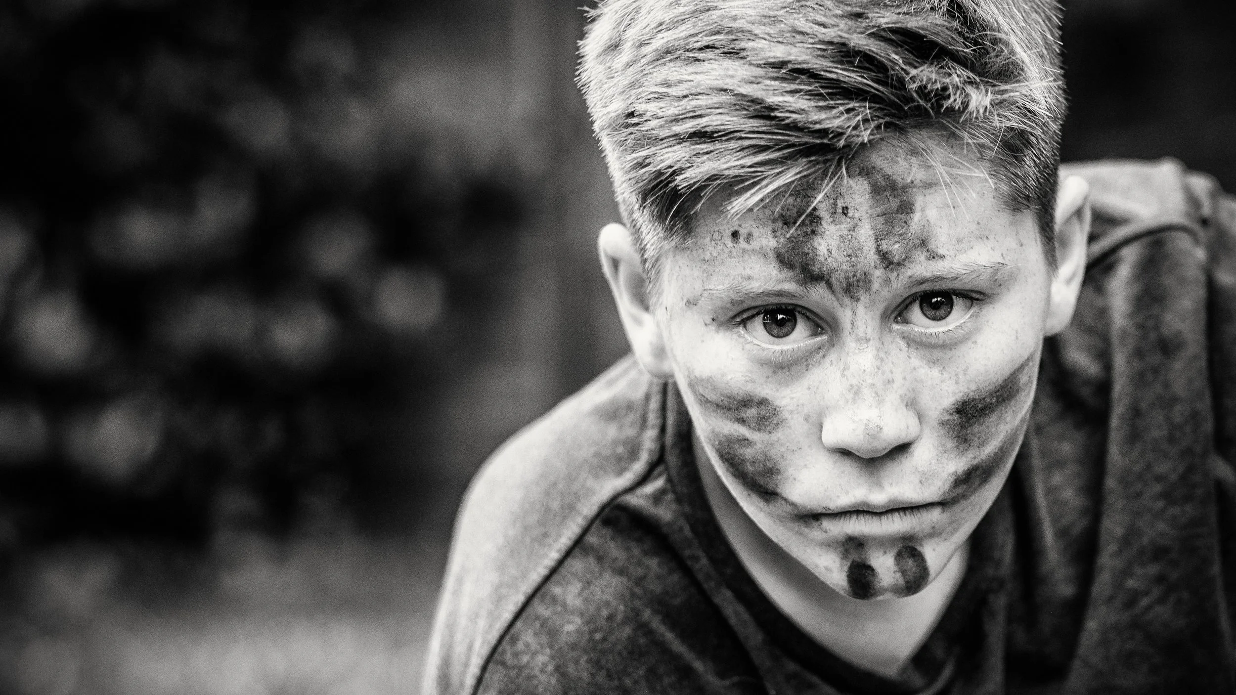
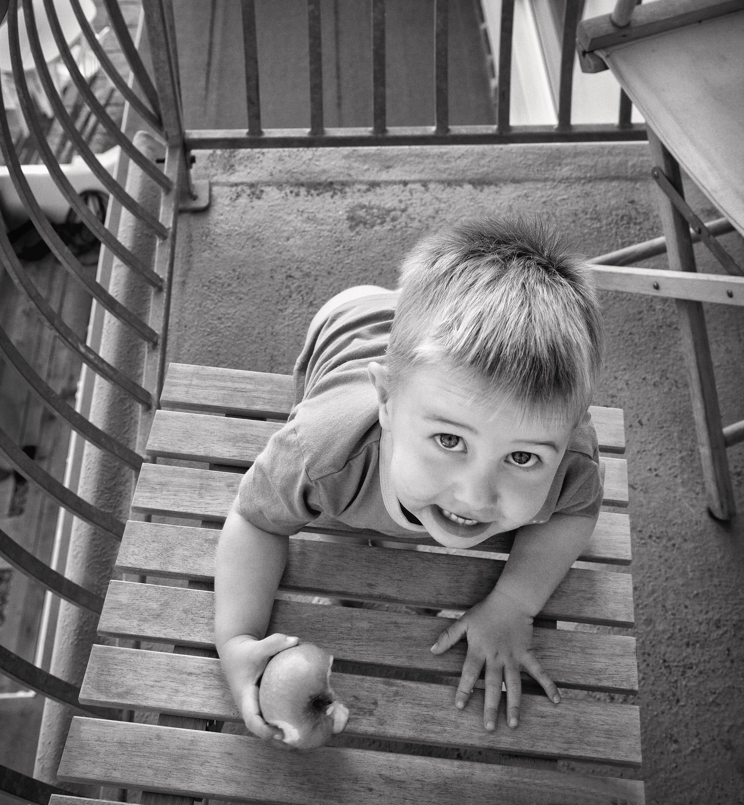
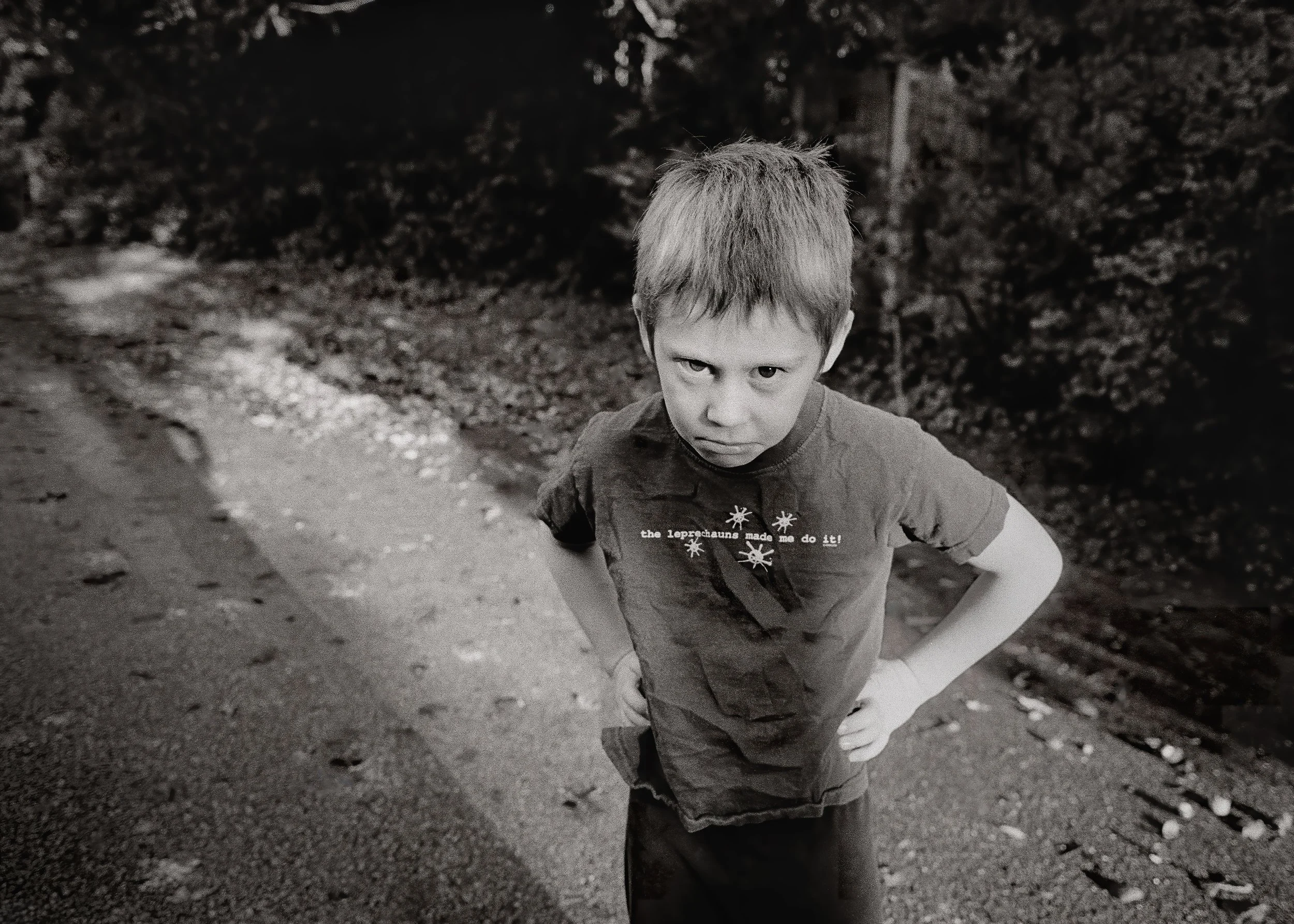
A formal architectural detail where bilateral symmetry is the subject demands centring. And a face looking directly into the lens, fully centred, creates a different and more powerful kind of intensity than any off-centre placement — because it meets the viewer's gaze head-on, with no ambiguity about where to look.
The Rule of Thirds, in those cases, is the wrong tool. Knowing when to put it down is as important as knowing how to use it.



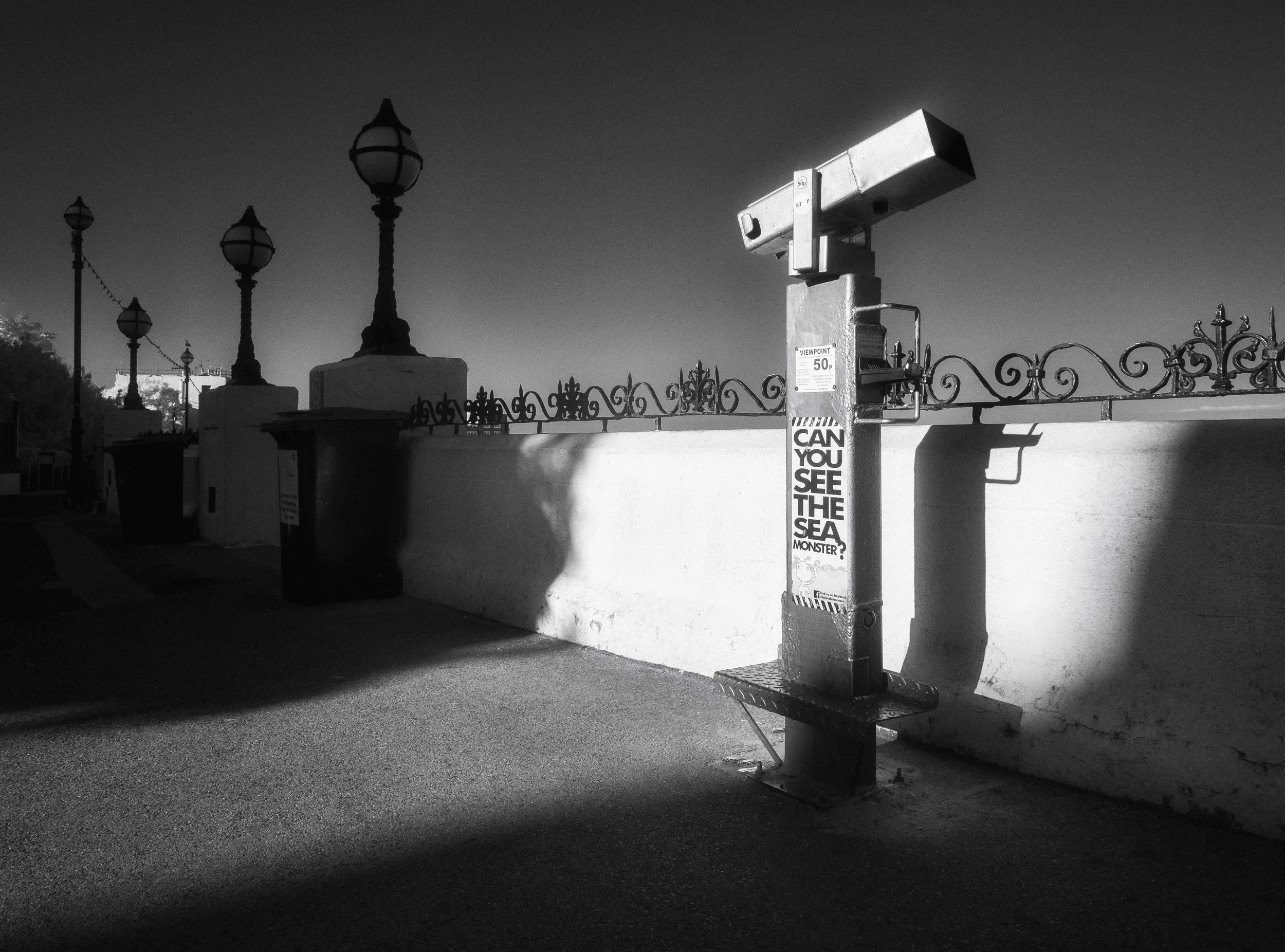
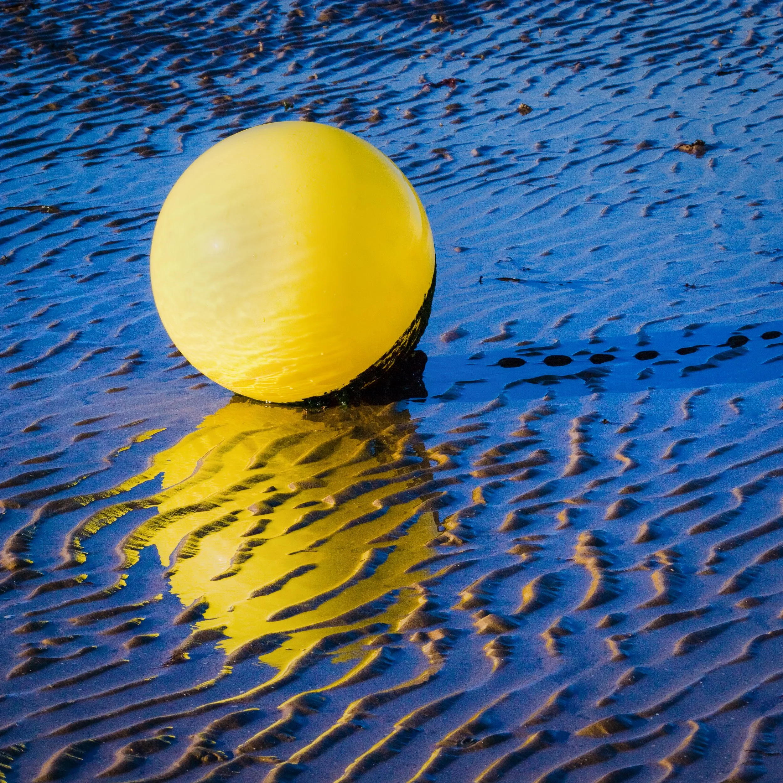
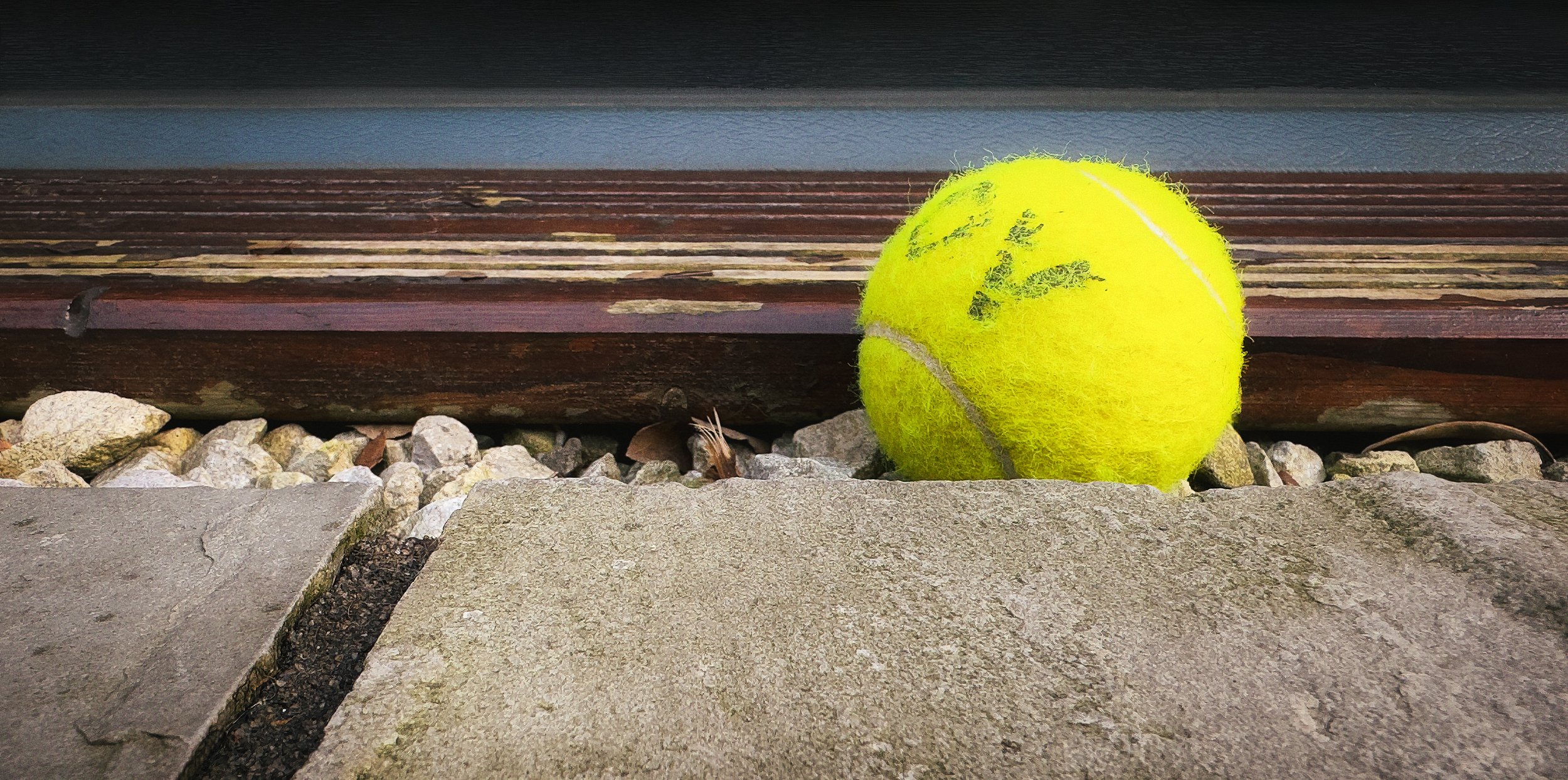
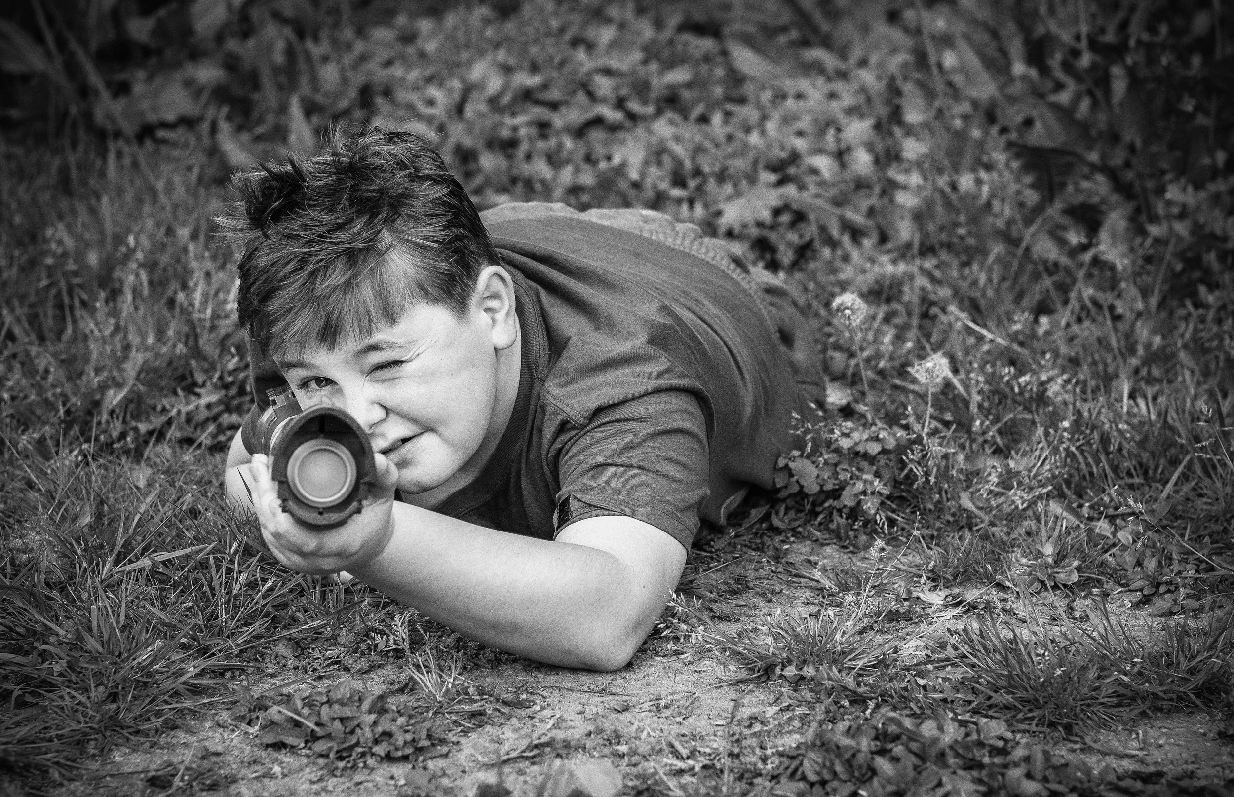
















Origins : Not Quite Where You Think
The first written use of the phrase "rule of thirds" appears in John Thomas Smith's Remarks on Rural Scenery, published in 1797. Smith — known to contemporaries as "Antiquity Smith" for his topographical and antiquarian work, and later as Keeper of Prints at the British Museum — wrote the book primarily about cottage scenery, with etchings. In a chapter on light and shade, drawing on a 1783 discourse by the painter Sir Joshua Reynolds, Smith extended Reynolds's observations about the proportion of light to dark in a painting into a broader compositional principle:
"Analogous to this 'Rule of Thirds' (if I may be allowed so to call it) I have presumed to think that, in connecting or in breaking the various lines of a picture, it would likewise be a good rule to do it, in general, by a similar scheme of proportion; for example, in a design of landscape, to determine the sky at about two-thirds; or else at about one-third, so that the material objects might occupy the other two."
It is worth noting what Smith was actually describing: a proportional relationship between areas of a composition — sky to land, light to shadow — rather than the specific placement of subjects at grid intersections. The modern rule-of-thirds-as-grid is a later development; Smith was naming a general preference for the 1:2 ratio over the equal half. The intersection points, the power points, the business of putting an eye on a specific node in a 3×3 grid — that came later, as the principle was adapted and simplified for photographic education.
Smith himself was building on something that already existed in practice. Painters from long before 1797 had been composing with asymmetric weight and off-centre focal points — the rule was a codification of instinct, not an invention. As Smith noted himself, he was drawing from Reynolds, who drew from observation of great paintings. Antiquity Smith was tidying up what painters already knew, and giving it a name.
The Golden Ratio comparison
The Rule of Thirds is frequently described as a simplified approximation of the Golden Ratio — the mathematical proportion roughly equal to 1.618, known since antiquity and found throughout classical art and architecture.
The comparison is understandable but should be treated with some scepticism. The Golden Ratio spiral places the focal point of a composition at a position that is distinctly different from a rule-of-thirds intersection — the spiral's eye sits closer to the centre of the frame than a power point does. They are in the same general neighbourhood, but they are not the same address, and presenting one as an approximation of the other glosses over a real difference. Cartier-Bresson spoke of composing with the Golden Section; he did not mean the rule-of-thirds grid.
Kodak and the democratisation of composition
The rule's real popularisation as a photographic principle happened in the twentieth century, as photography became a mass activity and there was a genuine need for simple, teachable principles that could be communicated to millions of people who had never studied art. Kodak's instructional materials played a significant role here; by the mid-twentieth century, the 3×3 grid was a standard fixture in photographic education manuals.
There is a mild irony in the fact that many of the great photographers being cited as examples of the rule — Cartier-Bresson, Lange, Adams — were composing by intuition, instinct, and a deep understanding of visual relationships, not by mentally overlaying a grid on their viewfinder.
The grid as a camera feature
The 3×3 grid overlay became a standard feature in digital cameras and smartphones gradually over the 2000s, and was brought to a very wide audience with iOS 7 (released in 2013), which added the camera grid as a toggleable option in the iPhone's Settings. The iPhone 5s shipped with iOS 7, making it the first iPhone to offer the grid overlay in native settings.
Since then, it has appeared in essentially every smartphone camera app. Its ubiquity has been enormously useful for beginners and has possibly, as a side effect, encouraged a slightly mechanical relationship with what should remain an instinctive skill — though the answer to that is not to turn the grid off prematurely, but to use it consciously until it becomes unnecessary.
How the Grid Works
To turn on the grid on an iPhone: Settings > Camera > Grid. Most Android camera apps have an equivalent option under their settings or composition menus.
Two horizontal lines and two vertical lines divide the frame into nine equal rectangles. The four points where the lines intersect are the power points. That is the whole structure.
In practice, the grid gives you several distinct tools.
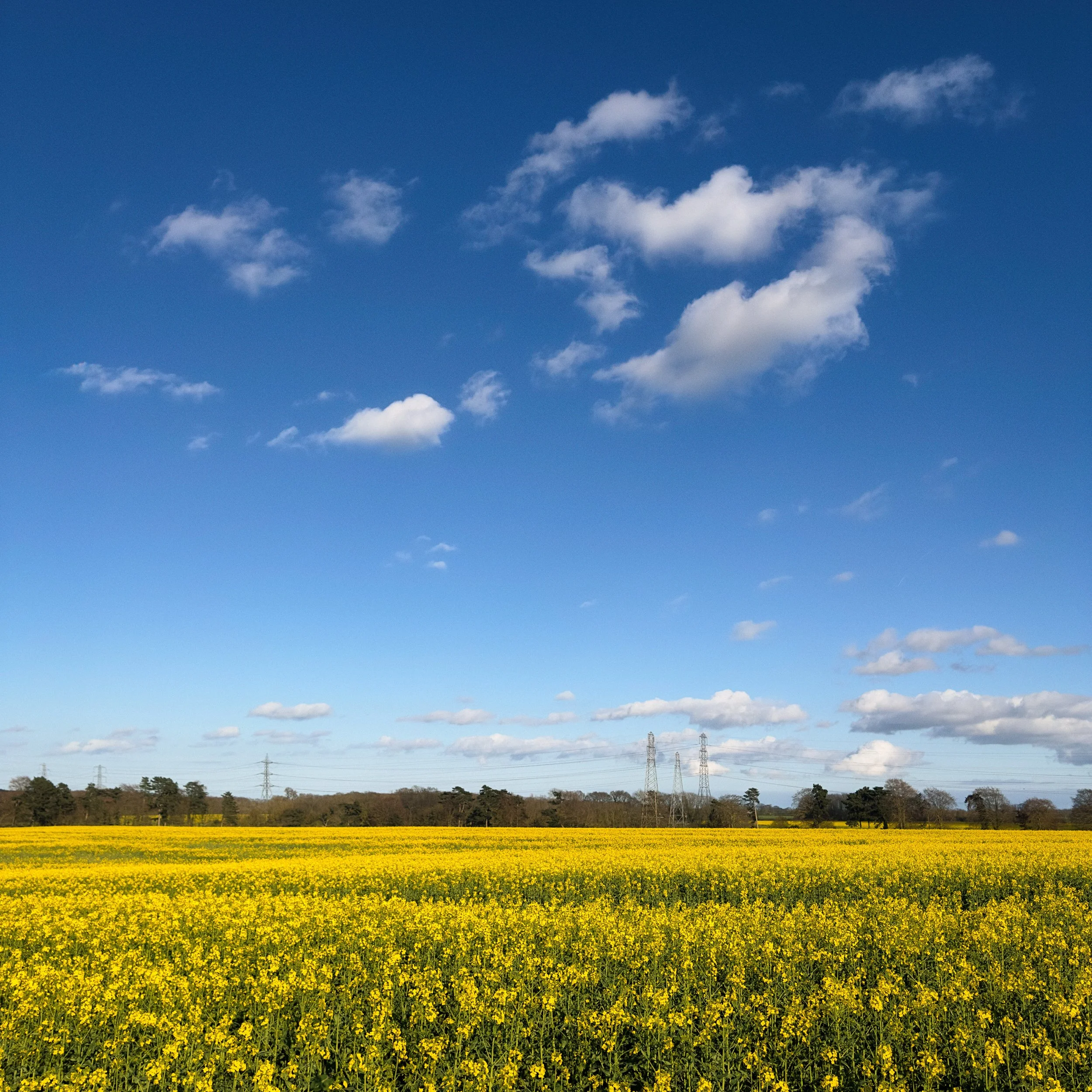
Horizon placement is probably the most common and most immediately useful application. When you photograph a landscape or seascape with a clear horizon, where you place that horizon line determines the entire mood of the image. Horizon at the lower third: the sky dominates, and the image becomes about atmosphere, weather, light, or the drama of the heavens. Horizon at the upper third: the foreground dominates, and the image becomes about what is happening on the ground — texture, detail, the land itself. Horizon in the centre: the image splits into two equal halves, which can feel static and unresolved — unless you specifically want the symmetry, as with a strong reflection.
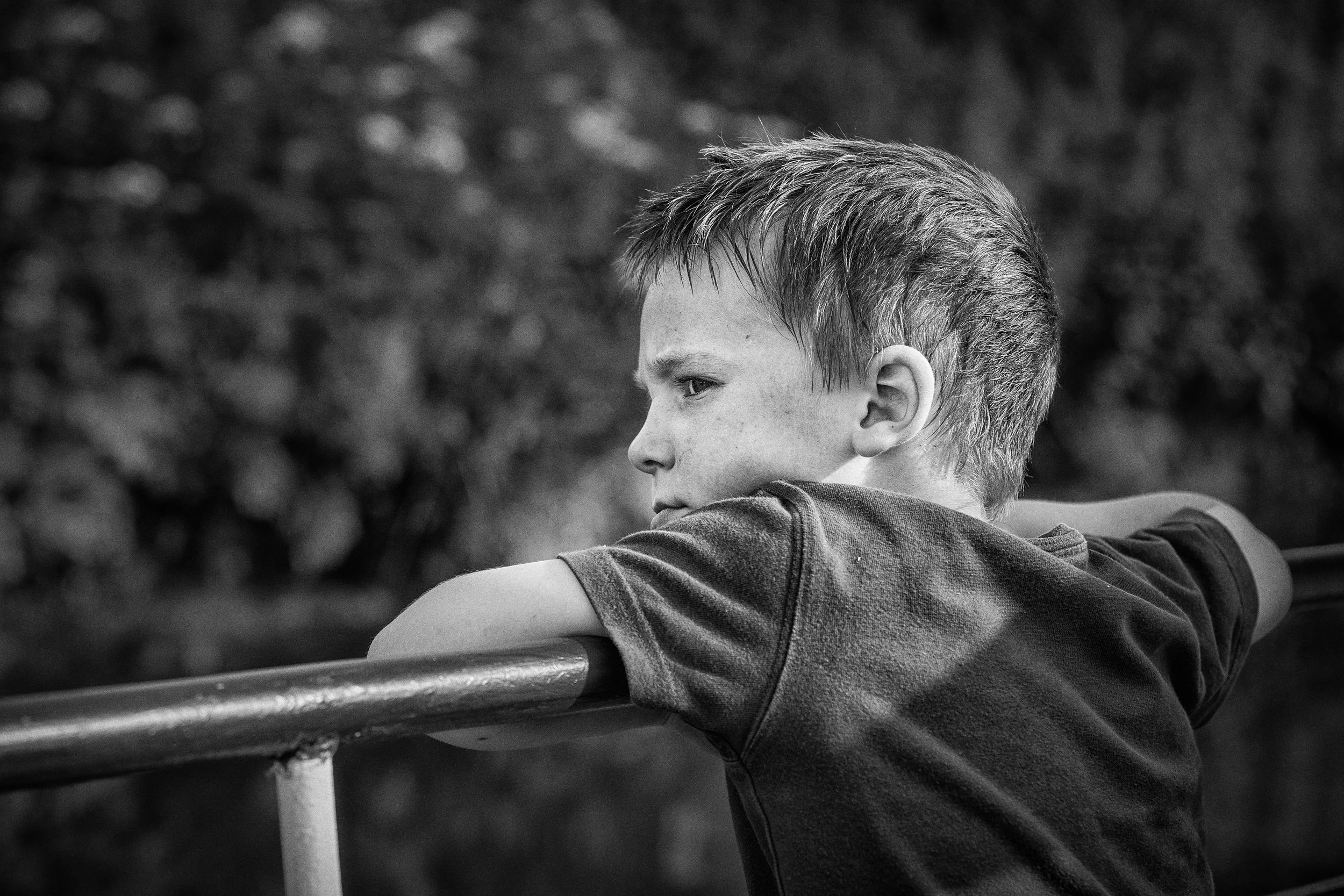
Subject placement at power points works slightly differently for different types of image. In a classic portrait where you can see more than the face — head and shoulders, or full length — the convention is to place the nearest eye on the upper power point on whichever side the subject occupies. This is not arbitrary. The eyes are where the viewer looks first in any portrait, and placing them at a power point draws the gaze to them efficiently and naturally. Try it once with a subject's eyes at the centre of the frame and once at the upper power point; the difference is usually immediately apparent. In a landscape composition, the key element — a tree, a building, a person, a rock formation — typically belongs at or near a power point, with the horizon on one of the horizontal lines. This gives you two compositional anchors working together.
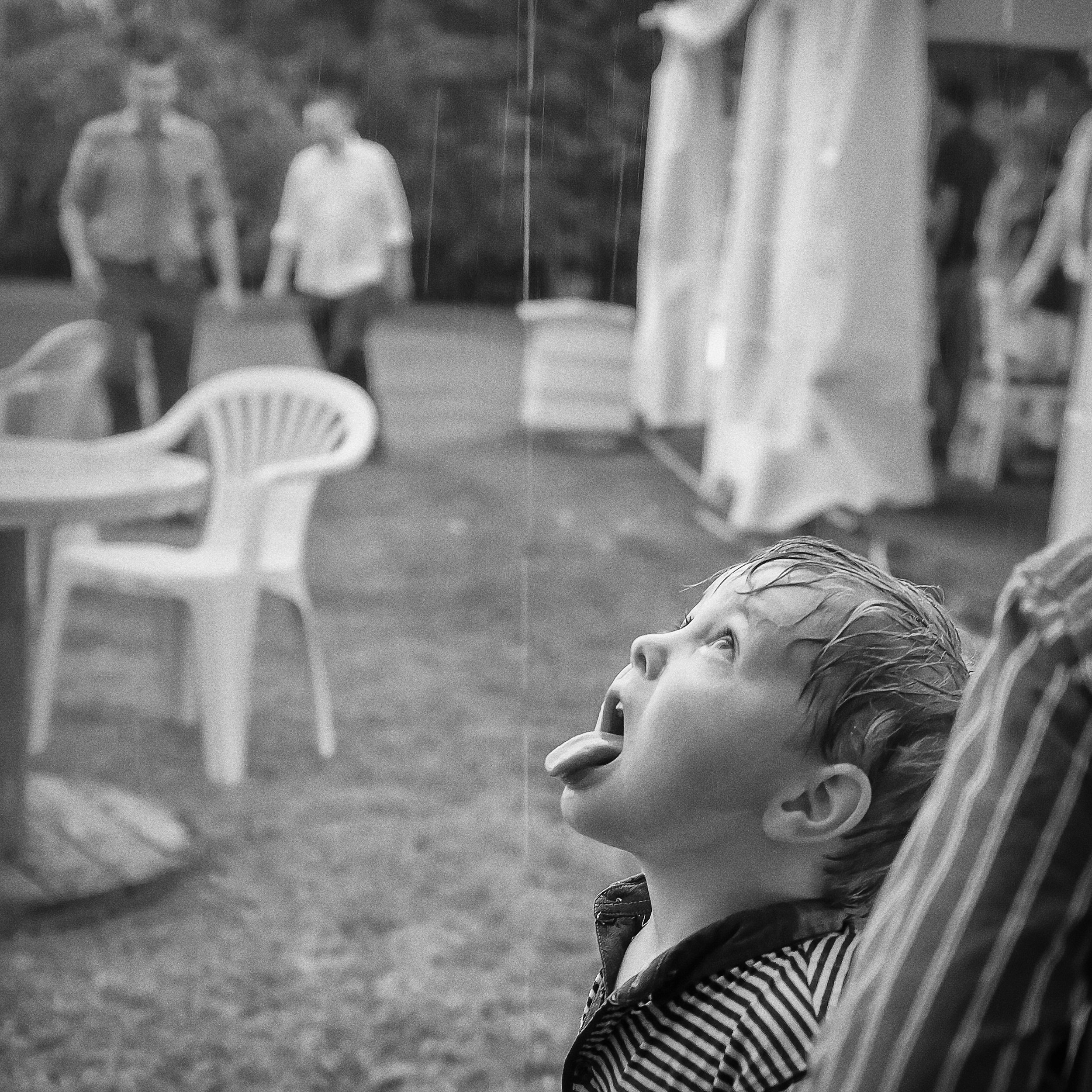
The direction of gaze and movement. As discussed in the perceptual section above: always leave space in the direction a subject faces or moves. The space is not empty — it is active. A cyclist in the left third, moving rightward, with open road to the right, reads as motion. Reverse the composition and they feel trapped. This principle applies to animals, vehicles, falling water, anything with implied direction. The negative space in front of a moving subject is doing real compositional work.
Negative Space : The Active Void
Negative space — the areas of a frame not occupied by the main subject — is one of the most misunderstood concepts in beginner photography, and it deserves more than a footnote.
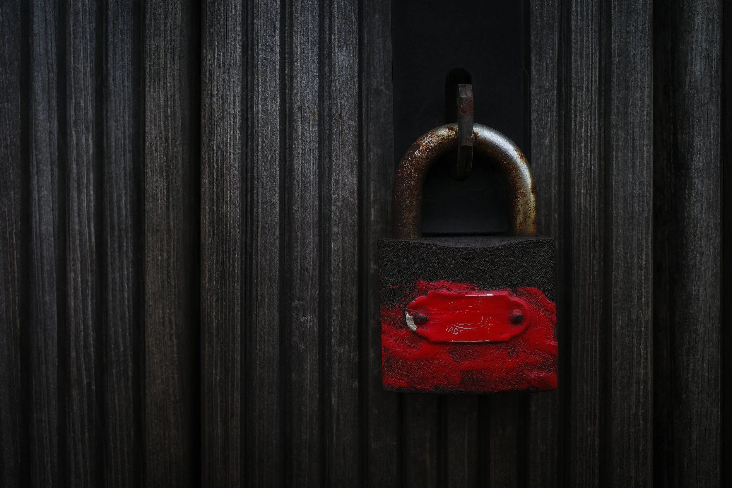
The temptation, particularly when you are new to photography, is to treat negative space as a problem to be solved: empty areas of frame that you have somehow failed to fill. This is backwards. Negative space defines the subject. It establishes scale — a single bird in a vast grey sky is not a small bird with wasted space, it is a statement about solitude and scale that the bird alone, close-cropped, cannot make. It isolates the subject from visual noise. And it creates the psychological weight that makes off-centre composition feel meaningful rather than accidental.
The Rule of Thirds, when applied to a subject, automatically creates meaningful negative space. Placing a figure on the left third of the frame leaves two-thirds of the frame to the right. What occupies that two-thirds — whether it is an uncluttered sky, an empty street, or a softly defocused landscape — will do compositional work whether you intend it to or not. The question is whether you are making deliberate decisions about what that space contains and what it communicates.
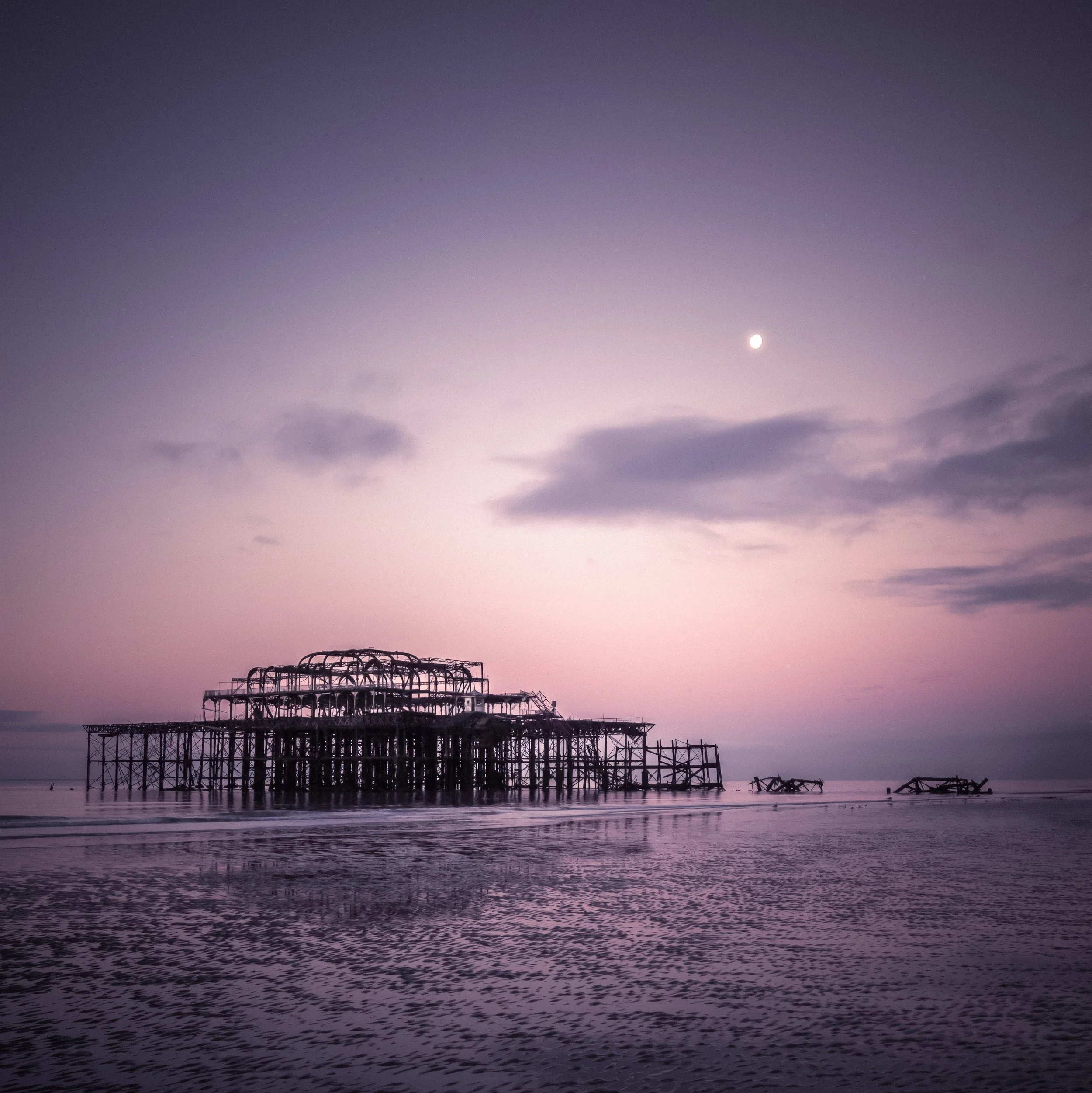
Square format and negative space. In square-format photography — and this matters if you shoot for Instagram or prefer the square crop — negative space behaves differently from the widescreen rectangle most cameras default to. The square format is inherently more balanced and more centripetal; the eye gravitates naturally to the centre. Asymmetric negative space in a square image therefore carries slightly more visual weight than it does in a wide rectangle, because it is working against the format's natural tendency toward balance. Photographers who work extensively in square format often say it forces them to think harder about where to place things.
Photographers who use negative space as a primary tool
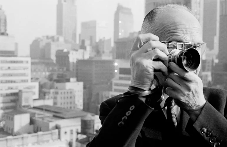
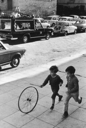
Fan Ho, Michael Kenna and Hiroshi Sugimoto, more comprehensively discussed in the Horizons & Verticals article, are well known for the use of negative space in their work. While not applying the Rule of Thirds in a literal, grid-checking sense, they are working with a deep understanding of the principle beneath the rule: that the relationship between subject and surrounding space is not a background consideration but the composition itself.
Fan Ho, the Hong Kong photographer working primarily in the 1950s and 1960s, built entire bodies of work around the relationship between a small figure and the vast geometry of light and shadow surrounding it. His photographs are architectural in their use of space — a child walking through a wedge of sunlight on a blank wall, dwarfed by the negative space of the wall itself.
Michael Kenna, the British landscape photographer, composes with negative space to a degree that would look like emptiness in less careful hands; a single tree in winter fog occupying a small corner of a large, quiet image has a stillness that is entirely dependent on what the image does not contain.
Hiroshi Sugimoto's long-exposure seascapes — discussed in the companion Horizons & Verticals article — take this to an extreme, producing images in which the only compositional elements are the division between sky and water and the silence of the negative space itself.
Famous Photographers & the Rule of Thirds
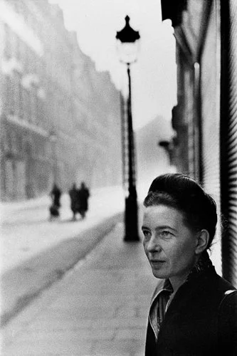
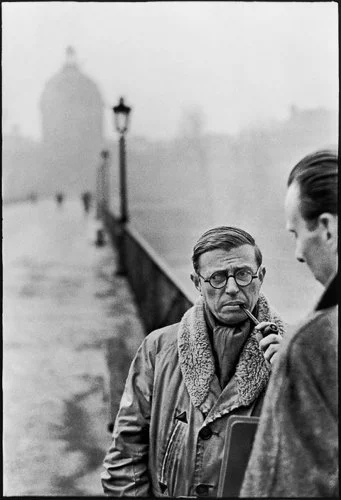
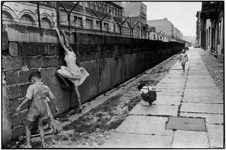
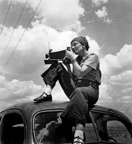
Cartier-Bresson is often invoked as an exemplary practitioner of the Rule of Thirds, and there is something in this — but it requires precision.
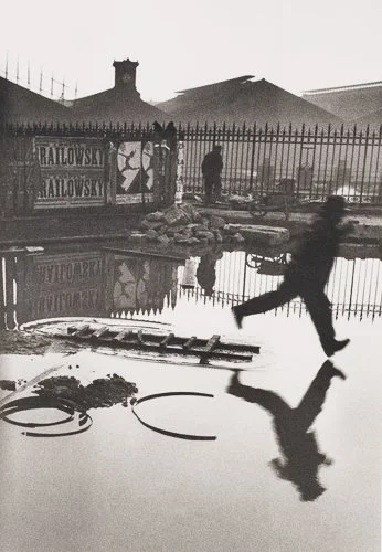
Henri Cartier-Bresson — Behind the Gare Saint-Lazare (1932)
Behind the Gare Saint-Lazare is the image most frequently cited. Made through a hole in a fence adjacent to the Gare Saint-Lazare in Paris, it shows a man leaping over a flooded surface, his reflection precise beneath him.
There are rule-of-thirds observations to be made: the leaping figure lands somewhere near the right side of the frame, and the horizon divides the image. But the governing compositional principle of that image is not the rule-of-thirds grid. It is the relationship between the figure and its reflection, the echoing of the circular shapes — the ripples on the water, the circular forms of the poster in the background — and the temporal precision of the capture at the exact moment of suspension. Cartier-Bresson was influenced by the Golden Section and by the painters he admired, particularly Cézanne. He composed geometrically and intuitively, and his geometry is more sophisticated than a 3×3 grid.
To say that Behind the Gare Saint-Lazare "uses the Rule of Thirds" is a bit like saying that a Bach fugue "uses a pentatonic scale." It is not wrong, exactly, but it misses what is actually interesting about the thing.
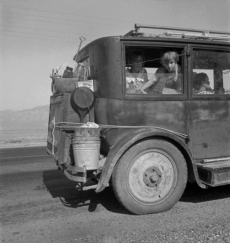
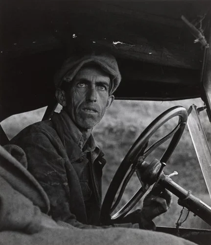
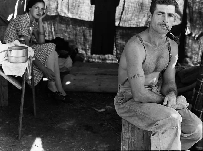
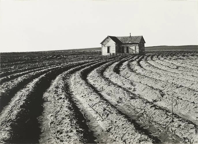
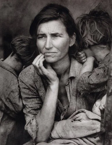
Dorothea Lange — Migrant Mother (1936)
Lange's photograph of Florence Owens Thompson and her children at a pea-pickers' camp in Nipomo, California, is one of the most recognisable images in the history of documentary photography. Thompson's face is the focal point, positioned slightly off-centre; the children press against her with their faces turned away, directing attention to her expression rather than competing with it. Her right arm runs up the left vertical third line of the frame. The placement amplifies emotional impact — there is nowhere else to look.
The circumstances surrounding the photograph deserve a fuller treatment. Lange actually made seven exposures of Thompson and her children during their encounter, though she later recalled having made five (she sent what she considered the five best to the Resettlement Administration in Washington). The famous image — the closest, most intimate of the series — was the culmination of working progressively closer to her subject over the course of a short meeting. The compositional refinement visible in that final image compared to the earlier exposures in the series is striking; Lange was making decisions, consciously or otherwise, with each step forward.
Thompson's own account of the encounter was significantly different from Lange's. Lange's subsequent captions described the family as destitute pea-pickers who had sold the tyres from their car to buy food. Thompson, when identified by a Modesto Bee reporter in 1978, flatly denied this. Her son Troy Owens said: "There's no way we sold our tires, because we didn't have any to sell. I don't believe Dorothea Lange was lying; I just think she had one story mixed up with another." Thompson herself had not consented to publication and felt, for much of the rest of her life, that she had been exploited without compensation or even acknowledgment.
The compositional point stands regardless of the biographical complexity: the off-centre placement and the children's averted faces are not accidents. But it is worth knowing that the photograph exists inside a more complicated story than its iconic status tends to allow.





Steve McCurry — Afghan Girl (1984)
McCurry's portrait of Sharbat Gula, photographed at the Nasir Bagh refugee camp near Peshawar, Pakistan, in December 1984, is one of the most recognised portraits in the history of photojournalism. It appeared on the cover of National Geographic in June 1985.
The rule-of-thirds observation is legitimate and precise: Gula's eyes — which are, of course, what you cannot stop looking at — fall roughly along the upper horizontal third line. The confrontational intensity of the image comes partly from this: the gaze is direct, unwavering, but slightly off-centre, which means it does not quite feel like a straight challenge to the viewer. There is a degree of asymmetry in her posture, of visual incompleteness, that keeps you looking.
McCurry did not record Gula's name when he photographed her, and she appeared on the cover without being identified. For seventeen years, she was simply "the Afghan girl." She was eventually located by McCurry and a National Geographic team in 2002, in a remote region of Afghanistan, and her identity was confirmed using iris recognition technology. She had not known, in the intervening years, that her image was one of the most reproduced photographs in the magazine's history.
The photograph was made on Kodachrome 64 colour slide film, using a Nikon FM2 with a 105mm Nikkor lens — a short telephoto focal length that compresses the background slightly and renders it as the wash of warm green that frames her face. The technical choices and the compositional instinct worked together; the rule of thirds is part of what makes the image work, but only part.
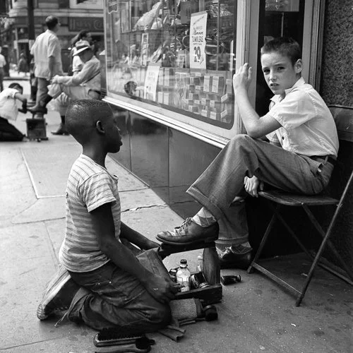
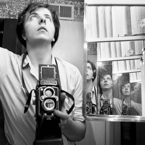
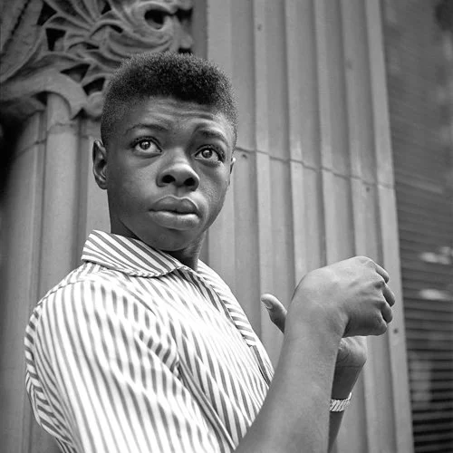
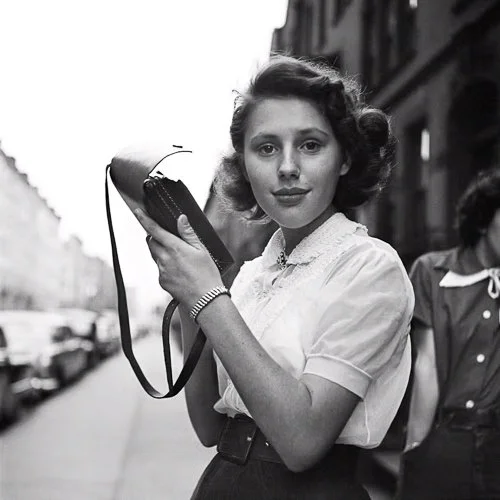
Vivian Maier — Asymmetric Intelligence
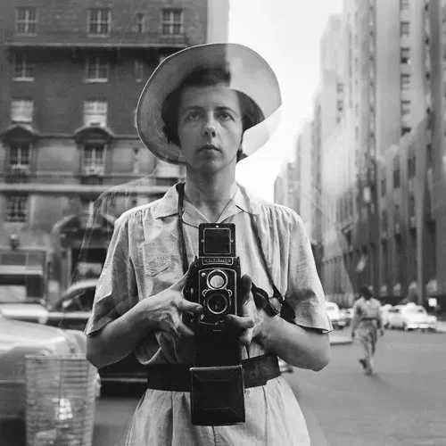
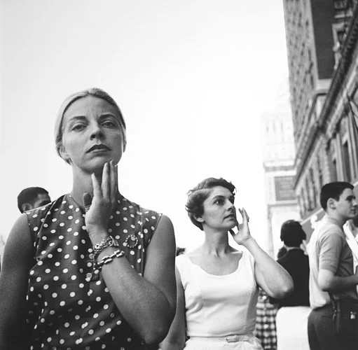
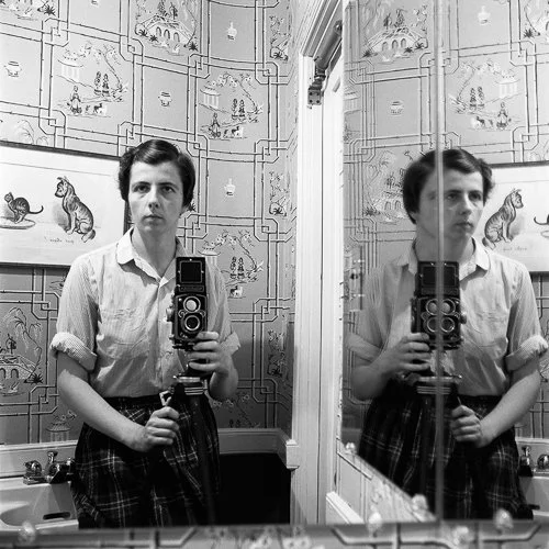
Maier, the American street photographer and nanny whose work was discovered largely after her death in 2009, made hundreds of self-portraits using reflective surfaces — shop windows, mirrors, darkened glass. What is interesting about these images in a compositional context is that Maier was working under severe physical constraints: a twin-lens reflex camera held at waist height, composing by looking down into a viewfinder while watching her own reflection.
The technical limitations of this setup meant that many conventional compositional approaches were simply not available to her. And yet, across the body of self-portraits, there is a consistent asymmetric intelligence to her own placement within the frame — she frequently positions herself to one side, with the space of the environment she is inhabiting visible around her. The result is that the self-portraits are as much about place and context as they are about the self, which is not an accident.
When Not to Use It — and Why That Matters
It’s frequently written that Ansel Adams once said: "the so-called rules of photographic composition are, in my opinion, invalid, irrelevant and immaterial." This quote circulates widely and is almost certainly genuine in sentiment, but the precise original source is not easy to verify — it is widely reproduced without citation to a specific book, essay, or interview, and should be treated as probable rather than confirmed.
Whether or not Adams said precisely that, the sentiment represents a real and coherent position. Rules in photography are not like rules in mathematics. They are descriptions of what tends to work, extracted from observation of many successful images, and presented as prescriptions. The problem with presenting them as prescriptions is that it inverts the actual process. Great photographs are not made by applying rules; the rules were derived from great photographs.
The more substantive argument for when not to use the Rule of Thirds is not that the rule is wrong, but that it is incomplete. Here are the cases where it consistently leads you in the wrong direction:
Symmetry. When the subject is the symmetry — a perfectly reflected landscape, a formal architectural façade, a geometric pattern — centring is not timid or lazy. It is the correct choice. Moving the subject off-centre would destroy the symmetry that is the whole point of the image.
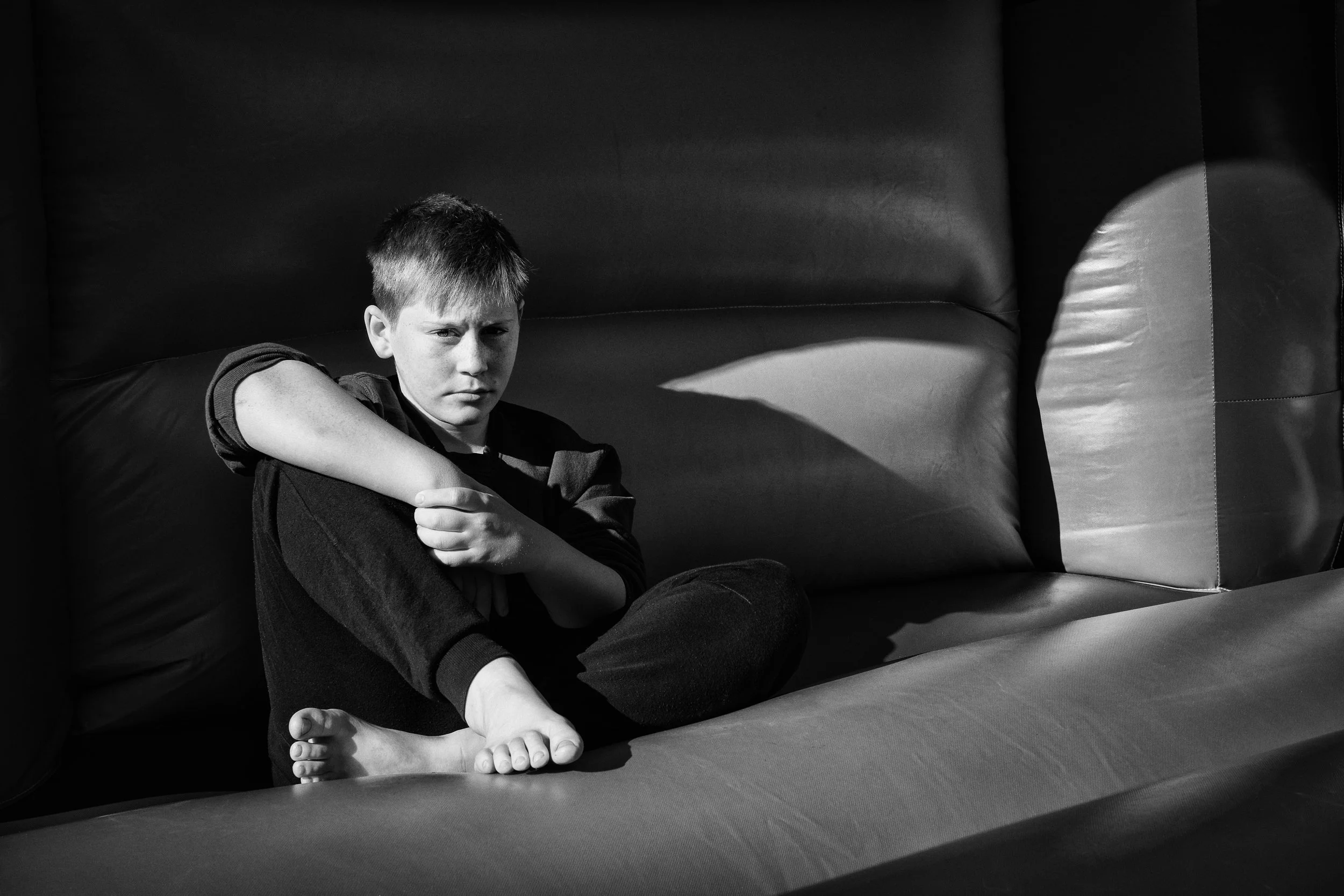
Confrontation. A face looking directly into the camera, centred, creates a different and more intense relationship with the viewer than an off-centre face. The directness is the point. Sliding it to the left third adds visual breathing room but removes the confrontational quality. Whether you want confrontation or breathing room depends on what you are trying to say.
Minimalist abstraction. A single object placed dead-centre in a vast, featureless negative space reads as a statement of isolation in a way that an off-centre placement does not. The centre, in that context, becomes the composition's subject: the mathematical precision of perfect placement against perfect emptiness.
The deeper point — the one worth actually taking away — is this: the Rule of Thirds is useful precisely because it has limits. A tool that worked for everything would teach you nothing. Learning where the rule stops working is the moment when it stops being a rule and starts being a genuine compositional understanding.
Resources
Jeff and Sarah Ascough are professional photographers based in the north of England who produce consistently excellent work on street photography and composition. Their video on the rule of thirds in street photography is particularly useful because it shows the principle applied to complex, unpredictable real-world situations rather than textbook still-life setups. Their broader channel is worth exploring if street photography interests you at all.
Ted Forbes approaches composition as an artist and art historian rather than a technician, which makes his treatment of the rule of thirds considerably richer than most online photography tutorials. The video shows its age slightly in production values, but the substance — the relationship between the rule and the broader compositional tradition it draws from — remains genuinely valuable.
Here’s Emil Pakarklis from the iPhone Photography School with his take on using the Rule of Thirds: “The rule of thirds is the most common composition guideline in the world. And for good reason! You can use it to create stunning compositions in so many situations…From wide open landscapes to close-up portraits and even moving subjects. Watch this video and discover how to correctly use the rule of thirds to greatly improve your iPhone photos.”
Finally, James Popsys with an alternative opinion. He explains how to improve photography by focusing on the relationship between main and supporting subjects rather than strictly adhering to composition rules. Through examples of portfolio work, the importance of balancing these elements to create a compelling narrative within the frame is explored.
Give it a Try!
Three exercises, pick one, or try them all.
The Grid Walk
Turn the grid on in your camera or phone settings and go for a walk of at least thirty minutes in an environment you know reasonably well — your neighbourhood, a local park, a shopping street. The specific environment matters less than the familiarity: you want your conscious attention on the composition, not on navigation.
Your aim is to make ten images in which the main subject — whatever draws your eye — falls on or very near a power point or a grid line. Do not force it; if the right composition requires the subject to be centred, make that image and move on. The goal is not to achieve ten rule-of-thirds compositions at any cost, but to develop the reflex of noticing where power points are in a scene and asking whether your subject belongs there. After thirty minutes, review your images with the grid overlay and notice how many you hit without consciously checking, and how many you missed.
The Negative Space Portrait
Find a person or an animal willing to be photographed, and make three deliberately different versions of the same image:
Subject facing left, placed on the right third, with open space to the left.
Subject facing right, placed on the left third, with open space to the right.
Subject facing directly into the lens, centred.
Keep everything else as consistent as you reasonably can — same distance, roughly same focal length, same light. Then compare the three images side by side.
The aim is to make the directionality of negative space physically apparent rather than theoretical. You should be able to see the difference in how each version feels: versions one and two will feel different from each other even though they are mirror images of the same compositional idea, and both will feel different from version three. Notice what version three does that the other two do not.
The Deliberate Centre
Make three images in which centring is the correct choice — not a compromise or a failure to think, but the most powerful option available. Suggested subjects: a strong reflection (a building in water, a face in a mirror, a window), a symmetrical architectural detail (an arch, a tiled floor seen from directly above, a doorway with matching elements on both sides), and a face looking directly into the lens with nothing competing for attention in the background.
The aim is to understand from the inside when the Rule of Thirds is the wrong tool. These three images, if they work, should feel different from everything you have made applying the rule — not weaker, just different in the way they land. If they do not feel right, the composition probably was not actually symmetrical or confrontational enough to justify the centring. Try again.