How to Shoot a Story
There is a difference between taking a photograph and telling a story with one, and most people can feel that difference the moment they look at a photograph — they just can't yet explain it, let alone reproduce it on purpose. You know a storytelling photograph when you see it. Something in it holds you. You linger. You wonder what happened before the shutter clicked and what happened after. The image pulls you in rather than letting you scroll past. That quality is not luck, or not entirely. It is a set of learnable instincts, and this article is about developing them.
Photographic storytelling comes in three distinct modes, and each makes different demands on you as a photographer. The first is the single image — one photograph that contains a complete narrative on its own, needing nothing beside it to be understood.
The second is the small group — a tightly edited set of three to twelve images that work together as a unit, a triptych or a short photo essay where meaning is generated by the sequence as much as by any individual frame.
The third is the personal project — a sustained body of work built around a theme, a place, or a subject over days, weeks, or months, in which the accumulated images make an argument that no single picture could make alone. This article will walk you through all three.
They are not as different as they might sound. All three rest on the same underlying instinct: the ability to recognise a moment, a relationship between elements, or a quality of light that carries emotional weight — and to frame it before it disappears. That instinct is where to start.
What Makes an Image a Story?
A photograph becomes a story the moment it contains more information than you strictly need to describe it. A portrait of a man looking at the camera is a document. A portrait of a man sitting on a suitcase in a railway station, looking at the platform clock, coat still buttoned, is a story. Same number of subjects. The difference is implication.
There are four things that tend to convert a document into a narrative, and they are worth naming clearly.
A subject with implied inner life. The viewer has to believe that something is going on inside the person — or animal, or even object — in the photograph. This is largely achieved through body language, through gaze, and through moment. If your subject is staring blankly, the image has a surface but no depth. If their expression or posture implies that they are waiting, or remembering, or deciding something, the viewer will do the rest. Dorothea Lange's Migrant Mother (1936) works as a story because Florence Owens Thompson is not simply photographed — she is clearly thinking something, something difficult, and her body holds it. You don't know what she is thinking. That is precisely the point.
A setting that contributes context. The background is not wallpaper. Every element in the frame is either working for you or against you. The railway station tells us something about movement and waiting; the bare field behind Migrant Mother tells us something about exposure and precarity. The setting should answer the question: where is this person in their life? Not literally — not with a caption — but visually, through the environment you have chosen to include around them.
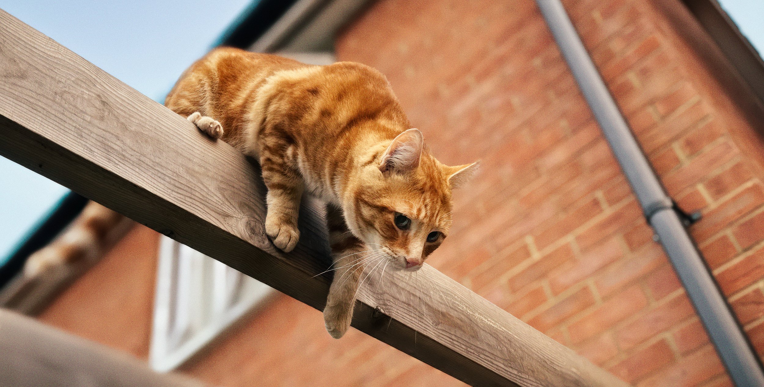
Something happening, or about to happen. Static scenes rarely generate narrative. The most powerful storytelling photographs freeze a moment that is kinetic in implication — the ball is about to be caught, the couple is about to kiss, the child is about to turn the corner. Robert Capa's photographs work because they are caught in the middle of something. They suggest a before and an after. Even a quiet scene can have this quality: a letter left open on a table suggests a before (someone read this) and an after (what will they do with what they've read?).
A quality of before-and-after. The best storytelling photographs contain time even though they are frozen. The viewer feels the fraction of a second they are looking at, but also the moment just preceding it and the moment about to follow. Henri Cartier-Bresson called this the decisive moment — not simply the best moment, but the moment at which all the visual and narrative elements align simultaneously. You'll understand why that's harder than it sounds by the end of the next section.
Decisive & Indecisive Moments
Cartier-Bresson's concept of l'instant décisif has had an enormous influence on how photographers think about timing, and an enormous amount of confusion attached to it. The popular version — get the timing right, press the shutter at the perfect instant — is correct, as far as it goes. But it leaves out the part that actually matters: the work you do before that moment arrives.
The decisive moment is a description of what you are looking for. It is not a technique. The technique is anticipation and position.
Position is the less glamorous half of street photography and photographic storytelling. Before any interesting moment happens, you have to be standing somewhere interesting. This means reading a scene: understanding where the light is, where the geometry of the background creates the cleanest or most interesting relationship with a potential subject, where people are likely to walk into frame. Cartier-Bresson was famously patient. He would find a background he liked — a piece of wall, an arch, a patterned surface — and wait for a subject to walk into it. He was not hunting subjects. He was setting a stage and waiting for the play to begin.
Anticipation is the habit of reading a few seconds ahead. You see a child running towards a puddle. You see a couple in the middle of a heated discussion on a street corner. You see a man reaching up towards something off-frame. Each of these is a situation about to resolve itself, and your job is to have the camera to your eye before it does. This is a skill that improves dramatically with practice and very little without it.
Here is the honest part: the decisive moment almost always makes sense in retrospect. You rarely know with certainty, in the fraction of a second before you press the shutter, that this is the shot. You press it because things are aligned and something is happening, and you find out when you look at the images later.
The photographers who appear to have a supernatural feel for timing are usually the ones who shoot a great deal, edit ruthlessly, and show only the hits. William Eugene Smith shot thousands of frames for his photo essays. The ones in the books are the decisive moments. The others are the indecisive ones, which he quietly kept to himself.
The implication for you is this: shoot more than you think you need, and edit harder than feels comfortable. The decisive moment does not emerge from restraint. It emerges from volume and selection.
Composition for Narrative
Composition in storytelling photography is not about making a beautiful picture. It is about directing the viewer's experience of reading the image. A well-composed storytelling photograph leads the eye through a sequence — in, around, and out — in a way that reinforces the narrative you are trying to tell.
The entry point is where the eye first lands. In most Western viewers, this is near the upper-left of the frame, following reading convention, unless something in the image overrides it — a bright area, a face, a burst of contrast. You want your entry point to be meaningful. If the viewer's first contact with the image is a dustbin or a blown-out sky, you've lost a beat before the story starts.
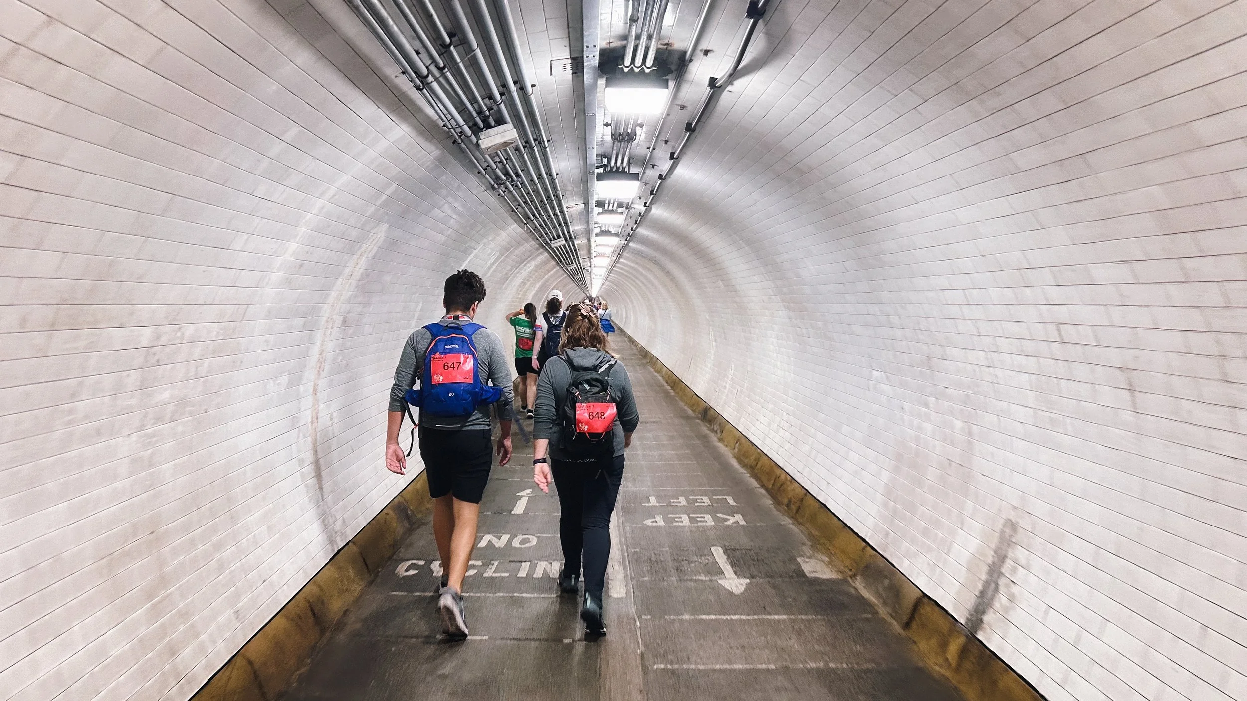
The eye path is the journey the viewer takes across the frame. Compositional lines — roads, fences, shadows, the direction a person is looking — direct this movement. Use them deliberately. A road that leads from the foreground to a figure in the mid-ground creates a journey. A person looking left creates a pull in that direction; if there is space to the left of them and nothing interesting behind them, the eye travels towards that space, which becomes part of the story — it is where they might be going, or where they are looking, or what they are waiting for.
The exit is where the eye leaves the frame. A bad composition lets the eye leave carelessly, through a gap in the corner, trailing nothing. A better composition lets the eye leave carrying something — a question, an emotion, a line of tension that resolves beyond the edge.
A few specific notes:
Never centre a person who is facing towards the frame's edge. If someone is walking left, looking left, or leaning left, put them on the right side of the frame. The space they are moving into or looking towards becomes narrative space — the unknown, the future, the destination. Centring them cuts that implication off. It makes the photograph about them as an object rather than about them in a story.
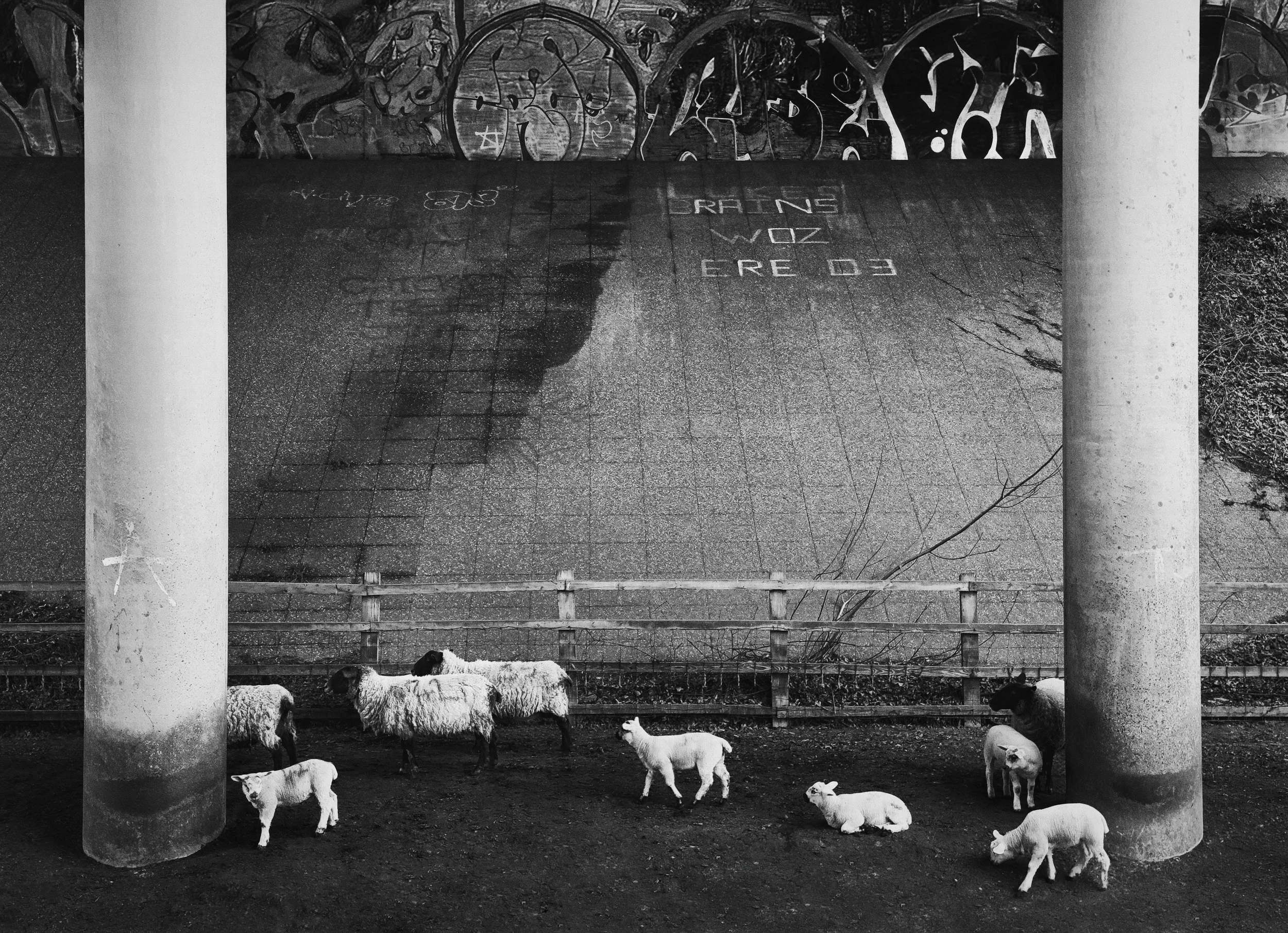
Juxtaposition is one of the most powerful tools available in the single image. Place a child in the foreground of a war photograph and the background becomes unendurable. Place a suited businessman in front of a wall of graffiti and you have social commentary. The juxtaposition does not have to be ironic — it can be harmonious, or tender, or simply surprising — but it works because the human mind is wired to notice the relationship between adjacent things and create meaning from it.
Foreground-background relationships are largely underused by photographers who are still focusing entirely on their subject. Including a sharp foreground element — a fence post, a blurred leaf, the edge of a doorframe — places the viewer inside the scene rather than in front of it. This is a compositional shift that has a surprising effect on the emotional register of a photograph: inside feels more intimate, more implicated, than outside.
Space and absence are as useful as presence. A large area of empty sky above a small figure expresses isolation or vulnerability. A wide empty road stretching away from a single figure suggests a journey or an ending. You do not have to fill the frame.
Light & Mood
Light is not a technical condition. It is a narrative instrument.
The problem with the phrase "golden hour" is not that the light isn't beautiful. It is that "beautiful" is only one emotional register, and it happens to be the wrong one for a lot of stories. If you are photographing urban poverty, factory workers, or the aftermath of a flood, golden-hour light is going to give your images a cinematic warmth that works actively against what you are trying to say. The light will lie.
Flat, overcast light — the grey diffuse light that photographers who have just bought their first camera are taught to avoid — is the native light of documentary photography, of W. Eugene Smith's hospital corridors, of the social documentary tradition that runs from Lange through to contemporary practitioners like Cristina de Middel.
It is shadowless and tonally even. This means that nothing in the scene is highlighted, everything receives equal weight, and the viewer's attention is directed entirely by subject matter and composition rather than by a patch of light. For stories about ordinary lives, hardship, or institutional settings, it is often exactly right.
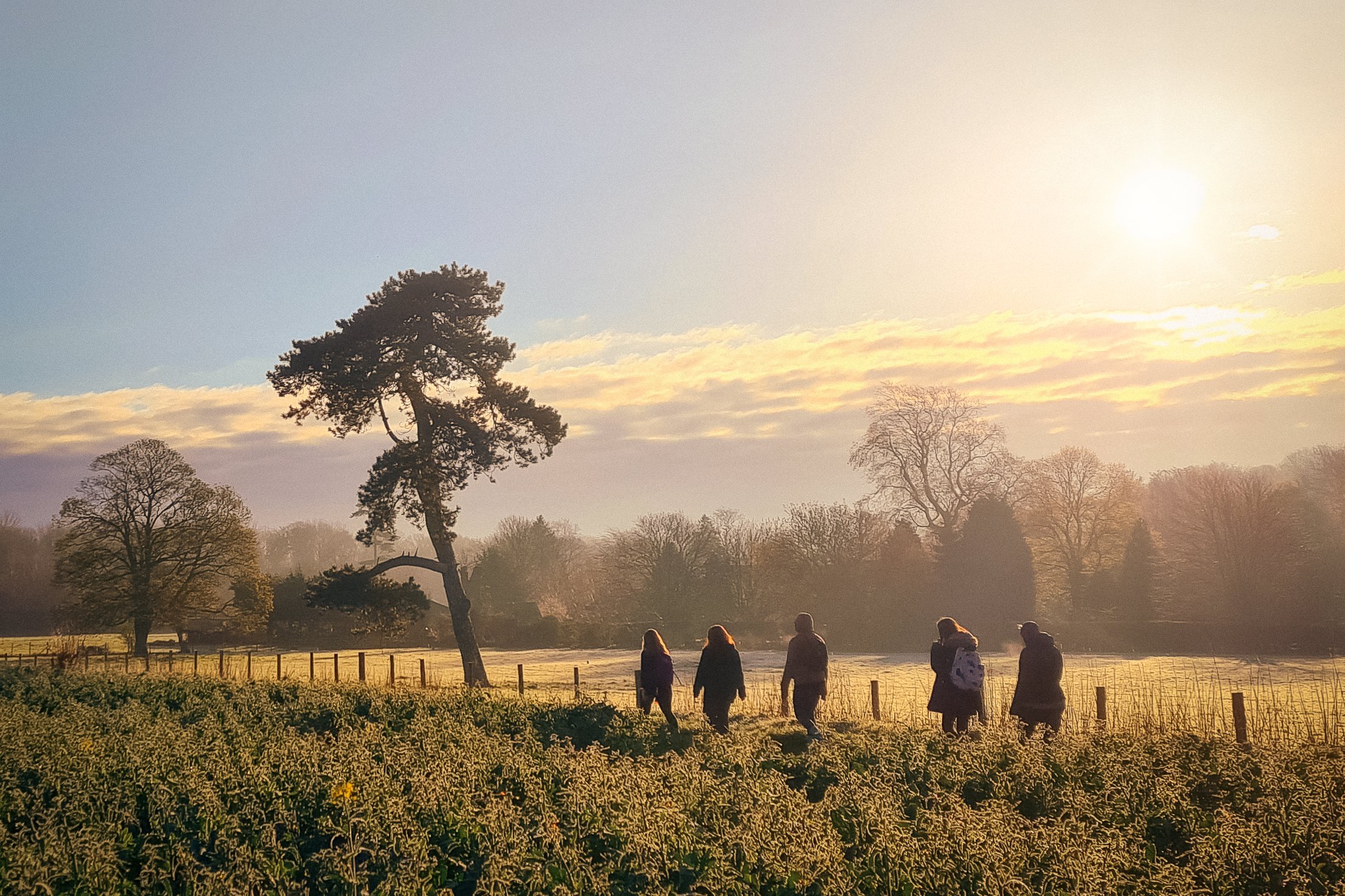
Low raking light — the light of early morning or late evening when the sun is near the horizon — creates long shadows and three-dimensional texture. It is good for stories involving the land, architecture, manual labour, or anything where surface and materiality matter. It separates planes and creates depth. It also tends to be warm, which implies intimacy and perhaps nostalgia.
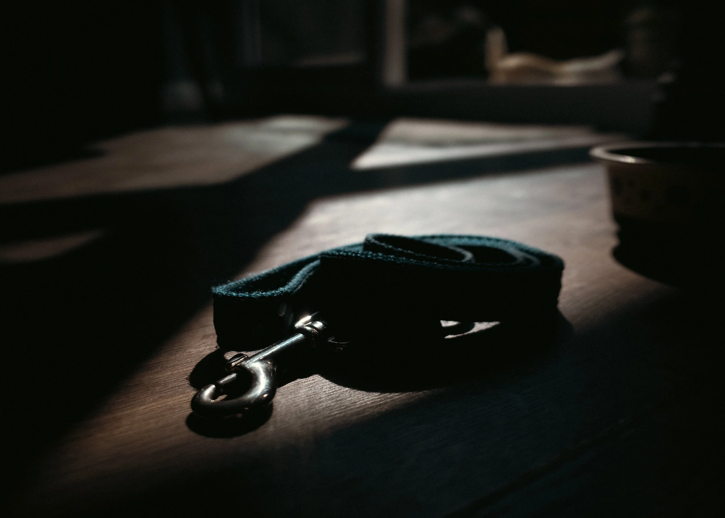
Backlighting flattens subject detail into silhouette and creates separation from the background through a rim of highlight. A silhouetted figure is a figure emptied of specificity and filled with implication.
You don't know who they are; you know only their outline, their gesture, their relationship to the light source — which is usually the horizon, a window, or a doorway. Backlighting is the light of departure, of threshold moments, of privacy. Steve McCurry uses it frequently. So did Cartier-Bresson.
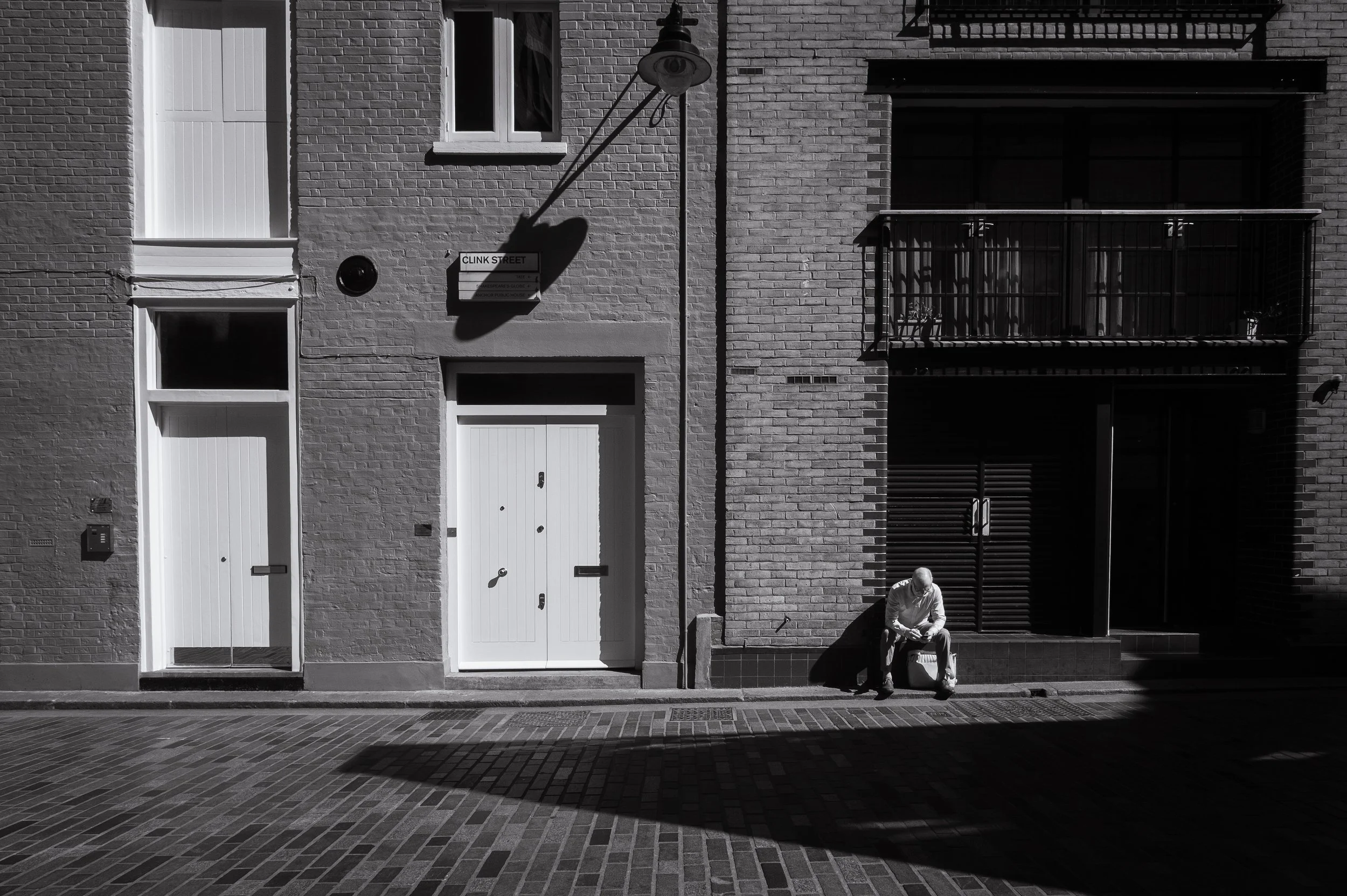
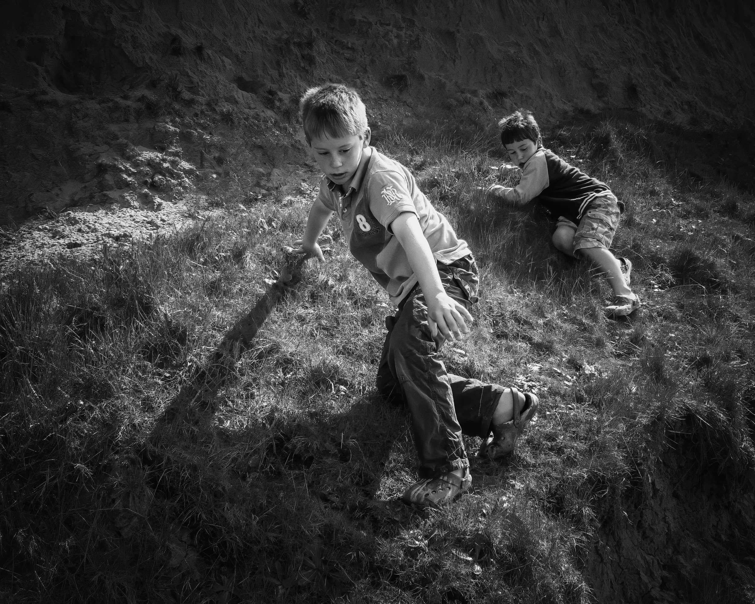
Hard direct light — midday sun, direct flash — produces hard shadows, crushed darks, and a starkness that can read as bleak, aggressive, or simply honest, depending on the subject. William Eggleston used direct flash in daylight on ordinary American scenes to produce something that felt both documentary and dreamlike — the harshness of the light emphasised the strangeness of what he was photographing. It is not an elegant light, which is sometimes exactly why it works.
The practical exercise here is to photograph the same scene in three different light conditions and compare the stories the images tell. You may be surprised how different they are.
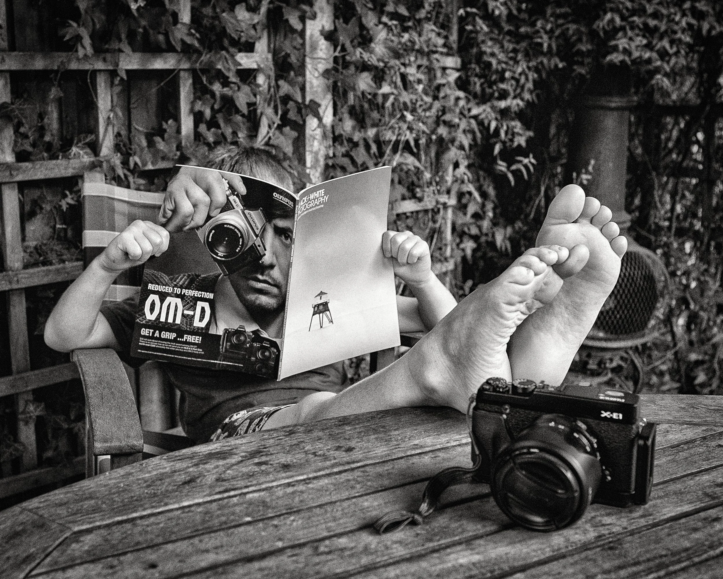
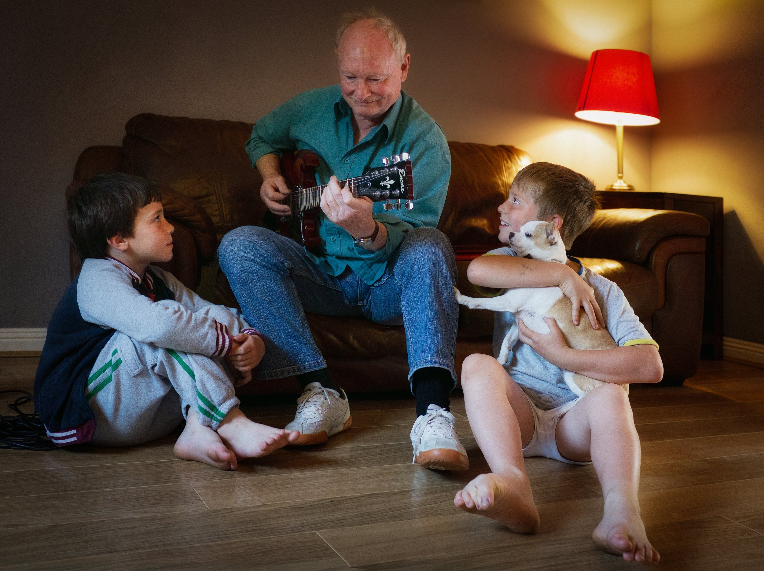
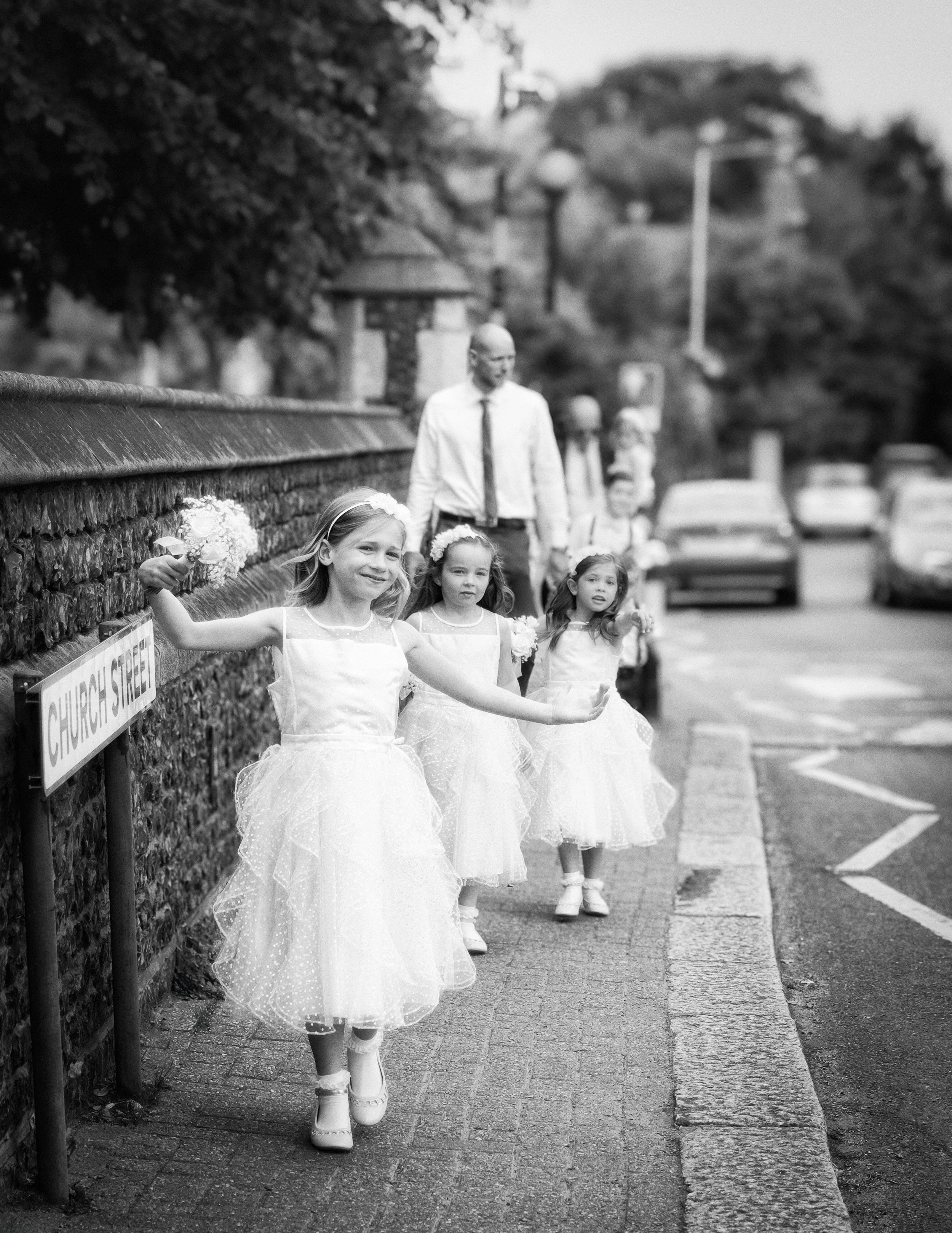
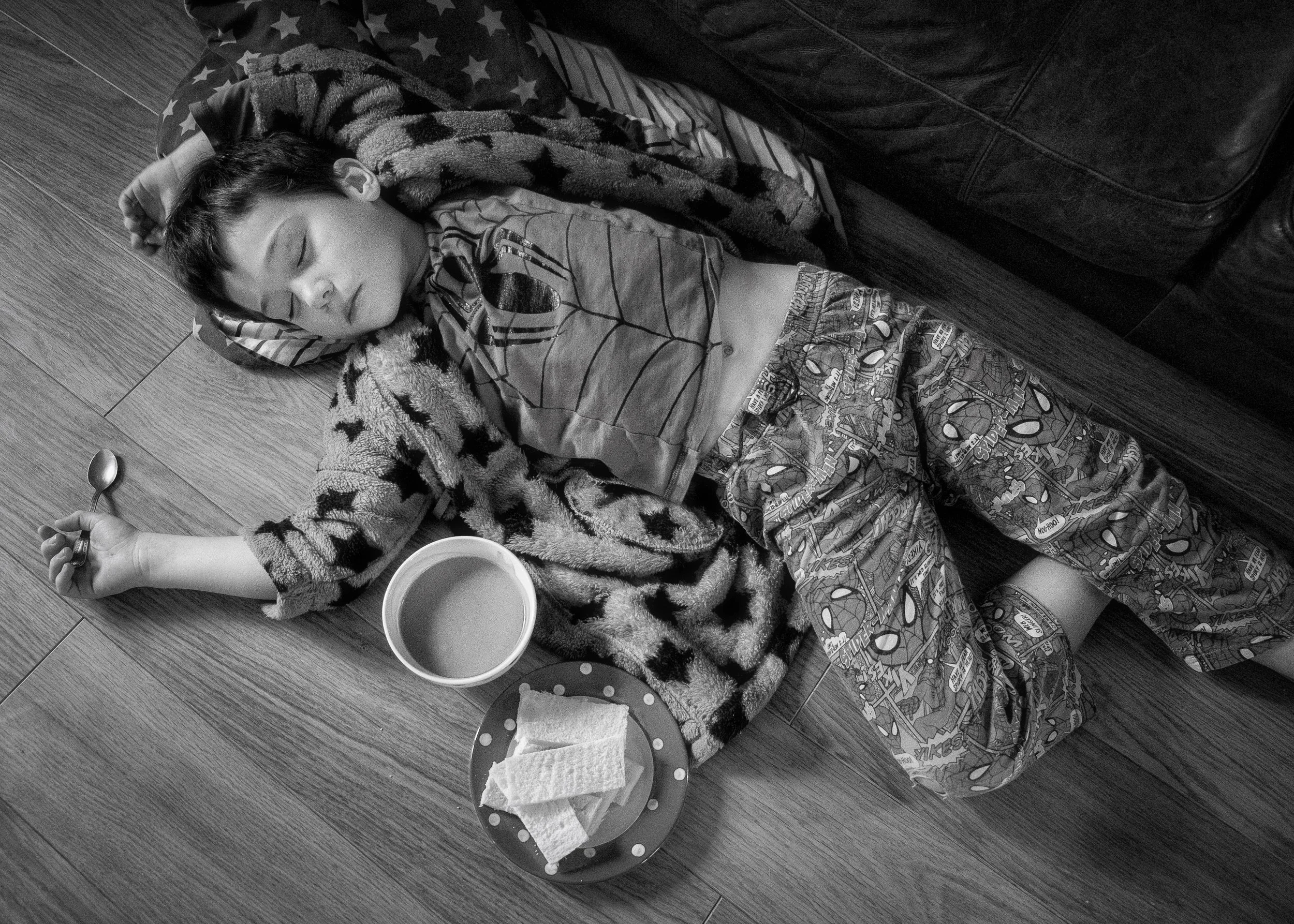
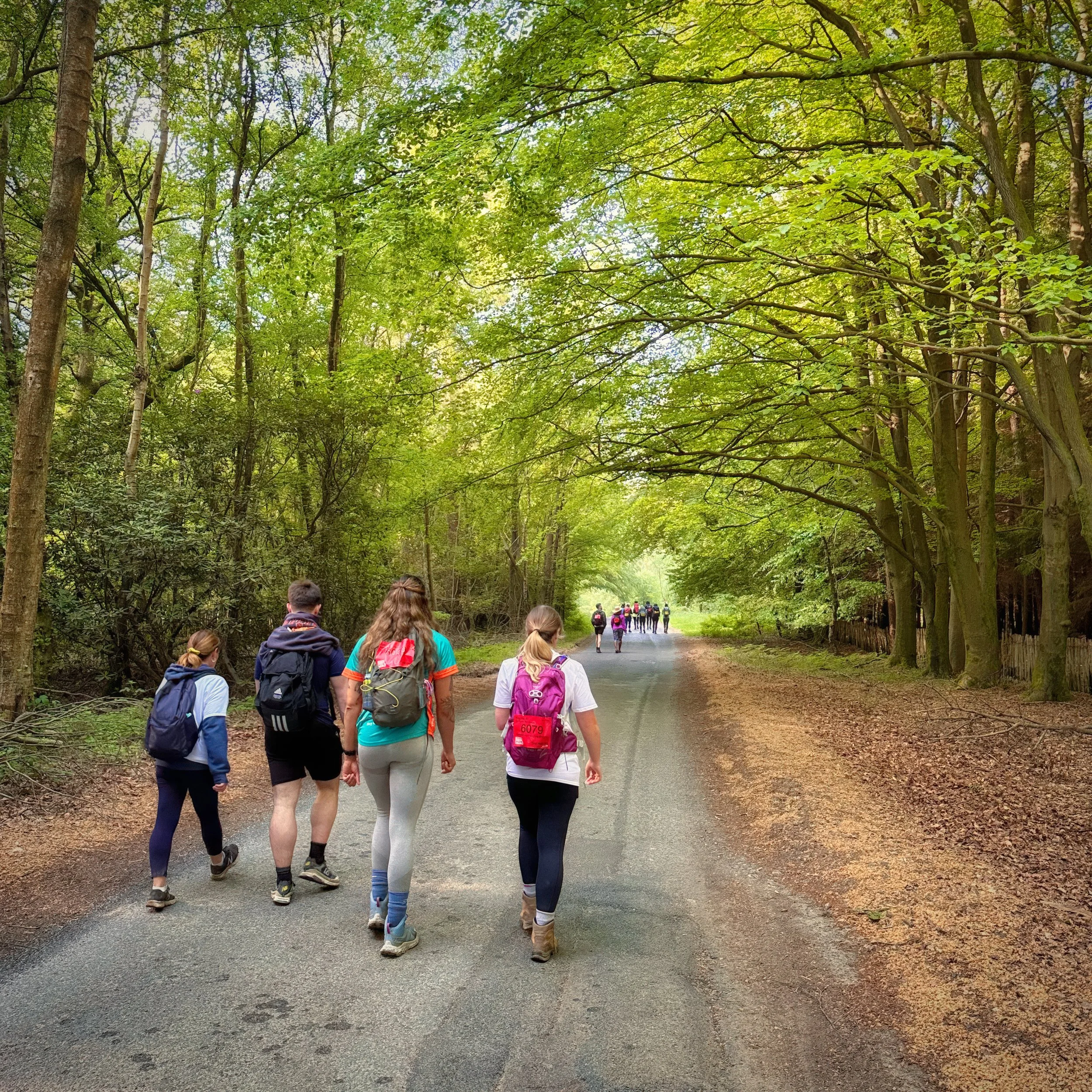
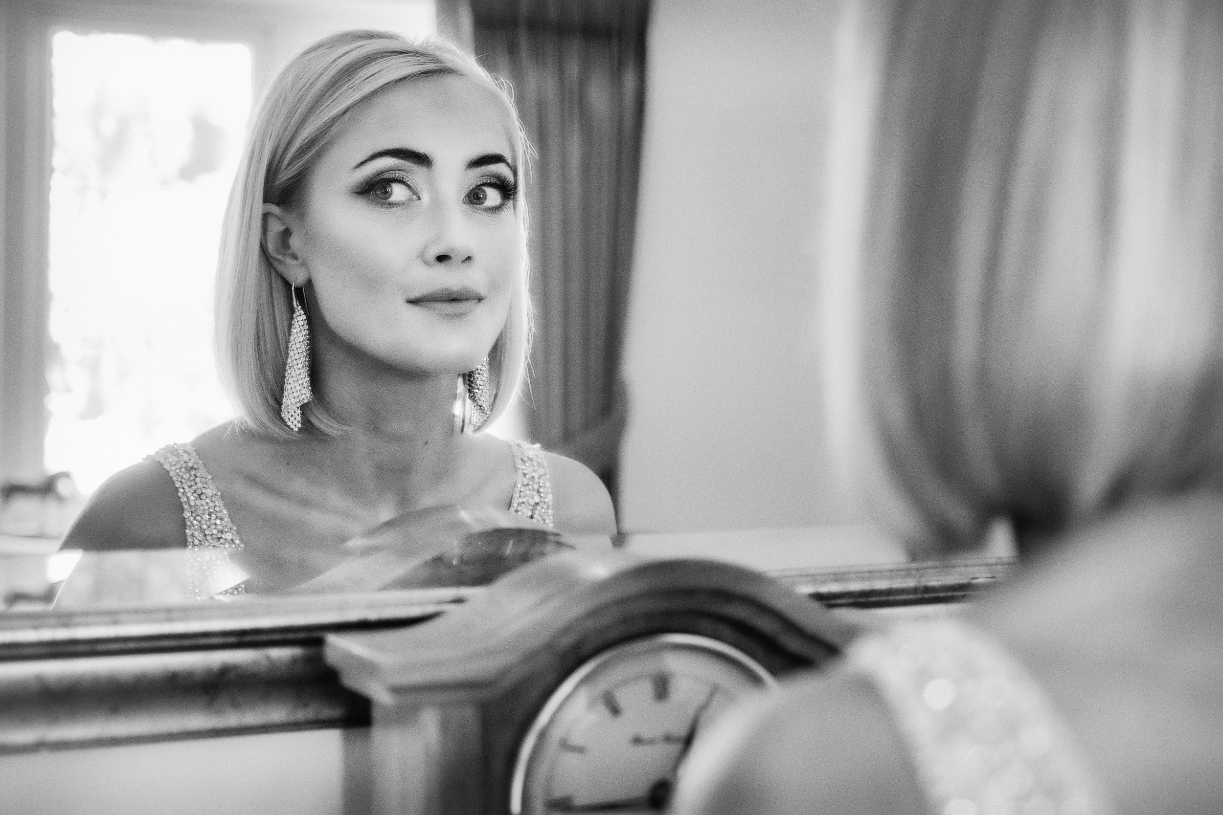

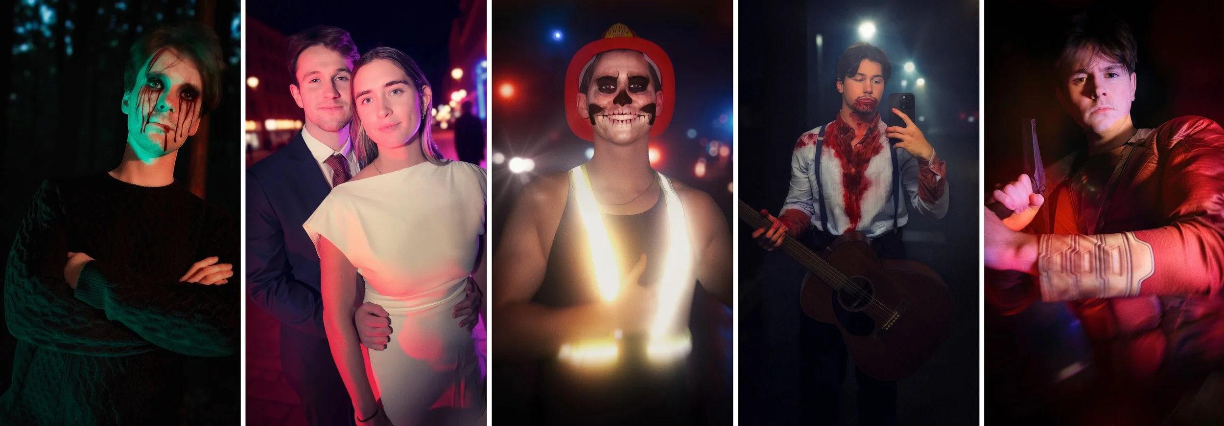
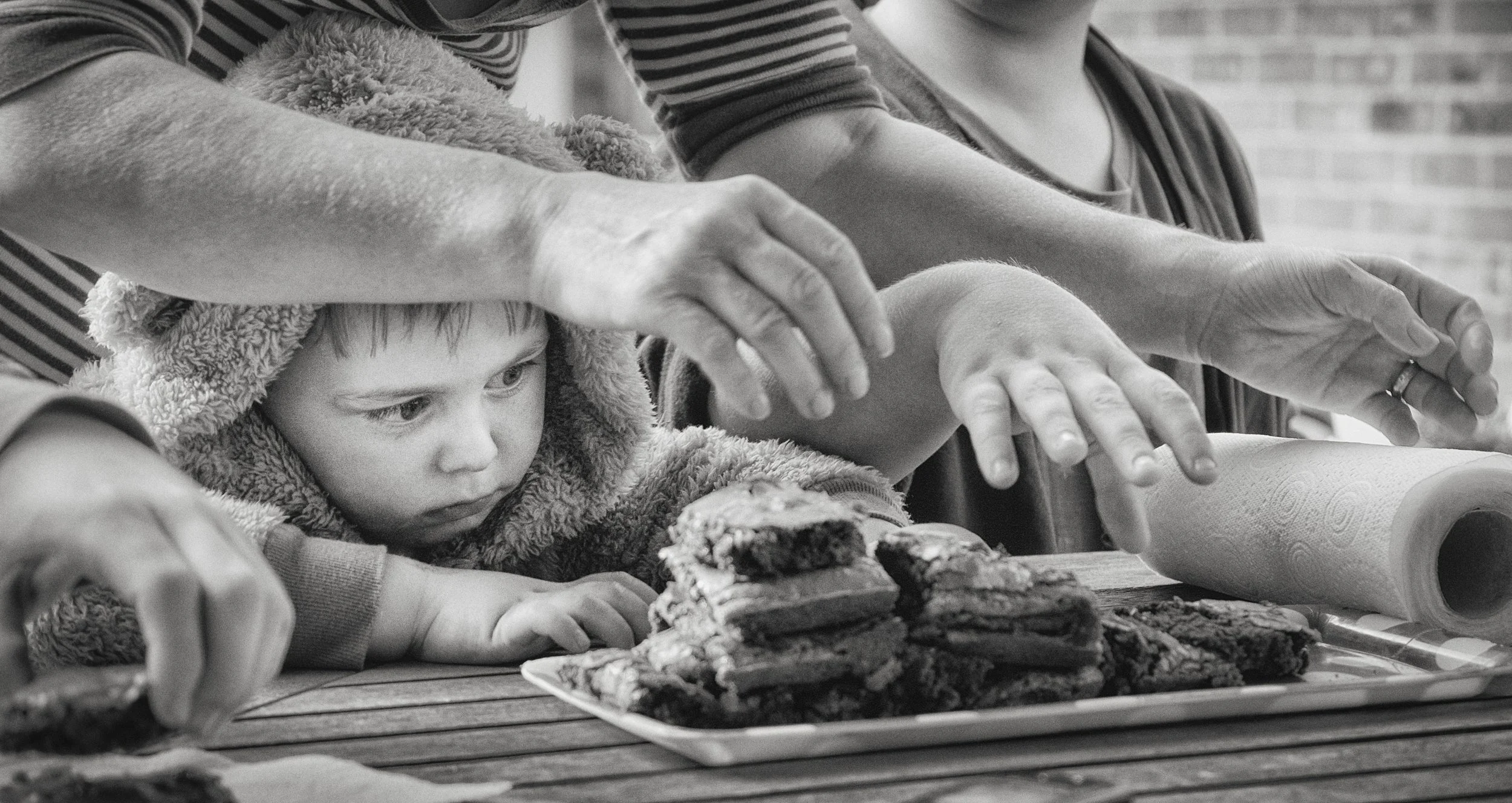
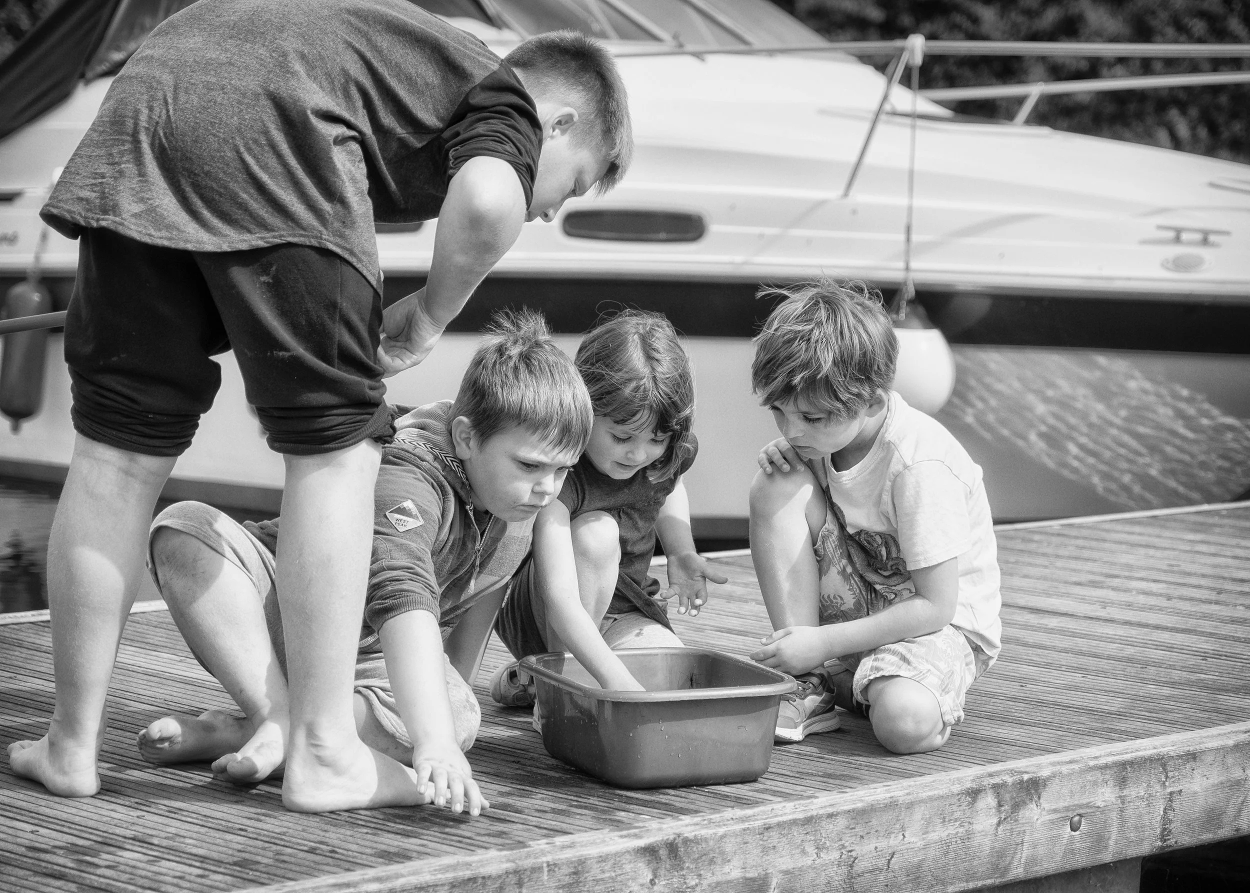
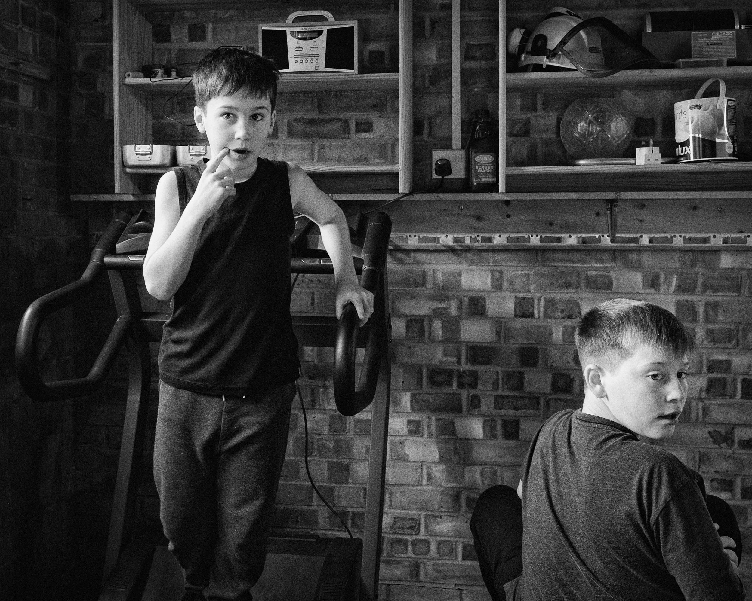
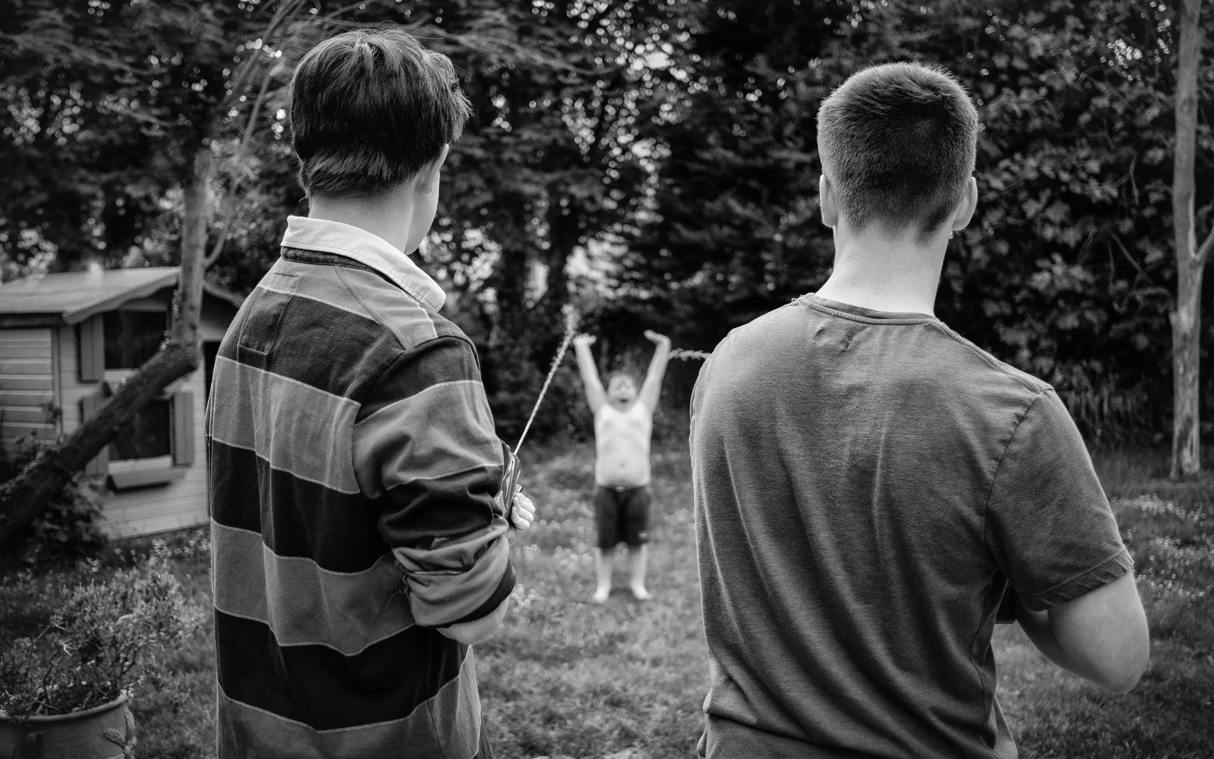
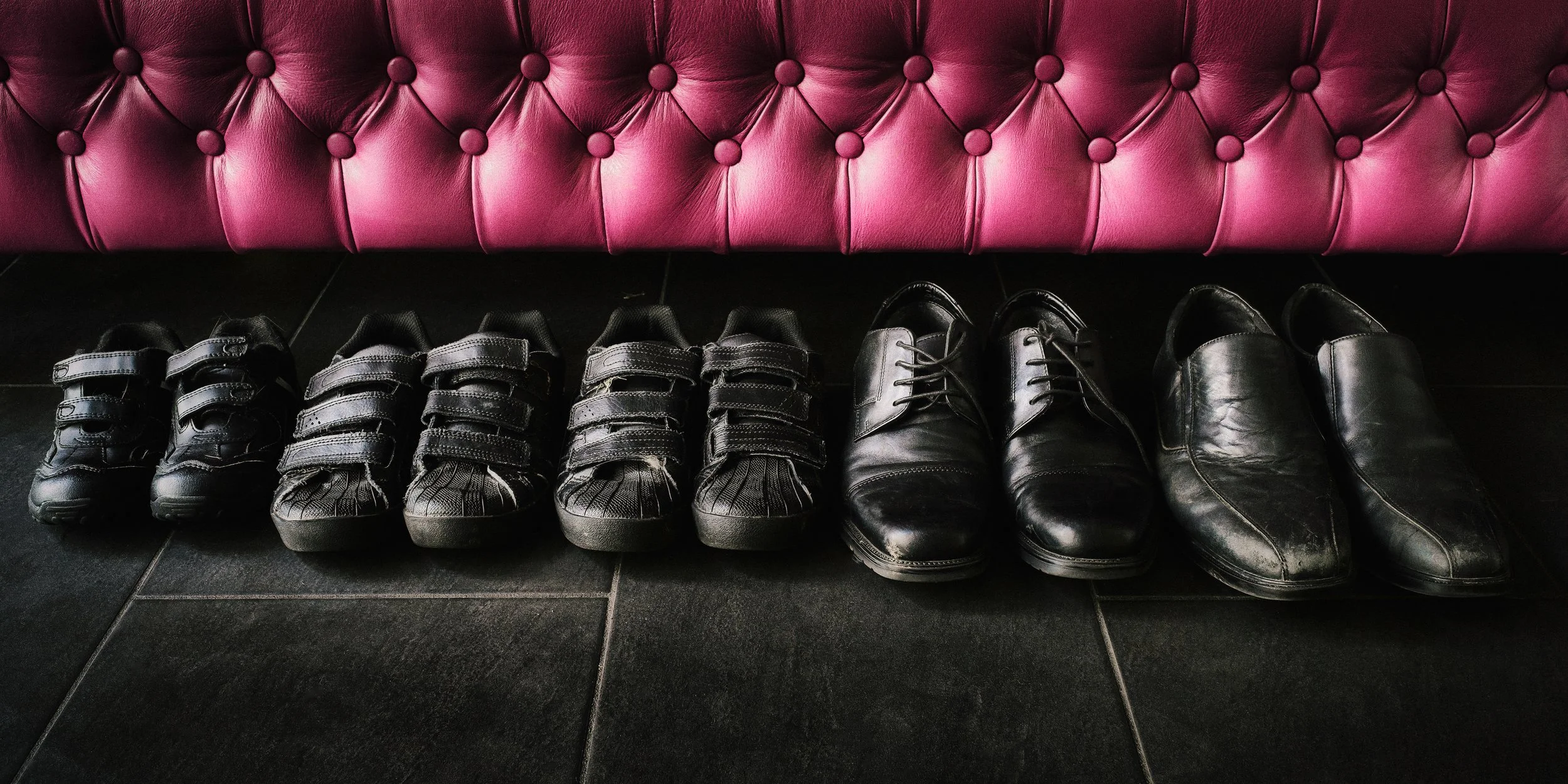
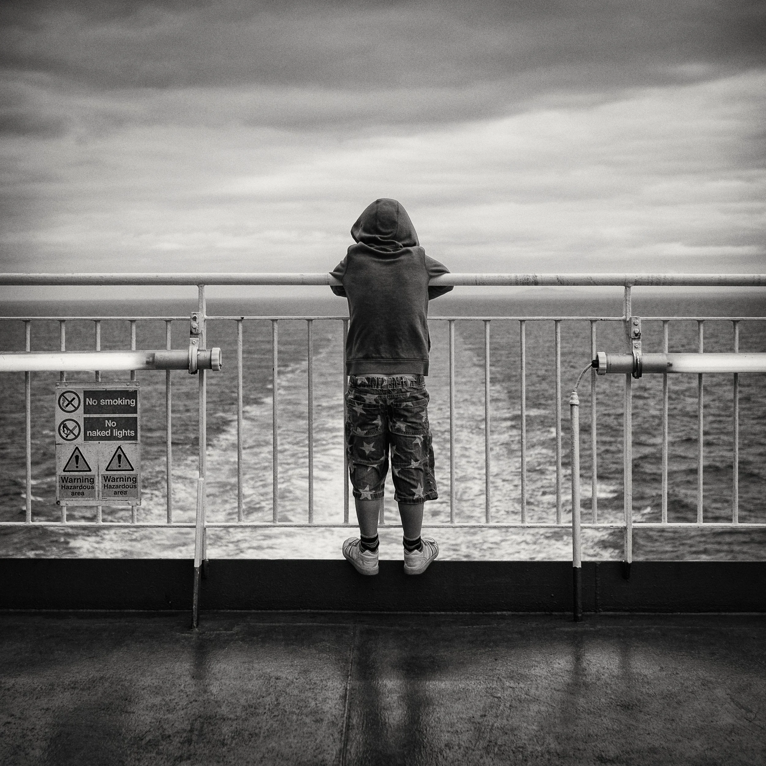
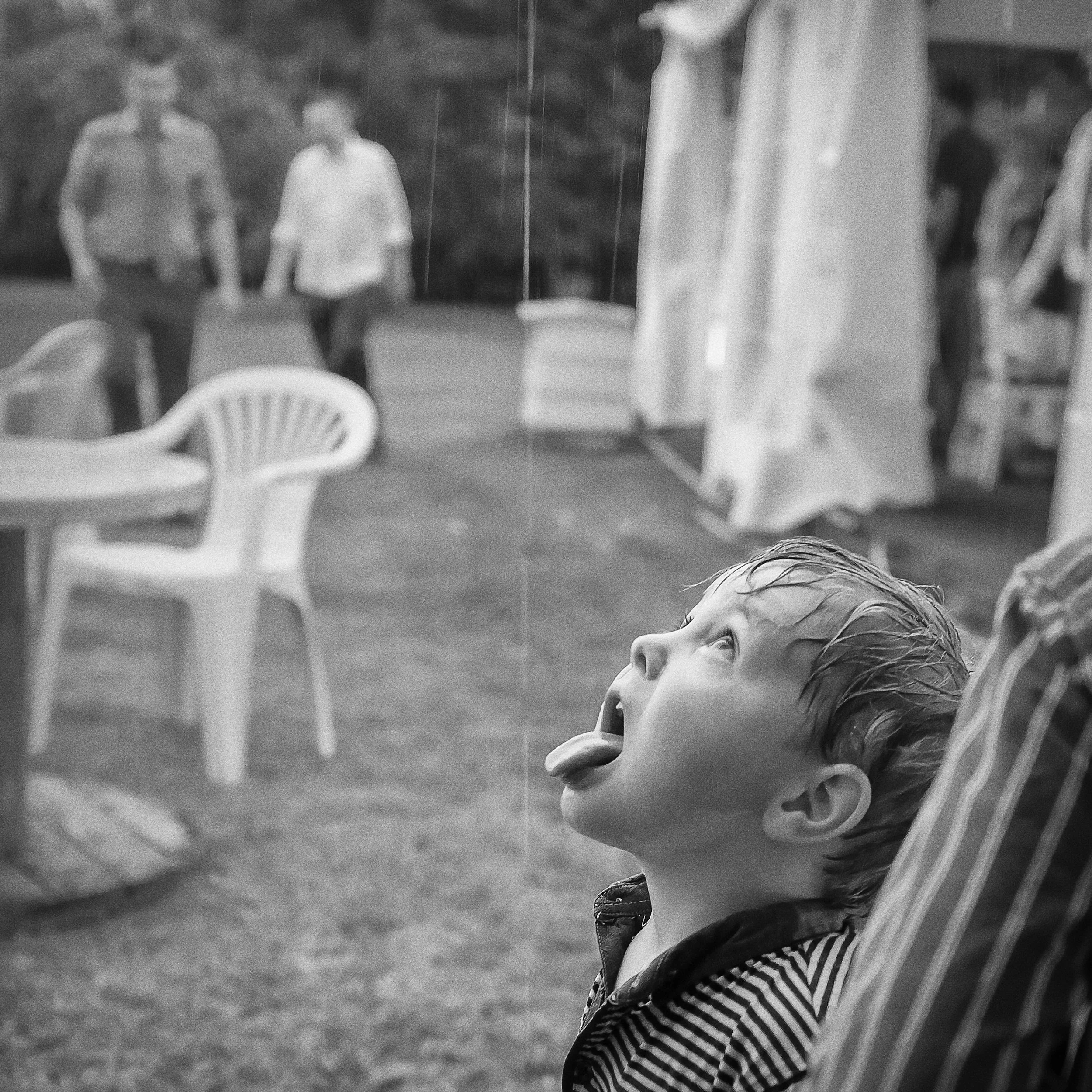
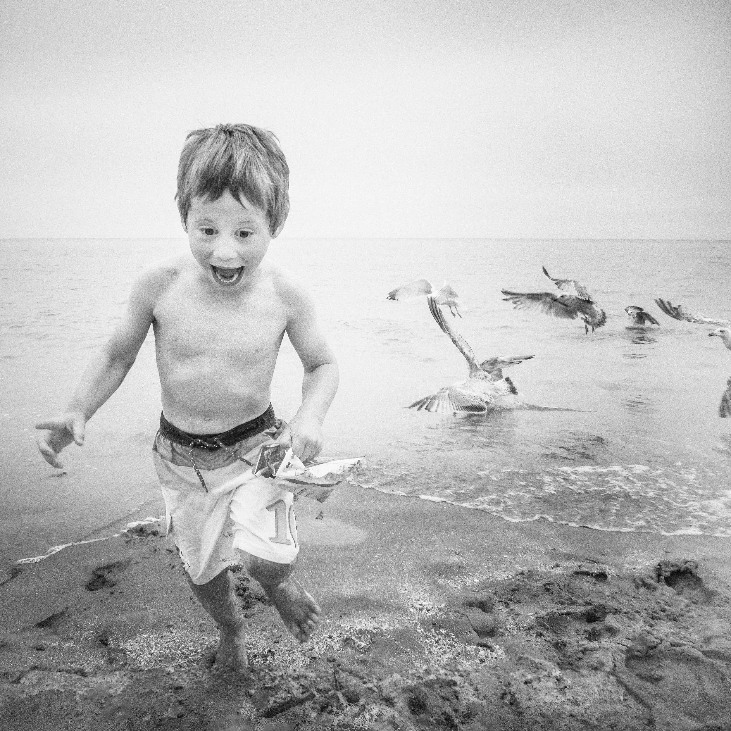
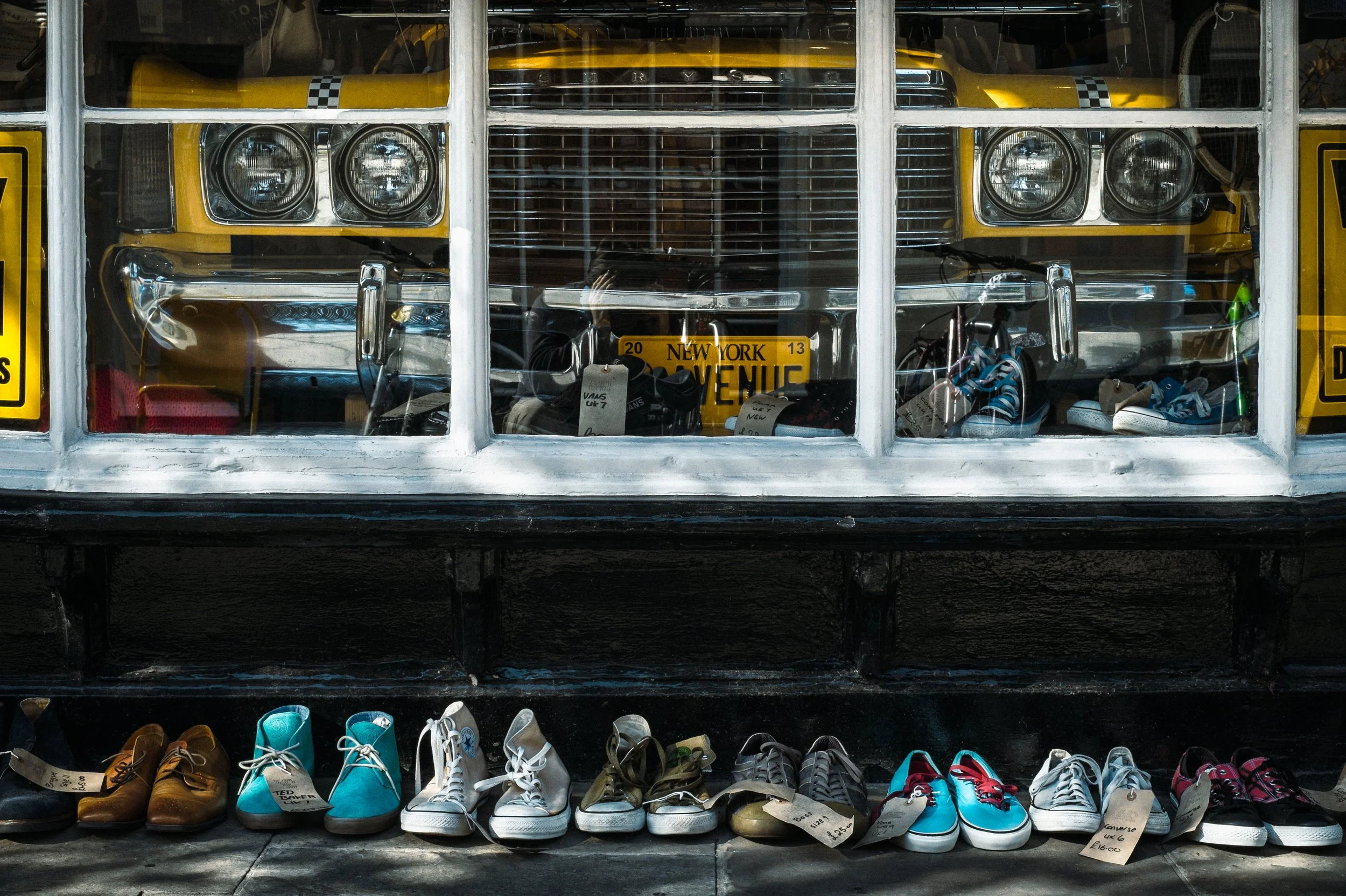
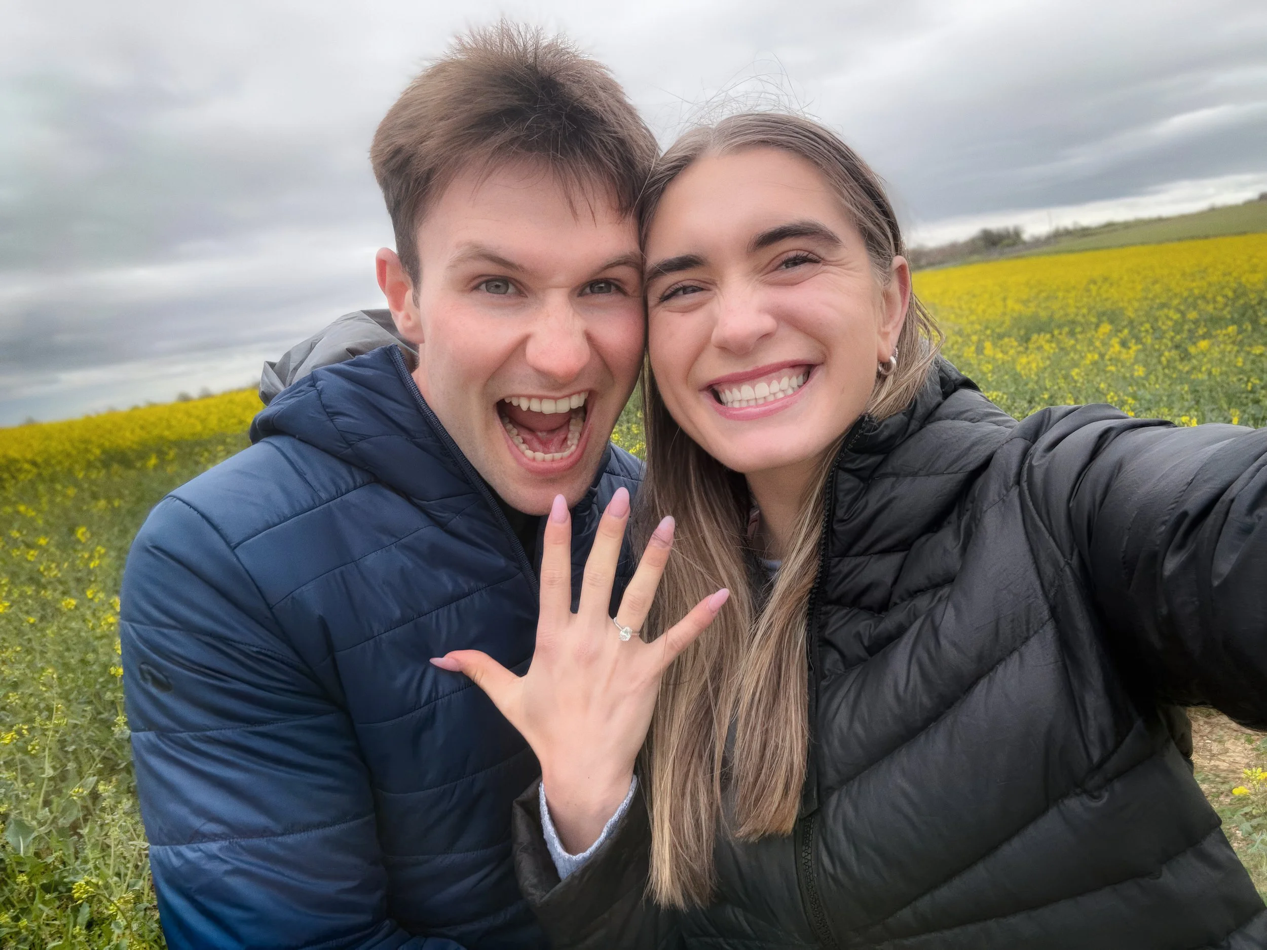
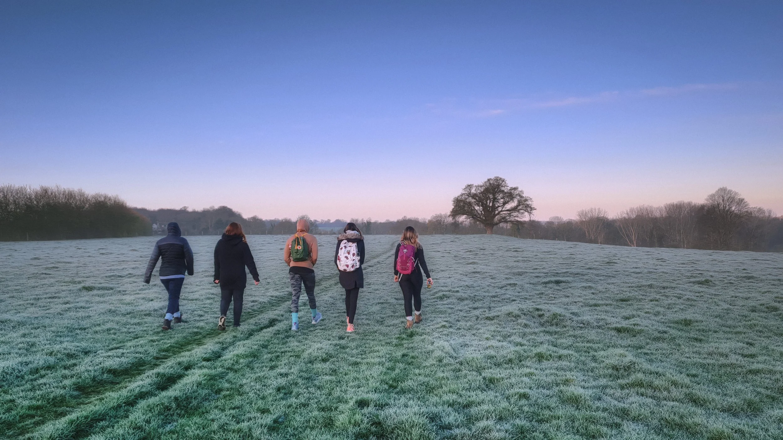
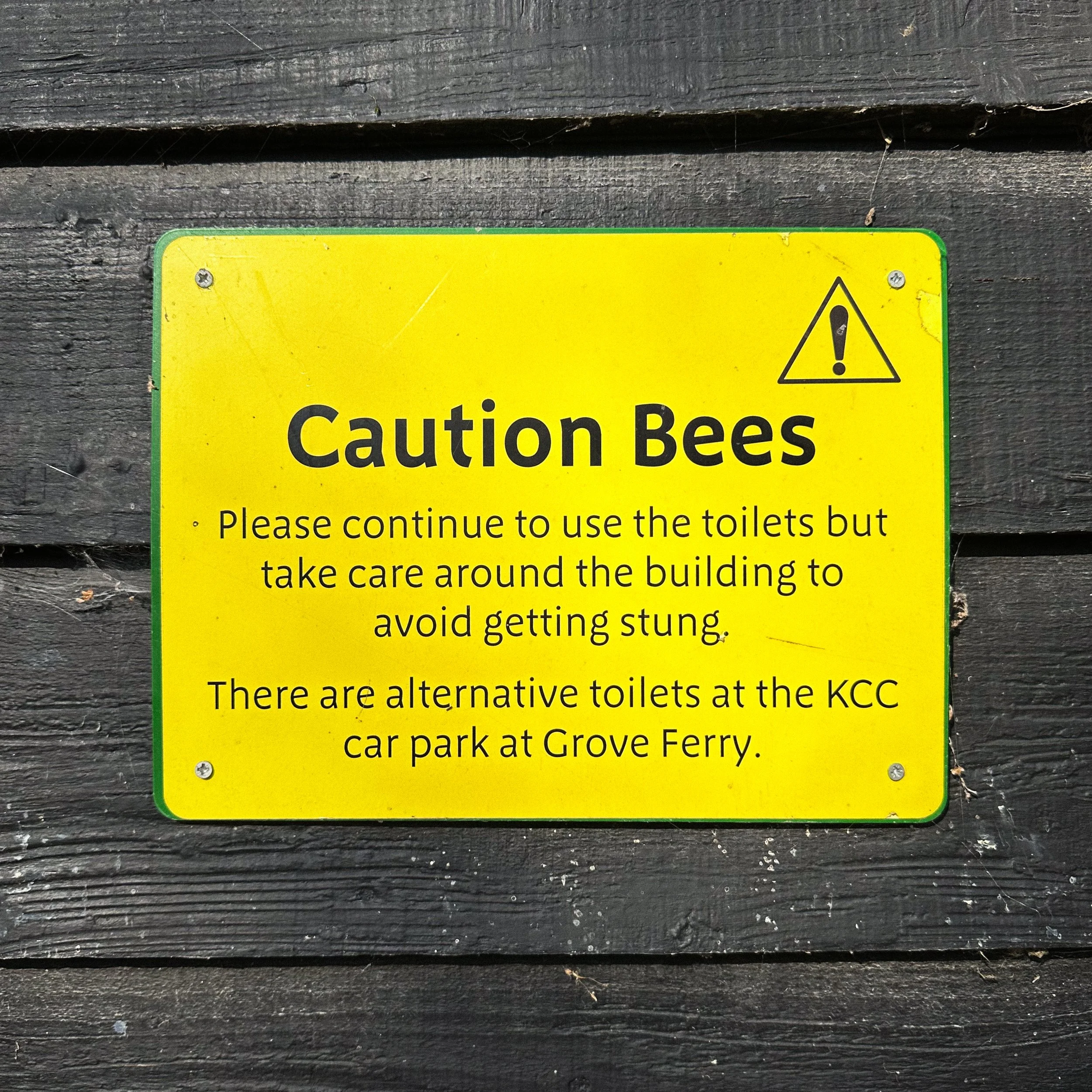

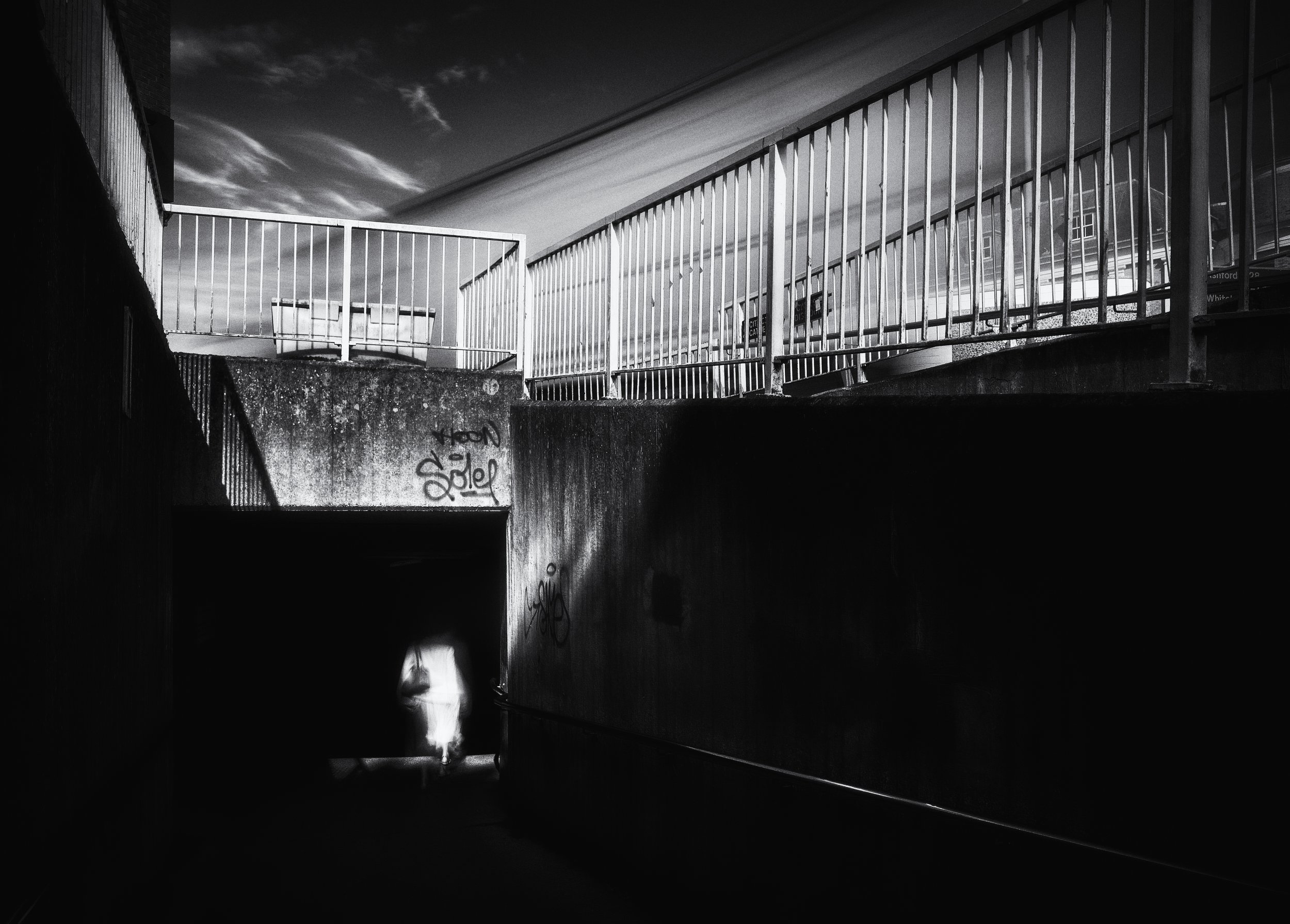
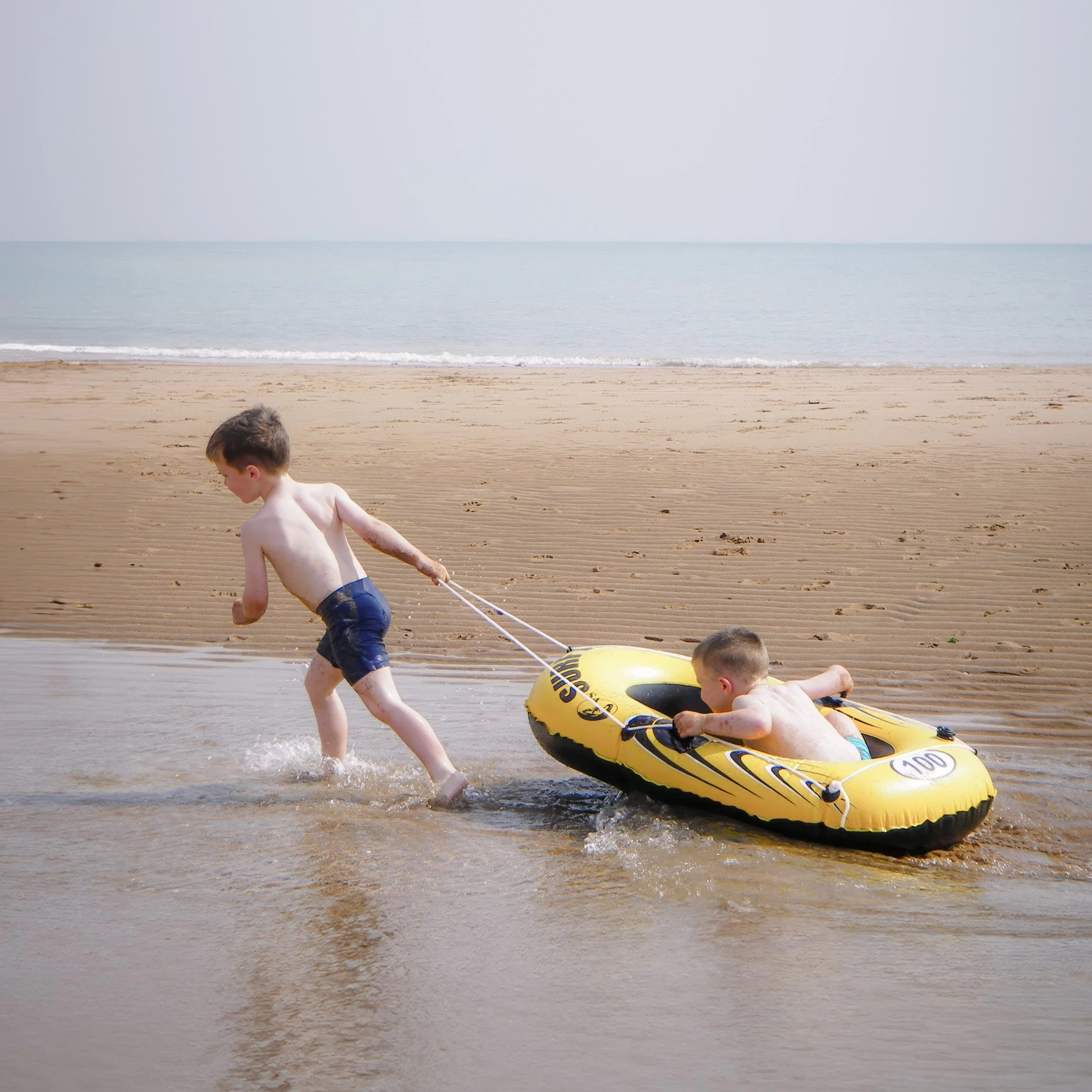
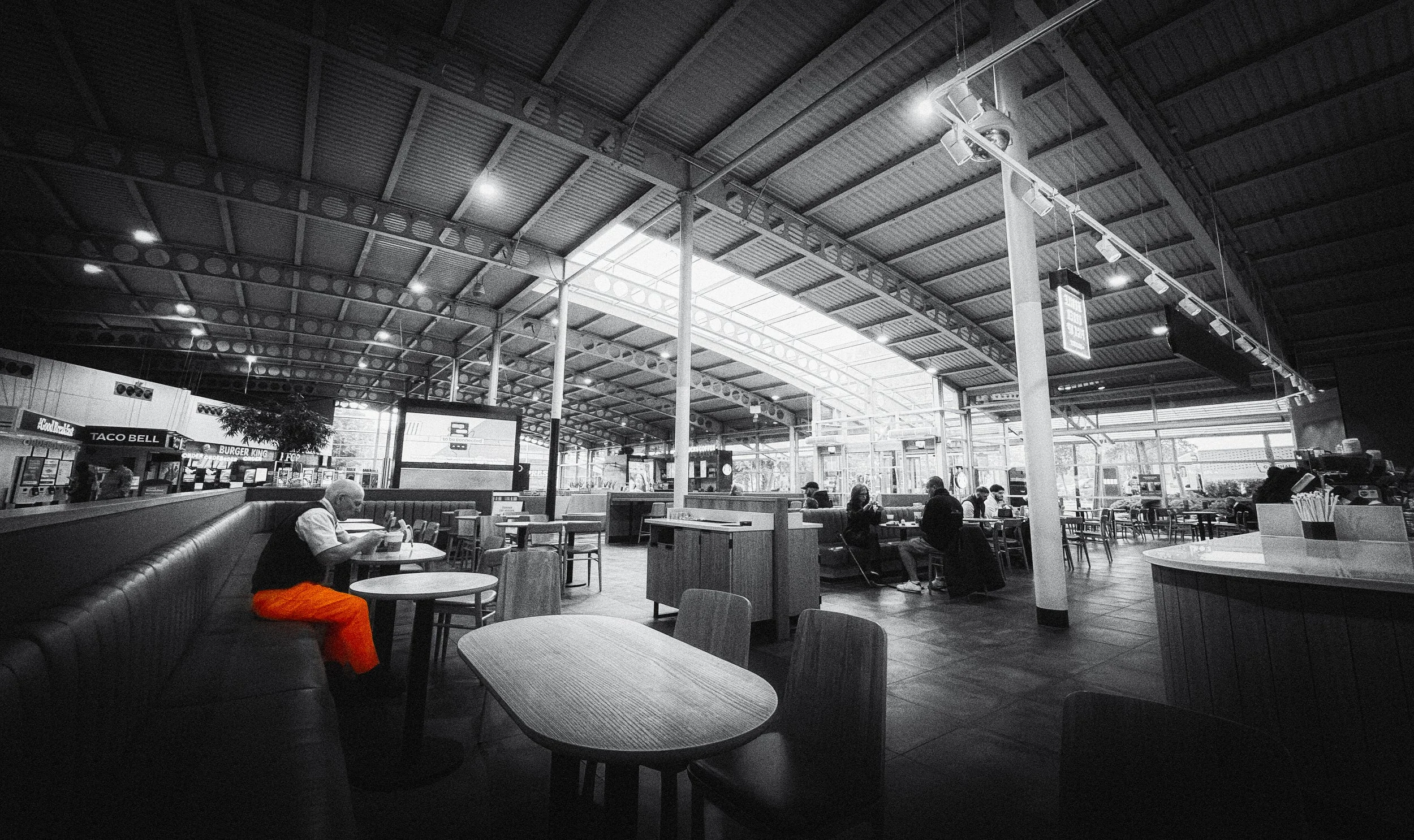
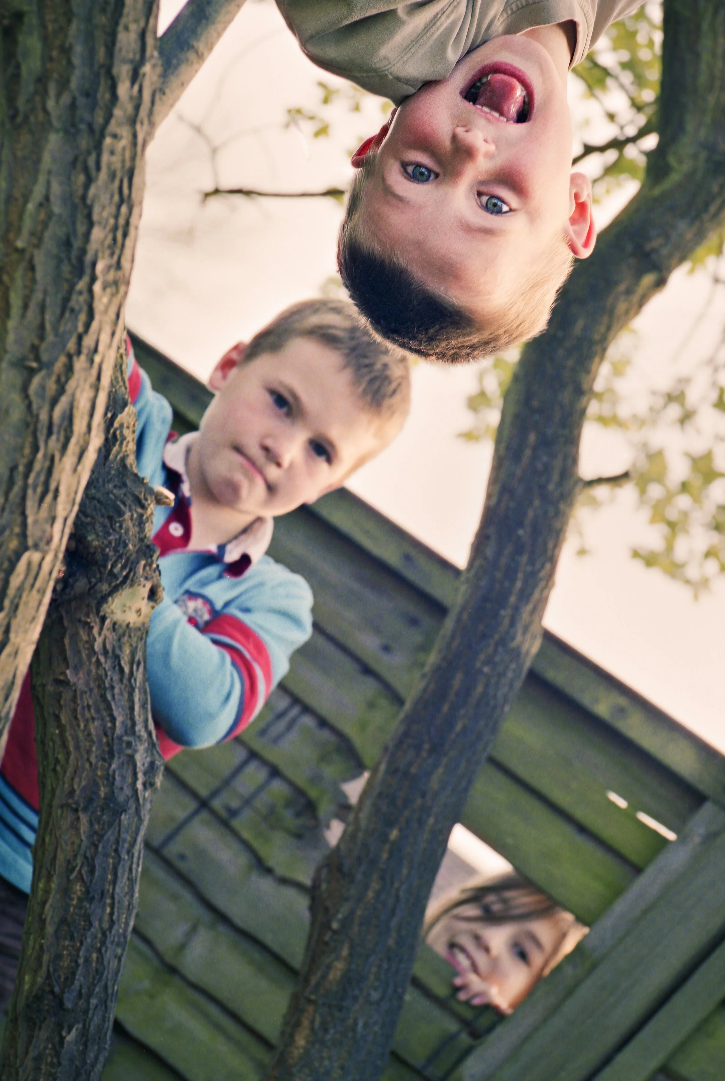
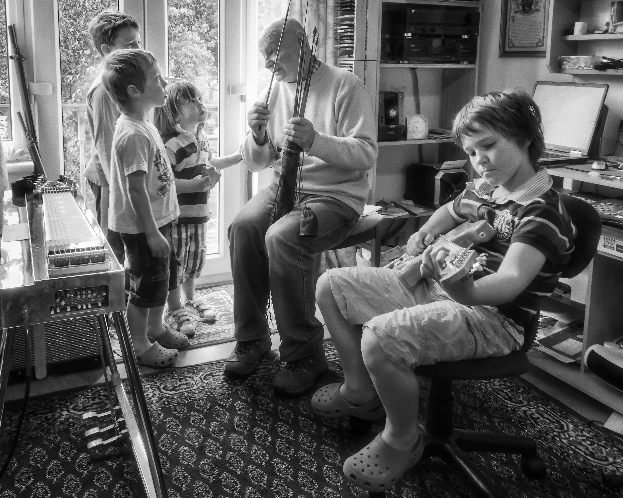
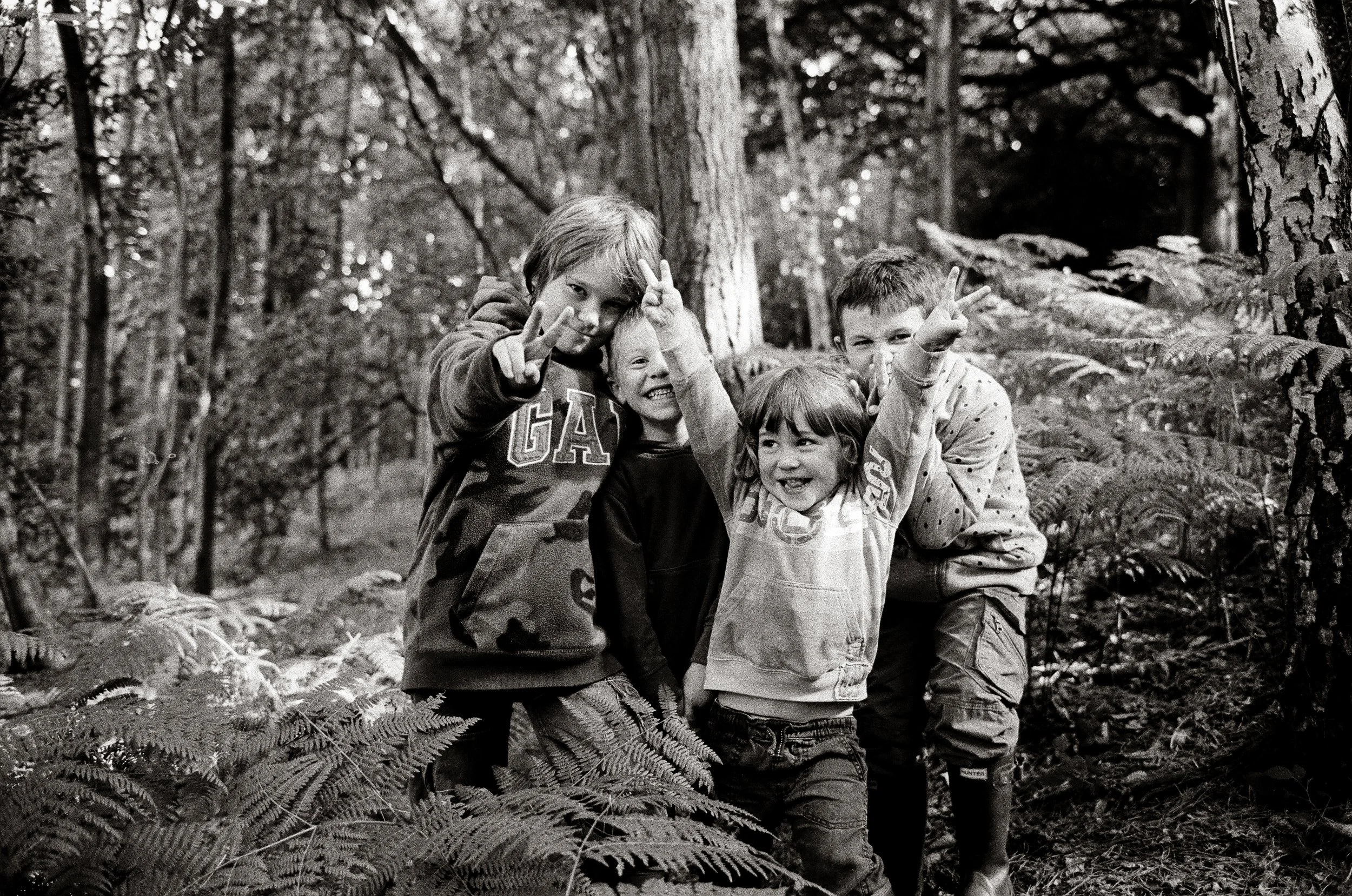
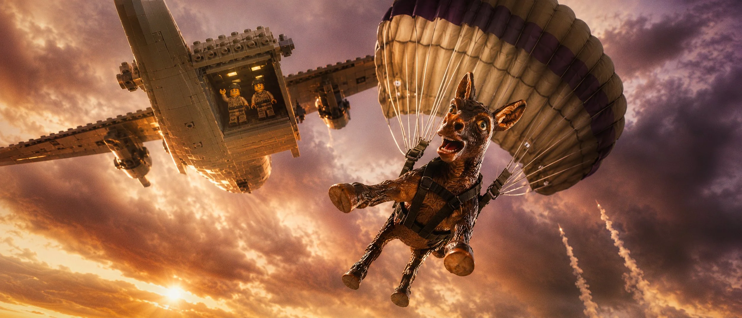
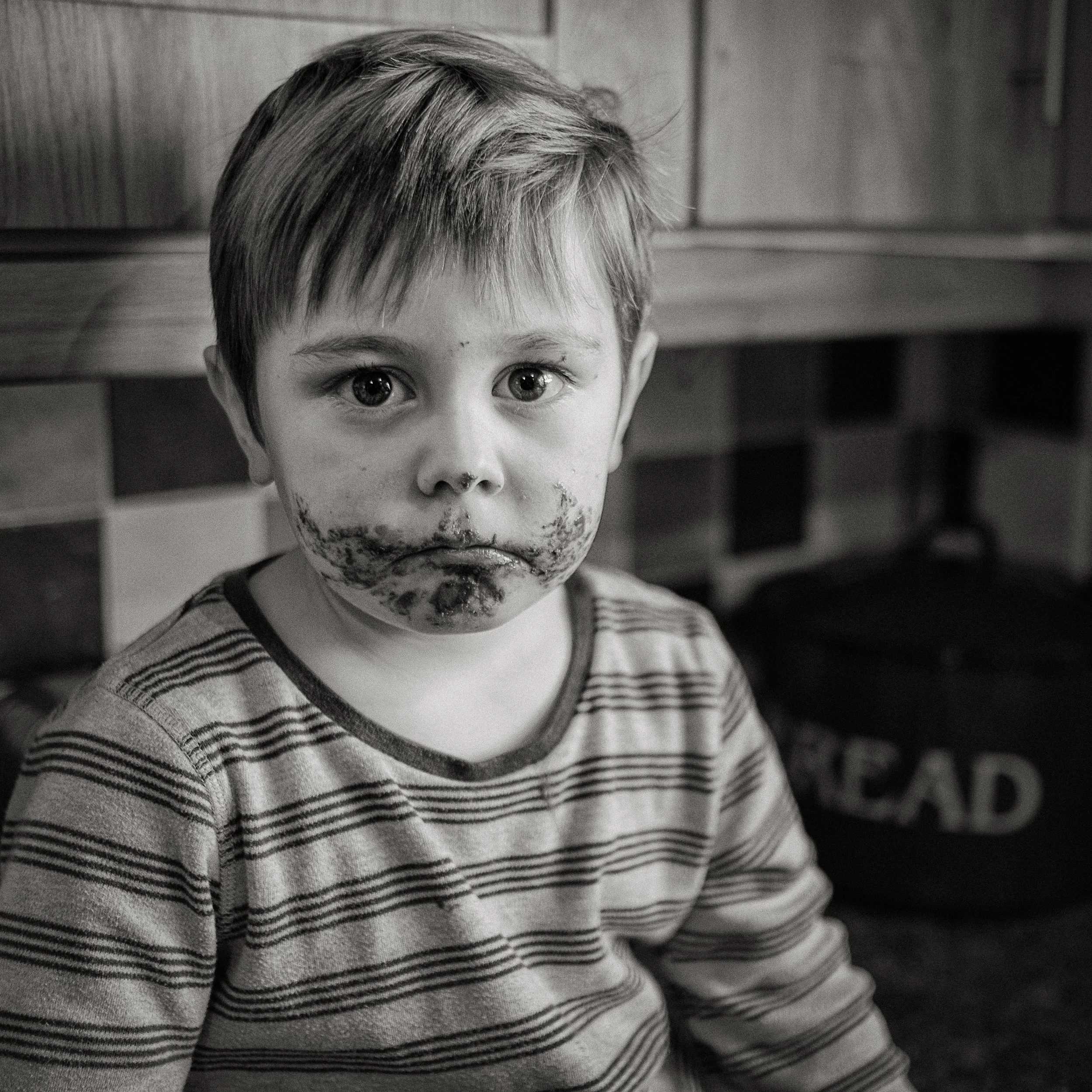
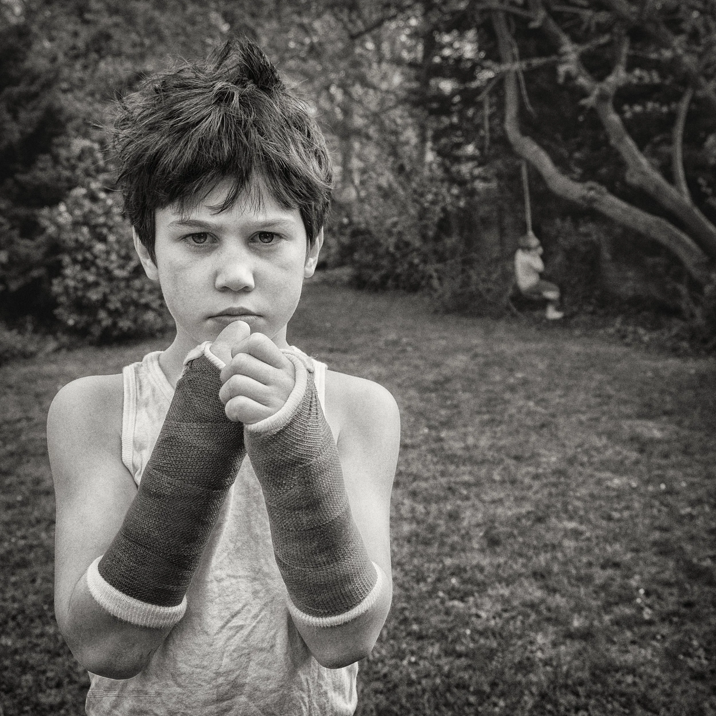
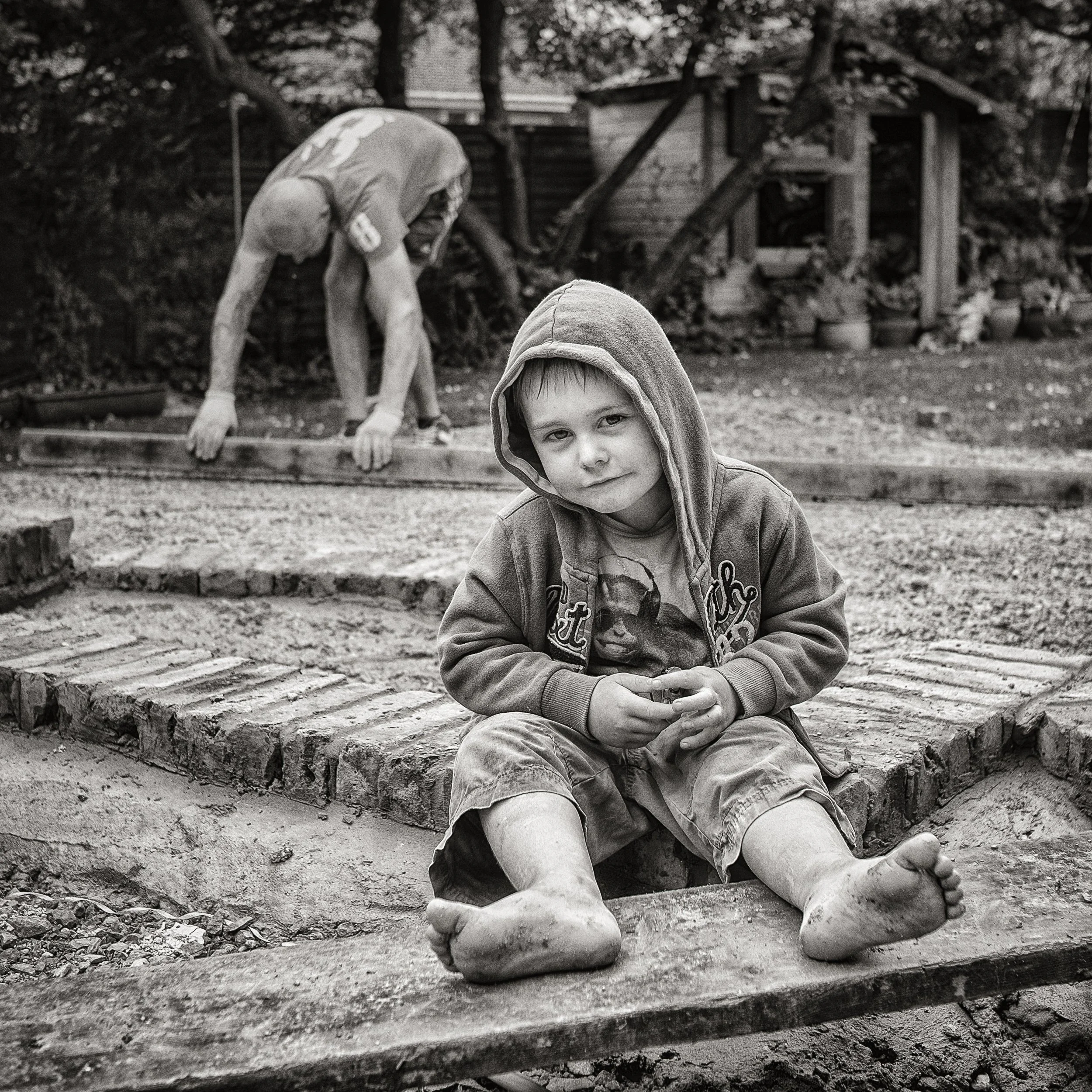
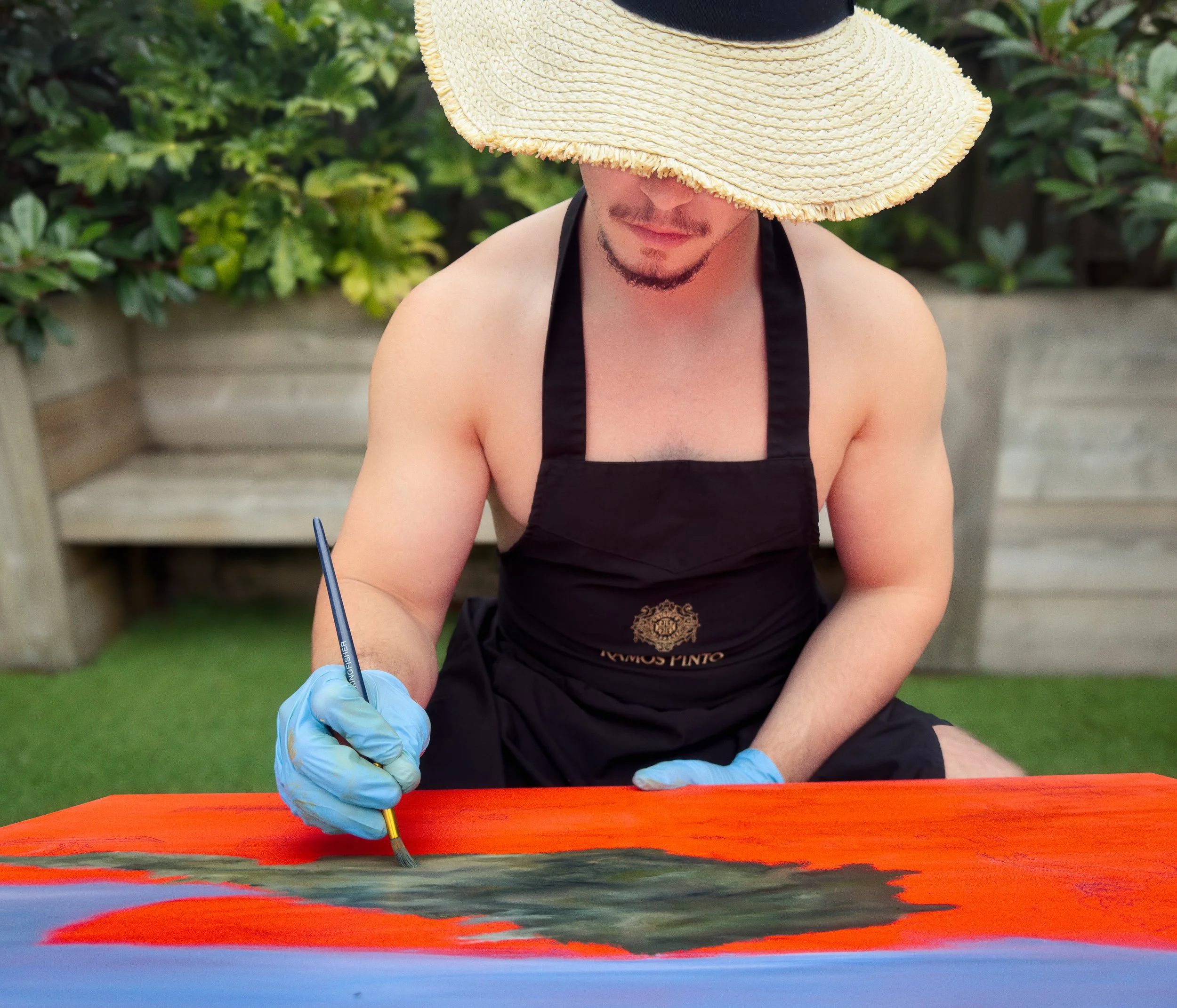
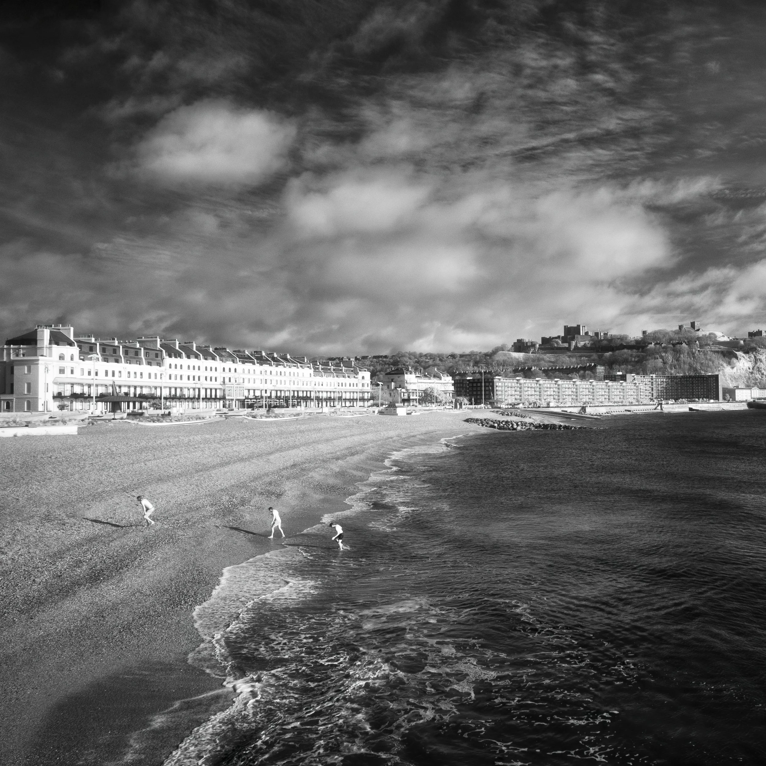
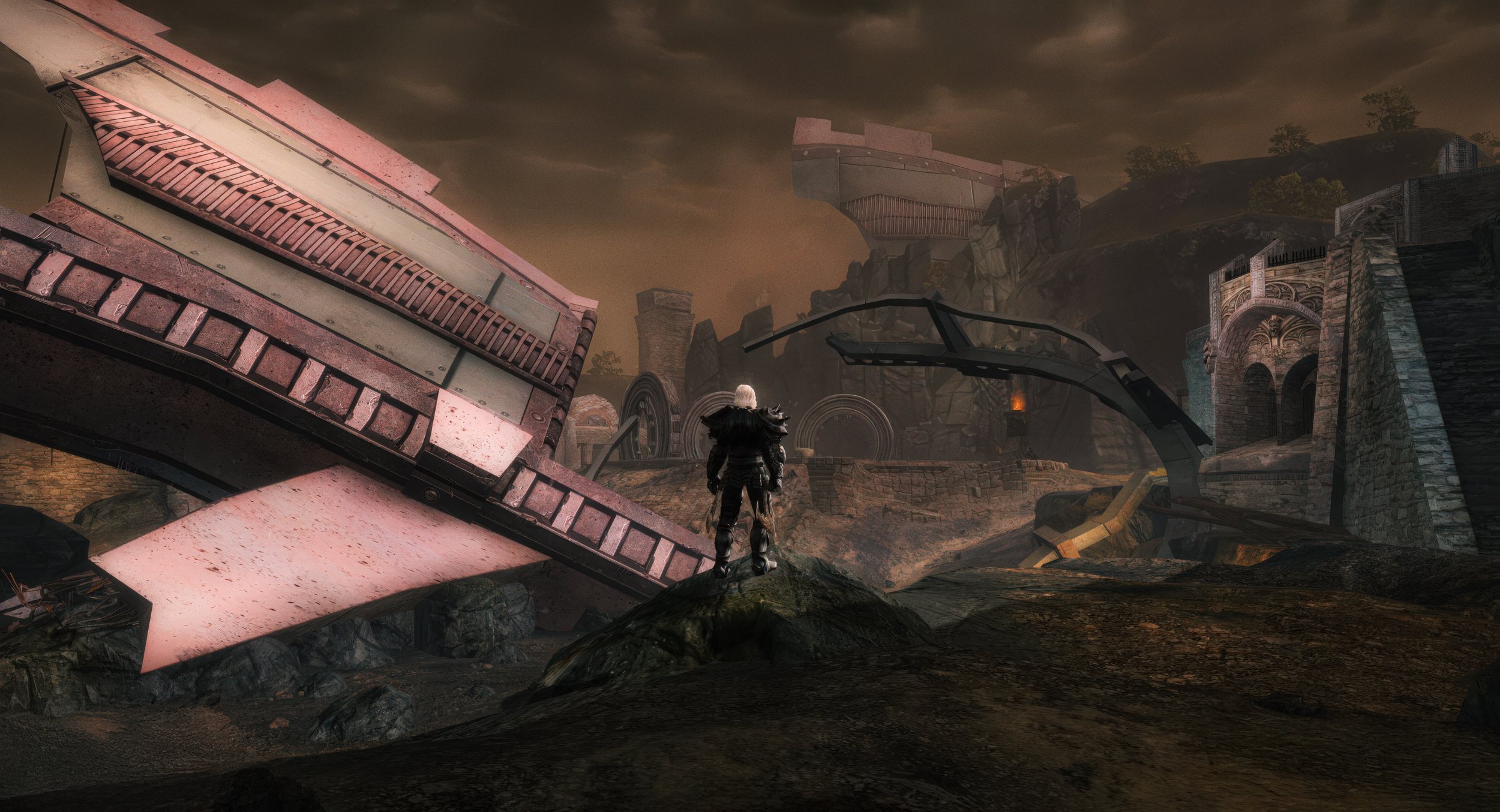
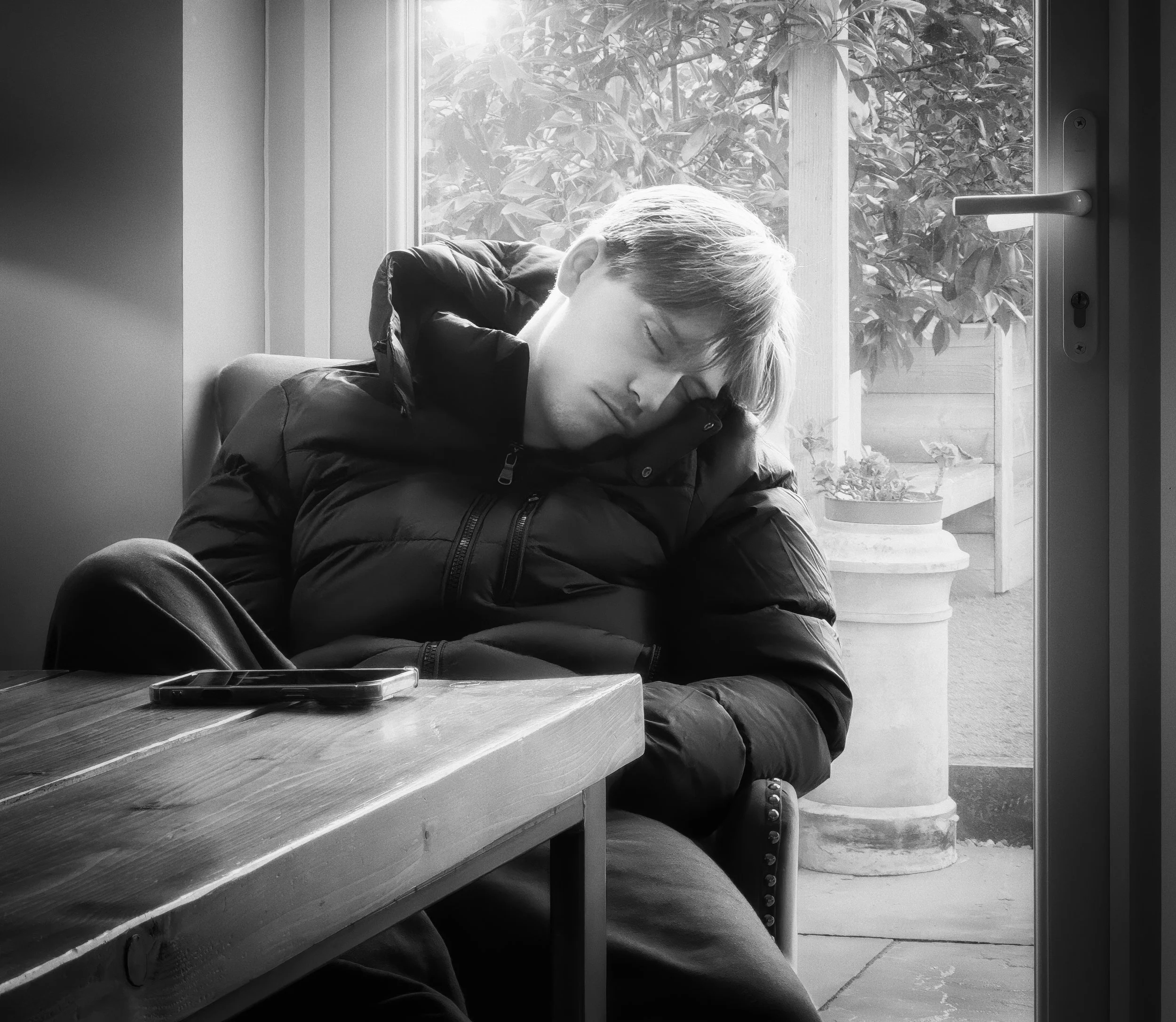

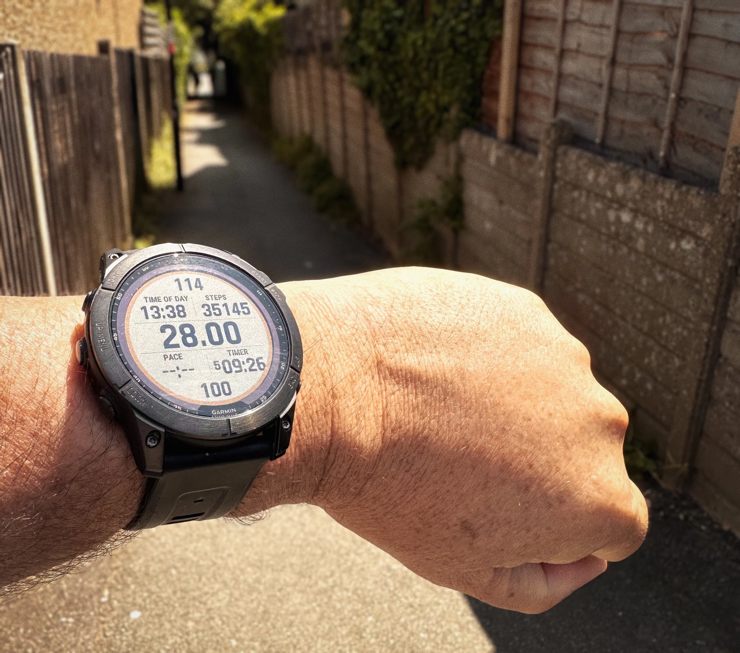
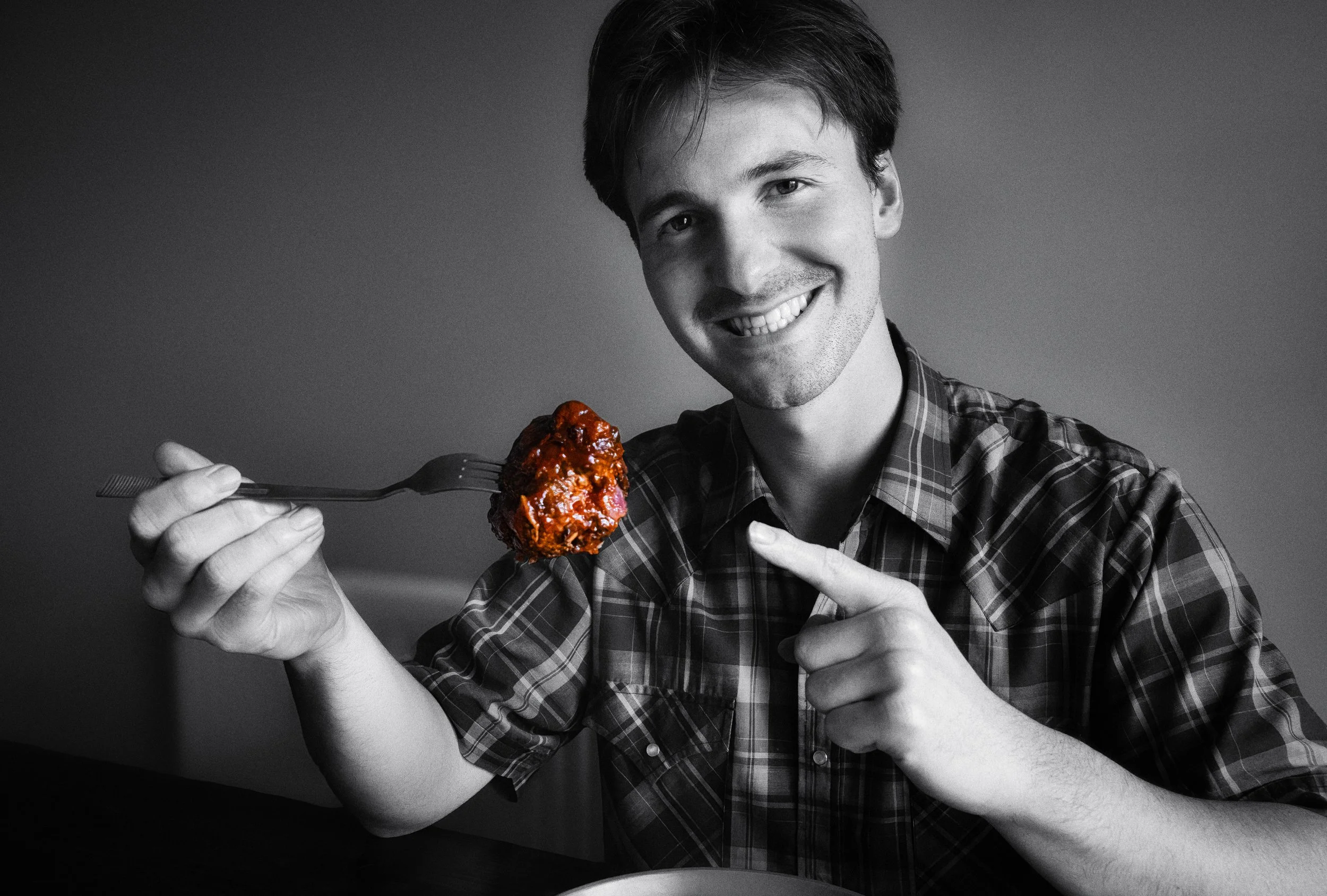

Working on a Theme: The Small Group
A set of photographs works differently than a single photograph. Once you have more than one image, you have sequence, and sequence has grammar.
The minimum meaningful unit is two images — a diptych — which creates a comparison. Side by side, two images will always create a relationship in the viewer's mind: similarity, contrast, before/after, cause/effect. The question is whether that relationship is the one you intend, or whether it is simply the one the viewer infers because you have placed two photographs next to each other.
Three images — a triptych — is the smallest unit that can carry a beginning, middle, and end. Five to twelve images is the range of a short photo essay. More than twelve, and you are asking the viewer to work quite hard, and the edit needs to be exceptional.
The edit is the story. This is the most important thing to understand about working in multiples. You may have shot two hundred frames. The story you tell depends almost entirely on which twelve you choose and in what order you place them. A mediocre sequence of good photographs will underperform a well-sequenced set of ordinary ones. Sequencing is a skill in itself, and it is largely about understanding what each image needs on either side of it to do its job.
The grammar of the short photo essay has been reasonably stable for eighty years:
The wide establishing shot — where is this? What is the context? This is usually the opening image, and it orients the viewer in space and mood.
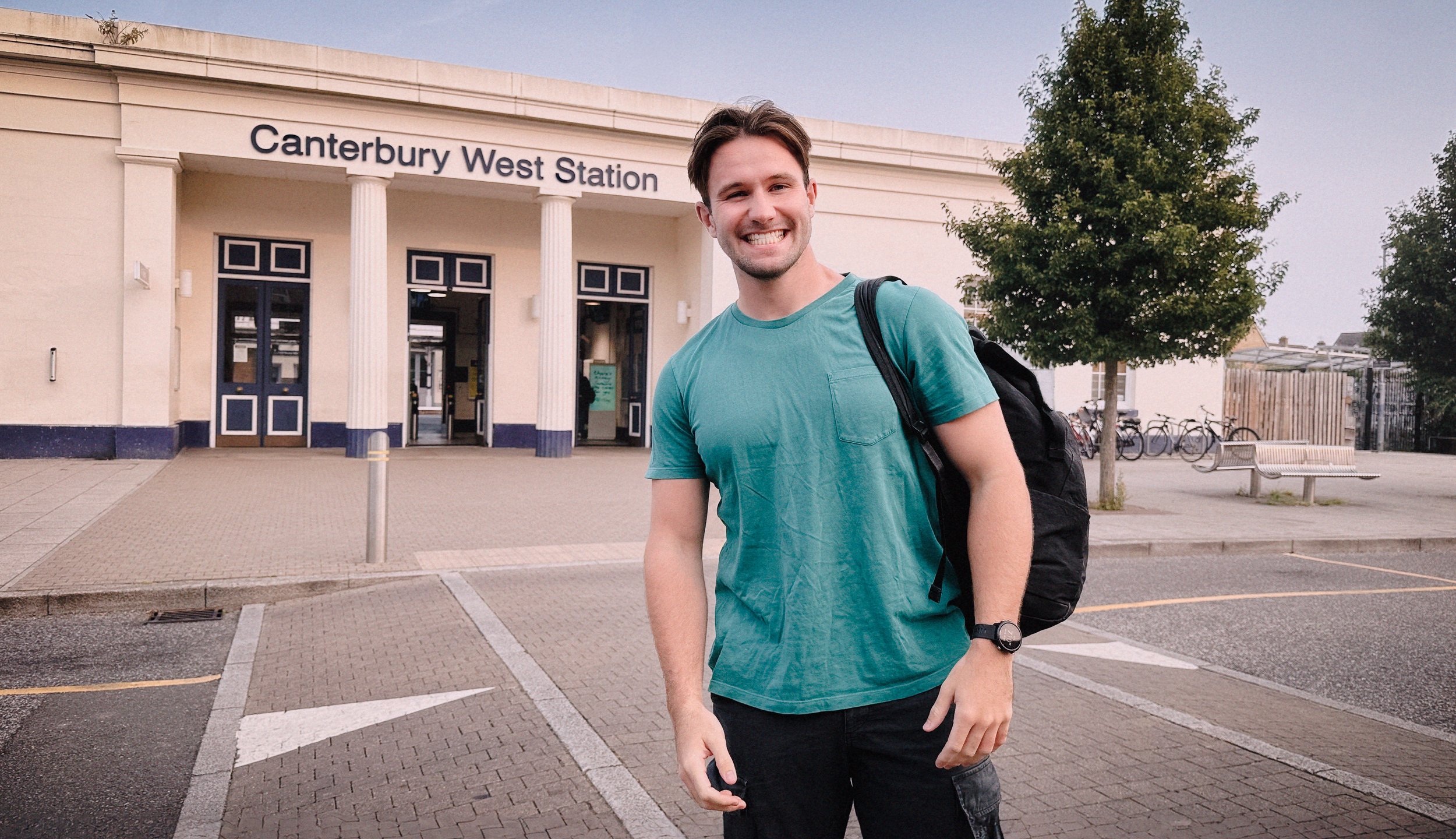
The portrait — who is this? (Or: who are these people?) The portrait brings us close to a subject and asks us to care.
The detail — a close-in image of an object, a texture, a gesture. Details slow the viewer down and create intimacy. They also suggest that you were present, that you were paying attention.
The action frame — something happening. Movement. Interaction. The narrative beat that drives the sequence forward.
The quiet closing image — not the action shot, not the portrait. Something contemplative: an empty space, a receding figure, a detail that resonates differently having seen everything before it.
This grammar is a starting point, not a formula. Deviate from it once you understand it.
When editing a set, the question to ask of every image is not "do I like this photograph?" but "does this image add something to the sequence that isn't already there?" If two images are doing the same narrative work — both wide shots, both quiet moments, both portraits of the same person — one of them needs to go. The discipline is in cutting the image you love if the sequence doesn't need it.
Photographers who do this well: Matt Stuart's street sequences, Patrick Zachmann's project-based work, Cristina de Middel's The Afronauts. Look at how they pace images within a set.
Building a Personal Project
A personal project is not simply a collection of photographs on the same general subject. It is a frame. The frame limits what you photograph, and limitation — counterintuitively — is what makes work interesting. Without a frame, you photograph everything that catches your eye. With a frame, you photograph everything that belongs to the argument you are making.
Choosing a subject is the first problem, and the most common mistake is choosing one that is either too broad or too abstract. "Urban life" is too broad. "The last fish-and-chip shops in a specific part of Manchester" is specific enough to be achievable and narrow enough to generate a coherent body of work. "Loneliness" is too abstract. "People eating alone in restaurants" is concrete, observable, and yields a consistent visual approach. The test of a good project subject is: can you explain it in one sentence? Can you immediately see what a photograph for this project would look like?
Before the camera, the notebook. Before you shoot a single frame of a personal project, write about it. What is the subject? What is the emotional register — is this tender, critical, celebratory, elegiac? What does a successful image look like? Who or what is the protagonist? What do you want a viewer to feel when they see the completed work? This notebook exercise is not optional; it is the thing that distinguishes a photographer who has decided what they are doing from a photographer who is hoping it will work itself out. It usually doesn't work itself out.
Scouting and returning. For most sustained projects, you will need to visit locations more than once. The first visit is about geography — learning the space, finding where the light comes from, identifying where the interesting moments might happen. The second visit is about timing — coming at a different time of day, watching what changes. The third visit is the one where you actually know what you're doing. This is not inefficiency; it is how projects work. Cartier-Bresson returned to locations repeatedly. Eggleston drove the same routes in the American South many times. The photographs that feel discovered were often the result of sustained, deliberate return.
Consistency of vision across many sessions is harder than it sounds when you are actually doing it. Moods change. Light changes. You have days when nothing works and days when everything does. The way to maintain consistency is to have made those notebook decisions early — about register, about approach, about what the project is — and to return to them regularly. This is the equivalent of an actor returning to their character notes. It keeps the work coherent.
When is a project finished? It is finished when you have enough images to make the argument clearly, and when adding more images would not add to the argument. Most photographers' instinct is to keep going — to hedge, to add, to over-insure. The edit will tell you when you are done. If you have forty strong images and you can only make a coherent sequence of twenty, you probably have what you need.
Post-Processing for Narrative
There are two different activities that often get described as "editing" in photography, and it is worth keeping them distinct: selection and curation (deciding which images to include and in what order) and processing (adjusting the look of the images in Lightroom, Capture One, Snapseed, or equivalent tools). Both serve the narrative; they serve it differently.
Selection and curation is editorial. It is the work of a picture editor: brutal, structural, concerned with sequence and argumentation. This is where most storytelling work is won or lost. A story with three strong, well-sequenced images will outperform a story with thirty undifferentiated images every time.
Processing reinforces the emotional register of the work. A few notes on specific choices:
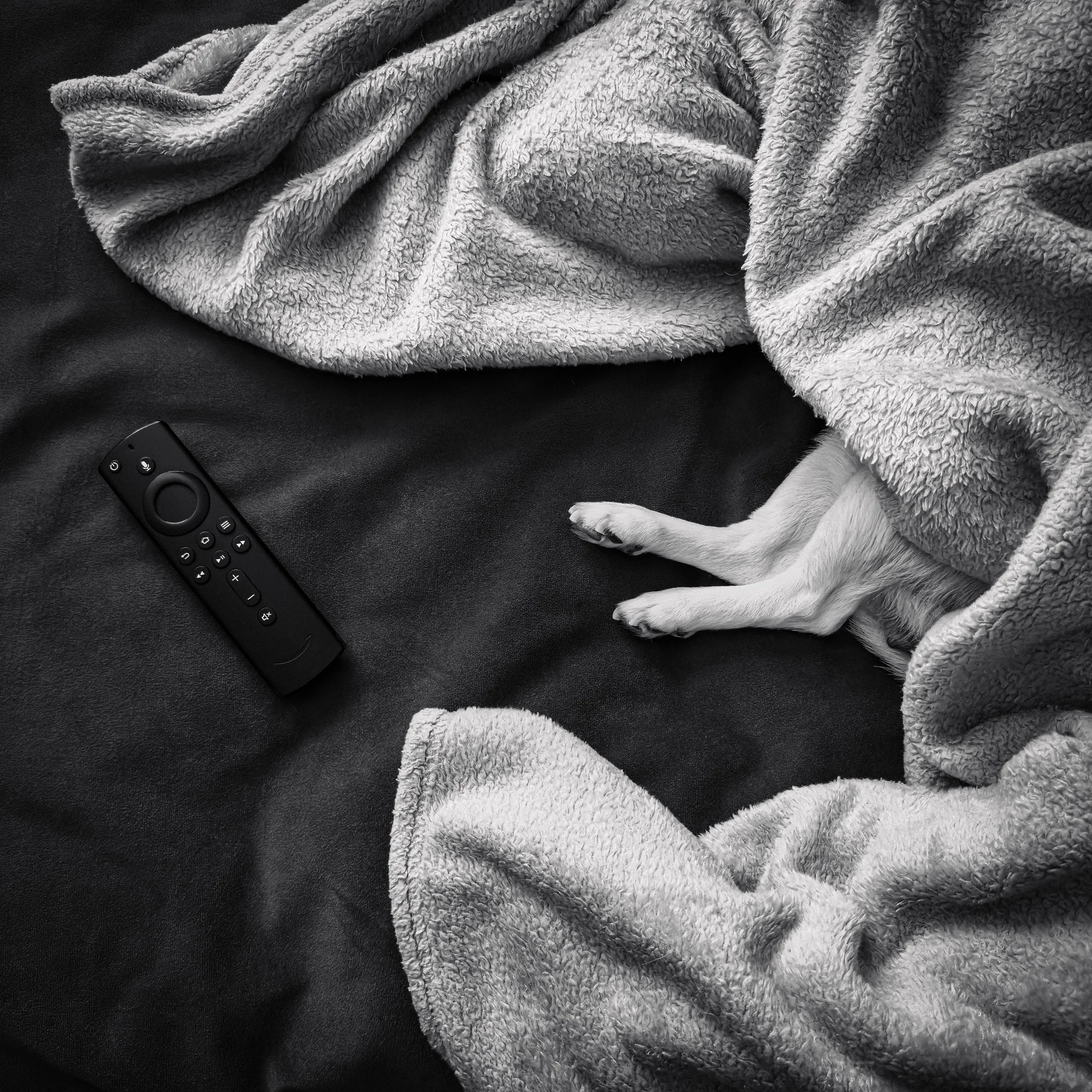
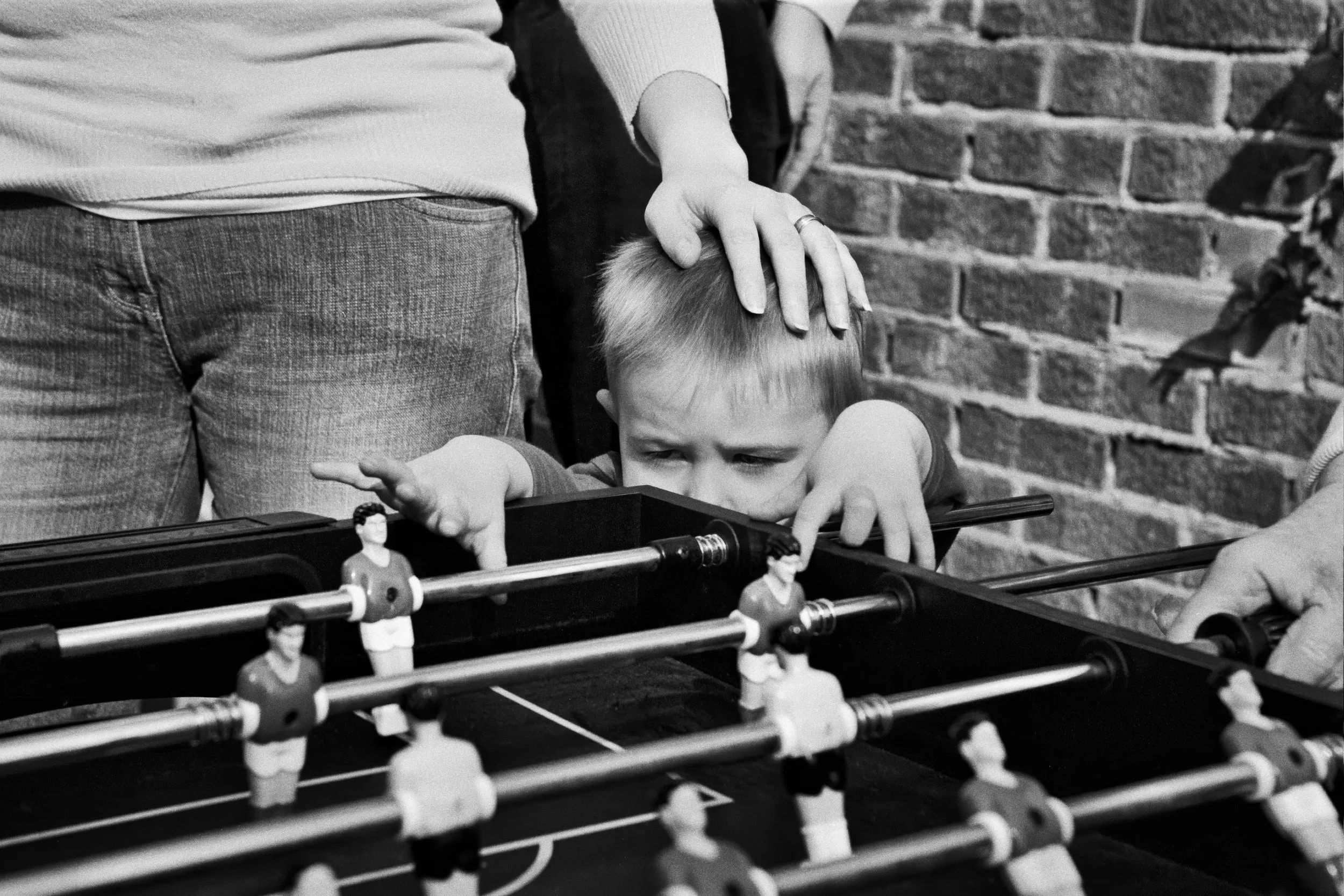
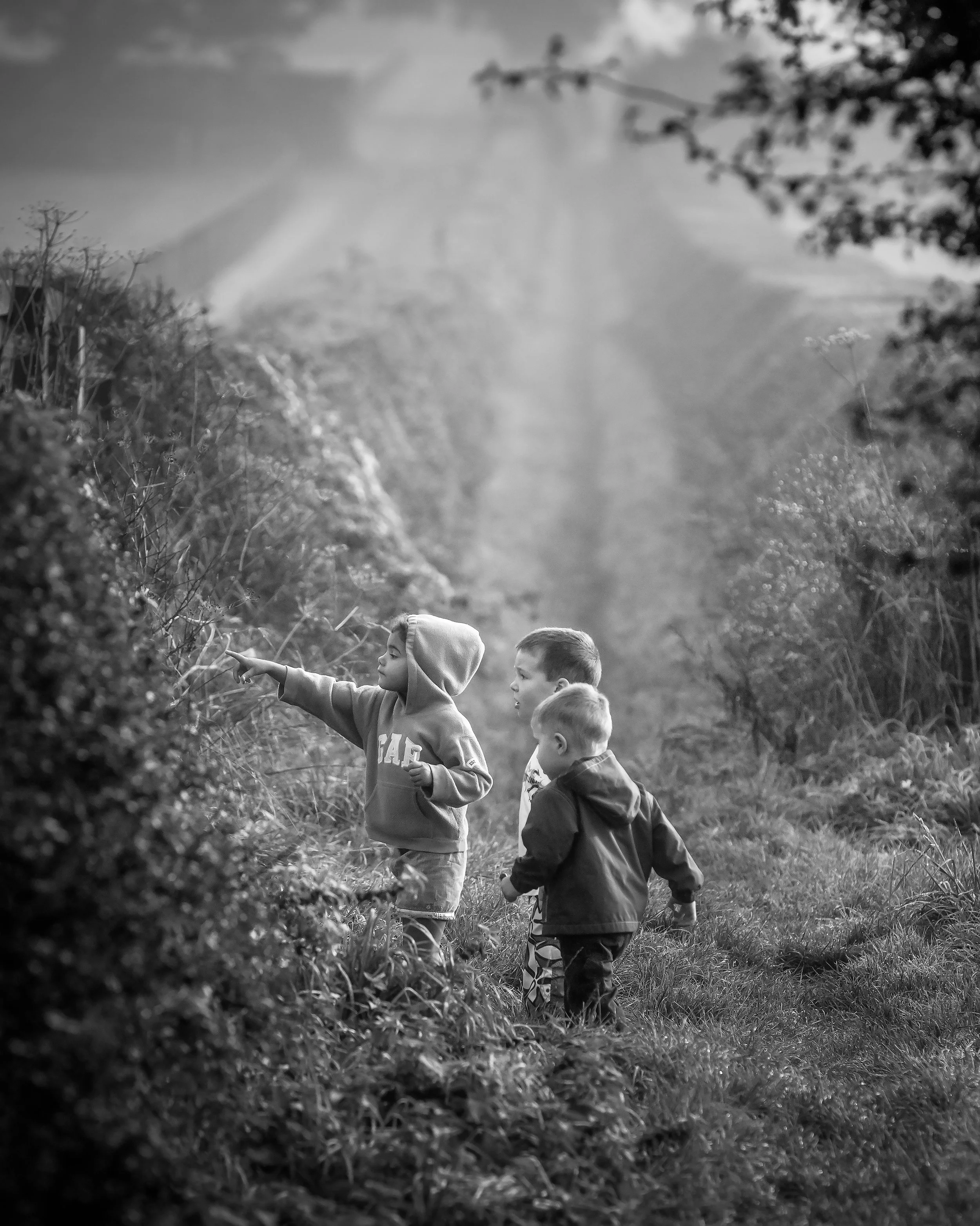
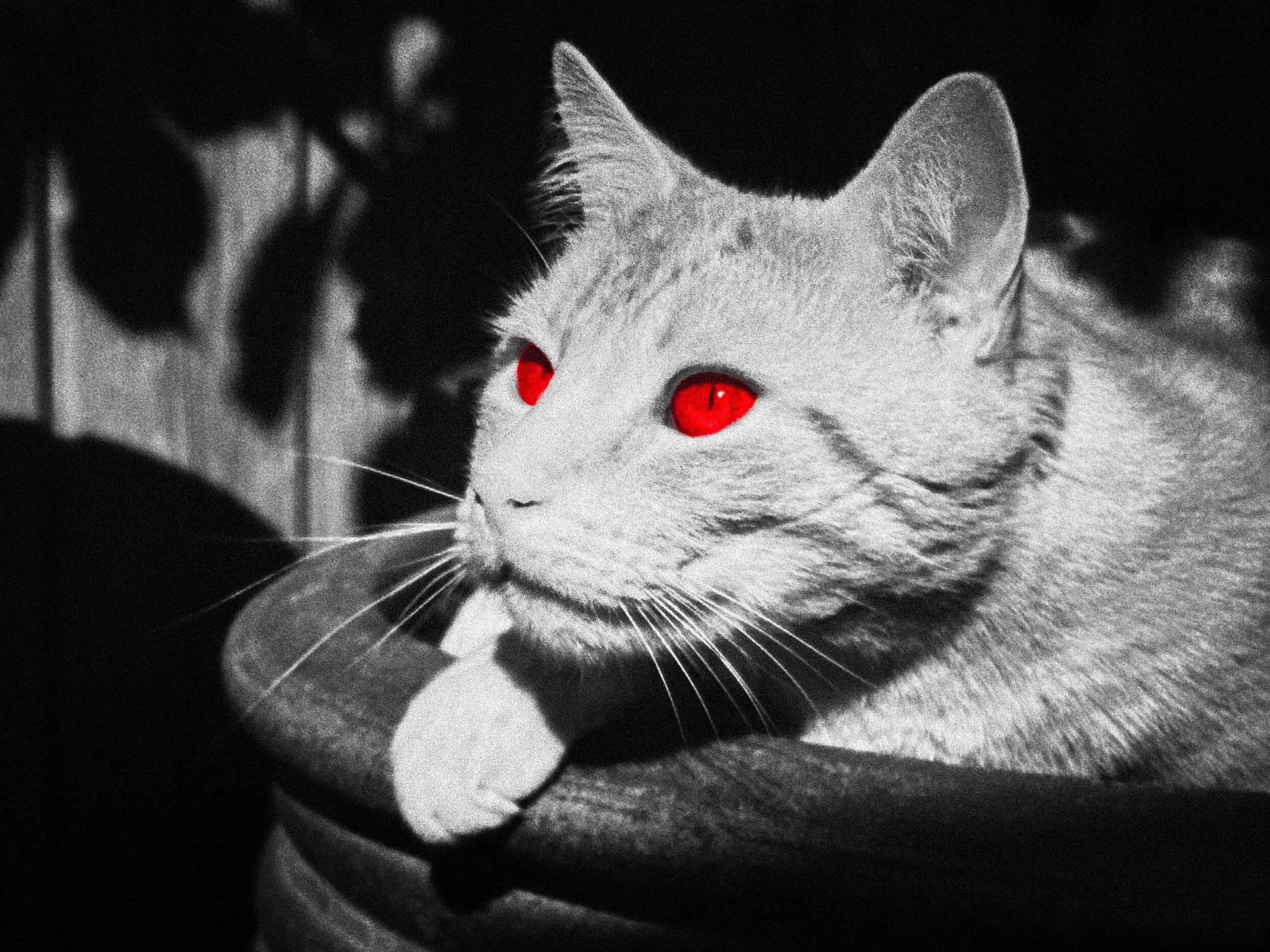
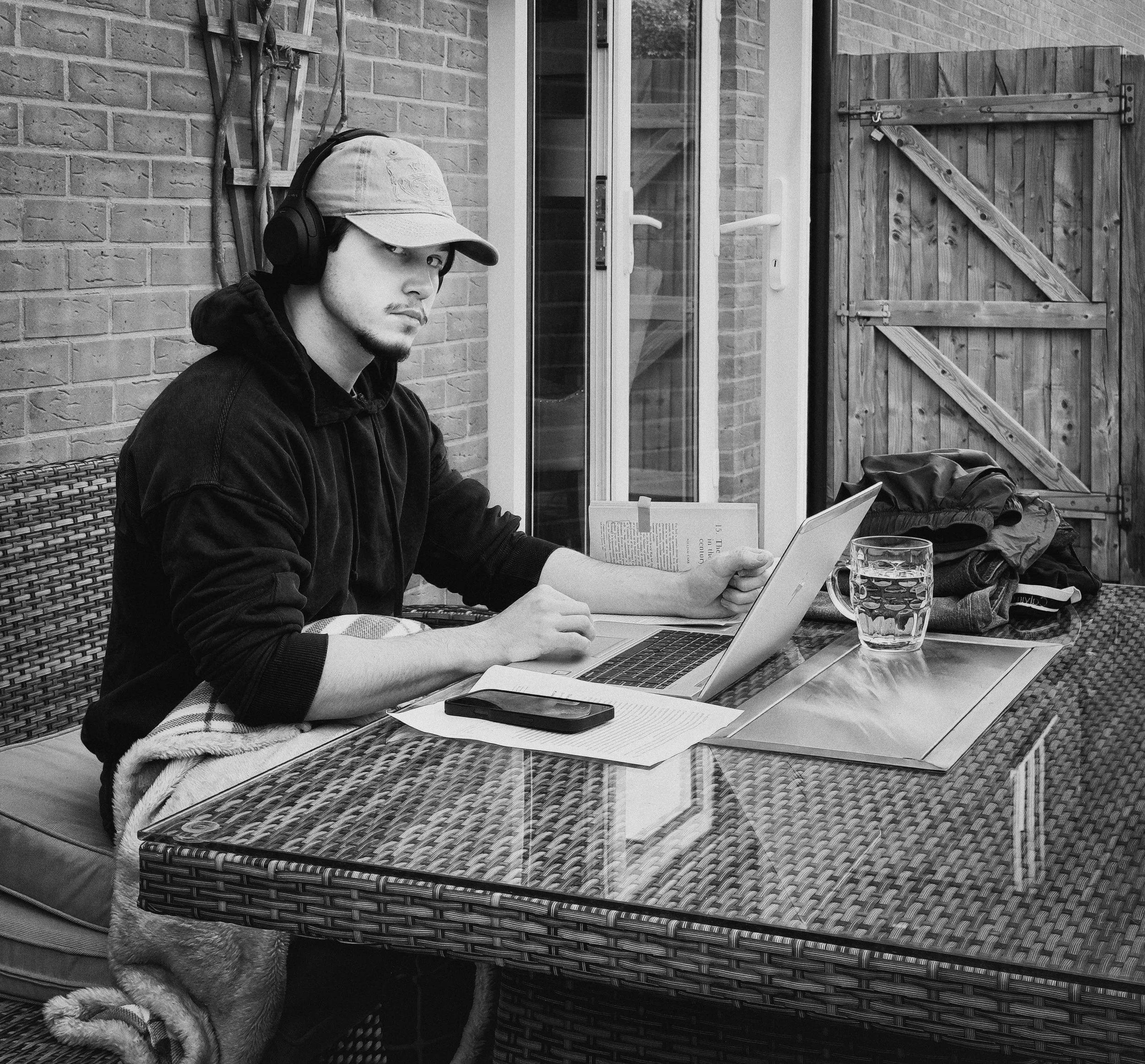
Black and white strips the image of colour information and, in doing so, tends to push the viewer towards geometry, tone, and expression rather than surface detail. It can lend universality — a black-and-white image of a person in distress is less pinned to a specific time and place than a colour image of the same person. It also tends to flatten the hierarchy between subjects in a documentary sequence, which is why so much of the social documentary tradition works in monochrome. If your project is about people and relationships rather than places and surfaces, black and white is worth considering seriously.
Warm film tones — whether achieved through film simulation presets, DXO FilmPack, or manual adjustment — create a quality of intimacy and temporal distance. They suggest analogue photography, and analogue photography suggests the past, the personal, and the handmade. For projects about family, community, personal history, or quiet domestic life, this is often the right register.
A desaturated, slightly cooled palette — the processing approach associated with contemporary documentary photography — feels present-tense, truthful, and slightly austere. It does not romanticise its subject. This is appropriate for work that wants to be taken as witness rather than as art.
Consistency across a set is more important than the specific choices you make. If half your images are warm and filmic and half are cool and clinical, the set will read as incoherent, and the viewer will sense it even if they cannot name it. Pick a processing direction and apply it across all the images in the sequence. The uniformity of processing is a signal to the viewer that these images belong together — that they are looking at a deliberate body of work rather than a collection of photographs that happened to be taken around the same time.
One final note on processing: restraint. Heavy processing tends to draw attention to itself, and the moment a viewer notices the processing, they have been taken out of the story and deposited in an opinion about style. The best processing is invisible. It reinforces the mood without announcing that it is doing so.
Resources
Here’s an interesting video by Craig Roberts of e6 Vlogs that discusses creating photo stories, and the decision to do this with a single image or a few of them: “One image or a set of three? Does one picture tell the whole story of a location, or will only multiple shots tell the whole tale? When and how do YOU decide the story you’re going to tell? I'm Craig Roberts, and e6 vlogs is my channel. For more videos and content, check out e6, the subscription service I run from my website. e6 offers videos, eGuides, eBooks, podcasts and more.”
This fascinating video, from Peter McKinnon, offers an original take on storytelling in photography. It reviews the unique panoramic photography of actor Jeff Bridges, who is an excellent photographer himself.
This video from Adam Karnacz of First Man Photography offers tips for composing photographs that tell a story: ‘Making pictures is so simple, but man, it is hard to master. I’ve put together a list of five great tricks to turn your everyday photography into epic, awe-inspiring photos.’
Finally, the awesome Ted Forbes from The Art of Photography, who regularly discusses photobooks and zines that come his way from a wide variety of photographers. This video has some interesting insights and examples of great work to inspire you.
Give it a Try!
Three exercises, in increasing order of commitment.
The Single Scene Challenge
Pick one location — a market, a café, a bus stop, a park — and give yourself ninety minutes. Do not move to a second location. Your goal is a single photograph that tells a complete story on its own: a subject with implied inner life, a setting that adds context, and a moment that implies a before and an after.
Before you start, write one sentence describing the story you intend to tell. When you finish, compare what you wrote with what you actually shot. If they match, you were purposeful. If they don't, decide whether you deviated because something better appeared, or because you got distracted. Both are informative.
The Three-Image Story
Open your existing photo library and find three photographs — not necessarily taken at the same time — that, when placed in sequence, tell a story. The sequence might be before/during/after, arrival/moment/departure, or any other three-act structure. The images do not have to be taken on the same day or in the same place. They have to belong together narratively.
This exercise is partly about selection and sequencing, but it is also a diagnostic. The images you reach for will tell you something about the kind of photographer you already are — the subjects you return to, the moments you instinctively photograph, the emotional territory you naturally inhabit. Pay attention to that.
The 30-Day Project
Choose a theme you can photograph every day within fifteen minutes of home. It does not have to be grand or urgent. Doors on my street. People at the bus stop. The same tree at the same time of day. The narrower the better.
Make one deliberate image per day. Deliberate means: you thought about composition, light, and moment before pressing the shutter. One image. Not a roll, not a burst — one.
Do not show anyone anything until day 30. The impulse to share early is understandable but corrosive to this kind of work. You need to develop a private relationship with the project before you open it to outside response. On day 30, lay all thirty images out — physically, if you can — and look at them together. You will almost certainly be surprised by what you made.