How to Shoot Abstracts
There is a moment, usually somewhere around your third attempt at photographing your cat or the view from your kitchen window, when you realise that the world is full of extraordinary things to photograph — and most of them are hiding in plain sight. A flaking door frame. The cut face of a lemon. The surface of a puddle after rain. Sand pushed into ridges by the tide. These are not exotic subjects, and you do not need to travel anywhere to find them. What you need is a different way of looking.
That is what abstract photography is, at its core: a different way of looking.
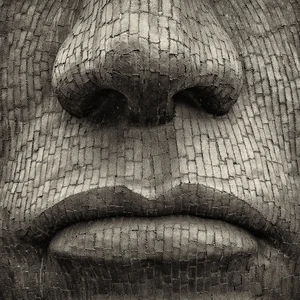
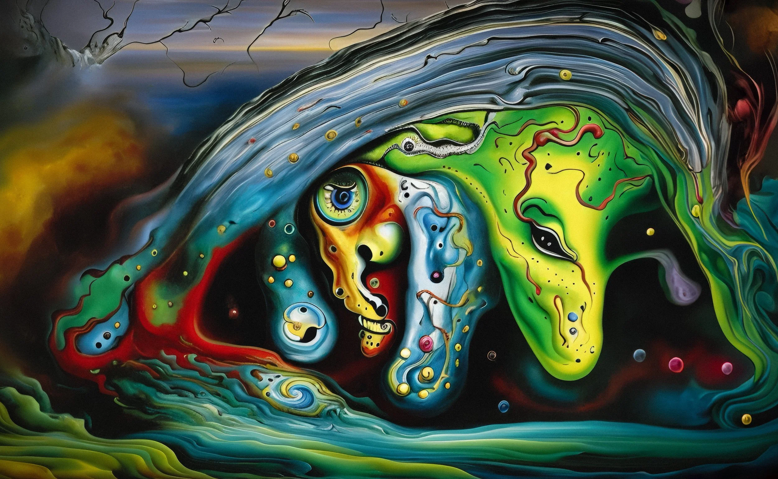
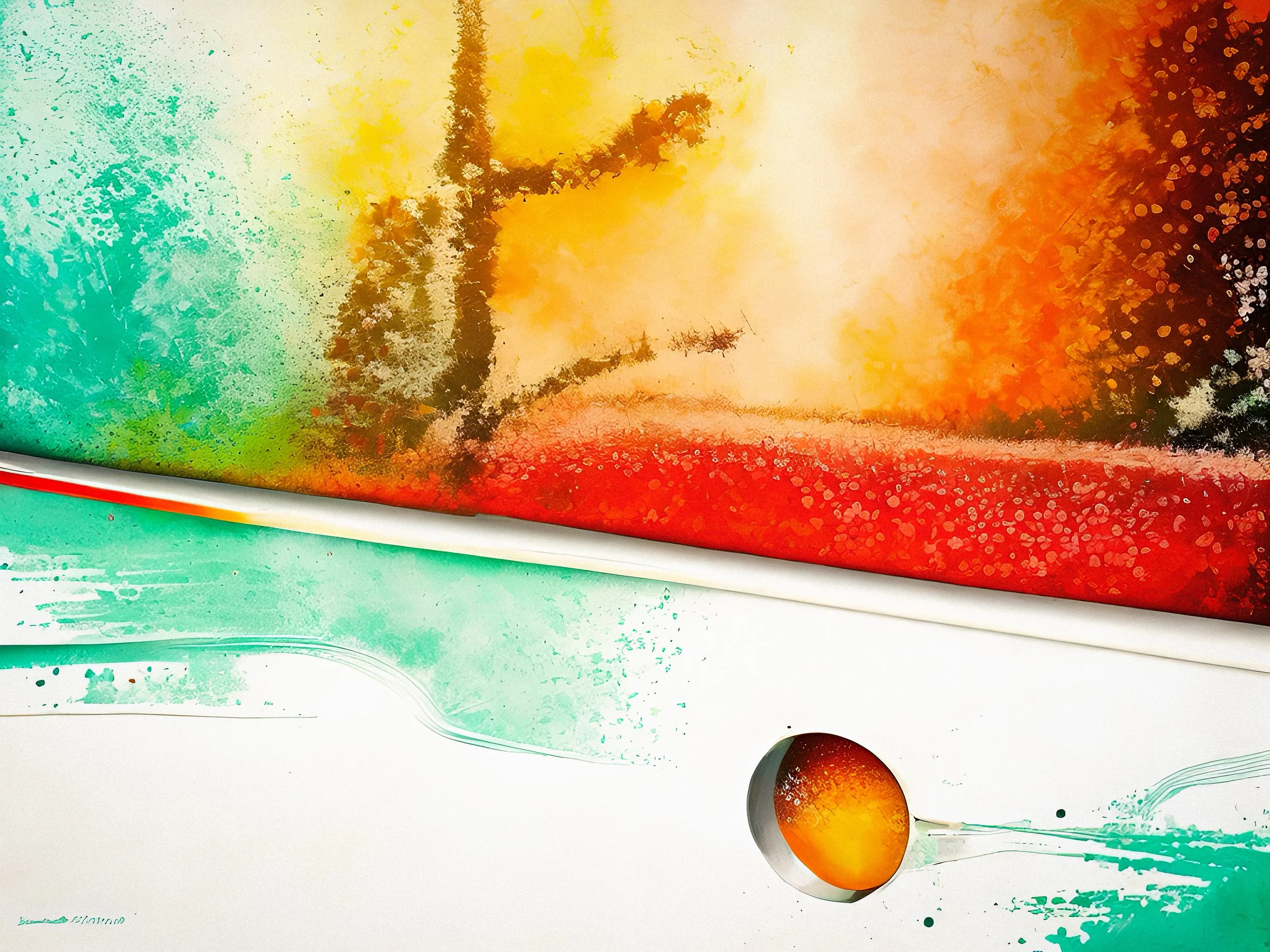
The word "abstract" can make people nervous — it summons images of gallery walls and artists explaining at length what their work is really about. Forget all that. In practical photography terms, abstract simply means that you are emphasising shape, form, colour, texture, and pattern rather than the literal identity of what you are photographing. The result does not need to be completely unrecognisable. It just needs to be primarily felt rather than primarily identified. A viewer looking at a well-made abstract photograph should find themselves thinking "that's beautiful" before they wonder "but what is it?"
This shift in thinking is enormously liberating, especially if you are starting out and feel vaguely inadequate because you do not own a telephoto lens or live near a mountain range. Abstract photography rewards attention and patience over expensive kit. Your smartphone is a perfectly capable instrument for it. The subject matter is literally everywhere. The barrier to entry is only learning to see.
And that, as it happens, is the interesting part.









Learning to See Abstractly
There is a useful observation about children and photography: if you hand a small child a camera, they will almost certainly photograph things differently from adults. Adults look at the big picture — the landmark, the person, the event. Children get down on the floor and photograph the pattern in a tile, or the way light falls across a tablecloth, or their own hand from three centimetres away. They have not yet learned to edit out the "insignificant" detail. In some respects, they see more than we do.
The goal of abstract photography is to recover some of that quality of attention. It is not about being childish; it is about being genuinely curious about the visual world rather than scanning it for familiar categories.
Shoot Less, See More
Most photographers, at some stage, go through a phase of shooting enormous quantities of images in the hope that something good will emerge from the pile. This strategy produces large hard drives and vague disappointment in roughly equal measure. Abstract photography is an antidote to it.
When you approach a subject with the intention of making an abstract image, you have to slow down. You have to look at the surface in front of you properly — the way light plays across it, the rhythm of the pattern, whether there is a detail that is more compelling than the whole. You probably shoot fewer frames. Each one is more considered. The photograph you make is a record of a moment of genuine visual attention.
This is the principle sometimes called "shoot less, see more." It is not a productivity tip. It is a change in relationship to what you are photographing. You are not harvesting images; you are observing something carefully and deciding that it deserves to be a photograph.
The Found Geometry Walk
Here is a practical exercise that many photographers find quietly revelatory: walk a route you know well — your commute, the walk to the shops, your own street — but set yourself one specific constraint. You are only allowed to photograph geometric patterns.
No people, no landscapes, no street scenes. Just shapes: grids, repeating triangles, parallel lines, the curve of an arch, the way iron railings cast their shadows onto a wall. Square drain covers. The brickwork around an arched doorway. The lattice of a security screen. The stacked circles of a ventilation grille.
Most people who try this are surprised by how much they find. The visual world is saturated with geometry, and we walk past almost all of it every day without noticing. After the walk, go through what you shot and notice which patterns drew your eye most consistently. That tells you something about your visual preferences, which is genuinely useful for developing your own photographic voice.
You can run the same exercise with other constraints: only look for colour contrasts. Only look for texture. Only look for reflections. Each one trains a different aspect of visual attention, and each one will produce a set of photographs you would not otherwise have made.
Finding Your Subjects
The short answer to "where do I find abstract subjects?" is "everywhere." The less glib answer requires a bit more specificity.
Natural Textures
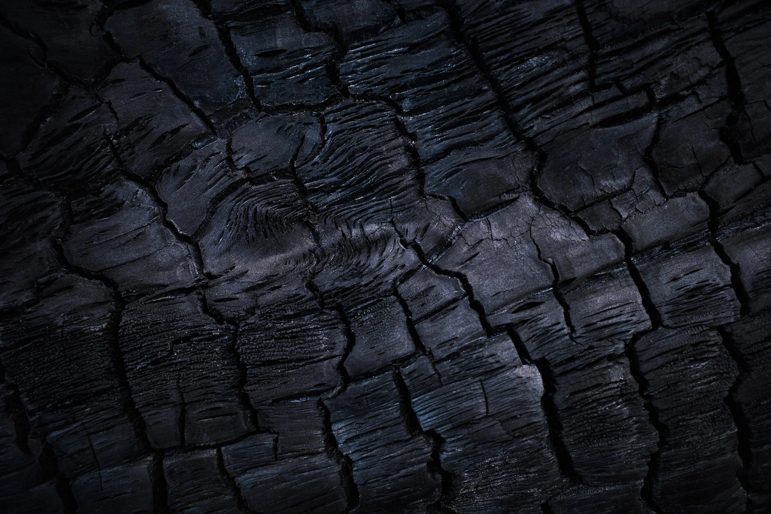
The natural world is an inexhaustible source of abstract material, and the great advantage of natural textures is that they are irregular. They have variation. They have history — the tree bark that has split and healed, the rock face that has been weathered for centuries, the leaf that carries the pattern of its veins on a microscopic scale. That irregularity is visually interesting in a way that manufactured surfaces often are not.
Good starting points: tree bark (especially rough-barked species with deep furrows), lichen on stone, the surface of calm water with reflected light, dried river mud cracking in geometric patterns, sand rippled by water or wind, leaves both fresh and decaying, the scales of a pine cone, feathers, and the cross-section of any natural material you care to slice open.
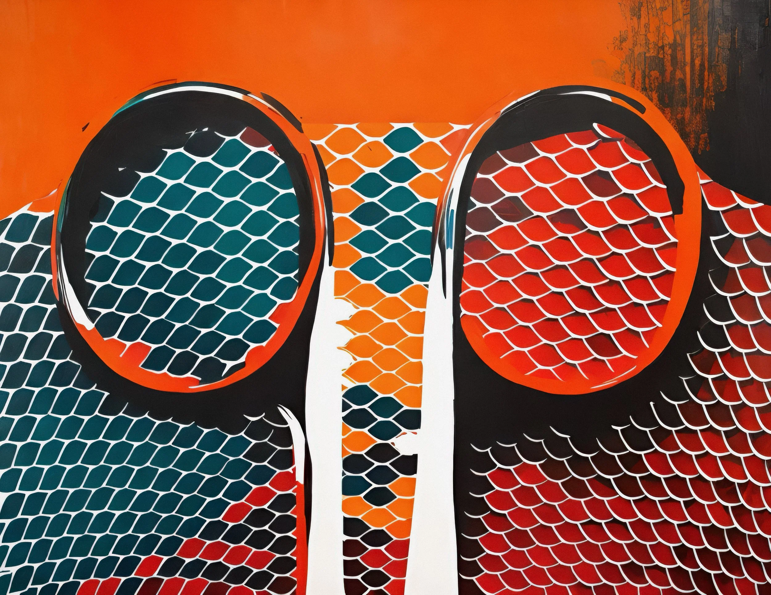
Some of the most rewarding abstract work happens at the very small end of the scale. Macro photography — working very close to your subject — reveals worlds that are completely invisible to the naked eye. The surface of a petal is not smooth; it is covered in microscopic structures that, at extreme close-up, look like an aerial photograph of a mountain range. The eye of an insect is a compound lens that looks, magnified, like a geodesic dome. You do not need a macro lens immediately, but be aware that this direction exists and is genuinely fascinating.
Manufactured Textures
Manufactured or constructed surfaces offer different qualities: repetition, regularity, geometric precision. Corrugated metal roofing. The regular course of brickwork. Woven textiles. Chain-link fencing. Stacked concrete blocks. Tightly packed roof tiles seen from above.
These subjects lend themselves to a more minimalist approach — the interest is in the pattern and its variations, the way light changes across a uniform surface. They can produce images that have an almost graphic quality, something closer to design than to conventional photography. That is not a weakness.
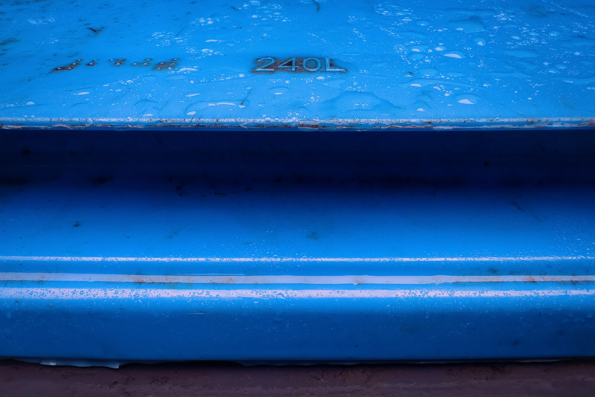
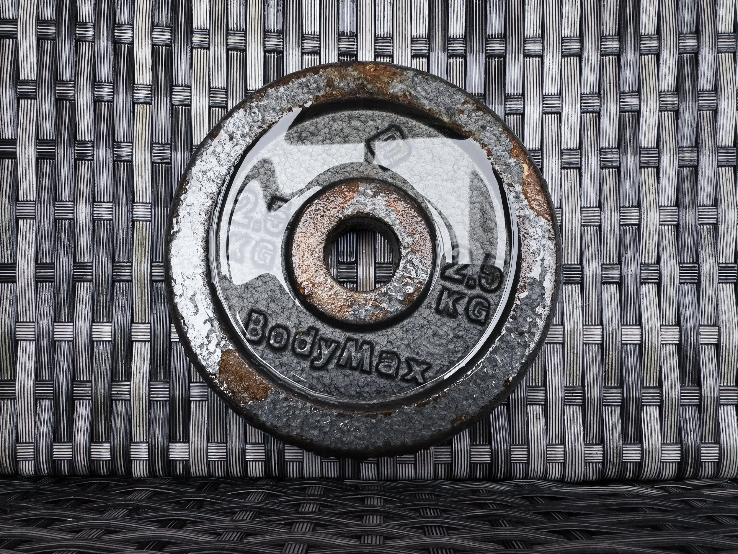
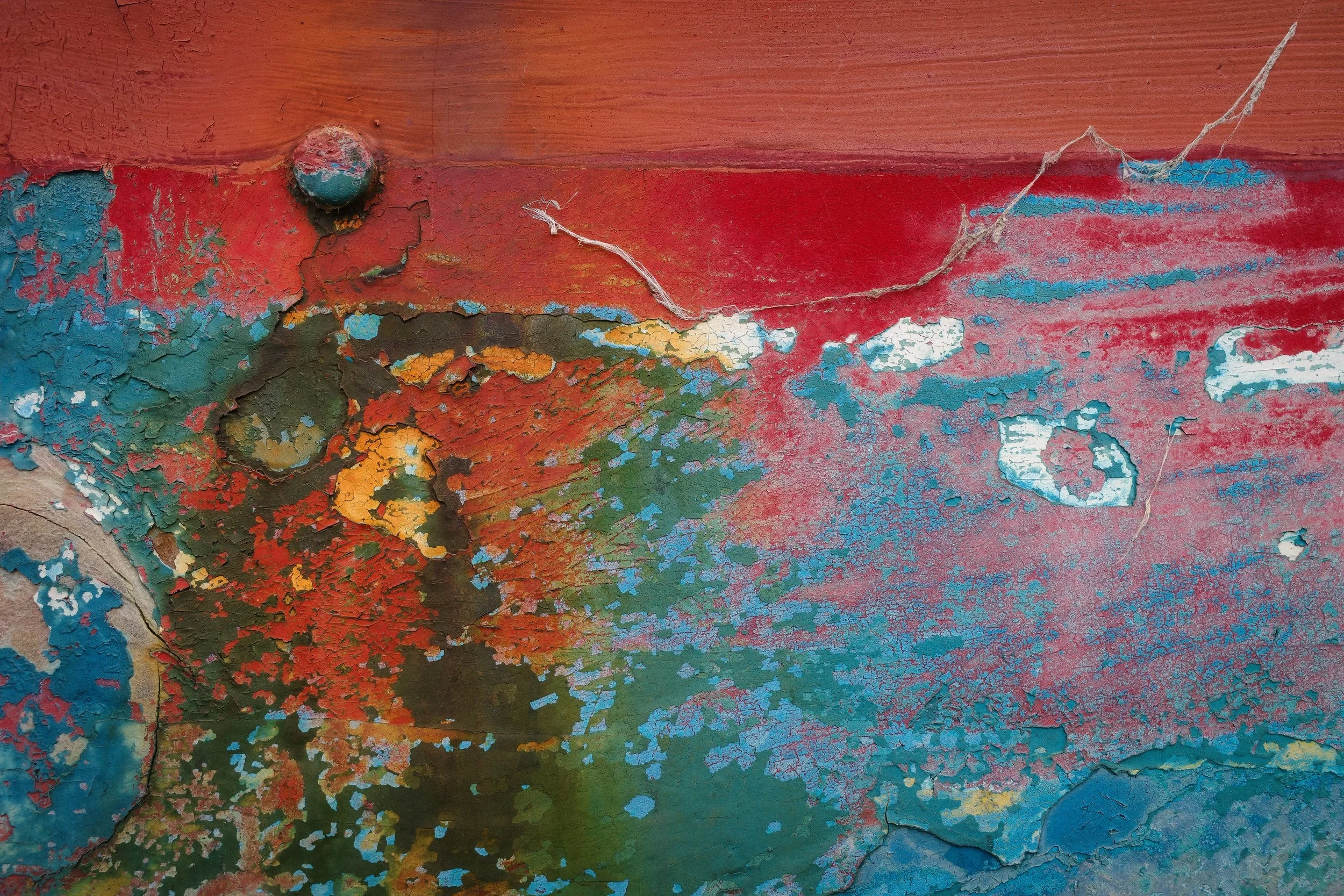
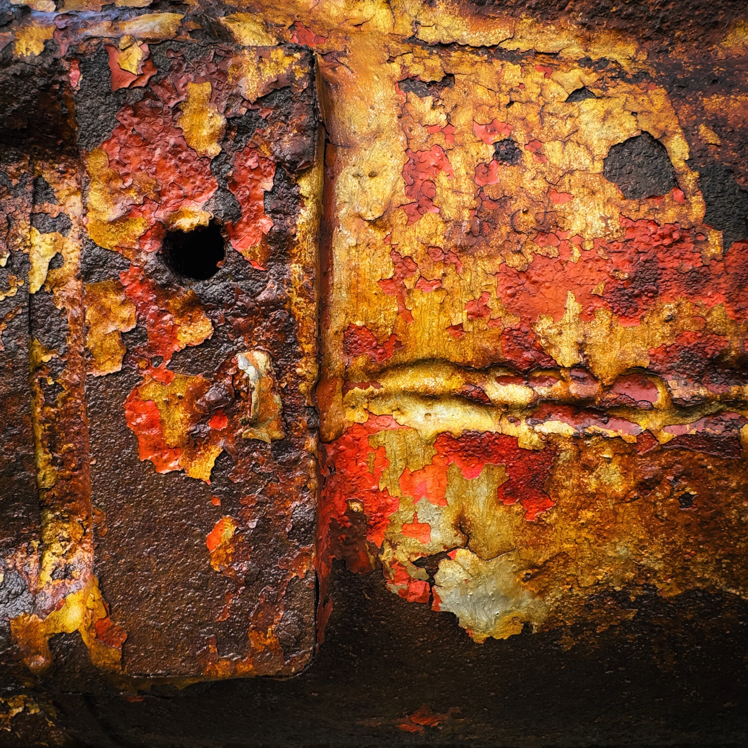
Weathered manufactured surfaces are especially rich: rusting corrugated iron, peeling painted metal, eroded concrete, crumbling plaster revealing layers of paint underneath. These surfaces combine the regularity of manufacture with the irregularity of aging. The result has character in a way that a fresh, undamaged surface rarely does.
Food and Everyday Objects
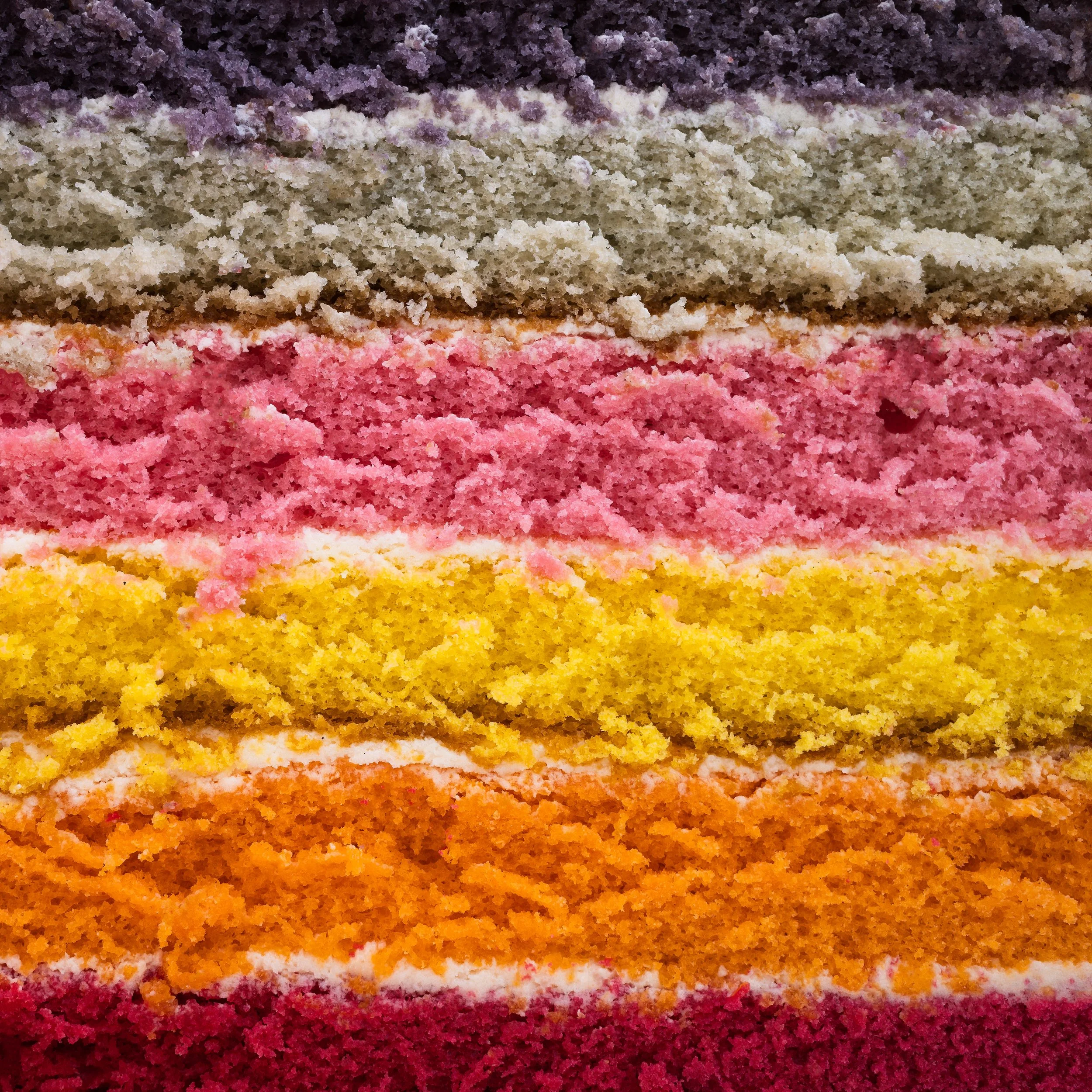
The kitchen is significantly underrated as a photography location. Citrus fruit cut in cross-section has extraordinary pattern — the radial structure of segments, the intricate network of pith, the translucency of the flesh against a light source. Bread with a serious crust. Cabbage leaves. The rings of a cut onion. The interior of a pomegranate. The crystalline surface of a sugar glaze.
These subjects have the advantage of being completely under your control. You can arrange the light. You can choose whether to add water droplets for surface interest. You can try multiple cuts of the same fruit at different angles. You have all the time you need.
Beyond food: fabric and textiles, the pages of an old book, a collection of similar objects arranged in a grid, the surface of a mirror or sheet of glass, coiled rope, stacked plates, the knurled grip of a tool.
Architecture and the Urban Environment
Buildings — particularly older ones, or brutalist concrete structures, or buildings with decorative facades — offer an enormous range of abstract material. Look upward: the surfaces you ignore at eye level often have compelling detail when viewed from below. Glazed curtain walls in modern buildings produce complex reflections. The shadows cast by architectural details across plain surfaces can be more interesting than the details themselves.
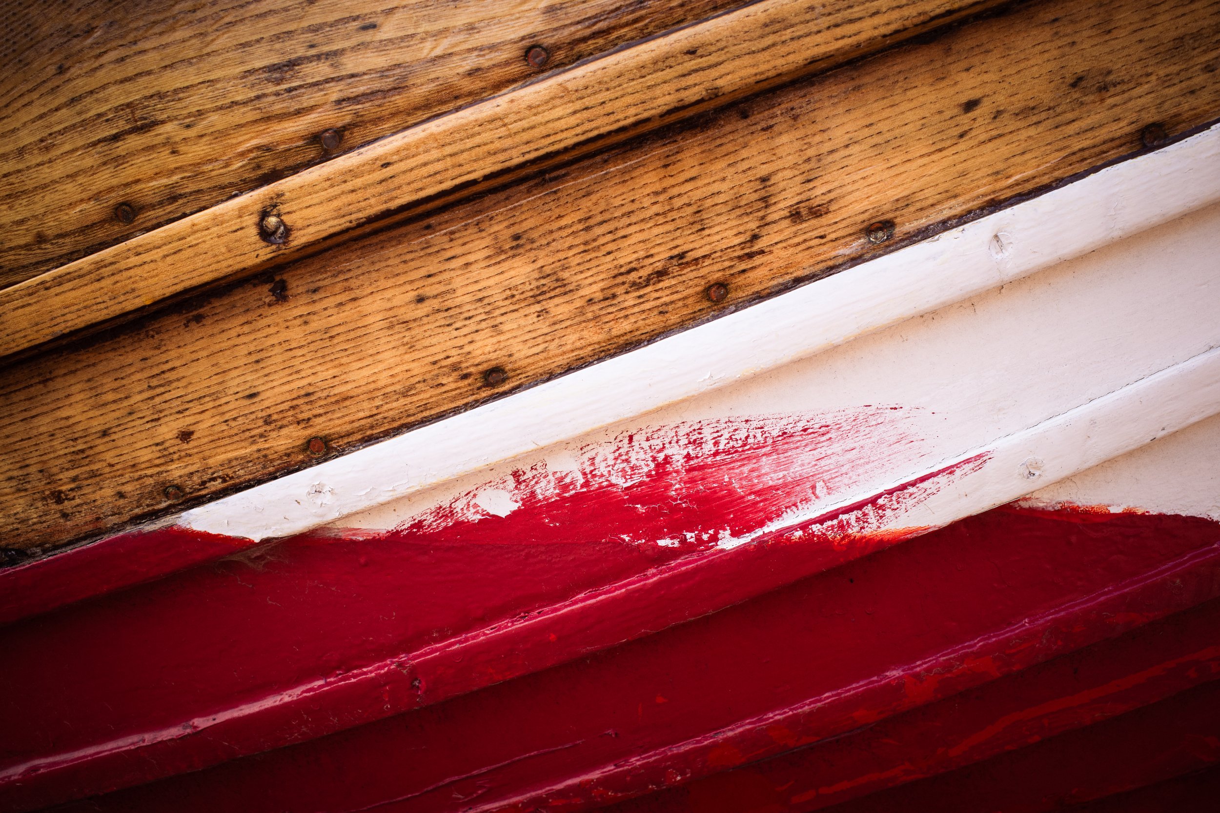
Peeling paint is a classic subject, and deservedly so. There is something compelling about the way paint ages — lifting at the edges, cracking along irregular lines, revealing the colour beneath. It has colour, texture, and pattern simultaneously. A flaking painted wall can produce a genuinely beautiful image.
Composing an Abstract Image
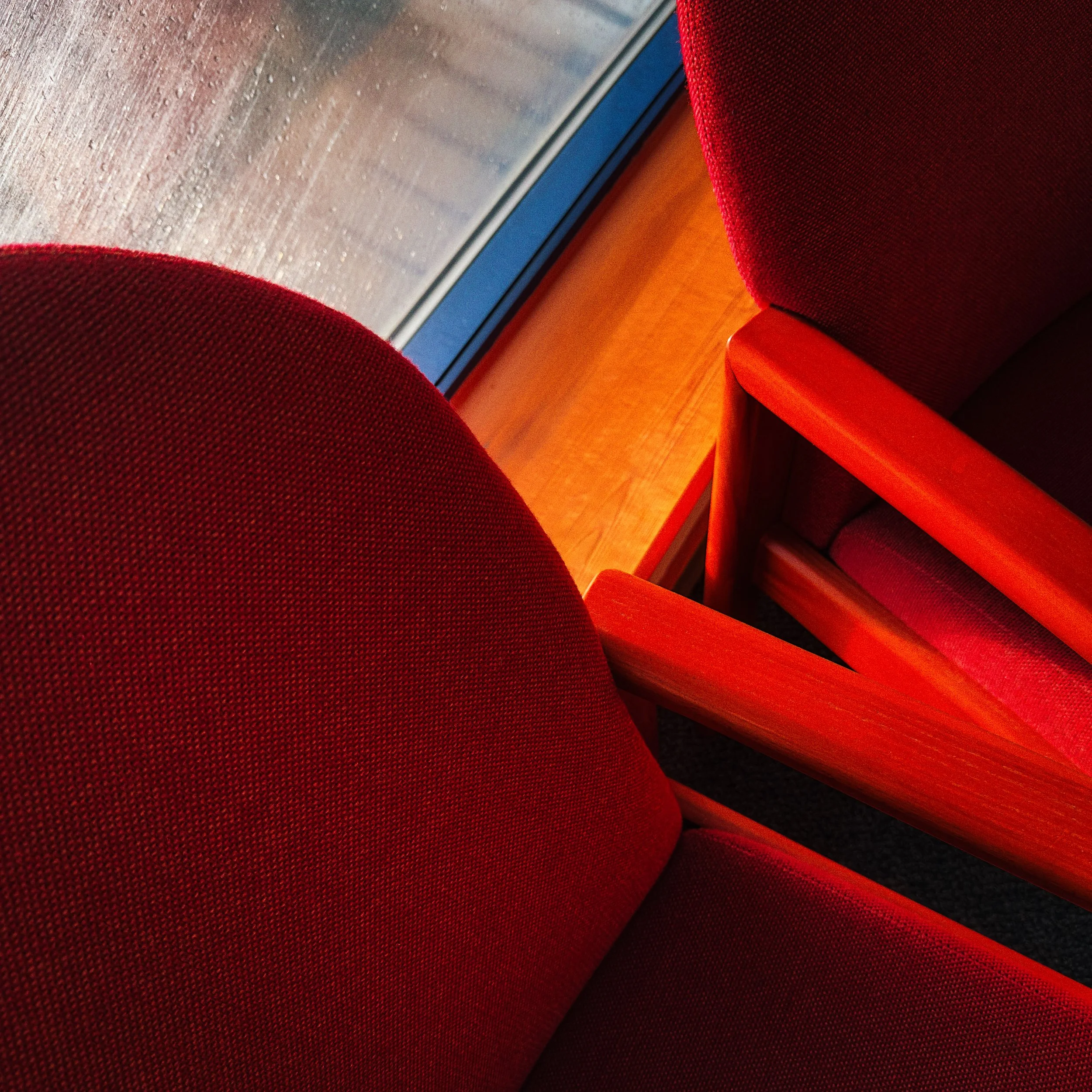
Composition in abstract photography is, in some respects, more demanding than in conventional photography — there is no natural subject to anchor the frame, so the arrangement of shapes, lines, and tones has to do all the work. The good news is that the classic compositional principles still apply, and in abstract work they become very visible, which makes them easier to study and learn.
Shape, Line, and Form
These are the three structural elements of abstract composition.
Shape is the flat outline of an object — a circle, a square, a triangle, an irregular polygon. In abstract photography, isolating a single strong shape and placing it well within the frame is often enough to make an image work. The shape does not need to be perfect; an almost-circle can be more interesting than a mathematical circle, because the eye notices the variation.
Line directs the viewer's eye. Straight horizontal lines convey stability and calm; vertical lines convey height and formality; diagonal lines create dynamism and movement. Curves are softer, more organic. When you compose an abstract image, notice where the dominant lines run and consider whether they are doing what you want them to do. A single strong diagonal line can transform an otherwise static composition.
Form is shape given depth — the three-dimensionality created by lighting. This is where light becomes compositional rather than merely practical. A spherical stone lit from the side is not just a circle in the frame; it is a three-dimensional object, and the gradation of tone across its surface tells the eye about its volume. Understanding this will change how you approach lighting for texture work.
The Rule of Thirds in Abstract Context
The rule of thirds tells you to place points of interest along lines that divide the frame into thirds, both horizontally and vertically. It is ubiquitous advice in photography, and it works. It applies in abstract photography too, though it requires some translation.
In abstract work, the "point of interest" might be the edge of a pattern, a change in tone, the junction of two different textures, or the one area of a uniform surface where something irregular occurs. Look for what draws your eye in the scene and consider whether moving it to a third-line position strengthens the image.
One note of caution: the rule of thirds is a starting point, not a law. Centred compositions can work beautifully when a subject has strong bilateral symmetry — the face of a flower, a radially patterned surface, a reflection. The point is to make a conscious decision rather than defaulting to whatever the camera's autofocus happens to land on.
Filling the Frame vs Negative Space
There are two opposite strategies in abstract composition, and both are valid.
Filling the frame means eliminating all context. The texture or pattern extends to all four edges; there is no sky, no background, nothing to indicate scale or location. This approach produces images that are completely immersive and can be visually quite intense. It works especially well with strong repeating patterns, where filling the frame emphasises the rhythm.
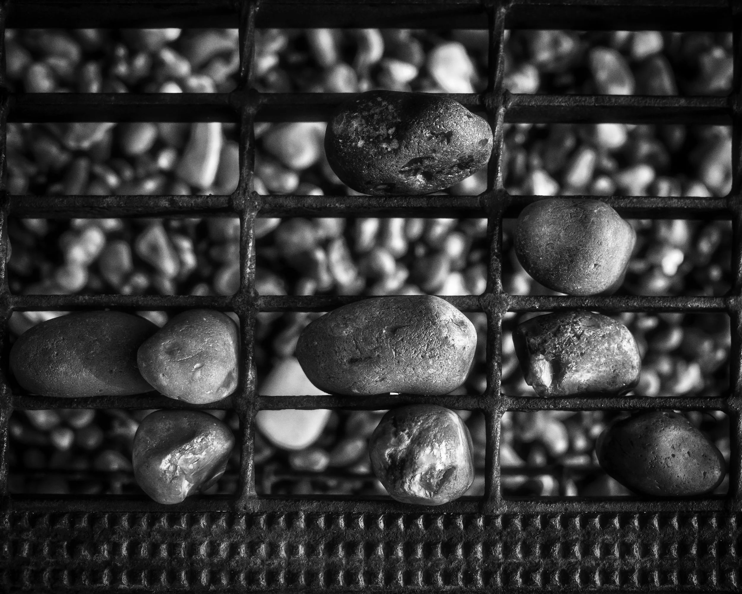
Negative space means allowing areas of plain, uninterrupted tone or colour to breathe alongside the main subject. A single pebble with an unusual surface, placed in the lower third of a frame with a large expanse of smooth sand above it, can be as striking as a frame-filling texture study — more so, sometimes, because the contrast between the detailed subject and the empty space gives each its full weight.
The choice between these approaches depends partly on the subject and partly on the mood you want to create. Dense, frame-filling patterns feel energetic; negative space feels contemplative. Neither is correct by default.
Aspect Ratios
The shape of your frame affects composition significantly, and it is worth thinking about deliberately rather than always shooting in the default ratio.
A square crop (1:1) suits symmetrical patterns and subjects with radial structure. It is also extremely forgiving of centred compositions — the equal dimensions on all sides make centring feel natural rather than lazy. Square crops work well for the kind of overhead flat-lay texture work you see done well with food photography.
A wide/panoramic crop (2:1 or wider) emphasises horizontal repetition — a row of windows, a band of strata in rock, a sequence of repeated objects receding into distance. The width of the frame becomes part of the composition.
A portrait (tall) crop works well for vertical structures — tree trunks, columns, dripping paint, anything with a strong vertical rhythm.
When you are shooting, try not to think of the crop as fixed at the point of capture. You can always crop in post. But it is worth composing with intent rather than always cropping to fill.
Light : The Texture Revealer
Light is, in all photography, the medium — but in abstract and texture photography, this truth becomes inescapable. Light does not just illuminate your subject; it reveals it. Change the light, and you change what the surface shows you.
Directional Light and the Shadow Effect
The single most important quality of light for texture photography is directionality. A single, clearly directional light source creates shadows. Shadows reveal texture. This is not complicated, but its implications are profound.
Consider a piece of rough stone. Lit by flat, diffused overhead light — like an overcast sky or a softbox directly above — the surface looks grey and rather dull. The irregularities are there, but the flat illumination fills in the shadows and reduces the apparent texture to almost nothing. Now light the same stone with a directional source from a low angle — a torch, a single lamp, late-afternoon sun raking across the surface. Every tiny bump casts its own shadow. The surface suddenly looks entirely different: dramatic, three-dimensional, alive.
This is the fundamental principle. Directional light creates shadows. Shadows reveal texture.
Low-Angle Lighting
Low-angle lighting means your light source is close to parallel with the surface you are photographing — nearly horizontal to it. This maximises the length of shadows cast by surface irregularities, which maximises the visible texture. It is the most useful lighting approach for texture work.
In natural outdoor light, this means shooting in the early morning or late afternoon/evening (the "golden hours") when the sun is low in the sky. Midday light is high and often flat; it is generally the worst time for texture photography outdoors.
Indoors, you create low-angle light deliberately. A table lamp positioned so that the light grazes across your subject. A torch held nearly horizontal to the surface. A window with the subject positioned at the edge of the light, so the rays arrive at a sharp angle. The specific light source matters less than the angle.
For flat-lay work — where you are shooting down onto a subject laid flat on a surface — the camera is above the subject and the light should still come from the side, low to the surface level. This gives you both the useful camera angle and the texture-revealing shadows.
Diffused vs Direct Light
Hard, direct light produces strong, well-defined shadows and high contrast. It is dramatic and can be very powerful for subjects with bold texture. But it can also overwhelm finer detail — if the shadows are too deep, the texture detail within them disappears.
Diffused light wraps around the subject, producing softer shadows with gradual edges. It shows detail in shadows that direct light would block out, but at the cost of some of that contrast and drama.
In practice, you often want something between the two extremes. A practical field technique: if your direct light source is too harsh, hold a sheet of tracing paper or baking parchment between the light and the subject. This diffuses the light without losing the directionality entirely — the shadows become softer but are still present.
For indoor work with a small subject, a single LED panel (something like the Smallrig P96L RGB panel, which is compact and controllable) gives you directional light with adjustable intensity and colour temperature. This kind of control lets you experiment quickly without setting up a full lighting arrangement.
The Torch Test
If you are unsure whether a subject has texture worth photographing, try the torch test: shine a torch (or your phone's torch function) across the surface at a low angle in a dim room. This exaggerates what good directional light will do in a more controlled way. If the surface comes alive under the raking torch light, it will photograph well. If it looks flat even then, there probably is not much to work with.
Smartphone Techniques
Your smartphone is a more capable tool for abstract photography than you might expect. The constraints it imposes — primarily the fixed aperture and the very short focal length of the main camera — are, in this context, often assets.
Close Focus and Macro Work
Modern smartphone cameras can focus very close to a subject — typically around 10–15 cm at the minimum. This is closer than a standard camera lens can manage without accessories, and it is close enough for many texture subjects. However, there is a catch: focusing accurately at minimum focus distance on a smartphone requires holding the camera completely steady, because the depth of field at that range is extremely shallow.
For very close work — insect-scale close, or wanting to fill the frame with a coin-sized subject — a clip-on macro lens is the simple and inexpensive solution. These typically come in 10x, 15x, and 20x magnification options. At 10x macro, you are photographing areas only a few centimetres across, and the resulting detail can be remarkable. At 20x, you are essentially doing microscopy, and camera shake becomes a serious challenge.
If you use a clip-on macro lens, use a tripod. There is no way around this. At high magnification, even breathing will blur the image.
Stability : Tripods and Steady Surfaces
Camera shake is the enemy of close-up photography. The magnification that makes a macro subject look interesting also magnifies any camera movement. For anything below about 30 cm subject distance, you should be working from a tripod or a firm surface.
A tabletop tripod is practical and inexpensive. Brands like Neewer, Smallrig, and K&F Concept all make usable options in the £20–40 range. The specific model matters less than the principle: the camera should not be moving when you press the shutter. Use the self-timer (even 2 seconds is sufficient) to eliminate the vibration of pressing the shutter button.
For outdoor work where a tripod is impractical, press the camera firmly against a wall or rest it on a surface. Use both hands. Take a breath out before pressing the shutter.
Portrait Mode for Texture
Portrait mode on modern iPhones (and the equivalent on other smartphones) applies a simulated depth-of-field effect using computational photography. At normal portrait distances this is designed to blur backgrounds behind people; but at close range, pointed at a textural subject, it can produce something quite different and rather useful: a very shallow focus zone across the surface, with natural-looking blur falling away behind.
This is not exactly what portrait mode was designed for, and the results are not always consistent, but when it works well it can isolate a small area of texture in a way that feels genuinely photographic rather than processed.
Manual Controls
The default automatic settings on a smartphone camera are optimised for general snapshots, which means they make decisions that are not always appropriate for deliberate abstract work. Most iPhones and Android smartphones have some degree of manual control either built in or accessible via third-party apps.
The key controls to understand:
ISO: This controls the camera sensor's sensitivity to light. Lower ISO (64–200) produces cleaner images with finer grain. Higher ISO introduces noise, which in texture photography is a problem — the noise competes visually with the actual texture. Always use the lowest ISO the lighting conditions will allow.
Shutter speed: For handheld close-up work, use fast shutter speeds (1/200 sec or faster) to eliminate camera shake. For intentional blur effects (covered below), slow shutter speeds are the whole point — but use a tripod.
Focus lock: Tap and hold on your subject in the iPhone camera app to lock focus and exposure. This is essential for close-up work where the camera's autofocus tends to wander. Once focus is locked, it stays locked even if the camera moves slightly.
Third-party apps like Halide (iOS) or Camera FV-5 (Android) give you full manual control and, critically, the ability to shoot RAW files.
Shooting RAW
If your phone supports RAW capture (most modern smartphones do, via third-party apps), use it for abstract photography. RAW files retain far more information than JPEG images, which gives you significantly more latitude in post-processing — especially when working with subtle tone gradations in texture, where JPEG compression can destroy fine detail.
The files are larger, and they require processing before you can share them, but for serious texture work the difference in quality is real.
Focus Stacking for Macro Work
When working at very close focus distances, the depth of field — the zone of the image that appears sharp — becomes vanishingly thin. At true macro magnifications, it may be only a millimetre or two deep, which means that even a slightly curved surface will have areas that are out of focus.
Focus stacking is a technique that solves this by combining multiple photographs taken at slightly different focus distances. Each frame captures a different slice of the subject in sharp focus; the stack combines the sharpest parts of each frame into a single image with greater apparent depth of field.
On a smartphone, this is not (yet) a common built-in feature, but the app Focos on iOS allows a version of this approach. For the technically inclined, you can also shoot a series of frames manually by adjusting focus incrementally between shots, then combine them in desktop software like Lightroom or Zerene Stacker. For complex macro subjects — a flower head, a textured stone, a piece of jewellery — the results are worth the effort.
Other Abstraction Techniques
Abstract photography is not only macro work. There is a whole range of techniques that produce abstracted images from subjects at normal distances — some of them familiar, some perhaps surprising.
Intentional Camera Movement (ICM)
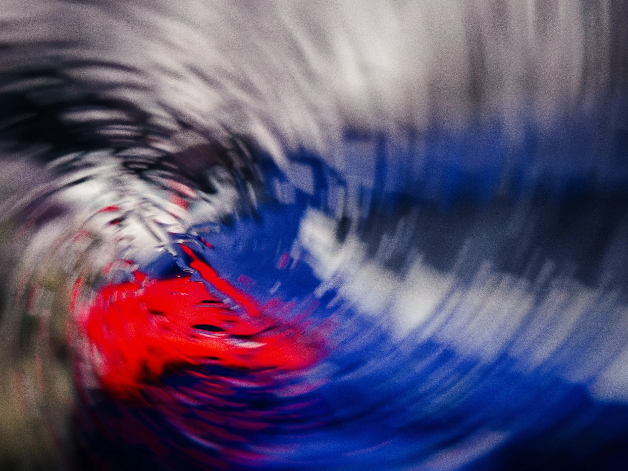
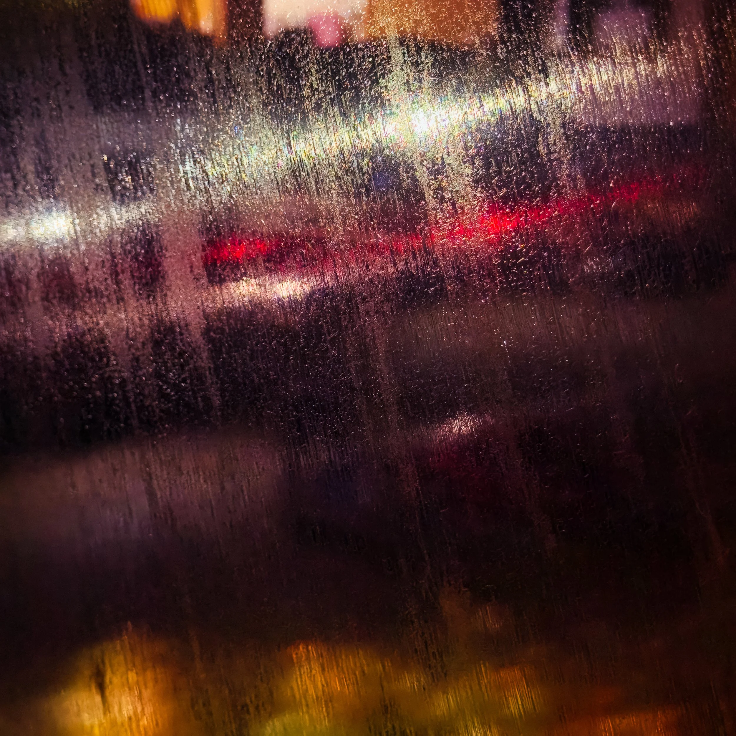
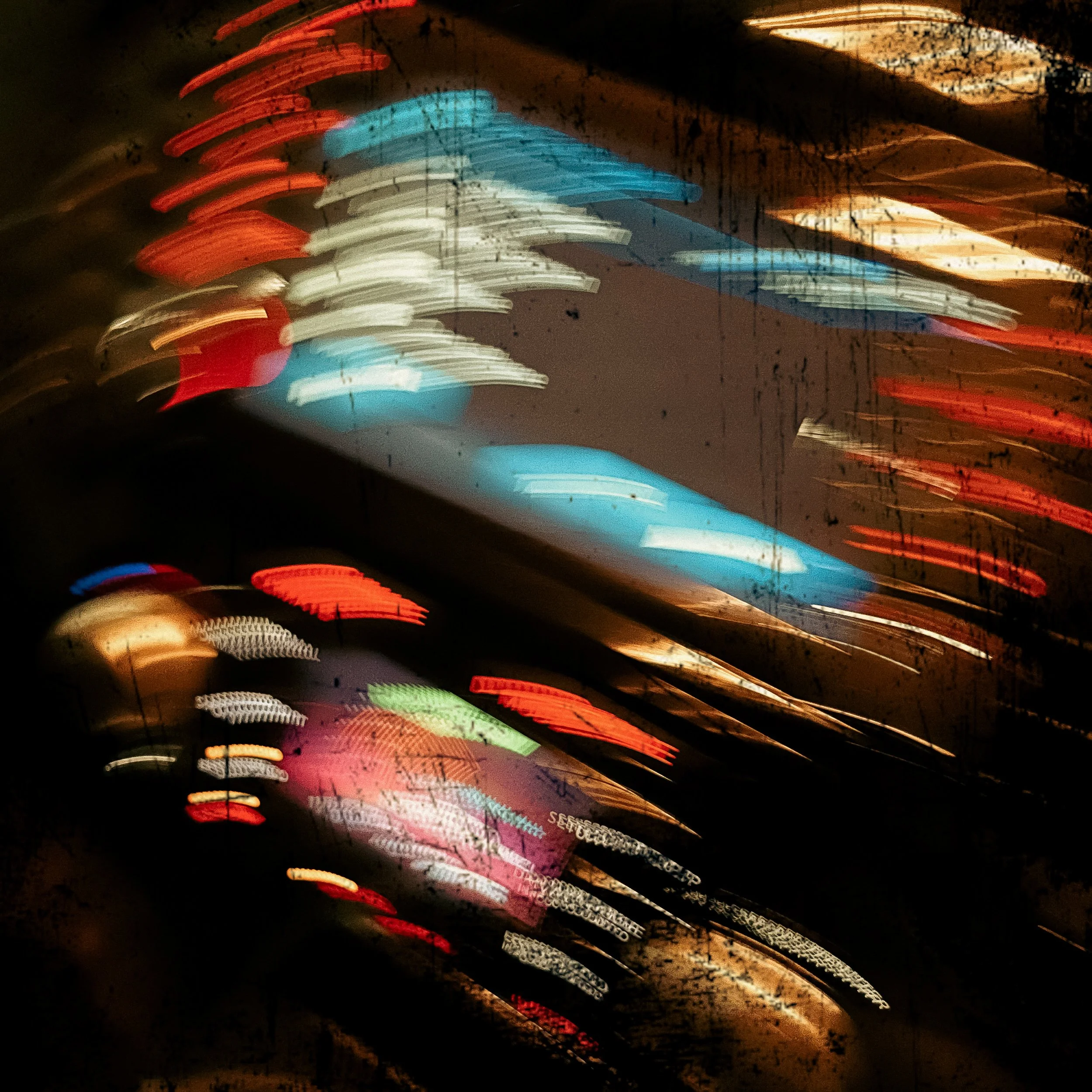
Intentional Camera Movement (ICM) is exactly what it sounds like: you deliberately move the camera during a long exposure. The result is not a mistake — it is a painting made with motion blur.
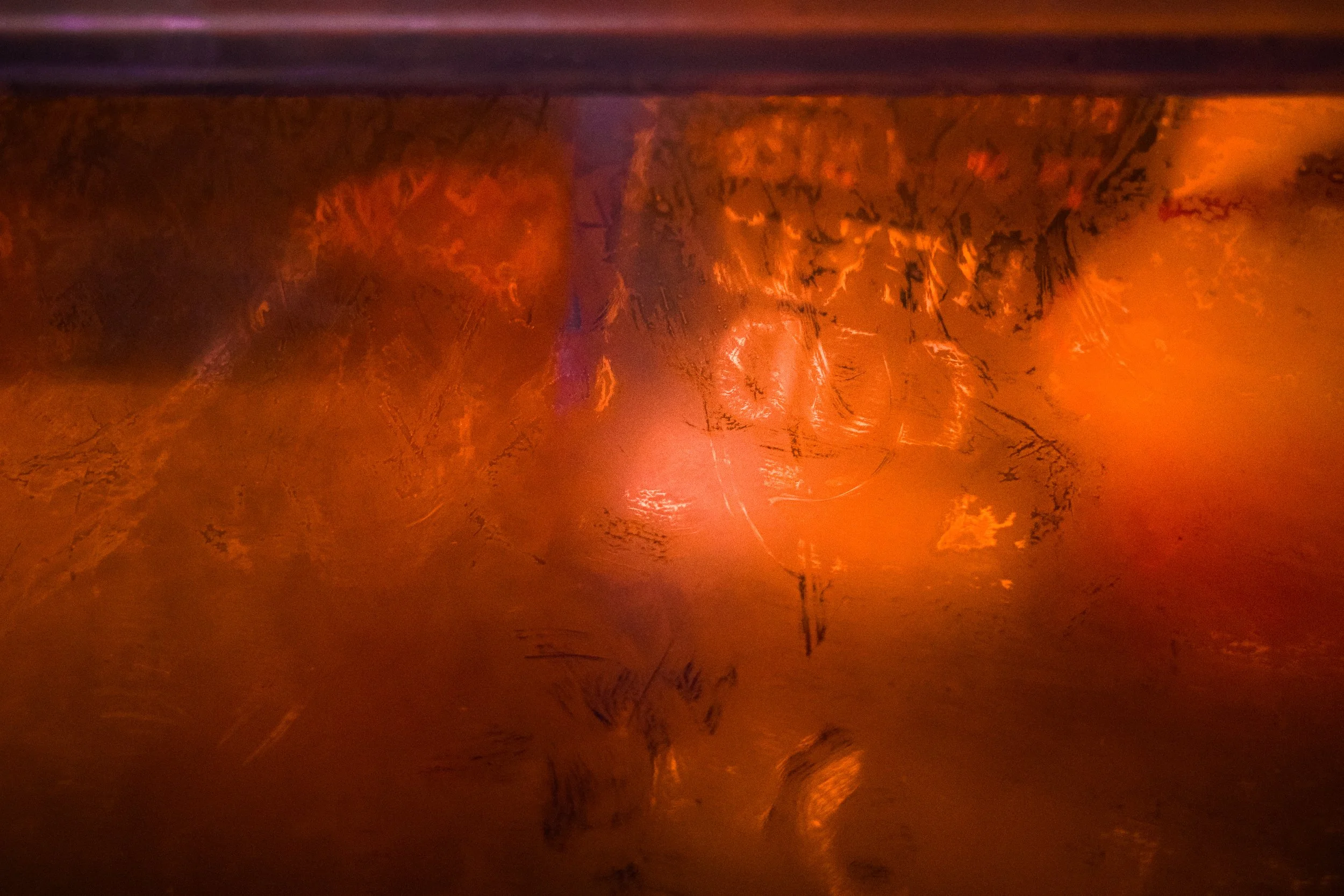
The technique requires a slow shutter speed, typically somewhere in the range of 1/15 sec to several seconds, depending on the speed and character of the movement you make. Vertical movement produces vertical streaks; horizontal movement produces horizontal streaks; rotating the camera produces circular blur; a small, gentle up-down oscillation produces a dreamy, soft effect that is useful with foliage or light sources.
Good subjects for ICM: trees and foliage (a vertical pan through a forest canopy at 1/8 sec produces something that looks like a Japanese ink wash painting); water with reflections; light sources at night; fields of crops or grass. Almost anything with interesting colour or tonal variation can work.
To practise: set your phone or camera to its lowest ISO, add a neutral density filter if the light is bright, and set the shutter to somewhere around 1/15 sec to start. Use a slow, deliberate vertical movement for the first experiments — it is the most controllable. Take many frames; ICM is inherently unpredictable, and a ratio of one keeper in twenty is entirely normal. The unpredictability is part of the point.
Telephoto Compression for Texture Studies
Wide-angle and standard focal lengths give you the world as it roughly appears to the eye. A telephoto lens (or the telephoto camera on a modern smartphone) does something different: it compresses perspective, making objects that are at different distances appear to be close together in the same plane.
This is enormously useful for texture photography because it allows you to fill the frame with a distant surface — a patterned brick wall seen from across the street, a field of lavender rows, a hillside of heather, the corrugated surface of a building facade — in a way that loses the sense of depth and turns the scene into an almost flat pattern. The compression removes the visual cues that tell us we are looking at something three-dimensional.
iPhone users: the 3x telephoto camera (where available) is excellent for this. For more compression, move further from the subject and zoom in more.
Polarising Filters
A polarising filter fits over your lens (clip-on versions are available for smartphones) and blocks light waves oscillating in certain directions. In practice, this means it reduces or eliminates reflections from non-metallic surfaces — particularly important for water and glass.
For texture photography, the key benefit is that a polariser can reveal detail that reflections are hiding. A wet rock surface without a polariser shows you mostly the reflection of the sky; with a polariser, you see the surface of the rock itself. The texture of stone under water becomes visible. The pattern in a pane of glass is revealed because the distracting reflected image is suppressed.
Polarisers also increase colour saturation in blue skies and reduce haze, which can be useful for landscape-scale texture work, and they deepen the surface texture of foliage by eliminating the reflective sheen on leaves.
The one limitation: polarisers only work on reflections. They have no effect on reflections from metallic surfaces, and they do not reduce specular highlights from light sources directly.
Reflections
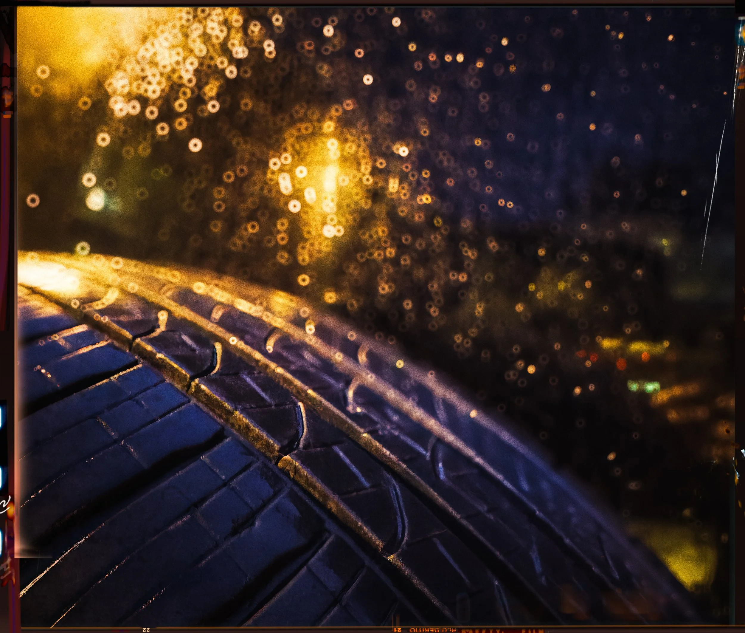
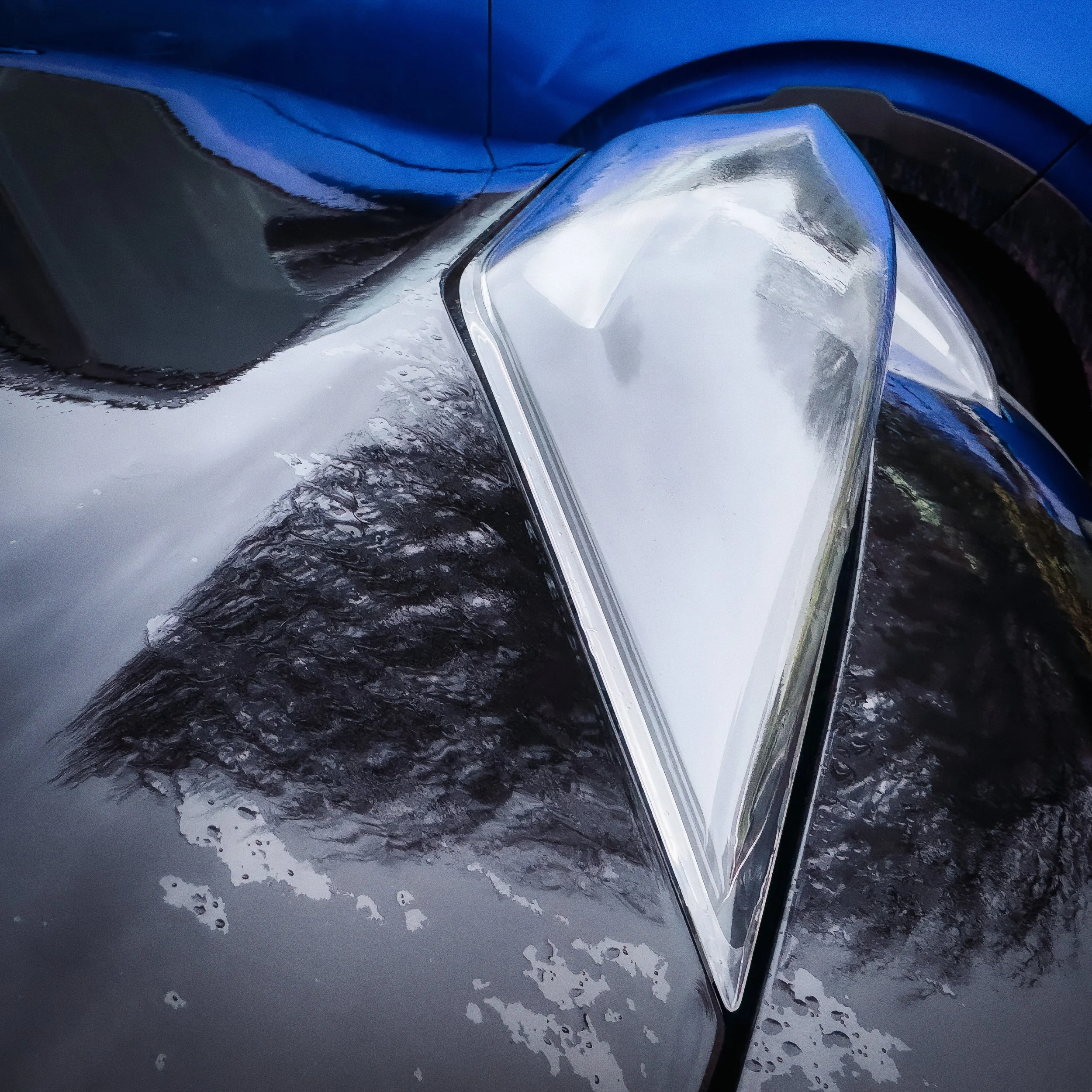
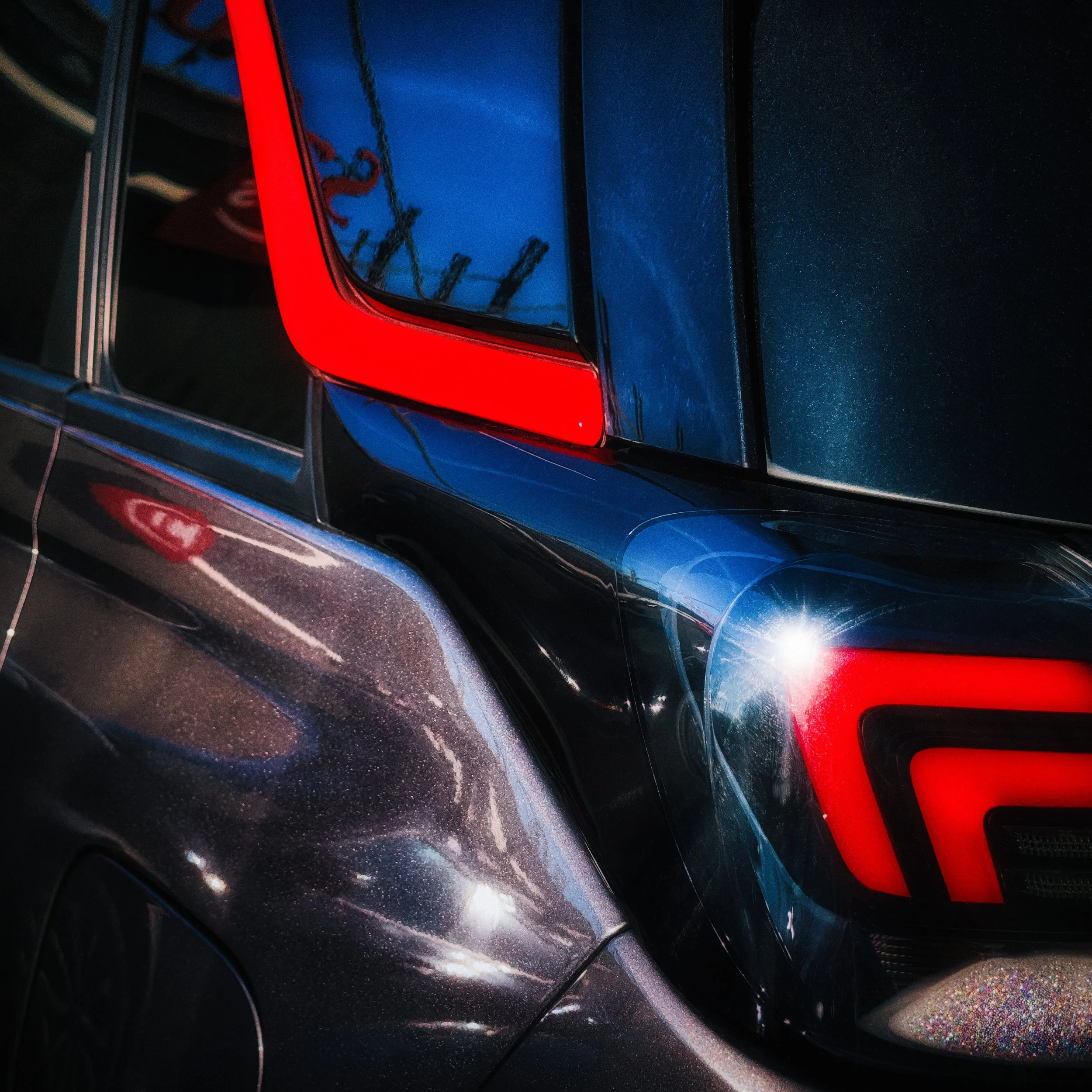
Reflections are naturally abstract — they distort, fragment, and layer the world. A calm water surface reflects the scene above it with near-photographic accuracy; introduce a slight breeze and those reflections fragment into broken colour and shape. A convex mirror in a car park shows an entire fisheye-distorted landscape in a circle. A puddle after rain fragments the surrounding buildings into angular shards. The polished surface of a dark car shows a continuous distorted panorama of everything around it.
Look for reflections not just in water but in glass, polished stone, windows, chrome fixtures, and any wet surface. The key compositional principle: decide whether the reflection or the real world is your subject, then eliminate (or at least minimise) the other one. Trying to include both equally often produces confused images. Tilting the camera to exclude the original subject and fill the frame with its reflection alone is often the better choice.
Multiple Exposures
Many cameras and some smartphones allow in-camera multiple exposures — combining two or more frames into a single image at the point of capture. This is a genuinely interesting technique for abstract work, though it requires some experimentation to understand how the tonal blending works.
The most useful approach: expose once for your main subject and a second time for a texture that you want to overlay. A portrait with a wood grain texture overlaid produces a painterly result. A flower photographed twice — once sharp, once deliberately out of focus — produces a dreamy layered effect.
If your camera does not support in-camera multiple exposures, the same effect can be achieved in post-processing in Lightroom or Photoshop using layer blending. The principle is the same; the control in post is greater.
Colour Isolation and Monochrome
Colour is a powerful attractor of attention. In many abstract photographs, colour is part of the point — the blue-green of oxidised copper, the warm ochre of sandstone, the vivid orange of rust. But colour can also be a distraction, preventing the viewer from engaging with the pure structure of a texture.
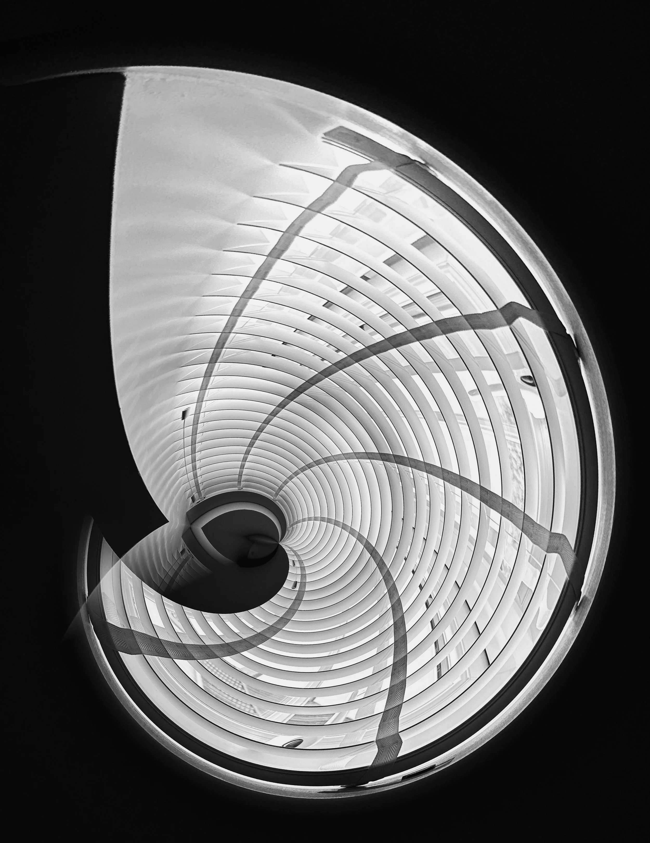
Converting an abstract image to black and white strips out colour entirely and forces the eye to engage with tonal contrast, texture, and form. This is particularly valuable for subjects where the colour is undramatic (a grey concrete surface, a sand dune under flat light) but the surface texture is compelling. Remove the dull colour and the texture, revealed by directional light as a sequence of tones from near-white to near-black, becomes the entire image.
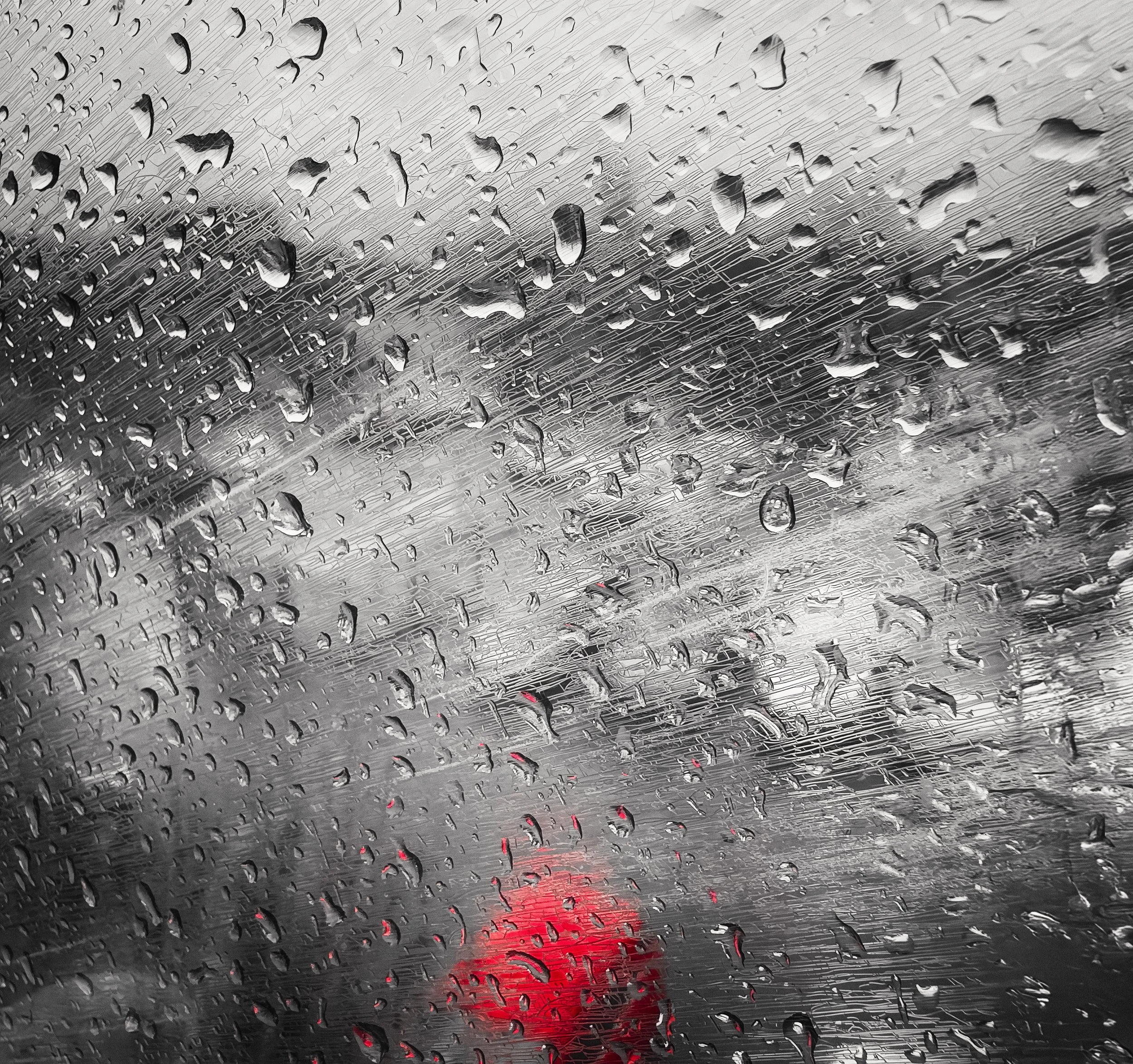
In Lightroom Mobile, the HSL (Hue, Saturation, Luminance) panel lets you convert individual colours to grey while leaving others intact — a technique called selective colour or colour isolation. You might, for example, desaturate everything except a single red element in the frame, leaving it as the only colour in an otherwise monochrome image. Used carefully, this is striking; used carelessly, it looks like the kind of image editing that was briefly fashionable in 2009. Be sparing.
For monochrome conversions, do not simply desaturate — use the B&W conversion tools that let you control how each colour channel is rendered as grey. Lightroom's B&W mix (or similar controls in Snapseed) lets you lighten or darken specific colours in the monochrome conversion, giving you considerable control over the final tonal relationships.
Editing Your Abstracts
The editing of abstract and texture images is a subject of real nuance, because post-processing has an unusual relationship with texture. Many of the tools that are normally beneficial — sharpening, noise reduction, contrast enhancement — can actively damage texture if applied without care.
Sharpening : Less Than You Think
The instinct when editing a texture image is to add sharpening to bring out the detail. This is partly right and partly dangerous.
Careful, targeted sharpening on fine-detail areas can increase the crispness of texture in a way that looks natural. Aggressive sharpening on everything creates what photographers call "crispy" artefacts — edge halos, false fine detail, a processed look that says "this has been edited" rather than "this is a real surface." These artefacts are particularly visible in texture photography because the viewer is paying close attention to the surface detail.
In Lightroom, use the masking slider in the Detail panel to confine sharpening to areas of genuine edge detail rather than applying it globally. In Snapseed, the Sharpen tool is relatively gentle; the Structure tool (see below) is usually more useful.
Apply sharpening as one of the last steps in your edit. View your image at 100% magnification when assessing sharpening — at smaller zoom levels, artefacts are invisible and you will oversharpen.
Contrast, Texture, and Clarity Sliders
Lightroom Mobile introduced dedicated Texture and Clarity sliders that are genuinely excellent for this kind of work.
Texture operates on mid-frequency detail — the kind of surface texture that makes stone look like stone and fabric look like fabric. It enhances this detail without affecting the fine-grain structure or the large-scale tonal contrast. For texture photography, it is the most precise tool available in consumer software. Small adjustments have significant visible effect; a value of +20 to +30 is often plenty.
Clarity operates on larger-scale contrast — the micro-contrast at the edges of tonal areas. It is useful for giving images a punchy, three-dimensional feel, but it can create halos around edges if pushed too far. Use it more sparingly than Texture.
Contrast, in the basic adjustments panel, affects the whole tonal range. A gentle S-curve (lift the highlights slightly, deepen the shadows slightly) adds depth without crushing detail. Be particularly careful about crushing the shadows in texture images — the detail that directional light reveals in the shadow areas is often the most interesting part of the image.
Snapseed's equivalent of Lightroom's Texture slider is the Structure tool within its Details adjustment. It works similarly and is worth exploring if Lightroom is not part of your toolkit.
Noise Reduction: The Texture Trap
Noise reduction is the most dangerous editing tool for texture photography. Automated noise reduction works by identifying areas of fine variation in tone and smoothing them out. The problem is that fine tonal variation is also what texture looks like. The algorithm cannot always tell the difference between noise and the actual surface grain of, say, rough stone.
The result of over-zealous noise reduction on a texture image is a surface that looks like it has been slightly smeared — smooth in a way that real stone or bark or fabric is not. The texture that the directional light so carefully revealed is partially erased.
The practical approach: shoot at a low ISO (64–200 on your phone, 100–400 on a camera) so that noise is minimal to begin with, and then apply noise reduction conservatively. Check the image at 100% magnification before and after to verify that you are smoothing genuine noise and not detail.
Lightroom's luminance noise reduction has a Detail slider within the Noise Reduction section; keeping this high preserves texture while reducing noise. Reduce Luminance first and use the Detail slider to recover surface information.
Monochrome Editing for Texture
When processing a monochrome texture image, the tonal editing is everything. Your goals are typically:
Strong, well-separated tones across the range (the directional light should have given you this to start with)
Preserved detail in both highlights and shadows — avoid blowing out the bright areas or blocking the dark areas
Sharpness that is visible but not processed-looking
Pulling up the Shadows slider and dropping the Highlights slider (the "filmic" approach) is often useful here, as it reveals detail at both ends of the tonal range. In Curves, a gentle S-shape increases local contrast without losing the endpoint detail.
Film emulation tools — such as DXO FilmPack's various film simulations — can add appropriate grain and tonal character to monochrome texture images. Ilford Delta 400's simulation, for example, adds a medium-fine grain that reads as texture in its own right and suits images with strong directional light.
Resources
This fascinating video from Ted Forbes at The Art of Photography explores the history and art theory of abstraction in photography. He says, “This video is likely my favourite of the Composition in Photography series that we've done so far. It was both difficult and interesting to research, and I'm excited to share a timeline of photography history with you as far as abstraction goes.”
This video, from the excellent landscape photographer Mads Peter Iversen, discusses the concept of abstract photography with a particular focus on the patterns and textures found in nature: “Abstract photography is a fascinating subgenre of photography. There are many approaches to it and in this video, I'll explain my three approaches to abstract photography in nature and landscape: "Clean Abstracts", "Resembling Abstracts" and " Abstract Vistas". To me, abstract photography is mainly about pattern recognition - a pattern that you usually just stumble upon. Enjoy the video!”at video
Here’s a great video from Alan Schaller, who takes us on a photo walk around central London while explaining his take on abstract photography, how to find and see interesting subjects and capture them: “In this months episode we cover the mysterious art of abstract photography. What makes things abstract, and how can you achieve it with your camera?”
Urban impressionist photographer Eva Polak talks about discovering abstract compositions in the city environment, spotting patterns in line, light, glass and tones: “Discover how to see the city in a whole new way. In this video, impressionist photographer Eva Polak guides you through the world of urban abstract photography—where concrete, glass, shadows, and reflections become your creative playground.”
Give it a Try!
Three exercises. Do all three, or start with the one that catches your eye.
Part One: The Geometry Walk
Take the route you walk most often — to work, to the shops, around the block — and walk it twice. On the first walk, just notice: make a mental or written list of every geometric pattern, repeating shape, or strong line you pass. Do not photograph anything yet.
On the second walk, photograph your five most interesting finds. Five only. Constraints are useful; they force decisions.
Process and look at the five images. Are they what you expected? Is there an unexpected favourite? What made you choose each one?
Part Two: The Torch and the Texture
Choose one subject from the following list — or find your own equivalent:
A piece of tree bark
A citrus fruit, cut in half
A piece of rough fabric or knitwear
A section of old painted wall or fence (peeling is ideal)
A handful of pebbles or stones
Working indoors after dark (so you have control over the light), photograph the subject using only a torch as your light source. Try the torch at three different angles: close to horizontal (grazing the surface), at 45 degrees, and directly overhead. Photograph each.
Compare the three results. Which angle reveals the most texture? Which is most dramatic? Is there a version where the light is so low that the shadows obscure the detail rather than enhance it?
If you have processed the images, try converting your favourite to black and white. Does removing the colour change the image significantly?
Share your results via the usual channels, or keep them for the exercise. Either way, you will have learned something specific and useful about light and texture — which is the point.
Part Three: The Invisible Subject
Find something you would not normally think of as photogenic. Not ugly, not beautiful — just ordinary and overlooked. The bottom of a shoe. The back of a plug socket. A crumpled receipt. The rim of a mug. A used matchstick. The corner where two walls meet.
Your task is to make one photograph of it that contains no information about what it actually is.
No context, no clues. If the photograph is working, a viewer should not be able to identify the object — they should only see shape, tone, and texture. Crop aggressively. Use strong directional light if you can. Convert to black and white if colour is giving too much away. Move closer than feels comfortable.
This is harder than it sounds, because your eye keeps pulling back to give context. The exercise is specifically about resisting that pull — about training yourself to see surface rather than object. A photographer who can do this with a mug rim or a scuffed shoesole can find a compelling abstract in almost anything.